|
| Group |
Round |
C/R |
Comment |
Date |
Image |
| 3 |
Jan 19 |
Reply |
I'd love to see the horizontal version. |
Jan 25th |
| 3 |
Jan 19 |
Comment |
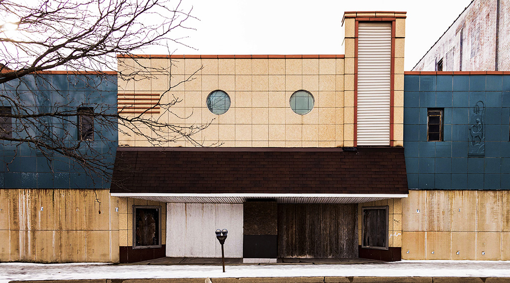
I find the theme of your exhibit intriguing. Focusing on abandoned buildings certainly gives a sober comment on our society and its quest for "newer and better." I appreciate your comment about keeping the view of the buildings stark and straight forward. I wonder about emphasizing the textures of the abandoned buildings by increasing contrast and darkening the cracks. I've attached an image with increased contrast to let you see how it would look. Have you considered converting some of the images to black and white? That can also give the look of aging and decline. Good luck on your exhibit, Lisa! |
Jan 18th |
 |
| 3 |
Jan 19 |
Comment |
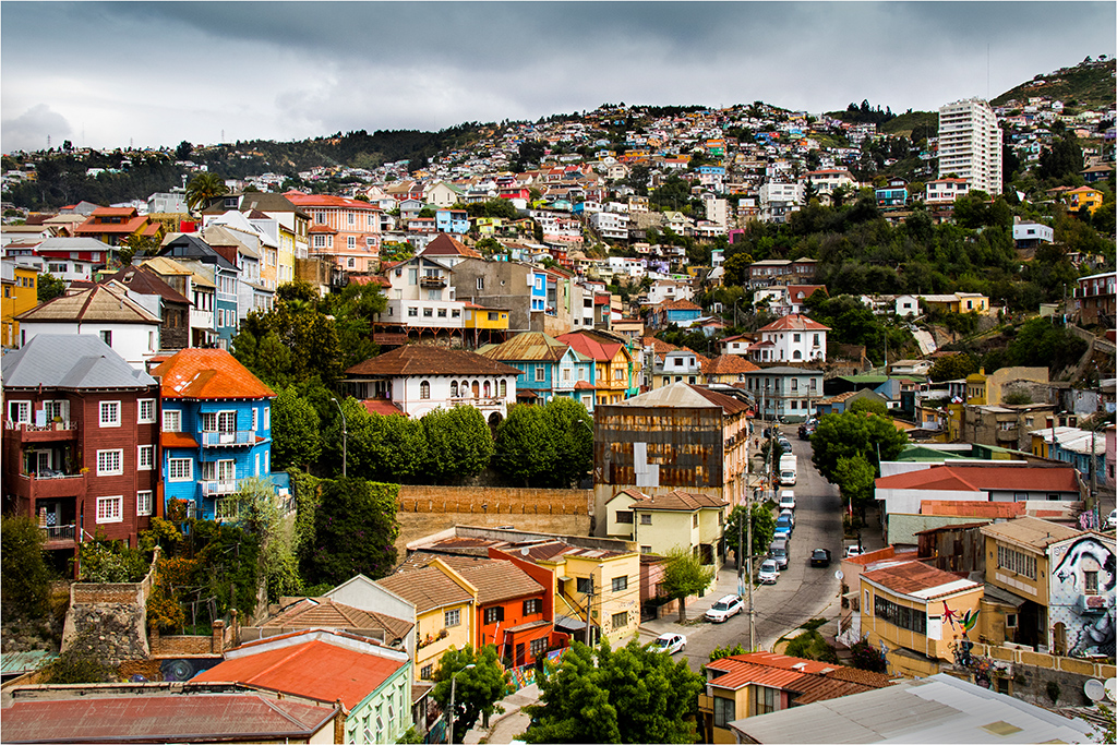
I like the beautiful evening light and lovely leading line of the railing. Having the bicycling and traditional street lamps in the foreground works well. As I look at the buildings, the top of front three buildings looks slightly wider than the bottom. I wonder if that lends to the "wonky" look that Lisa noticed. Since you're considering the image for competition, you could consider a slight crop off the top of the sky (in the cropped version) and/or maybe darkening the top of the sky slightly to keep the focus on the scene below. In my opinion, that might balance off the dark water. Beautiful photo! It's made even more special since your parents are from the Netherlands. |
Jan 18th |
| 3 |
Jan 19 |
Comment |
To me, the Chinese lanterns are colorful and striking in their painted detail. You did a good job of capturing a sharp image in dim lighting without using a tripod. The dark background sets off the lighted lanterns nicely. In my opinion, another view to consider would be a horizontal shot to include the complete circle of white lanterns around the larger central light. |
Jan 18th |
| 3 |
Jan 19 |
Comment |
Night time scenes with outdoor lighting are indeed challenging. I commend you for experimenting with different combinations of camera settings. I like the bright colors of the display. Your cropped version does focus my eye more on the snow people. Perhaps, doing a vignette or darkening the bright lights on the left side would also draw attention to the snow family. |
Jan 18th |
| 3 |
Jan 19 |
Comment |
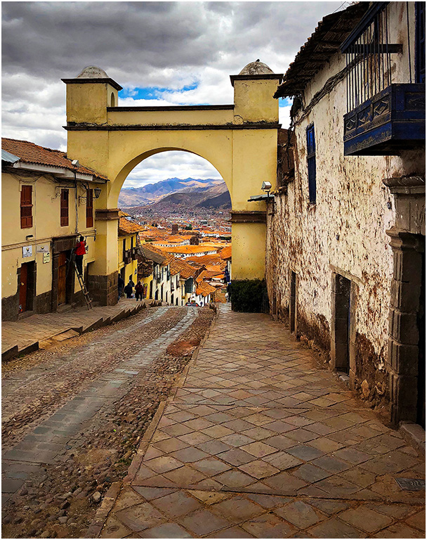
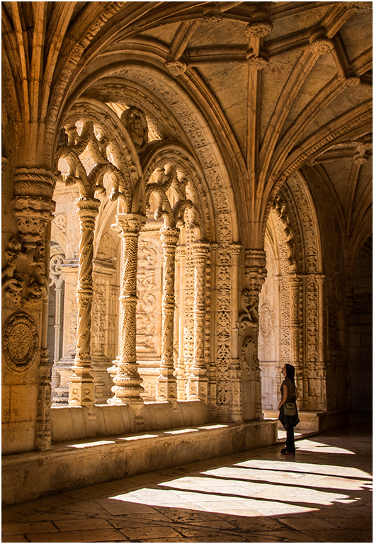
Good for you for making the resolution to work on your photography. It is definitely a matter of time. I like the textures in your photo, with the rough wall and tiles. Having a beautiful scene at the end of the hallway is a definite plus. The lighting of the scene adds to the richness of color and appeal in my opinion too. |
Jan 18th |
| 3 |
Jan 19 |
Reply |
I like your cropped version of Original 1 that uses the railing as a leading line to the building. |
Jan 18th |
| 3 |
Jan 19 |
Comment |
What a lovely idea to give your daughter this photo as a gift! I really like the morning light on the scene. Since the Calder sculpture is so identifiable, I would leave it in the image. Personally, I also appreciate Original 2, which includes the art museum, a beautifully designed building on the lake shore. I agree with Kieu-Hanh that correcting for the perspective distortion helps the image. The correction can also be done in PhotoShop by selecting the scene and doing an Edit--Transform--Skew. |
Jan 18th |
| 3 |
Jan 19 |
Reply |
Thanks, Lisa. |
Jan 18th |
| 3 |
Jan 19 |
Reply |
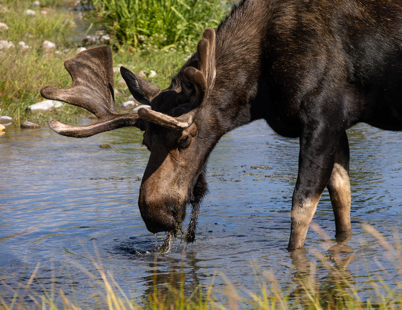
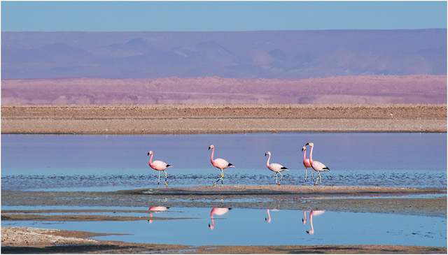
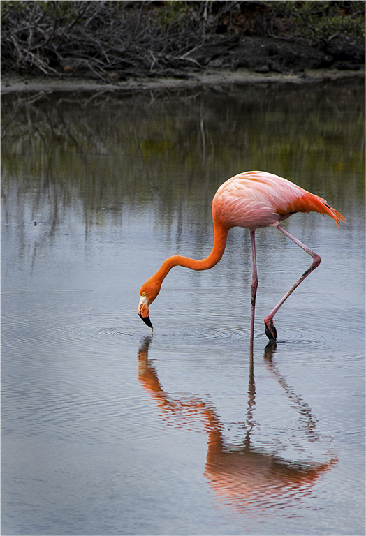
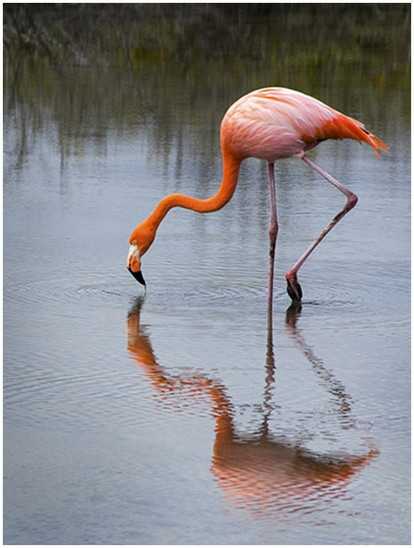
Thanks for noticing the water droplets on the flamingo's beak. I like that too. I appreciate your comments. |
Jan 18th |
| 3 |
Jan 19 |
Reply |
The cropped version eliminates the dark object you mentioned. Thanks for your comments. |
Jan 18th |
| 3 |
Jan 19 |
Reply |
Here's a cropped version that eliminates the bushes. What do you think? |
Jan 18th |
 |
6 comments - 6 replies for Group 3
|
6 comments - 6 replies Total
|