|
| Group |
Round |
C/R |
Comment |
Date |
Image |
| 39 |
Sep 18 |
Reply |
Okay all, I have done work on the original using you suggestions. Probably could use a little more work, but wanted to present you with an alternative image. |
Sep 20th |
 |
| 39 |
Sep 18 |
Comment |
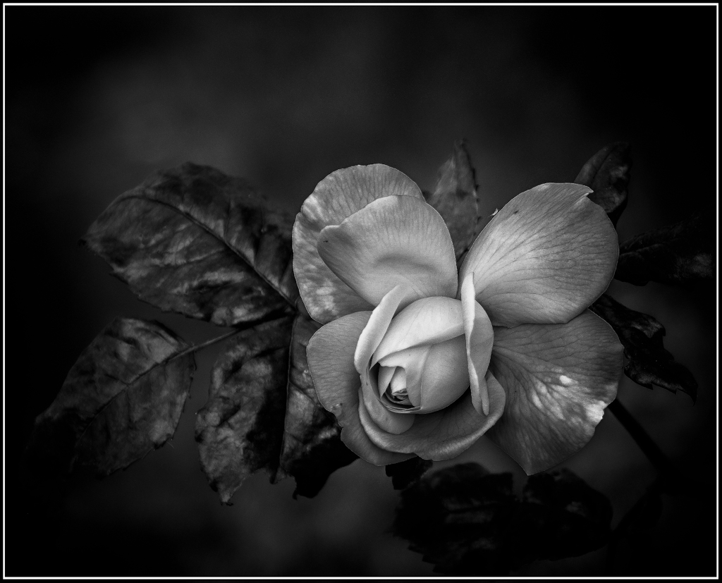
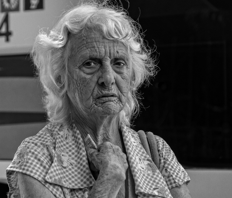
I think this is a stunning image and prefer the B&W to the color. I like the way her body fades into the background without becoming the background. The light on her neck, arm and foot are very striking and I agree that using either luminosity masking or Jerry's technique to match the tone on her arm with the one on her neck and foot. I look forward to seeing more of your dancer images. |
Sep 20th |
| 39 |
Sep 18 |
Comment |
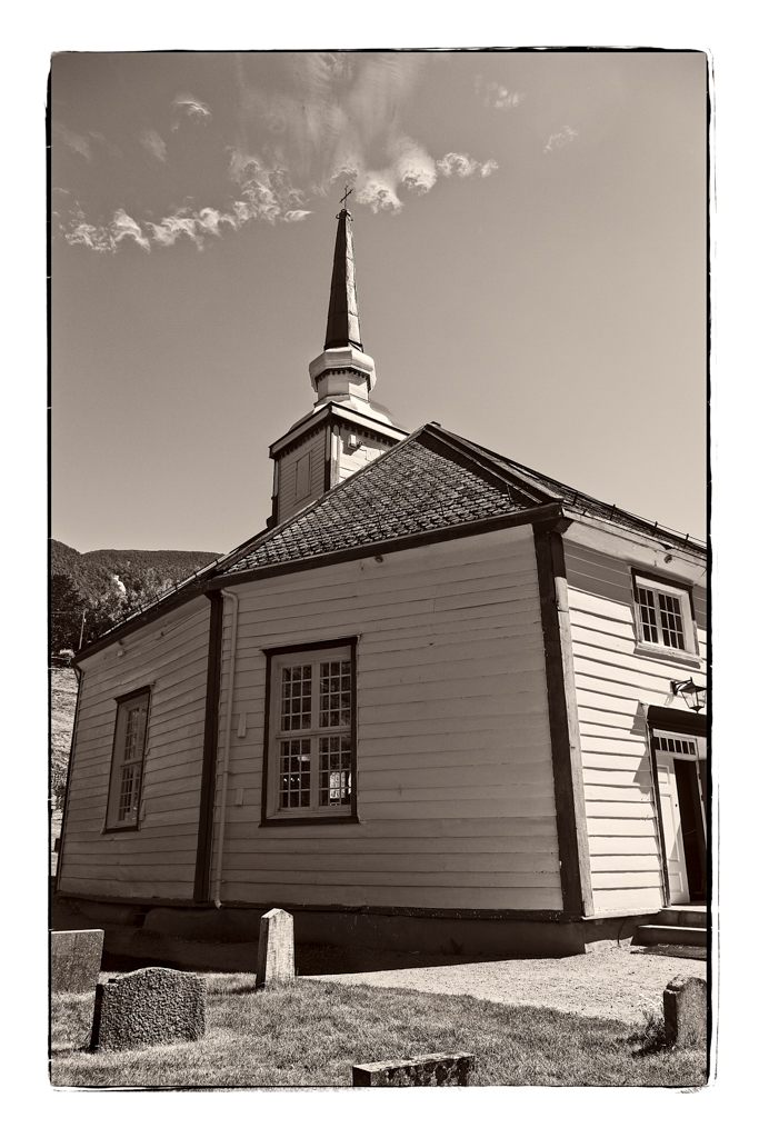
I love this part of the world, so I really appreciate this image. I also like the love you can feel from your sense of place and contentment living in this beautiful area. I agree that the sky is fantastic and the fence leading into the trees is wonderful. I don't mind the "emptiness" on the left, to me it makes the trees and path stand out and provides context and scale. |
Sep 20th |
| 39 |
Sep 18 |
Comment |
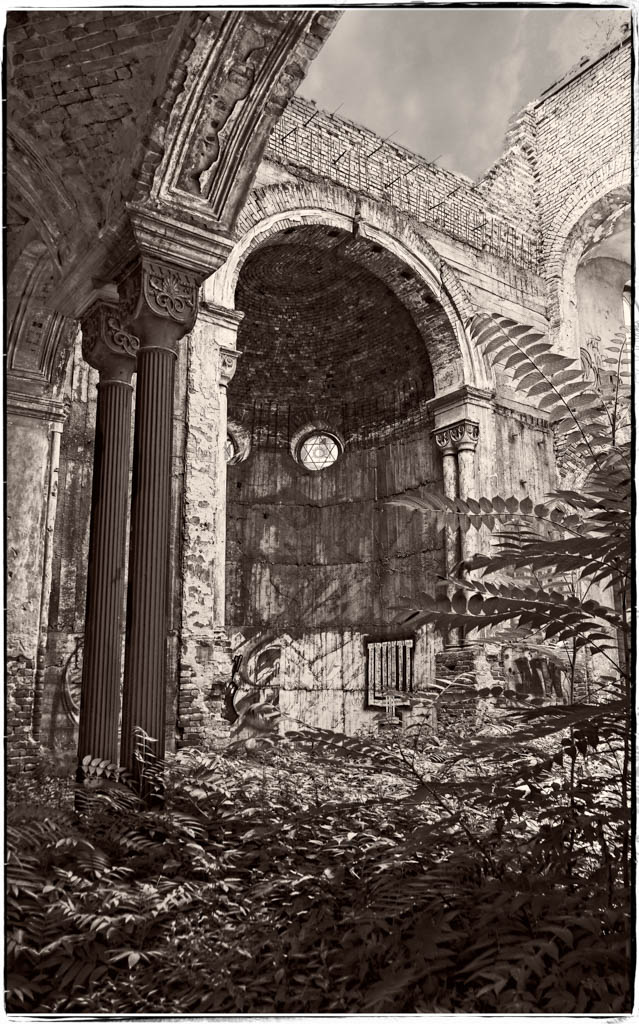
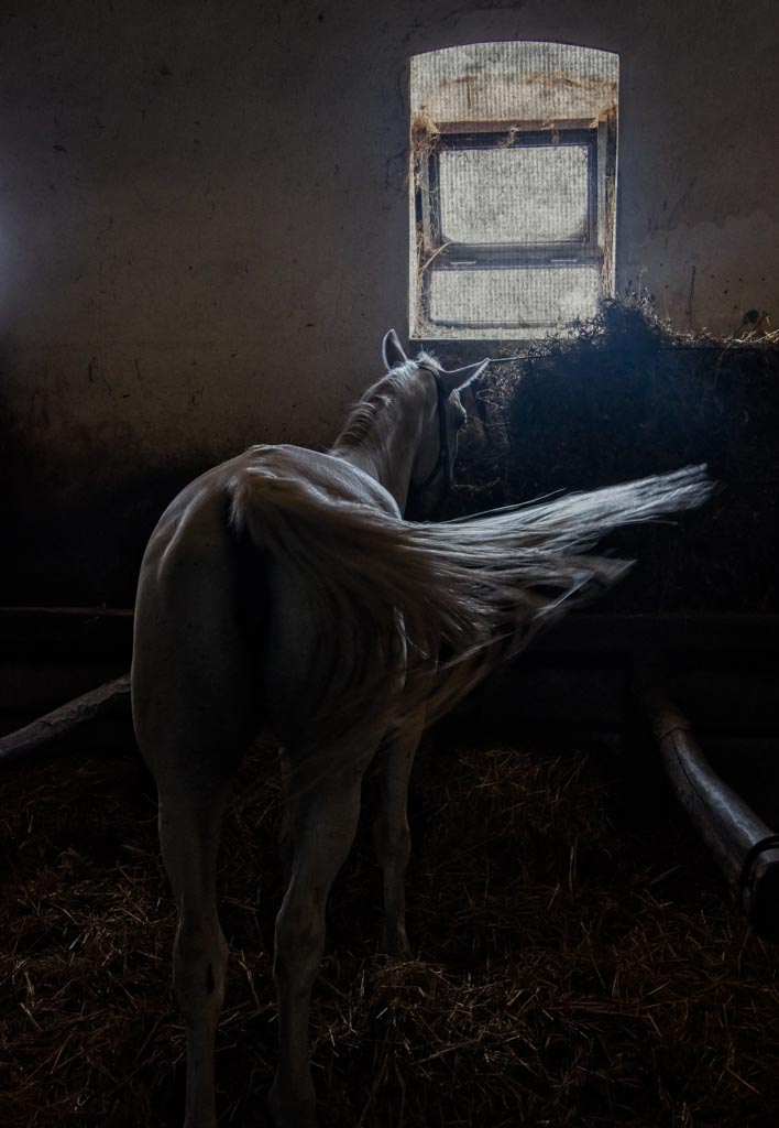
I really like the conversion of this image to infrared. Because of the treatment you utilized, the barn stands out beautifully surrounded by the fence and trees. I'm amazed that you could convert to infrared that looks like it was taken with an infrared camera. |
Sep 20th |
| 39 |
Sep 18 |
Comment |
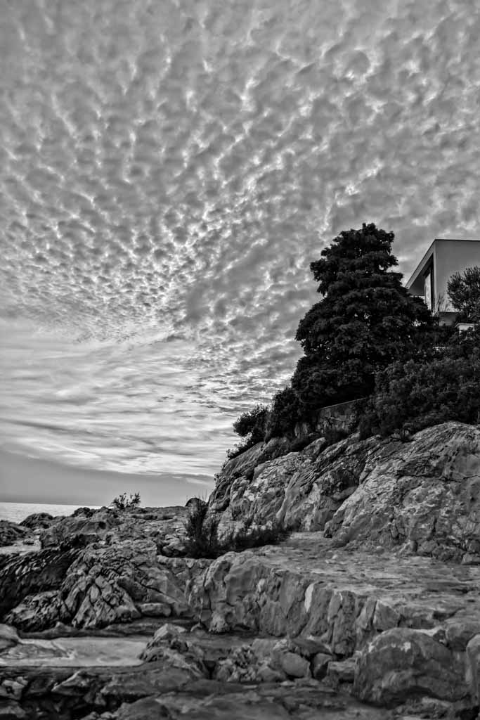
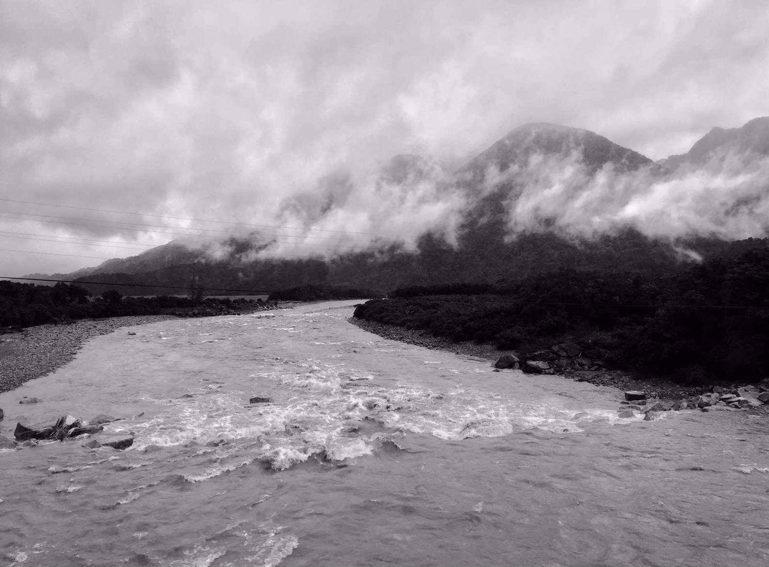
I applaud that you were able to seize the moment to capture this image. The composition works for me, especially the cropping of the B&W version. My issue is that I find the cloud to have lost the glow it has in the color image and the mountain is looking a bit too grey and flat. I think this image, in converting to B&W, would be served better using luminosity masks which would allow you to preserve the glow of the cloud and maintain the detail of the mountain without making it too flat. I hope this helps. |
Sep 20th |
| 39 |
Sep 18 |
Comment |
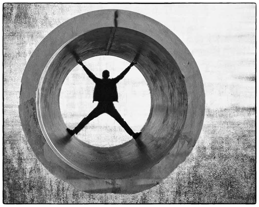
I find the B&W very striking and different. There is more of another world feeling in B&W. The one thing I would try is to lighten the, I don't know what you call it, the round bumpy thing :-) and darken the ant a bit. I think that is what makes the color work well is the black ant stands out more from the light green/yellow. |
Sep 20th |
5 comments - 1 reply for Group 39
|
5 comments - 1 reply Total
|