|
| Group |
Round |
C/R |
Comment |
Date |
Image |
| 14 |
Jan 21 |
Comment |
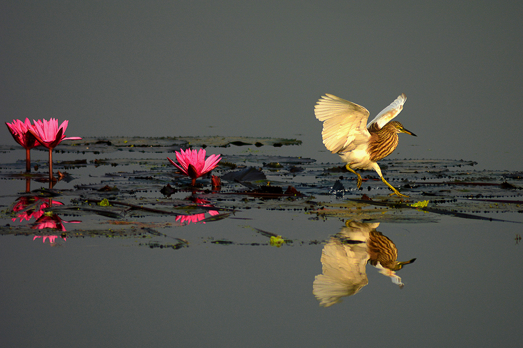
Double WOW on this image,Sayed. There is SO MUCH to like about this image, the subject, the color palette, the excellent focus, the prominent lighting which makes the center of interest very clear. There is SO MUCH to like about this image!! I have just 2 small quibbles that are quite minor but might further enhance this already excellent image: 1. There appears to be a great deal of noise in the gray areas of the photo that should be corrected. 2. If you flip the image horizontally, I feel that this makes a slightly stronger composition. See thumbnail. GOOD JOB!!!! |
Jan 10th |
 |
| 14 |
Jan 21 |
Reply |
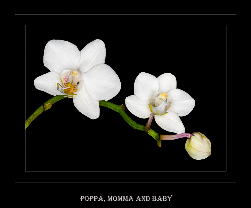
Yeah, I think you and Darcy have the same idea (great minds along the same track??)--there is just too much contrast between the white petals and the very black background. I am going to try a more muted--perhaps textured background and see if this might improve the image. I appreciate your candid comments. |
Jan 9th |
| 14 |
Jan 21 |
Comment |
Hi, Darcy, and HAPPY NEW YEAR to you. I am not a fan of this image for the following reasons: 1. in my personal aesthetic floral photography should be sharp--either the entire image is sharp or a portion of the image is sharp so as to draw the eye to the center of interest--or blurred with intent. This image is neither sharp or blurred with intent. 2. there does not seem to be a center of interest. I am not sure what I should be looking at. You could argue that this is a study in light and shadows, but the image has a monotone character and perhaps Greg's suggestion of more contrast might enhance the image. I agree with Greg that viewing the original image before cropping might be helpful. |
Jan 9th |
| 14 |
Jan 21 |
Comment |
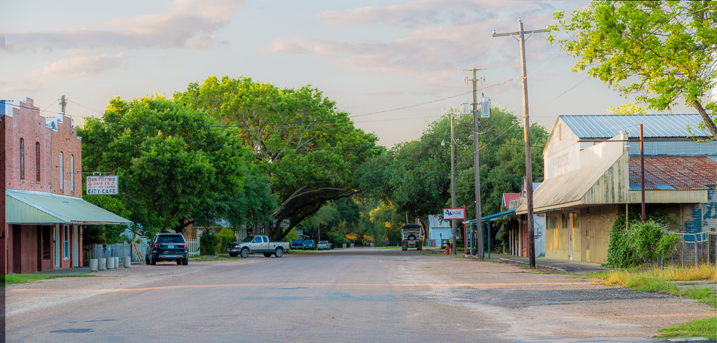
Hi, Quang, this is a nice pastoral scene and is well done and not over processed. GOOD JOB!! |
Jan 9th |
| 14 |
Jan 21 |
Comment |
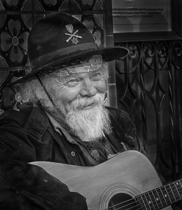
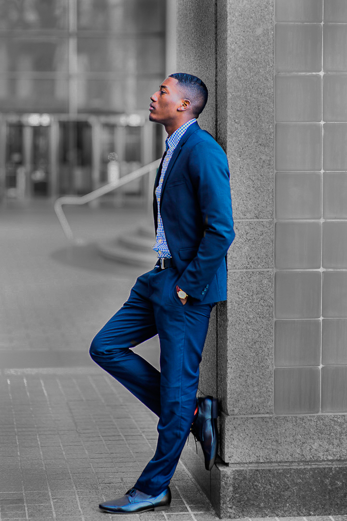
Wow, Xiao, you really have a knack for capturing these very evocative images. You seem to have mastered street photography very well. The image is well composed with the subject in the 3 and 4 power points. The story-telling component is very strong. From a technical standpoint, the presence of a tangent (lines which confuse the eye) is seen with the handrail seeming to protrude from the chest and because it is so bright draws my eye from the subject. Trying to remove the tangent would I think would destroy the integrity of the photo. An alternative would be to minimize the distraction by use of a color splash technique whereby all the attention is focused on the subject and much less on the background. See thumbnail.Regardless, this is a VERY WELL DONE image and I look forward to seeing more of your street photography. |
Jan 9th |
 |
| 14 |
Jan 21 |
Comment |
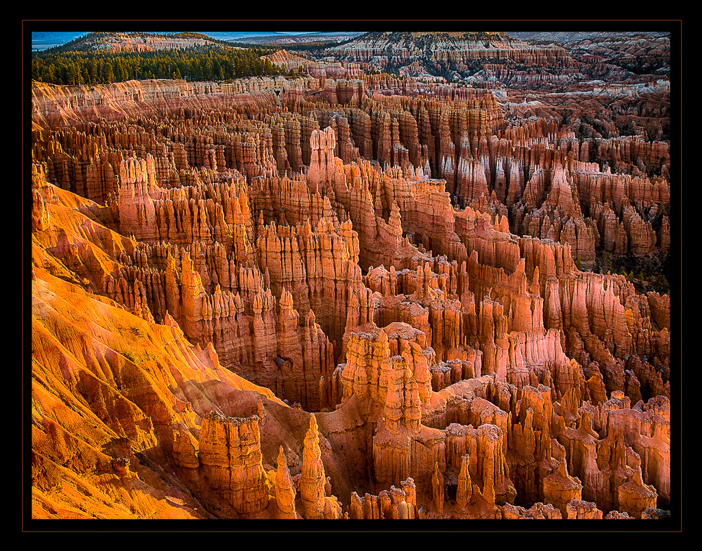
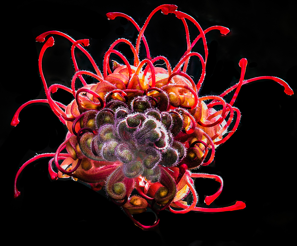
Hey, Tom, I am in TOTAL AWE of your perseverance in this focus stacked shot. I have done focus stacking in a studio type setting where there is no wind, etc and still have problems with each image being in perfect register. The fact that you did this with 80 images AND outdoors and still getting them to align in perfect register is beyond amazing. VERY WELL DONE!!! The image is to my eye a bit flat. Under the rubric of "go big or go home", you might consider ramping up the colors and exposure and removing distracting details. See thumbnail. Just a suggestion. Nevertheless, well done. |
Jan 9th |
 |
| 14 |
Jan 21 |
Comment |
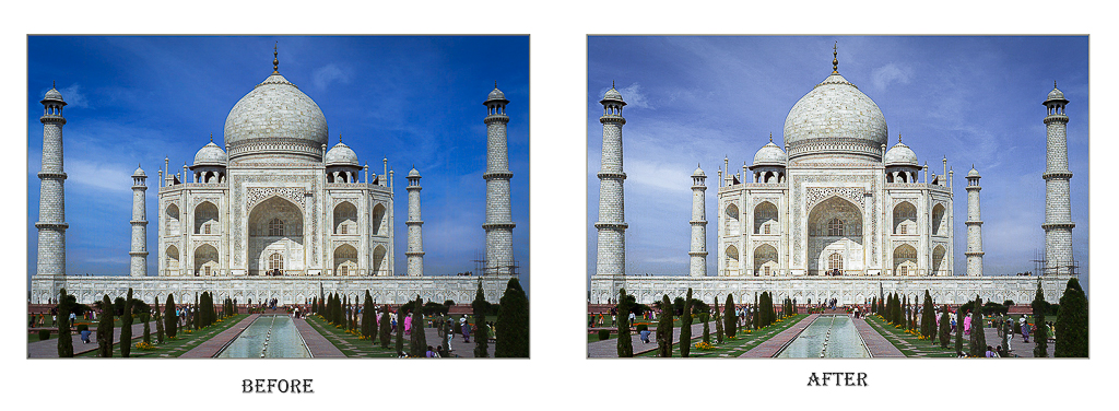
Wow, Greg, what a great image!!! It is so well done from an interest standpoint, the composition, the lighting, the exposure are all VERY WELL DONE. I would be VERY PROUD to have this in my portfolio So, very well done. This aleady powerful image MIGHT be enhanced by increasing the exposure VERY SLIGHTLY so as to focus the eye on the Taj. The sky replacement is, to my eye, a little too blue and you might consider decreasing the saturation a bit. See Thumbnail. Again, a very well done image. |
Jan 9th |
 |
6 comments - 2 replies for Group 14
|
6 comments - 2 replies Total
|
