|
| Group |
Round |
C/R |
Comment |
Date |
Image |
| 14 |
Nov 20 |
Comment |
This is a unique view of the Matterhorn. I have seen it from the hotel in Zermatt, but you appear to have gone the extra mile to give us a truly unique image and one that I have not experienced. The composition is, to my eye, exceptional with the grasses leading to the water and then to the Matterhorn. WELL DONE!! This already exceptional image is a bit problematic for me from a technical standpoint. There appears to be a lot of noise and banding in the sky. This could be remedied with some noise reduction and adding a bit of blur to the sky so as to decrease the banding. The other issue is with the mountain to the camera left. It is very underexposed and there is a complete crushing to the blacks that cannot be recovered in Lightroom. When faced with these situations, you might consider an HDR approach or do exposure blending (with camera on tripod, take one image properly exposed of the Matterhorn and another image properly exposed for the mountain and combine the two images in Photoshop). Thanks for sharing this REALLY NICE image. |
Nov 11th |
| 14 |
Nov 20 |
Reply |
I really like your modification MUCH better than the original image. GOOD JOB!!!! |
Nov 10th |
| 14 |
Nov 20 |
Comment |
Hi, Darcy. A very nice image taken from your cruise ship. I have very little to say to improve this already nice image. I would suggest that you do some noise reduction, especially in the sky. You also might SLIGHTLY ramp up the vibrance and saturation slider to emphasize the colors. (I did say SLIGHTLY). Nice job. |
Nov 1st |
| 14 |
Nov 20 |
Comment |
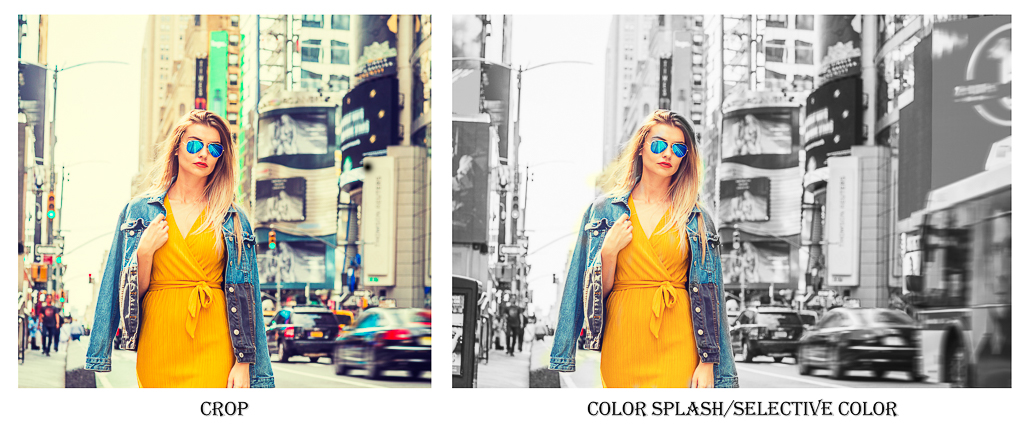
Hi, Xiao. Boy, this is a REALLY nice street scene. You have done a GREAT job of exposing the very elegant model and putting her in the context of a street scene. The exposure, focus, and story-telling are all exceptional. The one problem I have with this image is the red sign camera left which draws my eye away from the visual center of interest-the model. You might consider cropping the red sign out or if you do not want to lose the sign, then do a color splash/selective color technique so that the background is B&W and the model is her original color. (See thumbnail). GOOD JOB!!!! |
Nov 1st |
 |
| 14 |
Nov 20 |
Comment |
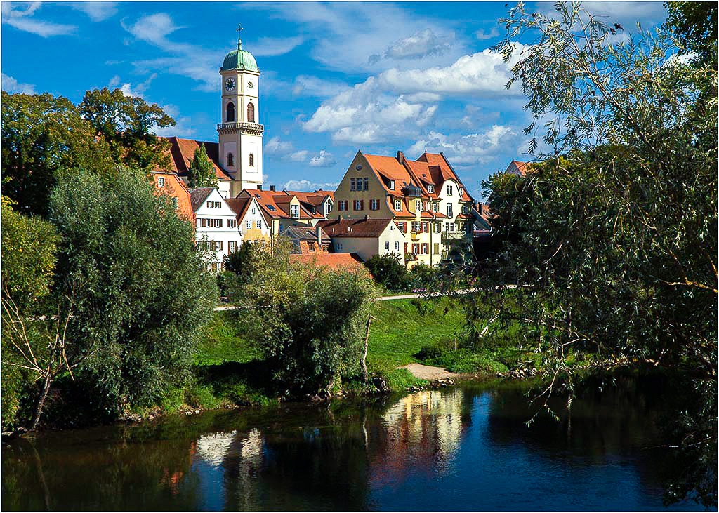
Hi, Gregory This is certainly a nice bucolic scene. You have a good eye for this type of image. I may have passed this scene up completely. The exposure, focus, composition are all well done. The sky replacement is a bit problematic. Luminar sky replacement gives a yellow cast to most of the images and without correction can be a problem. I did a "correct" white balance and it gives a completely different feel to the image (See Thumbnail). However, if it was your intention to tone this image with a yellow cast, then please disregard the previous comment. There is also a bit of haloing around the steeple and building. It is hardly noticeable from the low res images we have here, but if you decide to enlarge it to large print, it may become noticeable. Adobe PS came out with a sky replacement algorithm last week and it gives you the ability to refine the mask and thus eliminate the haloing. Check out this video: YouTube PHLEARN channel-Sky replacement video.
Good job!!!
|
Nov 1st |
 |
| 14 |
Nov 20 |
Comment |
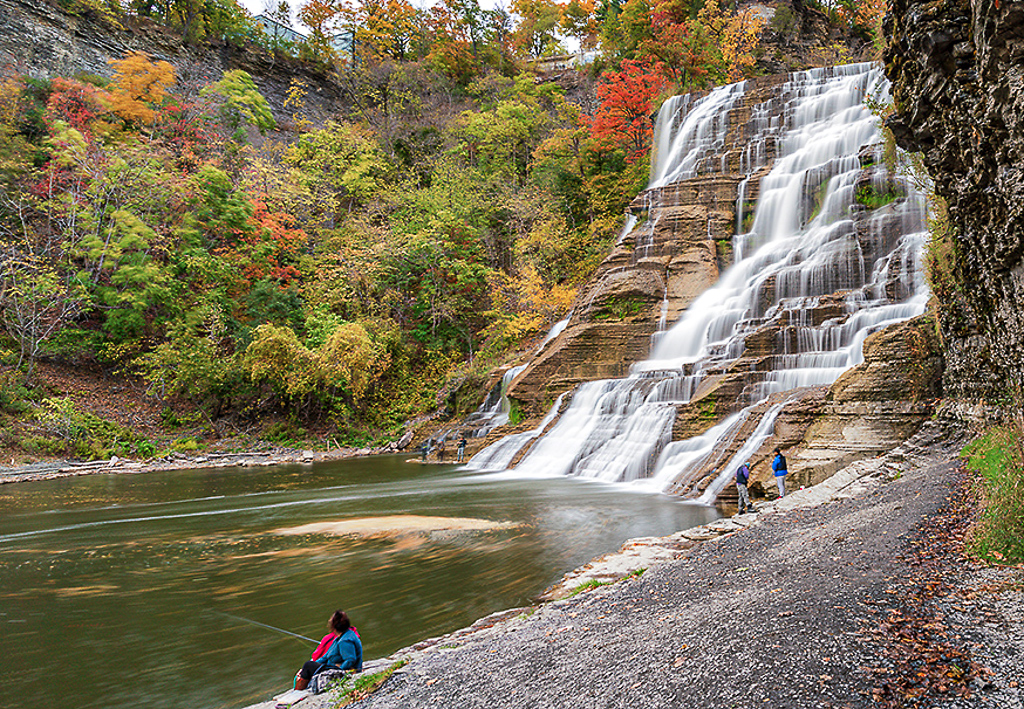
Hi, Quang. What a BEAUTIFUL image! It has everything going for it-exposure, focus, color balance, and story-telling. I especially like the way you have handled the waterfalls. They are perfectly exposed with detail in the whites and no evidence of overexposure. The only minor problem I have is the sky which acts like a light trap and draws my eye away from the center of visual interest-the waterfall. It has been suggested that you can do sky replacement which is a very acceptable option or you could consider just cropping out the sky. See Thumbnail. Either way, congrats on a REALLY nice image. |
Nov 1st |
 |
| 14 |
Nov 20 |
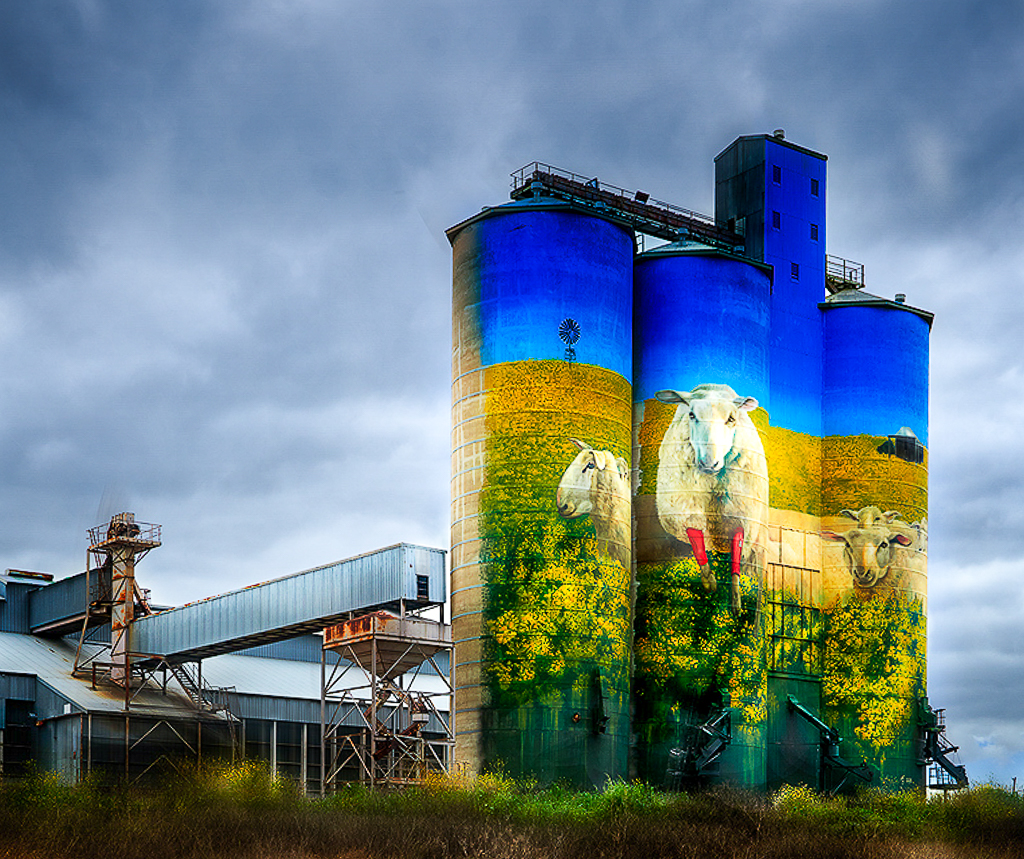
Comment |
There are just SO MANY things to like about this image. The subject itself, the rendition and especially the composition with the main subject -the silos-being eccentrically placed in the scene and the factory infrastructure acting as a leading line to the main subject. The exposure and focus are also well done. Where this image becomes problematic for me is the foreground which to my eye does not add anything to the image. And if it doesn't add to the image it detracts from it. I would consider cropping out the foreground so as to make the silos the unequivocal center of visual interest. You might also consider increasing the shadows slider so as to bring out more detail at the base of the silo. (See thumbnail) As an aside, you might consider taking about 10-12 more different images of these silos, printing them to 16x20 (or more) and then having an exhibition. VERY WELL DONE!!! |
Nov 1st |
 |
| 14 |
Nov 20 |
Reply |
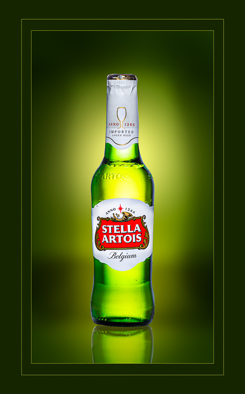
Hi, Tom. Thanks for your comments! With regard to the issue of saturation, all of the major brands have specific color palettes that they wish to be seen on their advertising so as to have consistency across various media. Stella has Stella Red, Stella Gold, Stella White and Stella Black as their color palette and each color has a specific HSL, CYMK, HSL and hexadecimal code for their product. What you see on the image is the "correct" red for Stella Red as requested by their design team. The reflection is simply a tool that I use to suggest that the bottle is on a surface of some sort so that it is not just floating in the air. I always appreciate what other people are thinking about my images and I certainly appreciate yours! |
Nov 1st |
6 comments - 2 replies for Group 14
|
6 comments - 2 replies Total
|