|
| Group |
Round |
C/R |
Comment |
Date |
Image |
| 10 |
May 18 |
Comment |
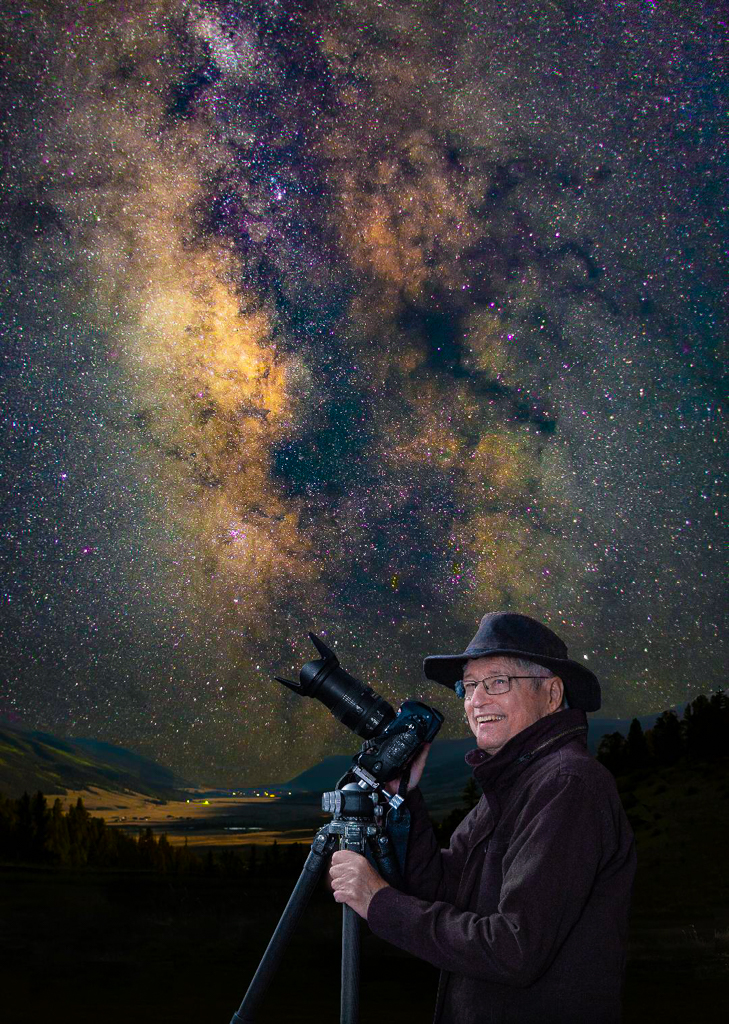
DOUBLE WOW on this image, Herb. Everything about this image is excellent, the exposure, the composition, the color balance, the storytelling, the style, the center of interest and the technique. GREAT JOB!!!! |
May 14th |
| 10 |
May 18 |
Comment |
Once again David you seem to have a good eye for all things photographic. I know that you eschew the use of photomanipulation but in this case, I think it really might help the image out even more. I need to get you out of your comfort zone and have you take up something different-like Lightroom or Photoshop. See what you think. See VF |
May 14th |
 |
| 10 |
May 18 |
Comment |
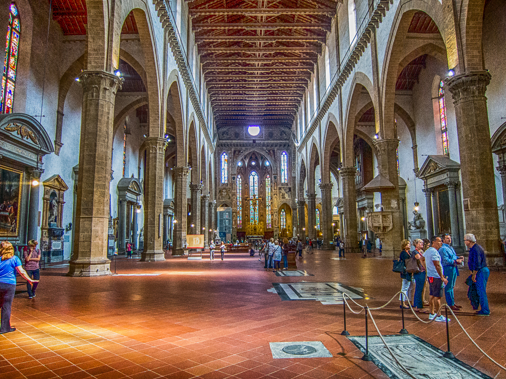
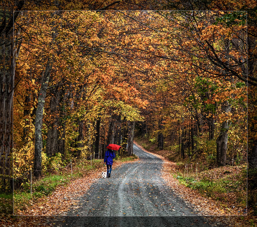
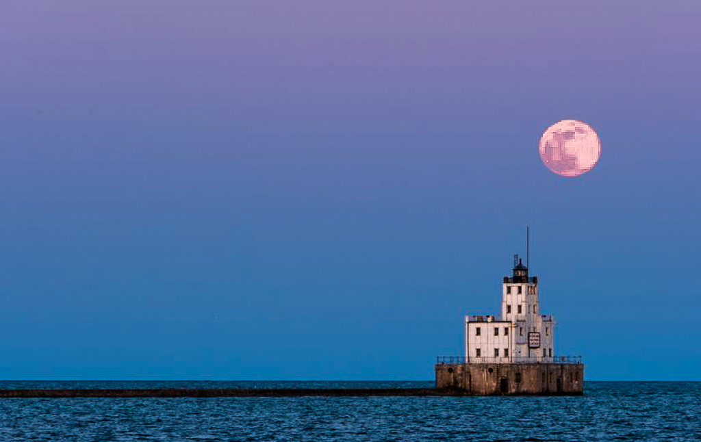
You have a good eye for composition, Diana. I like the exposure, and the time of day that you were able to capture this. Image might be enhanced by cropping a bit on the left and on the bottom so as to bring the lighthouse into the fourth PowerPoint. I realize this leaves a lot of negative space on the left side but the nice little pier tends to act as a leading line and really doesn't bother me that much. In addition if you get increased illuminance of the lighthouse that would further pull the eye to that center of interest. See what you think. See VF |
May 14th |
 |
| 10 |
May 18 |
Comment |
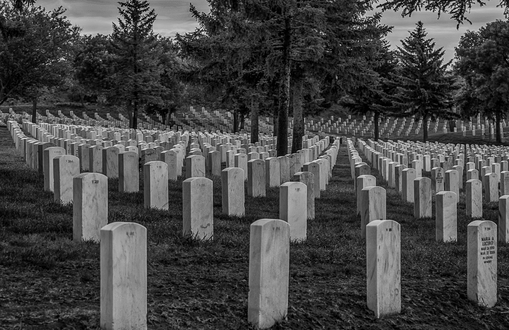
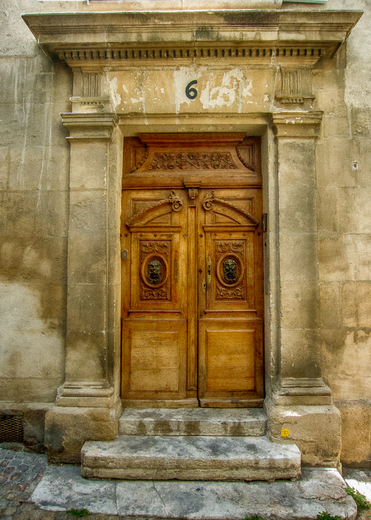
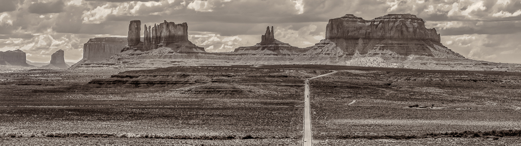
I agree with the comments as stated above. The image would be markedly improved by straightening out the image and adding a bit of clarity so as to bring out some of the nice texture in the image. See VF |
May 14th |
 |
| 10 |
May 18 |
Comment |
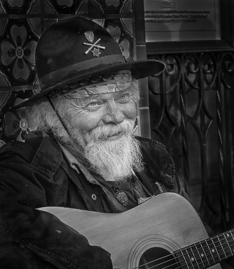
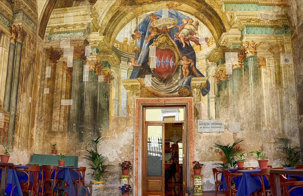
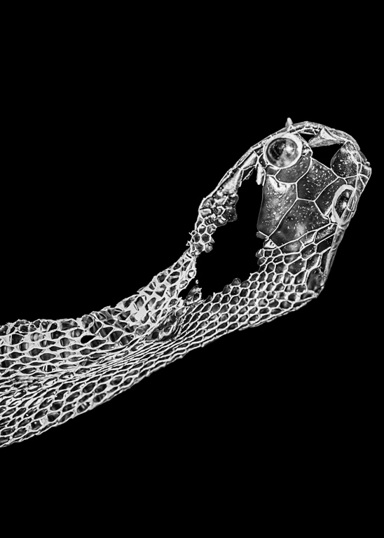
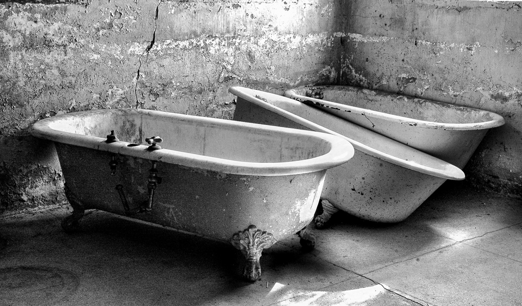
This is a really really nice image in a study of textures and shapes. I think your use of B&W was a very wise choice. The exposure, focus and composition are really exceptional. The image might be enhanced by eliminating the fused edge tangents at the top the image. These tend to confuse the eye. A simple cropping would take care of this. In addition, you might want to bring down some of the highlights and add just a bit of clarity to bring out more of the texture. See what you think. See VF |
May 14th |
 |
| 10 |
May 18 |
Comment |
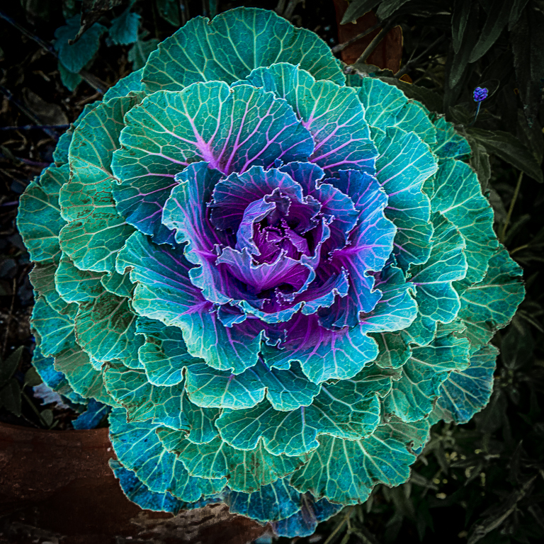
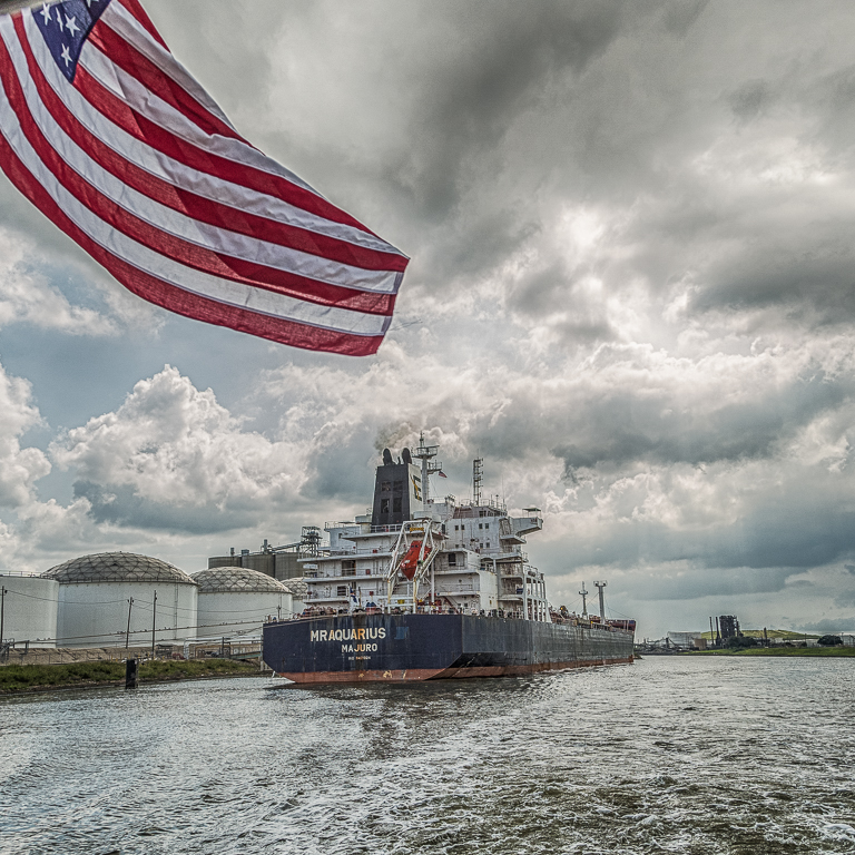
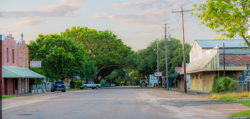
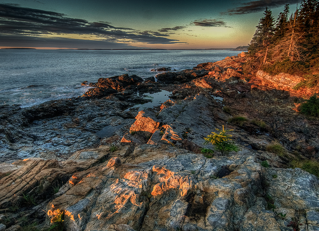
REALLY nice shot, Mark. The exposure is certainly spot on and the lighting is absolutely fantastic. You certainly captured this spot at exactly the right time. The image might be further enhanced by removing a large dust spot at about 12 o'clock position. You also might consider adding a bit of a gradient to the sky to bring down some of the brightness and bring more drama into the image. Once again, this is a really really nice image. See VF |
May 14th |
 |
6 comments - 0 replies for Group 10
|
6 comments - 0 replies Total
|