|
| Group |
Round |
C/R |
Comment |
Date |
Image |
| 10 |
Apr 17 |
Reply |
Check out this video from YouTube:
https://youtu.be/RH2NW-jjrtQ |
Apr 25th |
| 10 |
Apr 17 |
Reply |
Check out this video from YouTube:
https://youtu.be/A44ybqF8Jzc |
Apr 25th |
| 10 |
Apr 17 |
Reply |
Just two quick comments:
1. I TOTALLY AGREE with your comments regarding the variability of the brightness (luminosity) of various computer monitors. The Mac retina screen has a luminosity of about 375 cd/meter2-and that is the default value. Other monitors have substantially lower values. In the International Photographic Competition, they standardized the submission requirements. The jurors view all digitally submitted images on a 30 inch-NEC monitor set to D65, gamma of 2.20 and a luminosity of 120 cd/m2. This allows both the contestants and the judges to view the images at relatively equal brightness values. I currently view all of the images on my desktop monitor with these parameters. I also TOTALLY AGREE with Mark's comment that a laptop computer is extremely variable in terms of both luminosity and saturation values. Personally, I would NEVER submit an image that I had edited on my laptop because of the extreme variation.
2. One must be very careful to distinguish between the digital image and the printed image. The digital image is viewed in terms of transmitted light and the printed image is viewed in terms of reflected light. These are not the same types of light. The general standard is that the print is about 20%-30 % darker than what you see on your computer monitor. In order to compensate for this factor, many people will create a duplicate of their digital image and increase the brightness by about 20% which results in a wonderful print but a terrible looking digital image. I suspect that your image you submitted for this round looks absolutely MAGNIFICENT in print but looks a bit overexposed on the digital image. These are just my thoughts on the subject.
|
Apr 25th |
| 10 |
Apr 17 |
Comment |
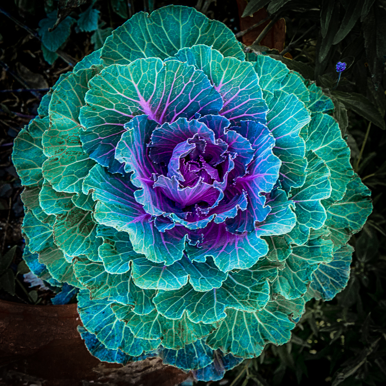
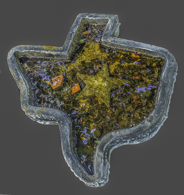
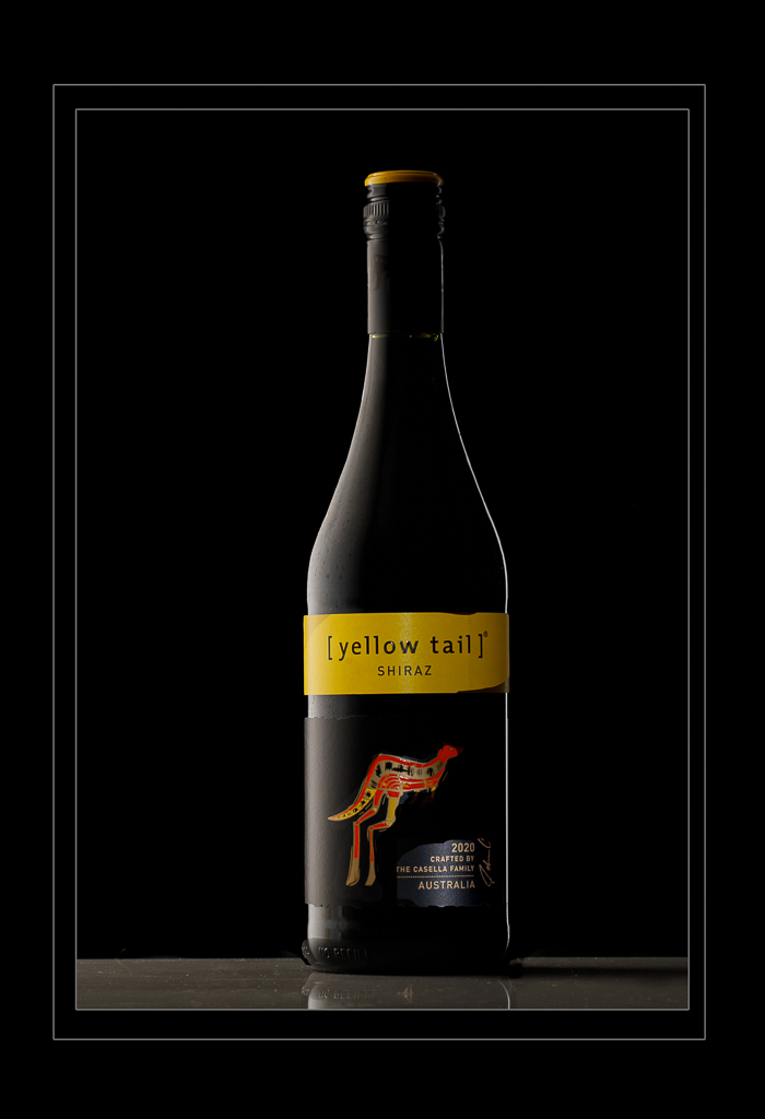
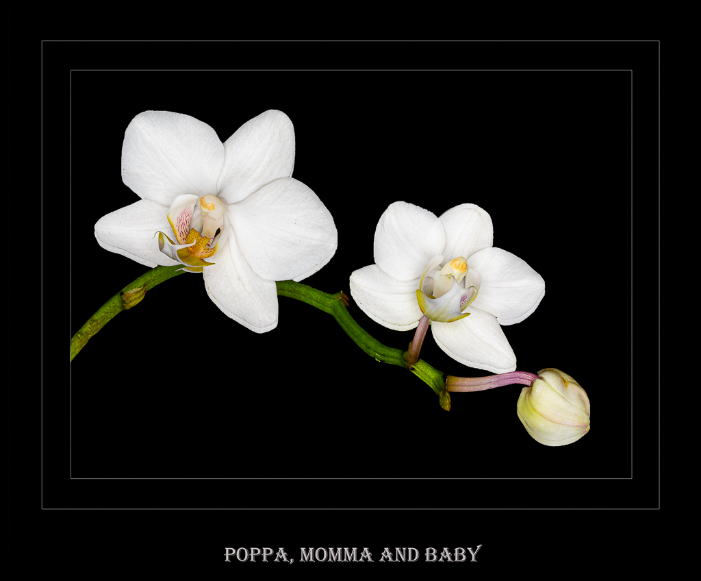
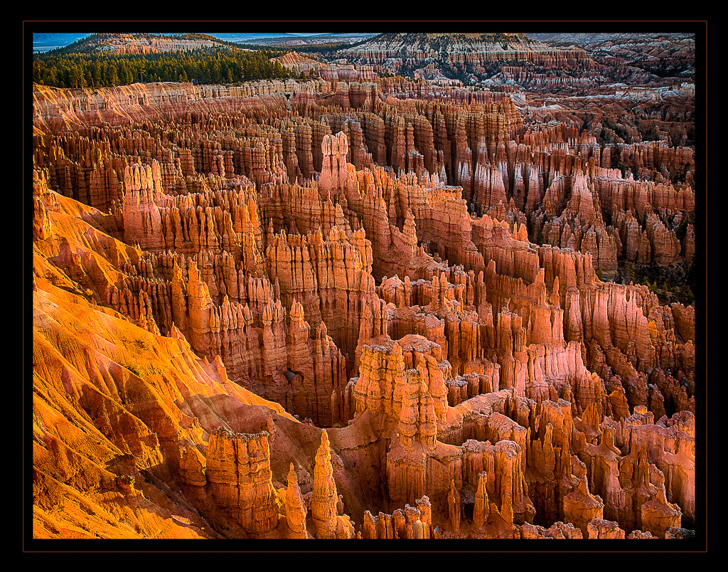
A very nice abstract image. The image is sharp and expose very well. I especially like the color balance as well as the composition. GOOD JOB!!! |
Apr 21st |
| 10 |
Apr 17 |
Comment |
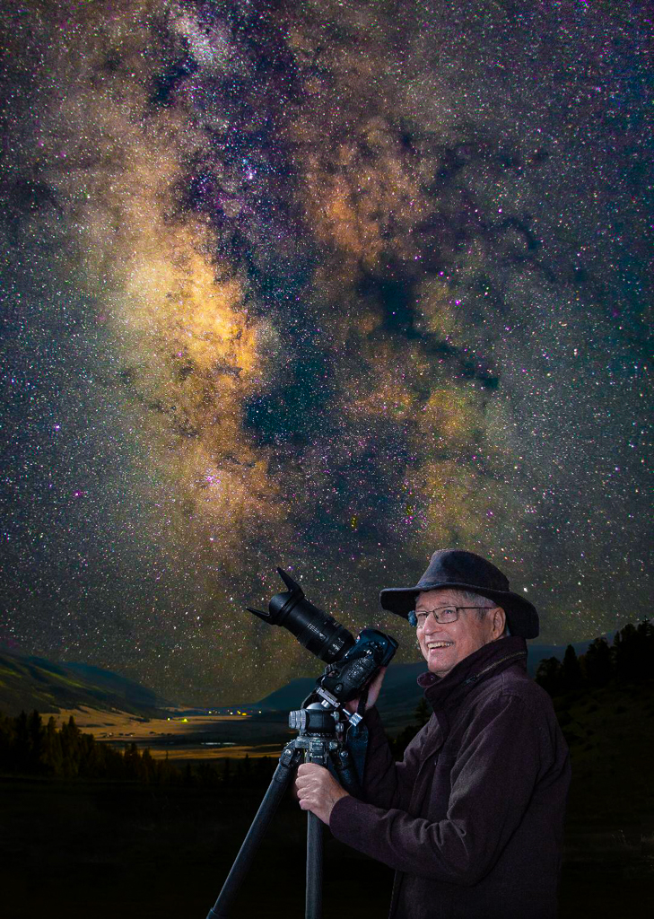
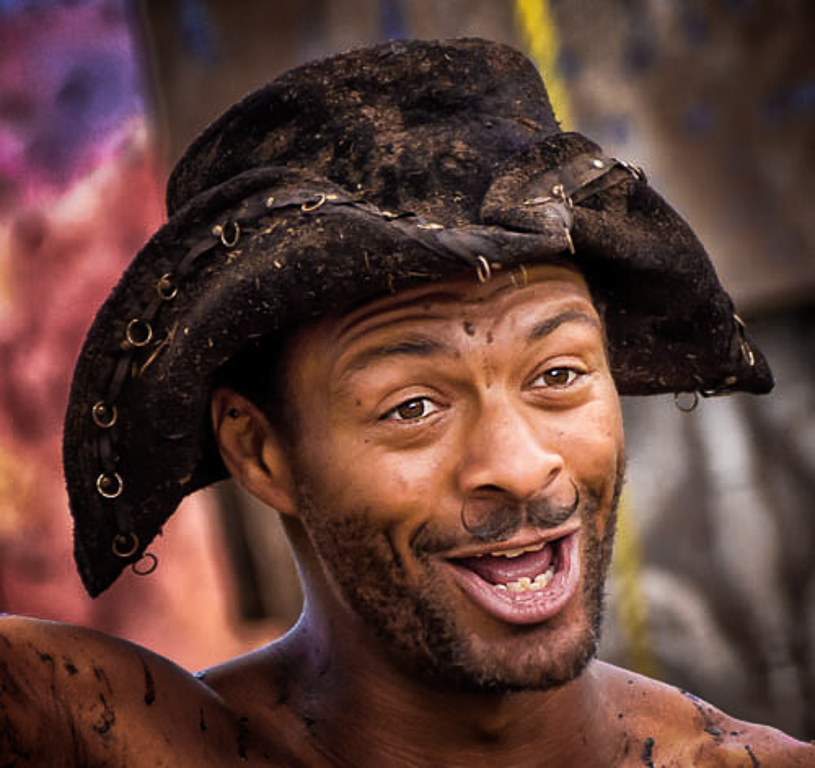
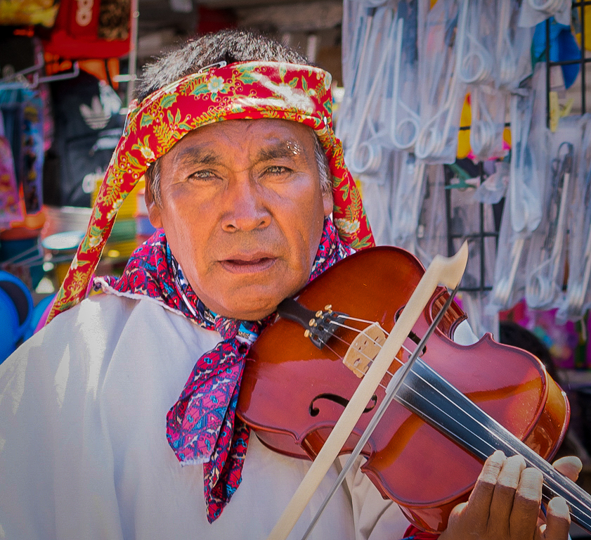
This is a very very nice capture of this very interesting gentleman with a very interesting mustache. The image is well exposed and well composed. This image might be enhanced by decreasing some of the bright color in the background as well as decreasing some of the exposure in the background. A slight vignette may further help us focus our eyes on the subject. see VF VERY NICE JOB |
Apr 21st |
 |
| 10 |
Apr 17 |
Comment |
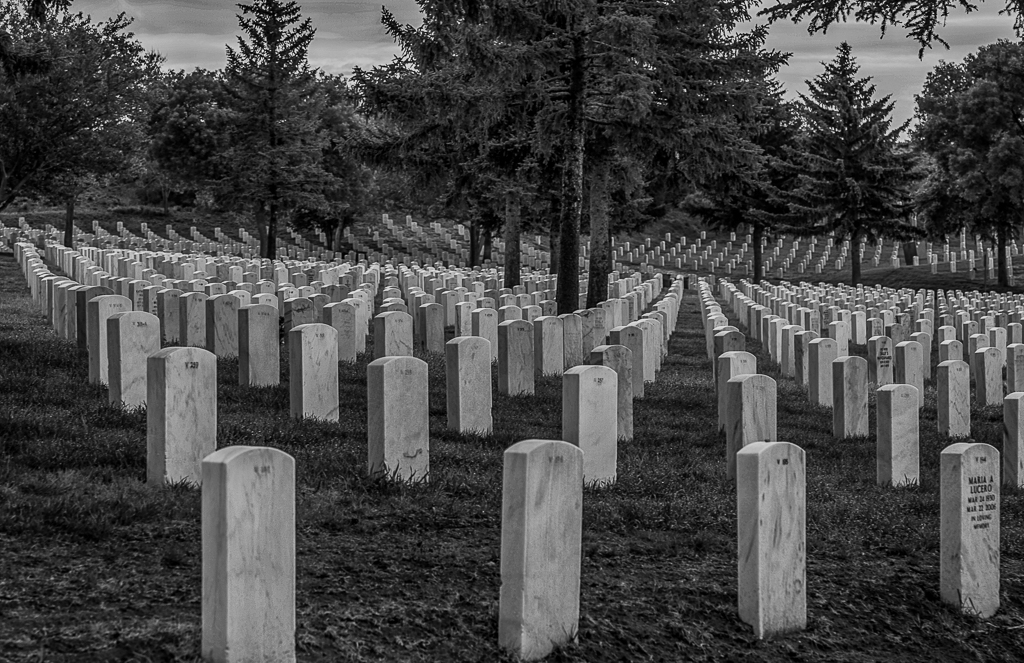
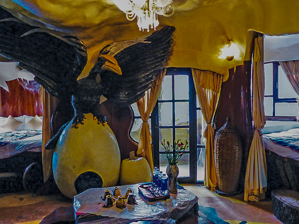
This is another one of your nice images from your travels through Vietnam. I love the composition and the color balance of this image. The image to my eye appears to be slightly overexposed-but there are no blown out details. This image might be improved by decreasing some of the exposure and highlights so that one can see beyond the Windows. See VF
NICE JOB |
Apr 21st |
 |
| 10 |
Apr 17 |
Comment |
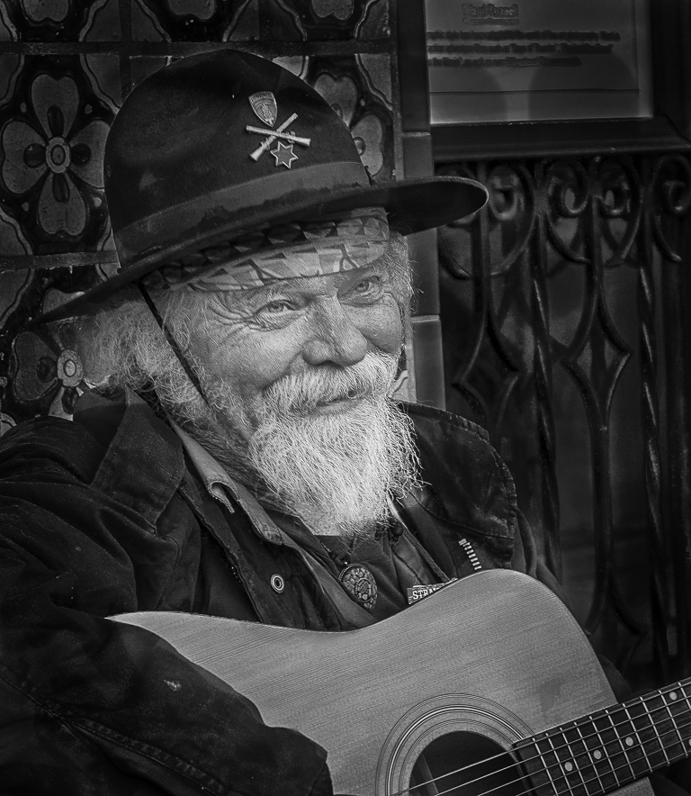
WOW! I really like this capture. The storytelling, focus, and color balance are truly exceptional. I particularly like the composition of the image. My only nitpick would be that the shirt appears to be blown out. The image might be enhanced by decreasing some of the highlights slider in Lightroom so as to provide detail in the shirt itself. One of my mentors in competition photography told me that if you don't take care of the highlights yourself, the judges will take care of it for you. See VF |
Apr 21st |
 |
| 10 |
Apr 17 |
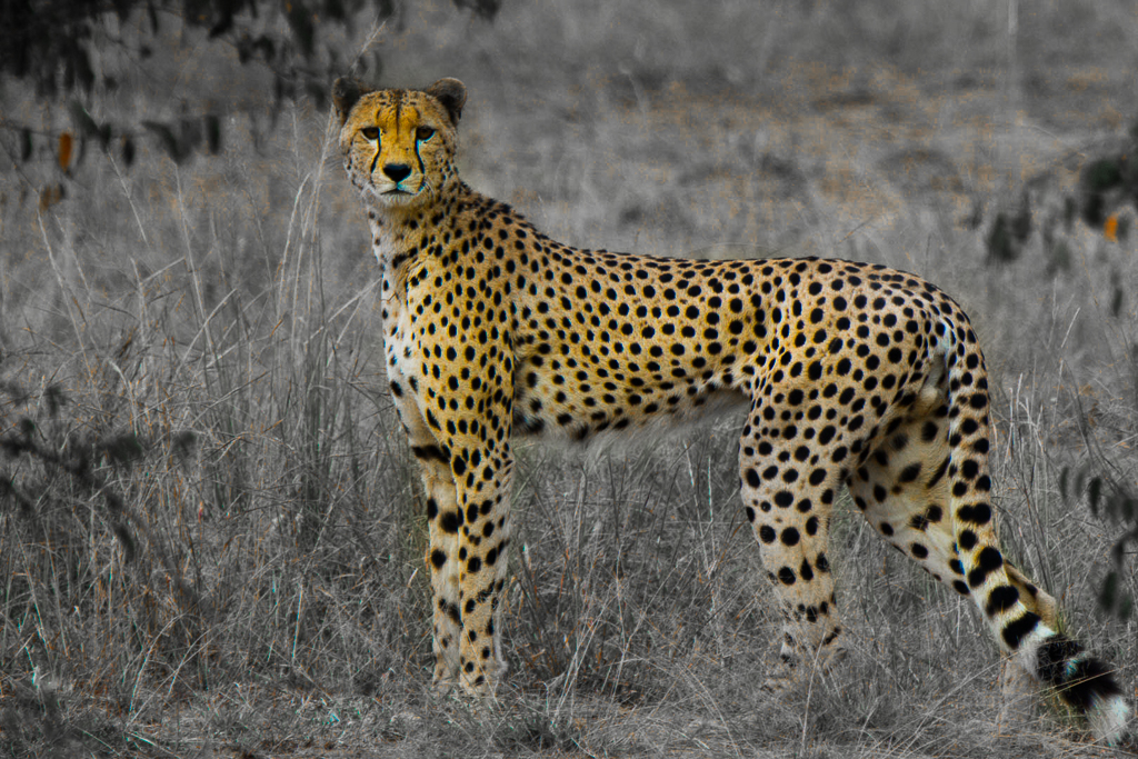
Comment |
You seem to have captured a variety of animals on your trip to Africa. This cheetah is very interesting. I like the tack sharp exposure, as well as the pose of this particular animal. The image might be enhanced by decreasing some of the green in the image and perhaps using a color splash technique. See VF. |
Apr 21st |
 |
5 comments - 3 replies for Group 10
|
5 comments - 3 replies Total
|