|
| Group |
Round |
C/R |
Comment |
Date |
Image |
| 37 |
Apr 17 |
Reply |
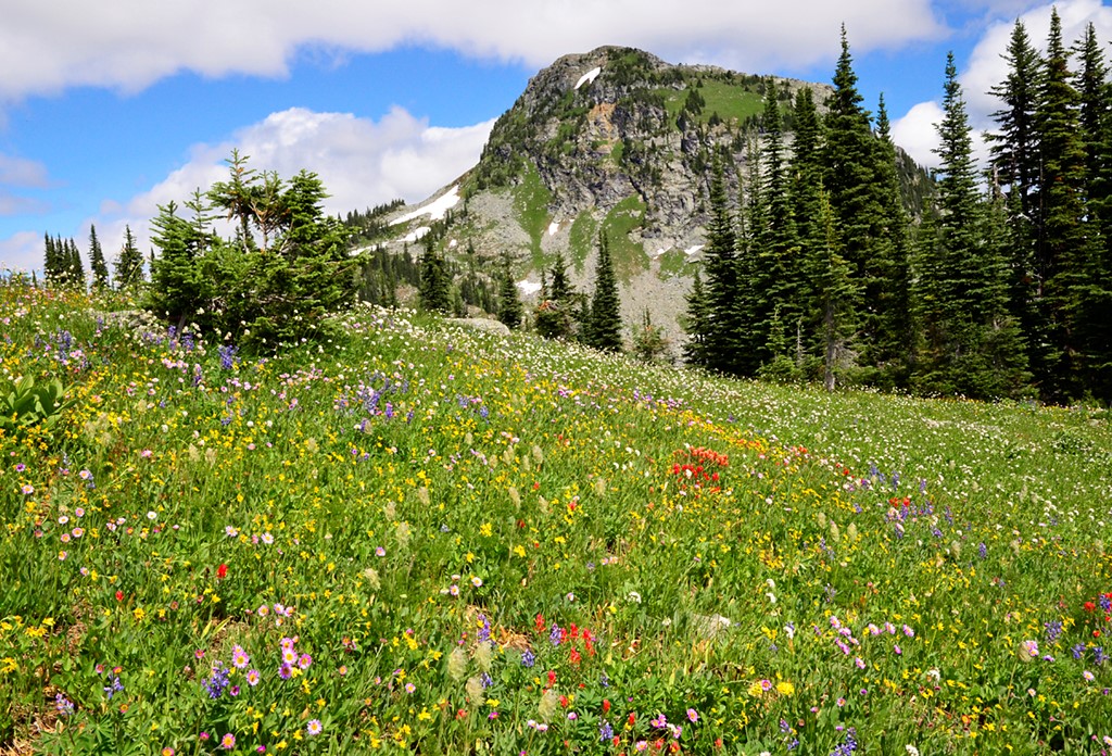
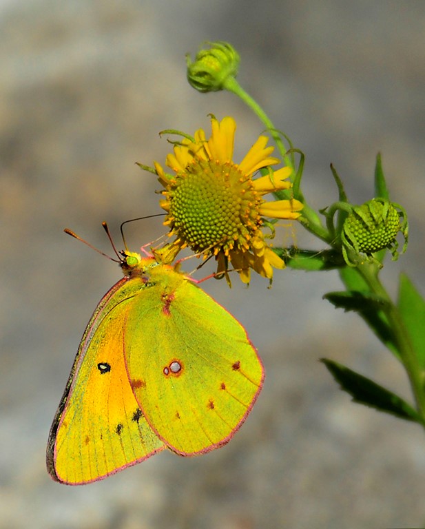
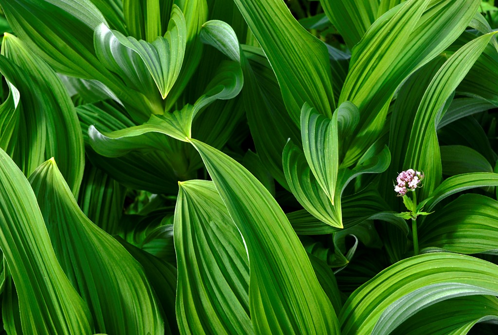
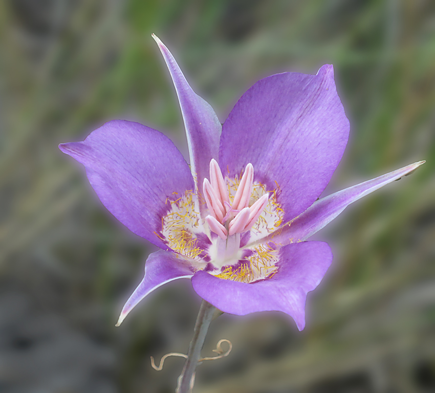
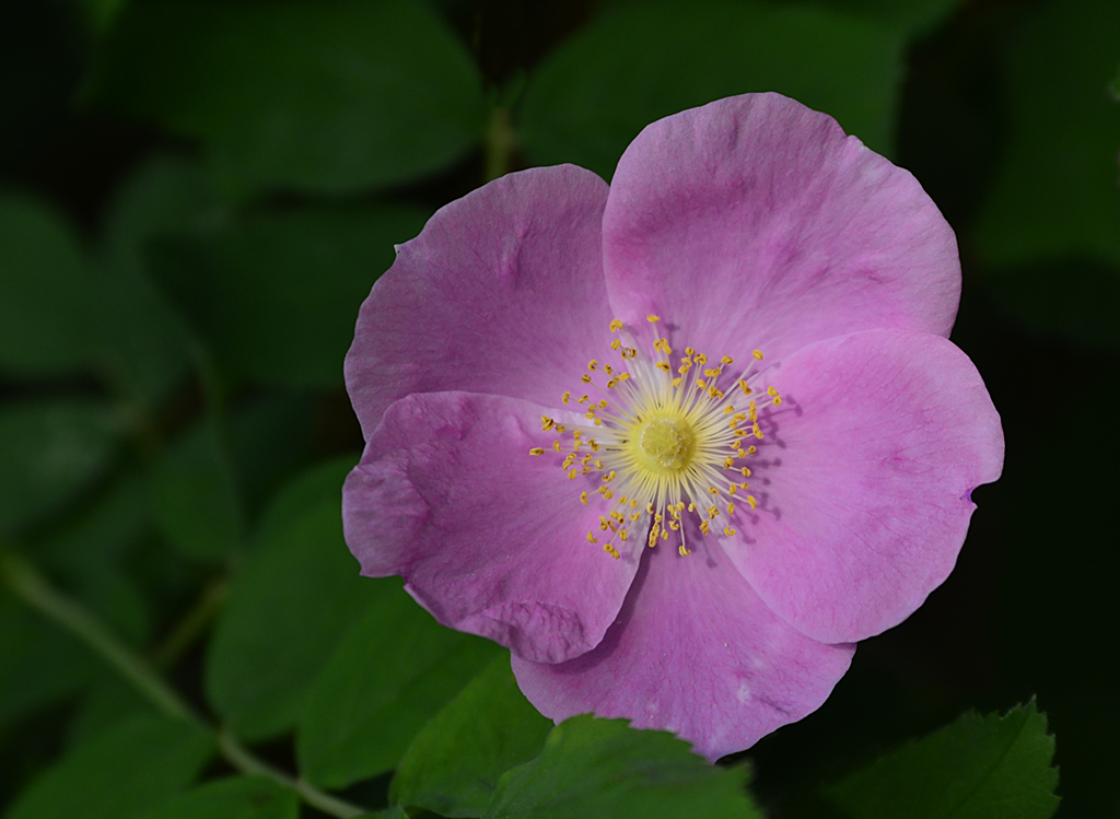
I guess you mean the glowy look. I am not sure, I will have to look. I did do a hack job on the processing cause as per usual I was almost late getting a pic in for this month. I notice that everyone thinks this image is overexposed, but in fact, the colours are very exact, this is what these flowers look like. It was a cloudy day, breezy, and it rained soon after. |
Apr 24th |
| 37 |
Apr 17 |
Comment |
The colours are delicious. The faint lines of the stamen give a sense of motion from the left. The petals are nice shapes surrounding the yellow centre.......I think that there should be just a bit more sharpness somewhere, in this case all the ends of the stamens. Stamens? Anyway, the brown parts. |
Apr 24th |
| 37 |
Apr 17 |
Comment |
I do believe I have been to this lighthouse, photographed it, and went inside. I will have to find the files and see what I did. The lighting you chose is contrasty, but with very nice colours. The darker blue sky separates from the white lighthouse......You mentioned about preferring the lighthouse in the centre, but it isn't actually, its off to the right a bit. You could think about cropping some off the left side, removing the first bush. Then the light house would be in the middle, and the frame would be balanced. I think. Maybe. |
Apr 24th |
| 37 |
Apr 17 |
Comment |
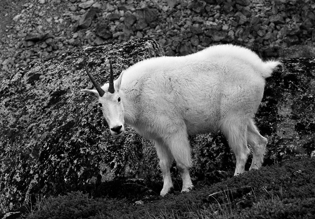
I have always founds crafts interesting, including the tools and details of making objects or art. For me the hands and the hammer in this image stand out and hold my attention. The conversion to B&W helps to focus our eye on these large shapes and how they relate to each other.........The mosaic chips being much smaller don't show up as well. The other shapes in the frame, as in the person's arm and legs, tend to distract from the centre of attention, but I think a bit of cropping would change this. |
Apr 24th |
| 37 |
Apr 17 |
Comment |
Your image is an interesting study of light and dark together. You achieved detail in both parts. The diagonal line between the light and dark implies movement, the 3 discs sort of become the subject and hold our eye. At first I thought you might take a bit off the top as the dark part is not as detailed, but after looking some more I realize that I was exploring the detail in both areas and the composition work very well. |
Apr 24th |
| 37 |
Apr 17 |
Comment |
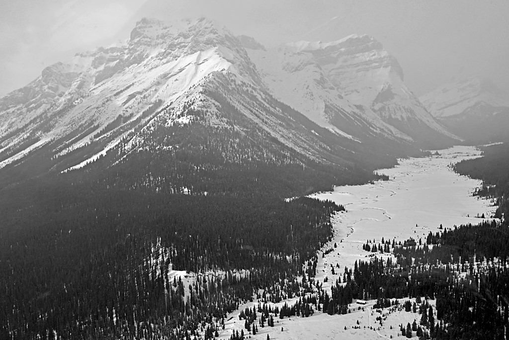
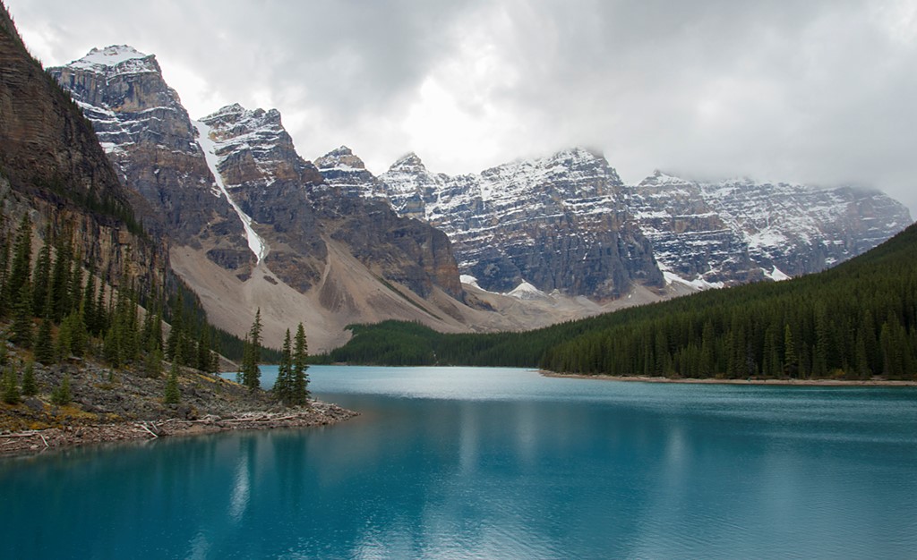
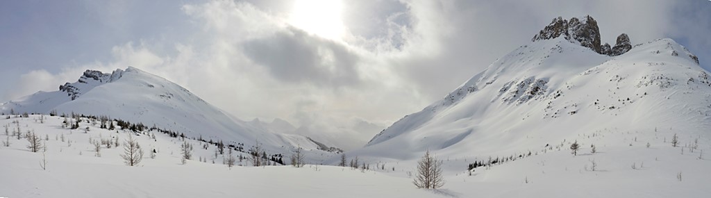
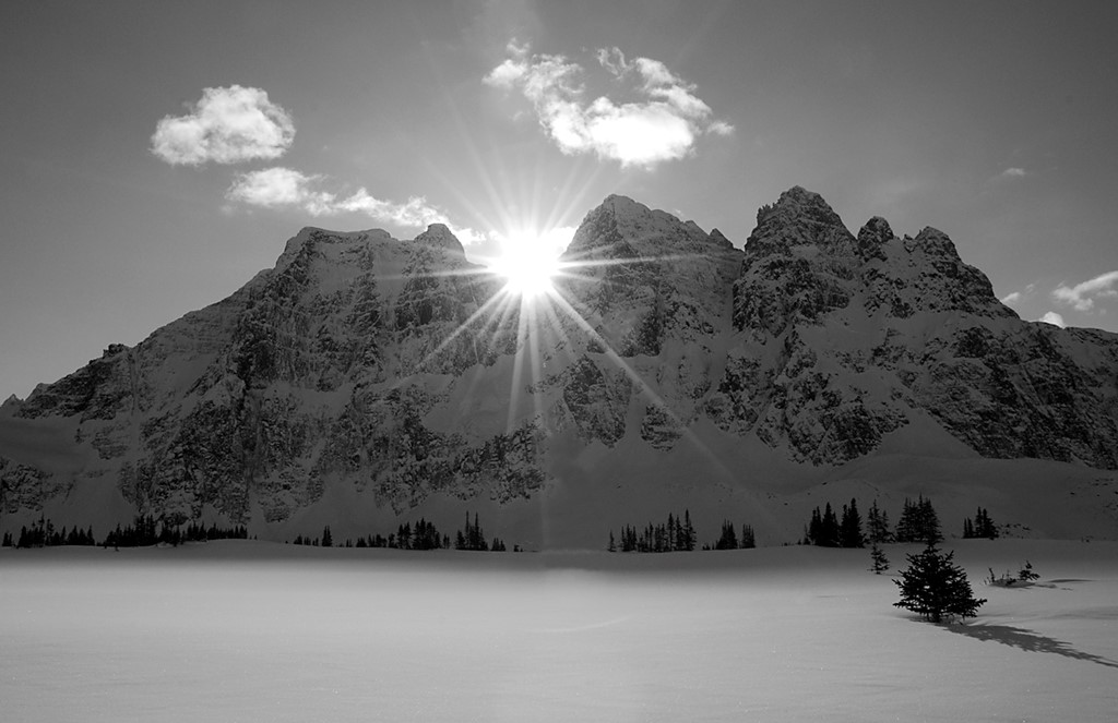
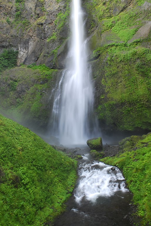
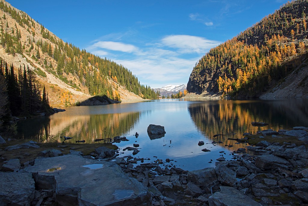
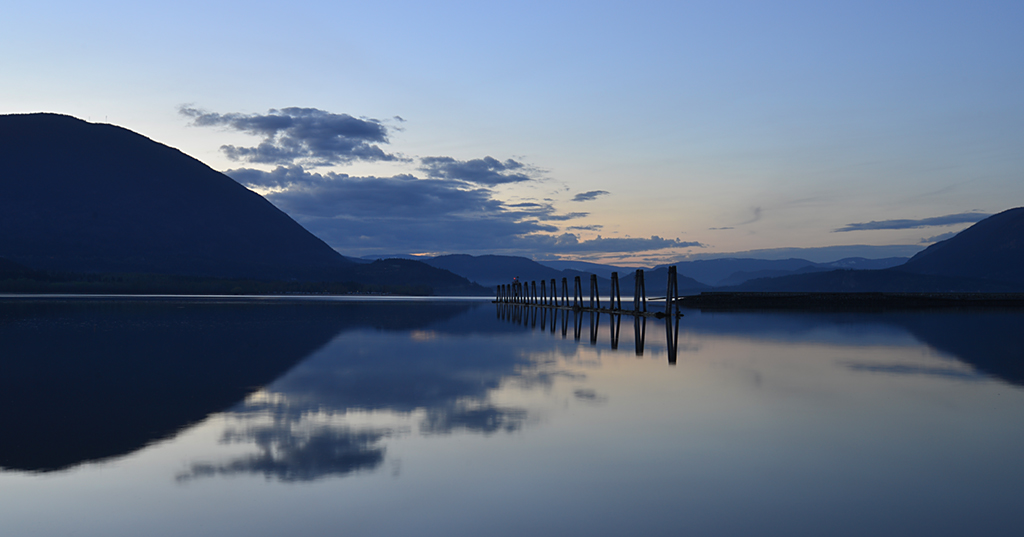
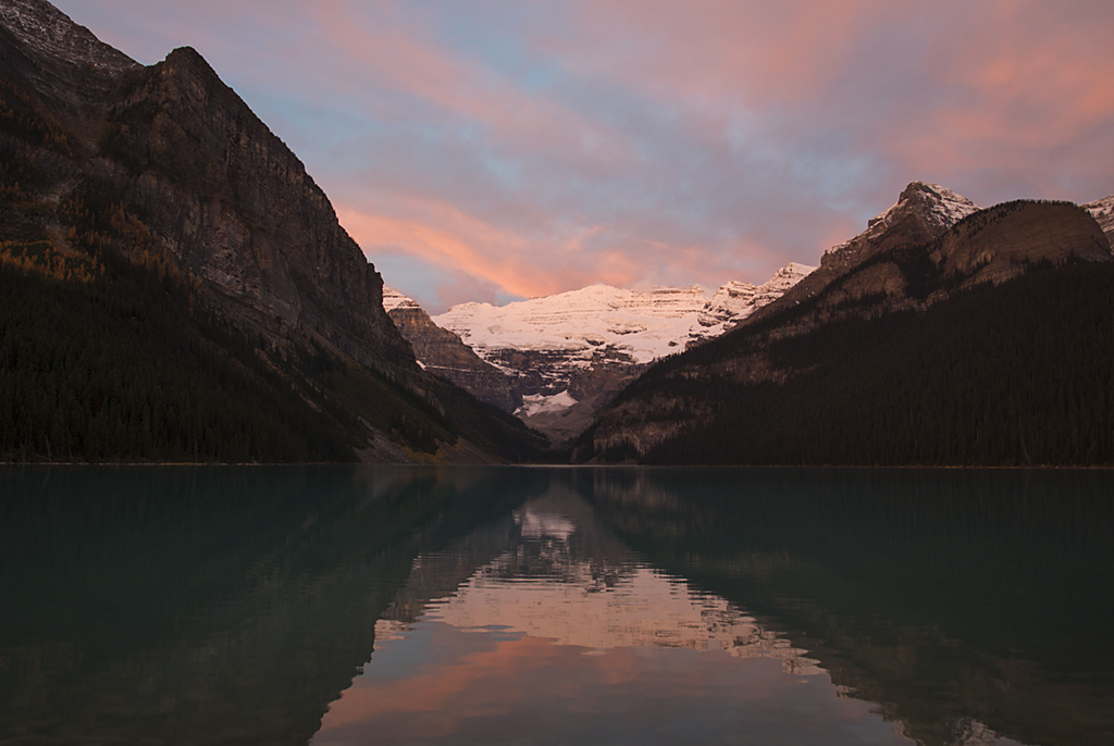
You captured the light well, just the right exposure. Very sharp, good details and colour contrast.......I think you could crop some off the bottom to reduce the large black shadow and so have more focus on the peaks and glowy clouds. |
Apr 24th |
| 37 |
Apr 17 |
Comment |
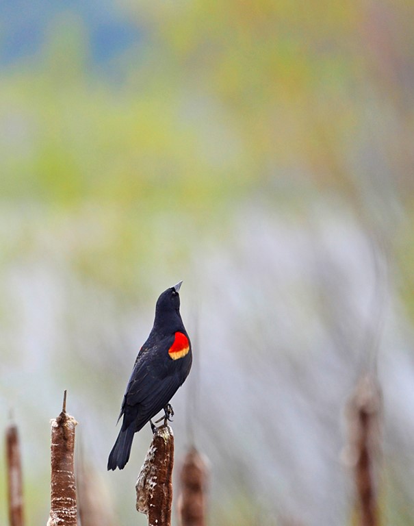
Its an austere composition, but very effective. The textures compliment each other nicely. Also an interesting nature story about sand and water. I think the shell, the subject would be fine in the middle of the frame too, if you wanted to place it there. |
Apr 24th |
6 comments - 1 reply for Group 37
|
6 comments - 1 reply Total
|