|
| Group |
Round |
C/R |
Comment |
Date |
Image |
| 31 |
Jun 24 |
Reply |
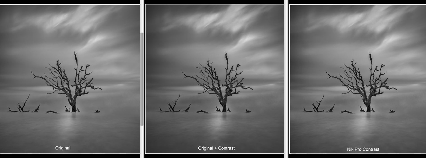
Viewed on the website your modified image seems to be a little dark, but in PS6 looks much better to my eye. A very subtle change which matches my suggestion using Nik Pro Contrast - see below .... |
Jun 16th |
 |
| 31 |
Jun 24 |
Comment |
Ella - an intriguing and inventive image to your usual high standard - competently created as usual.
A couple of minor points - the coin immediately adjacent to the box lacks detail and is a little burnt out as is the side of the coin stack and the lowest of the falling coins would appear to have just touched down and could have less blur or none at all.
Where would you be without your spectacles! |
Jun 5th |
| 31 |
Jun 24 |
Comment |
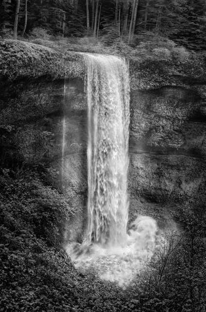
Susan - an attractive image of the falls which ticks most of the boxes. There is a lack of detail in the water which can be recovered in Nik Detail Extractor and a slight tweak in Curves.
In the image below I have applied a Nik Detail Extractor layer with the contrast slider set to 20% and then added a mask to apply the effect to the water only As a tweak I applied a Curves layer set to Darken at 25% opacity and masked this layer with the Detail Extractor mask inverted so that only the background is affected. Finally I applied a Nik Pro Contrast layer using the same mask as that used on the Curves layer. |
Jun 5th |
 |
| 31 |
Jun 24 |
Comment |
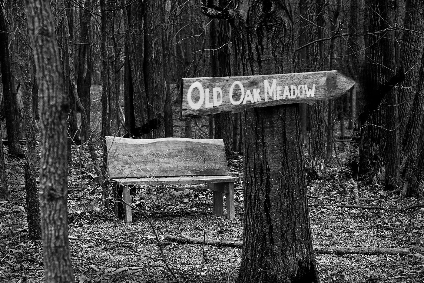
Ed - an interesting image of the bench, trees and sign with good separation between the elements and soft gentle lighting.
However, the white end of the sign is a major distraction and draws the eye and needs to be removed and I would also reduce the brightness of the text on the sign too .... |
Jun 5th |
 |
| 31 |
Jun 24 |
Comment |
Michael - My first impression is that of a competent image which is well composed and lifted from the realms of a single tree by the other branches above the water line. The sky with a feeling of diagonal movement is a big plus and the very long exposure has added a little softness to the image - the patch of light in front of the tree is a bonus and adds a little life to the image.
Overall I find the image to be a little flat and the application of Nik Pro Contrast layer at ~20% with the highlights protected lifts the image IMO.
Nik 7 is not compatible with CS6 which I use, but I expect it to be similar the earlier version which I use. |
Jun 5th |
| 31 |
Jun 24 |
Comment |
Ian - very well caught this time around with separation between the elements. I particularly like the apparent connection between the young boy and the adult - icing on the cake! Well done and looking forward to potential future images of this genre come November. |
Jun 5th |
| 31 |
Jun 24 |
Comment |
John - an intriguing image which could easily be misinterpreted as an aerial shot but for the twig and shadow.
Well seen and nicely composed and processed. You certainly have the eye for the unusual! |
Jun 5th |
6 comments - 1 reply for Group 31
|
6 comments - 1 reply Total
|