|
| Group |
Round |
C/R |
Comment |
Date |
Image |
| 31 |
Jan 23 |
Comment |
Ella - a truely professional image which could be mistaken for a pro advertising shot - no doubt your inspiration came from similar ad images - well done! |
Jan 14th |
| 31 |
Jan 23 |
Comment |
Susan - I am with Nick on this. The artifacts/sharpening halos around the birds and elsewhere are easily removed (in CS6) using the clone tool in darken mode. My standard practice on every image I produce. |
Jan 14th |
| 31 |
Jan 23 |
Comment |
Ed - Super sky, great fog bank, foreground interest and real depth to the image. I agree wholeheartedly that a 16x9 crop to remove part of the bottom of the image strengthens it. |
Jan 14th |
| 31 |
Jan 23 |
Comment |
Nick - a great study of shapes and textures - well composed with the diagonal lower left to upper right. I see no way of improving it! |
Jan 14th |
| 31 |
Jan 23 |
Comment |
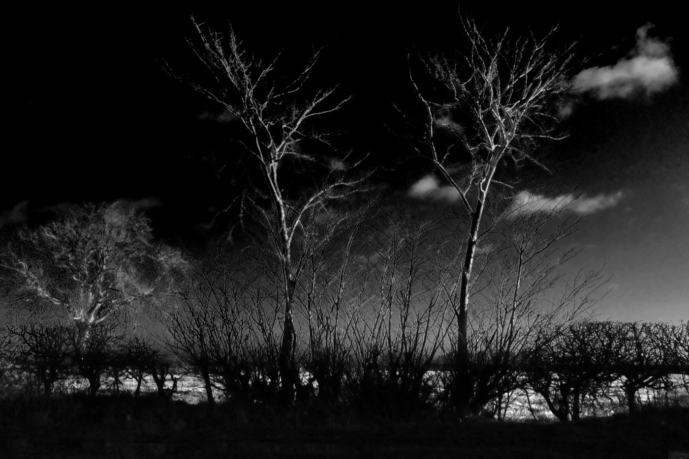
John - I feel that this image has potential, but requires further processing to bring out the best. In the image below - using CS6 ...
Set the white point on a dimly lit highlight on one of the upper branches, reduced the layer opacity to 15% and masked off the lower 50% of the image.
Reduced the brightness of the highlighted area behind the trees.
Darkened the base of the image rather than cropping it off.
|
Jan 14th |
 |
| 31 |
Jan 23 |
Reply |
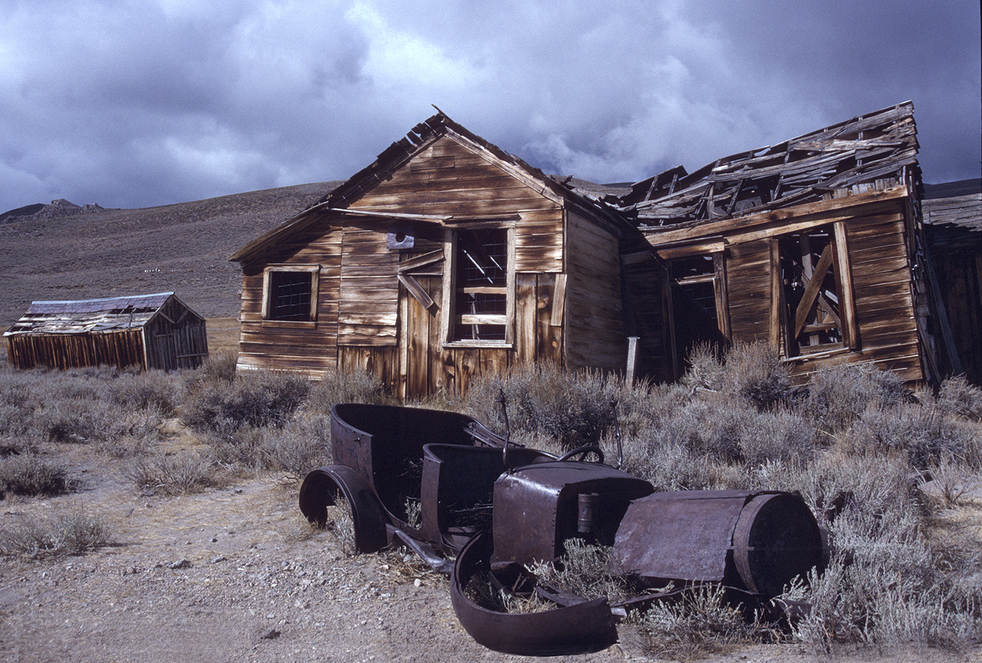
No - the sky was not added to the image - that is how it was! See the attached original (unprocessed) scan from slide.
Your edit certainly adds mood, but loses too much shadow detail for my taste. |
Jan 14th |
 |
5 comments - 1 reply for Group 31
|
5 comments - 1 reply Total
|