|
| Group |
Round |
C/R |
Comment |
Date |
Image |
| 31 |
Mar 20 |
Reply |
Ed - it's a bird! I thought about removing it, but decided to let it be. |
Mar 9th |
| 31 |
Mar 20 |
Comment |
Paul - another telling image, so sad, but well captured as usual. The bags/sacks in the background do detract from the image and draw the eye as Ella has noted. |
Mar 8th |
| 31 |
Mar 20 |
Comment |
Ed - A well captured image in which you have managed to achieve separation between the turbine uprights. I agree with the comment above that the crop is a little tight, but the post processing is spot on.
My take on stroking - a stroke should contain rather than distract and provide separation of the image from the page or projection background especially if that is black as is the case here and in exhibitions. 1-2 pixels stroke width is favourite and unlike Ella I always use white and stroke INSIDE the image. This is essential for my exhibition work where a maximum size of image is stated. Having sized the image to the required dimensions (horizontal and/or vertical) anything but an inside stroke would increase the o'all size of the image and lead to rejection. |
Mar 8th |
| 31 |
Mar 20 |
Comment |
Michael - a quality piece of work with a strong composition, lighting and tonal range. Never having used sheet film I failed to see your 'clue' - thanks for the explanation. |
Mar 8th |
| 31 |
Mar 20 |
Comment |
John - overall a very pleasing straightforward image in which reflection of the main boat in the water is key. Good to have maintained separation between the two boats.Well processed as usual. |
Mar 8th |
| 31 |
Mar 20 |
Comment |
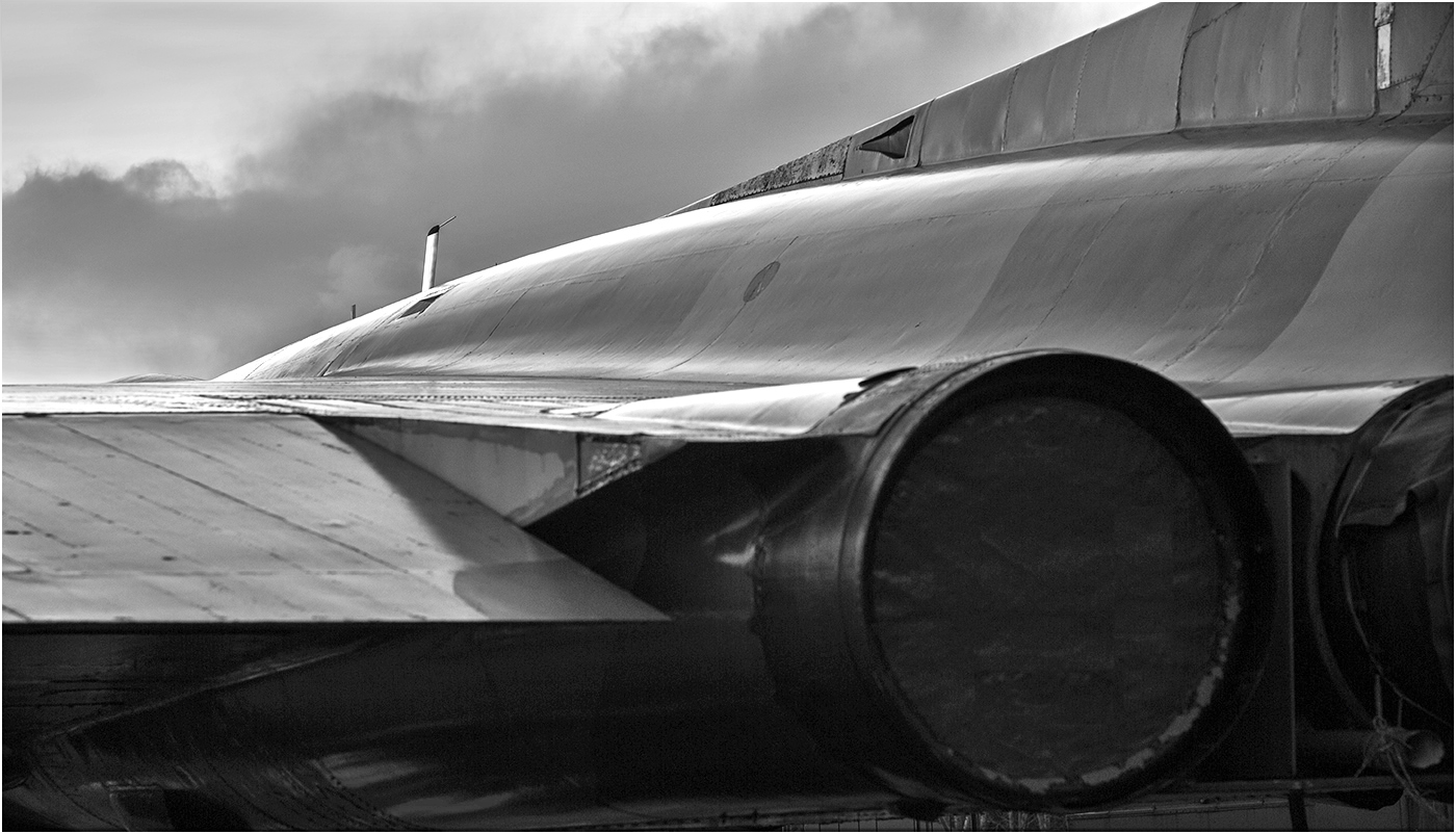
Ian - my first impression was some sort of abstract until I read your description and even than had to look hard at the image to identify which part of the Vulcan it was. Initially my eye was drawn straight to the vertical sensor ahead of the cockpit and then wandered down to the mass of black at the bottom of the frame which does not sit comfortably in the image. There is detail there (see below) and I feel that it adds to the image coupled with a reduction in brightness in the sky top left. Overall though I regret that the image does not appeal to me. |
Mar 8th |
 |
| 31 |
Mar 20 |
Comment |
Ella - the quality of the capture, lighting and post processing on the main subject is outstanding! However I find that the tape measure border - a neat idea - over dominates the image and a reduction of 50% in the width would be more effective. I am also not completely sold on the size of the spools which seem too much out of scale for comfort to my eyes.
Nevertheless a highly competent still life from conception through to final image - well done! |
Mar 8th |
| 31 |
Mar 20 |
Reply |
Hi Ella - your comment re. 'noise' is spot on and it has appeared in a few images of late to the extent that I have revisited this image to ascertain the source. I don't think it is noise as Nik Define has virtually no effect on it, rather I have confirmed in the original colour version that the granularity is induced by the over zealous use of Nik CEP 4 Tonal Contrast and Detail Extractor (nowadays I would generally use Pro Contrast). That granularity was of course transferred to the mono conversion and enhanced a little by further contrast adjustment in Pro Contrast leading to the need to apply masked blur layers to minimize the effect as Define did nothing. I tend to process skies aggressively for impact, but clearly go over the top on occasions! Thank you for your observations. |
Mar 5th |
6 comments - 2 replies for Group 31
|
6 comments - 2 replies Total
|