|
| Group |
Round |
C/R |
Comment |
Date |
Image |
| 31 |
Dec 18 |
Comment |
Congratulations of your recent achievements star wise - all contributing to your MPSA! I'm very much on track for GMPSA in 2019. |
Dec 19th |
| 31 |
Dec 18 |
Reply |
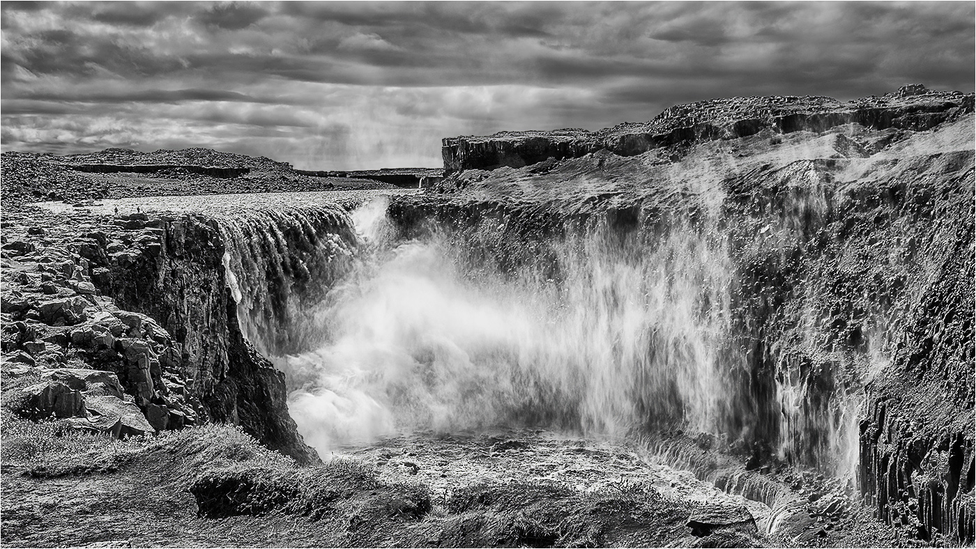
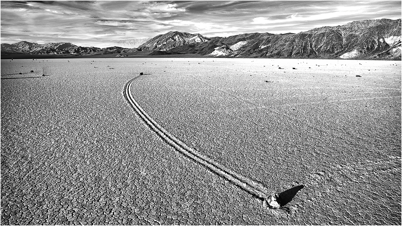
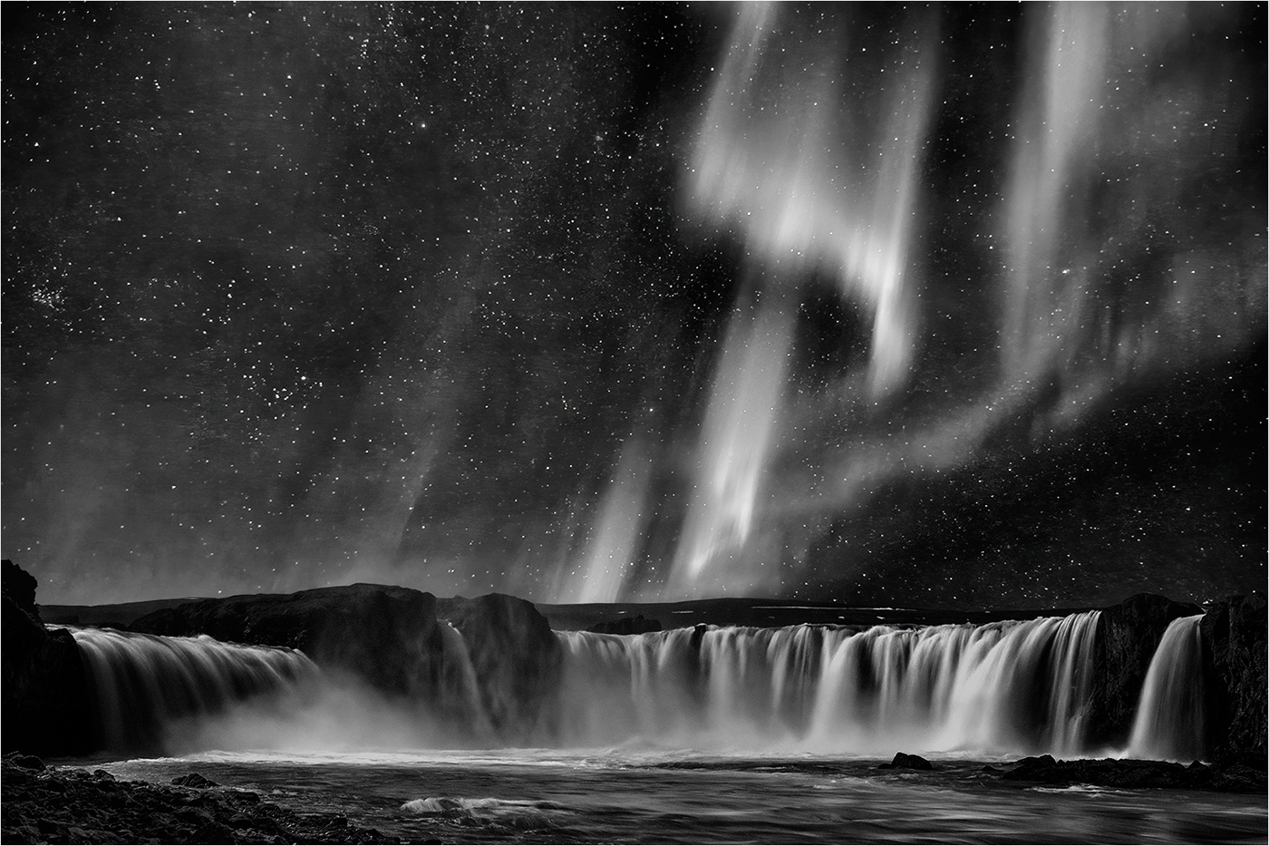
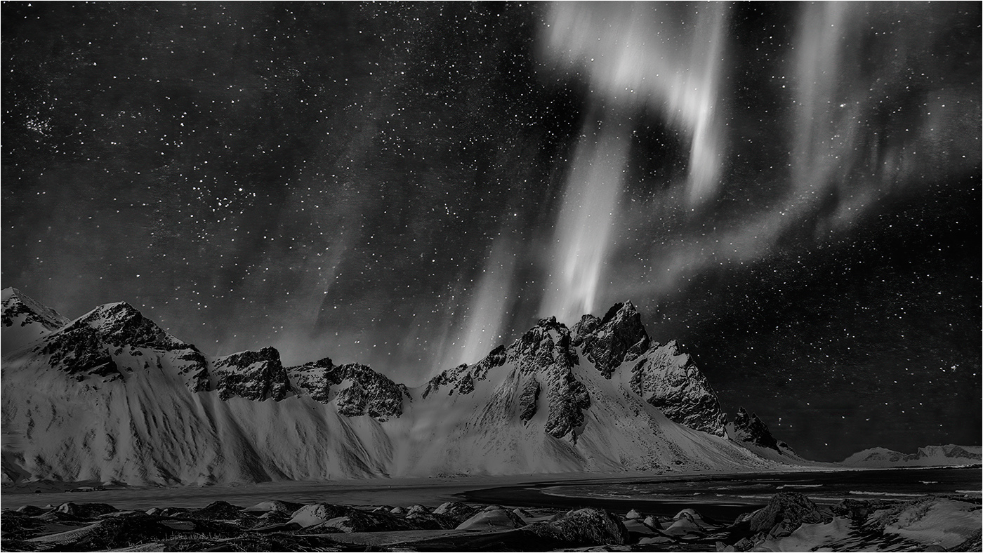
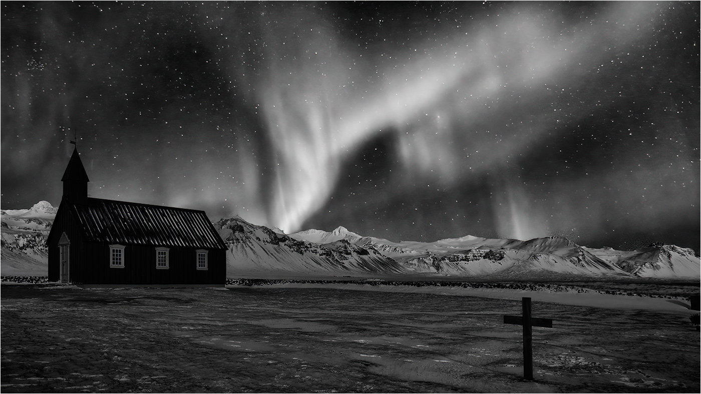
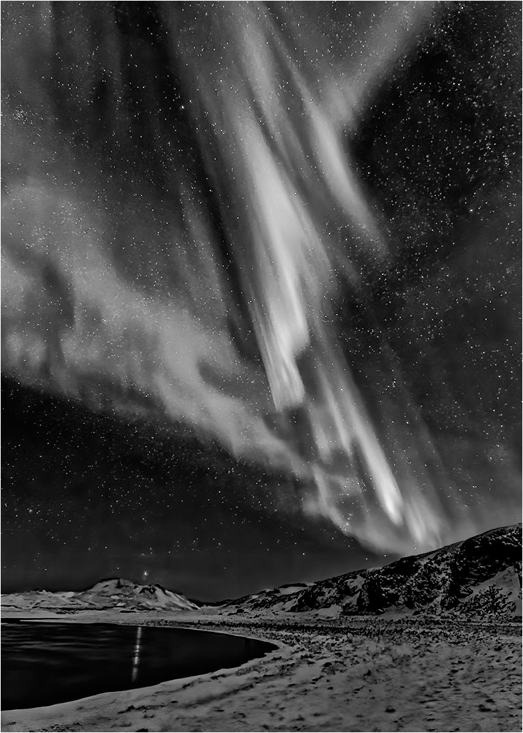
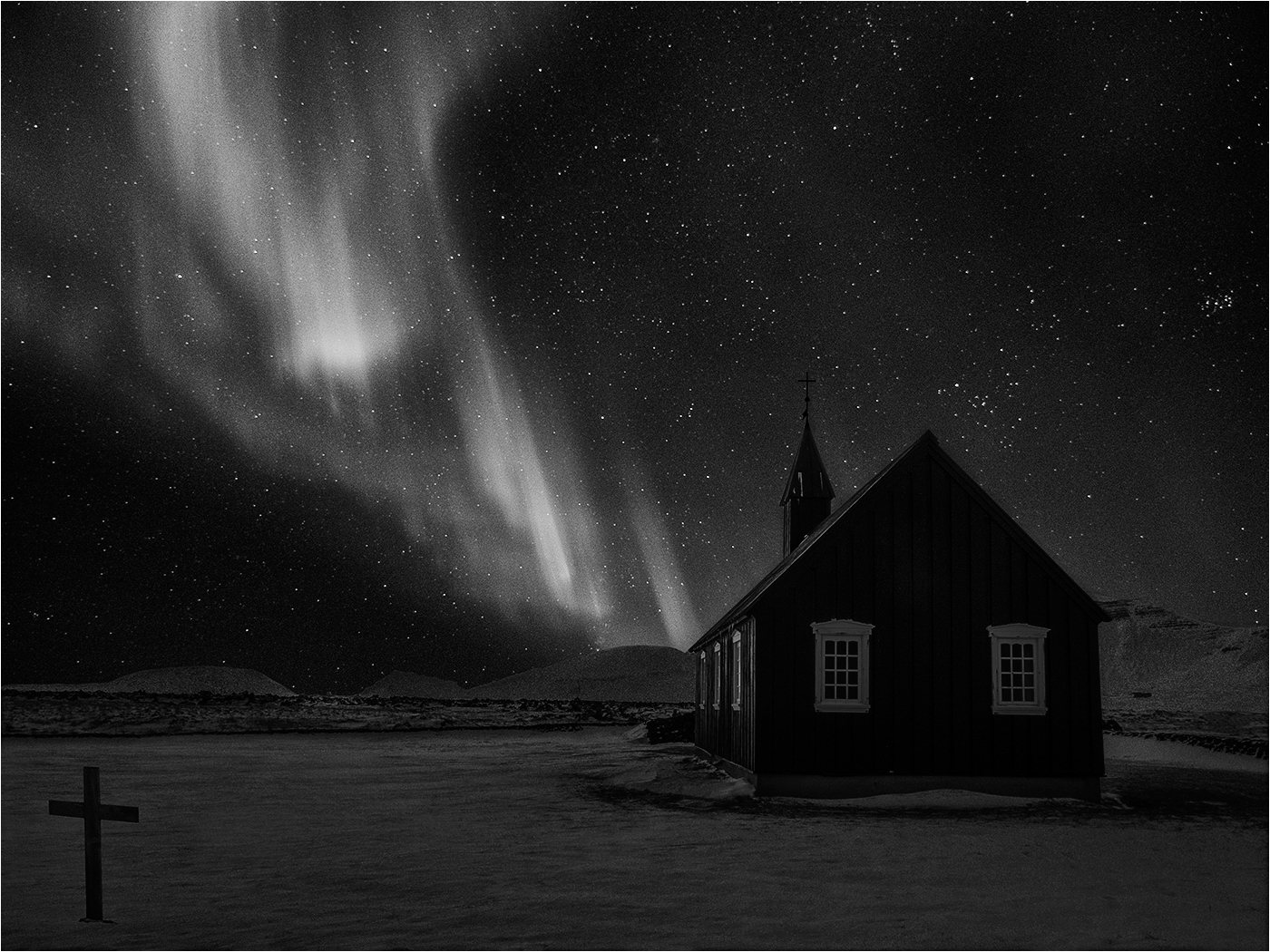
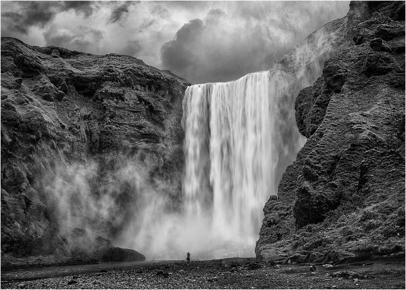
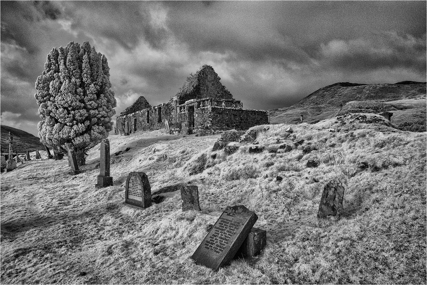
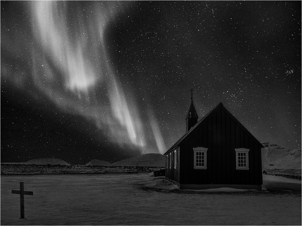
I agree there is a touch of grain remaining even after de noising - it's par for the course when aggressively processing the sky, but you should have seen it before the de noise! On reflection a simple blur may have been more effective. |
Dec 19th |
| 31 |
Dec 18 |
Comment |
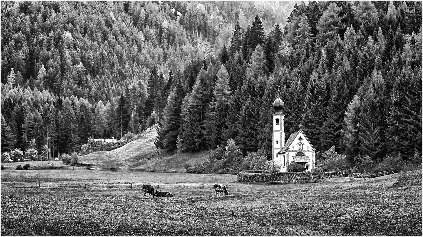
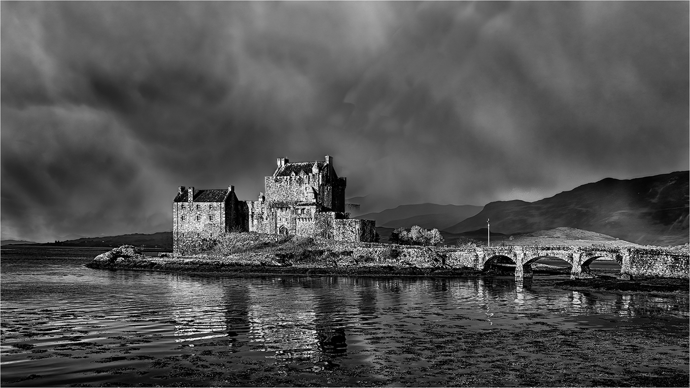
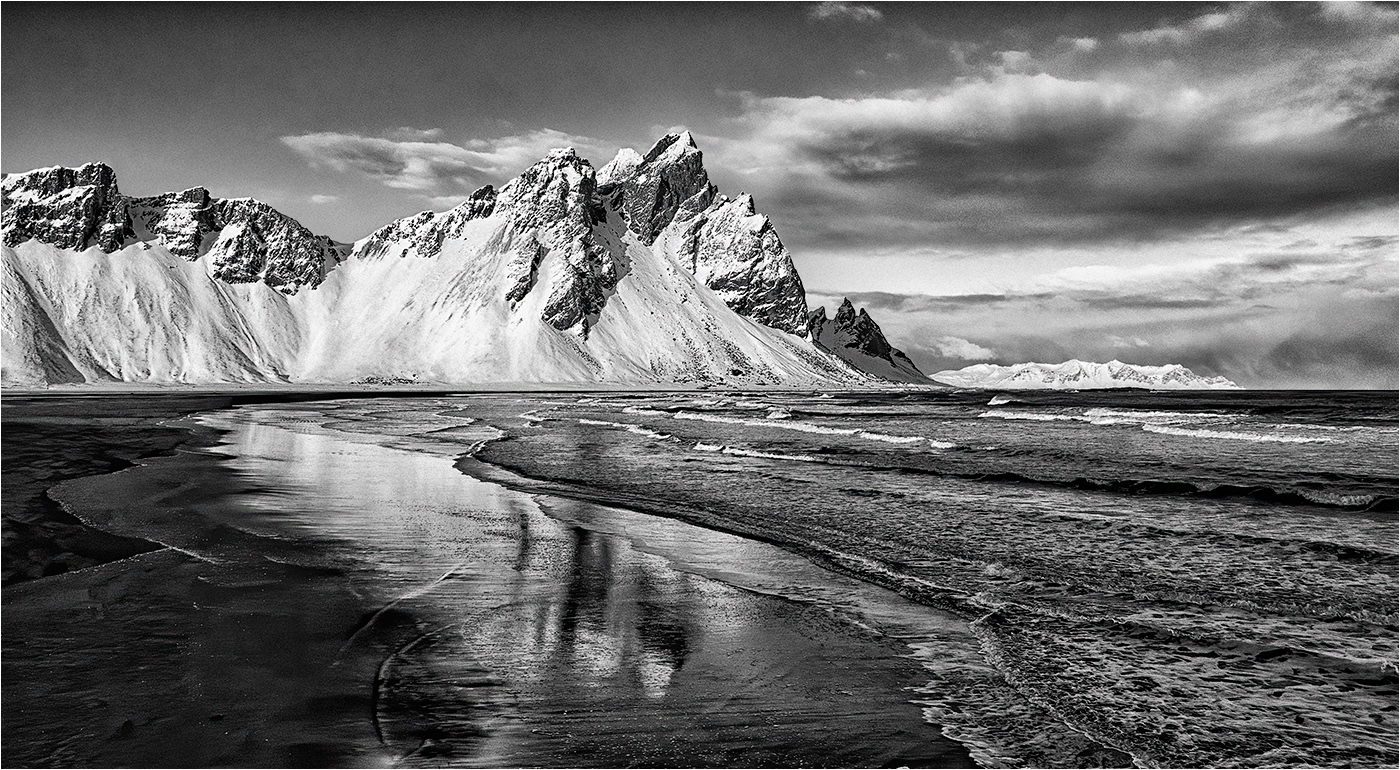
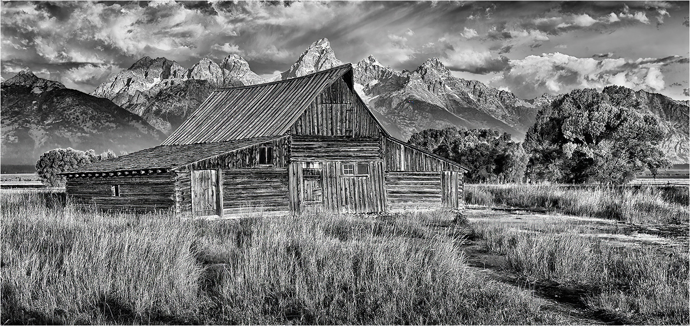
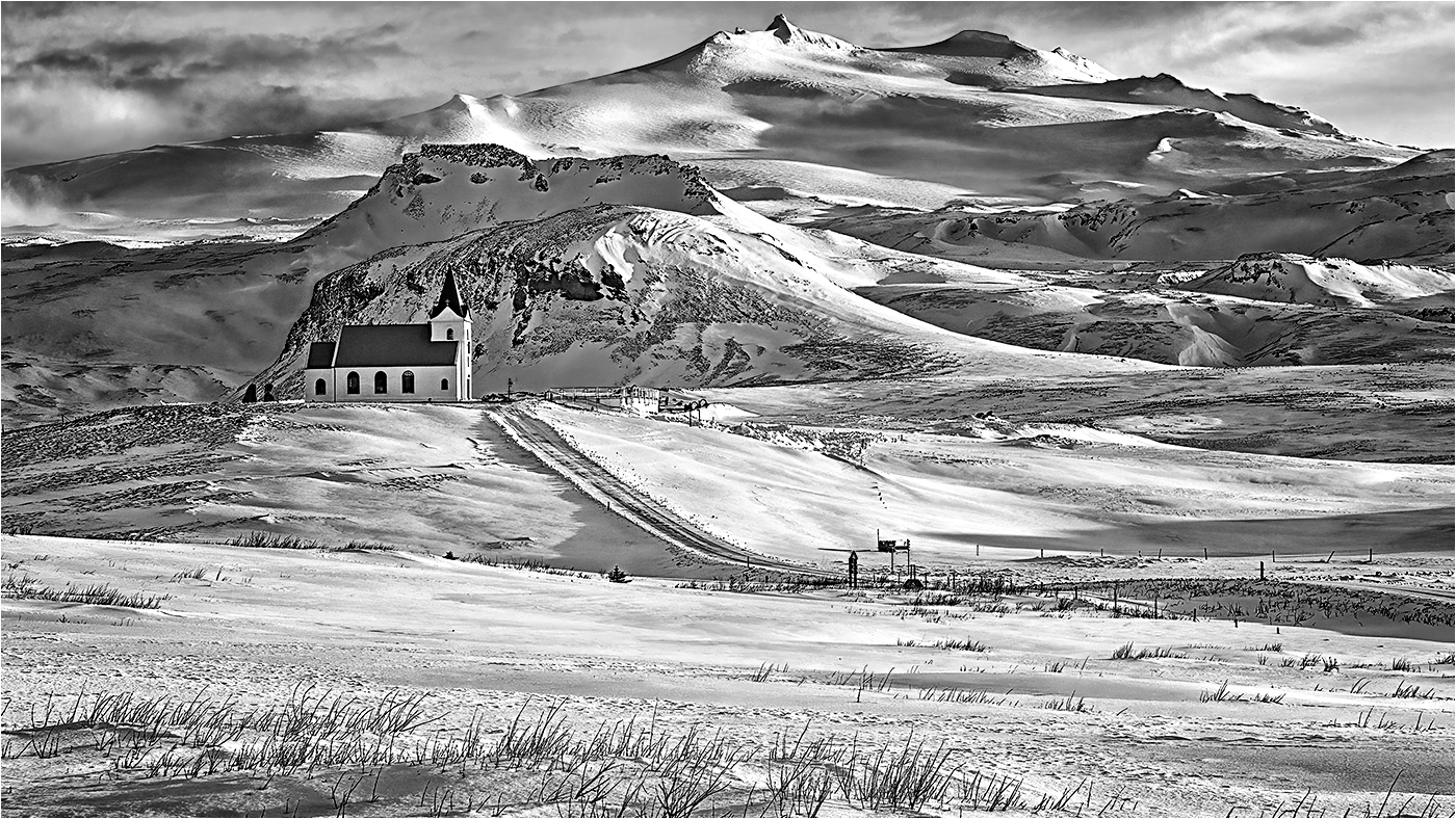
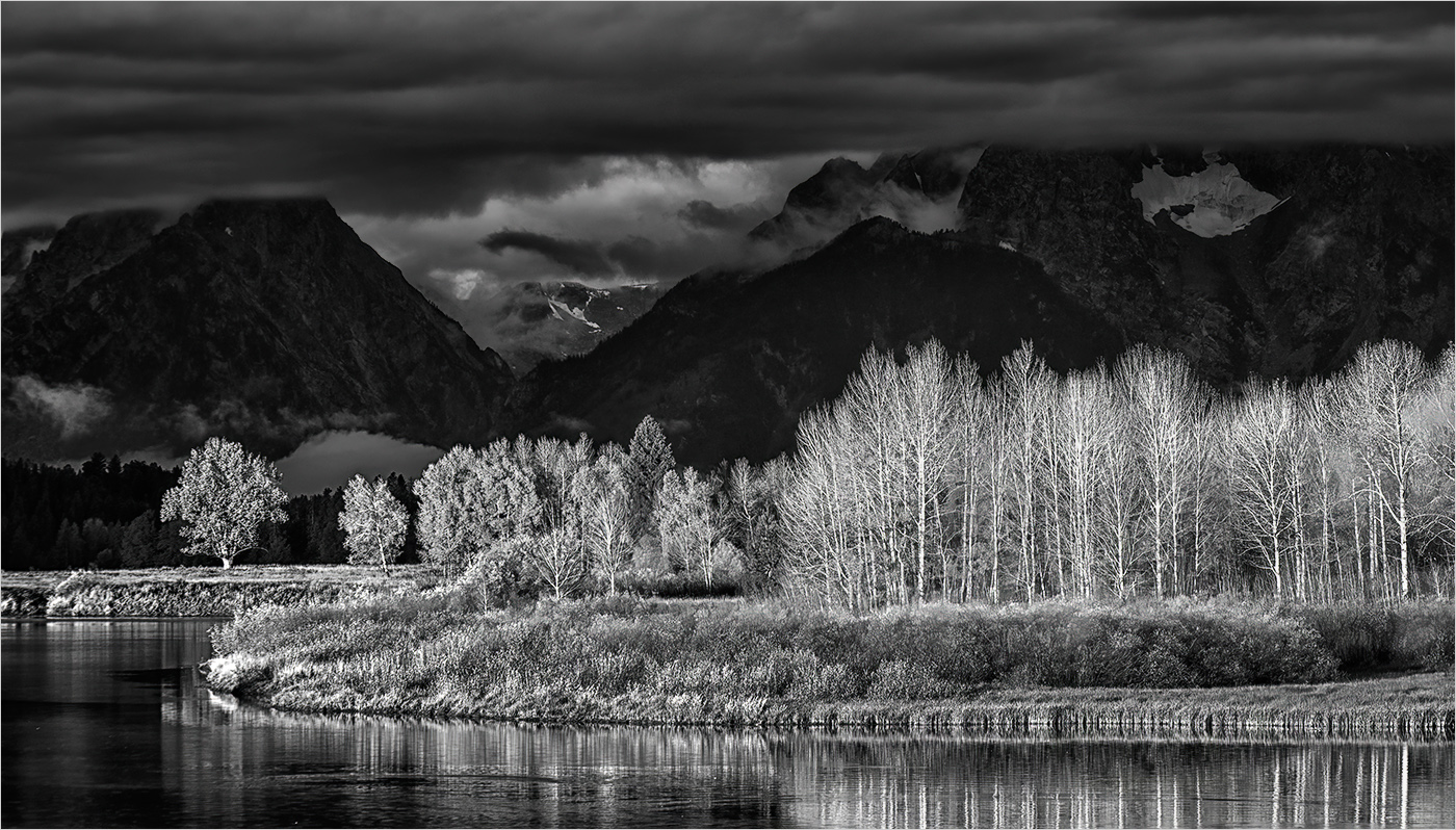
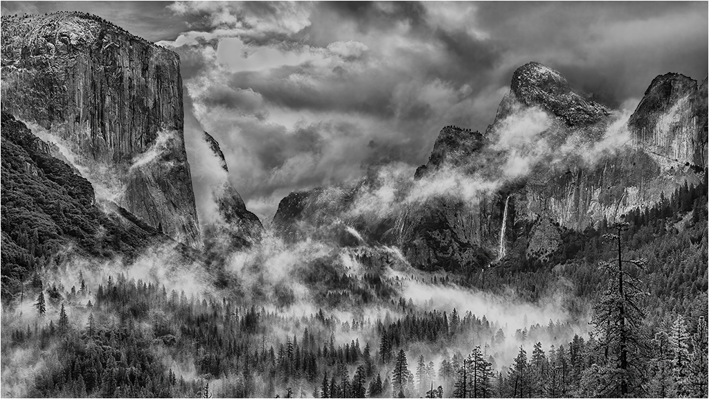
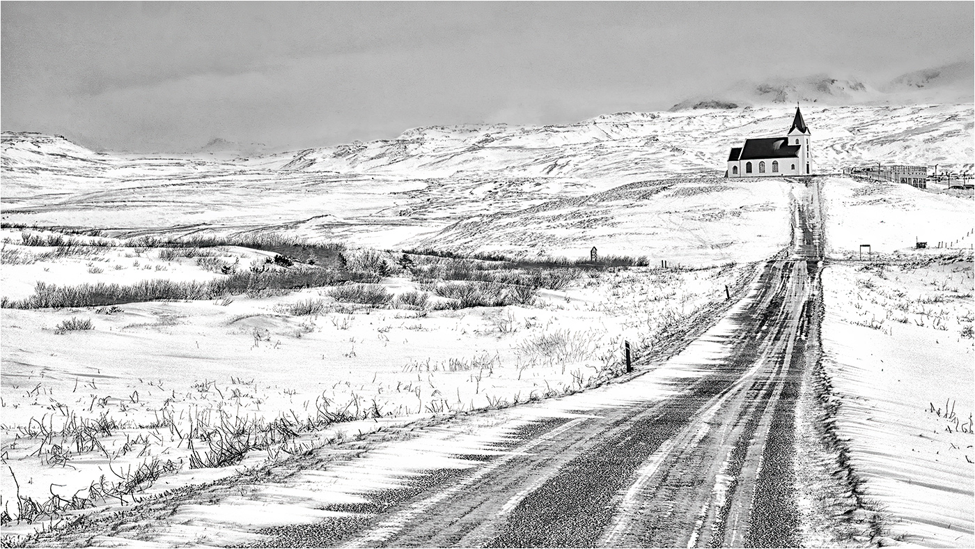
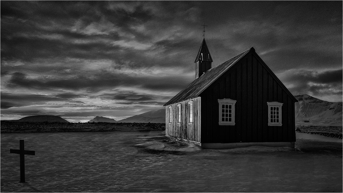
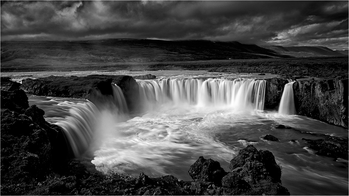
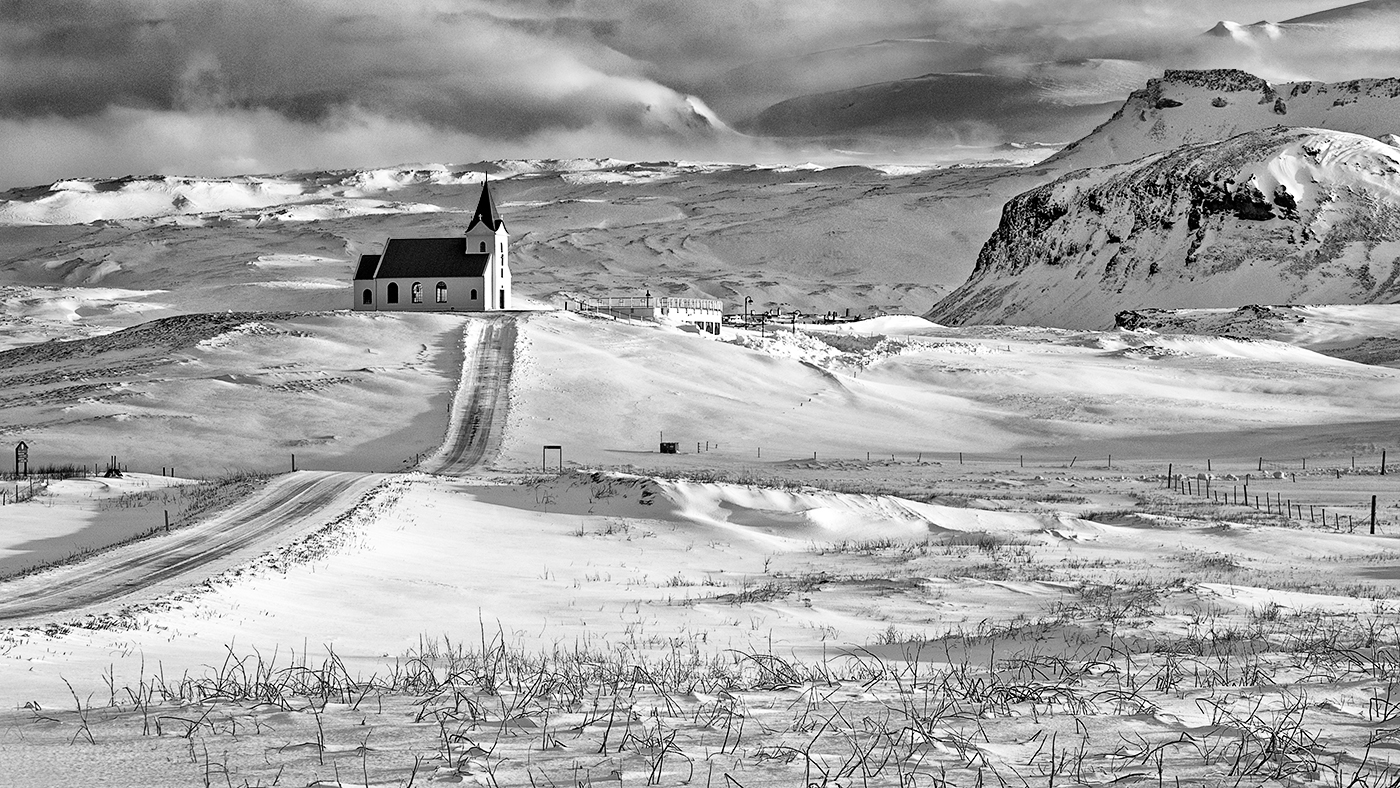
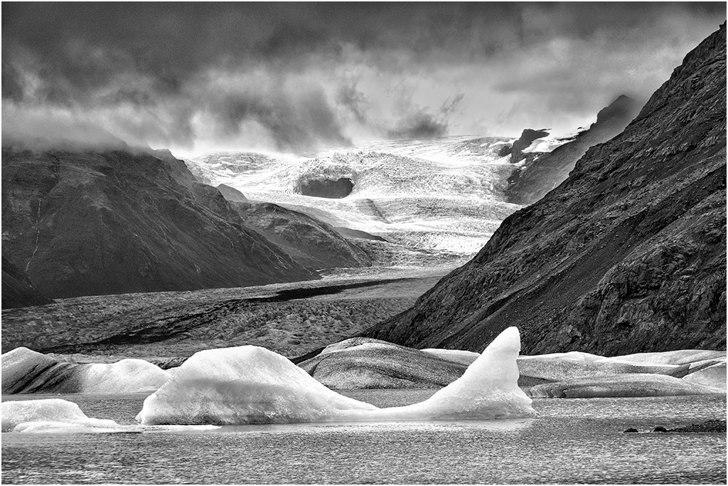
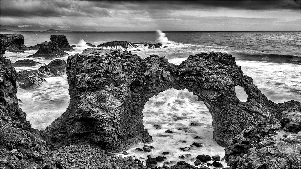
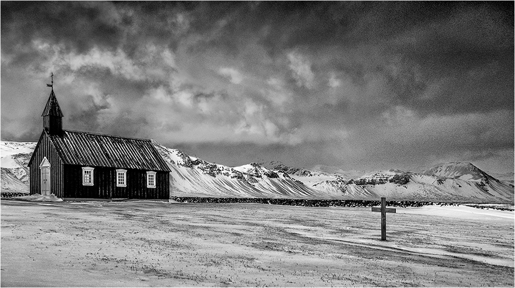
Well seen, photographed and processed - would possibly work well for Photo Travel. |
Dec 12th |
| 31 |
Dec 18 |
Comment |
It's amazing that smartphone cameras are so competent as exampled by this excellent portrait. Fortunately I do not have a smartphone so cannot be tempted away from my M4/3's! |
Dec 12th |
| 31 |
Dec 18 |
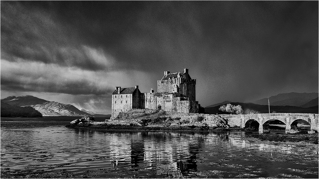
Comment |
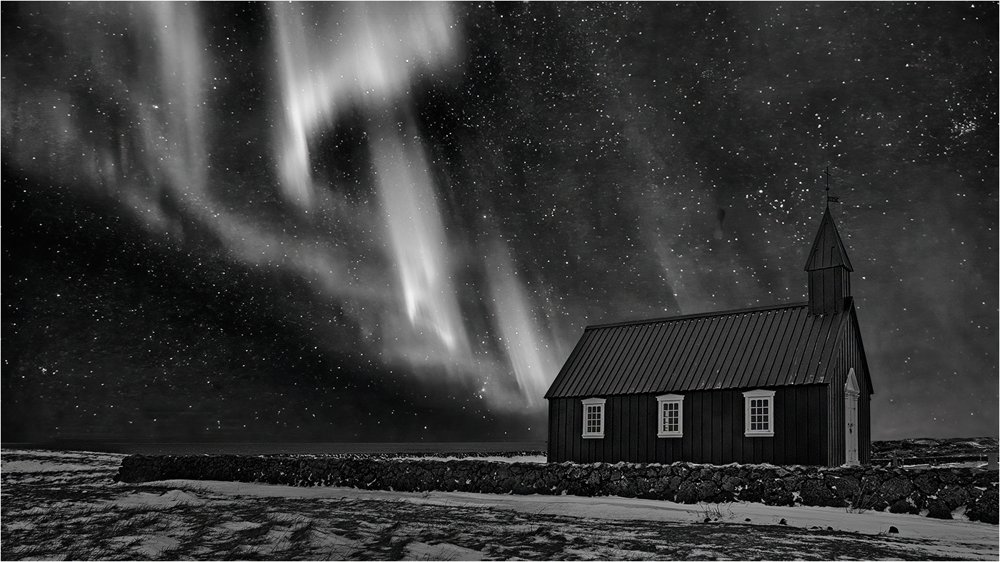
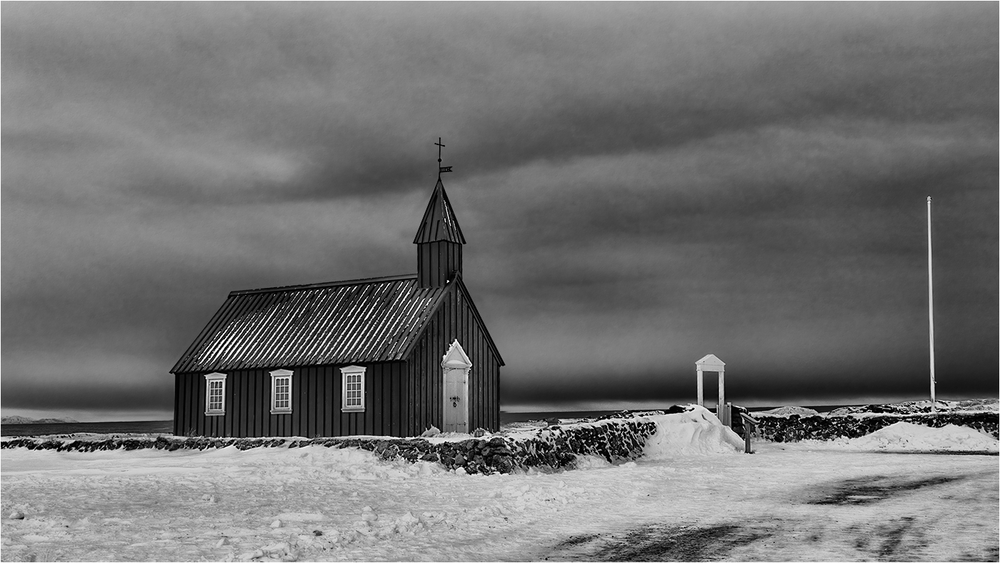
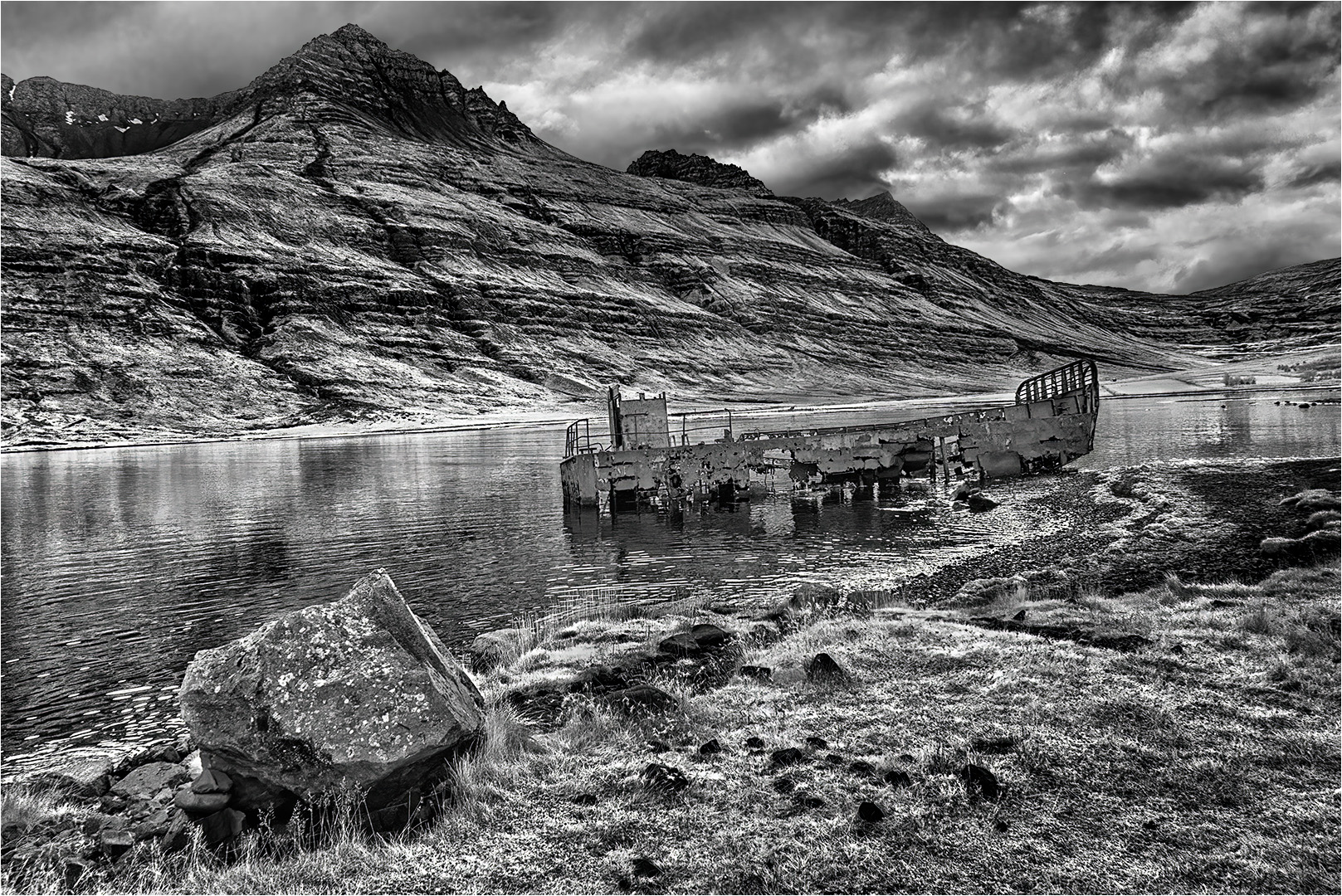
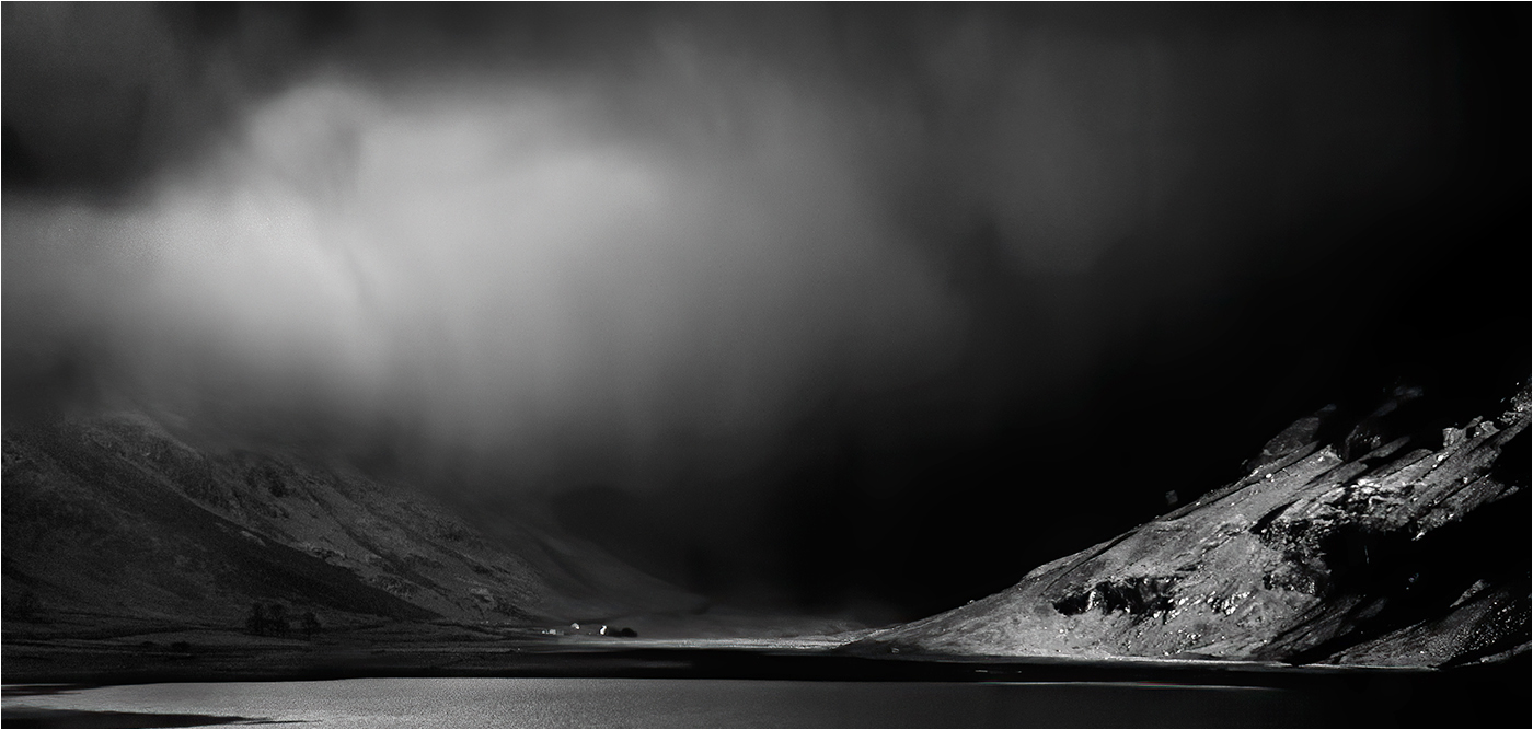
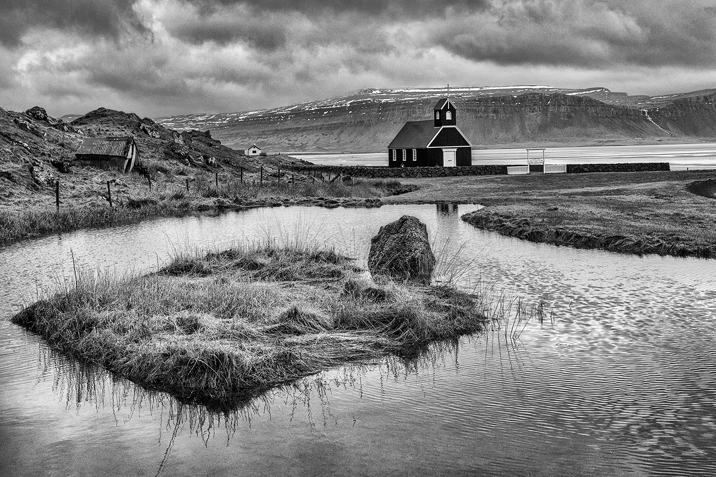
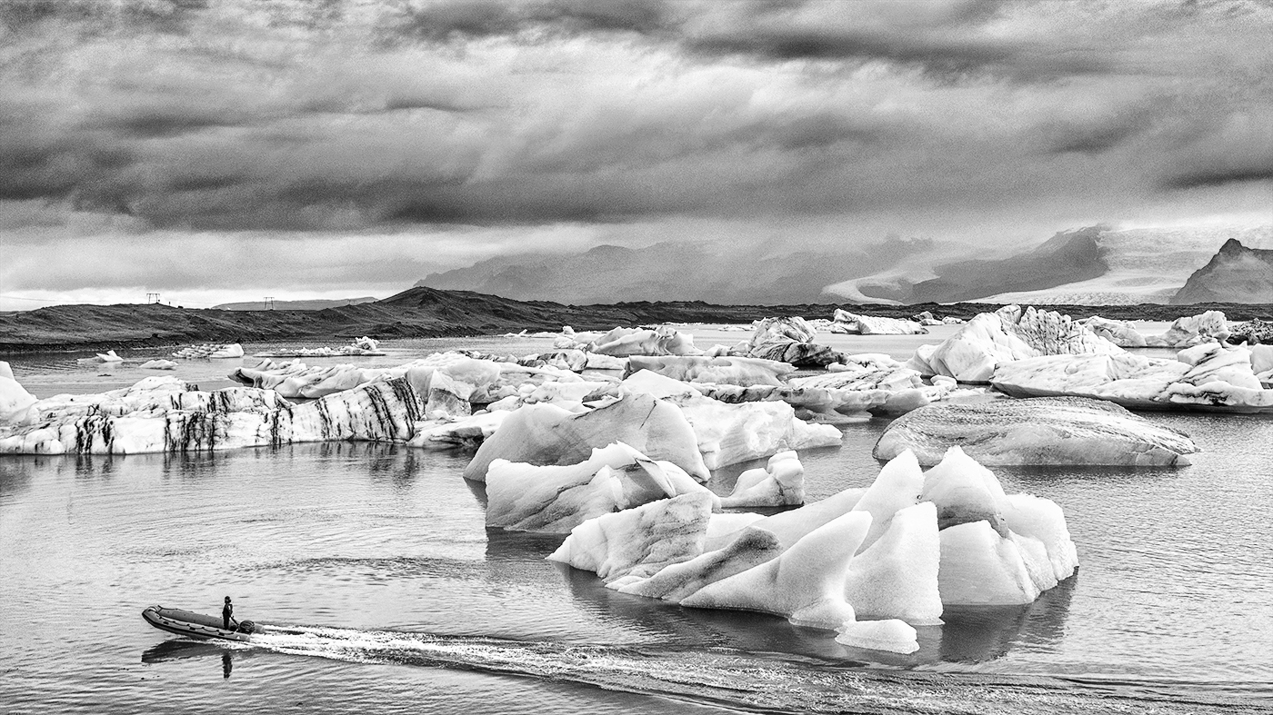
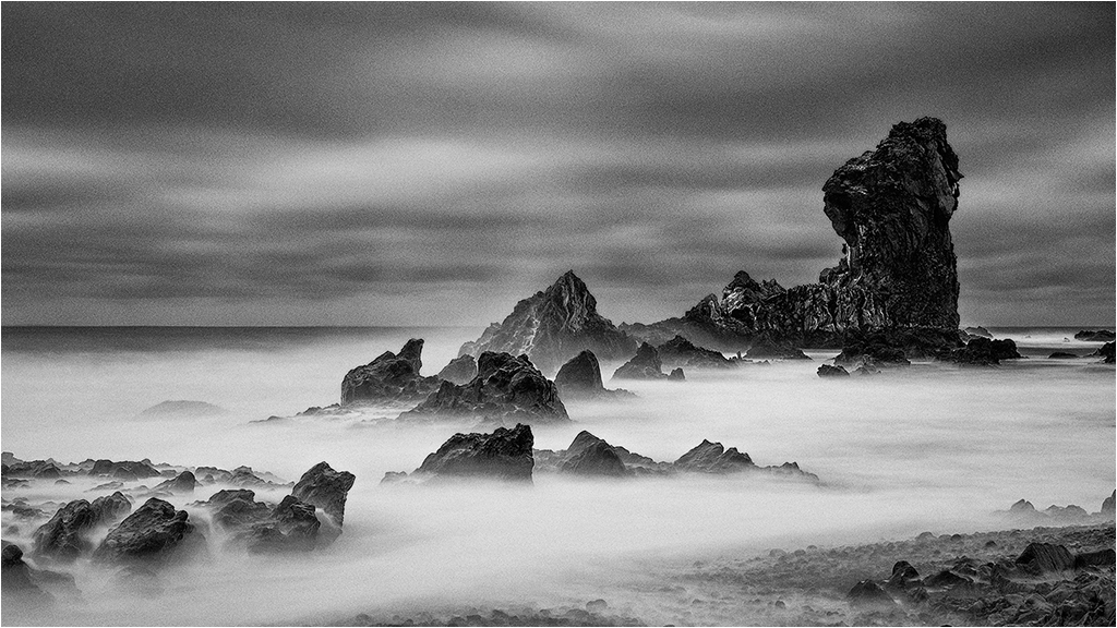
A very tranquil image with atmosphere, but no drama. I would agree with removing the floating structure and wonder about removing some of the people as well particularly the large group on the left. |
Dec 12th |
| 31 |
Dec 18 |
Reply |
Judy
"When you use your file for color, you mentioned that you remove the sharpening and vignetting layers. Do you mean you just turn that layer off, or do you delete it or does it matter?" I think there is a little confusion here! It is ONLY when I intend to convert the colour image to MONO that I duplicate it and remove the sharpening and vignetting layers, reapplying them afresh at the end of the mono processing. Deleting reduces the file size - turning the layers off before merging visible has the same end effect, but with a larger file size.
The final step in my image processing for print is to merge visible, sharpen with Nik and then apply Darken/Lighten centre - I have Nik set up to apply an effect to a separate layer so at the top of the layer stack you will see, in descending order Darken/Lighten Centre > Sharpener Pro 3 > Layer x which is the merge visible layer. There is no harm in merging visible again after sharpening and before Darken/Lighten centre - the end effect will be the same, but the file size larger. For the competition size prints from jpeg Sharpener Pro should be fine.
Jpegs destined for exhibition vary in size from 1024x768 to 1920x1080 depending on the requirements of the exhibition. I find that Nik Sharpener Pro over sharpens at these sizes and use High Pass in Soft Light mode at 0.5 pixel for 1024x768 and 0.9 pixel for 1400x1050 or larger. It is important to sharpen at the final image size. My workflow for the jpeg conversion is ��.
Duplicate colour/mono image > flatten duplicate image > duplicate image layer > convert to 8 bit and resize > apply High Pass to top layer and set to Soft Light mode > flatten image > convert to sRGB. Any sharpening halos are removed and the image saved.
The simplest option of sharing my comments with your group is for me to post them there which I will do.
Peter
|
Dec 8th |
| 31 |
Dec 18 |
Reply |
Hi Judy
Thanks for dropping in on my image in Group 31! I dropped in on your image in Group 83 - very nicely done and some good advice from the other group members to which I would add that I think the image would benefit from exploring the effect of applying CEP 4 Detail Extractor and/or Tonal Contrast, probably at reduced opacity and also masked. Seems to me that you have a pretty good grasp on BW and have handled a high contrast capture well.
When dealing with BW it is important to appreciate that there is no colour to give impact (obvious I know!) and you have to rely on shape and form and tone and texture along with a strong composition and creative lighting. Hence the need for multiple adjustments to emphasize these points.
I only use Photoshop CS 6 to process my images and have done so since PS 5.0 - many years before the introduction of Lightroom. PS is my digital darkroom following on from 25+ years working in my own wet darkroom - based on that experience I burn and dodge on Curves Adjustment layers which invariably are masked to apply the adjustment to specific areas Why Curves? - in Levels there are only 3 adjustments available (black point, white point and mid tone) whereas in Curves there are 256 adjustment points, plus in the later versions of PS there is the hand tool (above the eyedroppers) with which you can click and drag in the image to alter a specific tone - absolutely invaluable!
As I exhibit both colour and mono versions of the same image (shot in RAW) I invariably process the colour version first and then convert to mono in Nik Silver Efex Pro 2 (SEP 2) if appropriate. It is Important to remember to put any Curves layer into Luminosity blending mode to prevent unwanted colour changes - not an issue in mono.
My current workflow is to make adjustments in RAW to the curve and maybe lift the shadows a touch. In PS I apply a Nik Colour Efex Pro 4 (CEP 4) Detail Extractor Layer as a separate layer and follow that with a Tonal Contrast Layer (CEP 4). The opacity of these layers may be varied to suit the image and may also be masked. Fine tuning the image then follows on multiple Curves layers each of which deals with a specific area of the image using a mask, the opacity of which may be reduced and, if appropriate, a global Curves layer(s) will also be applied. When applying a Curves adjustment I will tend to over adjust and then control the strength of the adjustment by reducing the opacity of the layer. The final image at print size is sharpened using Nik Sharpener Pro 3 and as a jpeg for exhibition using the High Pass filter in Soft Light mode (0.5 - 0.9 pixels). Final touch is to Merge Visible at the top of the layer stack and apply a CEP 4 Darken/Lighten Centre layer (to a saved recipe) to apply a very slight vignette to the image to concentrate the eye - so slight that only by turning the layer on/off can the effect be readily seen.
If a mono conversion is to be considered this would either be done on a duplicate of the colour version with the sharpening and vignetting layers removed and the remaining layers merged visible or on a flattened duplicate of the colour version with the layers noted above removed. Processing of the mono version would then follow the steps noted with further fine tuning on multiple Curves layers, etc.
|
Dec 8th |
| 31 |
Dec 18 |
Comment |
Ella - Still life is not a walk in the park and the arrangement of the items requires thought to achieve a good balance which you have achieved! I concur with Stephen's comments re. textures, etc and the o'all image quality is technically excellent - with one exception ....
The shadow areas of a couple of the apples are blocked up and show no texture which I am sure will have been present on the original capture and can probably be revealed in CEP 4 Detail Extractor, for example. I also wonder whether the hint of the apple in the background is necessary - the remaining highlights are a marginal distraction.
|
Dec 7th |
| 31 |
Dec 18 |
Comment |
Paul - that's a belter of an image - perfectly caught and bitingly sharp. The use of the almost wide open aperture has rendered the background nicely OOF, but DOF still adequate for the main subject. Nice piece of glass! |
Dec 4th |
| 31 |
Dec 18 |
Comment |
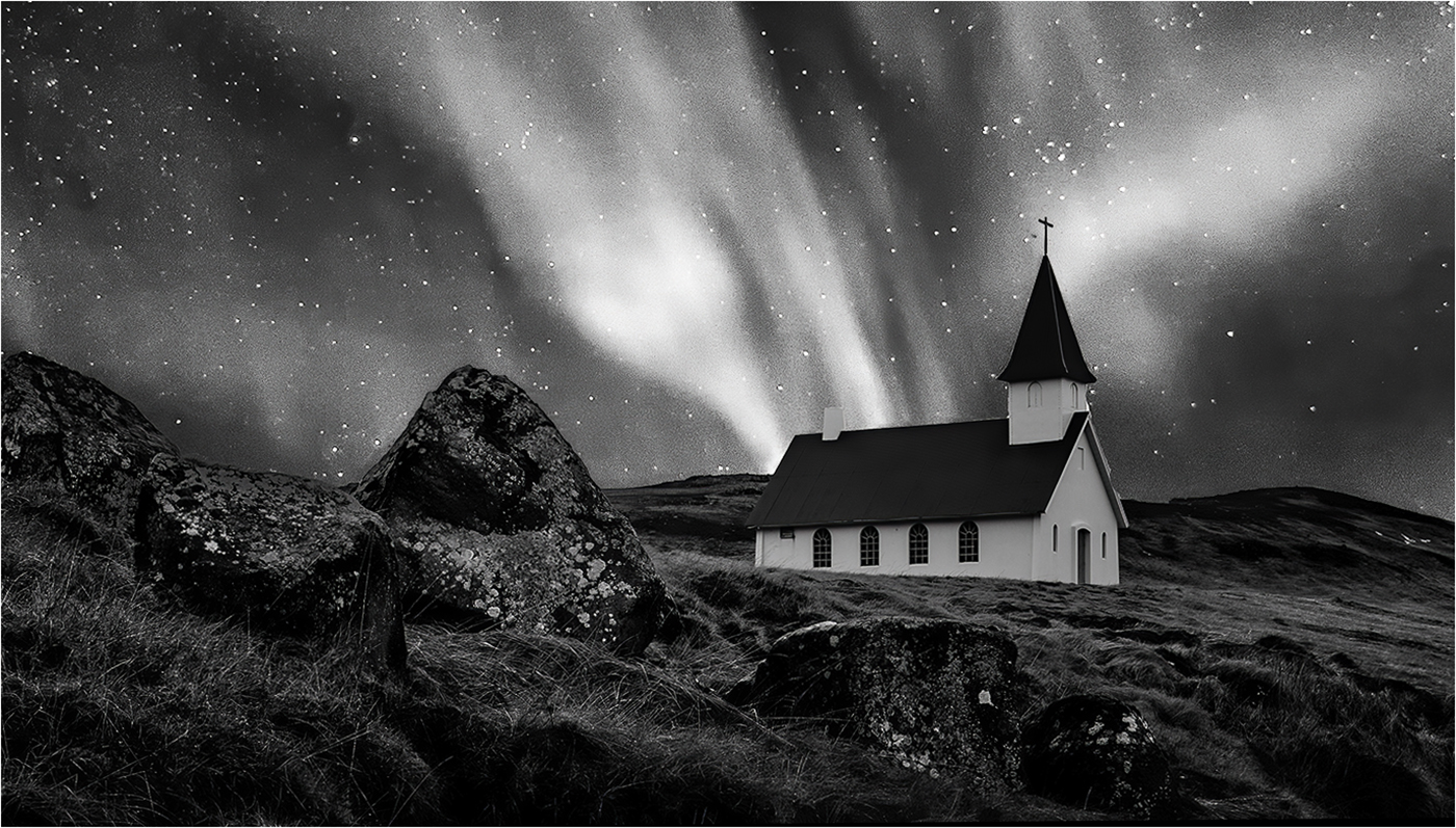
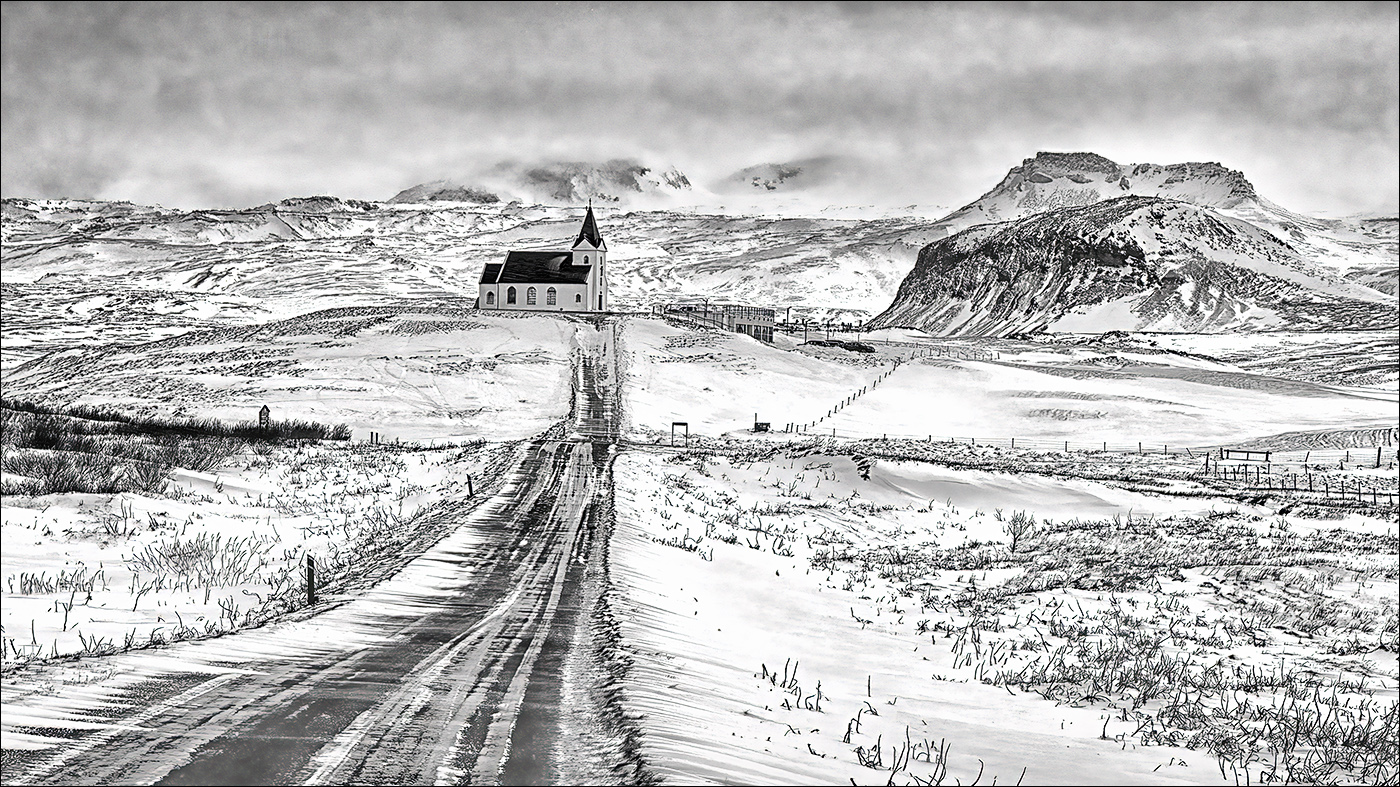
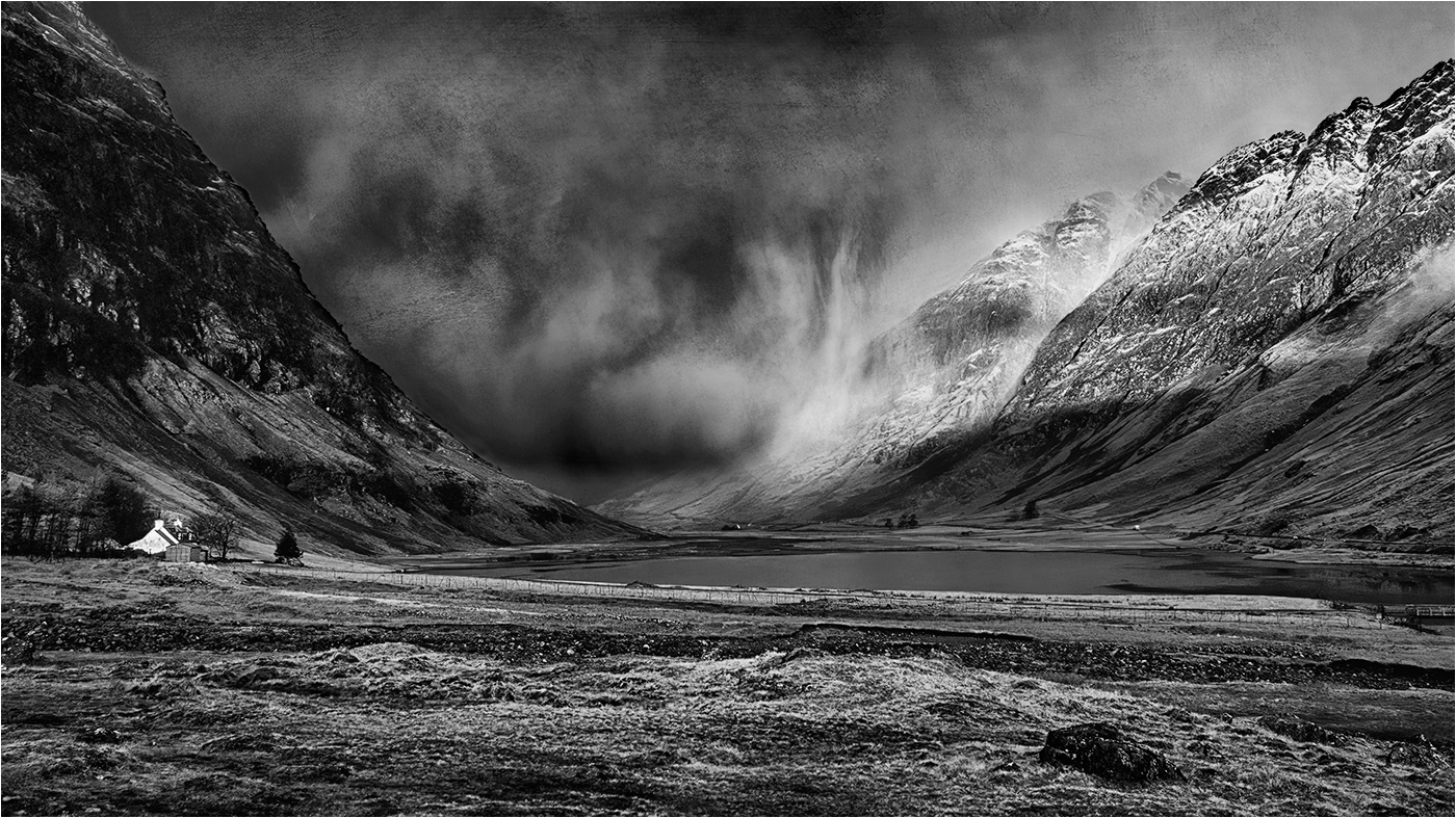
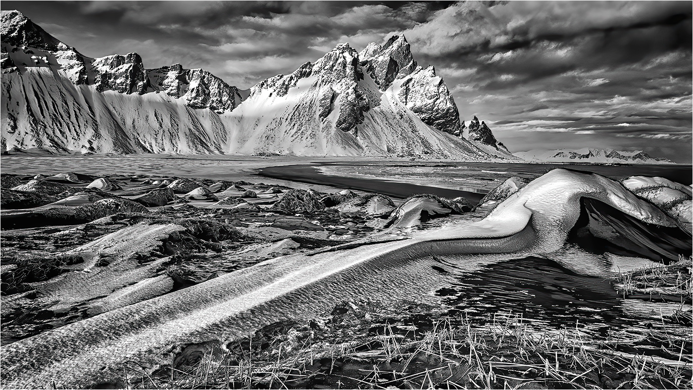
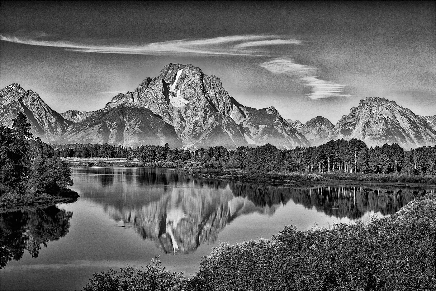
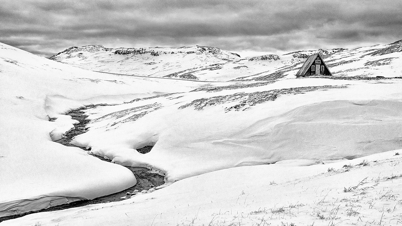
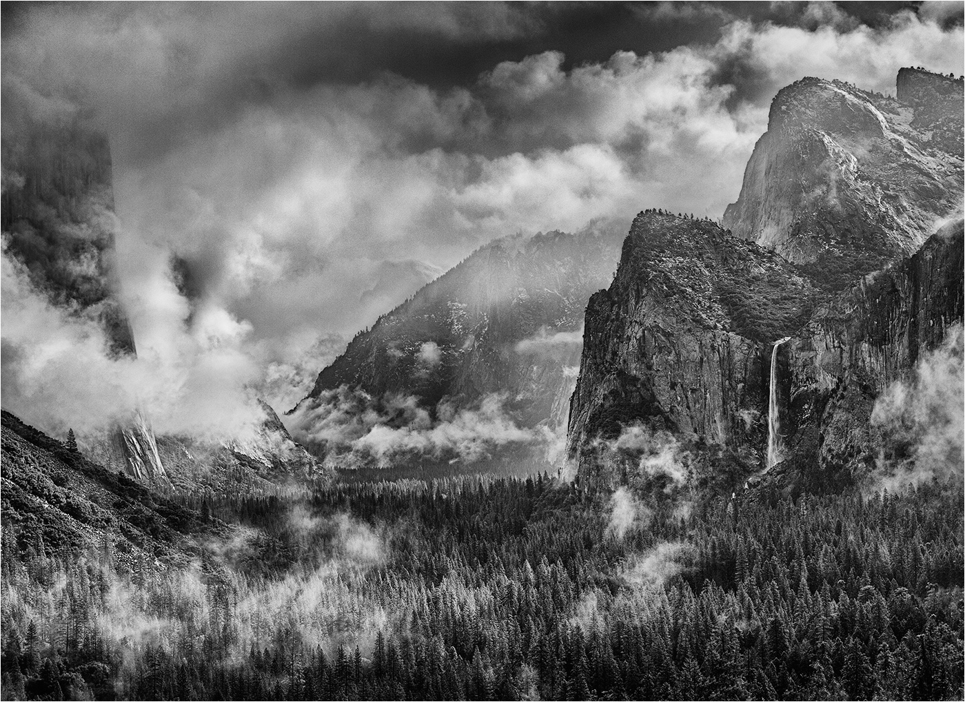
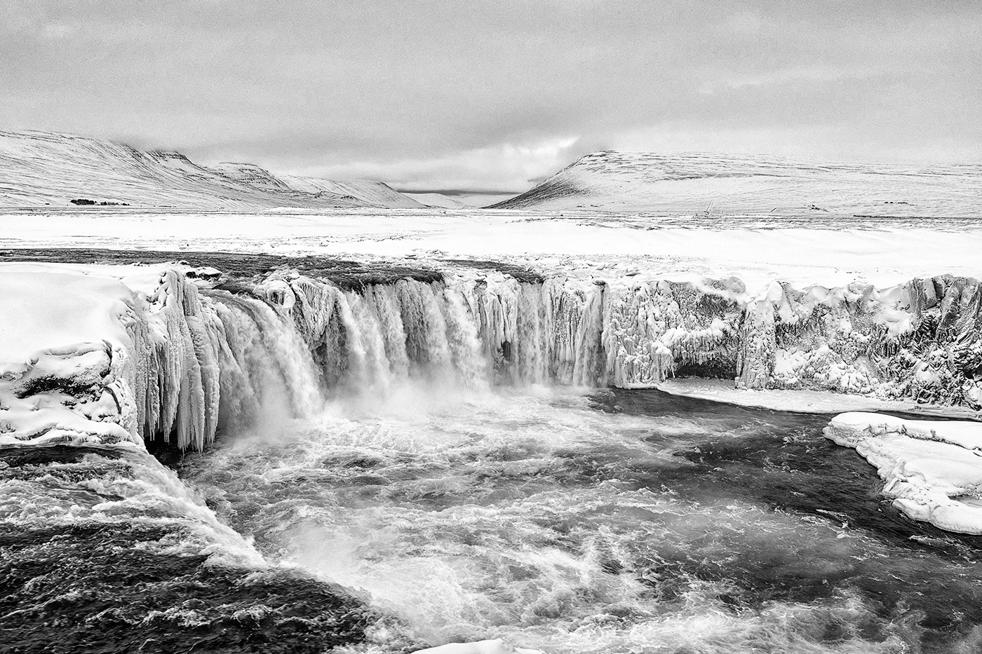
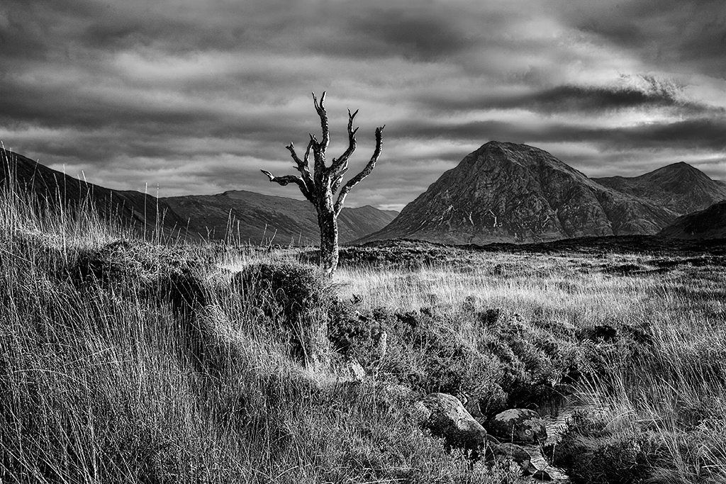
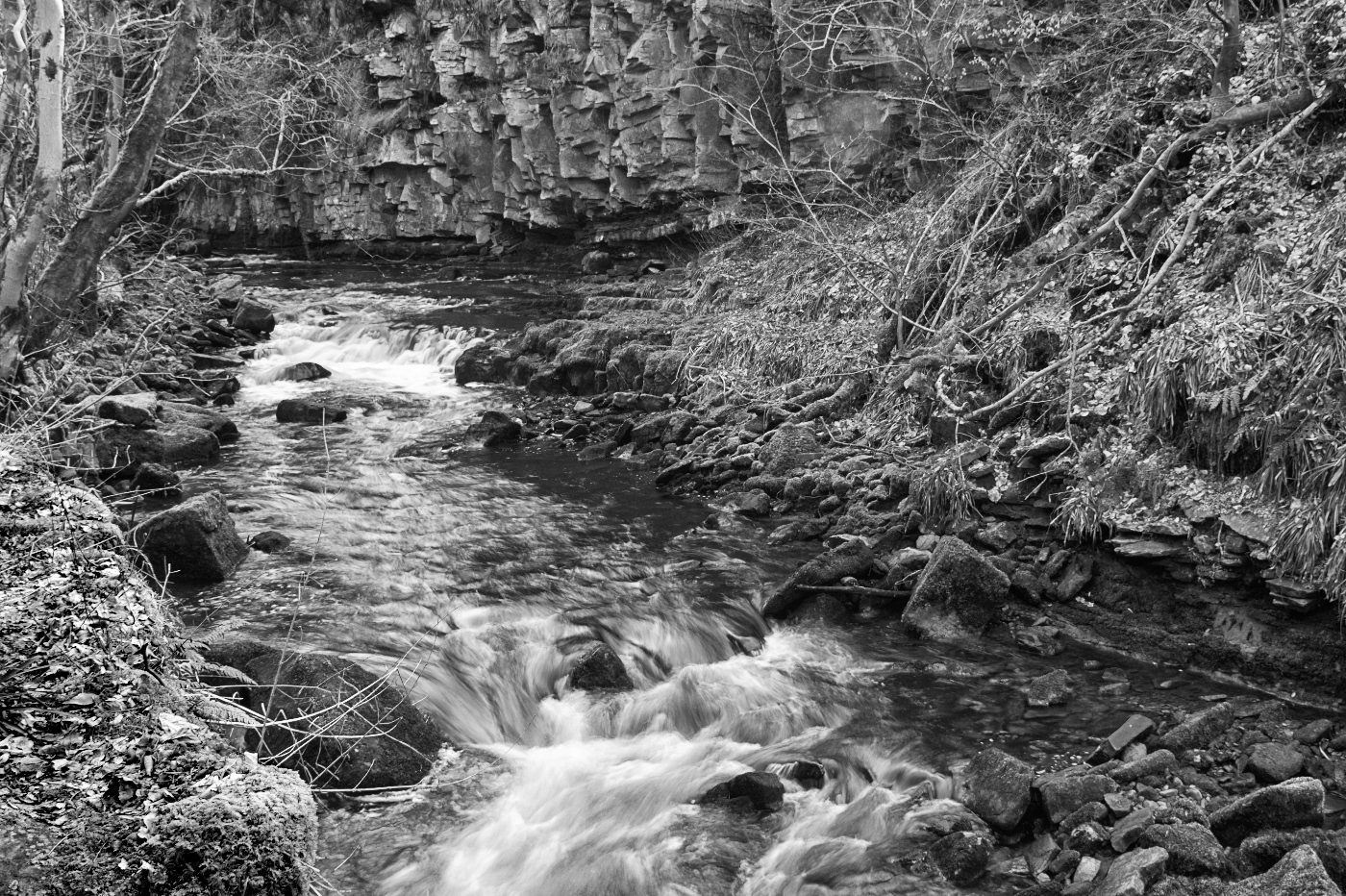
John - a nicely balanced image with the stream acting as a lead in to the interesting texture of the rocks in the background. Good feeling of movement in the water and highlights retained.
However the light toned bank in the lower left really does draw the eye and spoils the image for me. I guess it was frost??
I have taken the liberty of editing the image, applying a masked Curves layer to the bank area and also slightlu upping the contrast with a CEP 5 Tonal Contrast layer at 50% opacity. |
Dec 4th |
 |
7 comments - 3 replies for Group 31
|
| 83 |
Dec 18 |
Comment |
Cross posted from Group 31 at Judy's request.
Hi Judy
Thanks for dropping in on my image in Group 31! I dropped in on your image in Group 83 - very nicely done and some good advice from the other group members to which I would add that I think the image would benefit from exploring the effect of applying CEP 4 Detail Extractor and/or Tonal Contrast, probably at reduced opacity and also masked. Seems to me that you have a pretty good grasp on BW and have handled a high contrast capture well.
When dealing with BW it is important to appreciate that there is no colour to give impact (obvious I know!) and you have to rely on shape and form and tone and texture along with a strong composition and creative lighting. Hence the need for multiple adjustments to emphasize these points.
I only use Photoshop CS 6 to process my images and have done so since PS 5.0 - many years before the introduction of Lightroom. PS is my digital darkroom following on from 25+ years working in my own wet darkroom - based on that experience I burn and dodge on Curves Adjustment layers which invariably are masked to apply the adjustment to specific areas Why Curves? - in Levels there are only 3 adjustments available (black point, white point and mid tone) whereas in Curves there are 256 adjustment points, plus in the later versions of PS there is the hand tool (above the eyedroppers) with which you can click and drag in the image to alter a specific tone - absolutely invaluable!
As I exhibit both colour and mono versions of the same image (shot in RAW) I invariably process the colour version first and then convert to mono in Nik Silver Efex Pro 2 (SEP 2) if appropriate. It is Important to remember to put any Curves layer into Luminosity blending mode to prevent unwanted colour changes - not an issue in mono.
My current workflow is to make adjustments in RAW to the curve and maybe lift the shadows a touch. In PS I apply a Nik Colour Efex Pro 4 (CEP 4) Detail Extractor Layer as a separate layer and follow that with a Tonal Contrast Layer (CEP 4). The opacity of these layers may be varied to suit the image and may also be masked. Fine tuning the image then follows on multiple Curves layers each of which deals with a specific area of the image using a mask, the opacity of which may be reduced and, if appropriate, a global Curves layer(s) will also be applied. When applying a Curves adjustment I will tend to over adjust and then control the strength of the adjustment by reducing the opacity of the layer. The final image at print size is sharpened using Nik Sharpener Pro 3 and as a jpeg for exhibition using the High Pass filter in Soft Light mode (0.5 - 0.9 pixels). Final touch is to Merge Visible at the top of the layer stack and apply a CEP 4 Darken/Lighten Centre layer (to a saved recipe) to apply a very slight vignette to the image to concentrate the eye - so slight that only by turning the layer on/off can the effect be readily seen.
If a mono conversion is to be considered this would either be done on a duplicate of the colour version with the sharpening and vignetting layers removed and the remaining layers merged visible or on a flattened duplicate of the colour version with the layers noted above removed. Processing of the mono version would then follow the steps noted with further fine tuning on multiple Curves layers, etc.
|
Dec 8th |
1 comment - 0 replies for Group 83
|
8 comments - 3 replies Total
|