|
| Group |
Round |
C/R |
Comment |
Date |
Image |
| 31 |
Jul 18 |
Reply |
Ian - it's an optical illusion :) Placing the grid on the original image the church is absolutely vertical - I would have it no other way! |
Jul 16th |
| 31 |
Jul 18 |
Comment |
Ella - I think you have the basis for another good portrait here, but as presented I find it very flat, almost diffused although it is clearly sharp and to be honest somewhat unattractive. Have you considered applying the porcelain skin process which you used a couple of months ago on the granny? It could transform the image - or not! |
Jul 16th |
| 31 |
Jul 18 |
Comment |
Strong image Paul which would benefit from a stroke to separate it from the page background. I love the pose - there is a good diagonal flow from the lower LH corner up to the male dancer and the details in the blacks are just there. May be a touch more masked contrast? |
Jul 16th |
| 31 |
Jul 18 |
Comment |
Likewise this image is a little too abstract for me. |
Jul 16th |
| 31 |
Jul 18 |
Comment |
John - this image looks vaguely familiar - maybe you posted one similar in the past.As Ian commented the variety of shapes in the buildings is attractive and the people are arranged nicely. Very flat lighting that day and maybe a slight increase in contrast would help.Generally speaking the inclusion of bold text in an image distracts the eye, particularly when it is positioned at the edge of the frame. but in this case it adds to the atmosphere of the image and to the story. |
Jul 16th |
| 31 |
Jul 18 |
Comment |
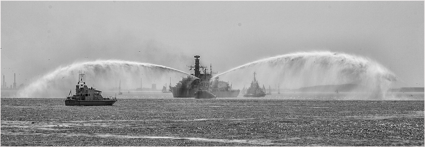
Ian - I like the composition and the drama induced into the image by the fire hoses, but find the image rather flat.
IMHO it is improved by applying CEP 4 Detail Extractor followed by CEP 4 Tonal Contrast at 50%. Admittedly this treatment does reveal some distant background detail which is a little intrusive, but can easily be cloned out. |
Jul 16th |
 |
5 comments - 1 reply for Group 31
|
5 comments - 1 reply Total
|