|
| Group |
Round |
C/R |
Comment |
Date |
Image |
| 31 |
Nov 17 |
Comment |
Hi Ella - I recognize that view from inside the opera house from my visit there in September. A good candid view of the two folk with the harbour in the background the detail in which does not distract and is slightly distorted by the glass
Somewhat puzzled as to why you found the need to shoot at 1250 ISO under those conditions - 'normal' exposure would have probably have rendered the people in semi silhouette at least.
There are minor halos around the people, but in this case they could be mistakened for rim lighting! |
Nov 14th |
| 31 |
Nov 17 |
Comment |
Hi Paul - I think the wildebeest have been well captured and cooperated well for a pleasing composition with a strong leading line. I would liked to have seen a little more space above the zebras at the top of the frame.
To my eye the tonal range is about right, but I always wonder about monochrome nature images as colour often seems to be more appropriate - having said that zebras work well in both mediums! |
Nov 14th |
| 31 |
Nov 17 |
Comment |
Hi Ed - although I agree withe the general jist of the comments above and, as usual, would suggest a little more contrast to make the bridge 'pop' a little more. To be honest the image does little for me :(
You are correct in saying that the sharpening at jpeg size has created the halos at the conjunction of light and dark edges. Sharpening is based on local contrast adjustment and where light meets dark halos will be formed. Halos will also be formed as above by aggressive contrast adjustments in a psd - view edges at 400-500% and you will see them I am sure!
So easy to remove without the need to be precise - see my web site for a tutorial ....
http://www.monolandscapes.talktalk.net/sharpening_halos.htm
or my original source ....
https://www.dpchallenge.com/tutorial.php?TUTORIAL_ID=80
For the sharpening of jpegs I use the High Pass Filter in Soft light mode - IMO Nik Sharpener Pro over sharpens small jpegs although it is fine for A3 prints. One of many tutorials here from Google ...
https://www.photoshopessentials.com/photo-editing/sharpen-high-pass/
Personally I don't convert to a Smart Object - unnecessary when you know from experience which setting to use.
My settings ....
1024x768 - radius 0.5, Soft Light Mode
1400x1050 and larger - radius 0.9, Soft Light Mode.
Then remove the sharpening halos!!
|
Nov 14th |
| 31 |
Nov 17 |
Comment |
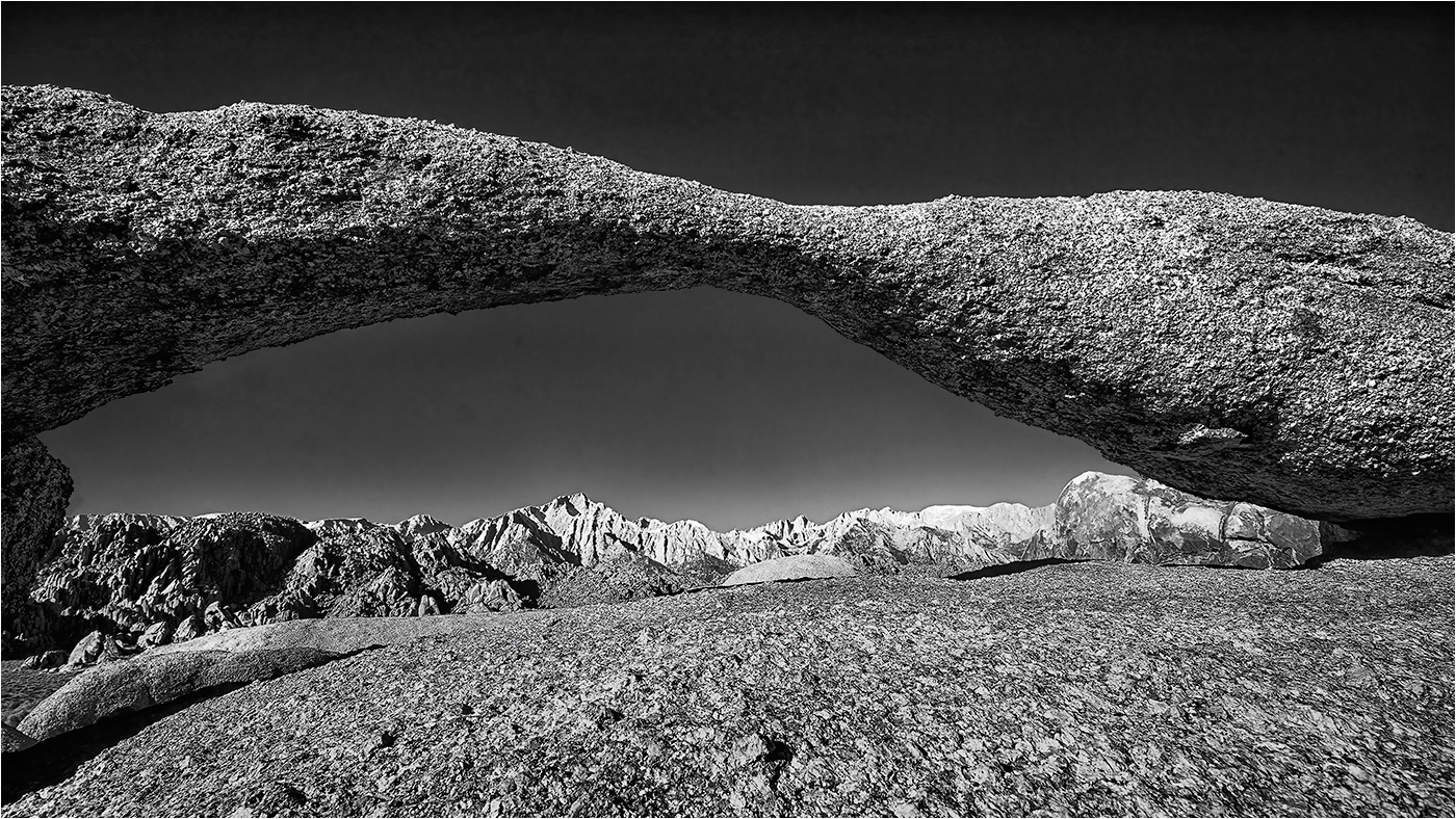
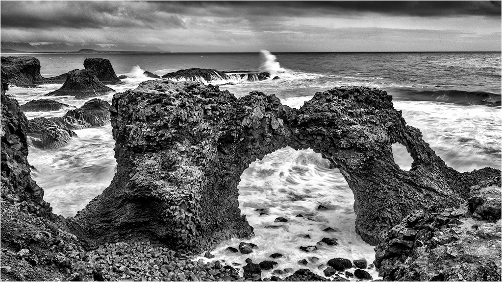
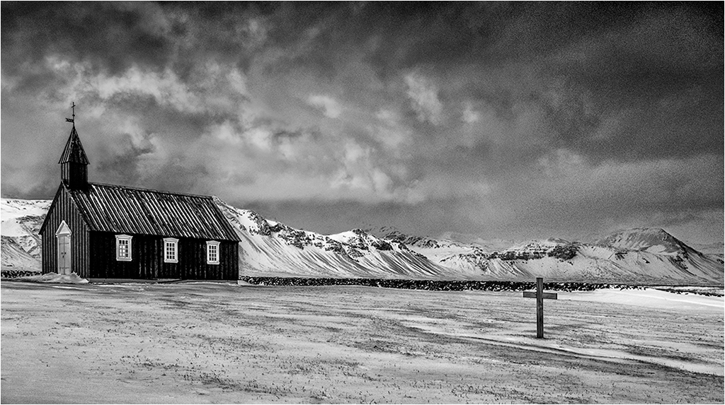
Rashid - I like the image overall with it's sense of isolation and a touch of mystery, but the bright area at the bottom of the frame kills it for me.
Ian's edit goes part way to improving the image, but reducing the exposure, albeit only slightly has made the area through and behind the arch too dark IMHO. The adjustment to the surrounding stone work is a great improvement. |
Nov 14th |
| 31 |
Nov 17 |
Comment |
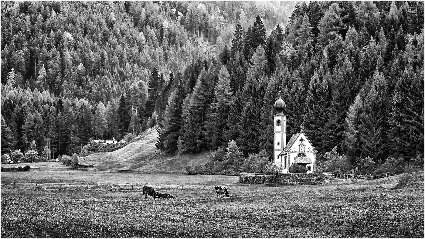
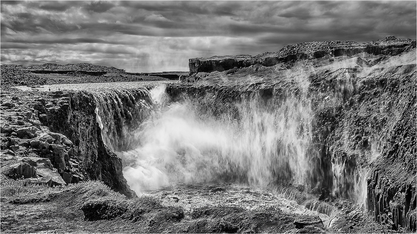
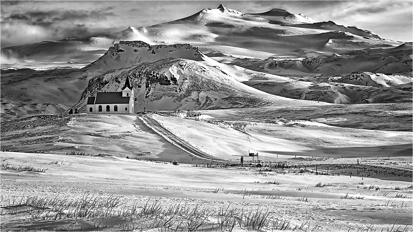
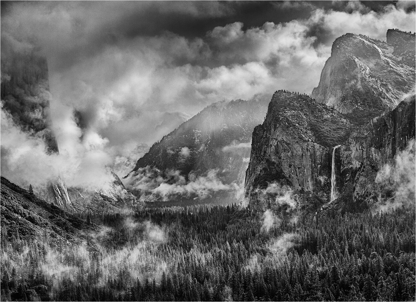
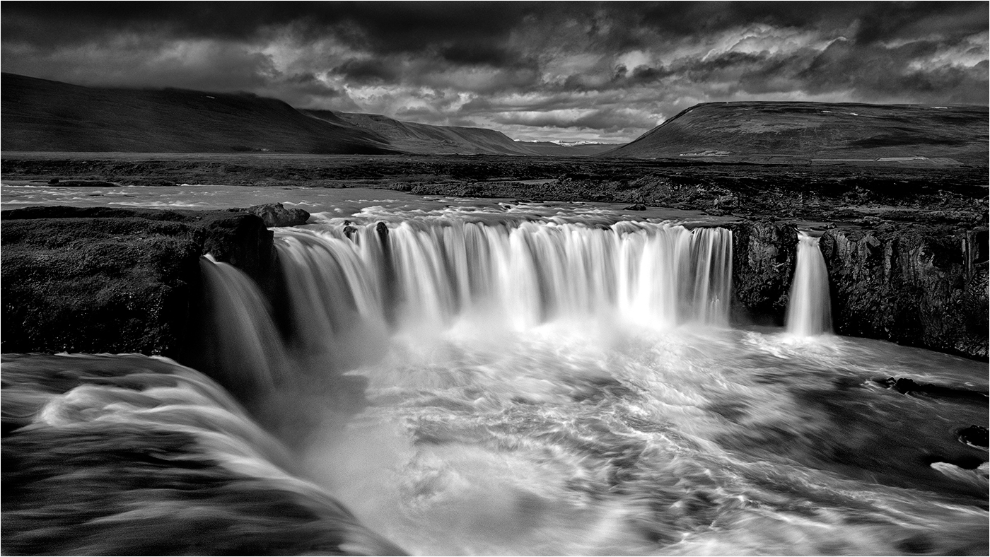
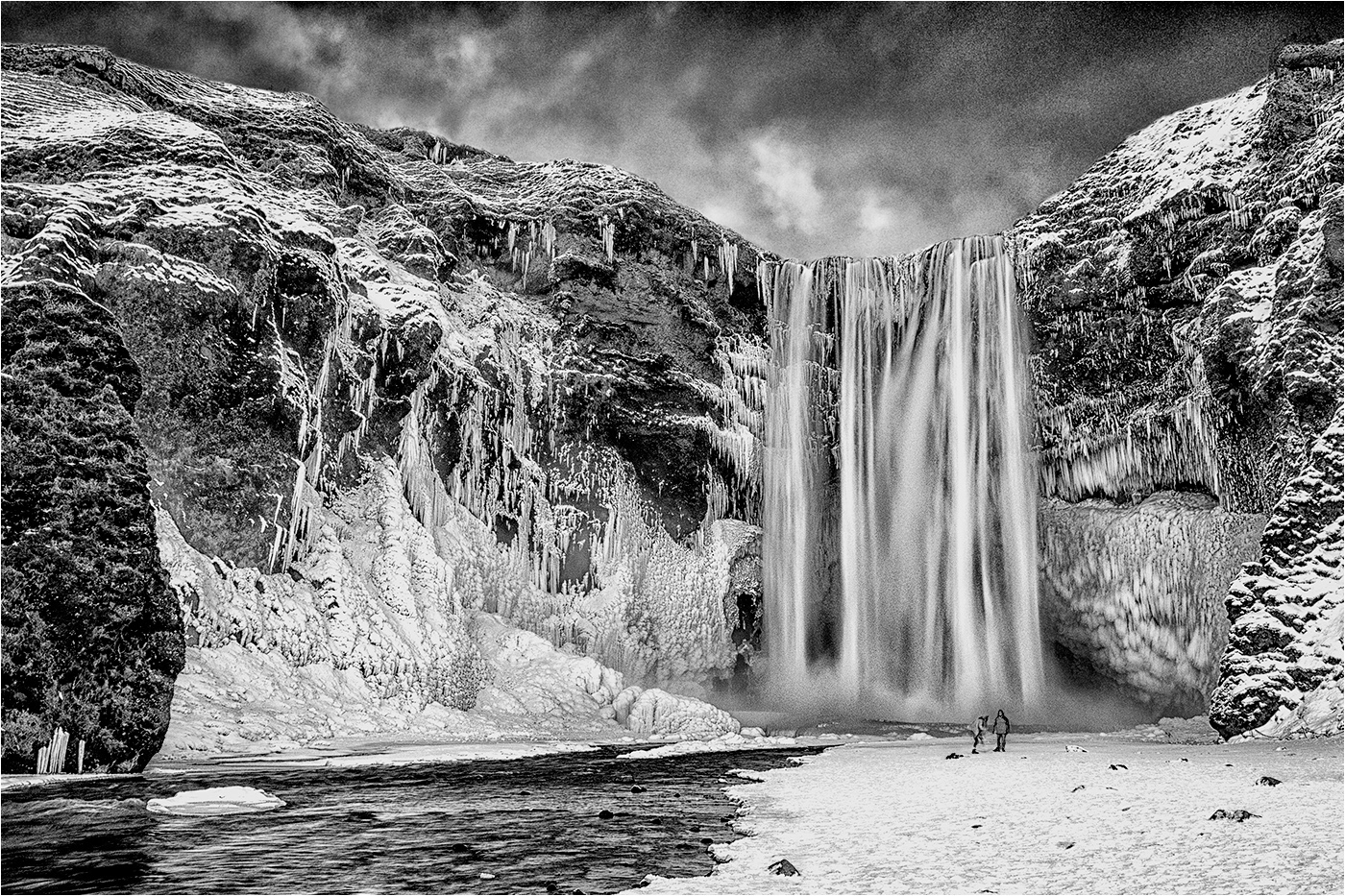
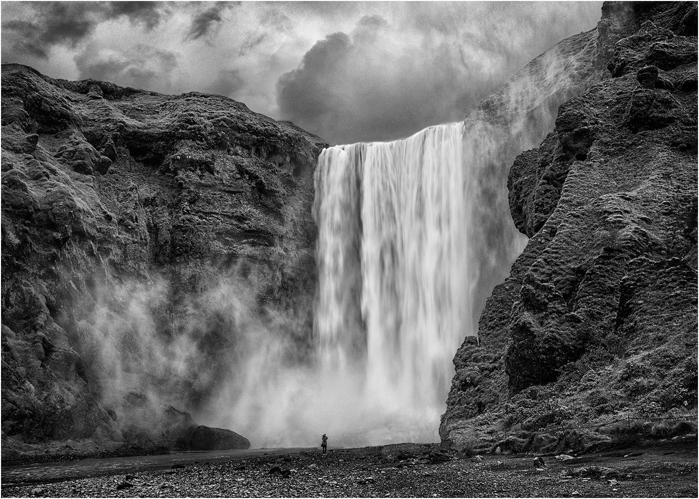
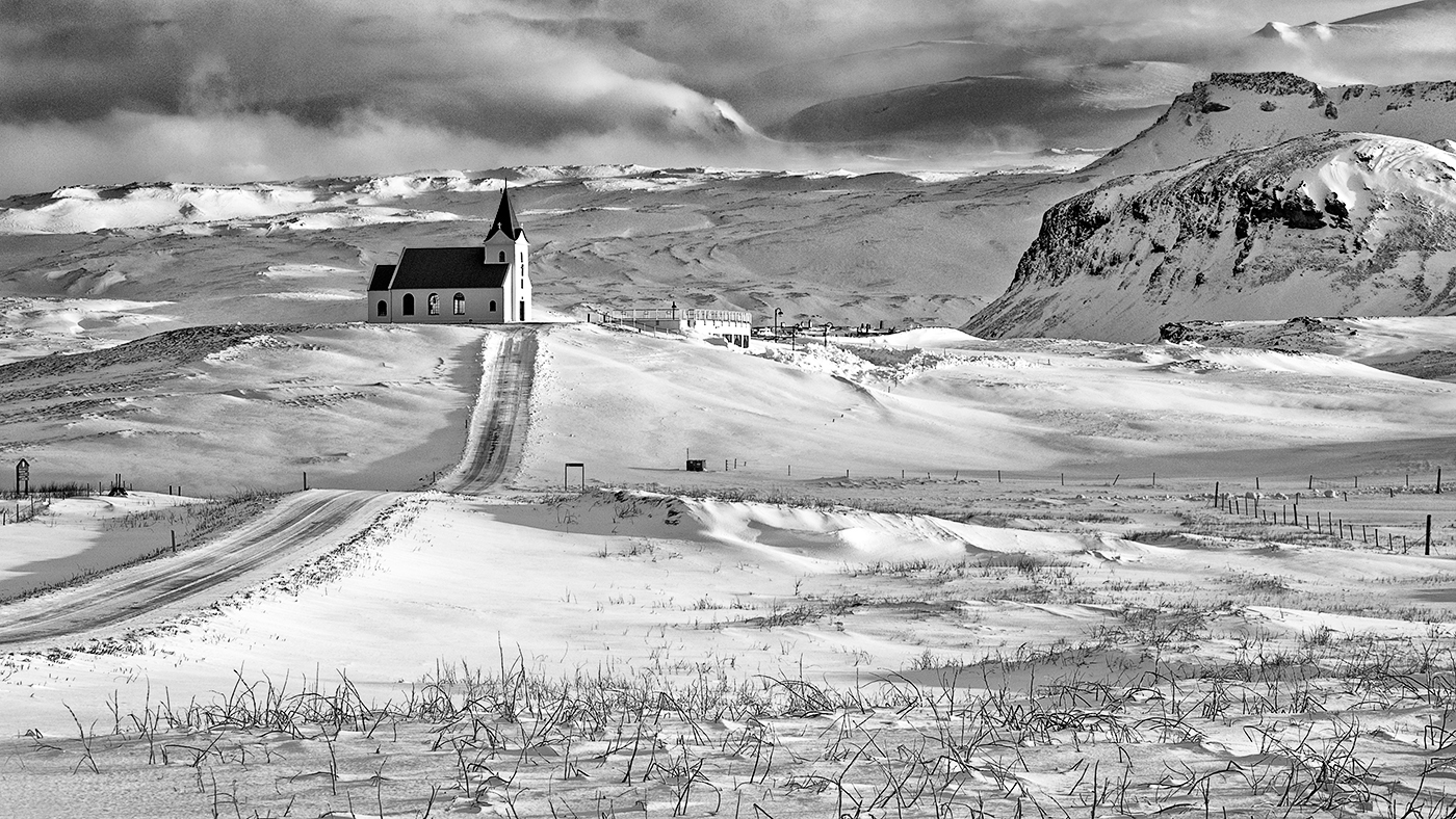
Hi John - Waterfalls, although a popular subject are not a straightforward as might first appear. The comp is fine with me with the fall offset to the left, but I feel that a little more contrast in the rocks would be beneficial.
Unlike Ella and Ian I think shutter speed could have been reduced further to provide a softer, silkier appearance in the water, but that's subjective and just my take on it. |
Nov 14th |
| 31 |
Nov 17 |
Comment |
Hi Ian - as usual you have produced another striking portrait. Very well lit and an unusual pose which works well. I'll keep my thoughts on tattoos to myself - got into trouble at a recent judging where I commented adversely on them!!
Would agree with Paul and Ella that the face is a little bright. |
Nov 14th |
| 31 |
Nov 17 |
Comment |
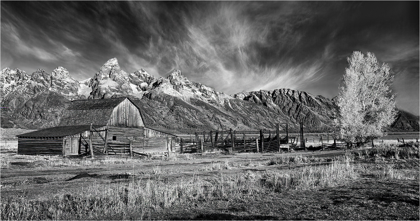
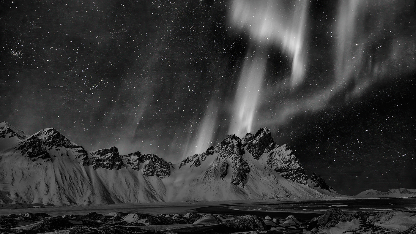
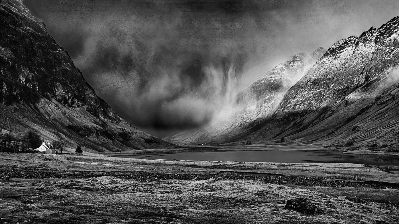
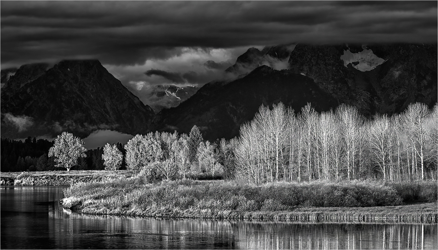
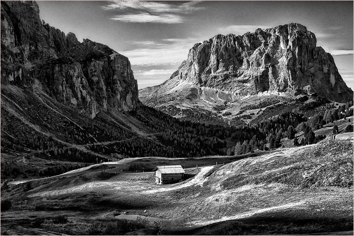
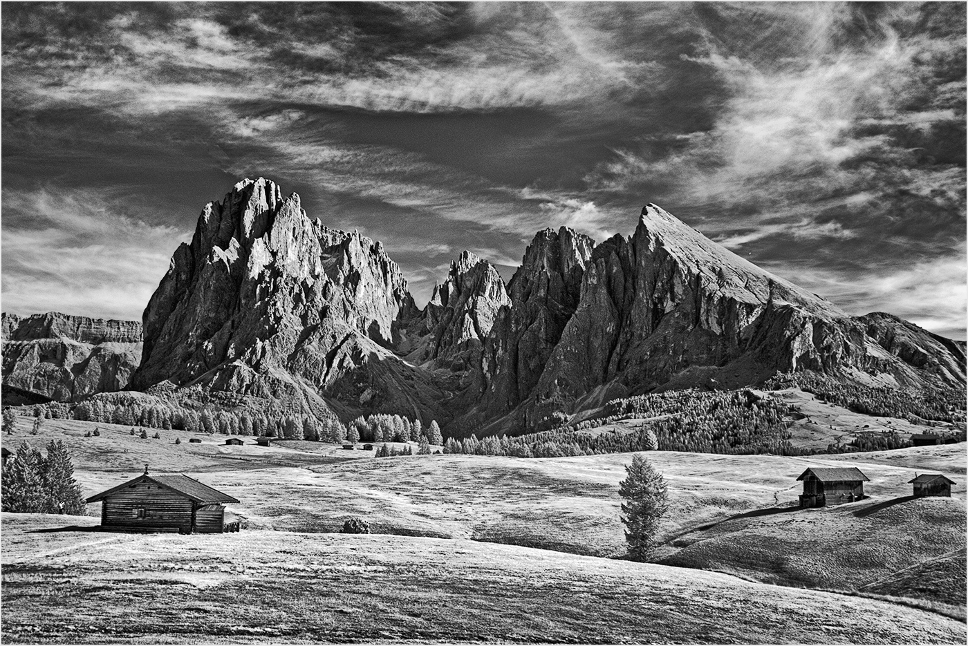
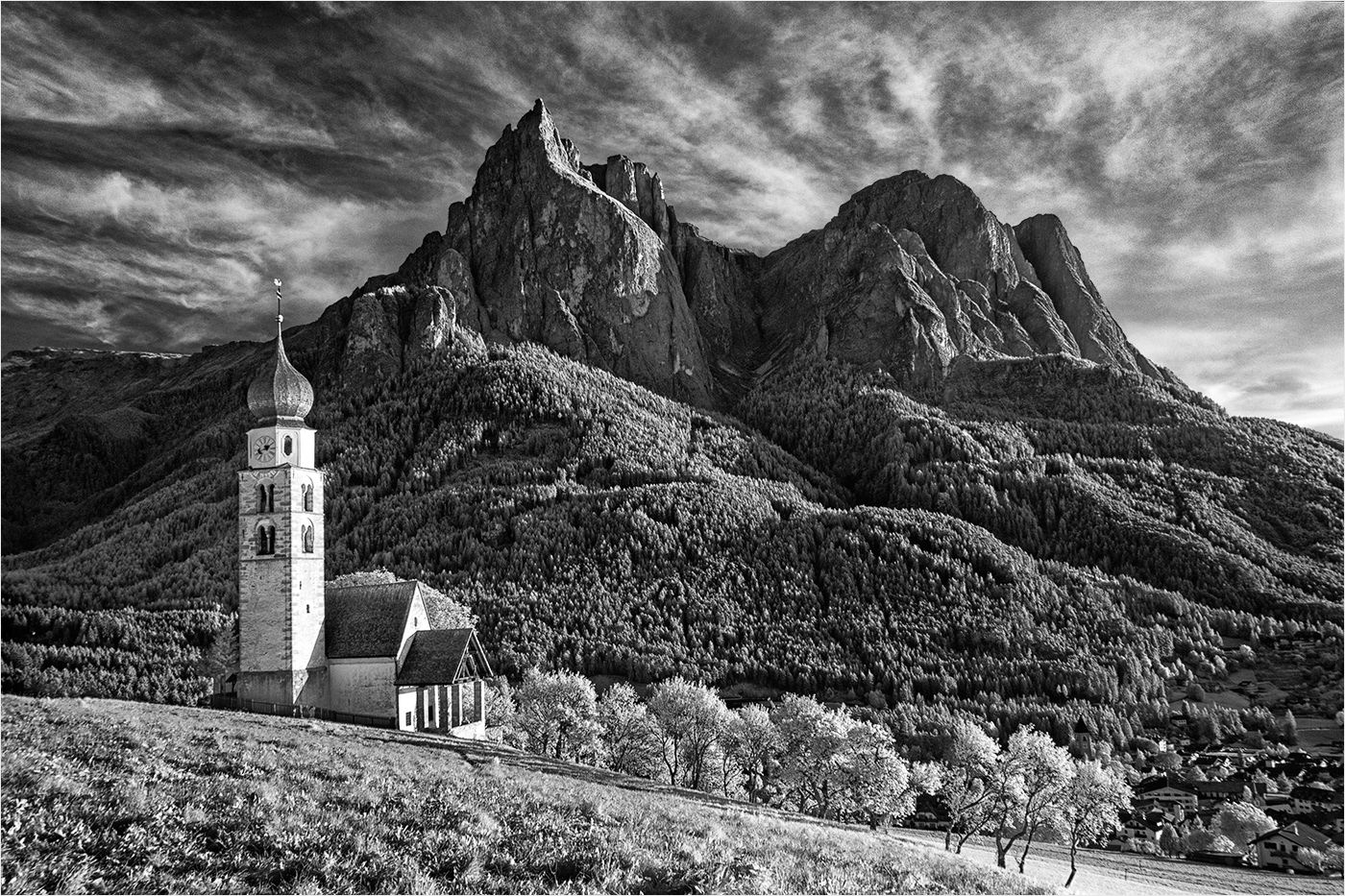
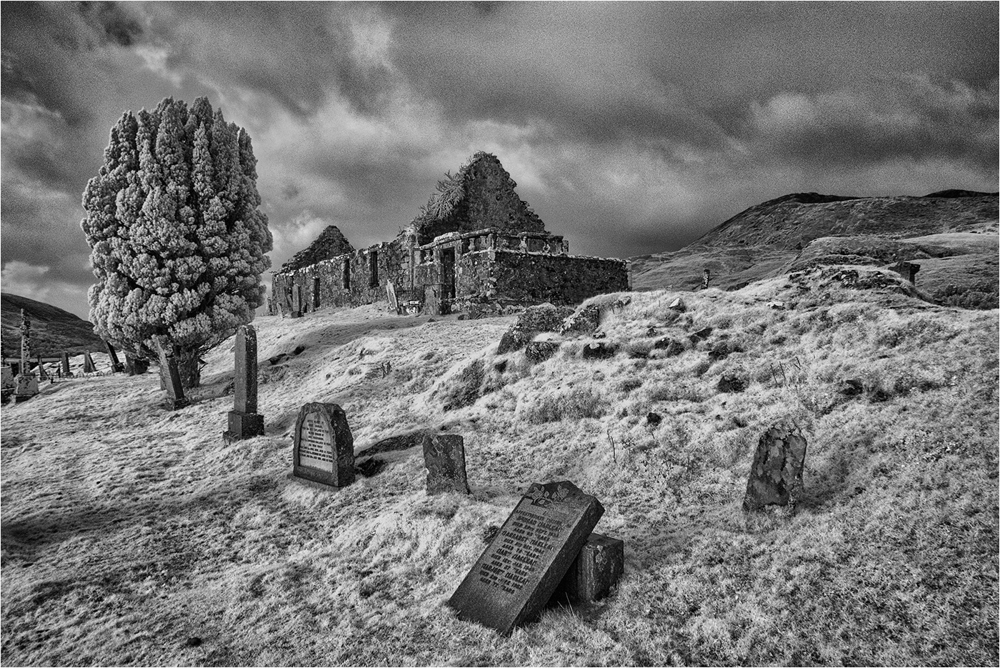
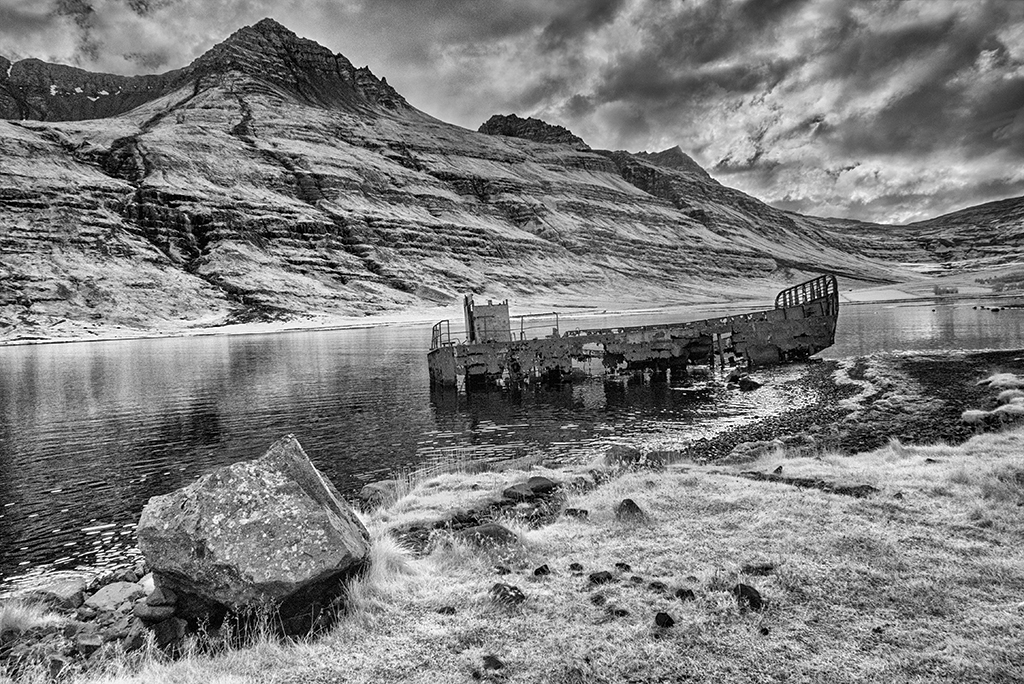
IR version - captured on an IR converted camera and not fully finished .... |
Nov 14th |
 |
| 31 |
Nov 17 |
Comment |
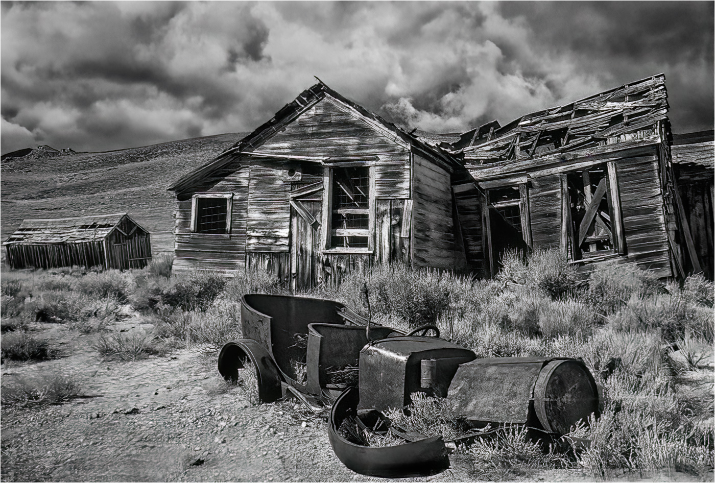
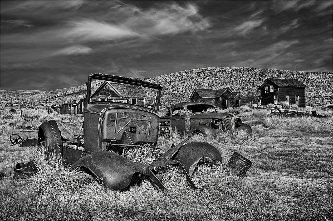
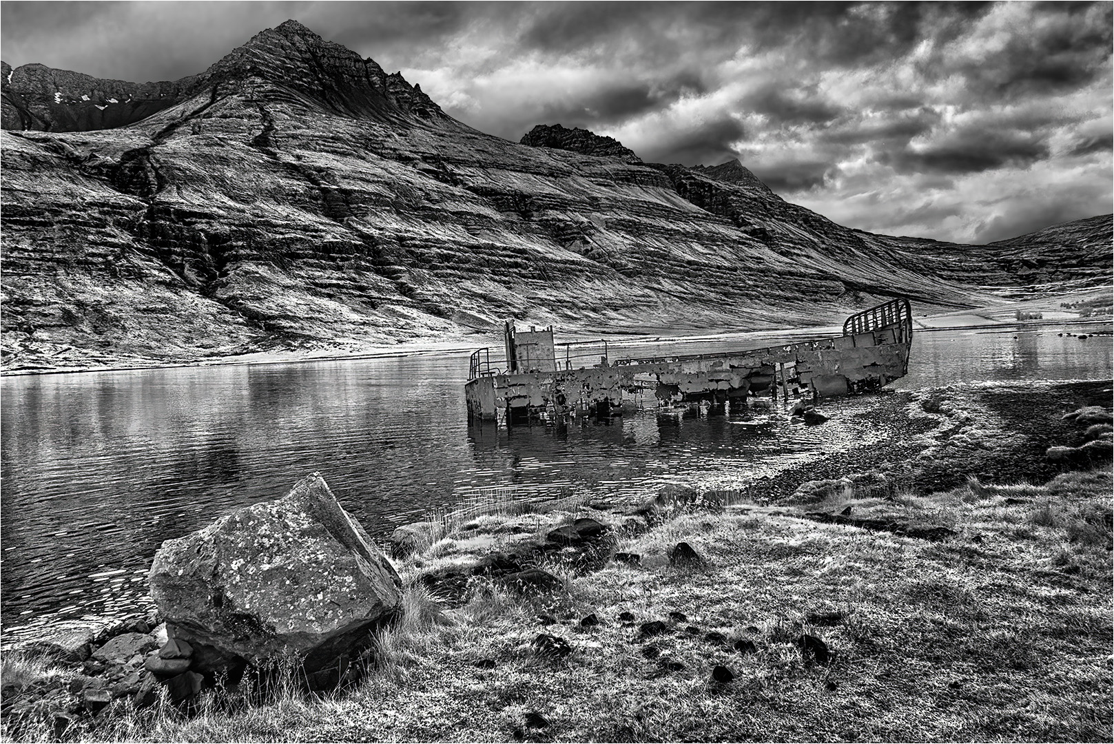
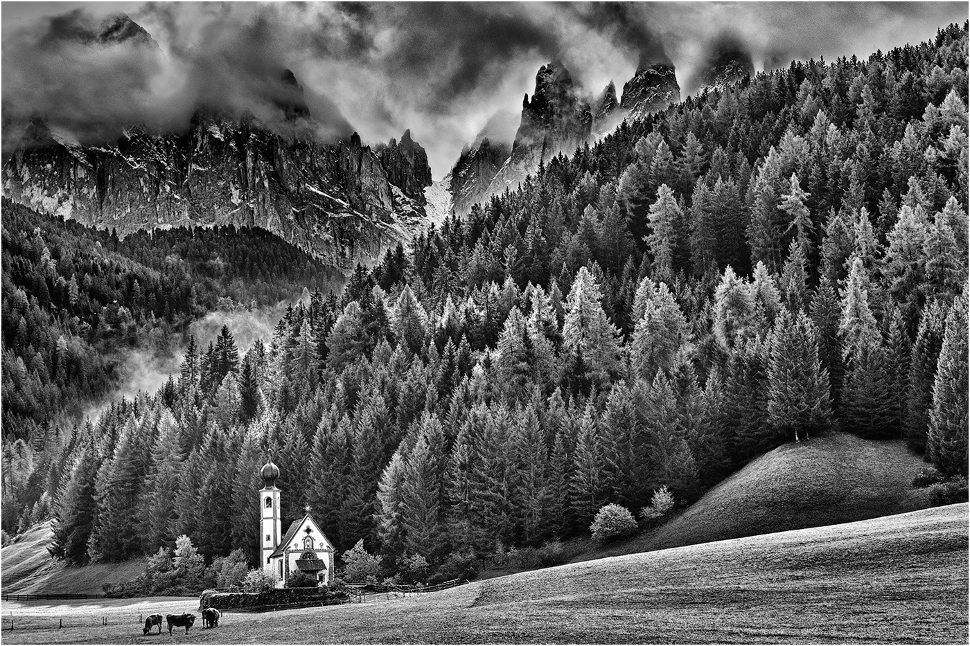
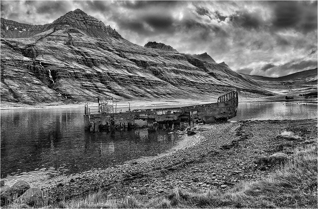
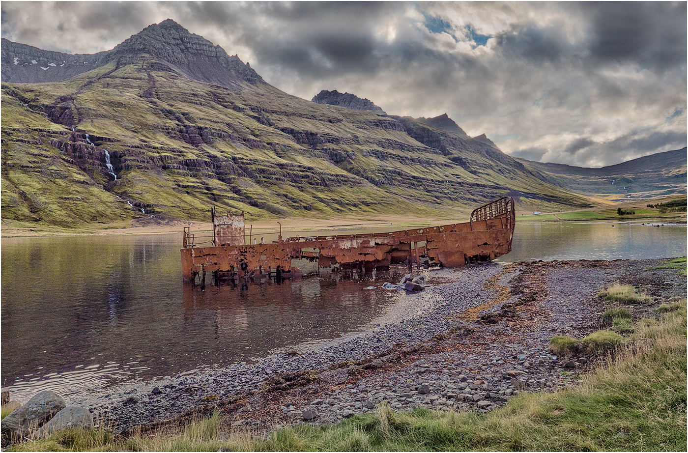
Ed - Suggestions for alternative processing always welcome! I have received good advice from this Group in the past which has sometimes enabled me to improve the image.
I regret to say that your edit is OTT and does not sit easy on the eye and looks very artificial. I see where you are coming from, but the wreck is, in the main surrounded by lighter tones.
For reference I have posted the original colour version below and another infrared version below that. |
Nov 14th |
 |
8 comments - 0 replies for Group 31
|
8 comments - 0 replies Total
|