|
| Group |
Round |
C/R |
Comment |
Date |
Image |
| 31 |
Jun 17 |
Comment |
I feel that Ian's crop is a bit draconian - more space needed at the top of the frame IMO. I returned to my original comment of using a wider aperture and simulated this by adding some blur to the background - also gave the foreground a brighten up in curves .... |
Jun 12th |
 |
| 31 |
Jun 17 |
Comment |
As usual Paul you have come up with a strong environmental portrait of the young girl which says so much about her. I am very much in favour of the landscape format for portraits with the subject to one side or the other despite the negative space - a form of presentation which is very much mainstream today.To use the portrait format would IMHO create a 'mug' shot.
I have no issue with the catch lights in the eyes and to lighten the whites there would step away from reality, but I would tone down the highlights below the ear and darken down the lower right hand corner. |
Jun 9th |
| 31 |
Jun 17 |
Comment |
I agree with John - a striking image in which the absolute symmetry is a key factor. Without the couple on the escalator the image would have been very mundane.and devoid of an intimate focal point.
The light tones of the escalator seem a little over bright to me given the dull nature of the outside lighting and the lack of any illumination from the overhead lights.
Neverthe less a very attractive image! |
Jun 9th |
| 31 |
Jun 17 |
Reply |
I did try longer shutter speeds, but to my eye they were not as effective as the one posted. Catching the waves crashing against the rocks in the background is a bonus which was lost with longer speeds. This was taken close to high tide and the rush of water through the arch was rather muted. |
Jun 5th |
| 31 |
Jun 17 |
Reply |
Far from belly flopping the highest possible camera position was necessary to lose some unwanted foreground and get vertical separation of the background from the arch.Would have tried hand holding but for the selected shutter speed - 1 sec. |
Jun 5th |
| 31 |
Jun 17 |
Comment |
Ian - as you say a straight forward record shot clear of people and cars (unless to pixel peep!). With the light tones of the building giving an almost high key effect I feel that the sky, dramatic though it is, seems rather over powering and would benefit from toning down a bit.
As the camera was pointing up the image benefits from perspective correction - see below and I have to bring to your attention the sharpening halos around the domes and other dark edges! |
Jun 4th |
 |
| 31 |
Jun 17 |
Comment |
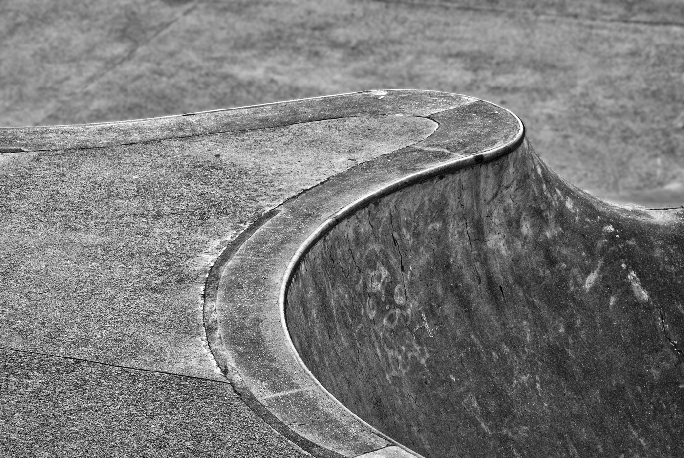
A well seen abstract in which the curve of the capping stone leads the eye through the image. The tonal range is limited and the curve tends to get lost as it runs out of the frame. I wonder if the use of a much wider aperture to throw the background out of focus would have given some separation from the curve itself. |
Jun 4th |
| 31 |
Jun 17 |
Comment |
A powerful image - I like the pose - down on the haunches and the eyes looking straight at you - catch lights are a bonus. Good and sharp where it matters, but I feel that closing down to f8 would have put a little more detail into the underbelly and shoulder - I would have put the ISO up to 200 - 400 to maintain the shutter speed. |
Jun 4th |
6 comments - 2 replies for Group 31
|
6 comments - 2 replies Total
|