|
| Group |
Round |
C/R |
Comment |
Date |
Image |
| 31 |
Jan 17 |
Comment |
Anu - I'm late to the party and can only echo the comments above. A superb and intriguing image - I love the minimalism of the scene, all the story telling elements are there and, for me, the couple walking by are perfectly positioned and crucial to the image. |
Jan 31st |
| 31 |
Jan 17 |
Comment |
I seen to recall that New Orleans had a strong French connection which makes John's comment all the more pertinent.
It's a very competent image recording a bygone age which still exists today and your processing is spot on - a natural for monochrome. However I feel that it is more of a record shot and would have loved to see a figure sitting at the far table or by the door to add a pictorial element. |
Jan 6th |
| 31 |
Jan 17 |
Comment |
Paul - another strong image in which the young lad's eyes draw the viewer in and the inclusion of part of another face adds an air of mystery.
Unfortunately the image on the page is an enlargement of your original 246x164 image and not unnaturally the quality is very poor and detracts from the viewing pleasure. |
Jan 6th |
| 31 |
Jan 17 |
Comment |
Rashid - a warm welcome to the Group!
I do like the dark moody nature of your image, the intense concentration on the face of the girl and the composition with her mirroring the guy in the picture on the wall. Your timing was perfect - the movement in the ball is so important in setting the scene and in telling the story.
As a side note it is beneficial with dark images to place a white stroke around the image to define the boundaries of the image against the black page background. |
Jan 6th |
| 31 |
Jan 17 |
Comment |
We have to suffer for our art! You certainly did and glad to hear that you suffered no lasting damage. For my part I have slipped and fallen twice in the interests of photography, breaking a hip on each occasion :-(
A great, well composed image with super textures in the old timbers of the boat. The angles of the two main boats add dynamism to the image and there is a good diagonal flow through the image.
I would be tempted to flip the image horizontally which gives a more balanced feel - for the most part we read L to R. A touch of Nik Tonal Contrast adds a little more punch and reveals a little more detail in the sky. |
Jan 6th |
 |
| 31 |
Jan 17 |
Comment |
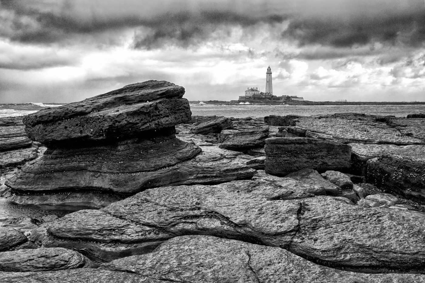
John - great composition with the foreground rock providing a good balance with the lighthouse in the background and giving depth to the image. Super detail and texture in the foreground rocks (these would benefit from a touch of tonal contrast in Nik Colour Efex) coupled with a potentially strong sky. I say potentially because the lighter tones above the darker tones in the sky draw the eye away from the main image rather than holding it in. These areas need to be darkened down or cropped off. Rough edit below.
|
Jan 1st |
 |
| 31 |
Jan 17 |
Comment |
Something awry here - your image bears no resemblance to the description! |
Jan 1st |
7 comments - 0 replies for Group 31
|
7 comments - 0 replies Total
|