|
| Group |
Round |
C/R |
Comment |
Date |
Image |
| 22 |
Feb 19 |
Comment |
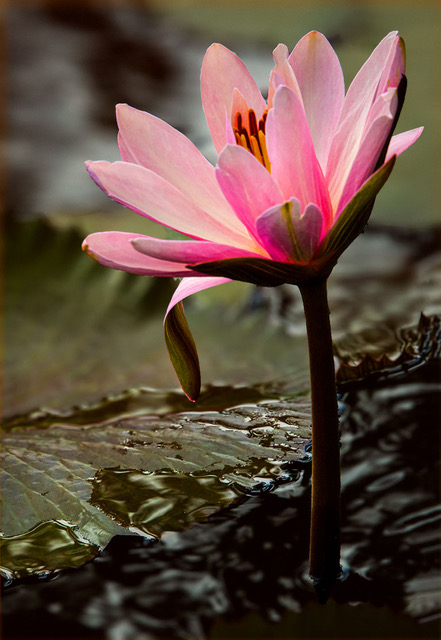
Perfect Kaylyn! I too feel that this has the delicate look of an Asian painting. Not only you had the eye to spot this, but you also did an excellent job of processing. I would just crop a bit from the bottom. |
Feb 10th |
| 22 |
Feb 19 |
Comment |
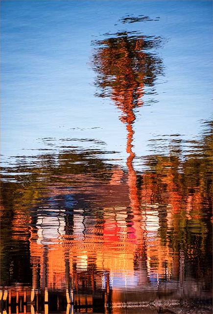
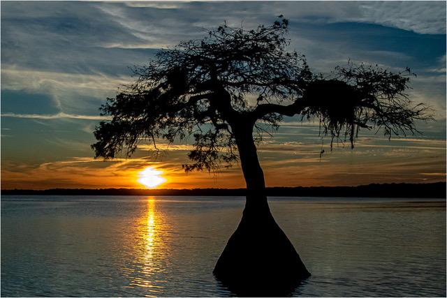
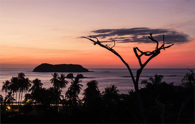
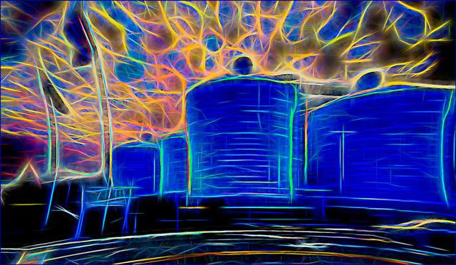
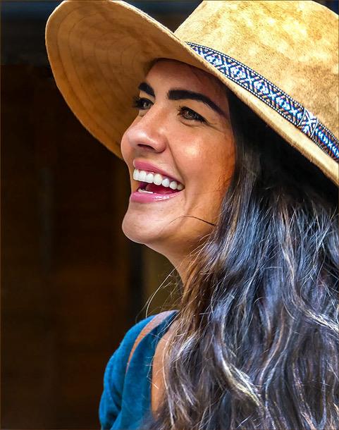
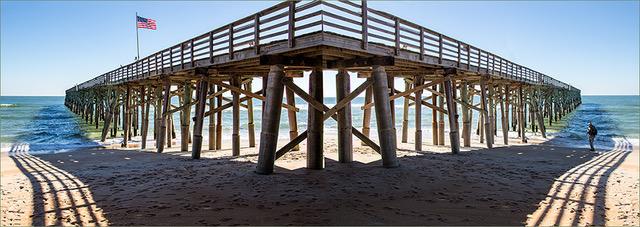
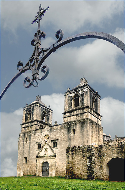
Mike, for me, the original is the best. It is different, crisp and very effective. Just a couple of inches more on the left would have helped a lot. But I think it is one to keep as it is. |
Feb 10th |
| 22 |
Feb 19 |
Comment |
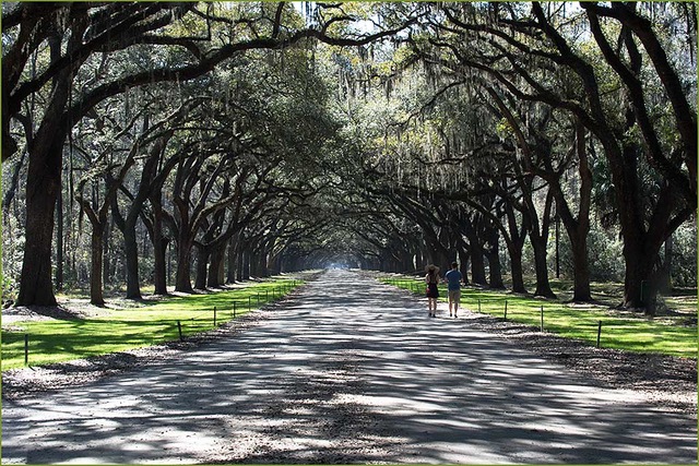
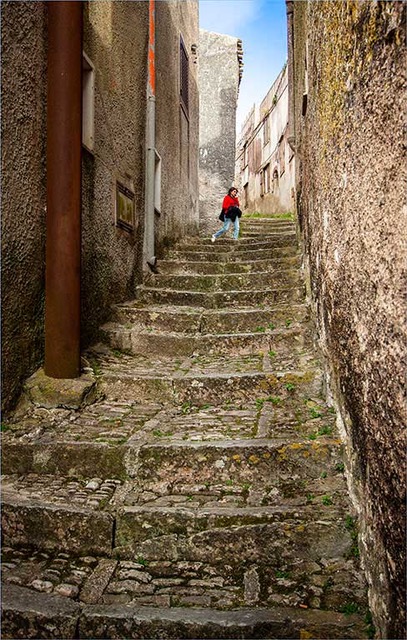
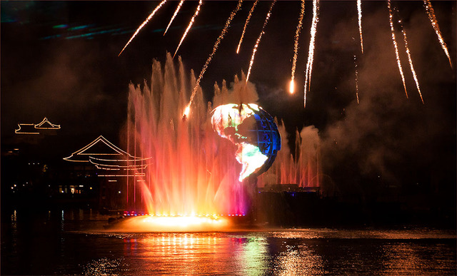
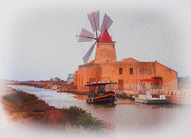
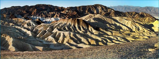
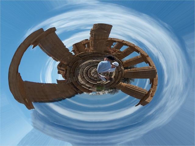
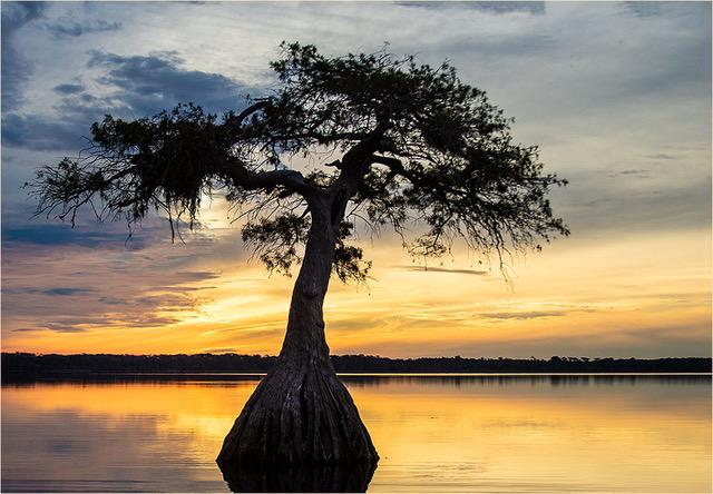
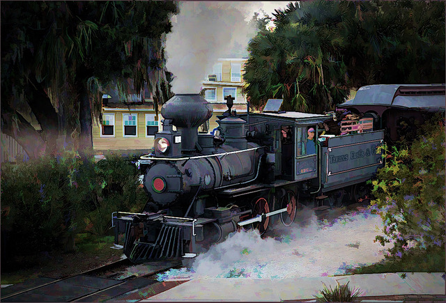
Yes, definitely crop 50% of the sky. There is nothing of importance on the right side, so I would crop right up to the lady with the carriage and place the ferris wheel right in the center. If you have more foreground in the original, then include it or create some. This way all the leading lines would point to the ferris wheel. A lower angle would have helped to make the wheel appear more dominant. I can say this sitting here, but rushing around and trying to avoid crowds, under the same circumstances, I probably would have done the same as you John. |
Feb 10th |
| 22 |
Feb 19 |
Comment |
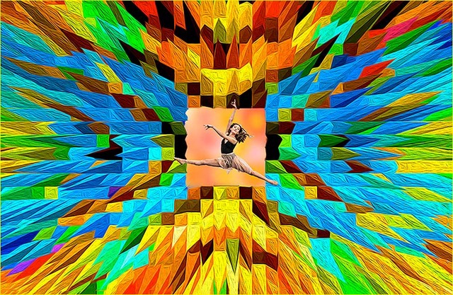
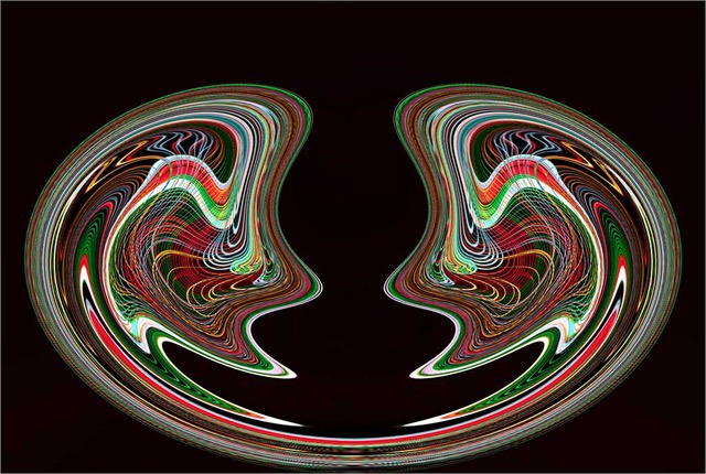
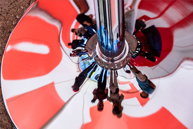
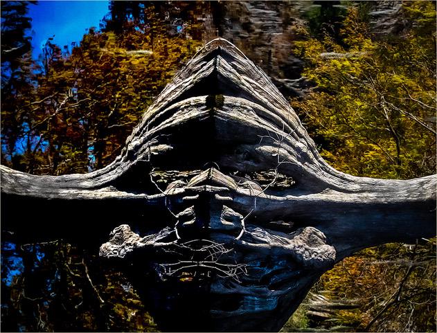
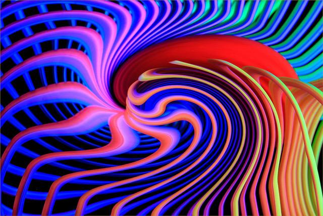
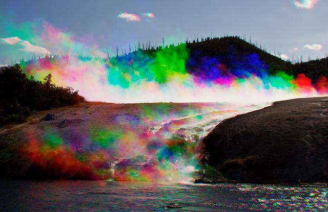
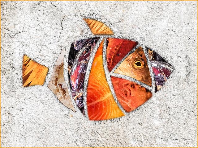
Jerry, excellent idea , composition and colors. Good job on the selections. Your technique is good and one to be explored. Perhaps it is my personal reaction or vertigo effect, but I think the blur may have been overdone a bit. |
Feb 10th |
| 22 |
Feb 19 |
Comment |
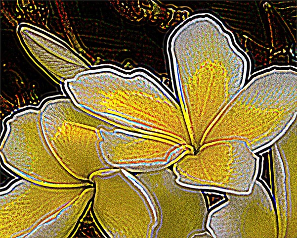
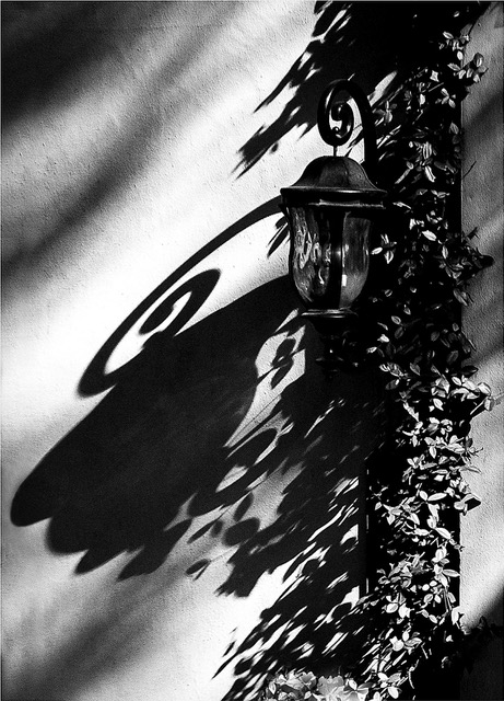
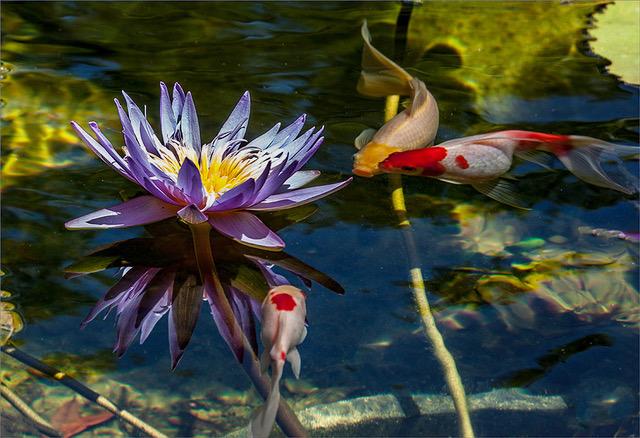
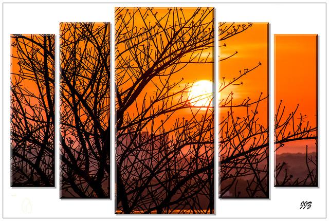
Peggy, this is a beautiful combination of horizontal, vertical, diagonal and curved lines. Great color combinations. I love how the curved lines start from left and end within the picture. The eye flows comfortably from left to right and again continues all around within the picture. For me, cropping the sky, kind of restricts the effect. If anything, I would crop a bit from the bottom and from the top, but not much. |
Feb 10th |
| 22 |
Feb 19 |
Comment |
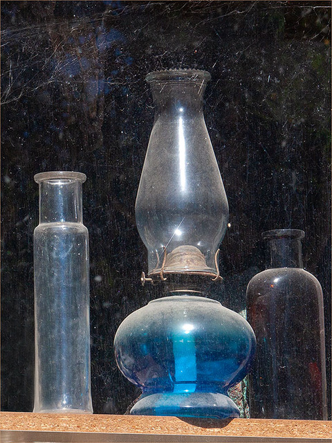
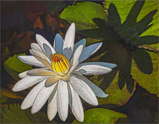
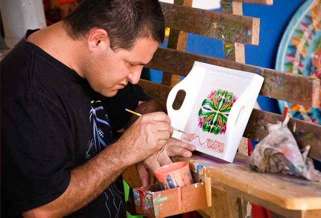
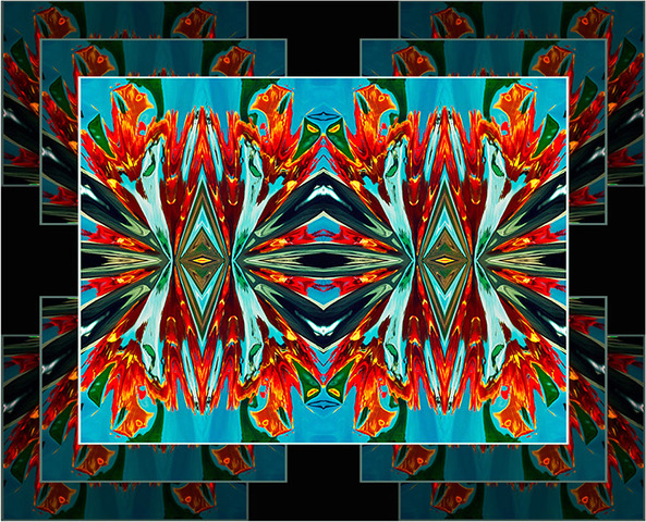
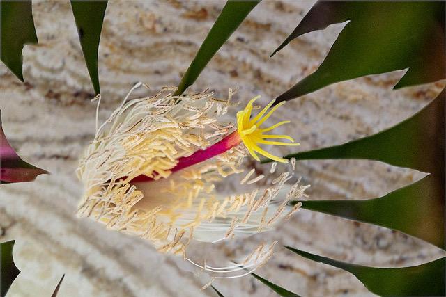
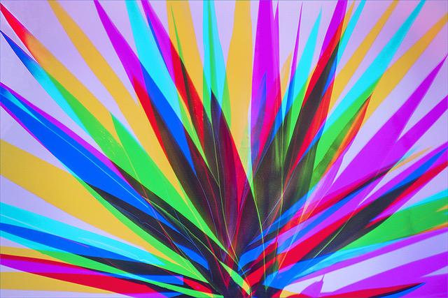
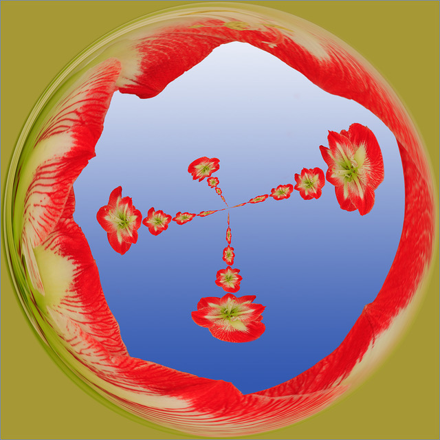
Marti, with your skills and this technique, you are on your way to create many artistic images. Technically, you have done an excellent job. I do have a few suggestions you may want to consider. Your selection is very good, but I would reduce it a bit in order to avoid the merger of the leaves on the edges and the design at the top. If you did this on purpose or do not want to reduce it, then perhaps enlarge the background. You can also create some shadow behind the flowers to give a better sense of separation with the background. The combination of colors and background is good, but I feel that it is competing with the flowers, you could soften it a bit. The stroke is too noticeable, I would also reduce the size. |
Feb 10th |
| 22 |
Feb 19 |
Reply |
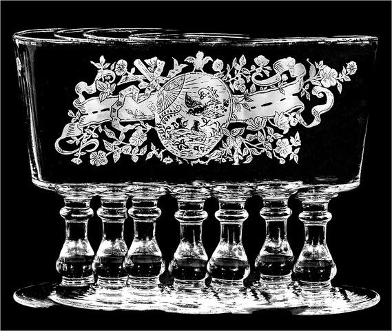
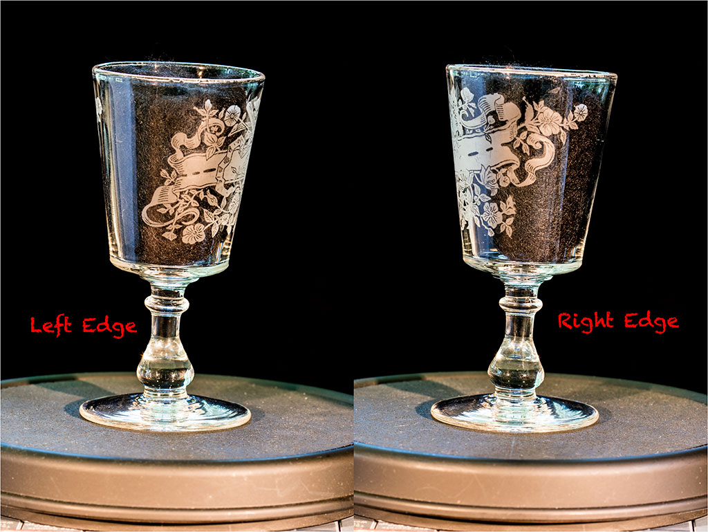
Marti, I am not sure of what you mean, but here is a copy of the left edge and the right edge. Perhaps you are referring to the black material we inserted in the glass, in order to keep from including part of the image in the back. This too caused more distractions that had to be cleaned out. Does this help? |
Feb 10th |
 |
| 22 |
Feb 19 |
Reply |
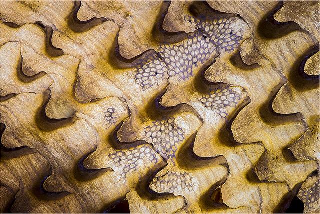
Thank you everyone for your appreciation and interest.
Jerry, please re-read my "How I Did It". 250 images were published from about 300 pictures I took as well as clean all the reflections, scratches and smudges. You can see the books and the first few pages, on Amazon just by entering >Books Joseph Zaia or Frank Consentino<. Yes, this image is in Book I of the two books, but only the top portion, without the bottom stems. Most images that had a design all around, were photographed, image by image, by rotating them on a Lazy Susan. |
Feb 10th |
6 comments - 2 replies for Group 22
|
6 comments - 2 replies Total
|