|
| Group |
Round |
C/R |
Comment |
Date |
Image |
| 22 |
Jan 19 |
Comment |
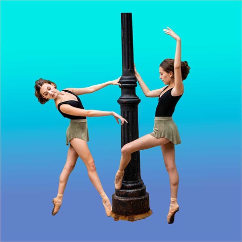
I think that Jerry's points are pretty valid, but as I look at the original bandana, it looks pretty much the same to me. Now I wonder and I ask everyone, how much should we alter or deviate an original image, for the sake of being "photographically correct?" |
Jan 22nd |
| 22 |
Jan 19 |
Reply |
Thank you, all valid points.
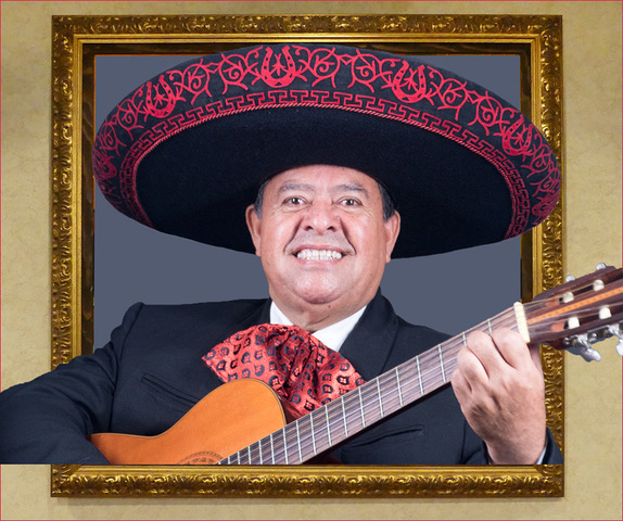
Marti, you did a good job of toning down the hot spots. How did you do it? However, you may have overdone it. Now I think it has lost the sparkle. |
Jan 21st |
| 22 |
Jan 19 |
Comment |
Keeping the scanner as clean as possible, using hand blowers, brushing the slides, keeping room fans closed, can eliminate about 75% of dust and save a lot of that tedious work. |
Jan 16th |
| 22 |
Jan 19 |
Comment |
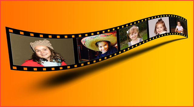
Thank you for your sugestions. I have brightened the eyes, toned down the glare on the face and removed some blue from the hair. I did not want to overdo it.
Mike, I am not an authority, but as far as I know, any person or person who's features are not visible or thing taken in public, is pretty much public domain. However, if you are going to have any person published or sell a picture of a person, it is best or required to have a release. As for exhibiting, the release is required if the picture is a winner and it is going to be published in a catalog. In the past few years, PSA requires a release of just about anything that is going to be published. |
Jan 16th |
 |
| 22 |
Jan 19 |
Comment |
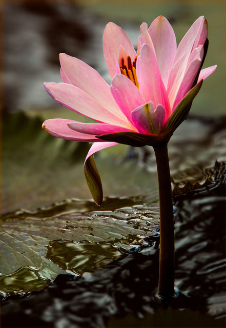
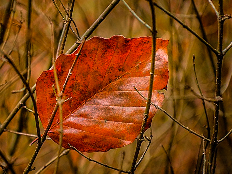
Yes John, this is a lovely leaf. Not sure if I have it, but I think this is more or less of what Jerry, Peggy and Kaylyn are talking about and which I agree with.
|
Jan 14th |
 |
| 22 |
Jan 19 |
Comment |
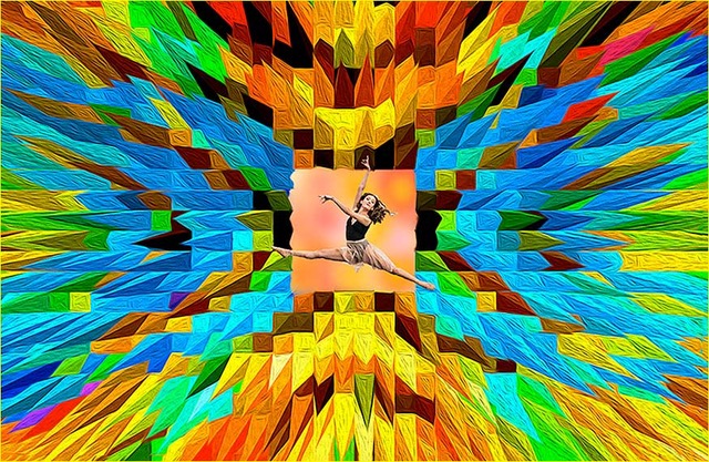
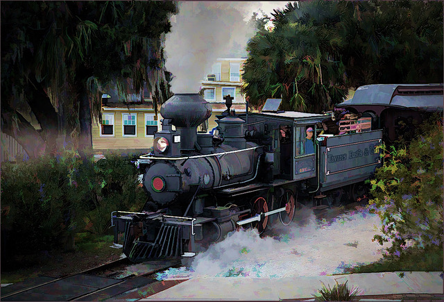
Jerry, this is an excellent action and photojournalistic image you can truly be proud of, not only for capturing it but also for the post processing. I hope you had your camera set at multiple exposures as the action was taking place. In spite of the noise and pixilation, you cab blow this image as big as you want and it would still be an excellent image. Keep in mind that the technical aspect is only 10%. The other 90% go for impact, originality, composition, subject matter and human interest, which you have. Well done! Another title that comes to mind is: "This is no Bull!"
|
Jan 14th |
| 22 |
Jan 19 |
Comment |
Yes, Jerry and Kaylyn, I do agree with you. The bridge is part of the scene and it does blend in. I believe it appears so strong because it is closer to the camera than it is to the buildings.
|
Jan 14th |
| 22 |
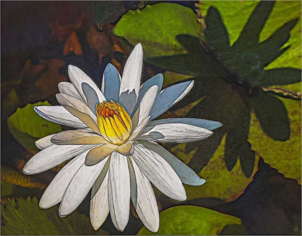
Jan 19 |
Comment |
Kaylyn, this is a very pleasing image and the oil paint filter gives it a nice soft touch. With these subjects, I think you could have used more distance. I would also like to see more of the cattle drive dragging behind; perhaps a horizontal would do that. You do have a horizontal as well, yes? Not sure if you noticed, but if you look at the hoofs of the cow and the horse and the paws of the dog, they are all in step; front and back. |
Jan 7th |
| 22 |
Jan 19 |
Comment |
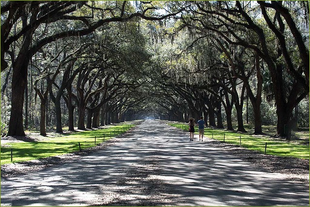
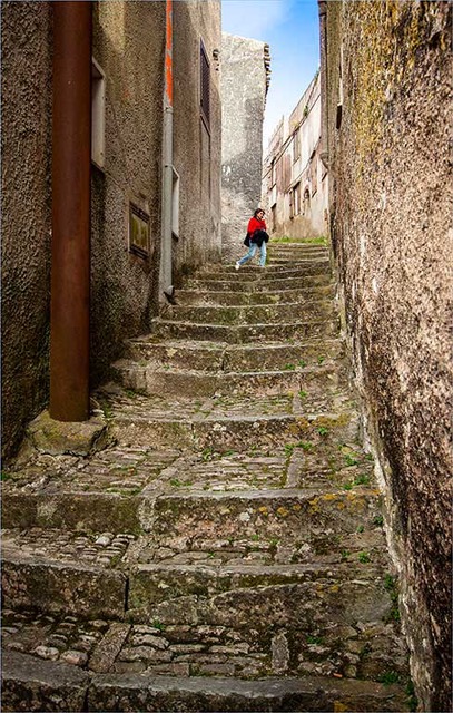
Mike, this scene is more common than it is photographed. Good for you being able to capture it. You were wise to eliminate the sky, which was not needed, but you placed the subjects right in the middle of the panel. I suggest that by including more of the foreground, which you have available, you would take the subjects away from the center and create a longer leading line for the eye to lead to the subjects.
|
Jan 7th |
| 22 |
Jan 19 |
Comment |
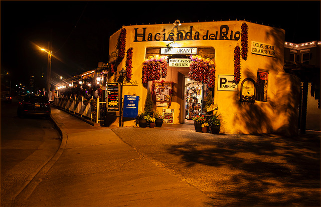
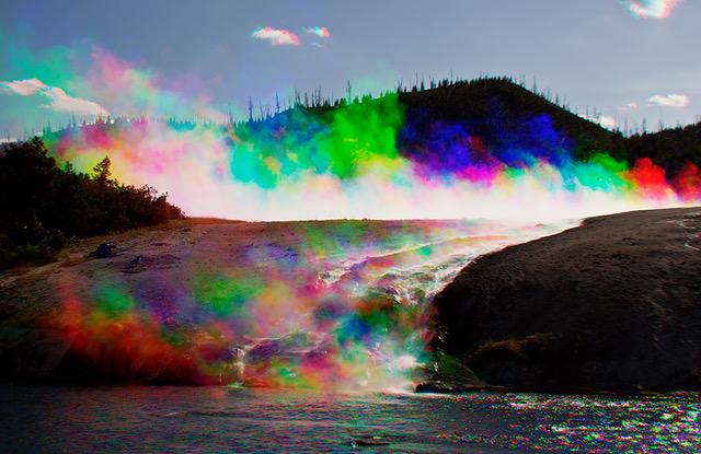
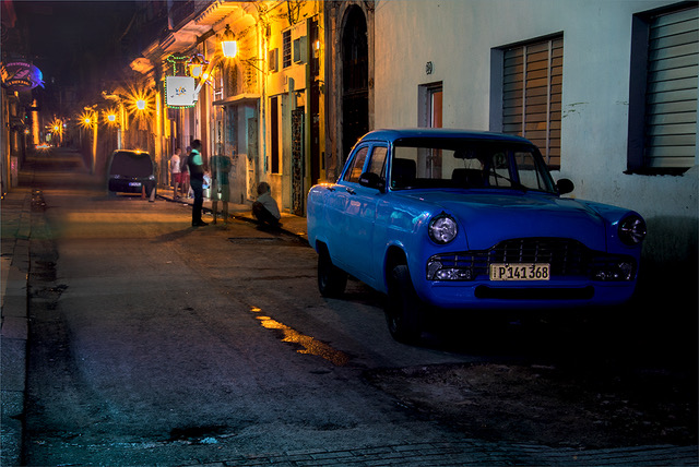
Very nice capture and composition Marti, plus the bonus of rainbow colors, created by the water. Unfortunately, you did not capture more of the fire truck. |
Jan 7th |
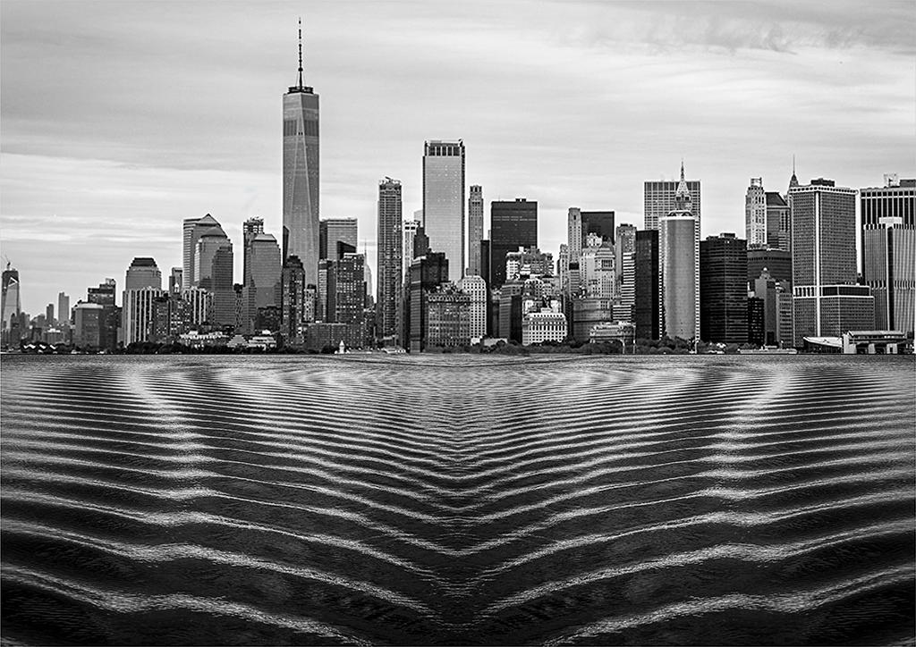
| 22 |
Jan 19 |
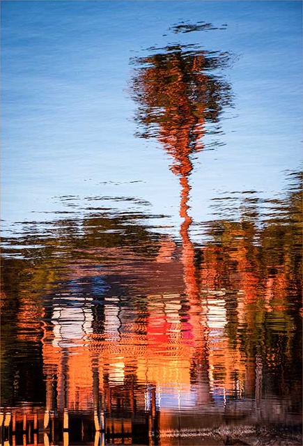
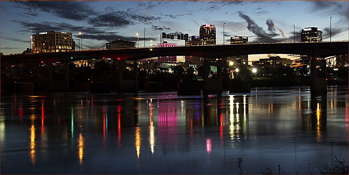
Comment |
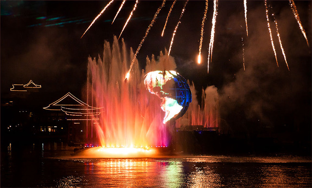
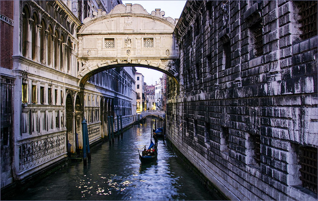
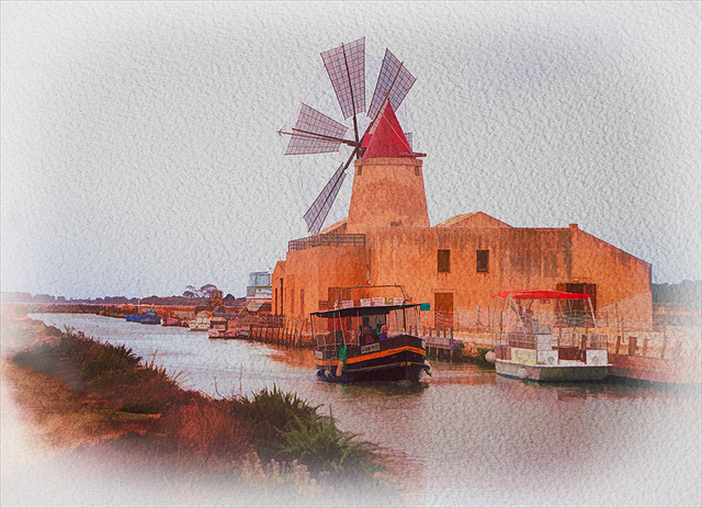
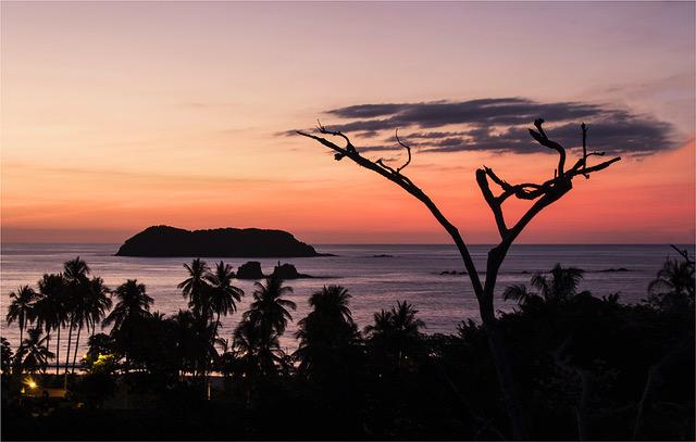
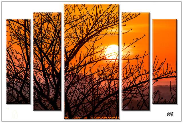
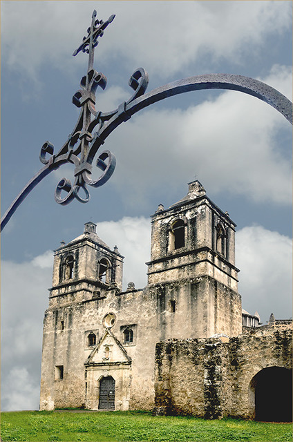
Peggy, this is a lovely, lovely picture and a colorful location, which I hope you have the opportunity to explore in various ways. You chose the best time of the day to photograph, when you still have glow in the sky. I definitely suggest to eliminate 50% of the sky (which is not as interesting as the reflections) and extend the foreground beyond the tips of the reflections; giving you longer leading lines to the subject. Leave the tips of the grass in the right bottom corner in, they fill in the negative space. I would not crop from either side. The longer panel, gives more strength to the image and the reflections on the water hold everything in place. The only thing I would eliminate is the bright sign by the left edge. Needless to say, the unfortunate thing in this image is the overpass or bridge, which does nothing, but damage the scene. Now I suppose that you could get a picture of the buildings from under the overpass/bridge and then superimpose that picture over the overpass, yes?!?
|
Jan 7th |
 |
10 comments - 1 reply for Group 22
|
| 34 |
Jan 19 |
Comment |
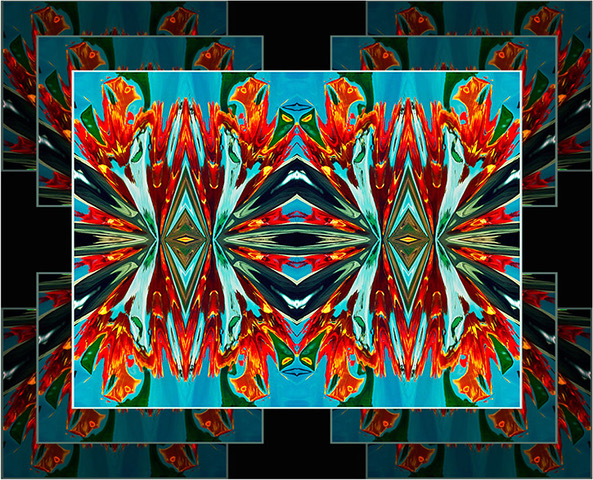
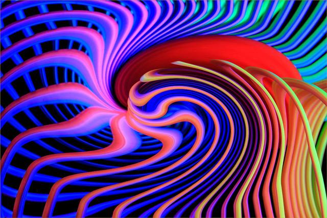
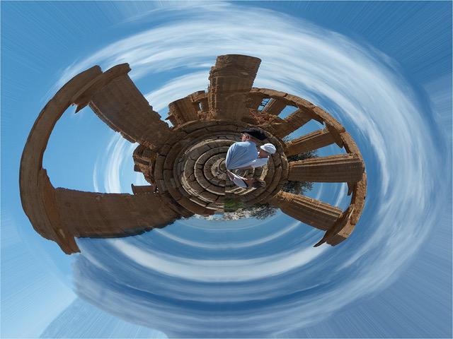
Hello Candy, I am also visiting to tell you how impressive your creation is. How did you ever think it? It is very nice of you to share your technique. I am tempted to try it. Congratulations! |
Jan 15th |
1 comment - 0 replies for Group 34
|
11 comments - 1 reply Total
|