|
| Group |
Round |
C/R |
Comment |
Date |
Image |
| 22 |
Jul 18 |
Reply |
Glad you like the result of my attempt. Yes, I agree and I neglected to mention the cloning effects, but I just wanted to see what could be accomplished. I would suspect that you have ather pictures of the same area. I would then take parts of the other pictures to make the picture olmost perfect. Naturally, an image like athis would not be useful for exhibition, but as part of a story, most of the time the imperfections are not noticed. |
Jul 14th |
| 22 |
Jul 18 |
Comment |
Peggy, I must admit I was challenged by your image. So, I increased the image to 500%, this gave me more background trees to work with. I selected roughly the two top images and below that. inverted the selection and cloned in the background trees, the tent and a few other distractions. I then went back and worked on the heads of the two ladies (top right), to make them more realistic.
Still not satisfied and disturbed by the man in the lower left. I saved what I had done and went to work on the man. I selected him and with Layers>New>Layer Via Copy, I placed him on the side. Again, by Cloning, I eliminated the original figure of the man. Then I took the selected image of the man, reduced him a bit and placed him behind the horse. To finish the tail end (he, he), I cloned in part of the tail. Yes, yes, the tail end is not sharp. well that is because it was in motion. Hope you like the result; at least at first look.
|
Jul 13th |
 |
| 22 |
Jul 18 |
Comment |
Marti, you have done an excellent job of converting this image into B&W. I love the crispness and the cold feeling it conveys. Yes, by all means consider cropping at least 50% of he sky, but leave the rest alone. The eye needs that foreground, middle ground and background to flow through. I would consider toning down only the lower mountains a bit, just to give the barn a little more separation. As I look at the picture, I am very much aware of the stroke. I would reduce at least 50%. |
Jul 13th |
| 22 |
Jul 18 |
Reply |
Yes Jerry, the image was hand-held with the Canon 50D and Tamron 18-250mm lens, ISO 200 F4.5 1/250 sec. Color is untouched. I left more room on the left, just to get it off center. Thank you for all the nice comments and for seeing the V and the M.
|
Jul 11th |
| 22 |
Jul 18 |
Comment |
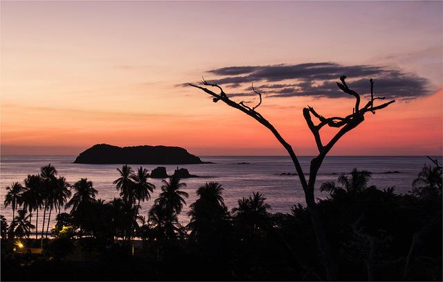
Kaylyn, will you be going back to this place? I love the way the right branch almost curves with the mountain in the background and the tip just clears the tip of the smaller mountain and a bit lower angle would have eliminated the merger of the left branch with the background. But if you are not planning to return there, I am sure you can improve this composition. Giving all the suggestions you have from the others, it should help. If you are not going to use this as a Nature picture, you may consider eliminating the stump near the left edge.
|
Jul 11th |
| 22 |
Jul 18 |
Comment |
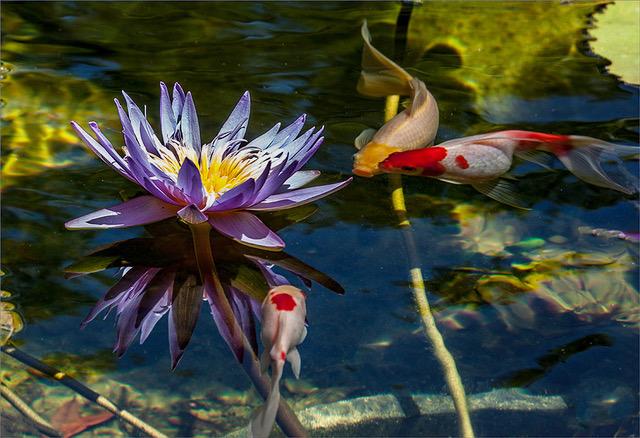
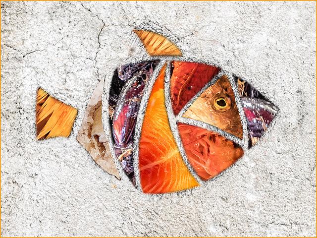
These are fun pictures and in this case, the water background, give it a sense of realism. Yes, by all means, if you can tone down the background, the fish would stand out better. I too would eliminate the distraction of the fish head on the left edge and I am not bothered by the cut-off tail, but I would extend the right side background. Fish move very quickly and here they look like they are boxed in and need more space.
|
Jul 11th |
| 22 |
Jul 18 |
Comment |
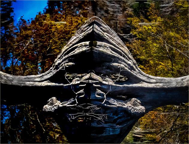
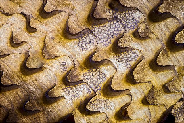
What a Nature's creation find! Compliments in seeing this and capturing it. Here is one of the times when centering is perfectly acceptable. You have lovely tones and colors and the sharpness really brings out the texture of the tree bark. Also nice little touch of the three leaves on the left of the foreground tree. I would consider calling this: "Double U" or "Double V" or "W".
|
Jul 11th |
| 22 |
Jul 18 |
Comment |
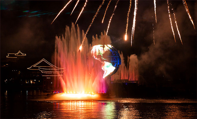
Jerry, for me, color is generally what makes fireworks stand out. However, without seeing the original, this is a beautiful set of fireworks. All the bursts are sharp and clear and you filled the frame very nicely. I think that this image can be improved by flipping it from left to right. Since you also like to experiment, what about making two other copies, one Blue and one Green, then blend the three images off-register to each other and see what you think of the results.
|
Jul 11th |
| 22 |
Jul 18 |
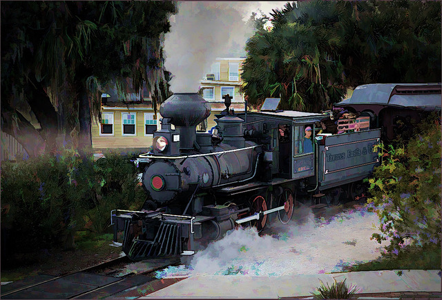
Comment |
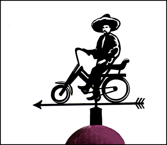
Peggy, considering the action taking place, it is amazing how sharp the horse and rider are. The color tones are very good and the horse is off all fours. The spectators are all part of the scene. I do wish the man on the left bottom was further back or smaller. As for the spectators on the right, my suggestion is to carefully select the lady with the blue top and the lady with the baby and below that. Then Inverse the selection and fill in the top row of spectators with background green trees. What is most disturbing to me is the white tent. With careful selection of the hat and hand of the rider, I would also fill in the tent area with green tree background.
|
Jul 11th |
7 comments - 2 replies for Group 22
|
7 comments - 2 replies Total
|