|
| Group |
Round |
C/R |
Comment |
Date |
Image |
| 4 |
May 18 |
Comment |
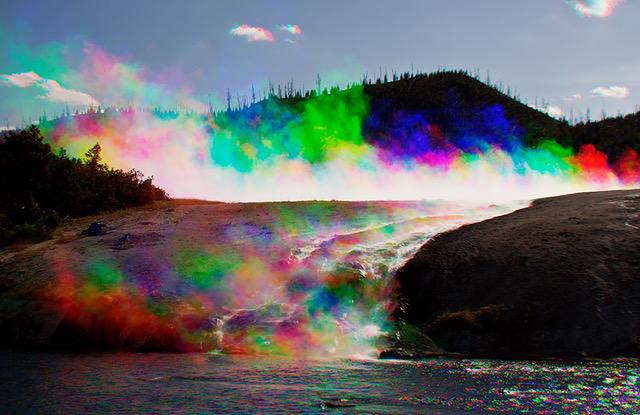
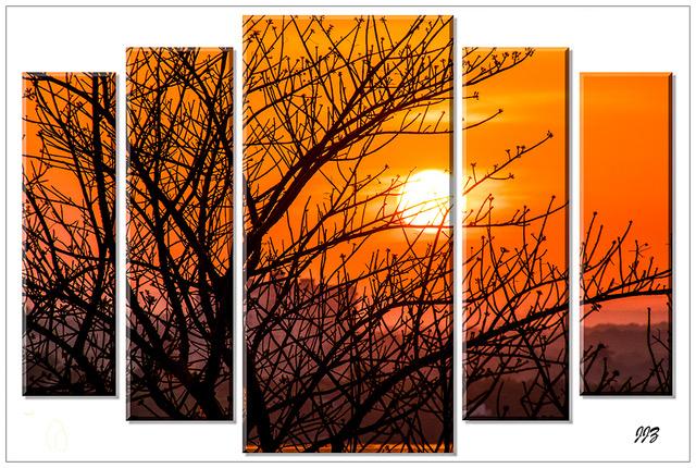
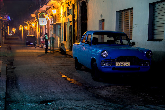
Hello David. I am impressed with your presentation and I thank you very much for your appreciation and multi-kind-words of my picture (Gp. 22). After seeing your beautiful image, I can understand why you liked my picture so much. We share a passion for color. I think the squinting and the hat, greatly compliment your creation. Good luck for continued success.
|
May 10th |
1 comment - 0 replies for Group 4
|
| 5 |
May 18 |
Comment |
Barbara, this is fabulous, even with the soft edge. |
May 31st |
1 comment - 0 replies for Group 5
|
| 21 |
May 18 |
Comment |
Nancy, you say that you lack the ability of expressing yourself with words, but if true, you certainly make it up with your vivid imagination. I compliment you for taking an almost unusable image and turning it into a story-telling image. I wish I had half of your imagination... To further improve your composition, I agree with Joan and Marie. By eliminating the blue horse and turning the white horse to blue, you may see a great improvement. |
May 26th |
| 21 |
May 18 |
Comment |
Great idea and well done Joan, but what about making a more patriotic version, by using three balloons, red, blue and white? Also, the statue appears a bit confined, allow for more space on the sides. |
May 26th |
2 comments - 0 replies for Group 21
|
| 22 |
May 18 |
Reply |
Peggy, if you are interested in trying the Harris Shutter system, I will be glad to share some ideas which may help you to get started. |
May 27th |
| 22 |
May 18 |
Reply |
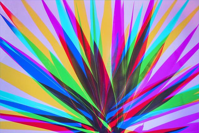
Jerry, not sure if you are asking me this question or if you are looking for a scientific answer, but all I can say is that RGB colors are considered as primary additive colors and that perhaps they are not the primary colors when the primary colors are the subtractive colors, which are: Cyan, Yellow and Magenta. If you have another answer, I would be interested to know it. |
May 26th |
| 22 |
May 18 |
Comment |
Jerry, my compliments on your revisualization and technique with great results. Two things I like to point out with the hope of making this even better. Crop more from the top and create a longer foreground. Also, can you expose more of the feet? They appear to me as if they are sinking into something. |
May 10th |
| 22 |
May 18 |
Reply |
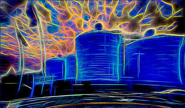
Hello David. Thank you very much for your appreciation and multi-kind-words. After seeing your beautiful May Picture, I can understand why you liked my presentation so much. We share a passion for color. I have done these images for many years and under different lighting conditions and the results are usually amazing. Thank you and good luck with your creations. |
May 10th |
| 22 |
May 18 |
Comment |
Marti, your in-camera double exposure worked out well and I am sure you have a good start in creating multiple images. What disturbs me is the transparency of the plane with the background. I am wondering if perhaps you needed 1/3 exposure for the background and 2/3 for the plane. I also suggest that you either reduce the size of the plane or leave more space around the plane.
|
May 10th |
| 22 |
May 18 |
Comment |
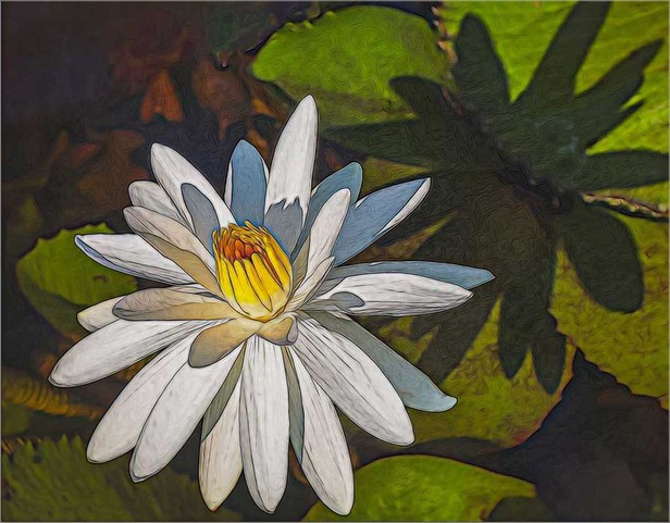
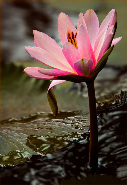
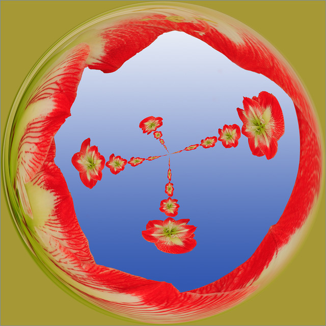
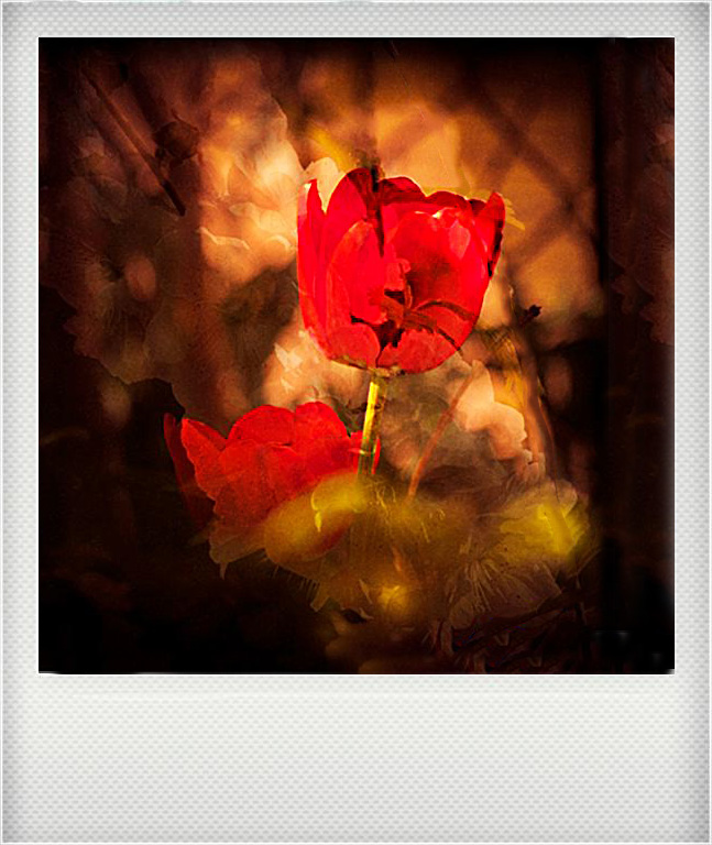
Peggy, although I am not an expert in blending, I think you also have a good start. Your idea and process is good. You have achieved your goal. I presume that the flower is intended to be the primary subject, but I do not feel that it stands out. Did you intend for the background to come through the flower? Most of these techniques are not as difficult as they look. So, if you are interested to be creative in this manner, I am sure we can be of help. |
May 10th |
| 22 |
May 18 |
Reply |
Well John, this is a good example of how each one of us see differently and how we are effected by each image. |
May 9th |
| 22 |
May 18 |
Comment |
John, your idea and blending looks good and by using three layers, I would say that you have fulfilled the assignment. However, I cannot help but wonder why you chose a busy background and did not eliminate the two strong sprigs on the left side and bottom left corner. In any case, if I may make some suggestions, I think this image can e improved. I first eliminated the sprigs with the Healing Brush. I then flipped it horizontally. I then centered it by shifting the image to the left and Filling in on the right with Content Aware and the Clone Tool. I think that in this case, centering the image and utilizing the negative space as framing and flipping the image, it gives a better visual appearance. What do you think? |
May 8th |
 |
4 comments - 4 replies for Group 22
|
8 comments - 4 replies Total
|