|
| Group |
Round |
C/R |
Comment |
Date |
Image |
| 22 |
Mar 18 |
Comment |
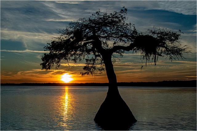
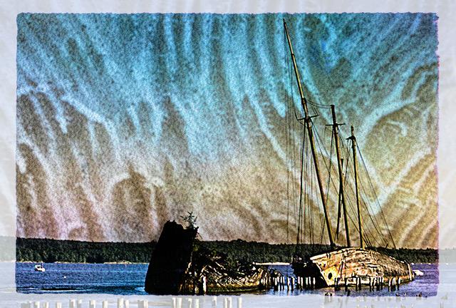
"Folding Sail" is a lovely and sentimental image. One that all of us can relate to and one that bring back many memories. At first look it gave me the impression as if the ripples in the water reflected into the sky, and I said to myself, 'how can that be?' Then I realized that it was the clouds that had the similar pattern as the water. I have no idea as to what are the chances of that to happen. Although this image may not go too far in the Internationals, it has much personal appeal. My sentiments go along with Peggy and Jerry. This is the kind of image that the entire image can be considered as the composition. The only thing that disturbed my eye is that the image is tilting a bit down on the right side.
|
Mar 24th |
| 22 |
Mar 18 |
Comment |
Mike, I would have called this: "Yum, yum!". The cropping and soft focus on the cranes work fine for me, but I agree with the sharpness of the coyote. You did not mention the shutter speed used. With a 400 mm lens, and likely hand-held, you probably need a shutter speed of 1000 or more. Yes Mike, stacking is not practical and especially hand-held, but by using two or three images (even hand-held), it gives the opportunity of placing one image over the other and with the help of Opacity, one can erase the unwanted parts of each image and utilized only the good parts.
|
Mar 24th |
| 22 |
Mar 18 |
Comment |
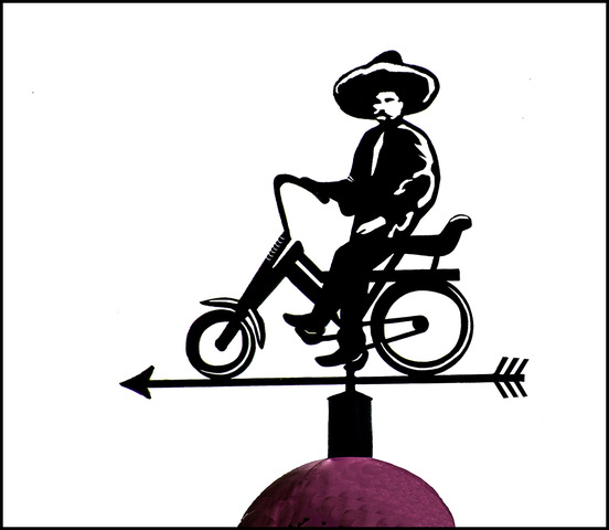
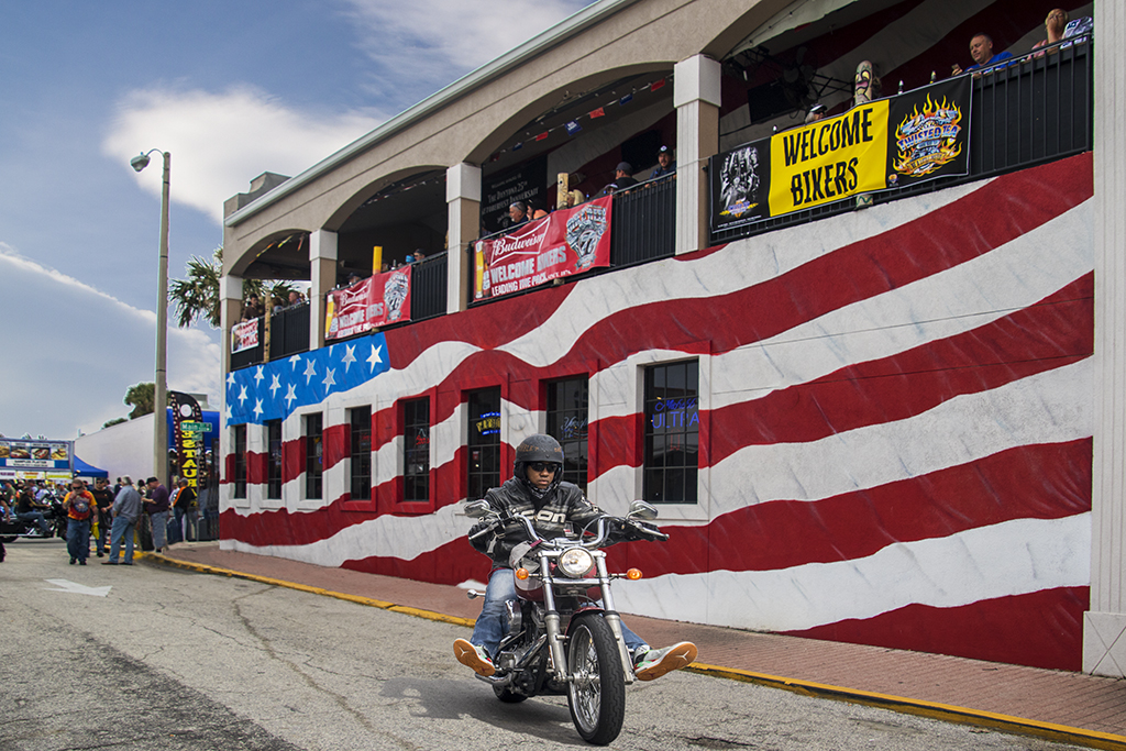
Thank you for all your encouraging comments and ideas. Yes, I am sure that all that you mention can be achieved. When working on something like this, I try to keep things as authentic as possible. When I first used the couple, it was because they were part of the scene; from another picture. The day was a bit cloudy and the couple were in the shade and no shadows, since the sun/light is on the other side of the building. Good point Jerry, they were going towards the action and yes, I probably could find a biker that would go towards the action, but this one is going away from the action because the painted white arrow on the street (you may have not noticed) shows a one-way street traffic. Yes, the lamp post can also be removed, but would it be realistic? Yes, the biker can be moved back and reduced a bit, but it would appear too centered in the image and further back he appeared too small to me. I hope this helps to clarify some of my thinking. |
Mar 24th |
| 22 |
Mar 18 |
Comment |
I also agree with all that has been said. With this type of picture, it is difficult to create a simple composition and eliminate distractions. To eliminate distractions in nature pictures, such as this, I carry with me two clothes pins tied to a string. One clip is clipped to a distracting branch or leaf and the other clip to another branch, pulled away from the camera view. Then the branch can be restored to its place without damaging anything. It is not always as simple, but most of the times manageable. I used Peggy's well cloned image to further eliminate other distractions and concentrate on the main set of leaves. I used the Clothing and Spot Healing Brushes.
|
Mar 24th |
 |
| 22 |
Mar 18 |
Comment |
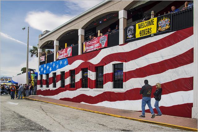
Well Jerry, you certainly put to good use your editing skills. Ditto on all the comments, but on the original I do not see red tablecloths in back of the horse, how did they get there? They are more distracting from the back of the horse, than in front. Also, the characters are too centered. It is always best to leave more room in front of any moving object and you do have more room in the original which you can use.
|
Mar 24th |
| 22 |
Mar 18 |
Comment |
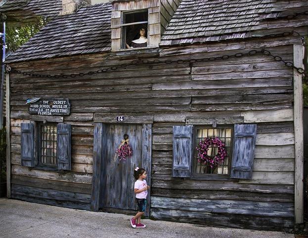
No question as to what the focal point of this picture is. I feel that the colors play a big part in creating that "fairy tale" look. I would love to see more of the foreground and the left side, since they appear to be the more colorful. To improve the composition, I would consider cropping from the top and right side since they are less interesting than the left and bottom. And for my picky part, there are two man-made items on the right and bottom left of the house that take away from the fairy tale look and I would try to remove them.
|
Mar 24th |
| 22 |
Mar 18 |
Comment |
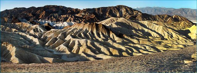
"Badlands" bring nice memories from our visit there during one of the PSA Conferences. I love how the colors popped out and what a contrast from the original. Like Kaylyn and Peggy, the foreground bushes start the eye to roll all the way to the background. You chose a good foreground for this scene. I flipped the image and found that the foreground leading lines from the bottom left to the right, kind of improved the composition, but it may be just a matter of preference.
|
Mar 24th |
| 22 |
Mar 18 |
Reply |
Okay Mike, as always, I like to please. First, the figures were selected from another flag background picture and placed exactly in the same location. Not sure how I could have made them look more realistic.
Second, here is a biker I tried to make it look as realistic as I could. Hope this is an improvement. |
Mar 13th |
 |
7 comments - 1 reply for Group 22
|
7 comments - 1 reply Total
|