|
| Group |
Round |
C/R |
Comment |
Date |
Image |
| 22 |
Feb 18 |
Comment |
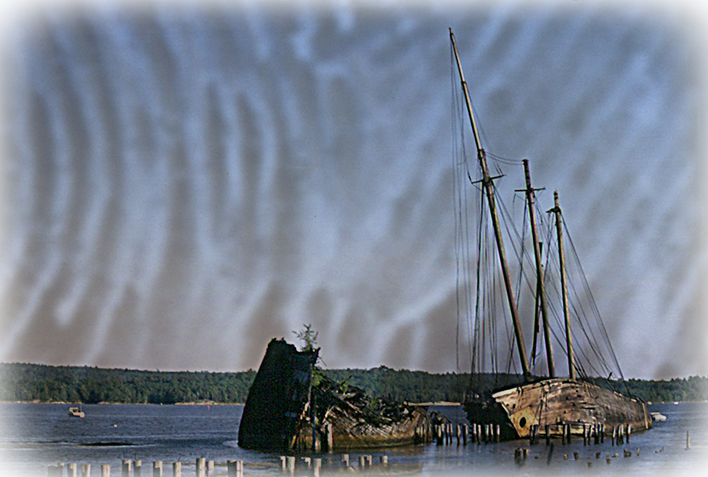
I have reworked my picture, by stretching the overlay, softening it and flipping it horizontally. I still wanted somewhat of an older look and this time I used Topaz Landscape White Vignette. |
Feb 18th |
 |
| 22 |
Feb 18 |
Comment |
Jerry, this too is a good combination and I love the way it appears that the light of the red clouds reflects on the grass. Although, I think that since most of the light is supposed to come from the background, it would help to tone down the grass area. Good job of cropping. |
Feb 17th |
| 22 |
Feb 18 |
Reply |
No 'hate' at all Jerry, just appreciation of your good points.
Peggy, great improvement with this version. |
Feb 17th |
| 22 |
Feb 18 |
Comment |
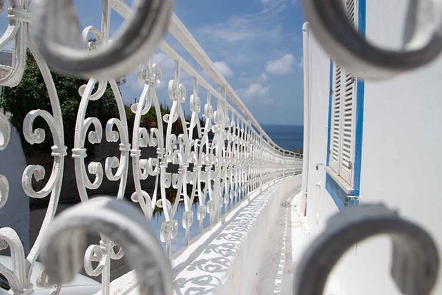
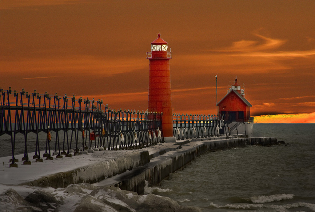
Marti, you have selected the perfect background for this image and you did a fabulous job of selecting, but there is a lot of cleaning that can be done, especially around the lights. I used the Healing and Clone tools. I think you overcropped the foreground, which lost the long sweep of the railing and that by reserving the image, you can appreciate the long sweep of the railing all the way to the cabin. Also by toning down the bright sky area and brightening the cabin a bit, the eye concentrates more on the lighthouses and the cabin. Your original also gave me the appearance of tilting to the right. |
Feb 17th |
 |
| 22 |
Feb 18 |
Comment |
Marti, I like picky. It helps to sharpen my eye. Yes, I agree with your observation, which was created by the Topaz Studio preset. Also, I note that the overlay shows more dominant than I intended it. It needs to be softer and not take away from the main subject.
Yes, the sky part of the picture was just blended in, but I did erase the bottom (picture part) to give the picture area more brightness.
But how does the overlay relate to the picture? Is it a good match? |
Feb 8th |
| 22 |
Feb 18 |
Comment |
I am simply suggesting to go to the Crop Tool > eye-ball the rotation with the Content Aware (on the tool bar) checked on and ok the check mark. As you can see, there is little or no obvious loss. |
Feb 8th |
 |
| 22 |
Feb 18 |
Comment |
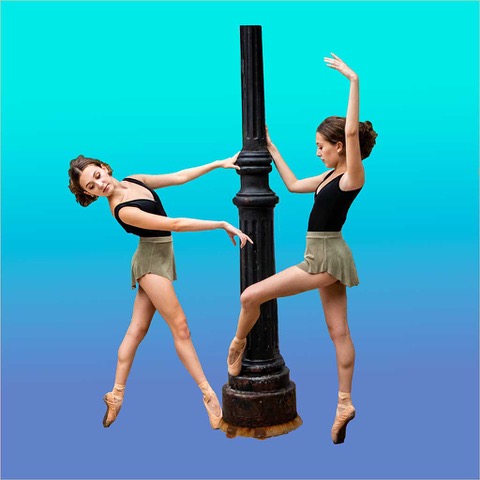
Well done Peggy. That is impressive work. I am most impressed on how clean the selection of the pole is. No one can tell unless you tell them. However, I think you can give this a better visual appearance by strengthening it a bit.
|
Feb 7th |
| 22 |
Feb 18 |
Comment |
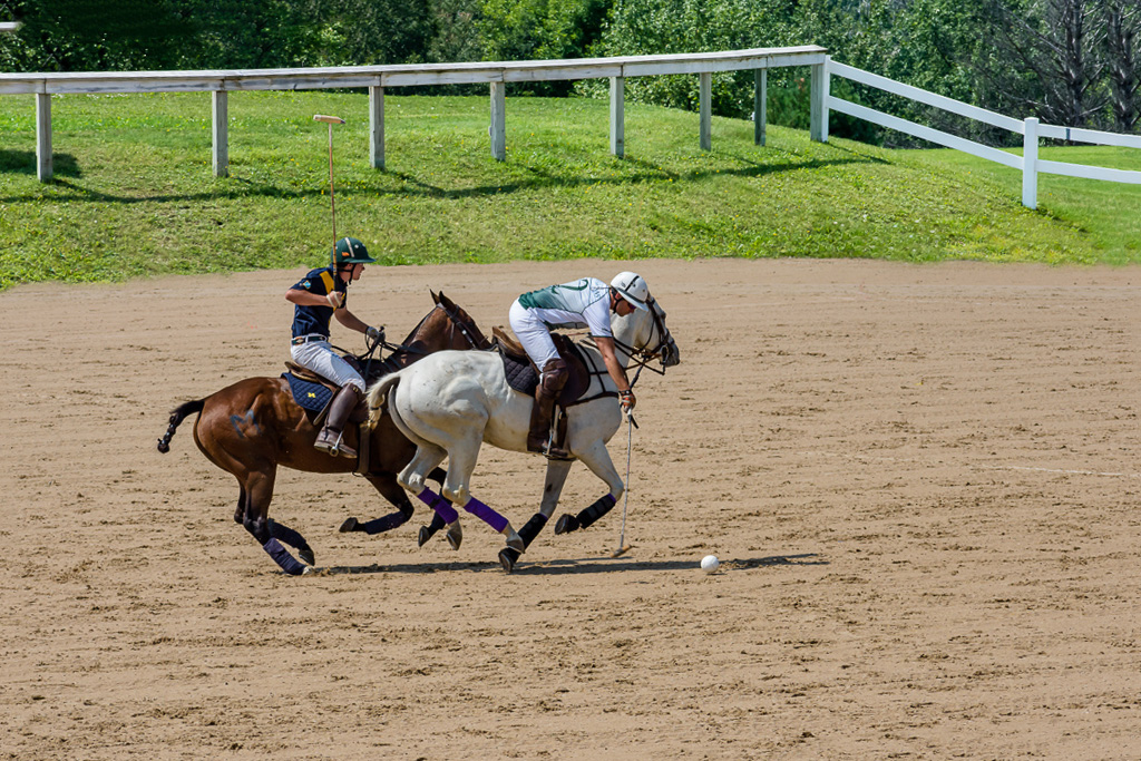
Kaylyn, perhaps it is not what you envisioned, but I think you did better than you think. The horse is nice and clear from the background. A lot of times, a blending is the result of a lot of trial and error. Select a background that does not have dark spots. or enlarge the background and/or move it around until it sits in the right spot. In other words, so that it does not complete with the main subject. I assure you, you will be happy with the next one. |
Feb 7th |
| 22 |
Feb 18 |
Comment |
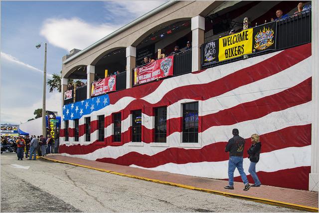
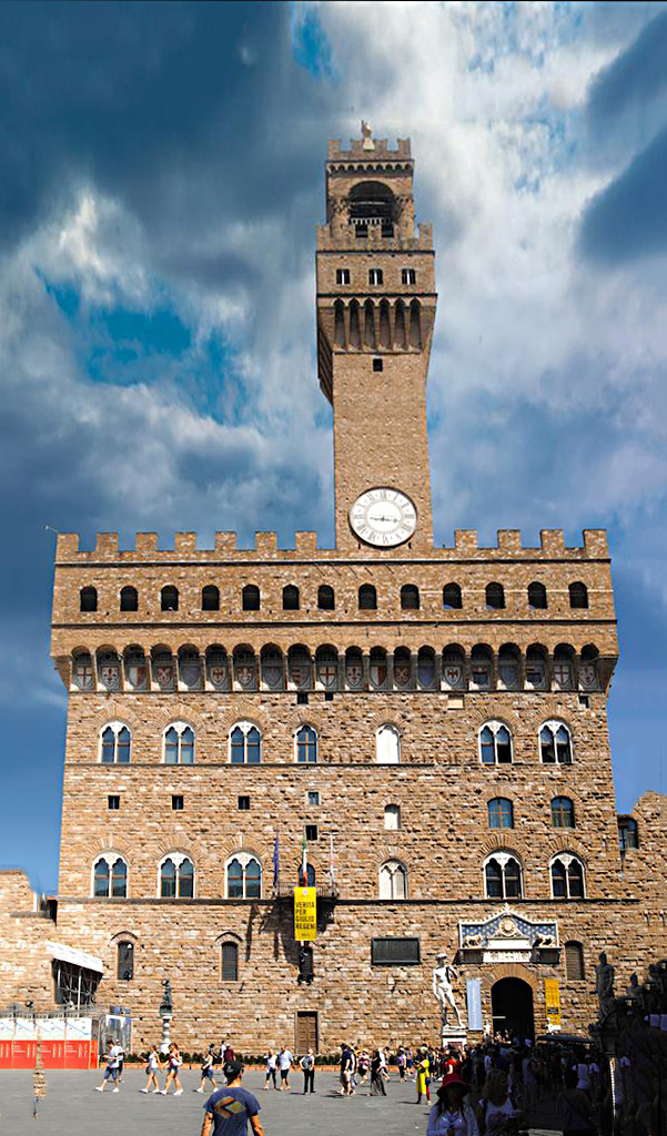
Well done John. No, no one will know unless you tell them. In addition, you brought out the color and texture of the building and now it is alive. Not sure if you want to consider this, but Select All > Edit > Transform and Skew, can help the Keystone. I filled in the bottom sides with the Healing Brush.
|
Feb 7th |
 |
8 comments - 1 reply for Group 22
|
8 comments - 1 reply Total
|