|
| Group |
Round |
C/R |
Comment |
Date |
Image |
| 22 |
Nov 17 |
Reply |
Yes Mike, we cannot always have what we want. It is amazing you got what you did under those conditions. |
Nov 27th |
| 22 |
Nov 17 |
Reply |
Thanks for catching that Jerry and thanks for the heads up... he, he, he! |
Nov 27th |
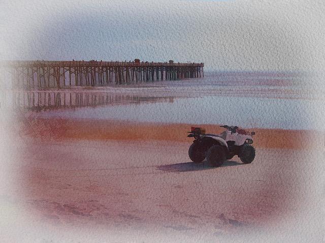
| 22 |
Nov 17 |
Reply |
Good point (pun intended) Marti. Thanks for filling in the point. I did wish that I had more pier to get the point in, but I did not take the time to finish the job. |
Nov 27th |
| 22 |
Nov 17 |
Comment |
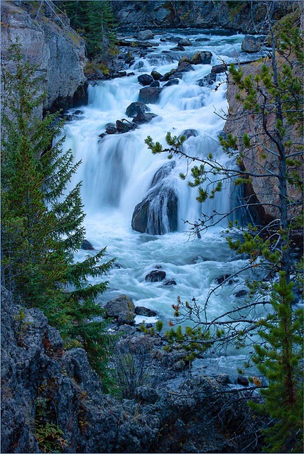
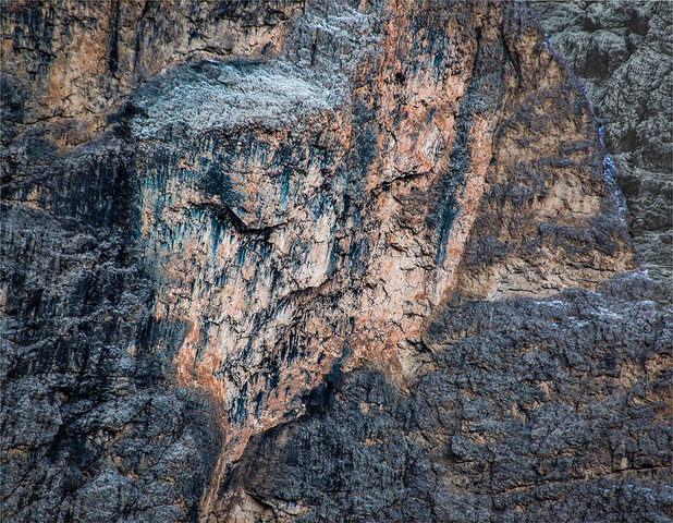
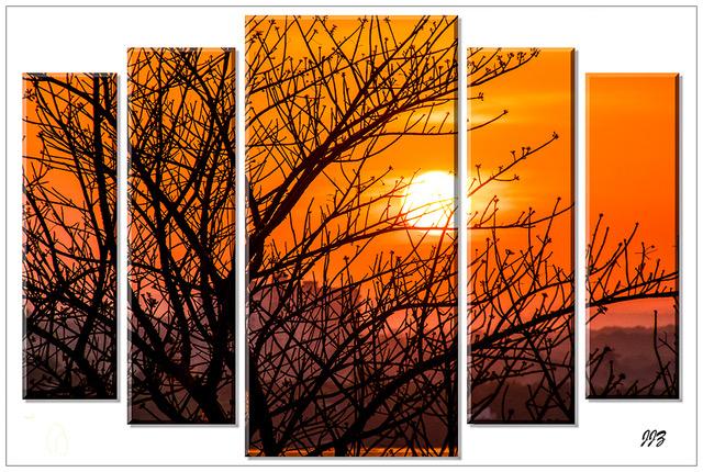
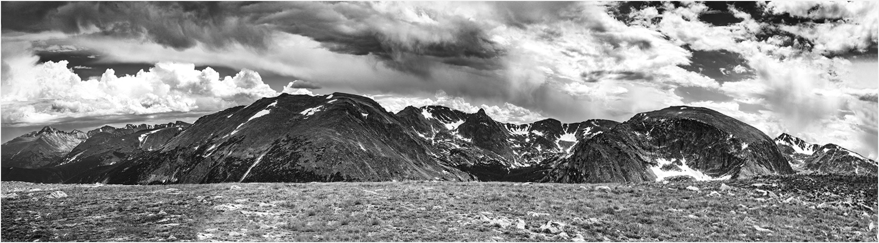
Lovely scene of the Rocky Mountains. Photoshop does a beautiful job of stitching and it is so forgiving. The curve is some time created by the way the images are captured (I think), but some of it can be corrected with the Transform and Skew tool or using another PS format instead of Auto. I prefer the color image because the Mountains are the eye-catching element. In the B&W version, I see the powerful clouds as the overpowering element. If you want to stay with the B&W version, I suggest that you crop about 50% of the clouds, which would bring the eye towards the mountains. My version is just a suggestion. |
Nov 10th |
 |
| 22 |
Nov 17 |
Comment |
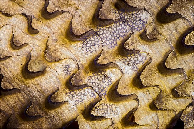
Another good catch Mike. You must have these Goats trained. (I would have thought these were some kind of Sheep and not Goats.) Yes, the light is just great. I love how all three are looking almost in the same directions. I also love that the first one is sharp, the second softer and the third even softer. The background is a bit disturbing to me, but if you are willing to darken the bright center are, it may be less noticeable. Kind of cloning the right corner and pasting it right on the bright area. Where I think you missed the boat (or the wagon in this case) is that you did not capture the lovely leading lines of the shadows, leading the eye right to the Goats. |
Nov 10th |
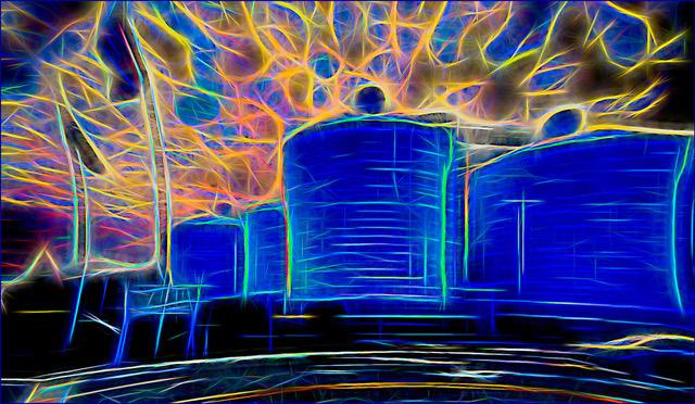
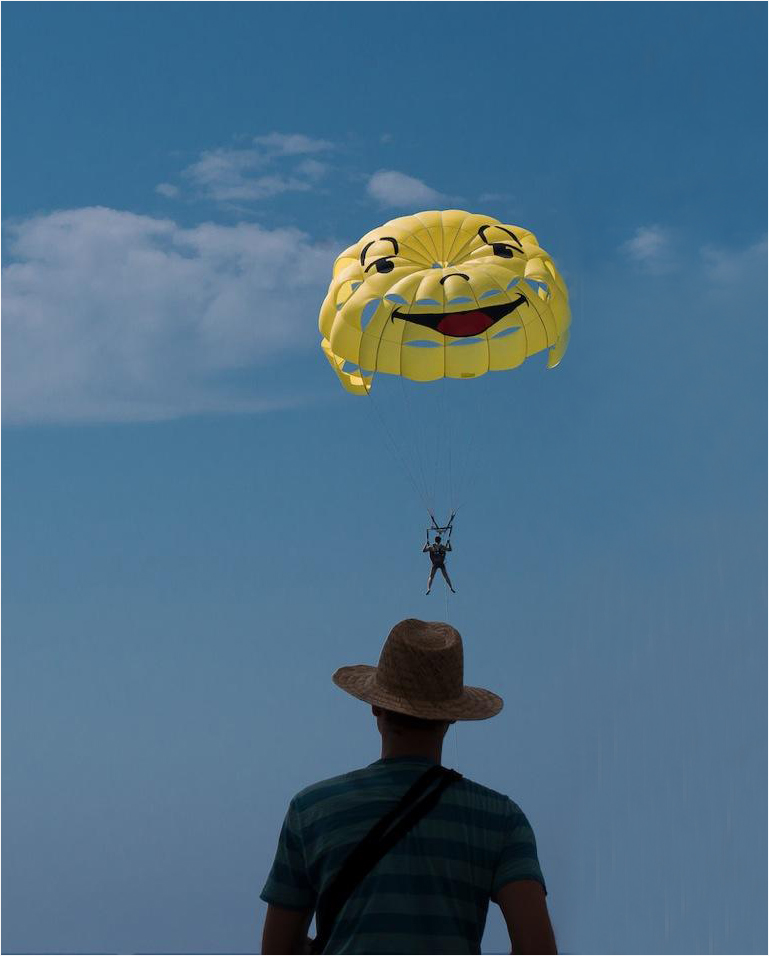
| 22 |
Nov 17 |
Comment |
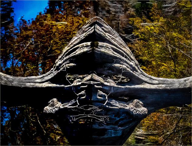
Nice catch John. You may consider calling this: "Smiling Jack". No, I do not think this is a composite. However, I would consider removing the distracting structure on the right and cloning in the same sky and try to reproduce those faint little clouds. Here is my idea if you like to consider it. To remove the structure, I cloned from the left and cleared the structure little at the time. I used the clone tool in order to maintain the tones of the sky. Does this help?
|
Nov 10th |
 |
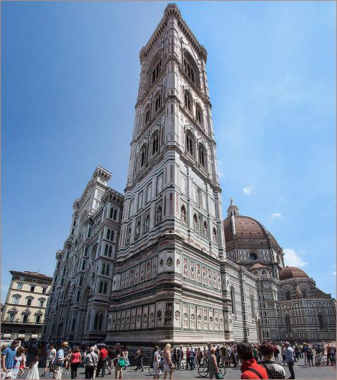
| 22 |
Nov 17 |
Comment |
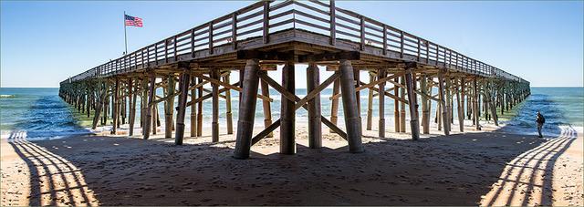
Good idea to convert this to B&W Jerry. In this way, the eye can concentrate on the various shapes and texture of the tower. It was also a good idea to crop the right sky. This way, you give the illusion that there is more tower on the right. All major lines lead to the man hanging out on the left. Sorry about the sad ending to your story. |
Nov 10th |
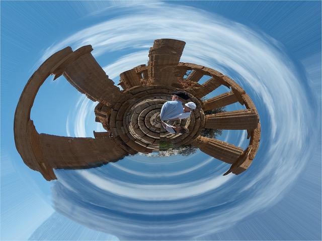
| 22 |
Nov 17 |
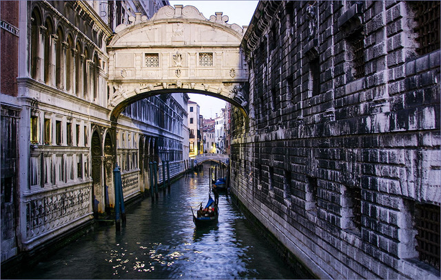
Comment |
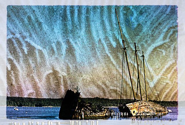
You have a strong diagonal line, complimented with other lines and triangles. Like Mike, I am lost trying to find a focal point. Perhaps blending in a moonrise or another boat, at the far left, could lead the eye to something. Just as an idea, I used one of my moons and used the Burning tool to brighten the sky and water. I see you cropped out the people on the right, but I think they are the only thing that bring the eye back into the image.
|
Nov 10th |
 |
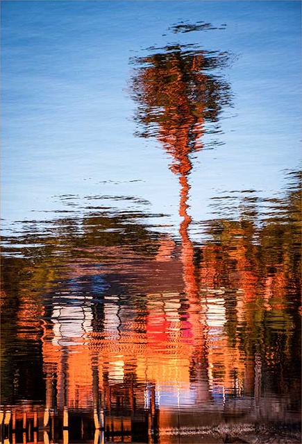
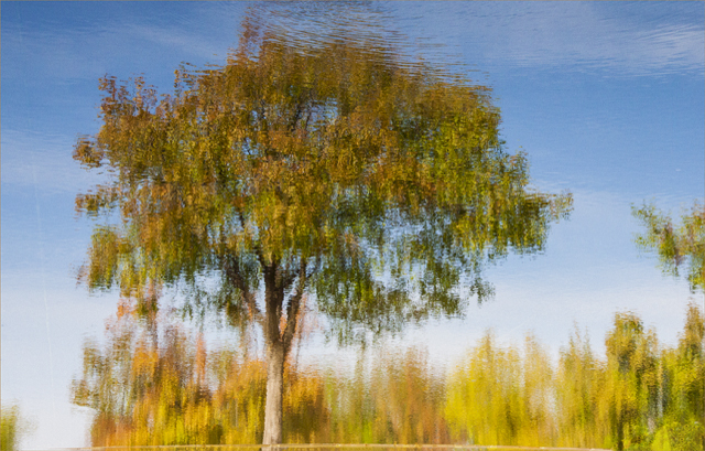
| 22 |
Nov 17 |
Comment |
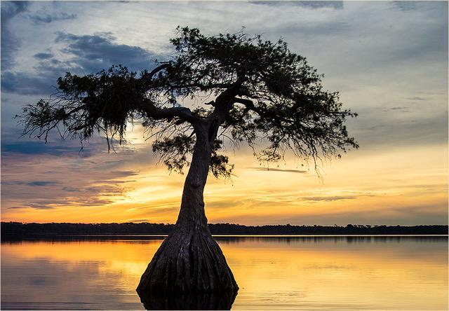
It appears that you were there at the right time, Marti. I love reflections and I hope you took lots of them. This scene is so rich, the I think the two images compete with each other. You have beautiful colors and composition and I am not sure that a B&W conversion would improve it, but you must try and see. Yes, brighter is better. As you can see, Vicki's version has more life.
|
Nov 10th |
6 comments - 3 replies for Group 22
|
6 comments - 3 replies Total
|