|
| Group |
Round |
C/R |
Comment |
Date |
Image |
| 22 |
May 17 |
Reply |
Okay John and Vicki, as much as I can appreciate what you are saying, I did not suggest to crop the top because I do not like it, I suggested it in order to create a focal point that the eye can go to. Without the cropping then, please can you tell me what the focal point is? And how many stories are we going to tell with this picture? |
May 28th |
| 22 |
May 17 |
Reply |
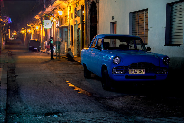
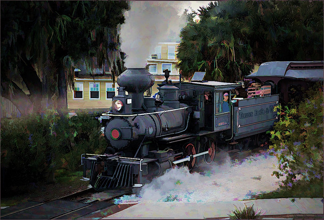
Thanks for catching that Vicki. 15 sec exposure is correct and John, I used a long exposure in order to illuminate the front of the car with a flashlight. Yes, I agree that the front of the car should be brighter and it was on my final image. |
May 28th |
| 22 |
May 17 |
Reply |
Thanks Peggy, I will consider that. |
May 16th |
| 22 |
May 17 |
Reply |
Yes Marti, it could show brighter, but it was brighter in my final version. |
May 16th |
| 22 |
May 17 |
Comment |
This is a very contrasty location and difficult to photograph at any time of day. I too would have a tendency to select the warm #1, but I admit that I also like the #2 version. I prefer the two originals, because they are more vivid and they have more life. The gazebo is the subject, but it is kind of lost between all the shadows and the trees. I believe that the picture here is in the reflection, but it would have to be on bright sunny day, with the water in the shade and with the fountains not running. All is in the eye of the beholder.
|
May 16th |
| 22 |
May 17 |
Comment |
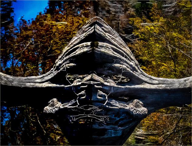
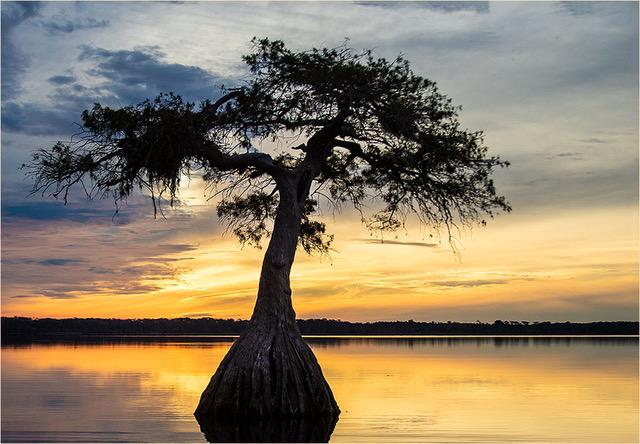
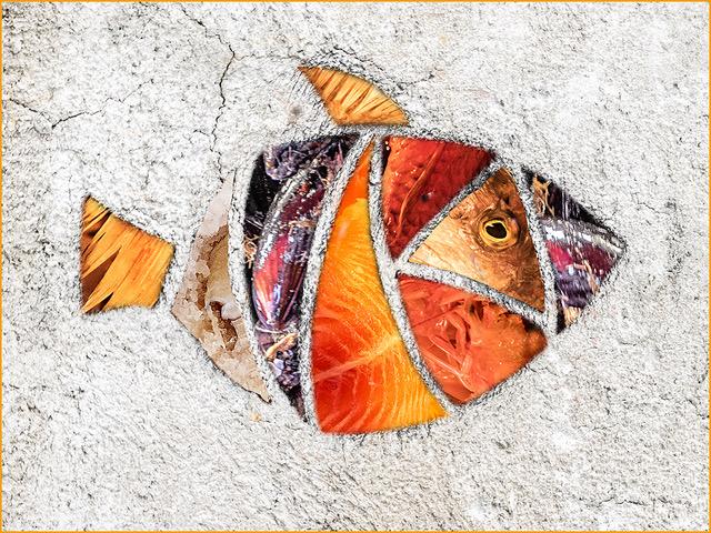
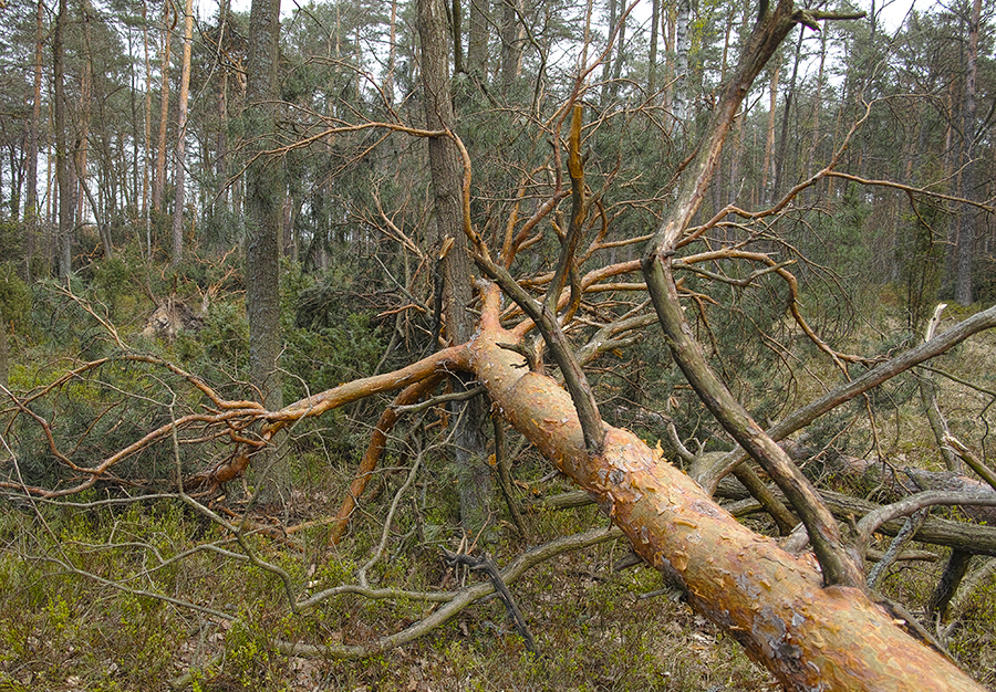
John, first of all, I want to compliment you for giving yourself a project to work with. This picture by itself may not tell much, but a group of fallen tree pictures could make an interesting and informative presentation. Although there may not be much interest in this subject, it is part of our lives and one that effects our lives… The colors and sharpness and the texture of the tree trunk, are just perfect for me. The strong leading line of the tree takes us to the middle ground and background, revealing the cluster of the forrest. As a nature picture, I would not temper with it in any way. The only improvement I would recommend is to crop a bit from the bottom (as I have done); mainly because it is generally not pleasing to have strong lines coming in or going out of corners.
|
May 16th |
 |
| 22 |
May 17 |
Comment |
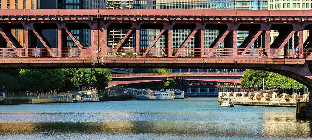
Peggy, I too think you did a beautiful job of bringing the colors out in this picture. Our visit to Chicago was during the 1997 PSA Chicago Conference and from what I remember is that from either from one of the river cruise boats or from standing on one of the bridges, one can gather hundreds of compositions of scenics and abstracts. As much as I love the colors and abstracts of the buildings, I think that the composition can be improved by cropping out the buildings and letting the eye to go from the foreground bridge to the next bridge and finally to the boats in the background.
|
May 16th |
 |
| 22 |
May 17 |
Comment |
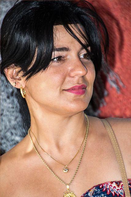
For me, this is one of those pictures that has that ‘yin and yang’ look. The more I look at it, the more I want to look at it; searching for meaning and relationships. Good color and nice selection of the hair and perfect blending. I would like to see the moon a bit more to the right and eliminate most of the negative space on the right, but sincerely, I am not sure if it would improve the composition. Well done Marti.
|
May 16th |
| 22 |
May 17 |
Comment |
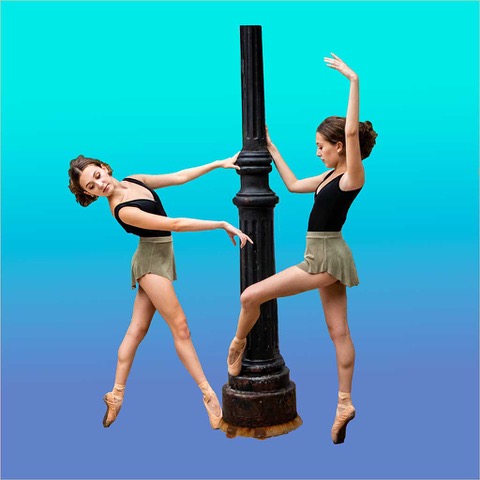
WOW Jerry, if you did not explain it, I would have never known it. It all looks very natural to me. The exposure on your subjects and background is just perfect for me and amazing sharpness on the subjects. I cannot see any flaws in the selections and I certainly could have not done any better. Congratulations, you can be proud of this one. |
May 6th |
| 22 |
May 17 |
Reply |
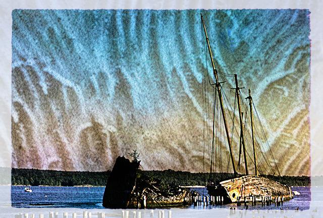
Thank you Mike for your observations. I also think that the pot-holes and the puddle in the foreground help to tell the story. |
May 5th |
| 22 |
May 17 |
Comment |
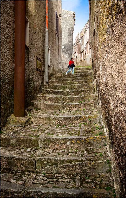
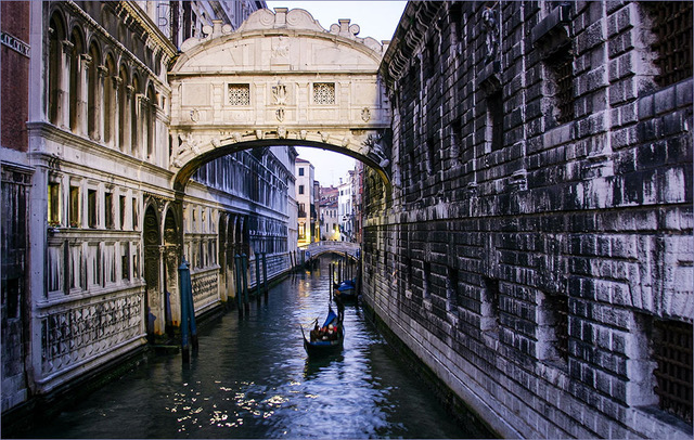
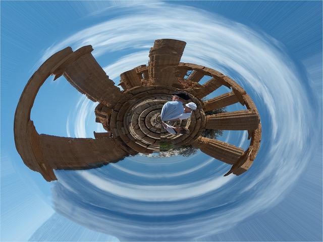
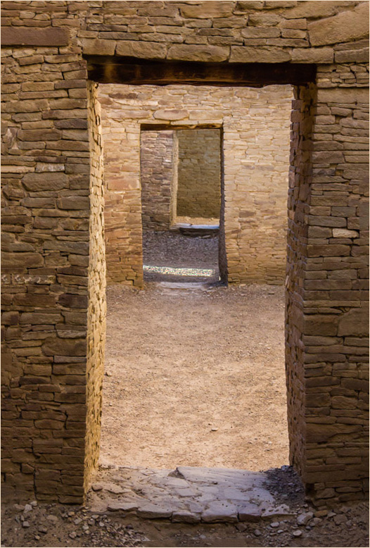
All types of tunnel images, always fascinates me. I am also fascinated by the texture of the stones and in spite of the course construction, I cannot help admire the craftiness and sturdiness of the construction, which has already proven to be longer lasting that many of our scientifically designed modern buildings… You did not mention it, but I wonder if you deliberately left the image slanted, which is fine if you are trying to emphasizes the uneven lines of the walls, but at the same time, I think it adds tension. I keep looking at the third and darkest wall, which is where my eye rests. My suggestions for improving this image are: First straighten it, then brighten a bit the third wall and then darken a bit the last and background wall. Also tone down a bit the sun spot on the ground. This leads the eye all the way to the end, making it more comfortable to look at and adding more mystery to the composition. |
May 5th |
 |
6 comments - 5 replies for Group 22
|
6 comments - 5 replies Total
|