|
| Group |
Round |
C/R |
Comment |
Date |
Image |
| 18 |
Jan 17 |
Comment |
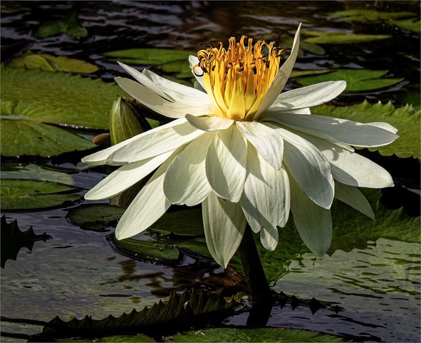
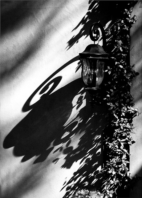
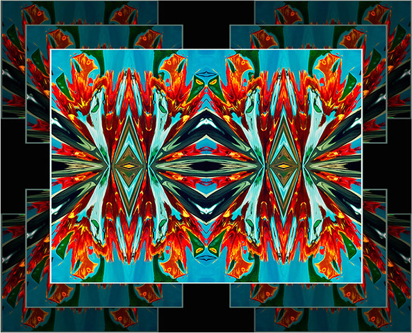
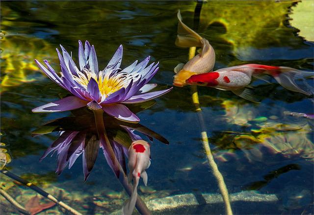
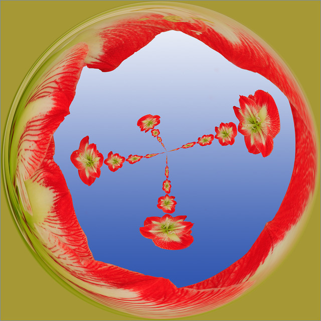
Hi Mark, missed you at the last conference. I enjoyed your idea and presentation. I agree with Bob, but you did not clarify if this was a blending or not. Since I see a reflection of the flowers onto the shell, I suspect that this may have been photographed as is. If it is a blending of two images, then I must compliment you on your skills of creating the reflections, which are just marvelous. |
Jan 16th |
1 comment - 0 replies for Group 18
|
| 22 |
Jan 17 |
Reply |
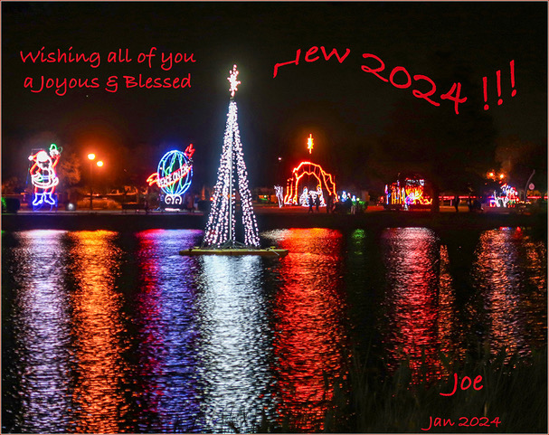
Thanks for confirming my suspicions Vicki. Although you used a short zoom, apparently the distance was too close to give the illusion of depth. |
Jan 16th |
| 22 |
Jan 17 |
Reply |
|
Jan 10th |
 |
| 22 |
Jan 17 |
Reply |
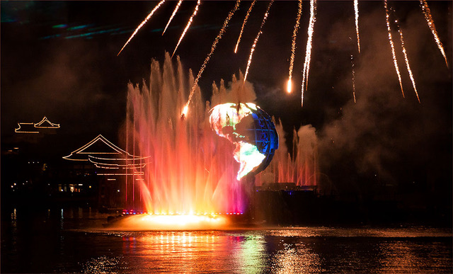
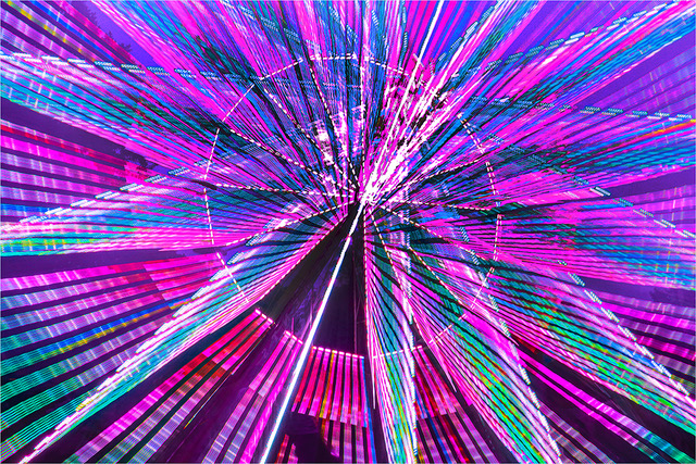
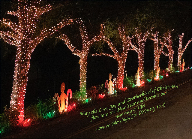
Jerry, since the only illumination came from the lights on the tree, the streaks recorded during the few seconds of the zoom, because they were the brightest parts of the scene. The dimmer lights have some streaking, but not as strong as the others. The tree, the gifts and the rest of the scene, were too dark to record during the zoom time, but they recorded during the remainder of the 25 second exposure, therefore, showing no zoom effect. At least, that is the way I see it. |
Jan 10th |
| 22 |
Jan 17 |
Comment |
I refuse to answer on the grounds that may show my ignorance.
Well done Vicki! |
Jan 9th |
| 22 |
Jan 17 |
Comment |
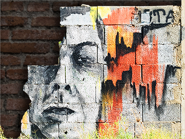
Vicki, first of all, let me say that you achieved a creative and beautiful effect and one to be proud of. However, I like to point out a few things which may help to improve your technique. The zooming effect was captured only in the lights and the reflecting lights on the window, but not on the tree, the gifts and the Friends picture. This means that you zoomed in and out for about 3-5 seconds, leaving the lens open for the remainder of the time. The star effect was created by the small lens opening and the long exposure; well done. As for your depth, I suspect you used a long zoom lens, which flattened your image from the foreground of the tree and the wall. A short zoom, perhaps would give you more depth. The only two flows I can see are: the Friends picture as a distraction to me and where my eye rests and no real focal point. The focal point in this scene should be the starting point of the zoom, which in this case is blank. You can easily correct this by placing the center of your viewfinder on one of the ornaments and zooming from there. Hope you find this helpful and that it will inspire you to do more.
|
Jan 9th |
| 22 |
Jan 17 |
Comment |
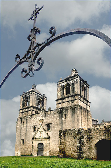
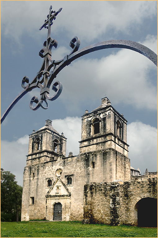
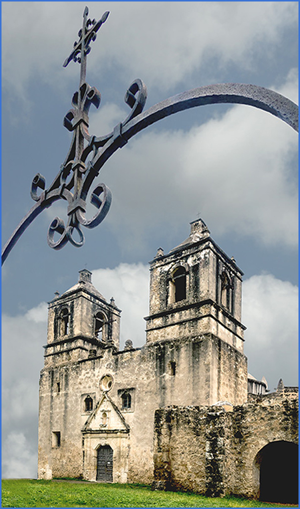
Okay, if it is trees you want, trees you will have. I took these trees from another Mission Concepcion image: Layer > New > Layer Via-copy > Move with Move Tool while holding Shift Key > size to scale. Mike, how is the grass now?
|
Jan 9th |
 |
| 22 |
Jan 17 |
Comment |
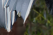
Wow Raymond, my compliments first on capturing this angle and second on the extensive work you did on your Anhinga. You have made the bird stand out beautifully and it is sharp. However, it appears that you accidentally added something that (although picky) caught my eye. In addition to Mike’s comments, the image would qualify for a pictorial exhibition and/or a photo essay. |
Jan 9th |
| 22 |
Jan 17 |
Comment |
Jerry, this is an excellent work of creativity and blending. The title is perfect too. I have a feeling that I have seen this before, was this picture in the PSA Journal or exhibition?… The idea, the composition and sharpness are perfect for me. Although, I do think that in color, it would have more human interest. |
Jan 9th |
| 22 |
Jan 17 |
Reply |
I did not see that, but could it be from the Burn Tool, when I was toning down the brightness around the flower. This treatment probably needs a Mask expert. Sorry about that. |
Jan 4th |
| 22 |
Jan 17 |
Comment |
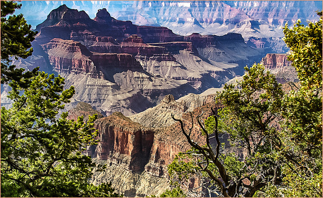
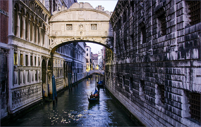
In my two quick visits to Venice, I did not notice this angle, but apart of all that has been said, I think that the foreground horse may have potential for some framing of the background horses. I’ll check it out if I ever get back.
|
Jan 4th |
| 22 |
Jan 17 |
Comment |
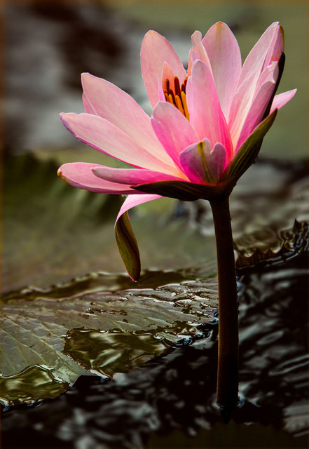
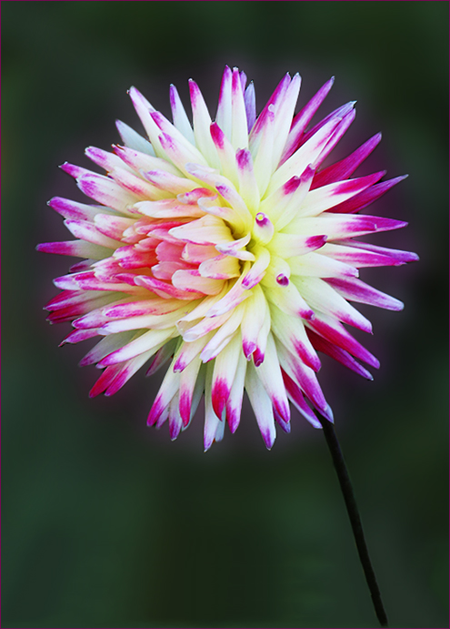
Excellent selection work Marti. I love how you brought out the color. I think this would be more realistic with a complimentary background color. It would also help to bring out the stem. Here is what I did: Using the original, I selected the flower, inverted and cloned out all the orange flowers and filled some black areas, then toned down all the bright areas with the Burn Tool, then applied the Gaussian Blur and more toning down where needed. I also extended the bottom with the Canvas Size and Fill.
|
Jan 4th |
 |
| 22 |
Jan 17 |
Reply |
Thanks Raymond, I will work on that. |
Jan 4th |
| 22 |
Jan 17 |
Reply |
I agree with your observations Marti. I lost the trees the I tried to straighten and extend the left side. |
Jan 4th |
| 22 |
Jan 17 |
Reply |
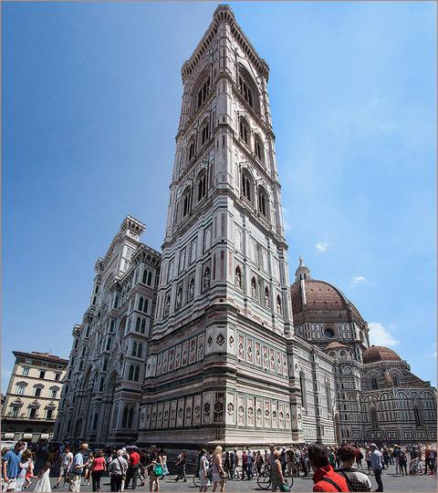
Thank you Barbara and Happy New Year!
I sized this image 768 px and always, H. 1024 X V. 768. I will be glad to size larger and whatever is appropriate.
I straightened the image with the right tower, but perhaps it can come forward more. I see the white and pinkish halo when enlarge the image. Hope this is better. |
Jan 3rd |
 |
7 comments - 7 replies for Group 22
|
8 comments - 7 replies Total
|