|
| Group |
Round |
C/R |
Comment |
Date |
Image |
| 41 |
Sep 17 |
Reply |
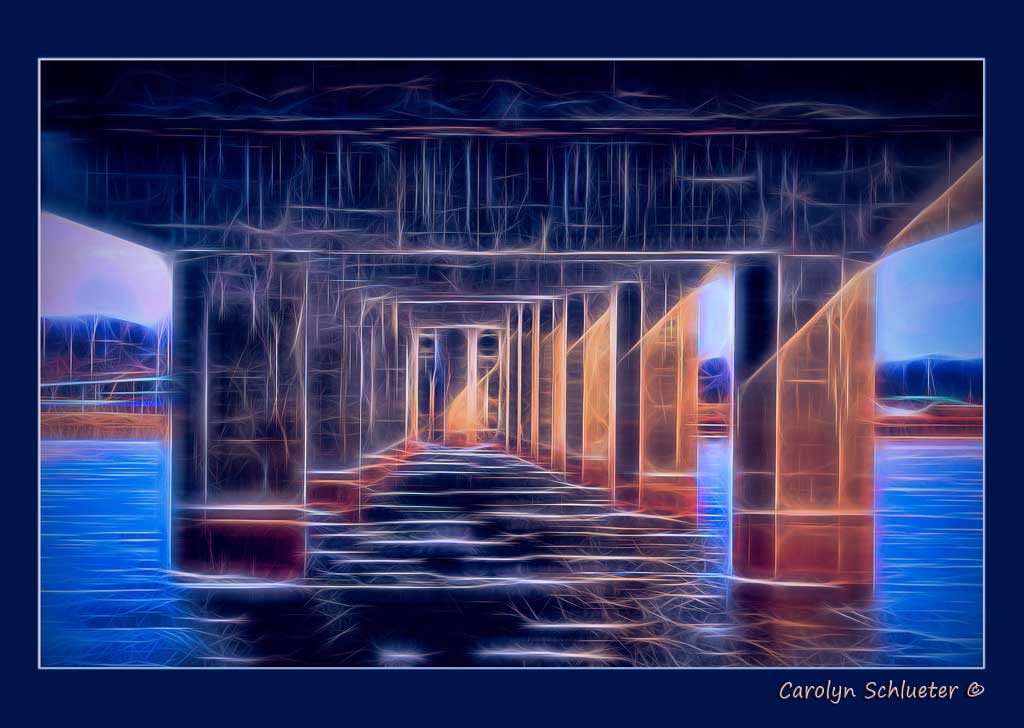
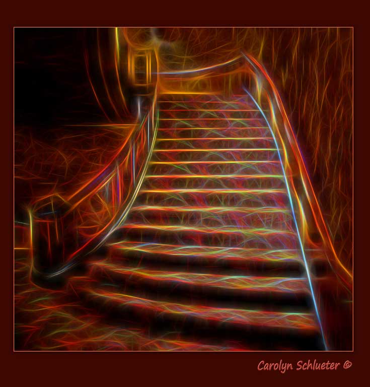
Thanks so much for your sage input Natalie. Yes .. definitely a black stroke and I like your suggestion of darkening the right hand wall so the staircase will pop more! That's the way the staircase is ... shorter on the left and longer along the wall on the right! Weird huh! |
Sep 16th |
| 41 |
Sep 17 |
Comment |
Oooooh!! Love your creation! Just beautiful and the only thing I would suggest composition-wise is to move the bottom of the stem so it is exactly centered at the bottom left of the photo to be tad more symmetrical. Would also tone down the very whitish top of the flower as my eye is drawn to that. Love the way you blended the two backgrounds and the inside stroke and drop shadow! Great job! |
Sep 15th |
| 41 |
Sep 17 |
Comment |
Wow Tony!! Love the pinwheel you have created from the butterfly's wing!! And am amazed how you were able to select it's antenna!! I have to say the second thing that caught my eye was the size of the butterfly flying out of the picture and feel if you are going to keep it in that the proportion needs to be the same size as the larger outside wing. Have you thought of just having the Mandala with a more textured or blurred background without adding the total butterfly? How you created the pinwheel is awesome!
|
Sep 15th |
| 41 |
Sep 17 |
Comment |
Like your choice of converting to a black and white! You might want to try selecting the entire bowl and adding a drop shadow for it to pop a bit more and love the background you have chosen! |
Sep 15th |
| 41 |
Sep 17 |
Comment |
Your final version has a lot of texture to it and it's a bit much for my taste as it kinda makes her neck look crinkley and wrinkly. I do like the way you burned the edges through the stroke ... cool. Personally my favorite is Original 2. Her thumb is a little too red but her skin tones are beautiful!! So are her eyes and I like that it is cropped tighter. |
Sep 15th |
| 41 |
Sep 17 |
Comment |
Thanks Yolanda. I have to agree with you that I should have used black for the outside stroke to keep the focus on the stairwell and the bleeding or smudge you see is the drop shadow effect.
|
Sep 15th |
5 comments - 1 reply for Group 41
|
5 comments - 1 reply Total
|