|
| Group |
Round |
C/R |
Comment |
Date |
Image |
| 7 |
Feb 17 |
Comment |
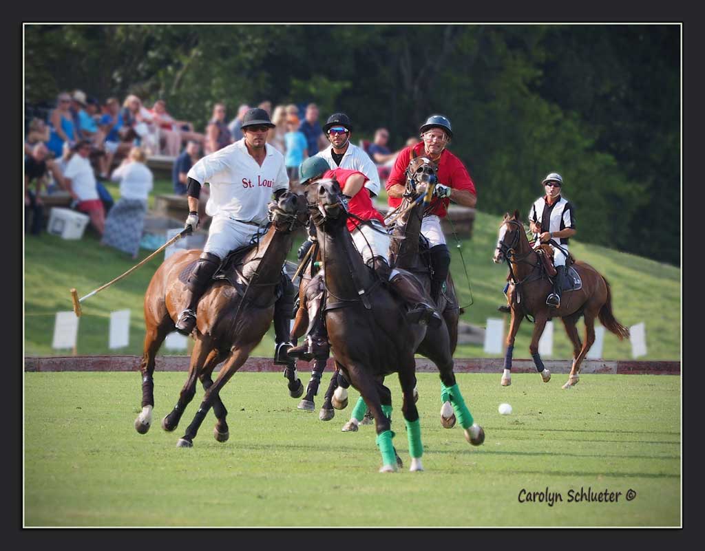
Great PJ shot with lots of action and the grouping of the three in the foreground and yup, Dad is checking the time! The colors really add to the impact of the image! |
Feb 10th |
| 7 |
Feb 17 |
Comment |
HI! Popping in for a quick comment! What a capture! The detail is amazing and you did a great job making all the lines of the buildings straight! Mesmerizing as you gaze into each office window! |
Feb 10th |
2 comments - 0 replies for Group 7
|
| 41 |
Feb 17 |
Reply |
Thanks Tony. I agree and would love to try the splatter brush technique but have never done anything like that .. think the end result would be very cool and artistic. May need Carol's advice on steps to do this! |
Feb 18th |
| 41 |
Feb 17 |
Reply |
Thanks Lisa. Great advice and this is what we did in our watercolor painting classes ... painted upside down and makes a big difference in the end result. |
Feb 18th |
| 41 |
Feb 17 |
Reply |
Like your suggestion for using the splatter brush like Carol does, but it seems so overwhelming to do! |
Feb 18th |
| 41 |
Feb 17 |
Comment |
Love all the gradient colors you have created and how the overall picture comes together and how you've achieved a totally balanced round segment, but I'm seeing too much dead space at the bottom. Think I would crop off a big part of the bottom and make the overall image appear a little closer so more detail can be enjoyed. Colors are gorgeous! |
Feb 10th |
| 41 |
Feb 17 |
Comment |
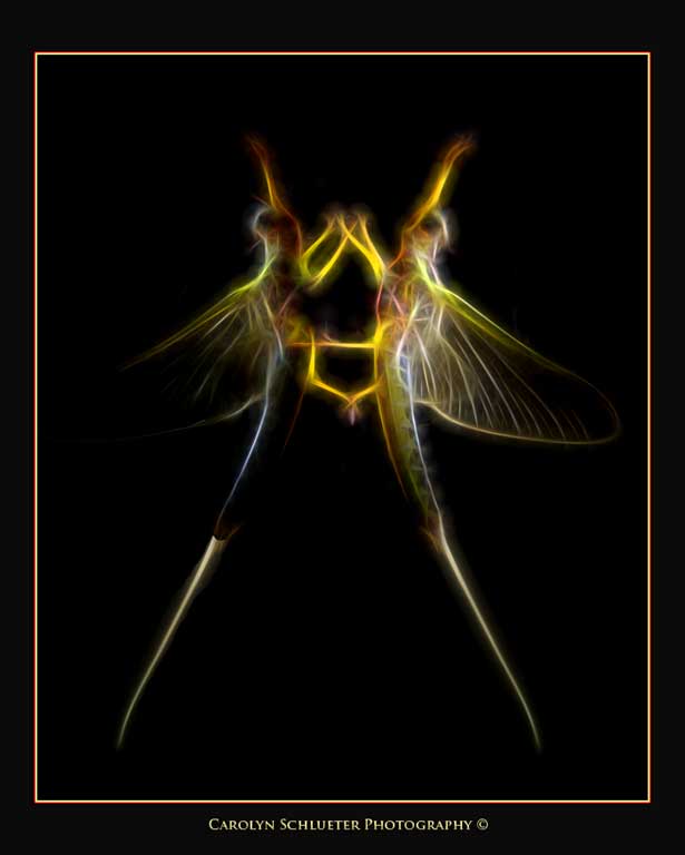
I really like this! You did an excellent job extracting the beautiful ballet dancer and love how she is leaping across the leaf and yes, I think she blends beautifully with your composition. The tonality of the flowers in the background with the raindrops is a perfect complement to the dancer and love how you created the dancer's shadow against the flowers. I do like this better than your January entry, although it was great seeing your picture in the picture! Dancer blends perfectly with the background and yes it looks very natural and pleasing to the eye! The stems on the flower lead us into and also out of the picture very gracefully. Adding a shade of white for an inside stroke and either black or the dark green for a canvas would also be complementary. Overall a very mesmerizing creation! |
Feb 10th |
| 41 |
Feb 17 |
Comment |
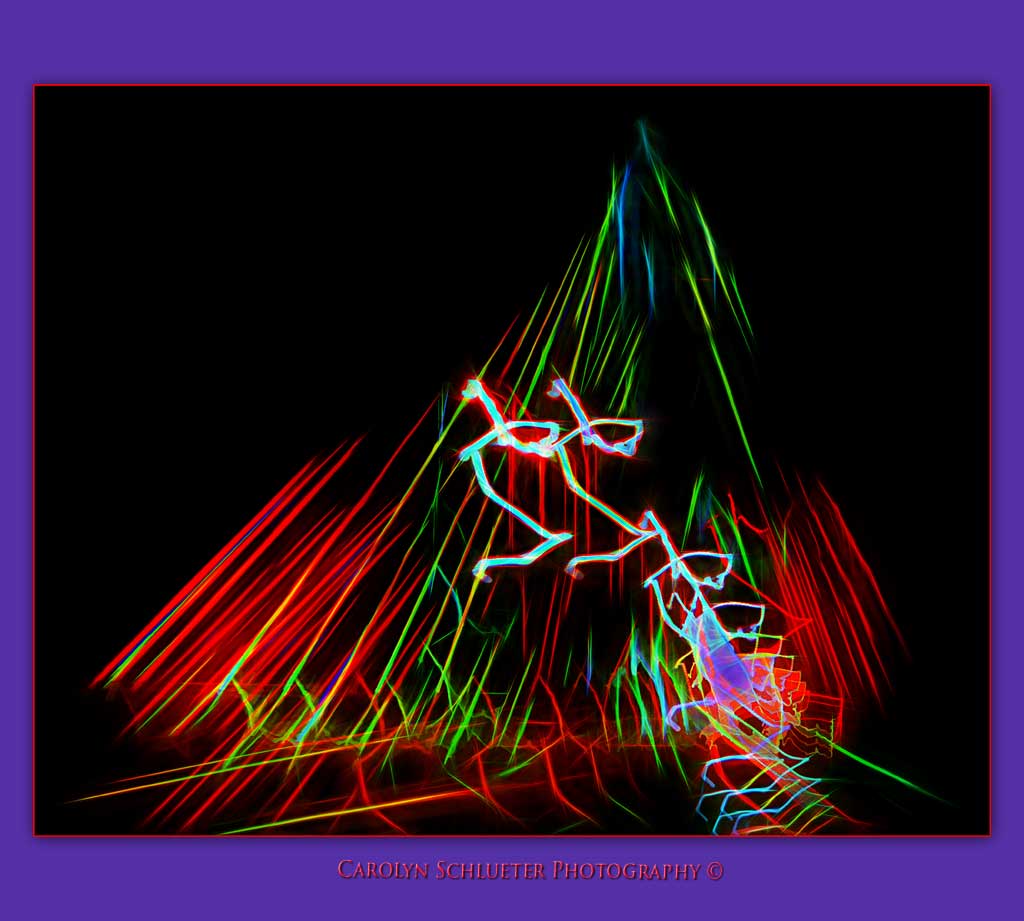
Thanks John. Yes, why did all those people happen to be in the background when this collision course was going on! LOL I should probably try taking out all the busy background and just show the grass/trees, but that would be a lot of work for me. Will also try darkening the background as that could help. |
Feb 10th |
| 41 |
Feb 17 |
Comment |
The overall image is a little on the busy side, but love how you have cropped the composition and brought out the four pots in the foreground! The leading lines of the pots really draws one's eye into the picture! My only suggestion would be to fix the lip of the cracked pot near the top where the light part is distracting from the overall picture. Your choice for the border color taken from the color of the four pots is cool! |
Feb 10th |
| 41 |
Feb 17 |
Comment |
I like the effect the shower gives for the background, but for me the stone carving detracts from the picture and I would remove that and either shorten the green stem coming down on the left so it doesn't create a 'merger' or move the entire flower a tad more in and then flip the photo.
Love the drop shadow effect and canvas you created! A perfect complement to the image. |
Feb 10th |
| 41 |
Feb 17 |
Comment |
Carol, you are amazing!! Love both your creations and especially the use of the gradients in the portraiture and the final effect. My suggestion would be to add a little more space on the left side for her to 'look' into. Beautiful.
The windowsill image seems to pop more for competition and again, it's awesome what you have created from the original image! Very impressive and I wouldn't change a thing! I've always wanted to do something like this but didn't have the foggiest idea where to even begin! Also love the borders you have chosen for each one. |
Feb 10th |
6 comments - 3 replies for Group 41
|
8 comments - 3 replies Total
|