|
| Group |
Round |
C/R |
Comment |
Date |
Image |
| 40 |
Oct 22 |
Comment |
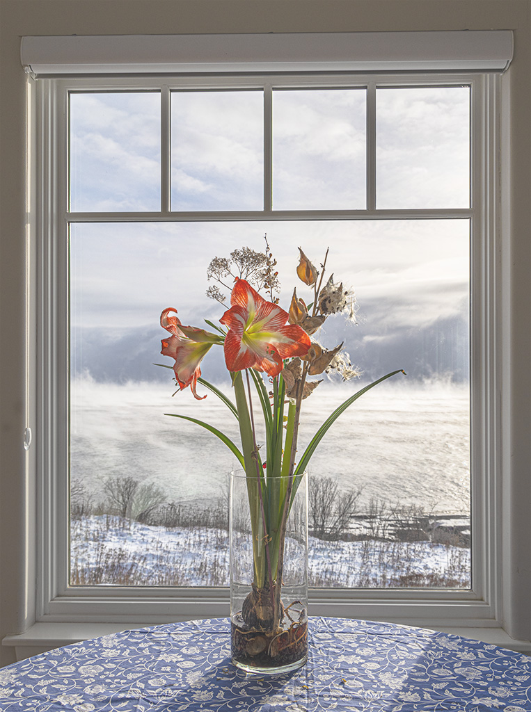
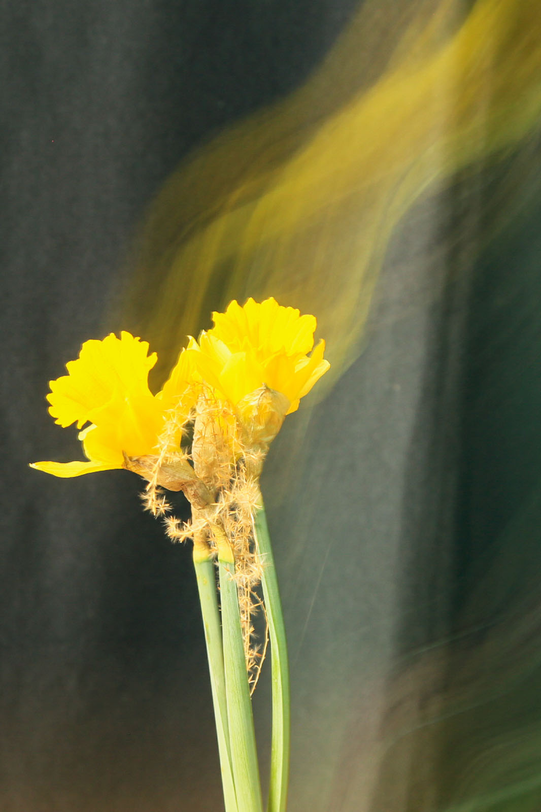
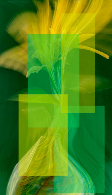
Catherine, great that you are trying some new techniques. This looks very impressionistic to me. You have lots of opportunities to try this with other subjects and shutter speeds.
Great image and keep at it! |
Oct 20th |
| 40 |
Oct 22 |
Comment |
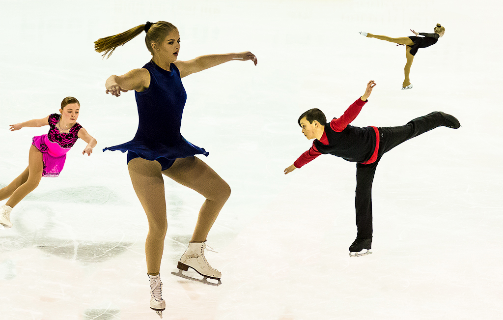
This is a wonderful lion picture Lin. I have the feeling that she is concentrated and ready to pounce for a meal.
I agree with the foregoing suggestions, especially the color balance which appears too green to me. |
Oct 20th |
| 40 |
Oct 22 |
Reply |
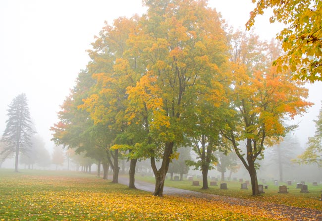
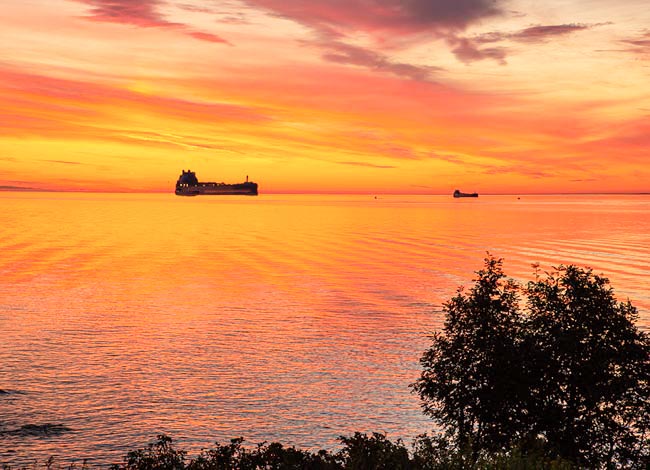
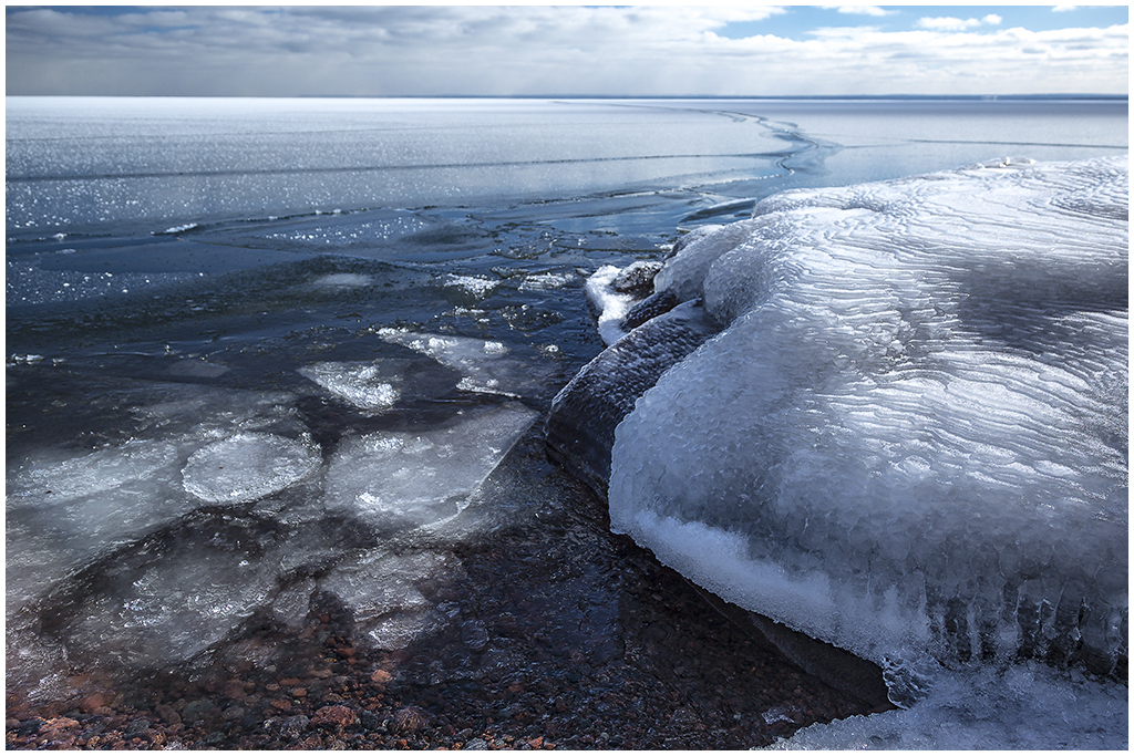
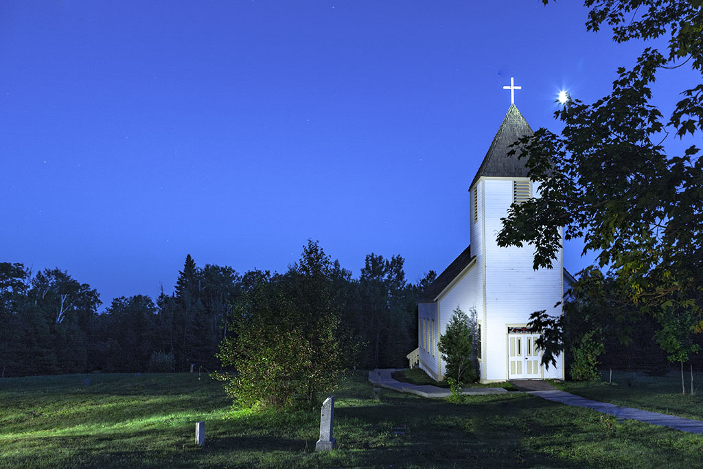
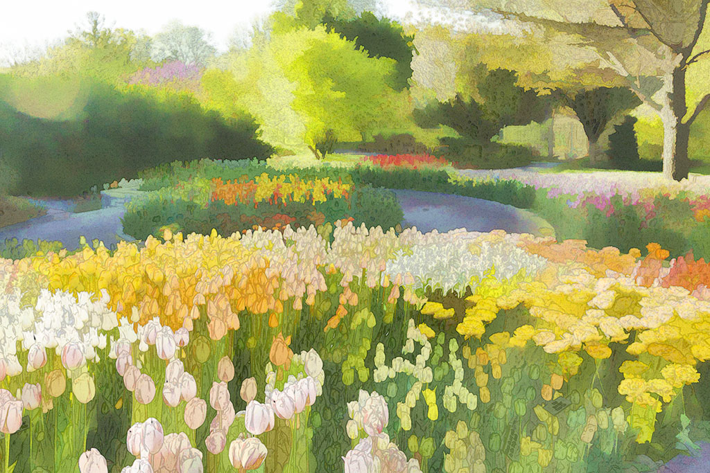
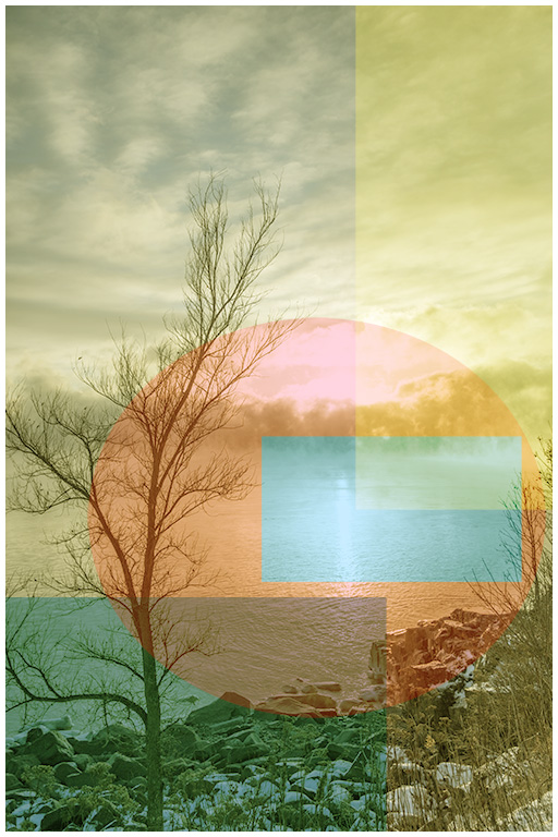
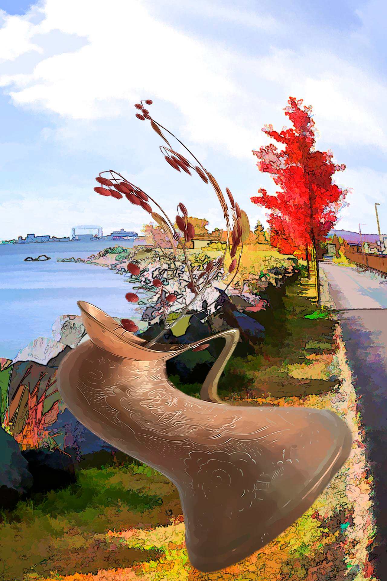
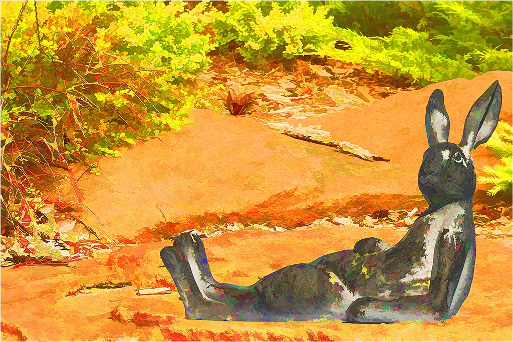
Andrew, next fall I will move farther to the left when fall colors once again appear. I was photographing from a walking bridge which had a support cable right to my left. Perhaps I can go on the other side of the cable and still include the rock and colorful bushes in the lower right.
I will bracket wider which you have mentioned before but which I have not done yet.
The white stick I should have cloned out.
The block of rock is soft. I should have used a smaller aperature and focused in closer. I will try it next fall. |
Oct 20th |
| 40 |
Oct 22 |
Reply |
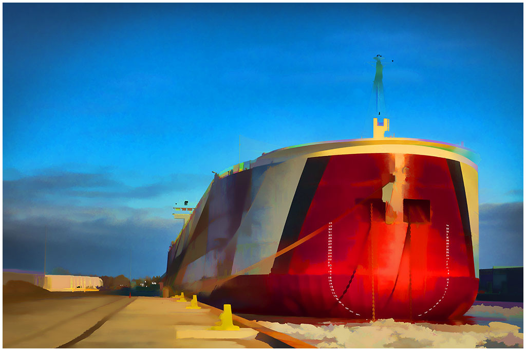
Well Julie, I could desaturate the blue sky - but not much as I want some color at the top which would otherwise be white. Good suggestion. |
Oct 20th |
| 40 |
Oct 22 |
Reply |
Thanks Catherine. |
Oct 20th |
| 40 |
Oct 22 |
Comment |
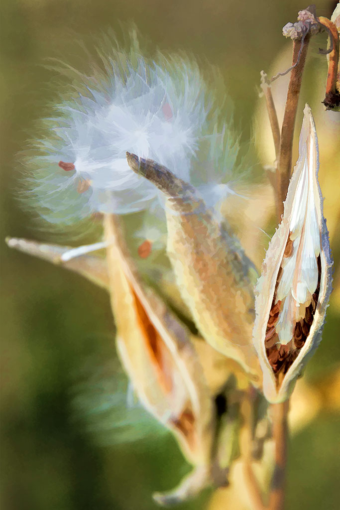
Ah Jamie, I love your sense of humor and wonder. I too would think the sticks to be snakes. As to the far right stick, you could crop it out. But I would be quite content to leave it in. It adds a dimensionality that surpasses three snakes. You had a good eye to catch this.
Suggestion - well maybe a little more contrast.
Catherine's comments were what I thought when I first looked at this image. |
Oct 20th |
| 40 |
Oct 22 |
Comment |
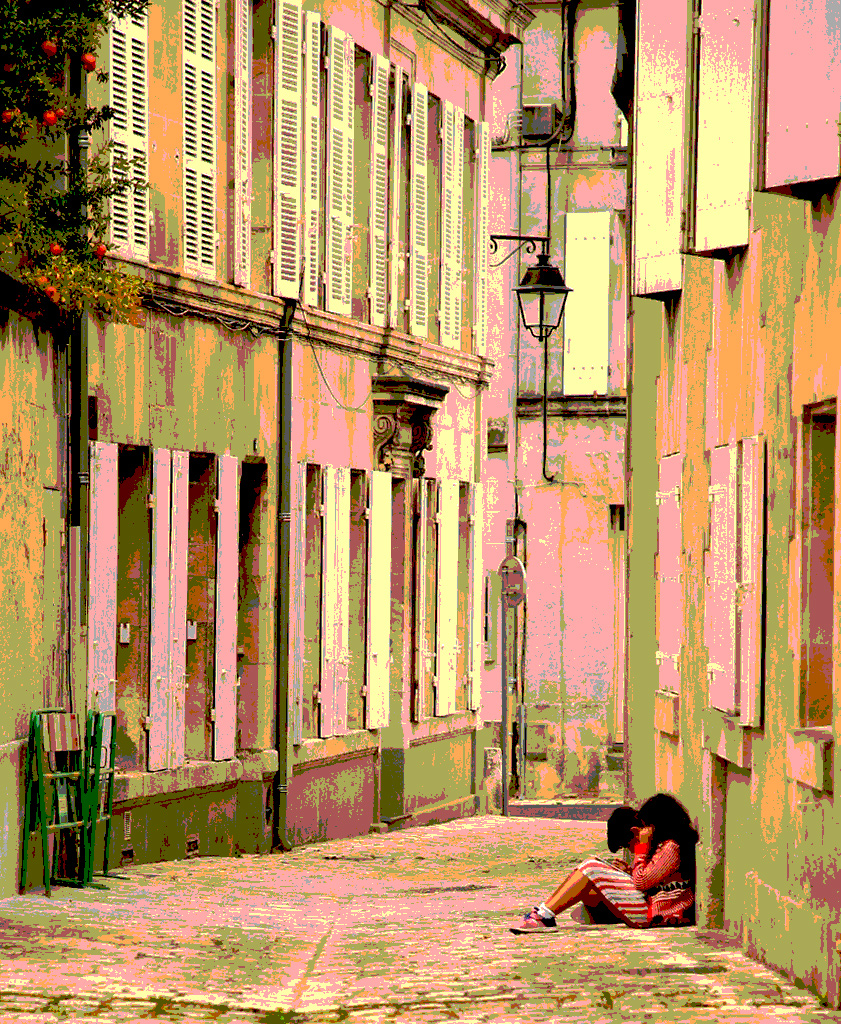
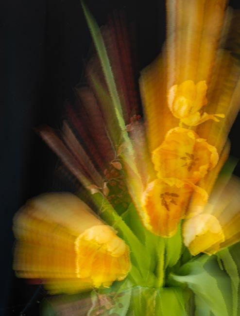
Julie, your post processing really worked to make this a winning image. Cropping, flipping, and playing with the high lights greatly improve what would otherwise have been a drab image.
Excellent work! |
Oct 20th |
| 40 |
Oct 22 |
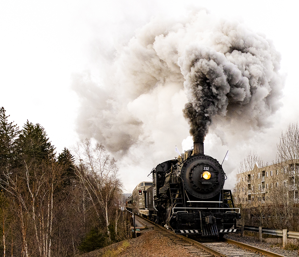
Comment |
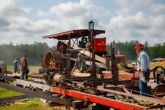
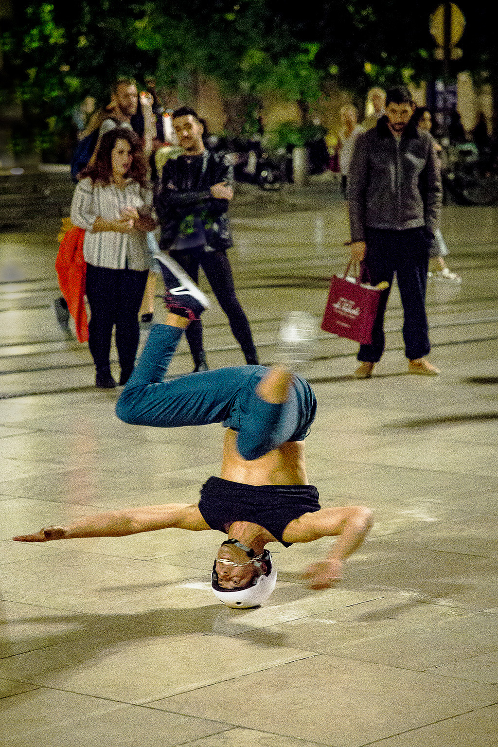
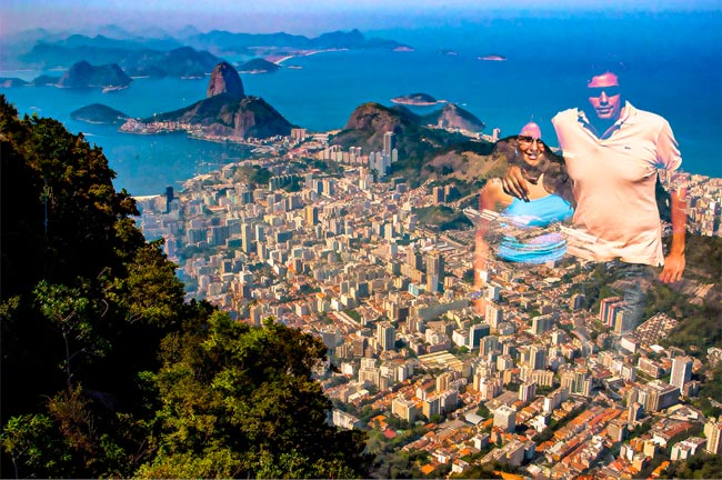
Andrew, I think you really captured the story in this image. There is rapt interest in the spectators, there is the interested child, and there is the steam rising to indicate action. There are the campers in the background to indicate some of the viewers have come some distance. Your post processing brings out the accents of color on the machine.
I can't think of any suggestions to improve this image.
Great job! |
Oct 20th |
5 comments - 3 replies for Group 40
|
| 41 |
Oct 22 |
Reply |
Thanks Brad. These comments are stretching my creative concepts. |
Oct 21st |
| 41 |
Oct 22 |
Comment |
This is a wonderful composite of how grief strikes us. The blending is impeccable, the elements fit together and convey the many faces of grief. I have no suggestions.
Now, having read the other comments, I see there are many ways to look at your image. |
Oct 21st |
| 41 |
Oct 22 |
Comment |
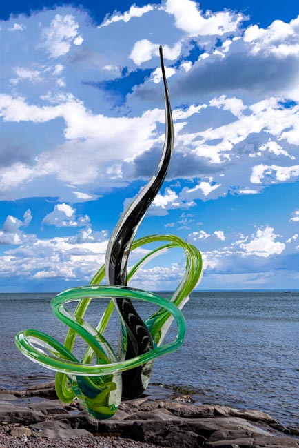
Brian, your Suprematism image challenges the viewer to really contemplate what the artist, you, are conveying and what it means to the viewer. Taking the overall image first, I cannot relate it to any real world construct I have experienced and would not know what it was without your explanation. The white background does set the individual parts in display. Psychologically the narrow line does tie the elements together, with the exception of the far right image.
Now examining the individual elements, the varying copper tone of all does relate them to each other. All, except one, are verticals which does resonate with me as I am partial to verticals for some unknown reason. Then I look in detail at each element which all contain circular or elliptical elements.
In summary I find myself trying to relate the overall image to a real world construct as I have trained myself or been trained to do. But this is not Suprematism or what probably you wanted us viewers to do. So you are very positively stretching our perceptions. I think I should print this and put it on the wall to contemplate in quiet moments.
Thank you for the challenging stretch and keep doing it each month.
Now, having read the comments of the others and your responses, I can see we are all widening our perceptions.
Thanks Brian and welcome to the group. |
Oct 21st |
| 41 |
Oct 22 |
Comment |
Julie, wonderful composite, deftly crafted and blended.
I have nothing to add as the foregoing comments and your replies have done a fine job.
I look forward to your future posts. |
Oct 20th |
| 41 |
Oct 22 |
Reply |
Wow Brian, thanks for all the suggestions. Now I have lots of new techniques to try and experiment with. |
Oct 16th |
| 41 |
Oct 22 |
Reply |
Brian, thanks for your suggestions, particularly about composition. I have colorized to a blue and flipped horizontally as you suggested. Monochrome I leave to you as I seem to like color.
You are opening my eyes to new PS techniques which is good. |
Oct 16th |
 |
| 41 |
Oct 22 |
Reply |
|
Oct 16th |
 |
| 41 |
Oct 22 |
Reply |
Hi Tom,
Good suggestions. I will leave a monochrome version to you but I did experiment with a texture layer. I took a cloud picture in my files, played with the Camera Raw sliders, then took it into the final image as a texture layer, blend mode darken, opacity 92, fill opacity 100. The result is slightly more dramatic and hopefully more artistic. This is moving me into new steps which is good. |
Oct 16th |
3 comments - 5 replies for Group 41
|
8 comments - 8 replies Total
|