|
| Group |
Round |
C/R |
Comment |
Date |
Image |
| 40 |
Jun 21 |
Reply |
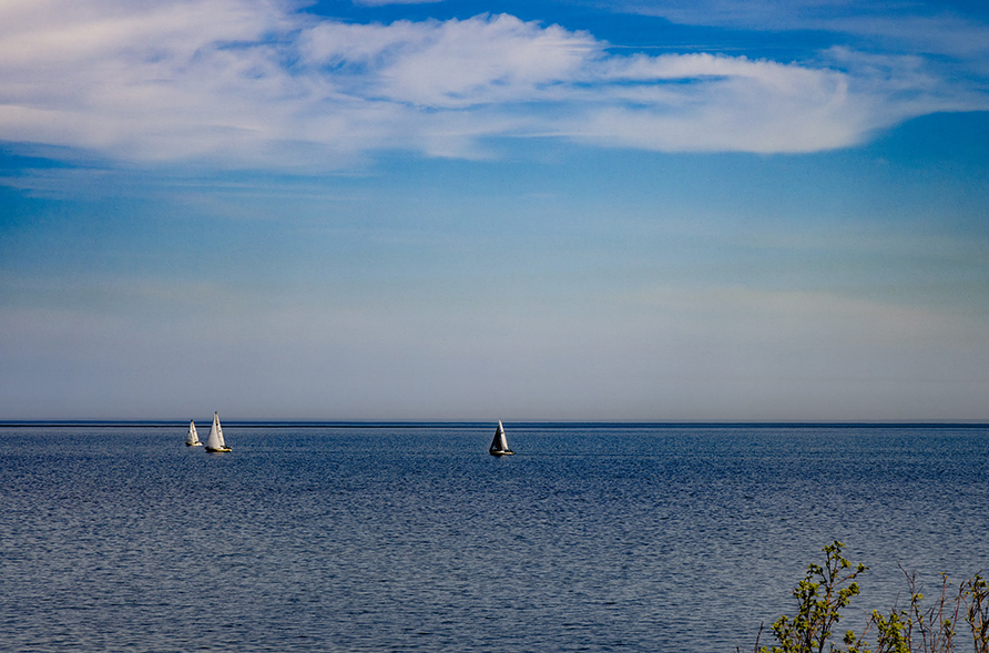
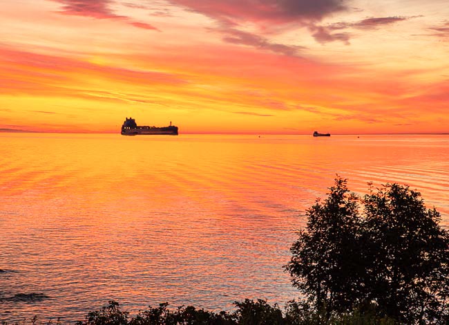
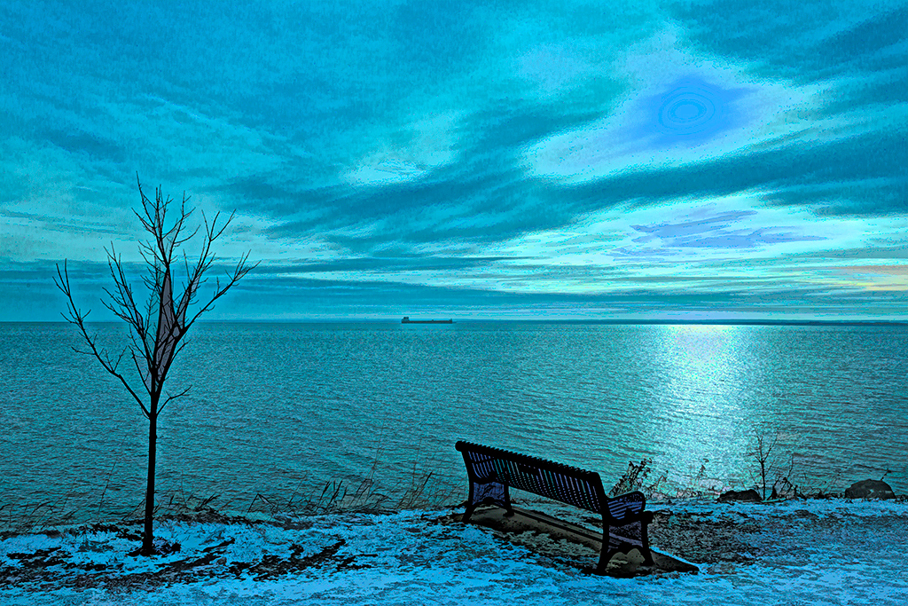
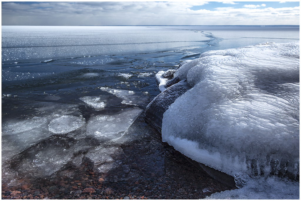
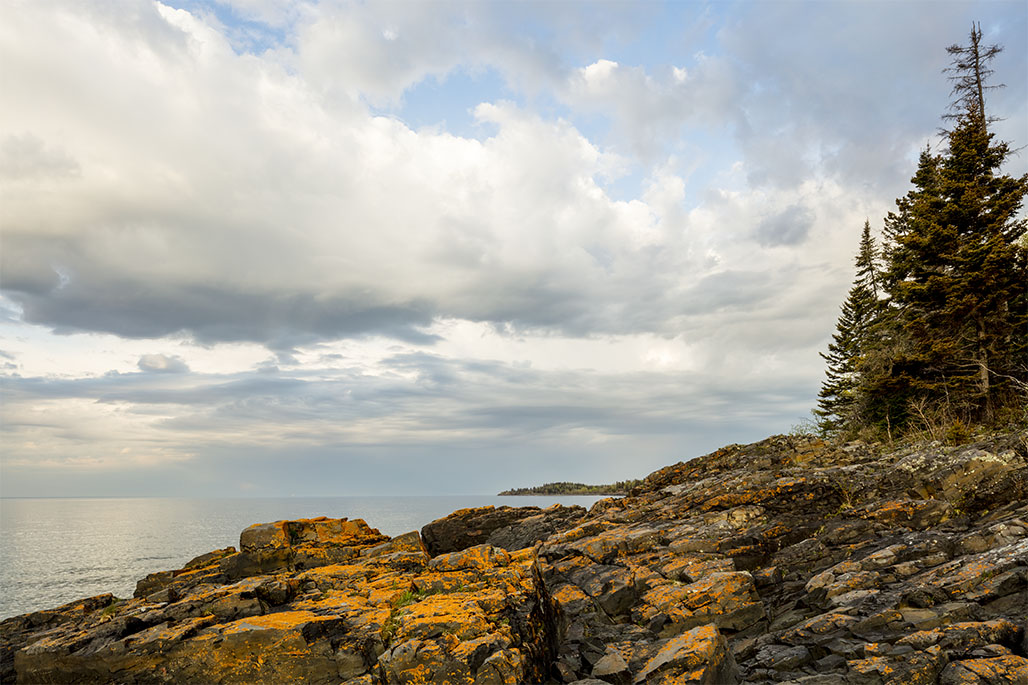
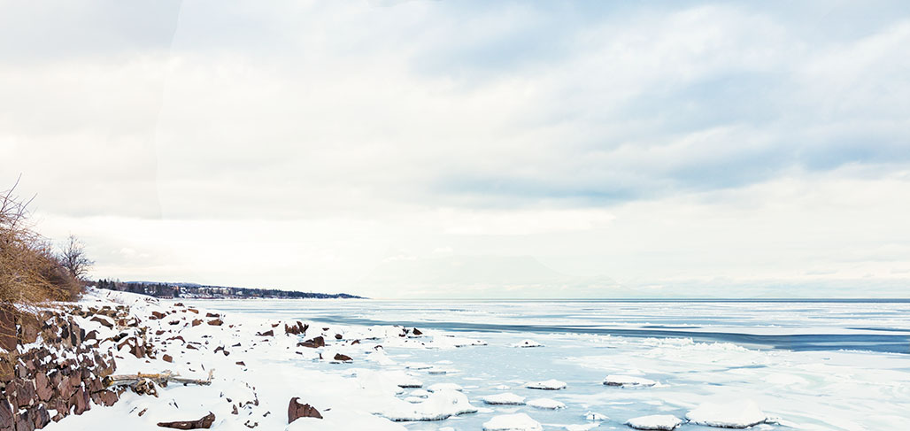
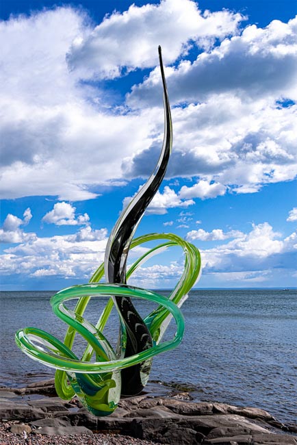
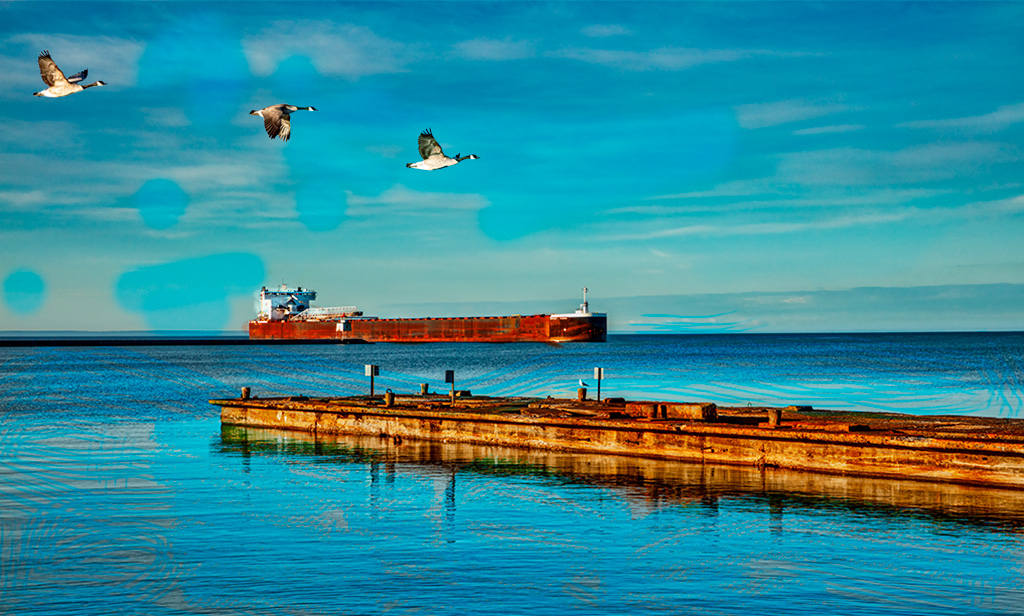
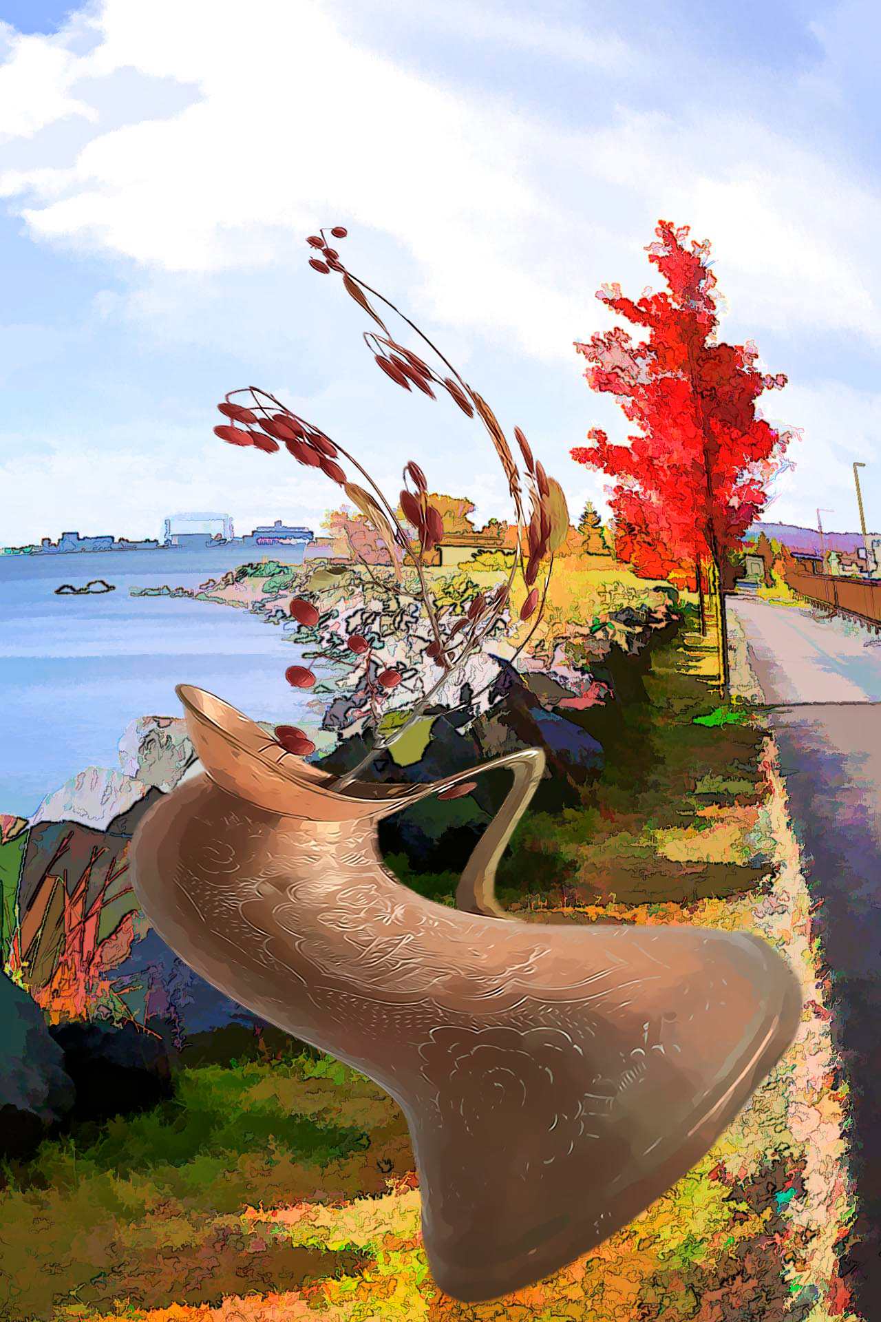
Good comment Andrew. I included the tree to show more of the location, the immensity of Lake Superior and that I was on the shore. But your suggestion to leave out the tree is good for another version. |
Jun 25th |
| 40 |
Jun 21 |
Comment |
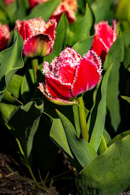
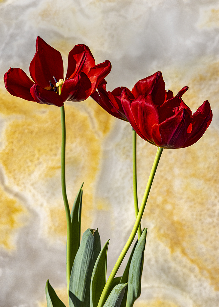
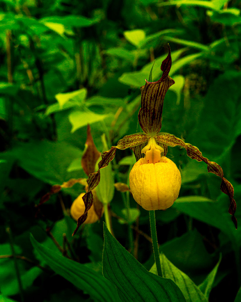
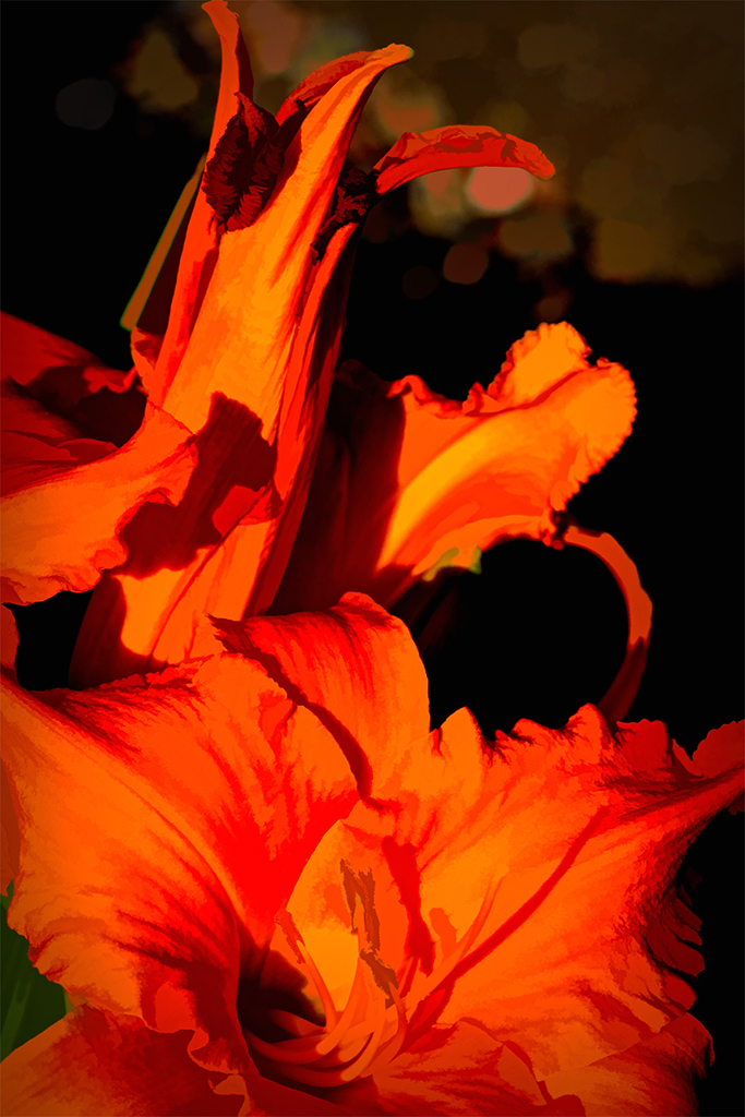
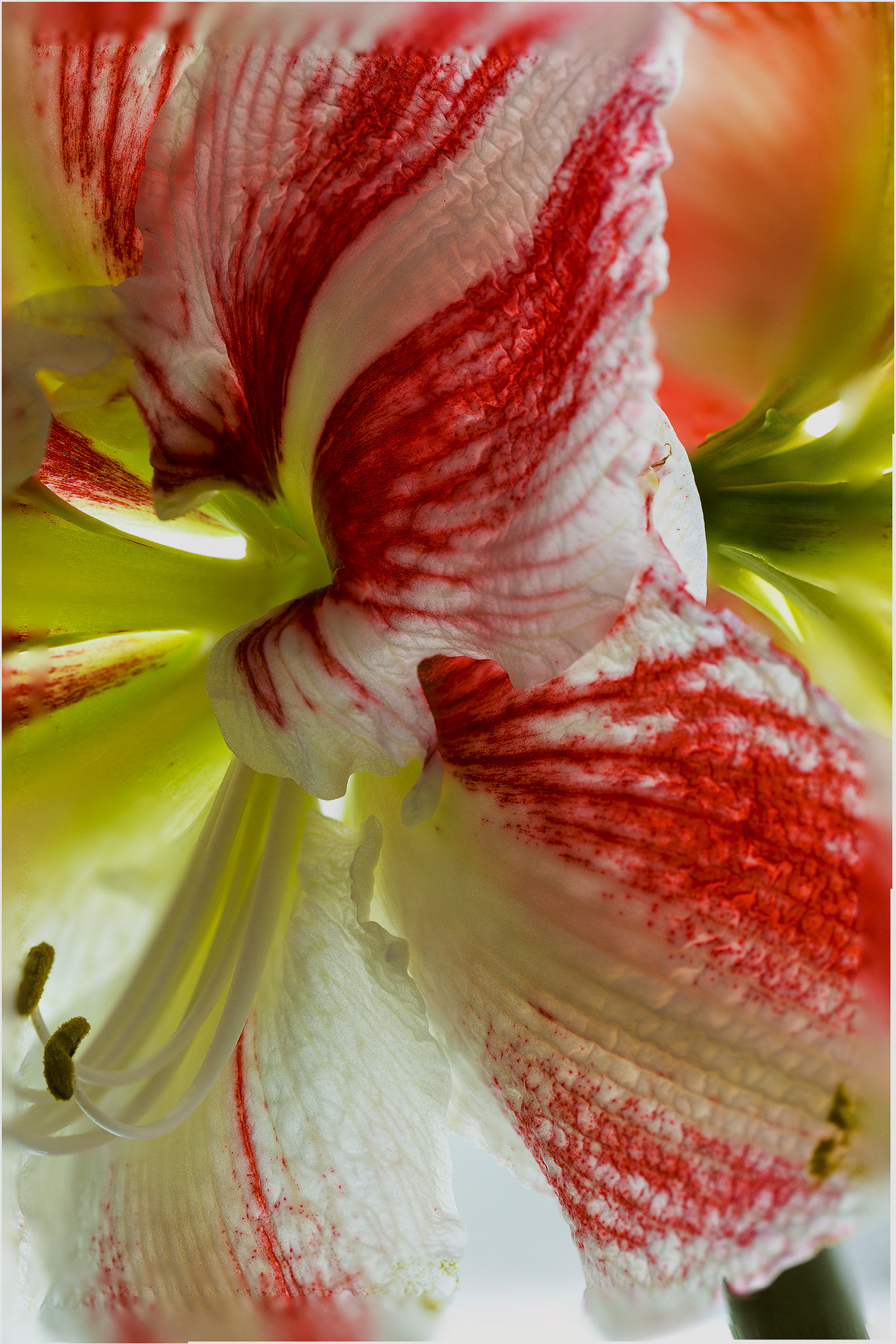
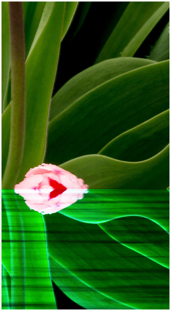
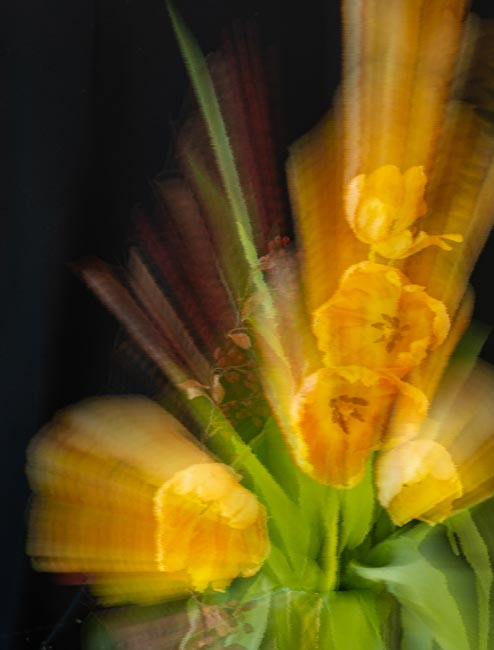
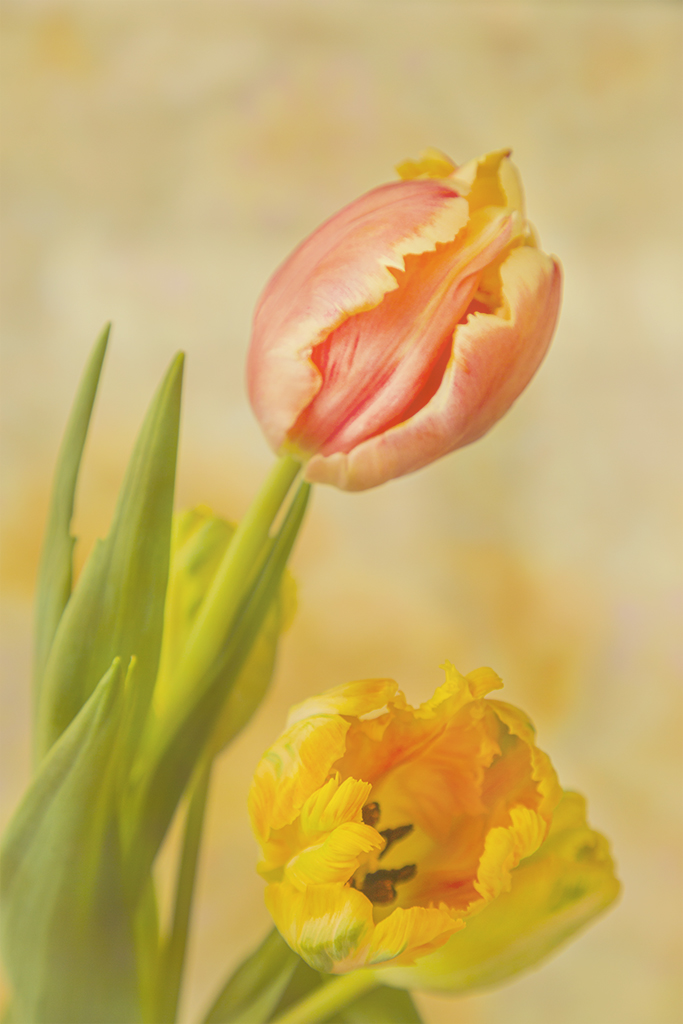
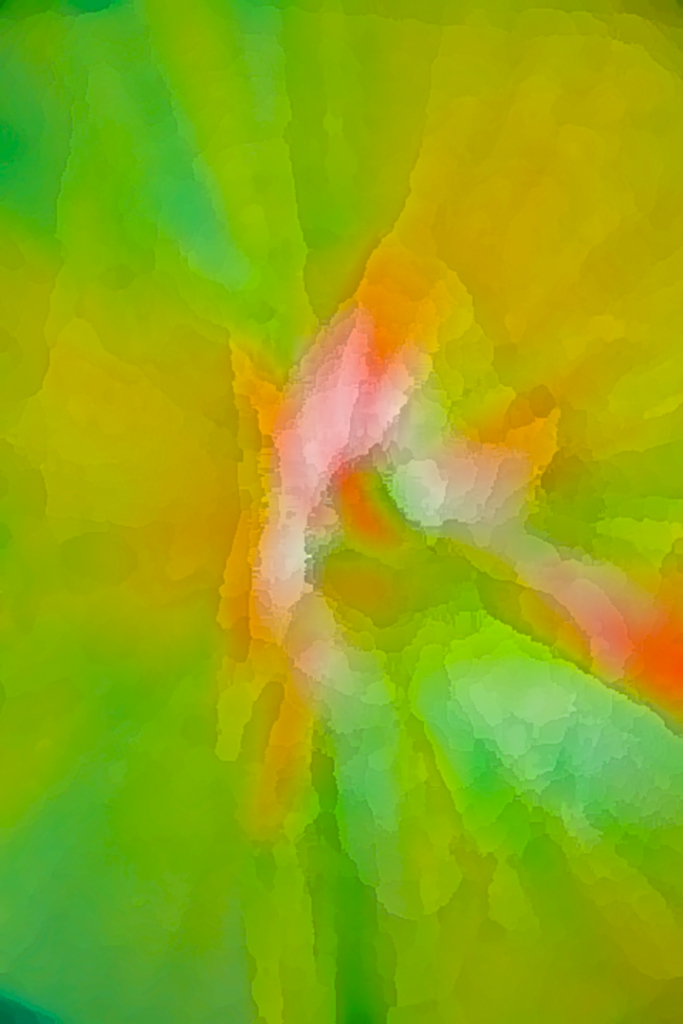
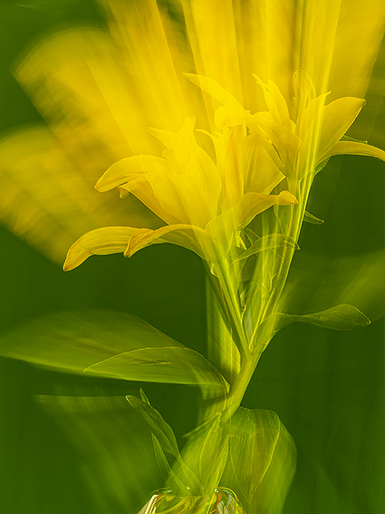
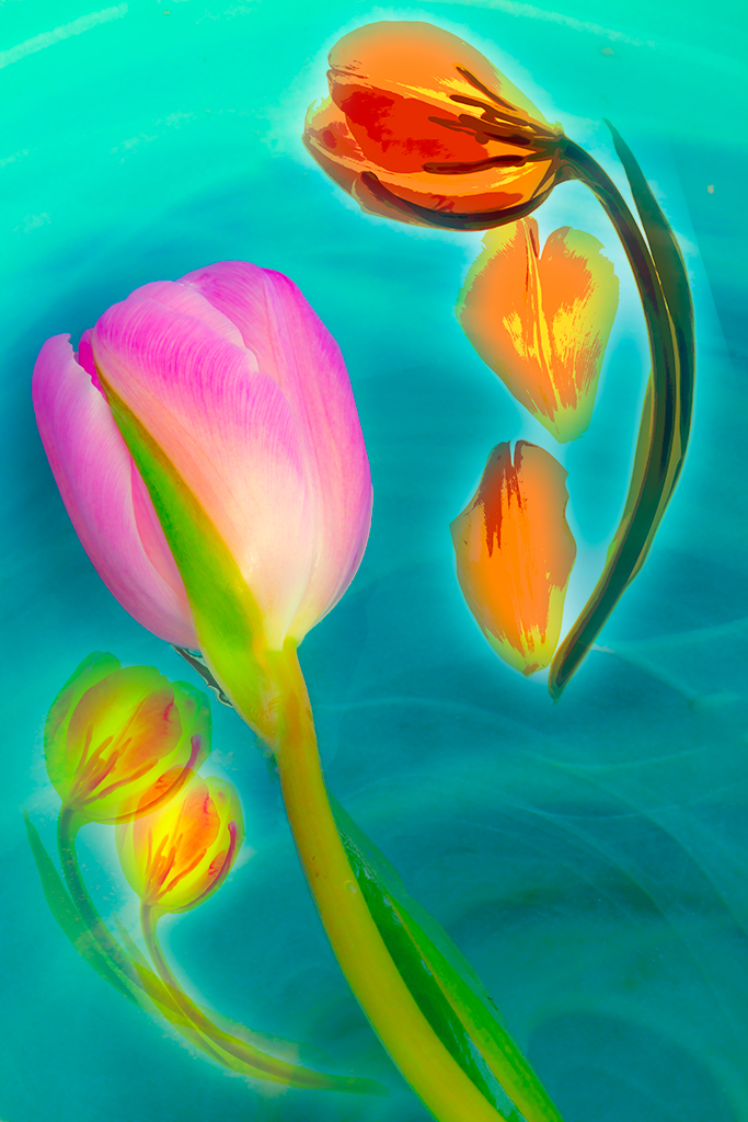
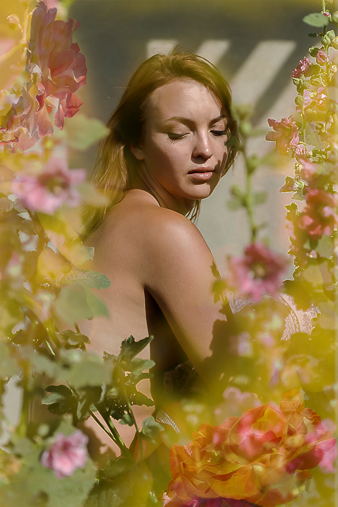
Alison, I like your above version but agree with you the one blurred flower is somewhat detracting. But maybe the impressionists weren't tack sharp either. Thanks for trying my suggestion. And now I do find your original crop really does a nice job. It just goes to show viewers are fickle. |
Jun 25th |
| 40 |
Jun 21 |
Comment |
Julie, I have long wanted to visit Australia but have never had the opportunity to do so. This is to say that I am always pleased to see your images which convey what your country is like, what it is like living in an arid land, and what you find interesting. Please keep showing us for I am sure many others are also interested in Australia. |
Jun 25th |
| 40 |
Jun 21 |
Comment |
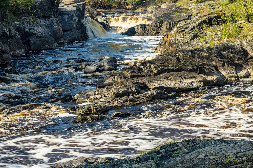
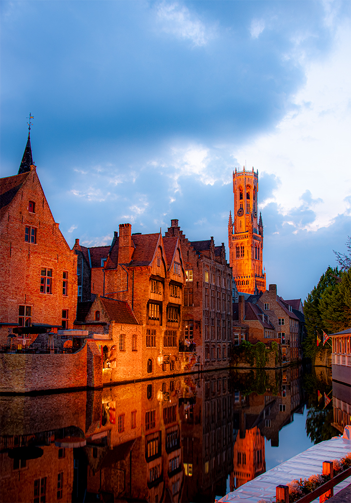
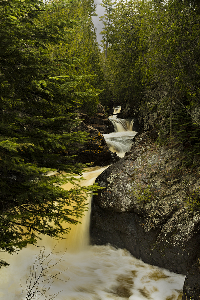
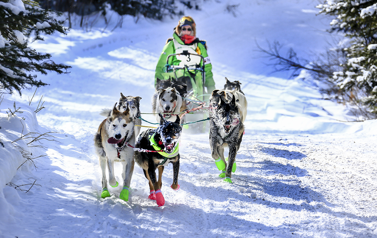
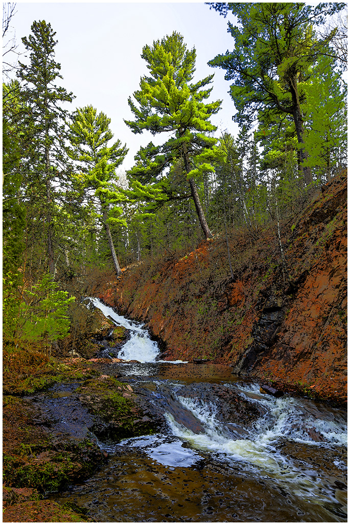
Jamie, you notched it, top of your game!
Light or dark I feel is a personal call, especially at dusk or sunrise. So bracket and take what implies what you want viewers to see. Personally I would lighten this image unless you are conveying a twilight time.
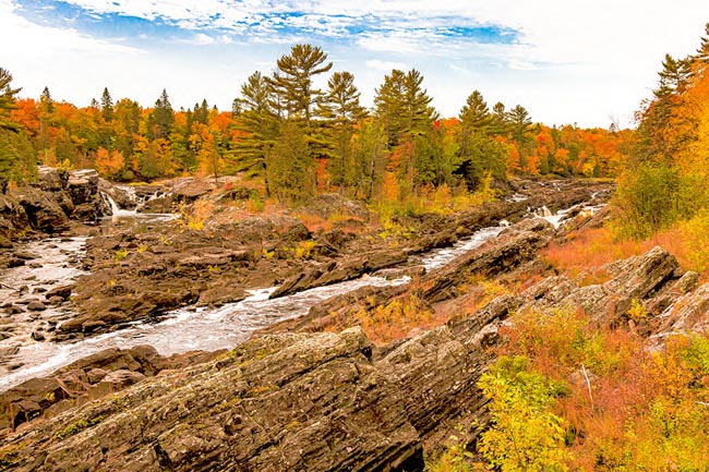
Exposure of waterfalls - I now do waterfalls as a series of shutter priority shots from say 1 second to 1/500th so in post processing I can choose the blur representation I like best. You could even do some composting with some of the water blurred and some sharp. |
Jun 25th |
| 40 |
Jun 21 |
Comment |
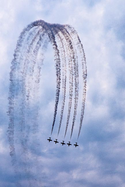
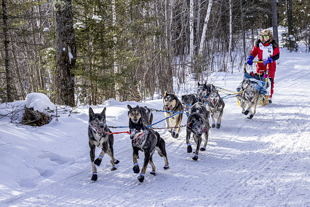
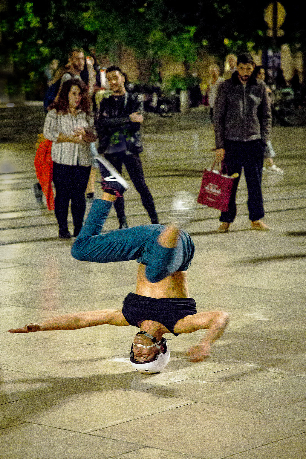
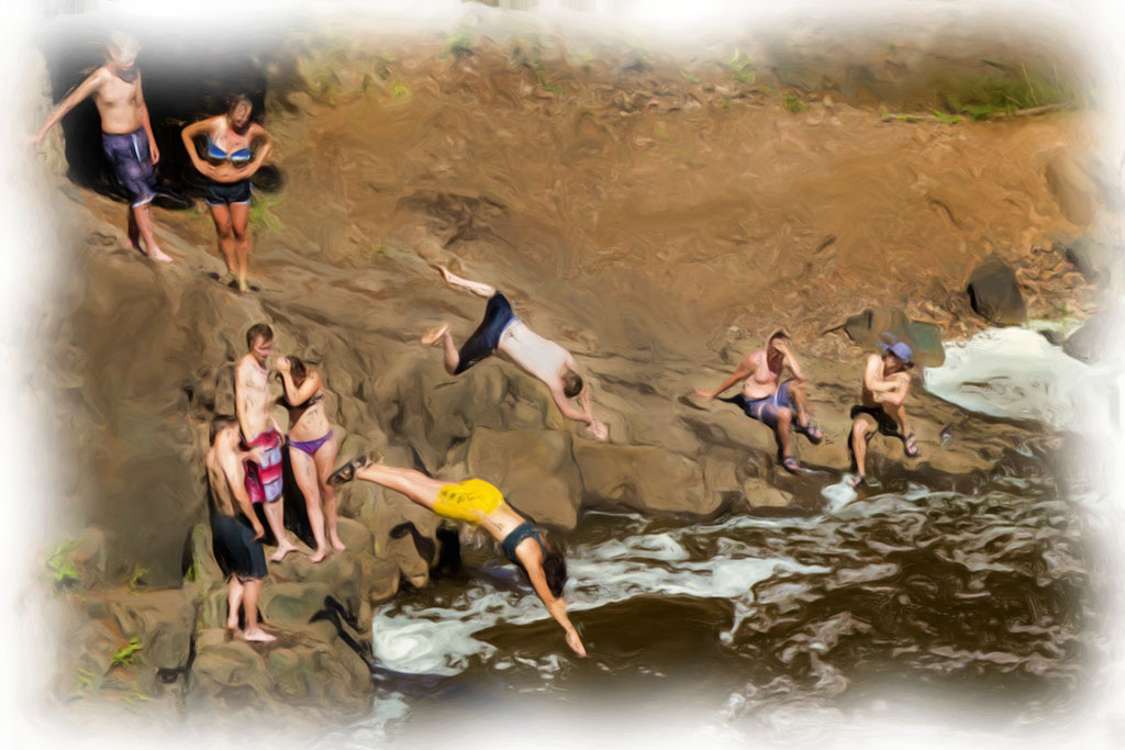
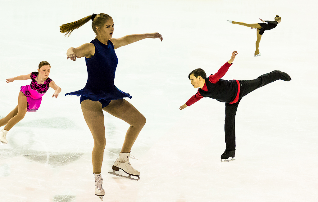
Great air time Anne! I like the cropping and the simplicity of just the rider, some blue sky and cloud in the background along with the trees. And I like your low angle from the ground looking up at the rider passing over head. I'm glad the rider didn't land on you.
How about trying some variations such as shooting shutter priority and then a series of shots varying the speed from 1/2 second up to the 1/1600 you used. That way you could have more action indicating blur in the wheels. And you could be panning also. That would blur the background, another tel (indication) of motion and action. The result will be mostly deletes but some of the images will have the wheels spinning and perhaps the clouds stretching out. Then you can see which variation you like best.
|
Jun 25th |
| 40 |
Jun 21 |
Comment |
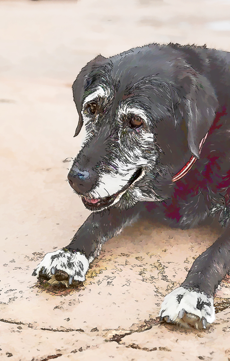
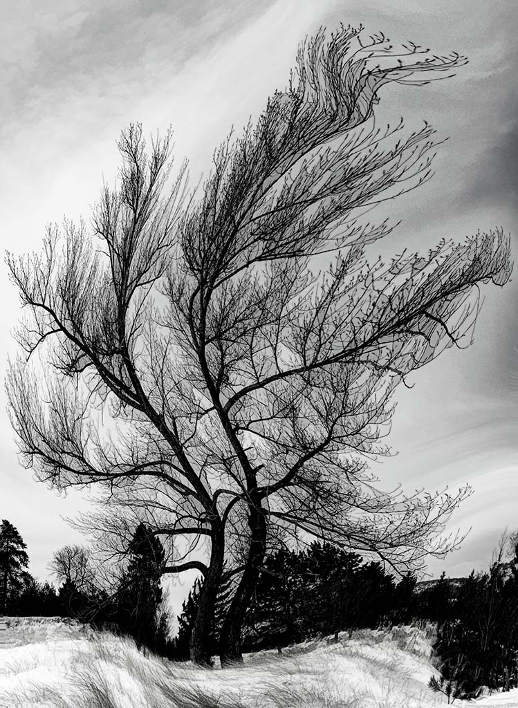
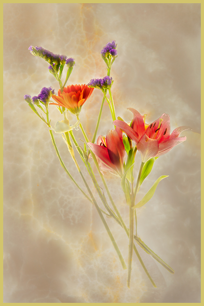
Julie, I like the contrast and how well this image shows in black and white. There is a simplicity to the image which is admirable.
To try another version of this beautiful image for your camera club I would do some cropping and perhaps increasing the contrast. What do you think?
I enjoy the comments of the others and think they have merit too.
|
Jun 25th |
 |
| 40 |
Jun 21 |
Comment |
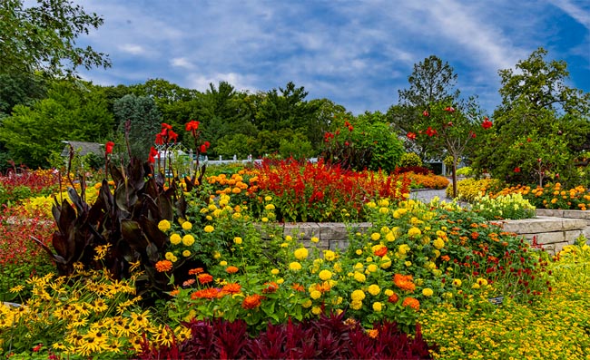
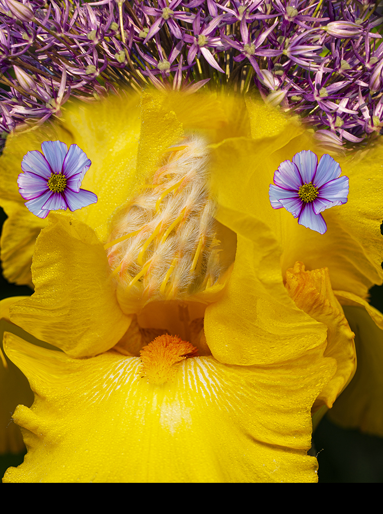
Andrew, how about cropping off some of the top, and perhaps reducing the prominence of the yellow color. To me this is a relaxing study of a still pond and a swan.
The above comments give some thoughts for changing the concept of the image which are interesting. |
Jun 23rd |
| 40 |
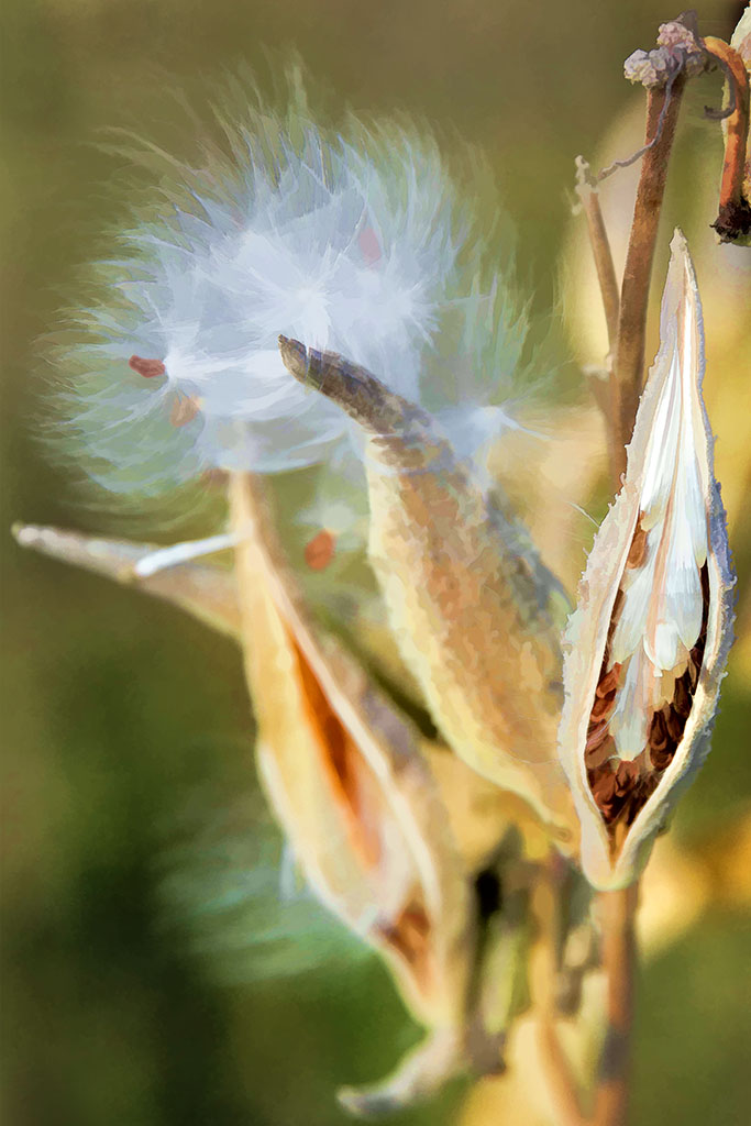
Jun 21 |
Comment |
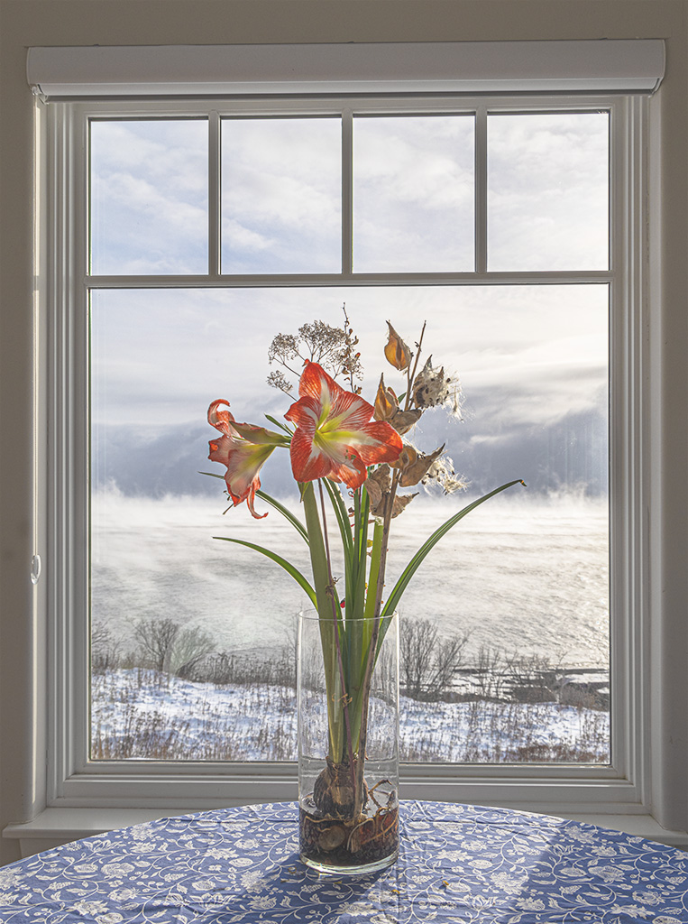
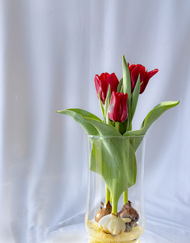
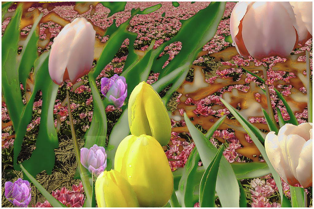
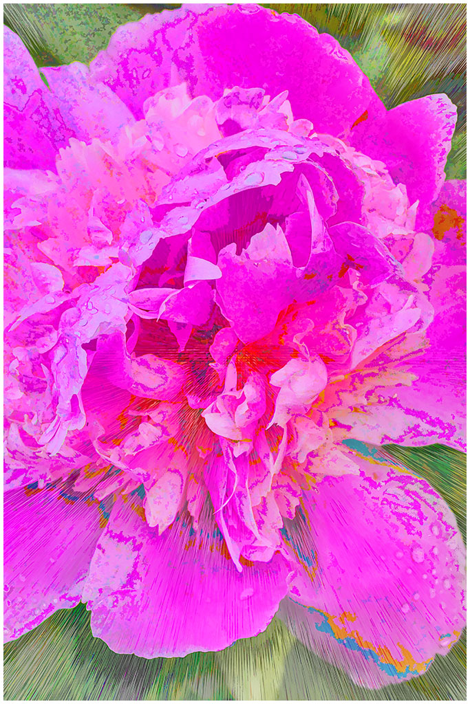
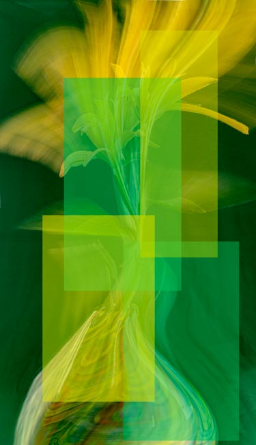
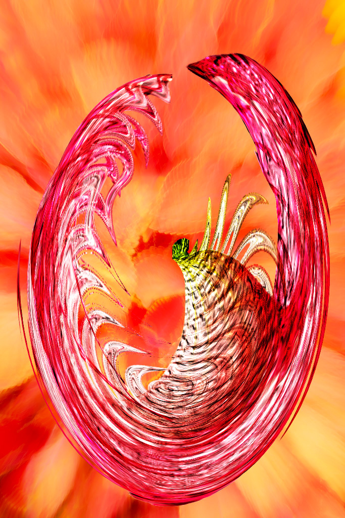
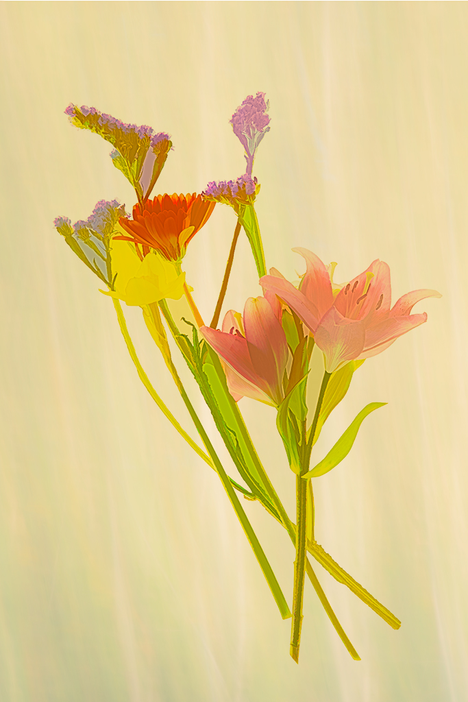
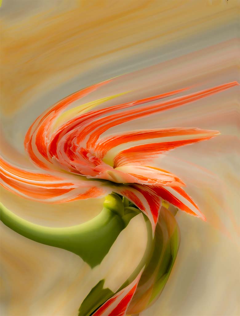
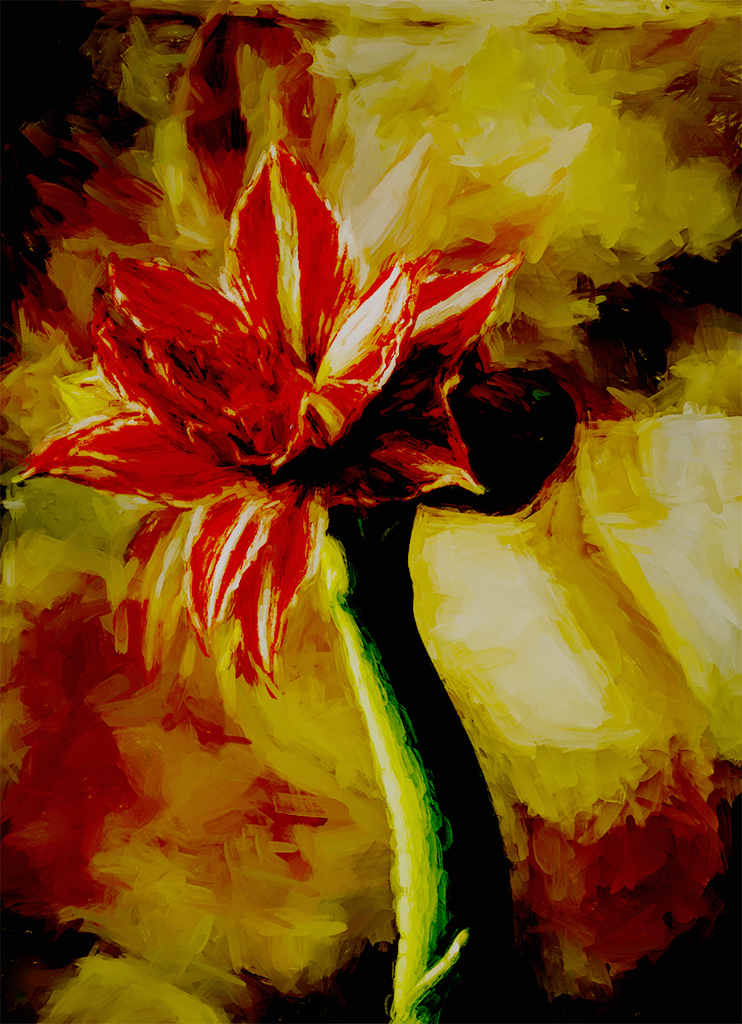
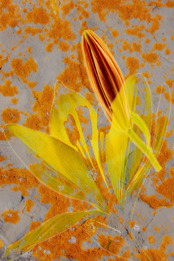
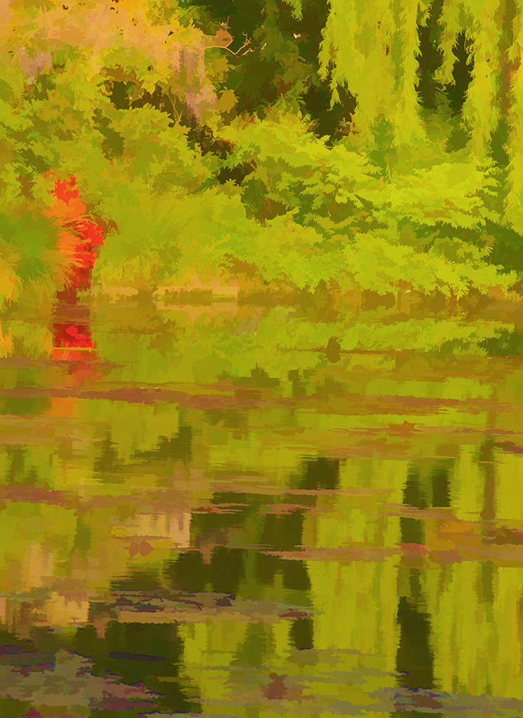
Alison, you have created a beautiful impressionist painting which you can be proud of. Personally I am more drawn to the orginal than the cropped final version because it just seems to balance better but that may be my own personal preference. And I might lighten it slightly but again that is my own personal preference. I look forward to more of your impressionist creations.
The comments of the above members have really good thoughts. |
Jun 23rd |
| 40 |
Jun 21 |
Comment |
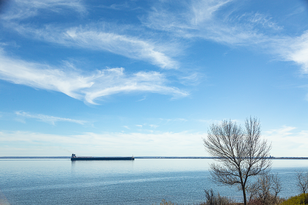
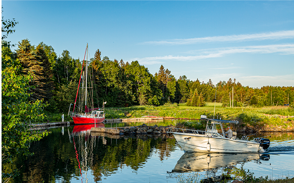
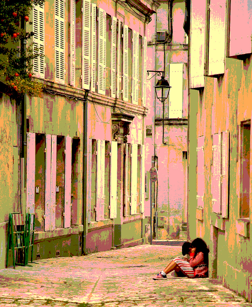
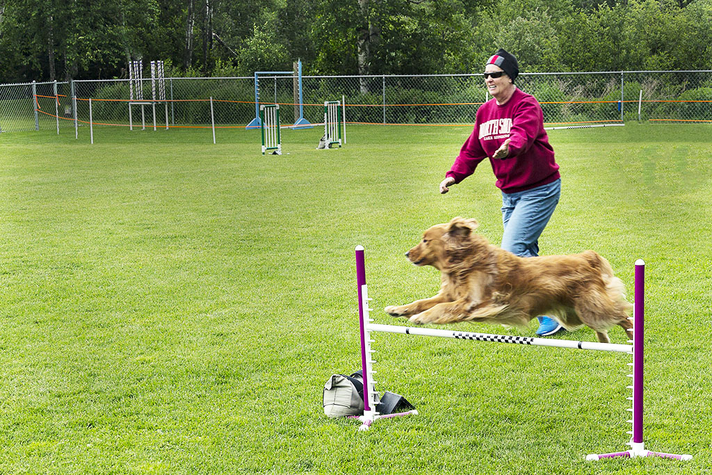
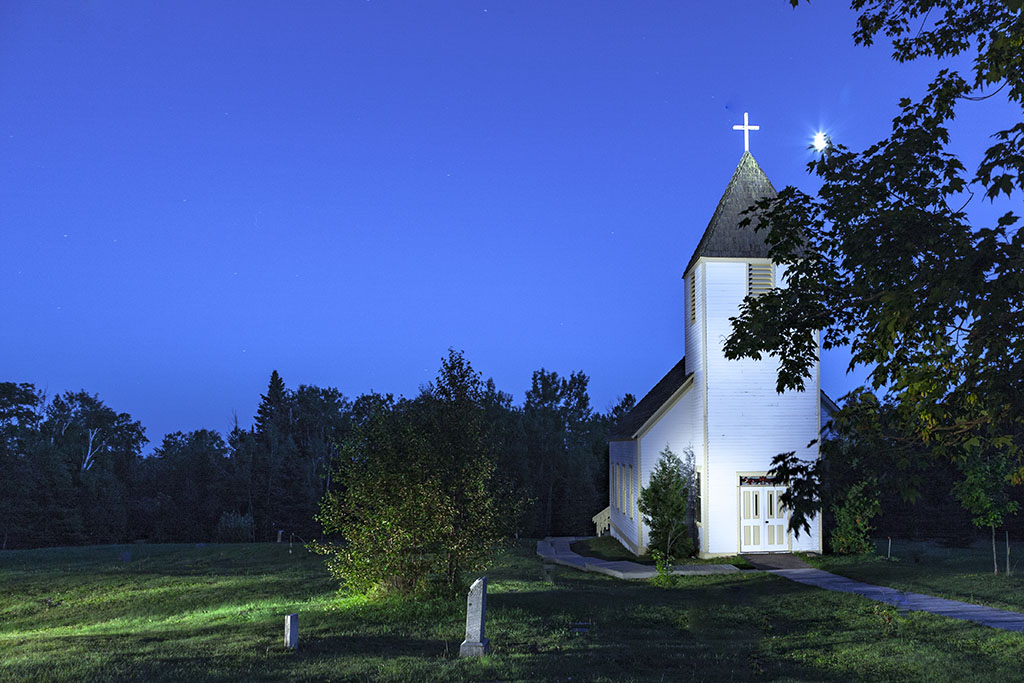
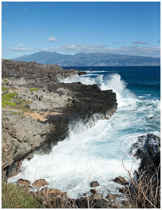
Anne, your suggestions are on the mark and very helpful. Thanks so much! And yes, your vertical version does retain the expansiveness that I so like. This was taken from my deck but I can get down 10 feet to the lawn which is perhaps another 10 feet above the waterline which is hard for me to reach. But I will try some shots from the lawn.
Thanks! |
Jun 6th |
8 comments - 1 reply for Group 40
|
| 41 |
Jun 21 |
Comment |
Composte fantasy images. Tom, you have mastered it! I look forward each month to see what you can do. |
Jun 23rd |
| 41 |
Jun 21 |
Comment |
Kathy,
This image captures its name, portal of dreams with the young man looking into the future. Nitpicking: light on foreground may be coming from a slightly different direction than the background sky but maybe not. Beautiful, beautiful composite. |
Jun 23rd |
| 41 |
Jun 21 |
Comment |
Kathy, for a family therapist you certainly have a most fertile and creative mind. Orchid butterfly - well I would be more inclined to call it alien man or alien butterfly. You must have fun working on this. Now I am waiting expectantly to see where you go with it. I can't give you any suggestions for improving Orchid Butterfly.
I am going to keep a copy of how you did this and experiment with some of your steps.
Brad and Jan have great comments. |
Jun 22nd |
| 41 |
Jun 21 |
Comment |
Well, Brad, this composite set me to thinking. Without your commentary, I would not know what to think. Looking at it for more than a moment I would think that maybe this was an ocean rising to cover a continent with a surfer riding and controlling the advancement. What a ride! I hope he doesn't fall forward and get covered himself. Well, that is what my imagination can conger up. I like your fertile imagination which is always challenging me to stretch. What will it be next month? |
Jun 22nd |
4 comments - 0 replies for Group 41
|
12 comments - 1 reply Total
|