|
| Group |
Round |
C/R |
Comment |
Date |
Image |
| 40 |
May 21 |
Reply |
Thanks Catherine, this tighter crop minimal composition does work. |
May 25th |
| 40 |
May 21 |
Reply |
Thanks Jamie.
Henry |
May 25th |
| 40 |
May 21 |
Reply |
Good comments Julie. See my comments to the others above. |
May 23rd |
| 40 |
May 21 |
Reply |
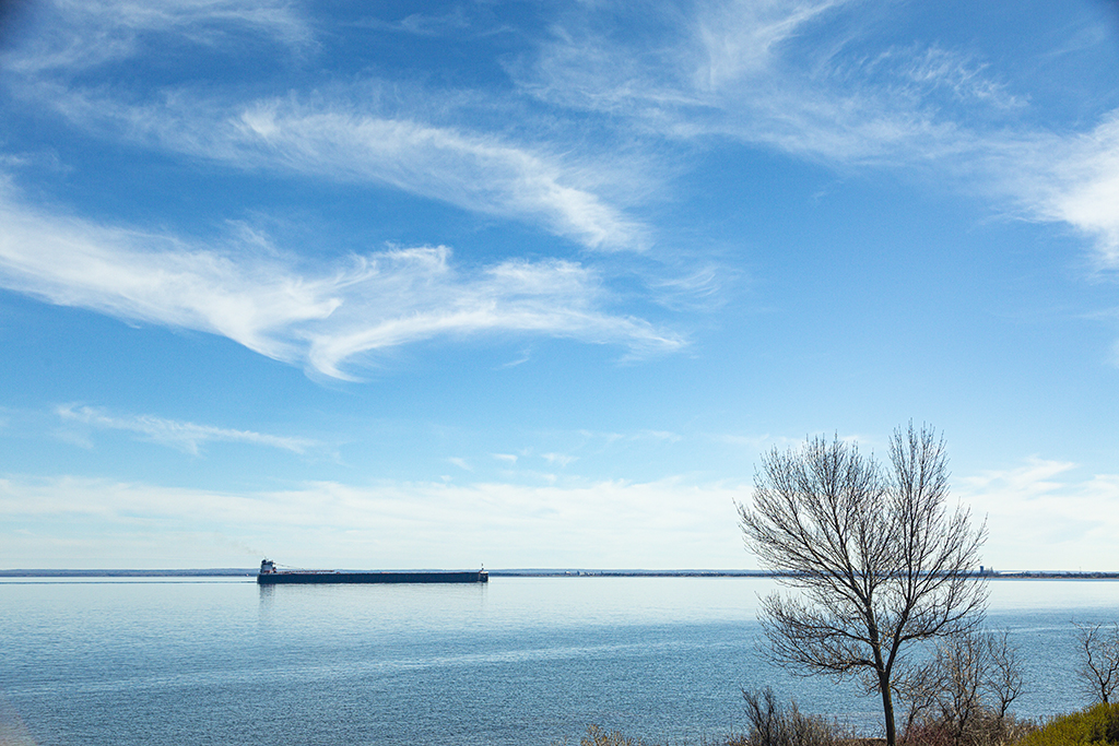
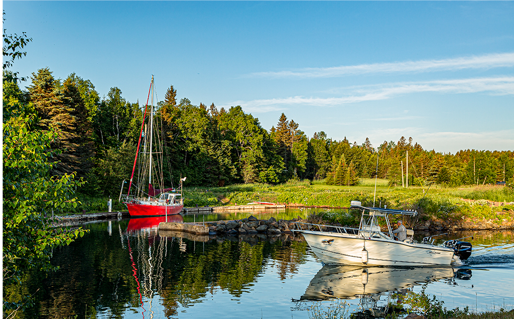
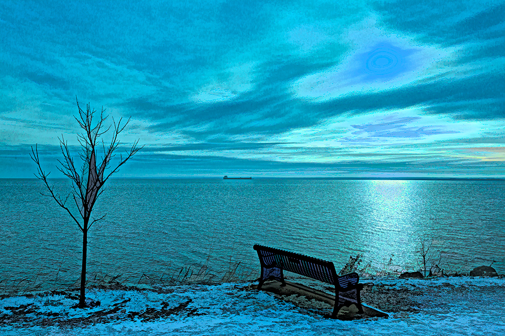
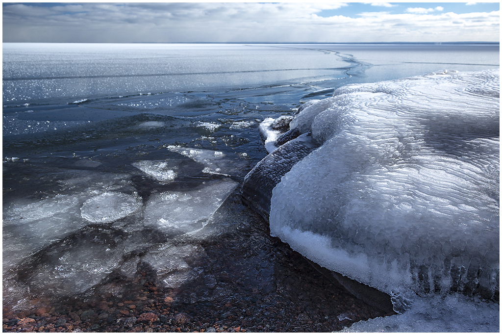
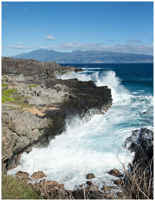
Anne, good suggestion. I will go down to the shore and try photographing, perhaps with a longer lens. See my comments to the others above. |
May 23rd |
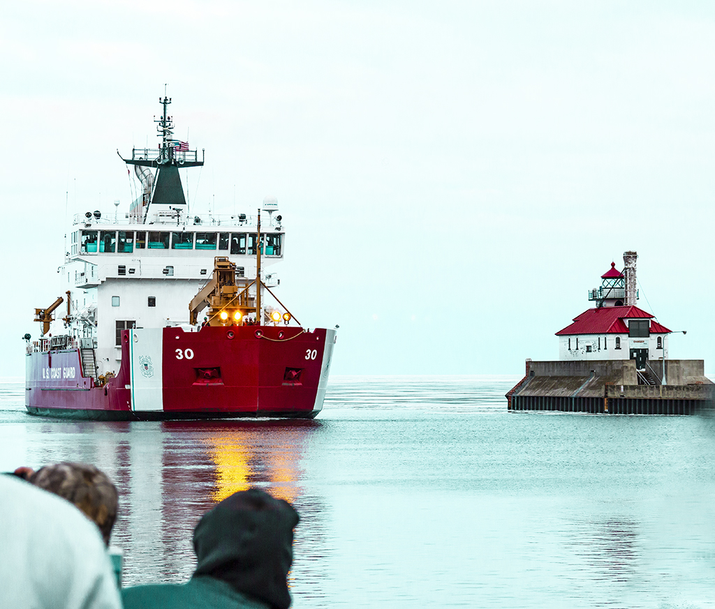
| 40 |
May 21 |
Reply |
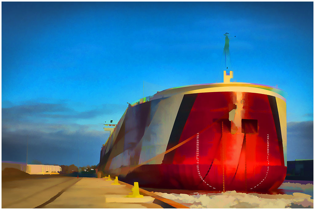
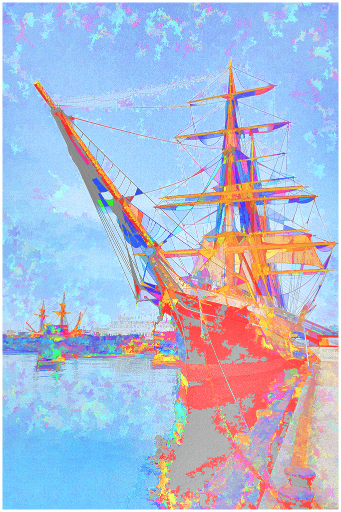
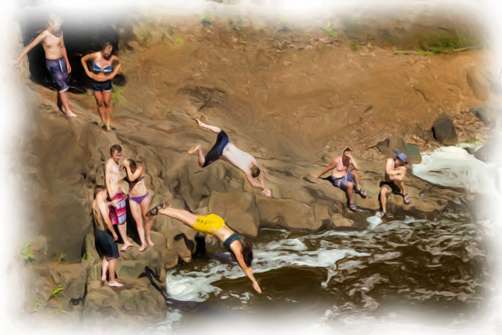
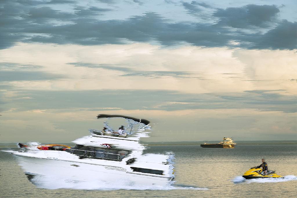
Alison, your crop works beautifully for an image of the iron ore carrier, perhaps with a longer tele lens than the 300mm lens I used. See my response to Larry above. |
May 23rd |
| 40 |
May 21 |
Reply |
Alison, your crop works for a panorama.
|
May 23rd |
| 40 |
May 21 |
Reply |
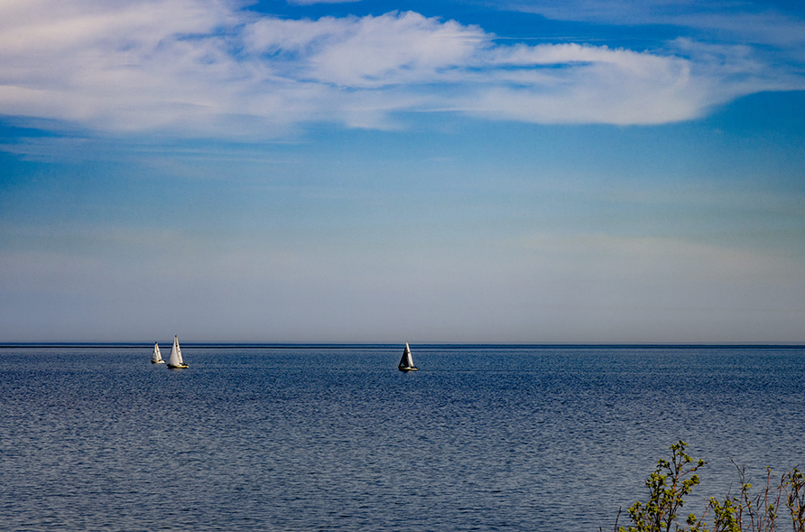
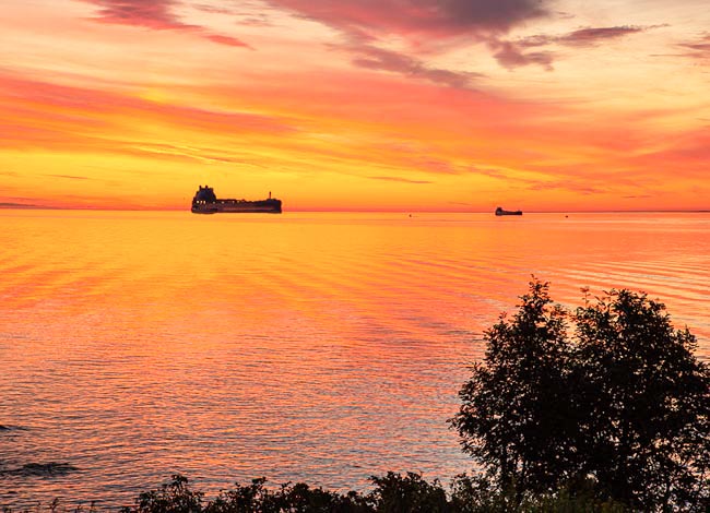
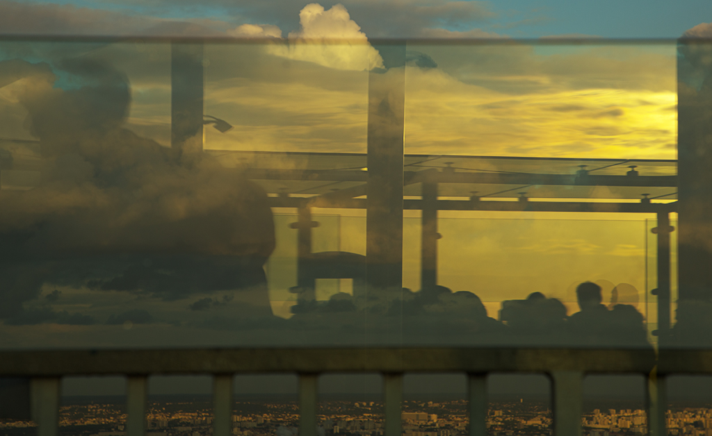
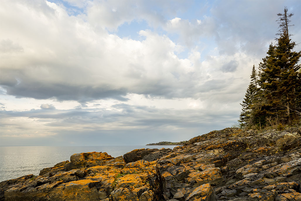
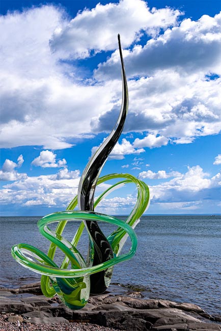
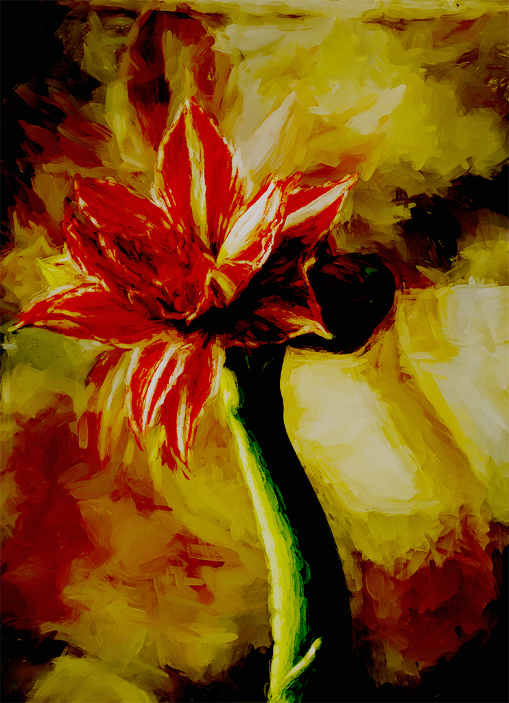
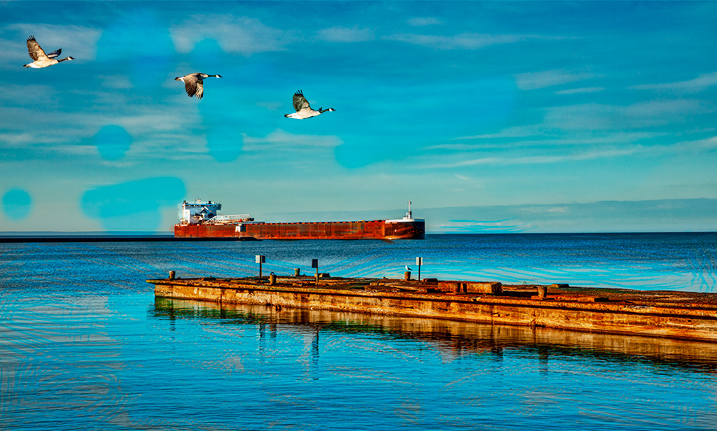
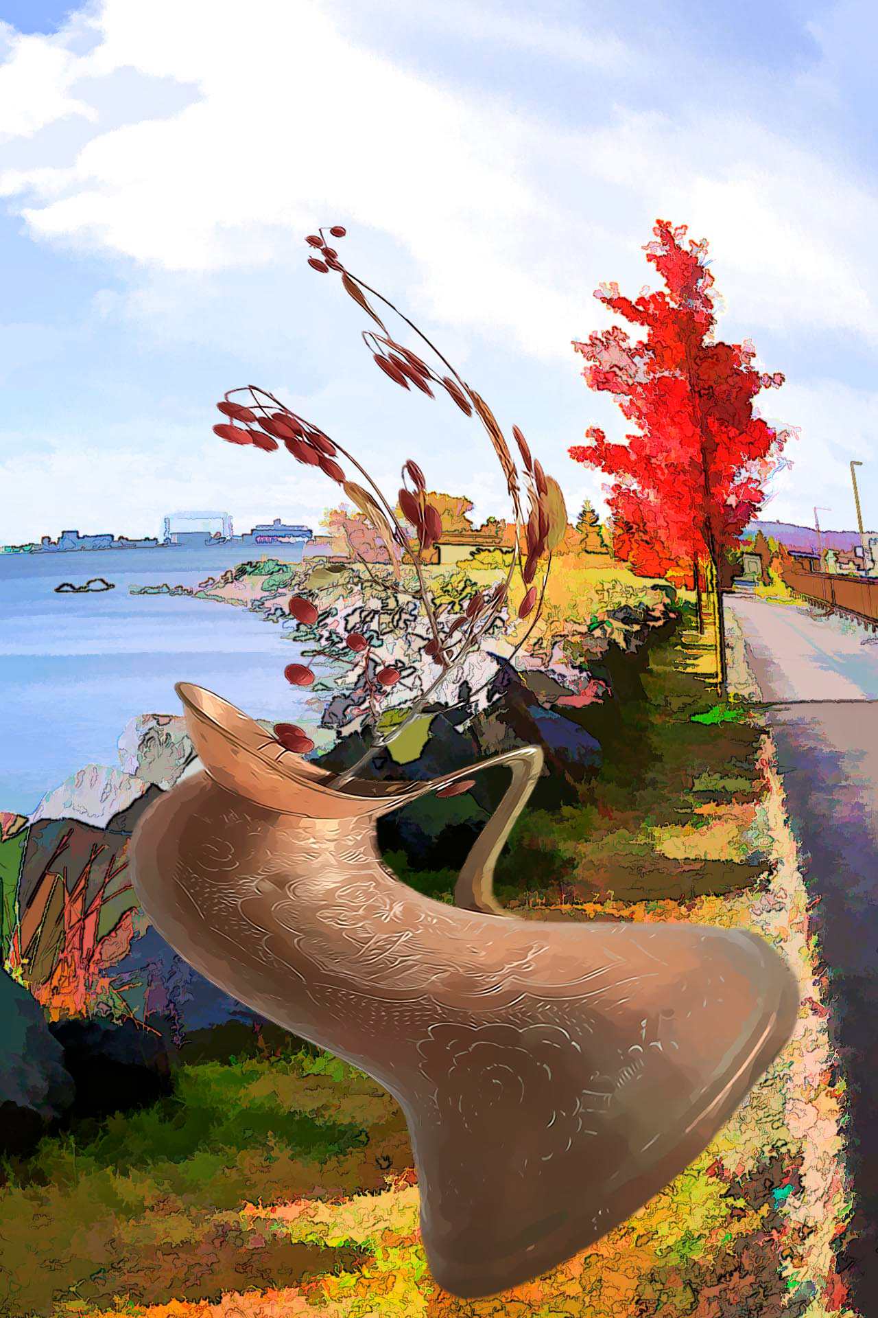
Andrew, I agree with you and thought this image didn't have much punch when I submitted it. On the other hand it does indicate, to me anyway, a warm, quiet, spring day at the shore of Lake Superior. |
May 23rd |
| 40 |
May 21 |
Reply |
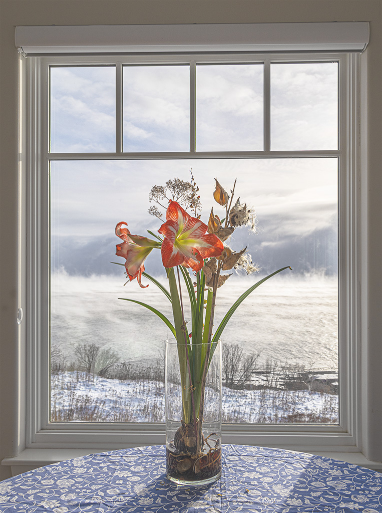
Larry, thank you for your thoughtful and instructful reply. Hence forth I will take a moment before pressing the shutter release to to focus on what I want to say.
Now as to this image, what do I want to say. To start out with the day it is spring, it is warm and beautiful clouds, which I wanted to include, are floating across a clear blue sky. I have a personal love affair with clouds and like to include them when I can. An ore freighter is passing by all of which indicates spring in Duluth, Minnesota.
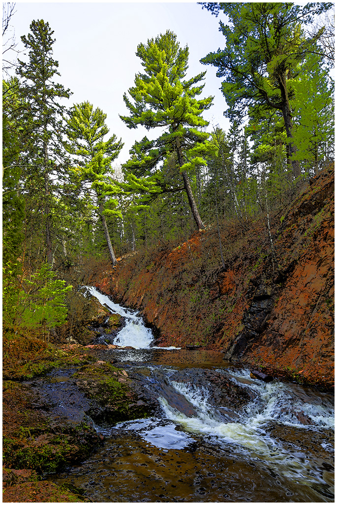
So let's say I wanted to capture spring and a passing freighter. The blue sky and clouds can say spring. The arrival of iron ore carriers say spring. Fresh green spring leaves say spring (but they hadn't quite popped yet). But the iron ore carrier is distant and remote. Had I thought a moment I would have left the deck, gone down near the shore, and included some shoreline, trees or bushes in the foreground and included the freighter as perhaps the center of interest coming in from the left side. From my own preference I would have included the same amount of sky and clouds just because I like wide open spaces. Perhaps I could use a longer lens than the 300mm lens I used but then it would be difficult to include shoreline.
Ok, two different images here. I should have used a 500mm tele lens to concentrate on the freighter and forget the concept of spring. Or I should have concentrated on the concept of spring, while forgetting about the freighter.
Once again Larry, thanks for pointing out to me to take a moment to think what I want to say and concentrate the image on that.
|
May 23rd |
| 40 |
May 21 |
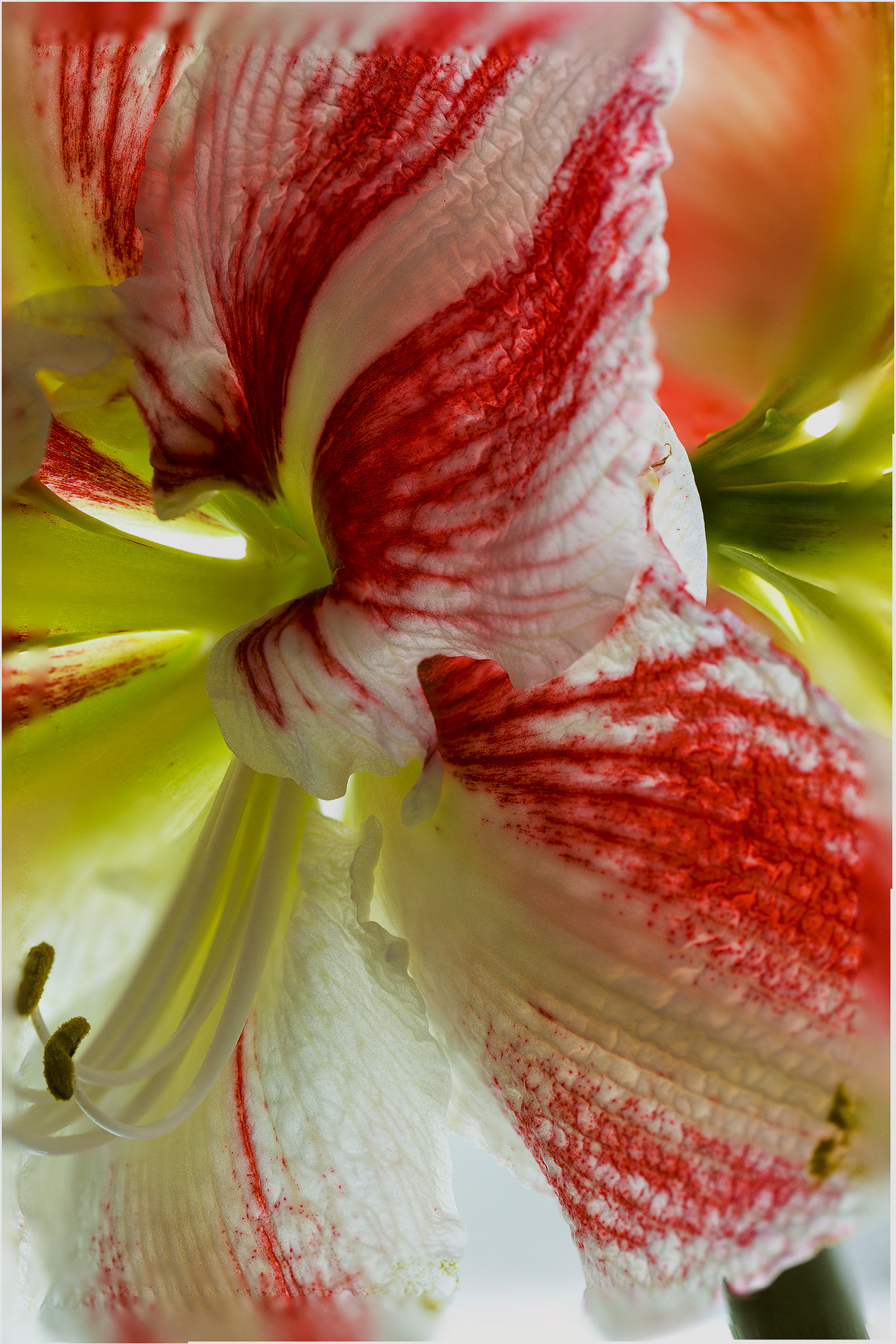
Comment |
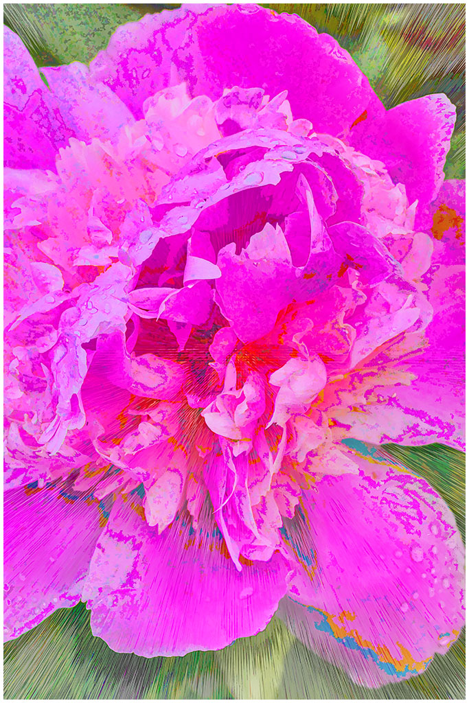
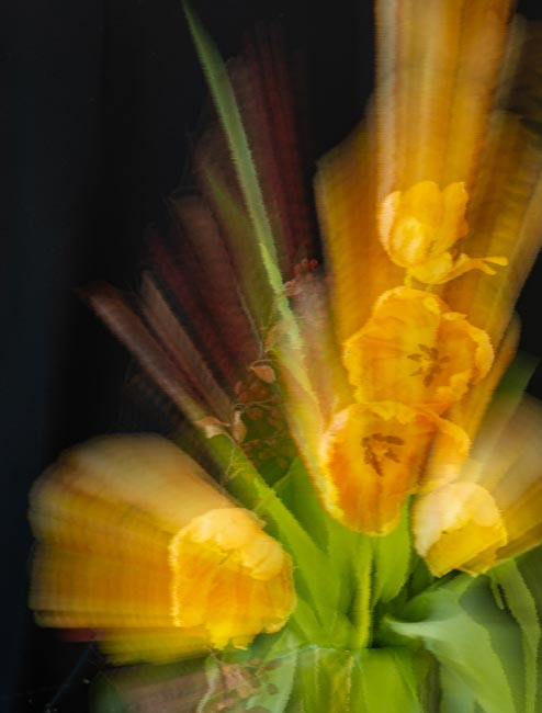
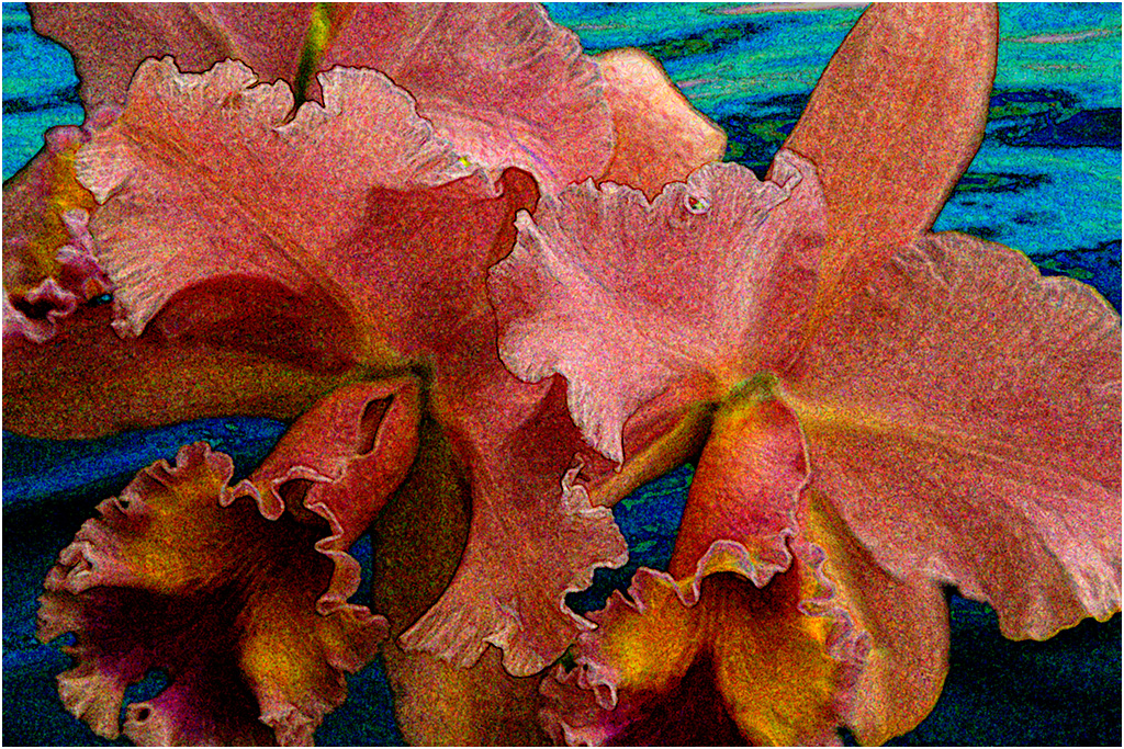
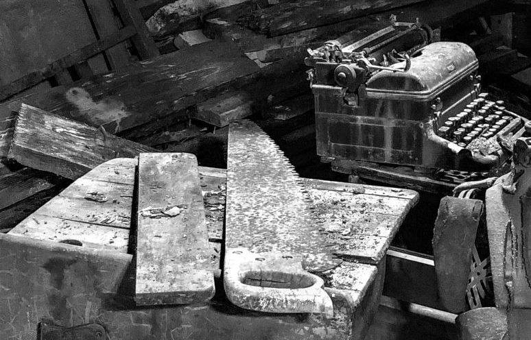
Catherine, nice find and nice conversion into black and white. I really like the contrast between the window light (?) and the shadows.
If this were mine, I would be tempted to crop it so the saw blade and the typewriter become a focal point and center of interest. What do you think?
Now having read Alison, Andrew, and Anne's comments I think there are several versions of this that all would be good.
Nice work!
|
May 22nd |
 |
| 40 |
May 21 |
Comment |
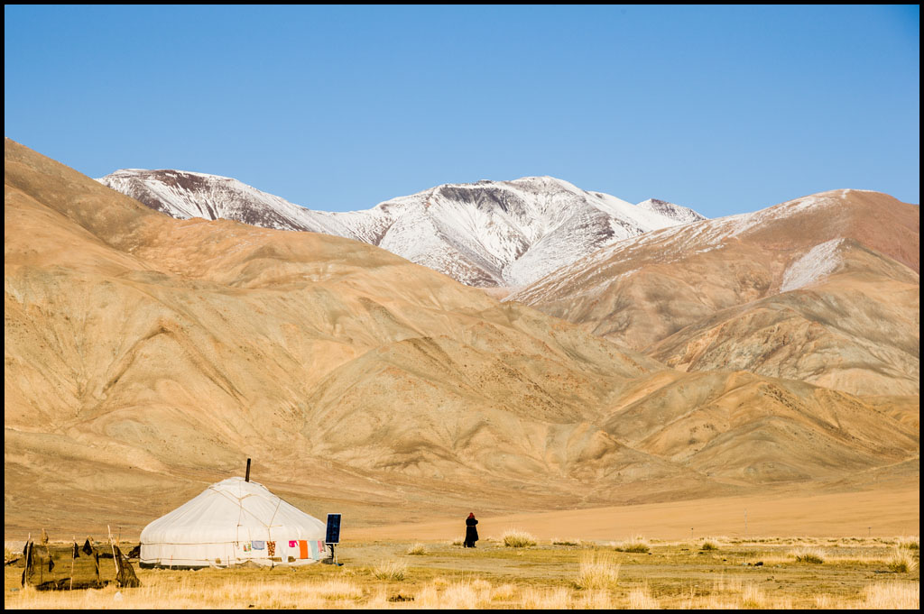
Jamie, I am impressed that you could do this with a cell phone and be as sharp as it is. Your use of the shoes and socks in the foreground with the footsteps in the sand leading into the background puts great motion and energy into the image.
I am wondering, without being there, if you could have moved slightly left and turned slightly left so that the curving line of footsteps would extend more to the left. But I don't know what is over to the left. And the snow covered peak would be omitted. Nope, I think you notched it.
Jamie, isn't it great to be free again! |
May 20th |
| 40 |
May 21 |
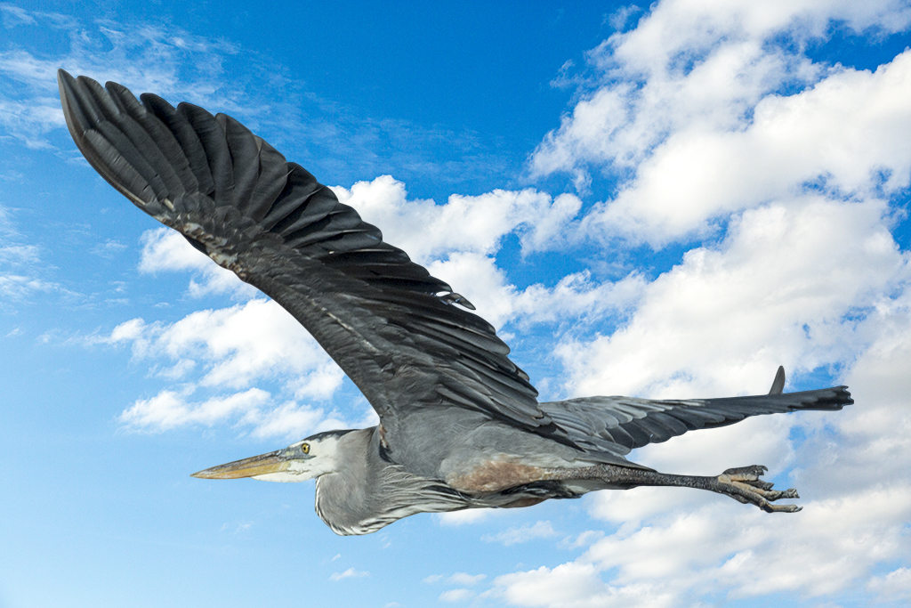
Comment |
Annie, flipping and cloning out the branch in front of the beak was the way to go. The sharpness of the eye is right on. The softness of the background concentrates one's attention on the bird. All magnificently done!
I particularly like how sharp the legs are. It is not often that one sees such detail in legs which makes it all the more interesting.
I found the comments of the others informative and interesting. |
May 20th |
| 40 |
May 21 |
Comment |
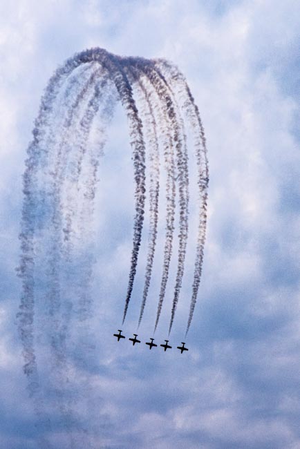
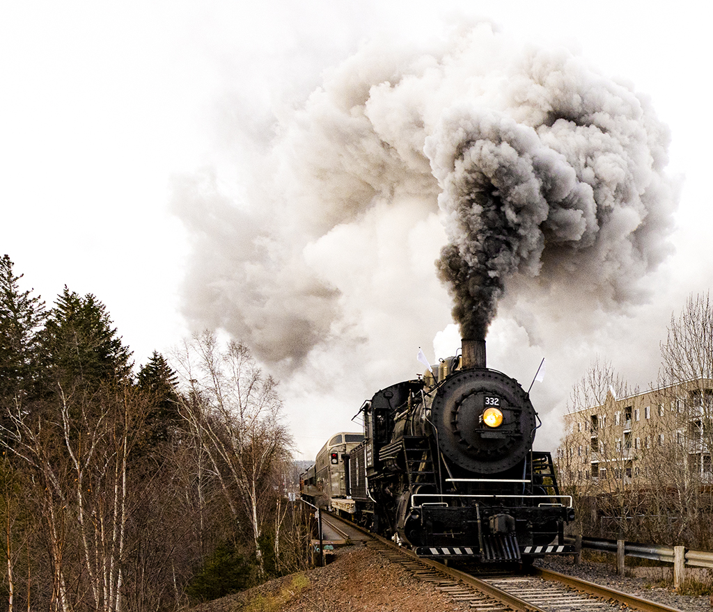
Julie, I like it! It is simple, the plane has a nice tilt, you have caught the slight puff of chemical. The prop - I like that your exposure time has captured the prop sharply so that you can see it is a 5 bladed prop used in crop dusting planes. Some viewers would like a slower, blurred motion. To each his own.
Your lightness/darkness is spot on and you cloned out the power lines of the original beautifully.
If you wanted to play in Photoshop, you could add some clouds to the background but I believe you do not like to manipulate so I think you are perfect as you have done it. |
May 20th |
| 40 |
May 21 |
Comment |
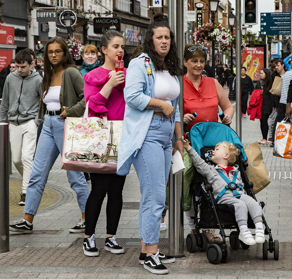
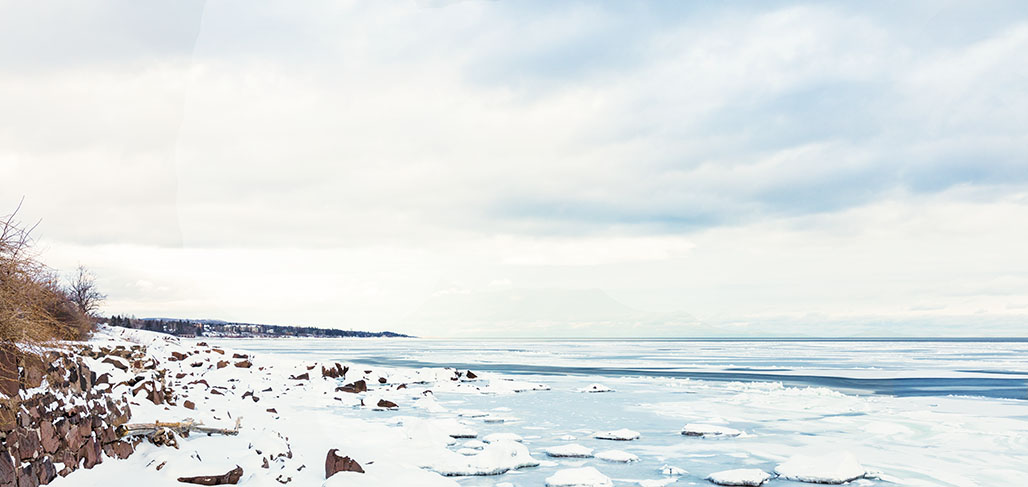
Andrew, I could flip a coin of whether to keep or crop out the box. I guess I would keep it because I like to have a number of things to look at in an image.
I might like a little more brightness to the overall image but I realize you were showing that it was just at sunset.
I think the next frame on the roll is the better of the two. |
May 20th |
5 comments - 8 replies for Group 40
|
| 41 |
May 21 |
Comment |
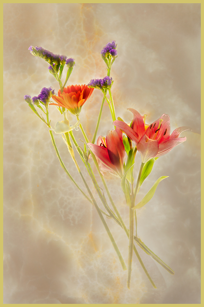
Lisa, a brilliant stunning image! There is no suggestion I could make for improvement. |
May 22nd |
| 41 |
May 21 |
Comment |
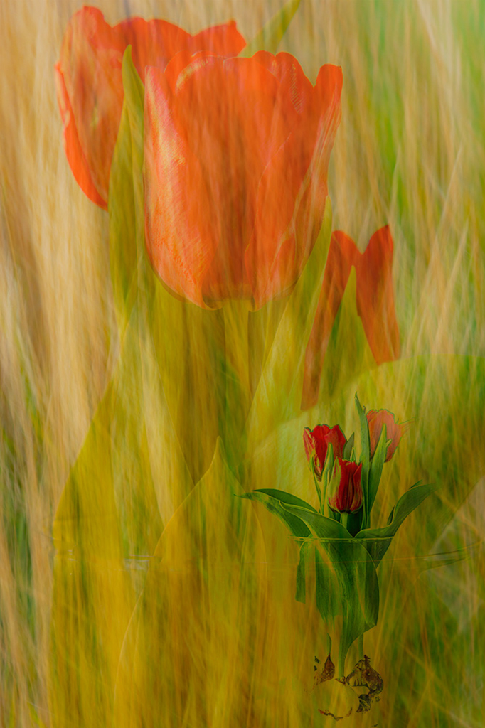
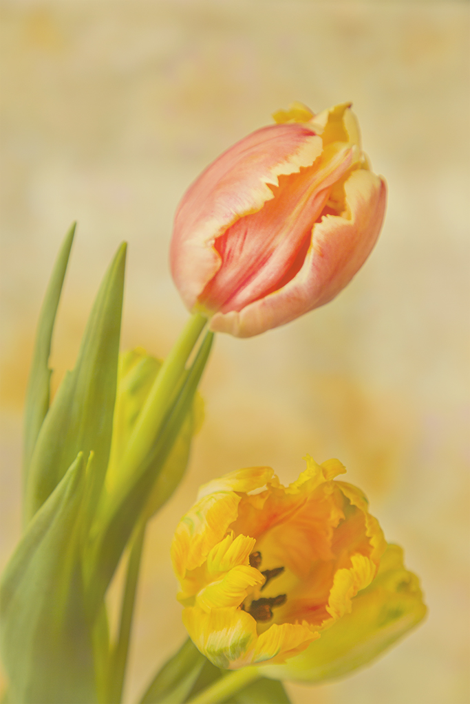
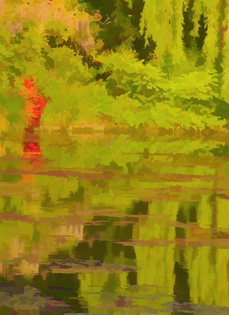
You are becoming an impressionist Jan! The softness and blending of the colors and the simplicity of the composition speak to me. This is perfect, no suggestions needed Jan. |
May 22nd |
| 41 |
May 21 |
Comment |
Tom, you really are imaginative and creative! I wait with baited breath for your next creation. |
May 22nd |
| 41 |
May 21 |
Comment |
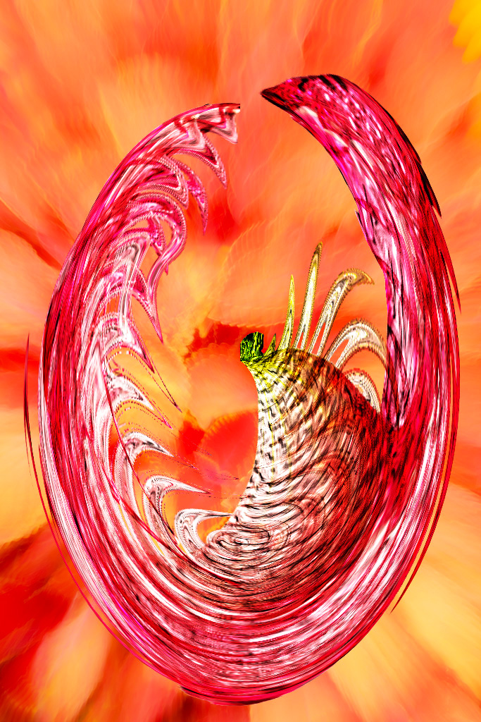
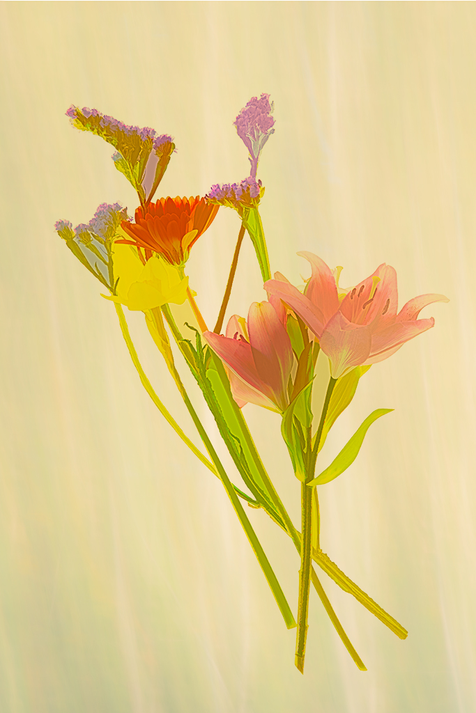
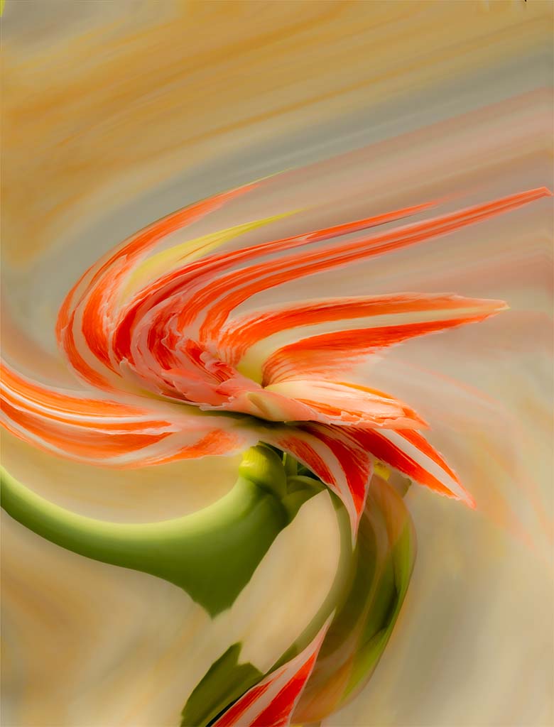
And there we go Mary Ellen for a ride out into the solar system. I like the changing size of the planets, and the swirls as they turn round and round. The abalone shell is so colorful and beautiful that I wish it were a little brighter.
Beautiful creation!
|
May 22nd |
| 41 |
May 21 |
Comment |
Kathy, you and Brad are masters at putting composites together! I think the smoker really adds pop to your concept. But could you move the smoker a little to the left so he doesn't blend in to the monument? and now I see a mask on the right which could have more contrast so that it doesn't blend into the background. What fun?
Now, reading the comments of the others, I realize you were aiming for ghost like qualities which I was too literal to notice. Great idea! |
May 22nd |
| 41 |
May 21 |
Comment |
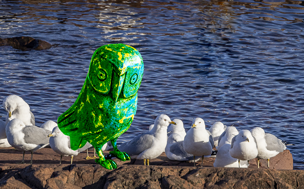
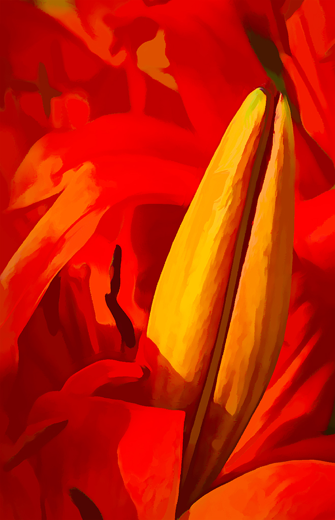
Ah Brad, you are so whimsical and creative! Direction to take this? How about a butterfly or ants coming out the mouth of the skull?
I really like the way you took the skull off the bench, put it on the ground and worked into the flowers on the ground. You have such a creative imagination!
How were you able to change the flower color from purple to blue so deftly?
The comments of the others are interesting. |
May 22nd |
6 comments - 0 replies for Group 41
|
11 comments - 8 replies Total
|