|
| Group |
Round |
C/R |
Comment |
Date |
Image |
| 40 |
Mar 21 |
Comment |
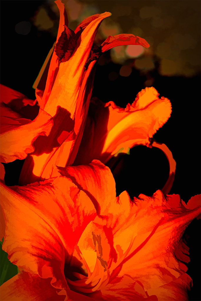
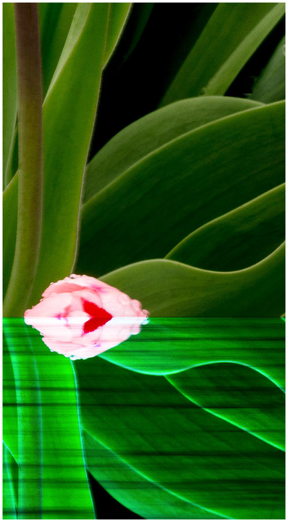
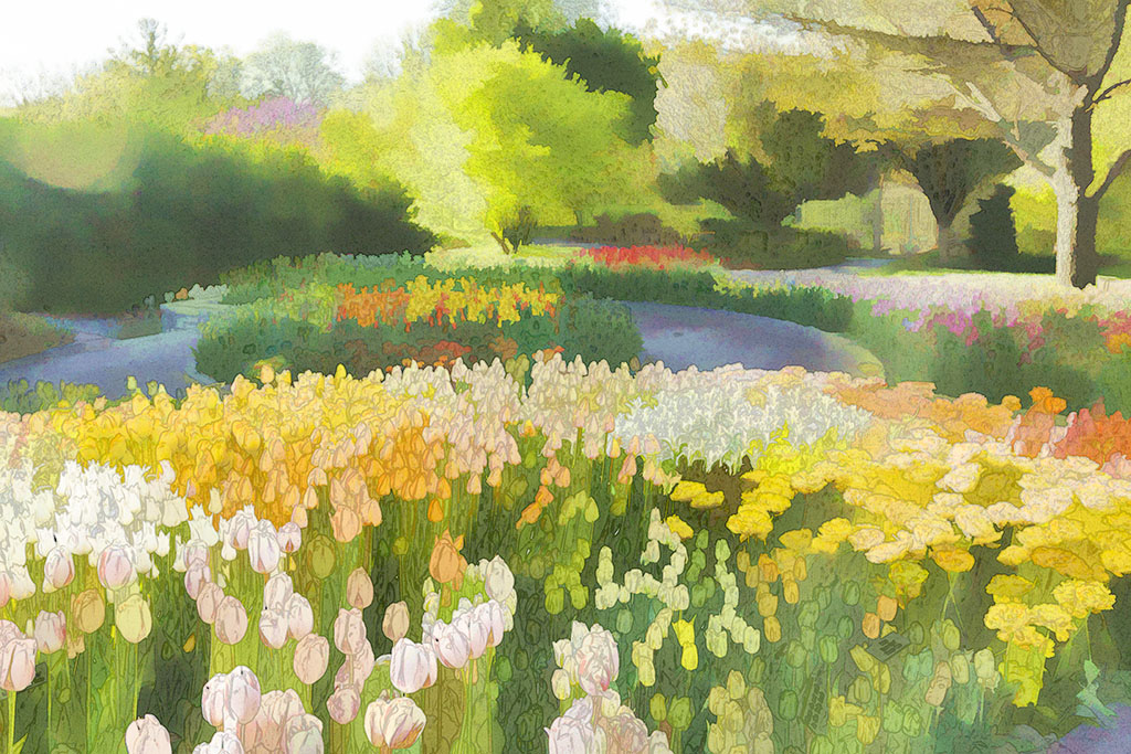
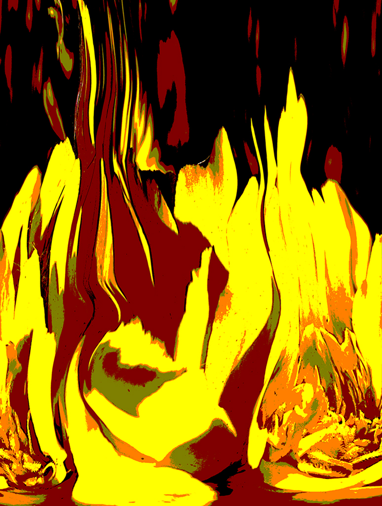
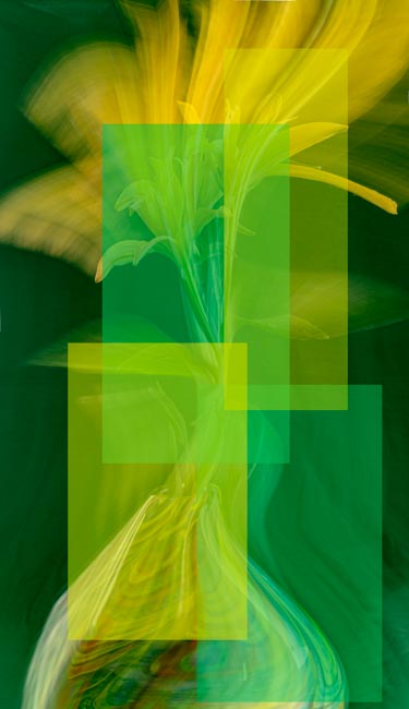
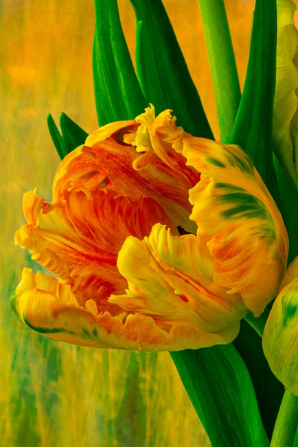
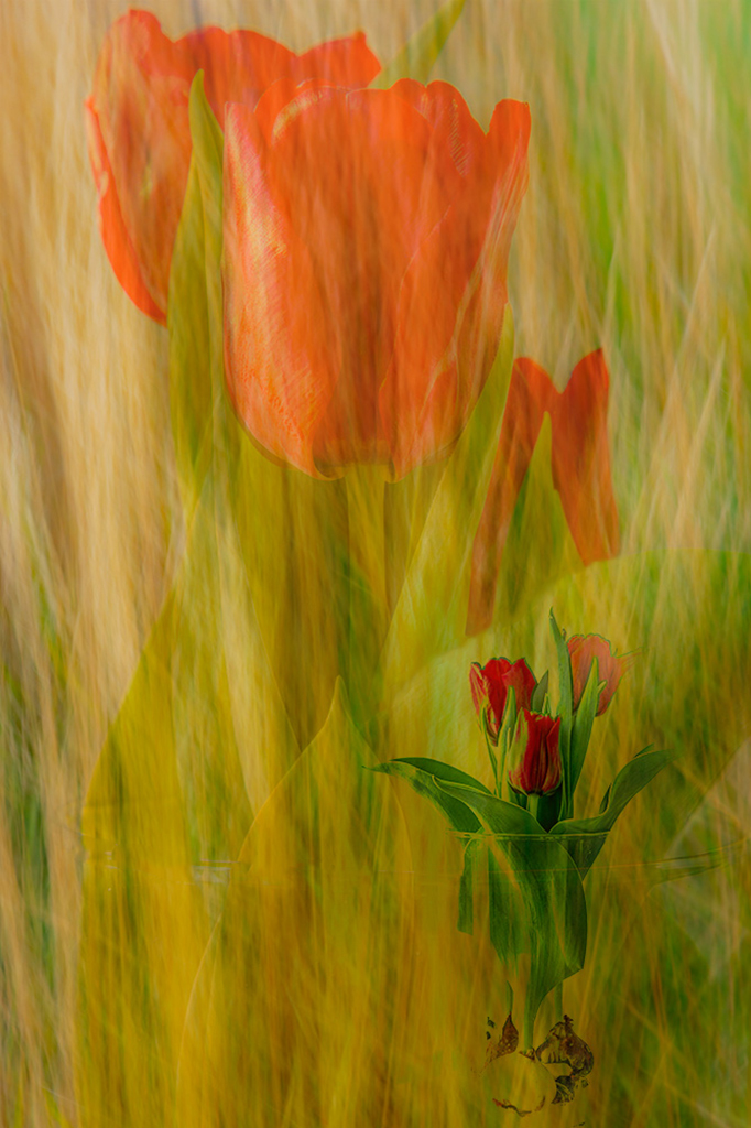
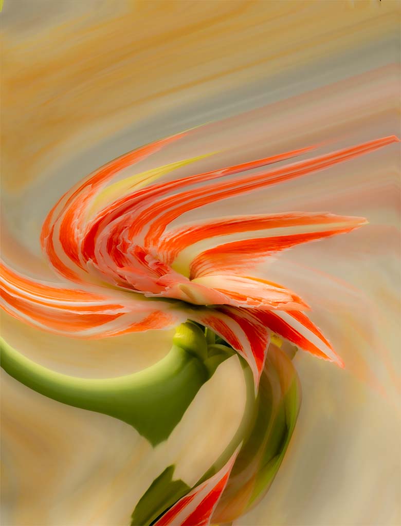
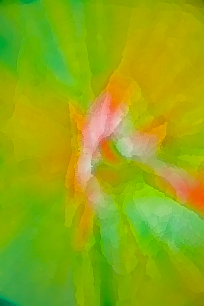
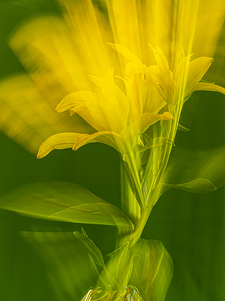
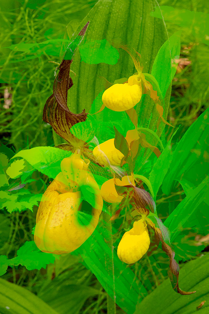
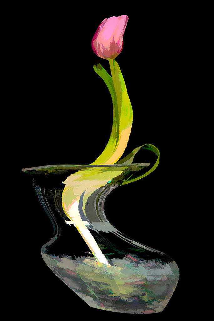
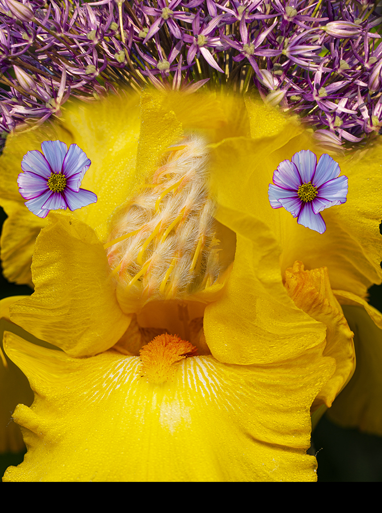
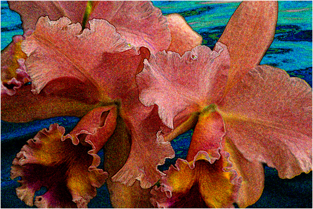
This is a nice abstract Catherine with the abstract effect working well. The yellow colored objects give it life and vitality.
A thought - this would work well as an abstract background base for another photo. The others have good suggestions. |
Mar 22nd |
| 40 |
Mar 21 |
Comment |
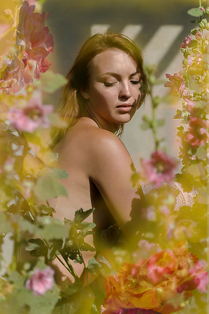
Nice portrait Alison! I wonder if you cropped in a little bit and reduced some of the blue cast this would be more personal.
The comments above are worth trying. |
Mar 22nd |
| 40 |
Mar 21 |
Comment |
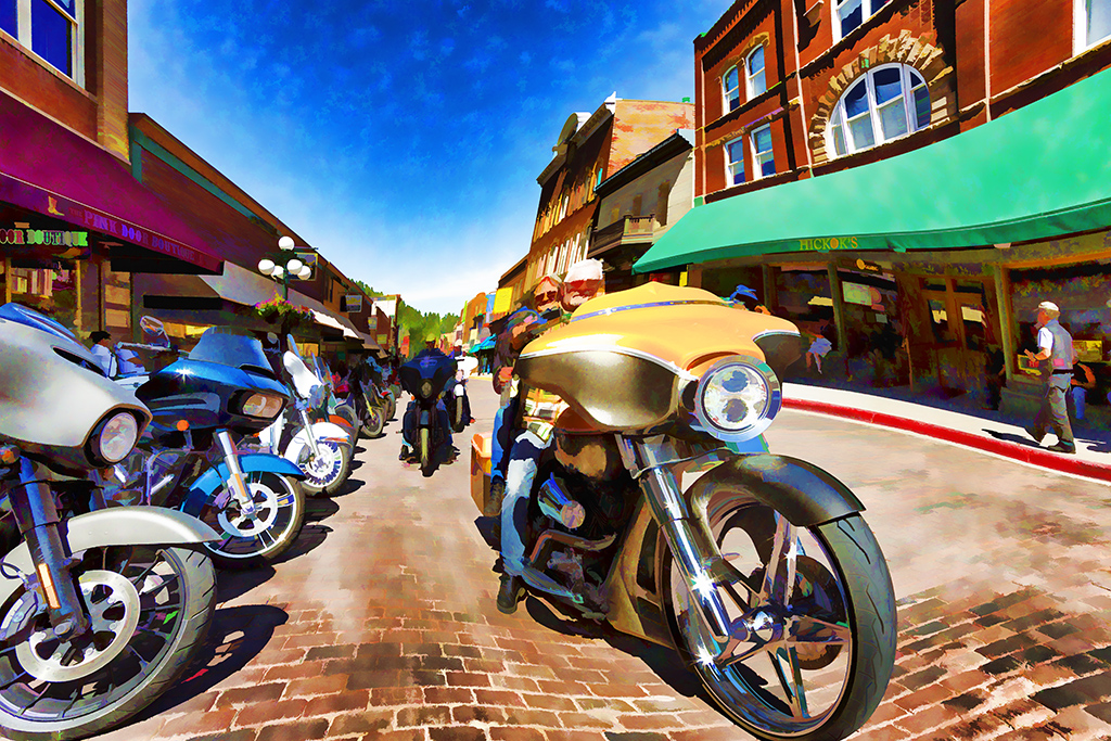
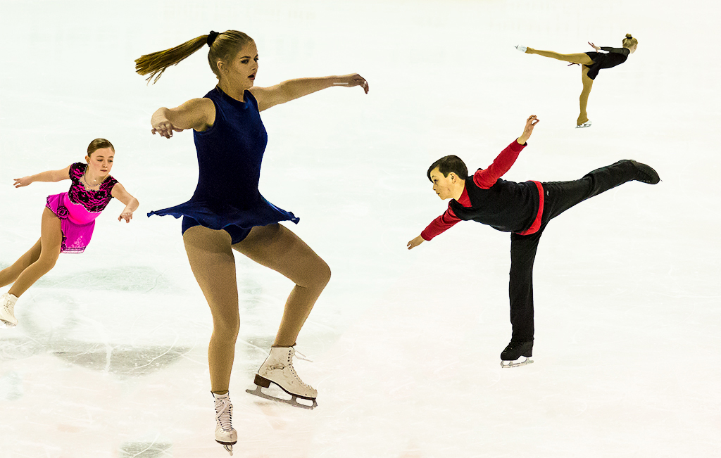
Jamie, black and white is the perfect answer to this stellar image! Your cropping to the essentials is good. However, another alternative might be to crop in on the right (or alternatively on the left) and have some natural context about the three webs. |
Mar 22nd |
| 40 |
Mar 21 |
Comment |
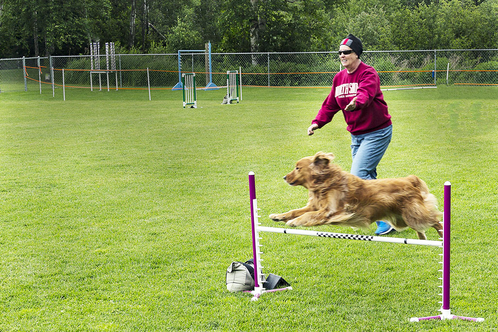
Anne, I really like the results of your post processing. The repetition of mail boxes and mail bags builds eye appeal. Using a 16mm fish eye lens adds drama to the workspace.
Now if I had done this I would think to myself why didn't I get someone to pose as a sorting mail model which would add some human interest. Of course I usually forget to do this until I look at the result on my computer monitor.
I really like all the interesting detail and lines that jump out here. Nice work! |
Mar 22nd |
| 40 |
Mar 21 |
Comment |
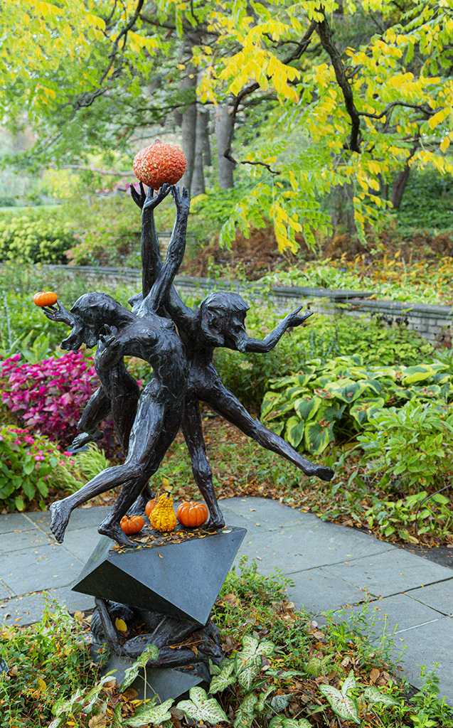
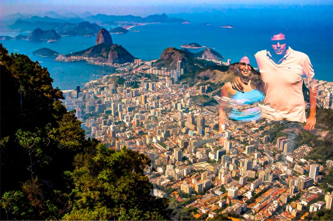
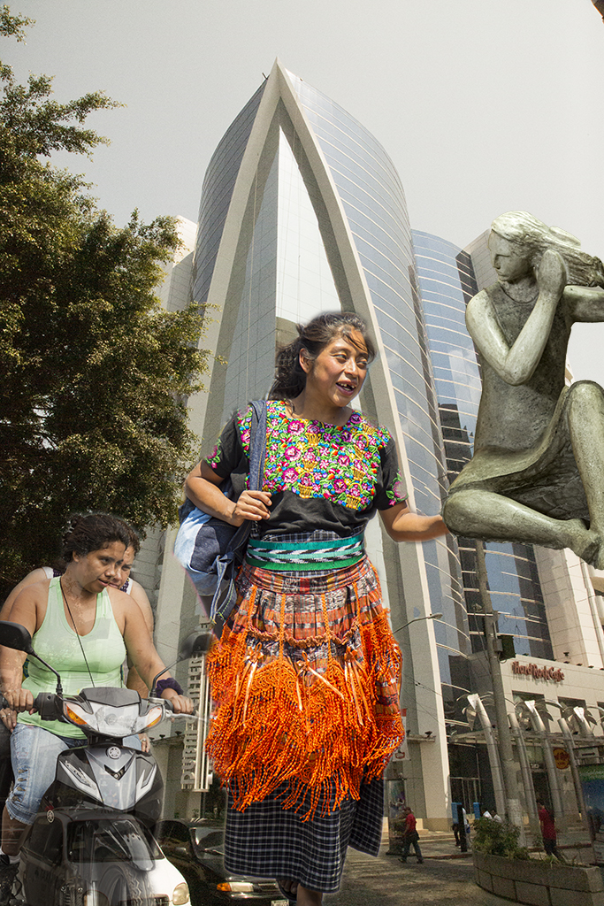
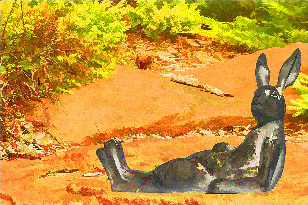
Andrew, I like the statue and think you did a great job of making them the center of interest. Yes, you could blur out some of the background a little bit but leave it there for context. Of course you could have used a wider aperture to begin with or do so the next time you are there.
|
Mar 22nd |
| 40 |
Mar 21 |
Reply |
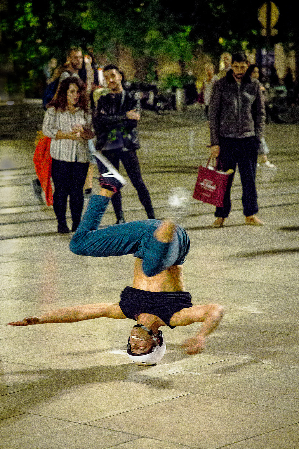
Anne, as to cropping, see my comment to Andrew. As to sharpness, I had pushed the ISO to high and was trying to reduce the noise but over did it. |
Mar 22nd |
| 40 |
Mar 21 |
Reply |
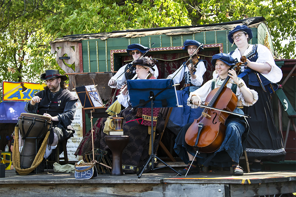
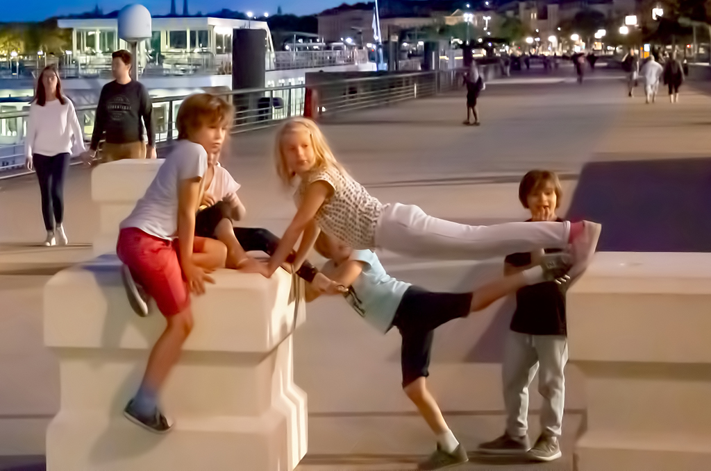
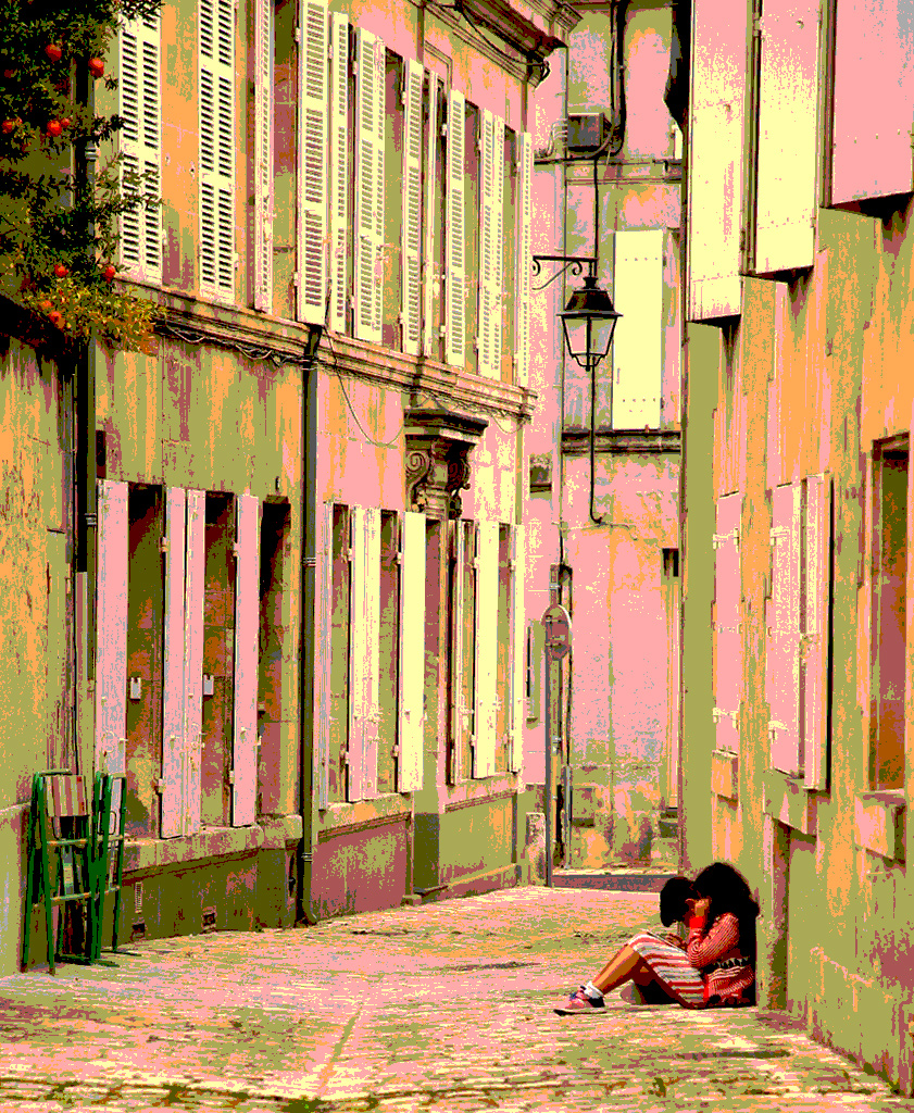
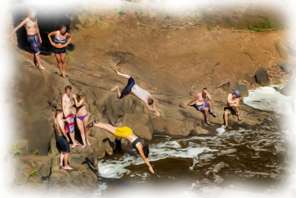
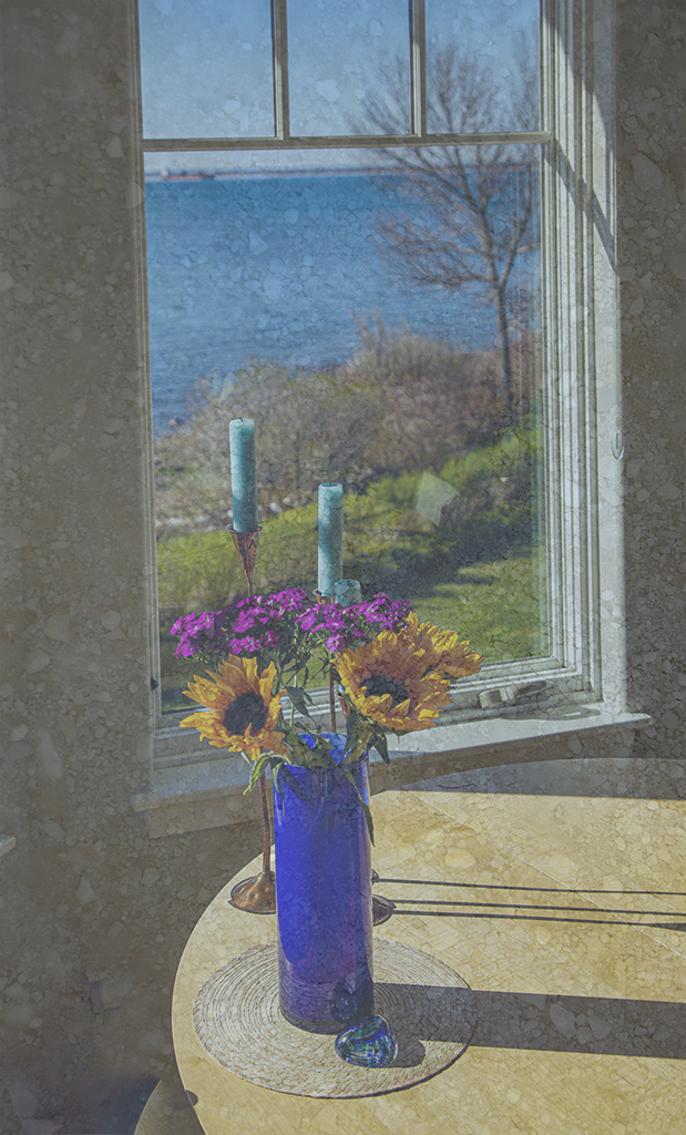
Andrew, I did over process. I need to work move with Denoise. As to cropping, I like my close cropping because it centers more on the children but I also agree with you that the original has a better feeling of scale and context. |
Mar 22nd |
| 40 |
Mar 21 |
Reply |
Hi Catherine, thanks for the comment. Children, when they are not watching a photographer, are so natural and interesting. |
Mar 22nd |
| 40 |
Mar 21 |
Reply |
Hi Julie, yes, I did take Denoise too far which caused the blurring. I will not take it as far next time. The children were watching the action in a skate board park which unfortunately was not behind me. |
Mar 22nd |
5 comments - 4 replies for Group 40
|
| 41 |
Mar 21 |
Comment |
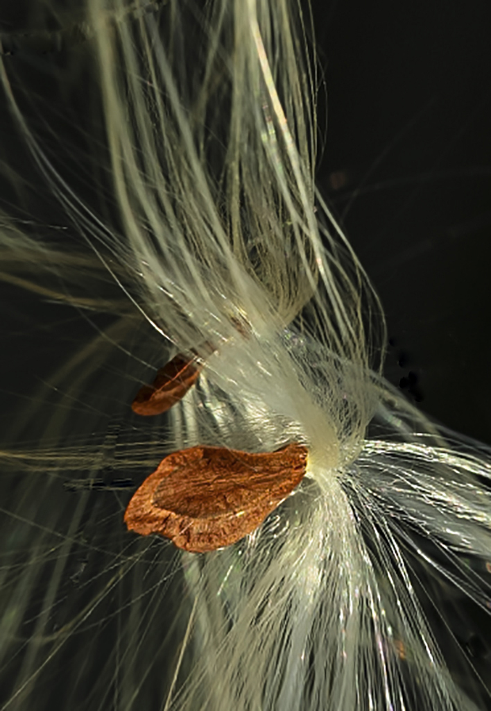
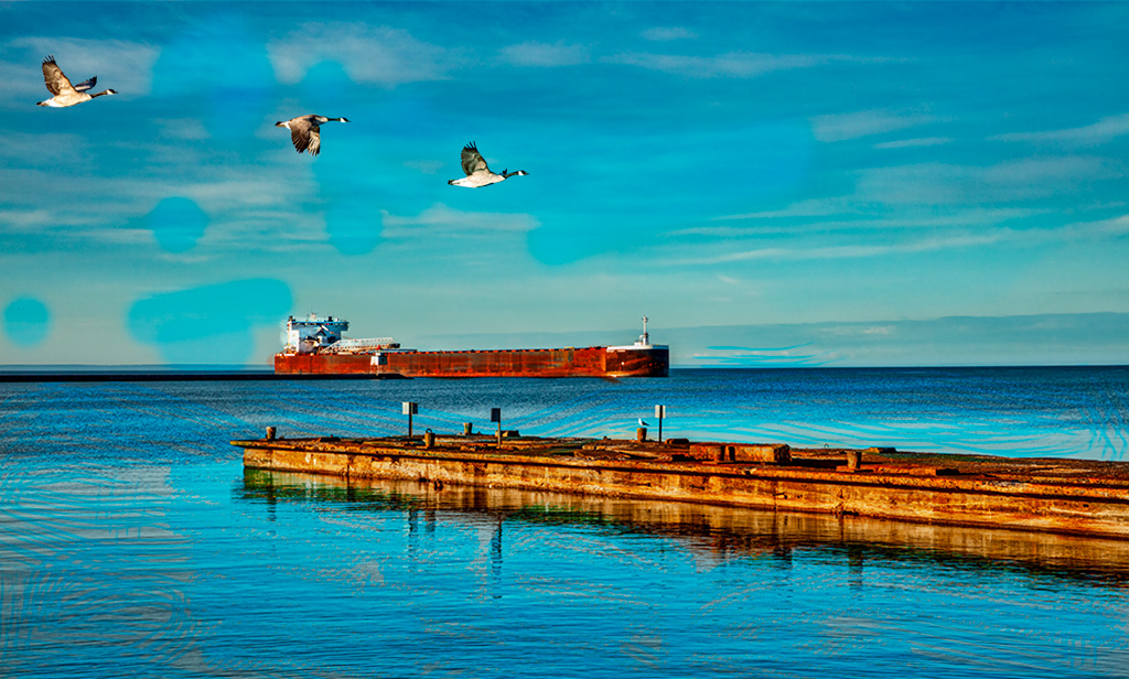
Jan, it has taken me a little time to absorb this image and what it means to me. Shall we say that it is a slight abstraction with the textured layer across the whole image and with the gull large in the foreground. I like it!
Now for some variations to try. Apply the textured layer only to the background but not the lighthouse and gull. Flip the gull to fly in the other direction. The gull is a little large in proportion to the lighthouse as you have done it but this to me just means it is closer to where I am standing.
Well, now after reading the above comments of Brad and Kathy, I see lots of variations that can be done. I can't wait to see your next submission. |
Mar 24th |
| 41 |
Mar 21 |
Comment |
Tom, I love this fantasy image and the creative energy you have put into it. I have no suggestions. But I do look forward with anticipation to seeing your future contributions. Welcome to the group!
I like Brad and Kathy's personal response suggestions and your response image to Kathy and your comment concerning phantom limbs.
|
Mar 24th |
| 41 |
Mar 21 |
Comment |
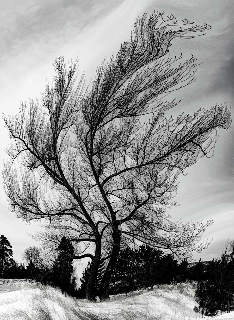
Maryellen, this appeals to me as a very subtle rendition of a tree stump we would pass by without noticing. But your use of Topaz has created an image that catches the eye and demands contemplation of the tonal gradations and the flow of the lines. The above comments suggest a focal point which would also be a complementary image. But as you have done this, I find my eye attracted to the central dark area and then freely wandering about to explore the rest of the image. Nice! Restful! |
Mar 24th |
| 41 |
Mar 21 |
Reply |
Kathy, that is a good suggestion. Here is an improvement.
|
Mar 24th |
 |
| 41 |
Mar 21 |
Reply |
Brad, you are correct that one shouldn't rely too much on Topaz. I will try to limit it's use in the future. |
Mar 24th |
| 41 |
Mar 21 |
Comment |
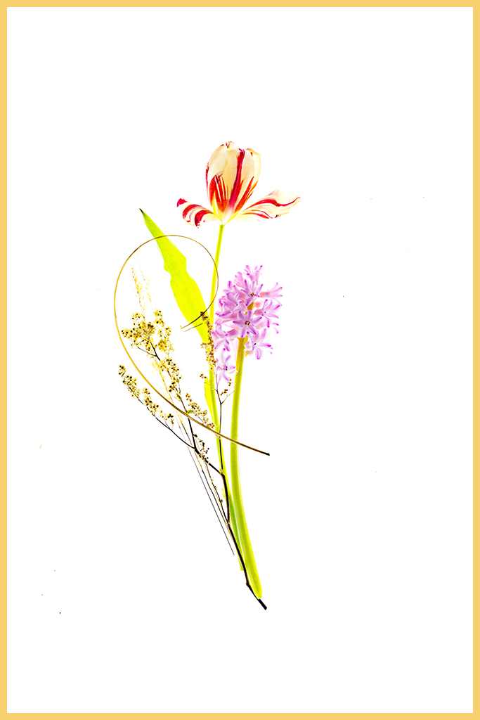
Kathy, this is a wonderfully conceived and skillfully executed composite. The sprig of flowers is the finishing touch. There is no way I could improve this work of art.
I enjoyed the comments of Brad and Tom above. |
Mar 22nd |
| 41 |
Mar 21 |
Comment |
Brad, this is a great composite with the hand and scissors adding a delightful whimsical touch. Topaz de-emphasized the forest making the tree stand out more. I can't think of any suggestions to improve this image. Kathy and Tom do have useful suggestions. |
Mar 22nd |
5 comments - 2 replies for Group 41
|
10 comments - 6 replies Total
|