|
| Group |
Round |
C/R |
Comment |
Date |
Image |
| 40 |
Jan 21 |
Reply |
Thanks Catherine. My submission for February will be a horizontal but I seem to innately prefer verticals. |
Jan 30th |
| 40 |
Jan 21 |
Reply |
Thanks Jamie. |
Jan 30th |
| 40 |
Jan 21 |
Reply |
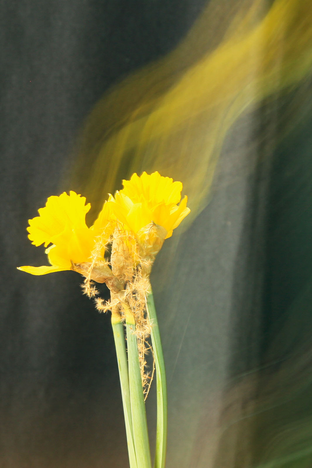
Andrew, now that you mention it, there is a softness I could have cropped out. |
Jan 30th |
| 40 |
Jan 21 |
Reply |
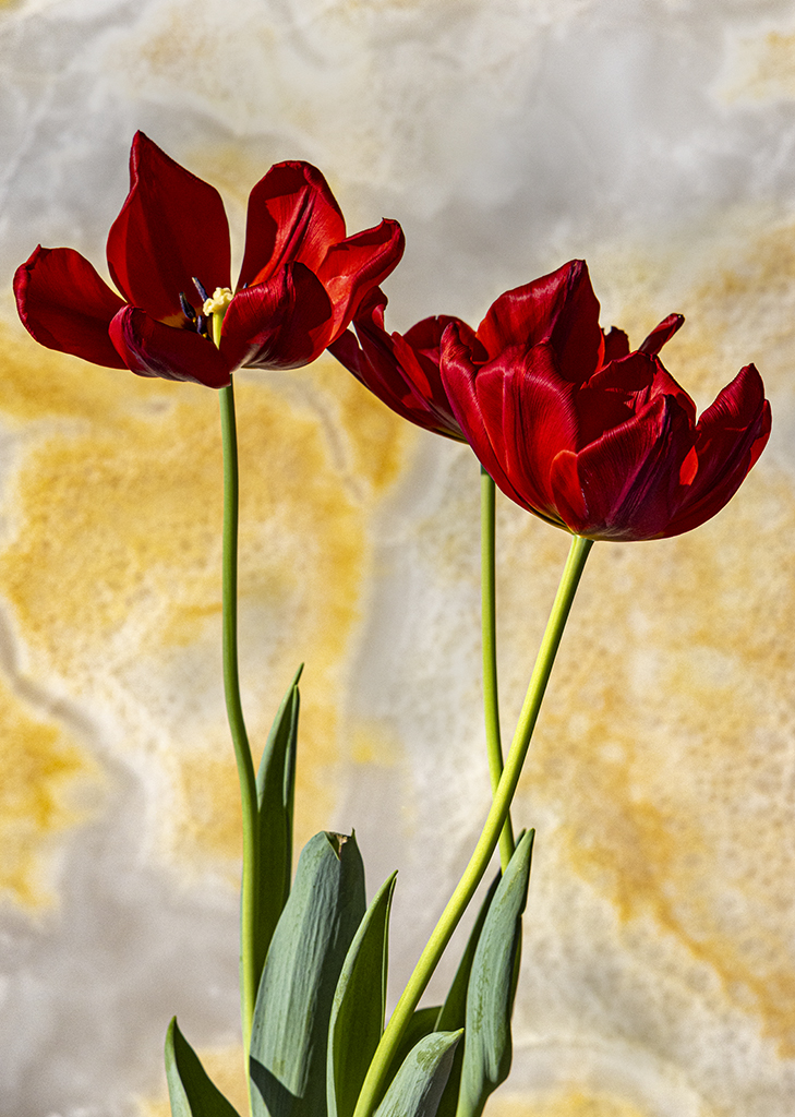
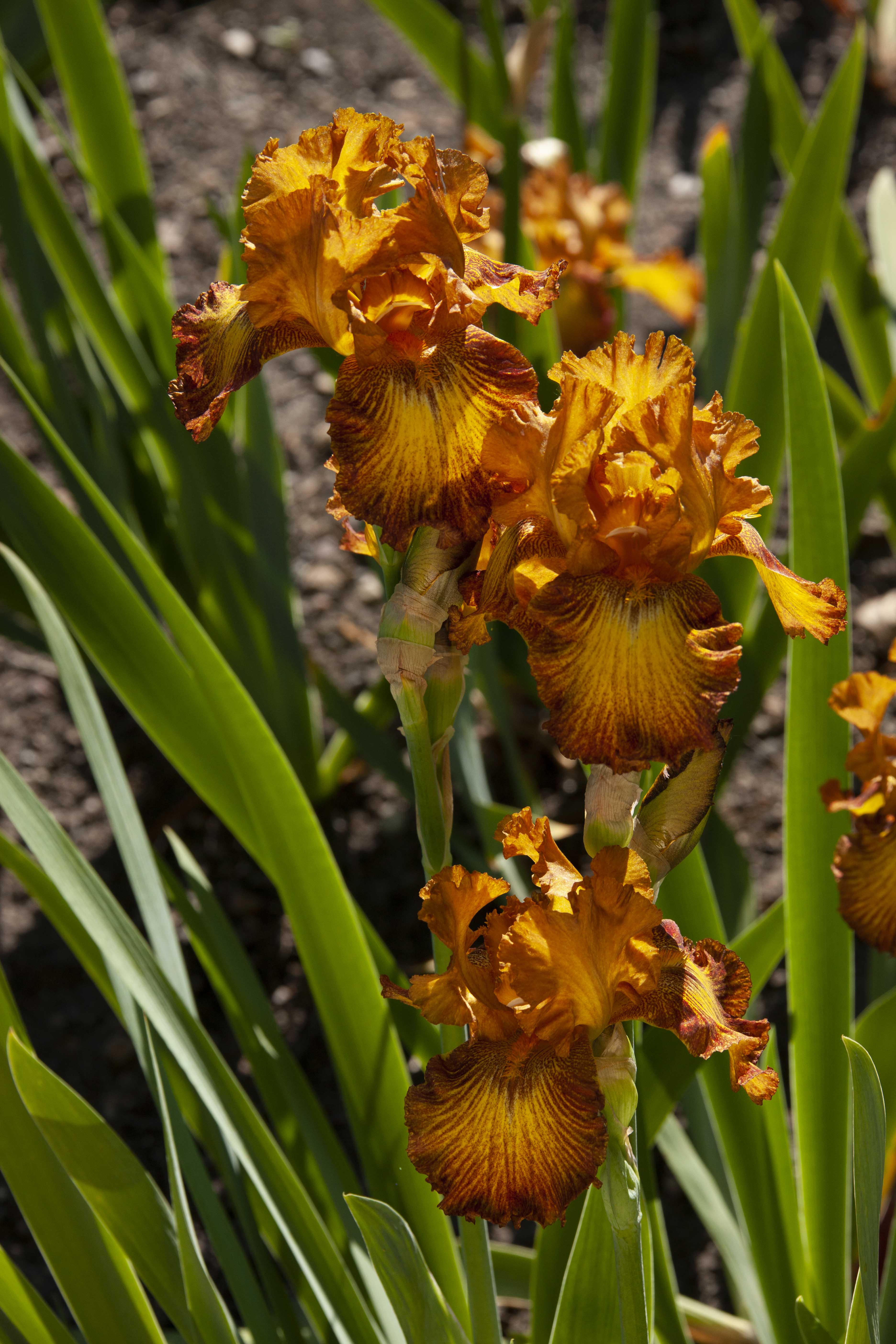
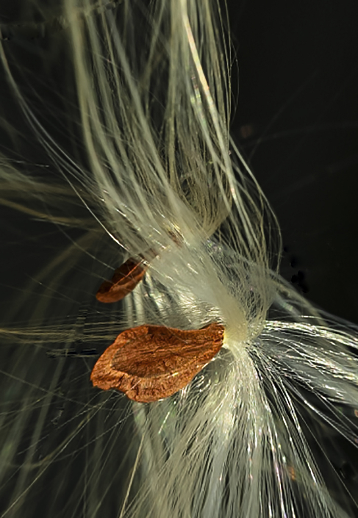
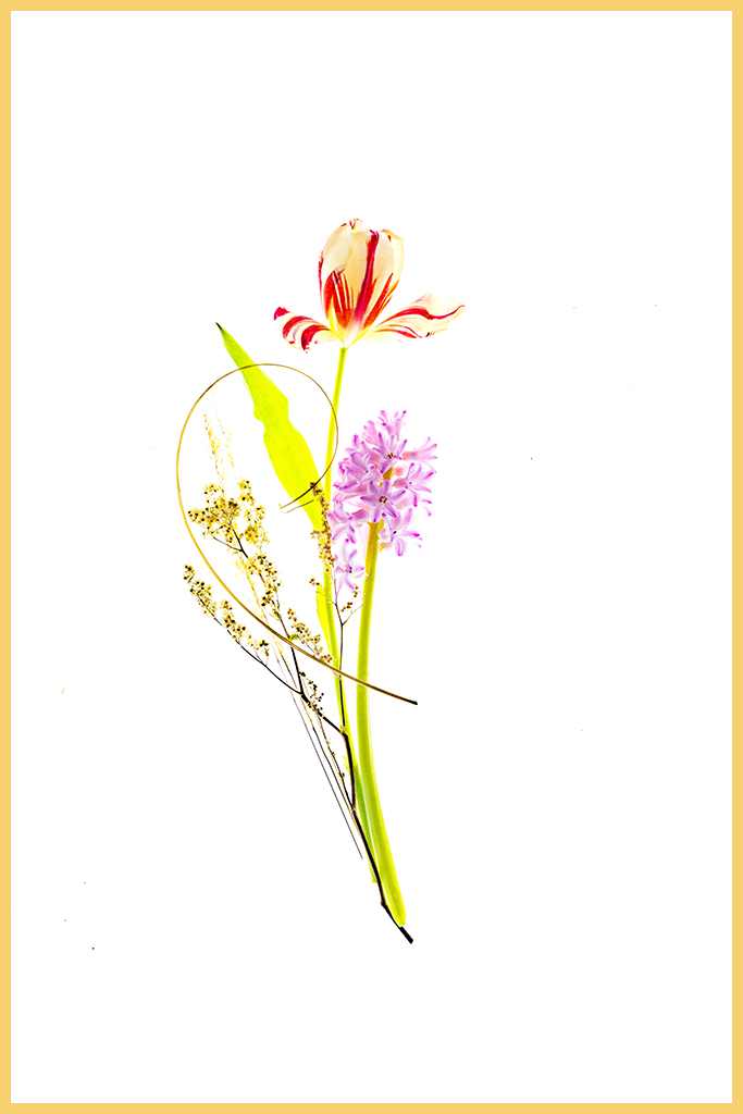
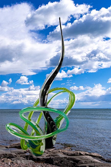
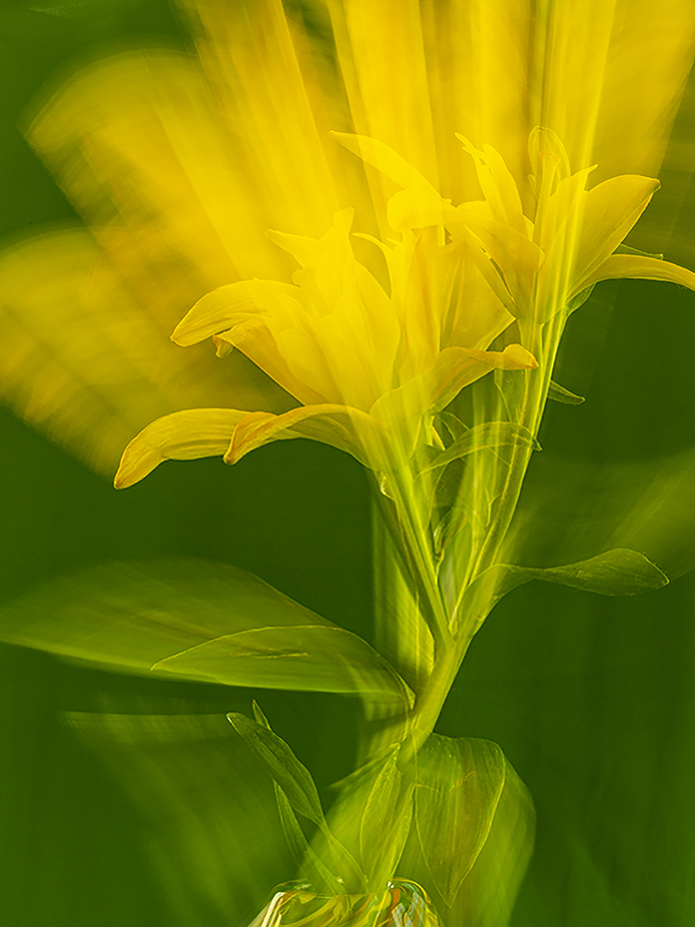
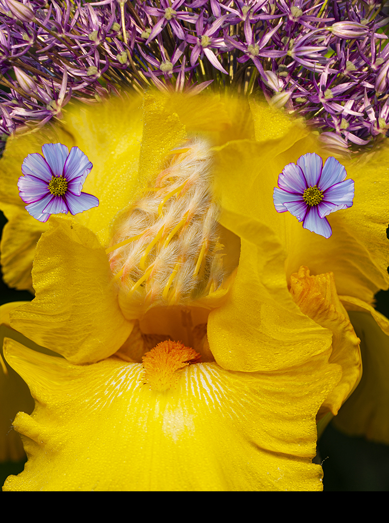
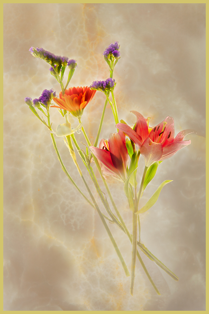
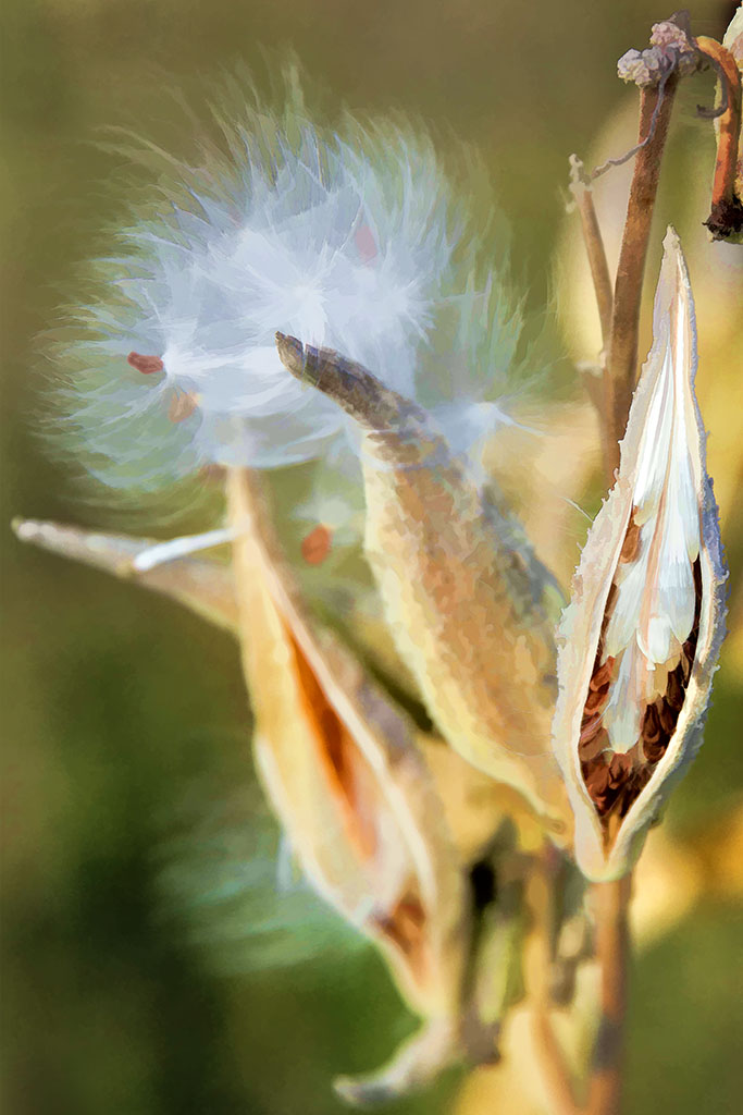
Julie, thanks for the comments and suggestions. Yes, a square format would work well but I also like the slight curve of the silken hairs. |
Jan 18th |
| 40 |
Jan 21 |
Reply |
Anne, for some unknown reason, I inherently usually prefer verticals to horizontals. Maybe it is because I am tall or I like ceilings up toward the sky Go figure!
Thanks for the suggestions and your designer self. |
Jan 18th |
| 40 |
Jan 21 |
Reply |
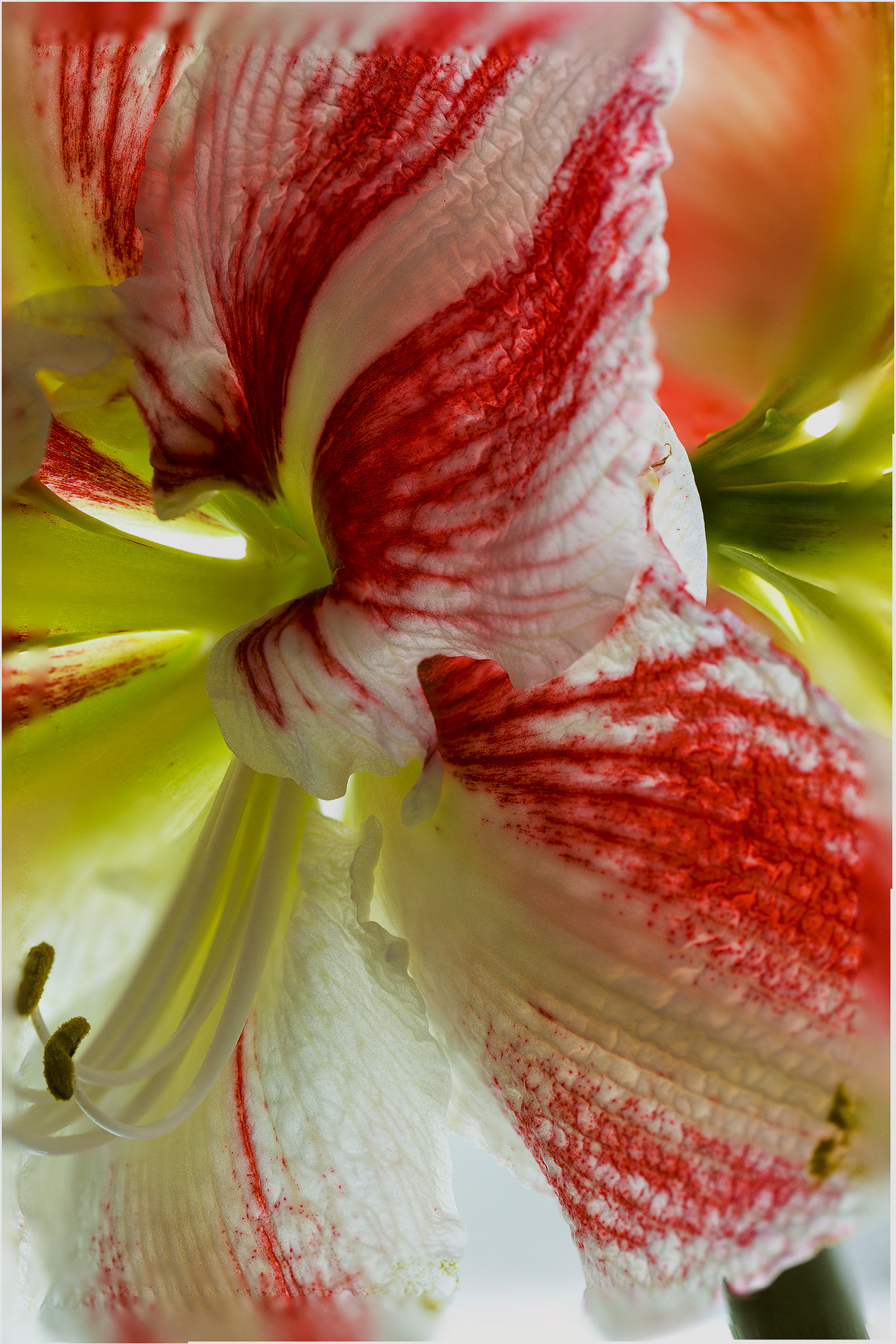
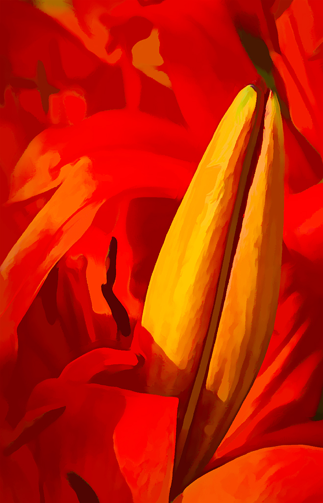
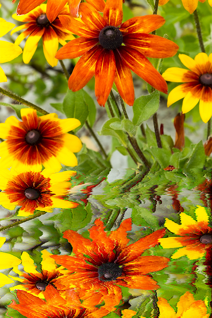
Alison, thank you for your comments. Perhaps I did go too far with the sliders - I will be more careful in the future.
The seeds - in the spring I will plant them, hope to get new plants and eventually monarch butterflies and caterpillars. |
Jan 11th |
| 40 |
Jan 21 |
Comment |
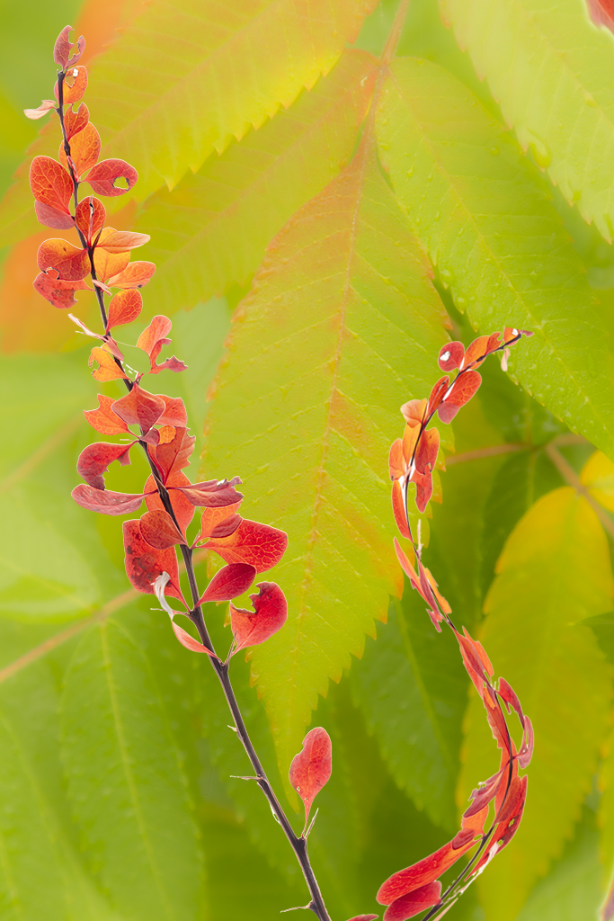
Catherine, you achieved your goal magnificently! I imagine you used almost a wide open aperture to throw the background out of focus yet leaving the berries in good focus. Can you go back and search for some combination of berries and branches that might have a different composition? More and more when I find a subject I like, I take a number of exposures from different angles so in post processing I have a selection of images to choose from.
|
Jan 10th |
| 40 |
Jan 21 |
Comment |
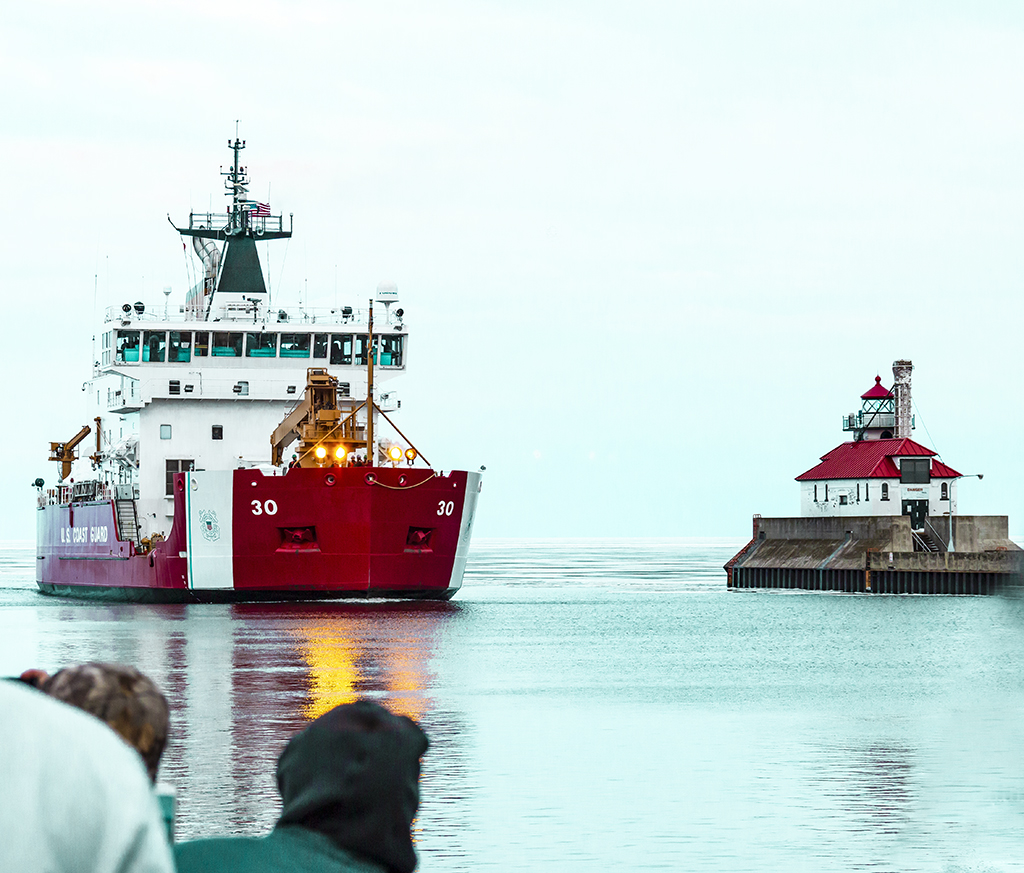
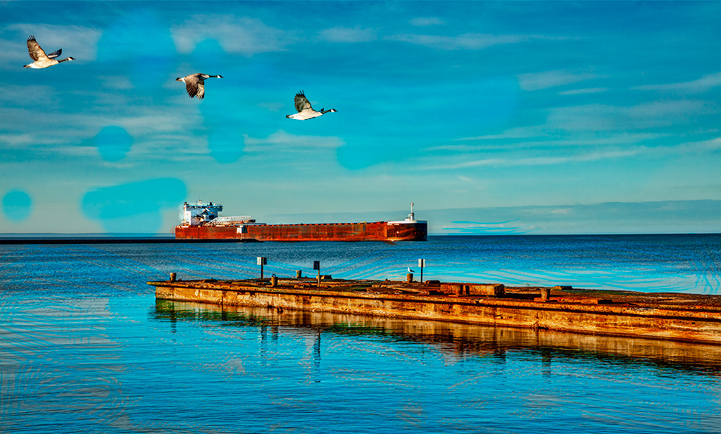
What a challenge to get the Jupiter/Saturn conjunction but you did it! Congratulations! |
Jan 10th |
| 40 |
Jan 21 |
Comment |
Jamie, this image evokes a feeling of solitude, of infinite peace. Wow, great!
I like the cropping as there is movement from the lower right leaf to the upper left leaf. I thought of cropping out the lower right leaf but that would destroy the balance you have achieved.
I wonder if you could lighten the overall image a little more. As to sharpness, you can just leave it soft for all images don't have to be sharp. This image can be dream like.
Now, reading Alison's comments, I think she has a good point about considering the light and dark balance. |
Jan 10th |
| 40 |
Jan 21 |
Comment |
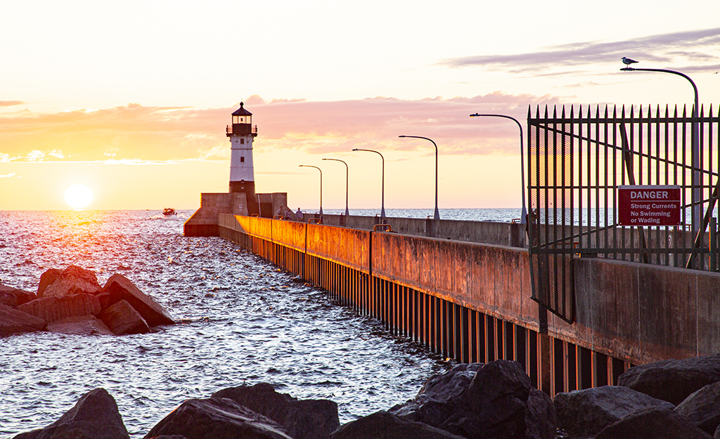
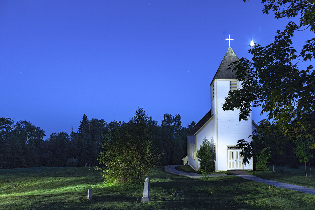
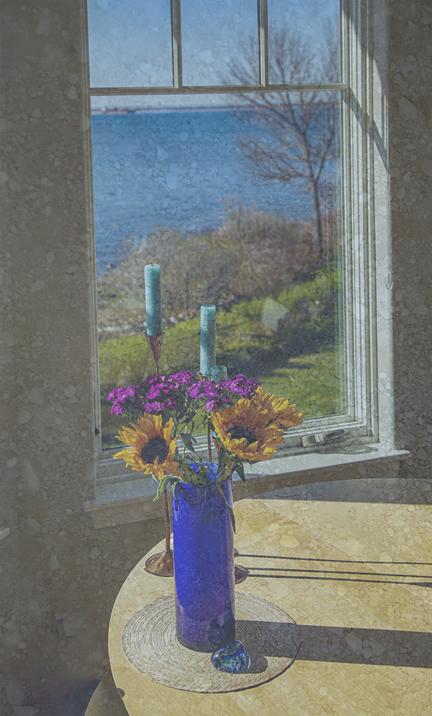
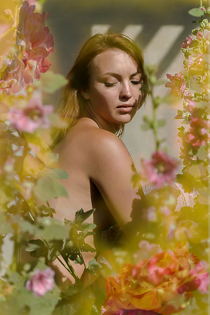
Anne, your skill as a graphic designer shows! This image is simple, clear and direct. I like the single window and the simple texture of the wall of what must be a lighthouse. And I like the subtle variation in the shades of the sky.
For me, I would crop the right side to make it into a vertical but I like verticals but so that's just personal preference.
Alison has a strong statement of her emotional response which I would endorse. In further contemplation I would add that I think of the winding circular narrow staircases one climbs in lighthouses. |
Jan 10th |
| 40 |
Jan 21 |
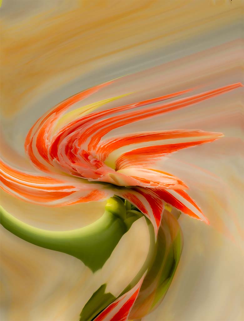
Comment |
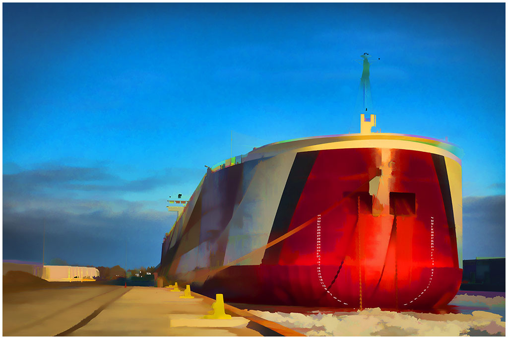
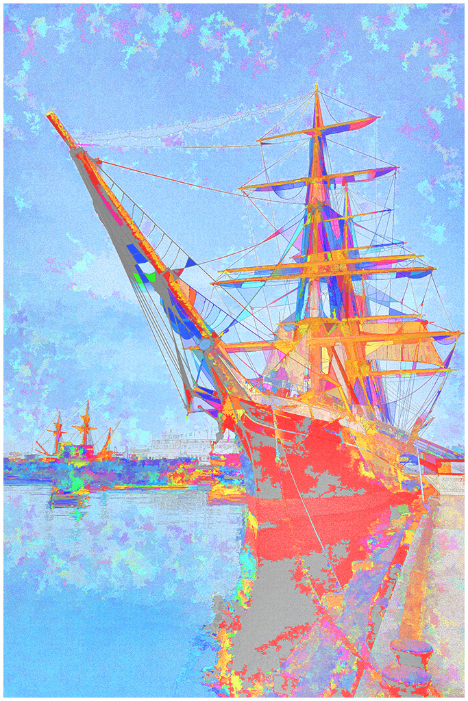
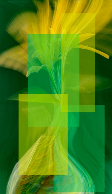
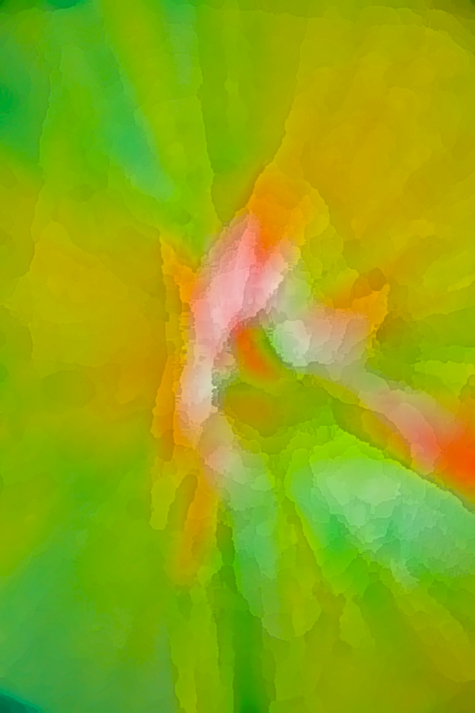
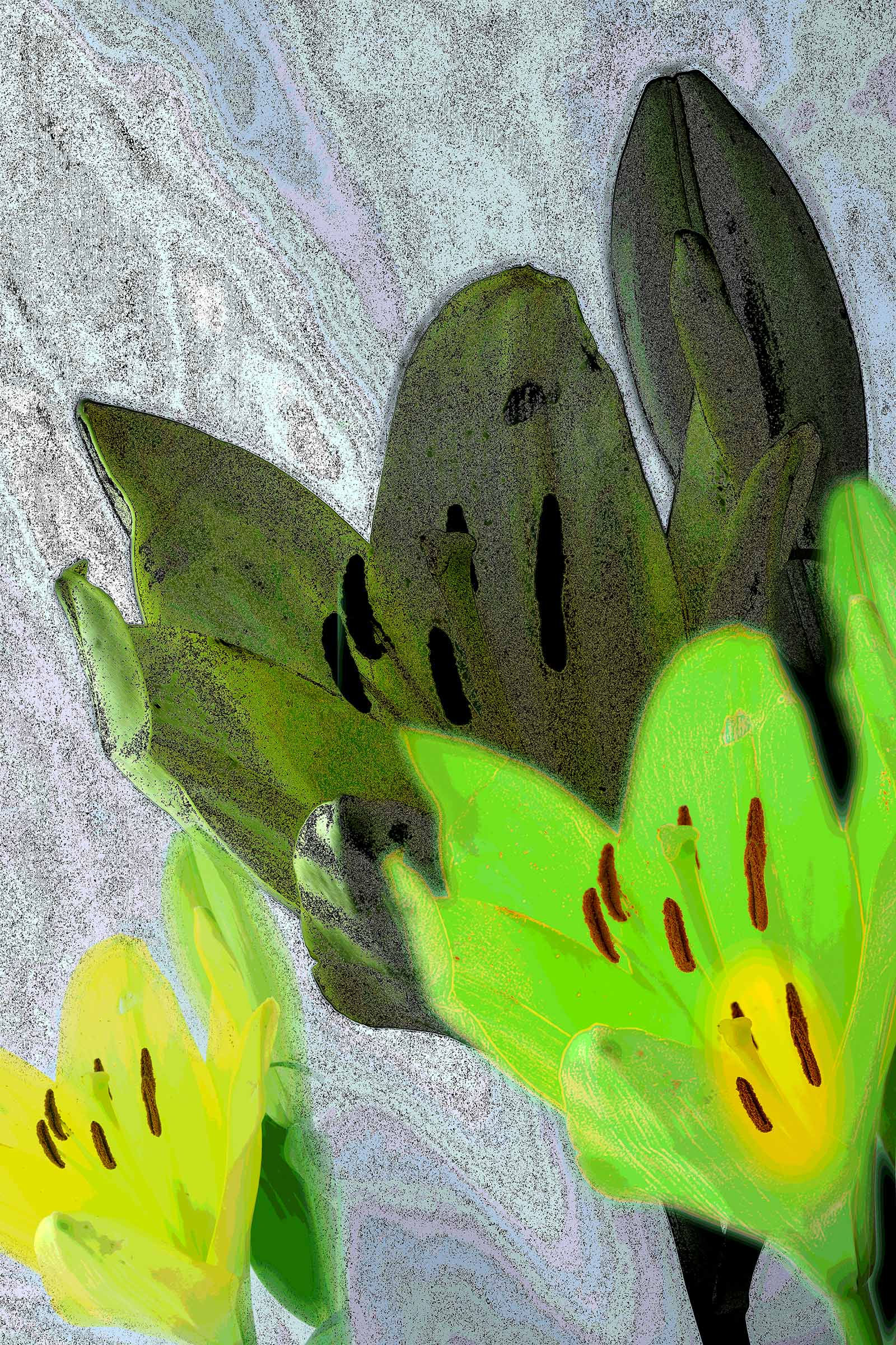
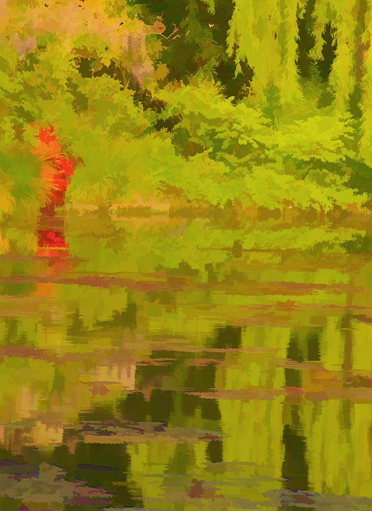
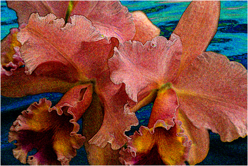
Julie, this is really an interesting experimentation which I would like to try myself. It is great that you are trying new techniques to show your creativity.
And I like your further experimentation in response to Alison. Julie, keep experimenting and having fun. |
Jan 10th |
| 40 |
Jan 21 |
Comment |
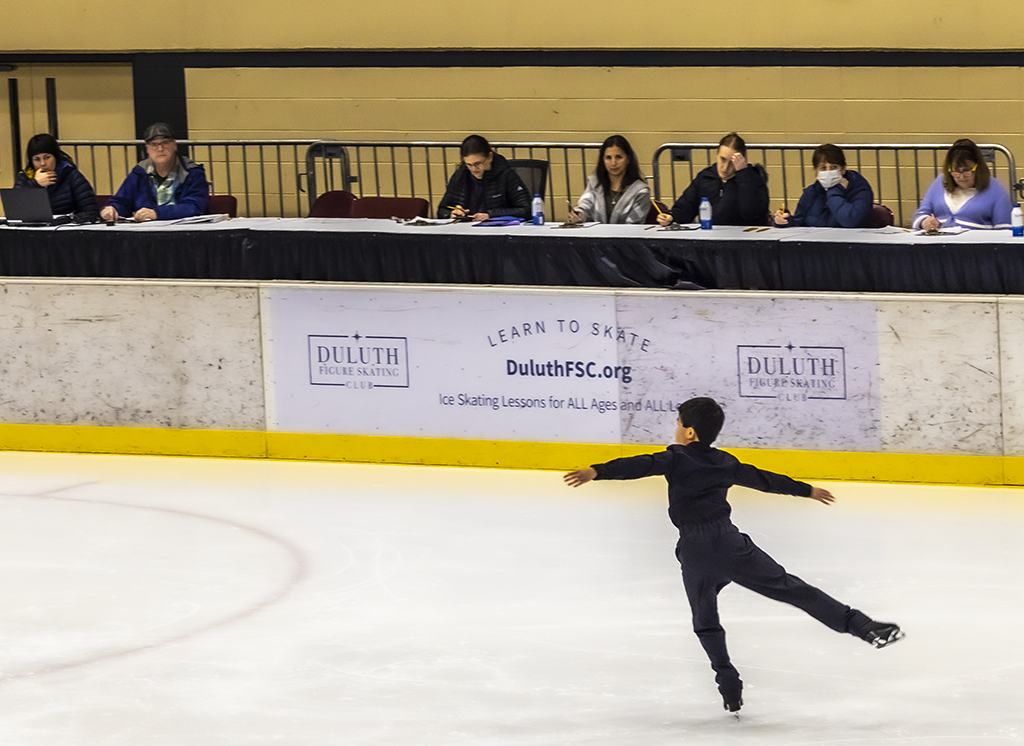
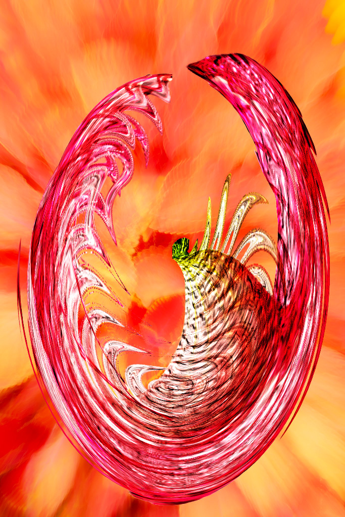
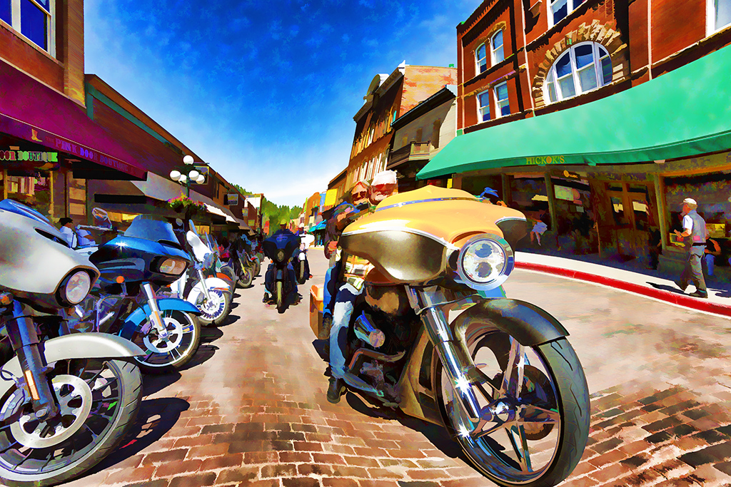
Andrew, I like the diagonal, I like the increased intensity and I like the minimalism. I would like some object, not necessarily large, that would be the center of interest and attract my eye initially. But this might detract from your minimalism concept. |
Jan 10th |
6 comments - 6 replies for Group 40
|
| 41 |
Jan 21 |
Reply |
Thanks Maryellen |
Jan 30th |
| 41 |
Jan 21 |
Reply |
Thanks Lisa. I did miss that line. |
Jan 18th |
| 41 |
Jan 21 |
Reply |
Thanks for the encouragement Jan. |
Jan 18th |
| 41 |
Jan 21 |
Comment |
Once again Lisa you have shown your mastery of photo technique and computer artistry.
Great image! |
Jan 15th |
| 41 |
Jan 21 |
Comment |
Jan, I like it, I like it, I like it! It is whimsical, it is eye catching, it is creative. Your composting serves as a spur to my own composting.
There is no way I can find anything further to suggest.
Keep it up for us. |
Jan 15th |
| 41 |
Jan 21 |
Comment |
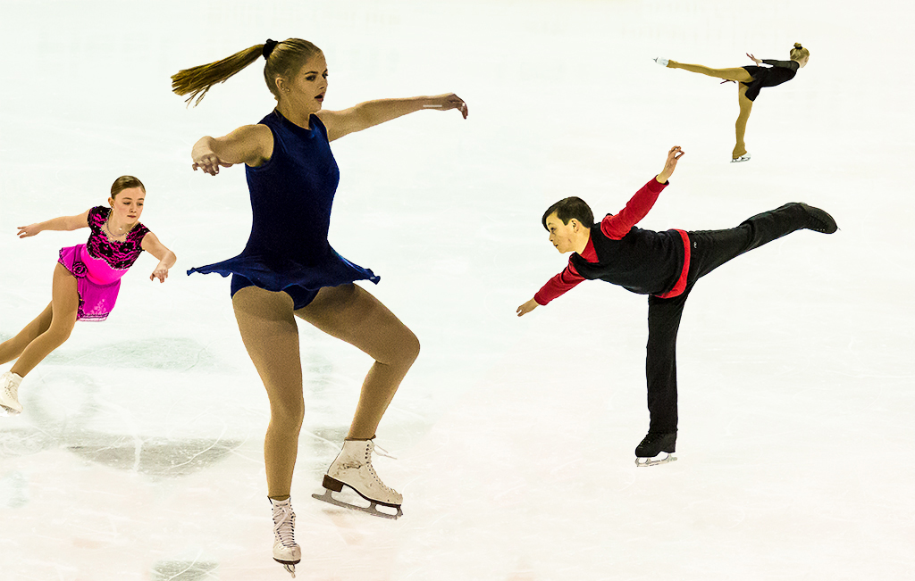
Maryellen, how bright and cheerful this is and what a great idea to repeat the various stances in one image! You put it all together in one appealing composite for us to smile.
I, for one, have no suggestions that could improve this. |
Jan 15th |
| 41 |
Jan 21 |
Reply |
Brad, I support your personal journey and your artist's choice. |
Jan 15th |
| 41 |
Jan 21 |
Reply |
Thanks Kathy. Abstraction creations are fun and one of a kind. |
Jan 14th |
| 41 |
Jan 21 |
Reply |
Thanks Brad. There are just infinite ways to be creative, both with the camera equipment and the computer. |
Jan 14th |
| 41 |
Jan 21 |
Comment |
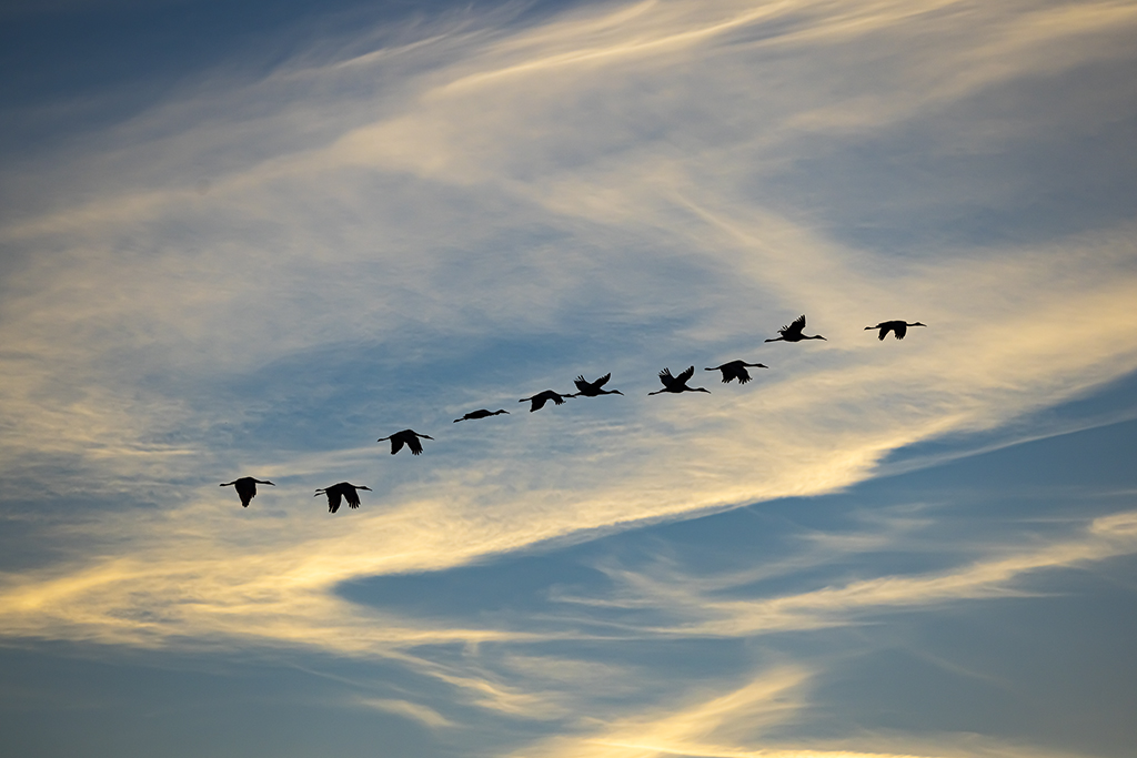
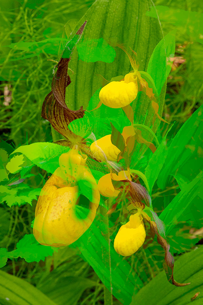
Kathy, magnificent composite. The landscape really complements the sandhill cranes and balances the composition. The clouds fill what would otherwise have been an empty top of the image. And the graduated filter layer sets the scene of the sunrise. How fortunate to have what look like buffleheads floating in the same direction on the water. Although some may not agree, I like the faint grasses in the lower right setting the scene as being a marsh that you are crouching in.
I looked at the sandhill cranes with the white on their neck and thought they could be loons which also have white on their neck, then realized loons do not have long trailing legs. |
Jan 14th |
| 41 |
Jan 21 |
Comment |
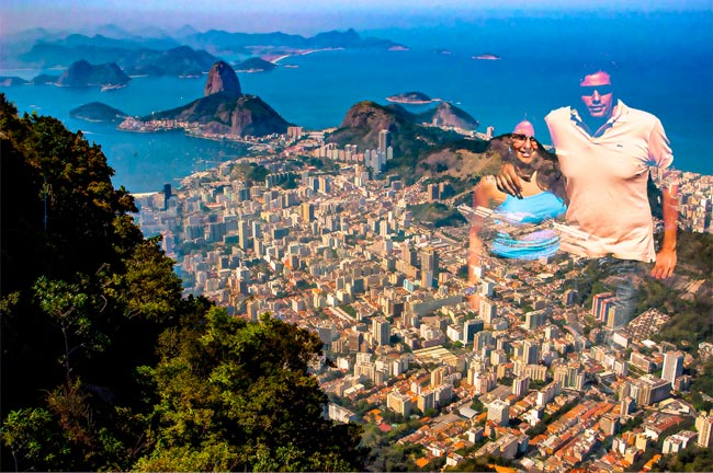
Brad, it is always fun each month to see where your fertile imagination has taken you and this month is no exception. Cutting out your pointing hand and combining it into a composite and then applying a Topaz filter really produced a powerful image.
Just a thought - could you have applied the topaz filter to the Mount Ridder image before adding the hand or selecting the hand and not applying the filter to it? As it is now, the hand looks a little weird with grass growing out of it.
Great creative work as always! |
Jan 10th |
5 comments - 6 replies for Group 41
|
11 comments - 12 replies Total
|