|
| Group |
Round |
C/R |
Comment |
Date |
Image |
| 40 |
Feb 20 |
Reply |
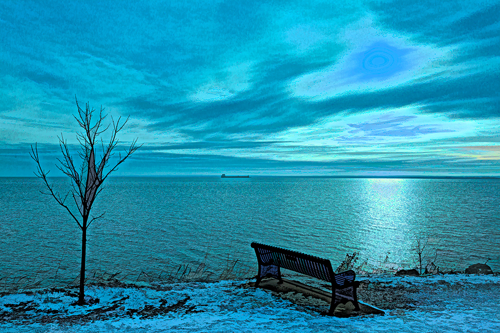
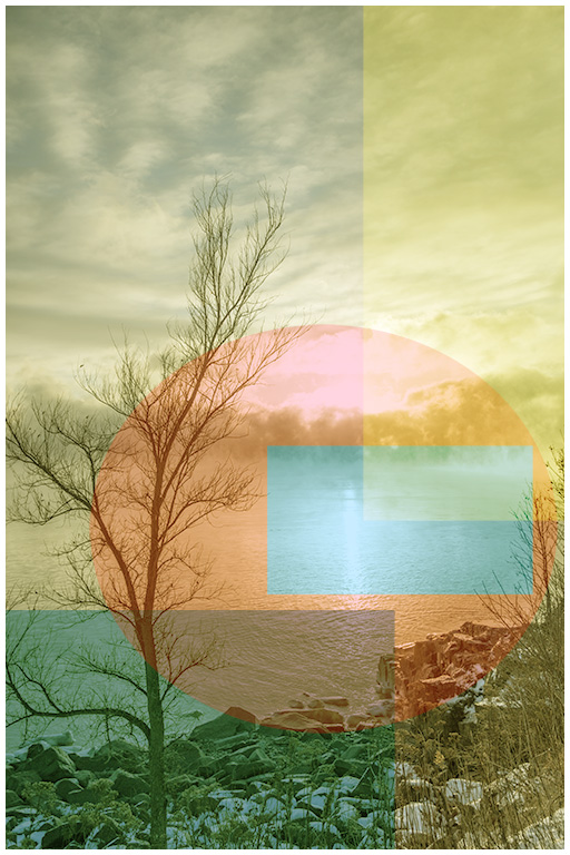
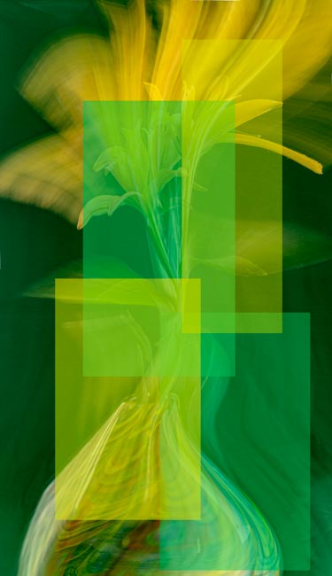
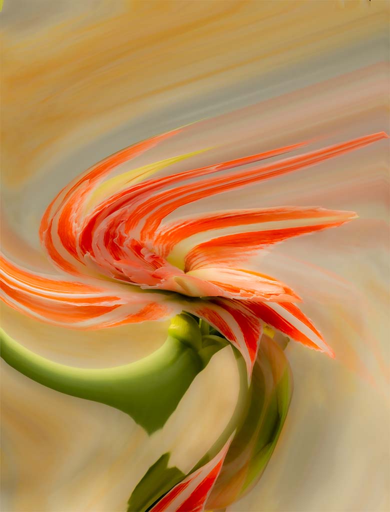
Jamie, the blue in my final version above is an abstraction and probably can stand as such. But if I were trying to keep it more realistic to a cold, bluish morning, then I should temper the cast. Perhaps there is a place for two versions.
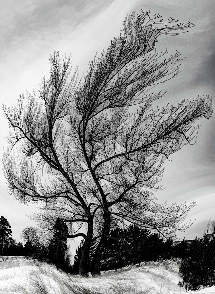
The object in the tree I believe is a sheet of wrapping plastic which was blown and stretched there. On my next walk I will see if I can pull it down.
I probably have commented before that I have a fondness for Colorado and the Colorado plateau where you have retired. As a high school senior, college student, and then parent, I skied with friends and family at Aspen, Vail, Snow Mass, etc. I also have photographically worked on the red colors exposed across the plateau. You and your husband have great photographic opportunities. |
Feb 16th |
| 40 |
Feb 20 |
Reply |
Hi Alison, I agree with you and the others that the blue tone did not work out as I envisioned. I will have to work on this again.
By the way, I treasure the thoughtfulness you put into your comments about our fellow member's work which is really instructive for improvement and a spur to stretch our comfort zones. Please keep doing so! |
Feb 16th |
| 40 |
Feb 20 |
Reply |
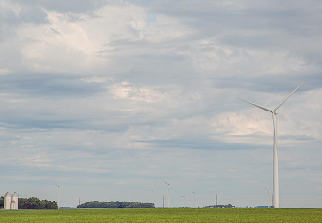
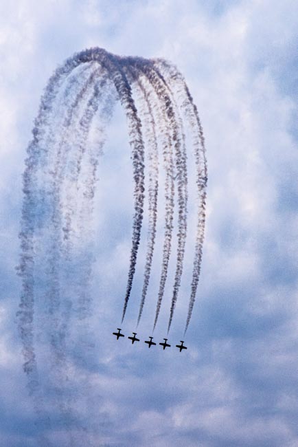
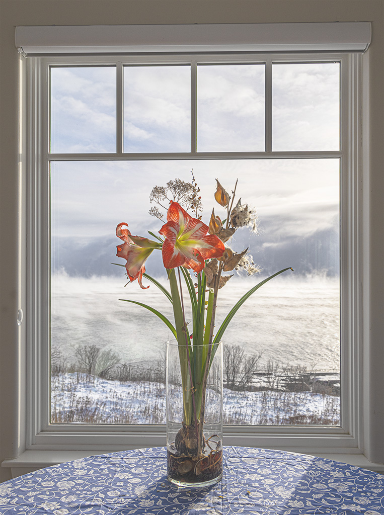
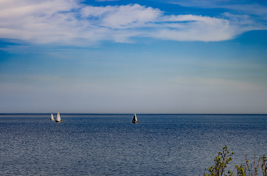
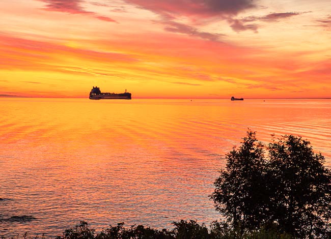
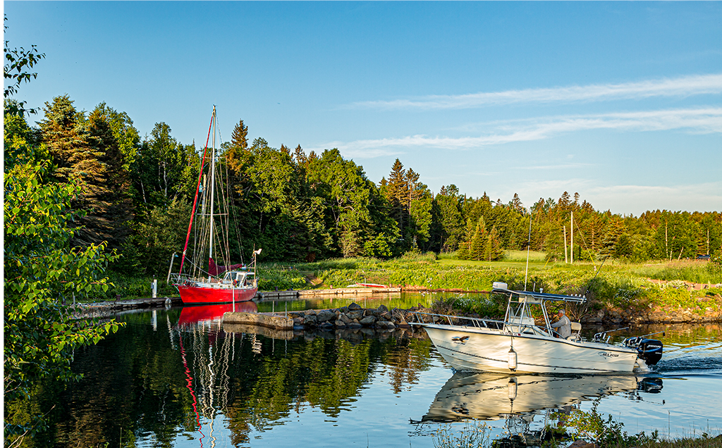
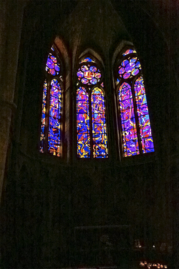
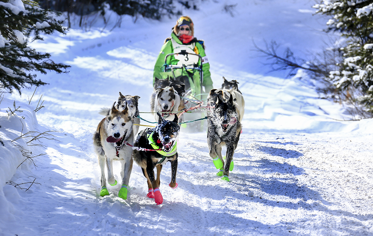
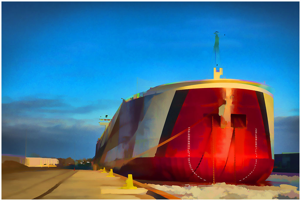
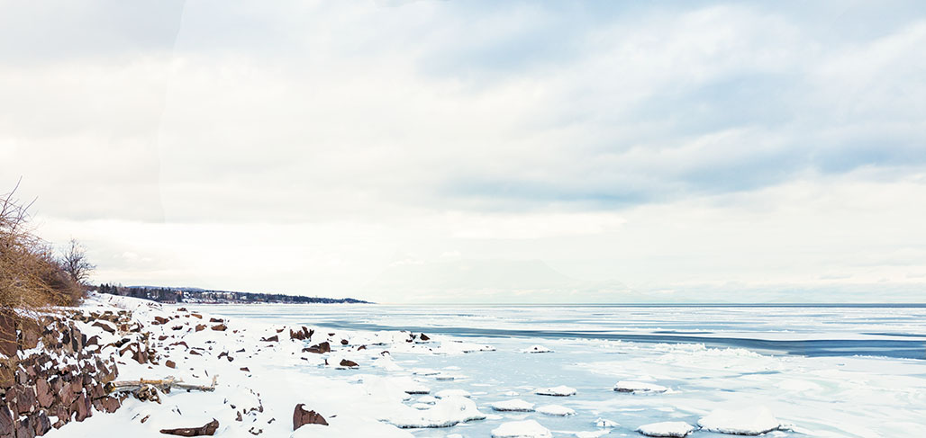
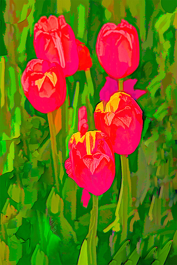
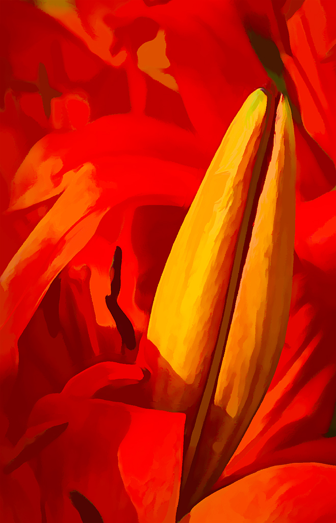
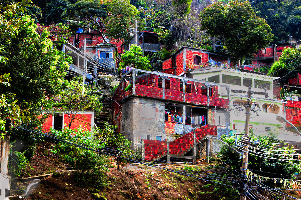
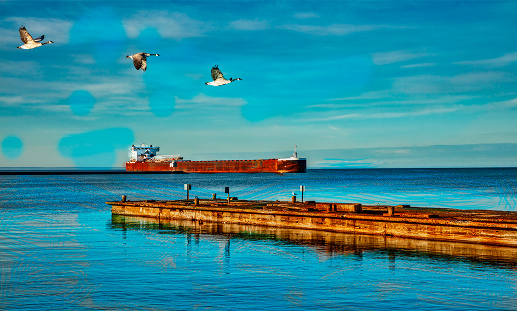
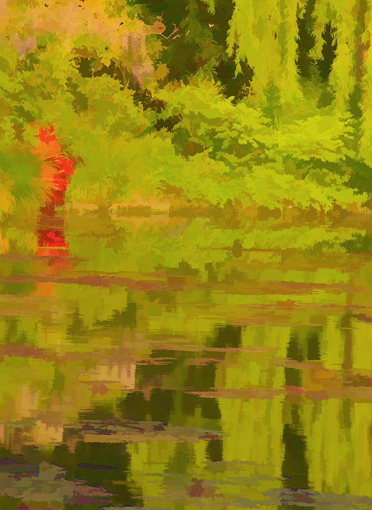
Moria, I agree with you that the blue filter did not work out. I should have gone back and worked with the filters for something better. This was taken looking east across Lake Superior as the rising sun was partially showing through breaks in the clouds, thus producing a lot of tonality variation. When a northeaster is blowing, it can be really raw and penetratingly cold along the Lake Walk. I will work some more on this. |
Feb 16th |
| 40 |
Feb 20 |
Reply |
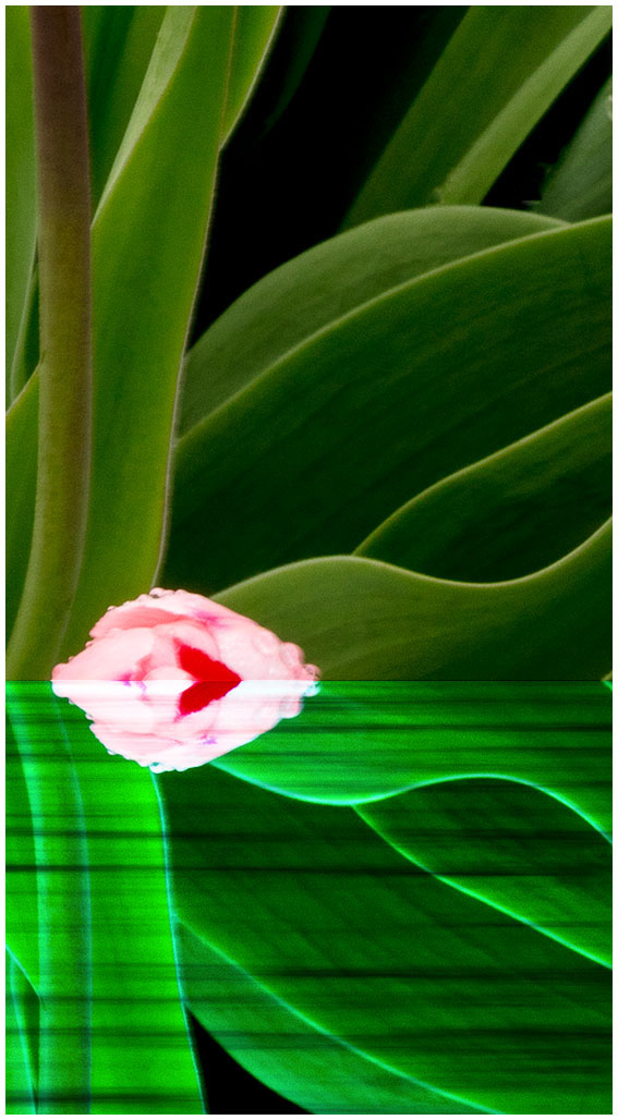
Andrew, I agree with you that the blue toning looks false and I should have toned it down or even just left it alone.
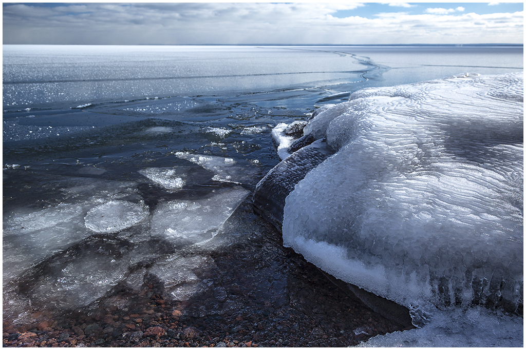
I do have some ice fishing tents on the ice from past winters but this winter has been warmer and the windy days have broken up skim ice before it has thickened enough to become solid. When the skim ice is breaking and moving, it produces a crinkling sound. |
Feb 16th |
| 40 |
Feb 20 |
Comment |
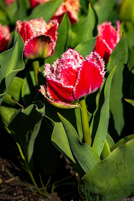
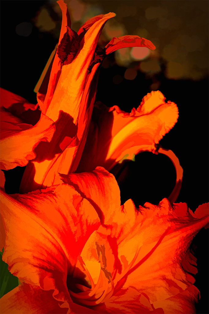
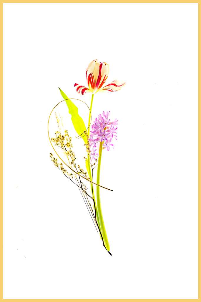
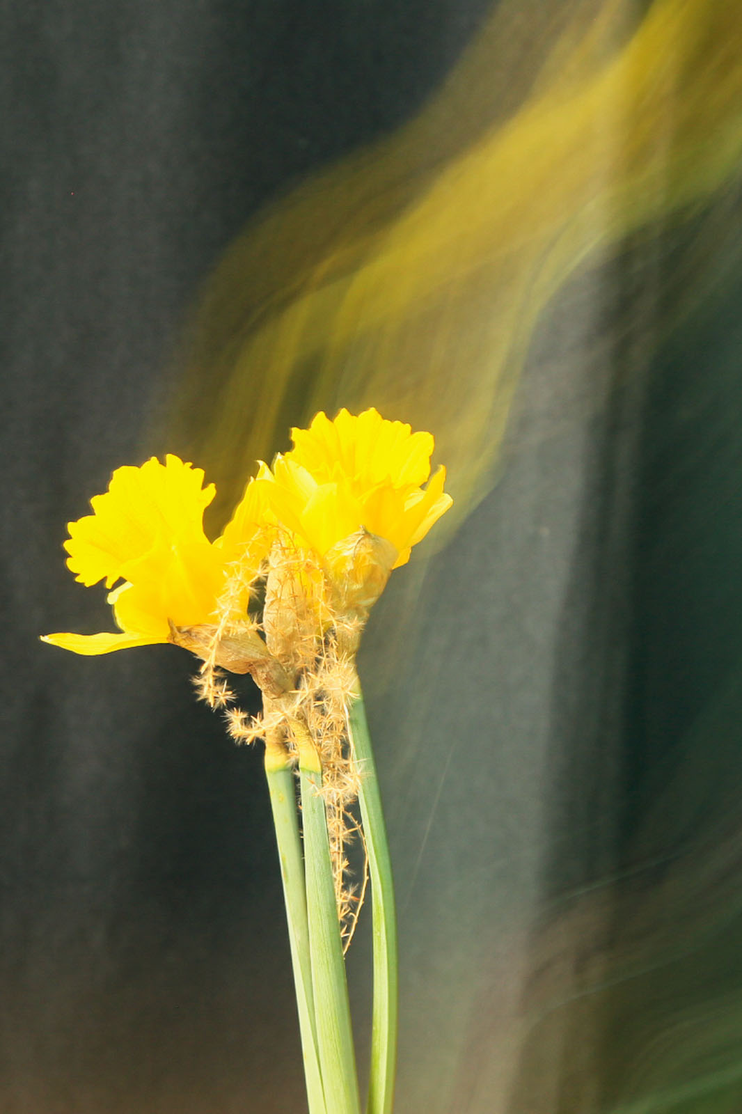
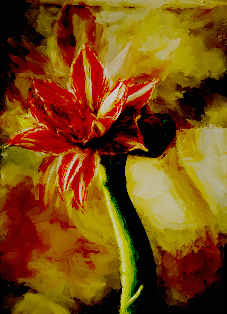
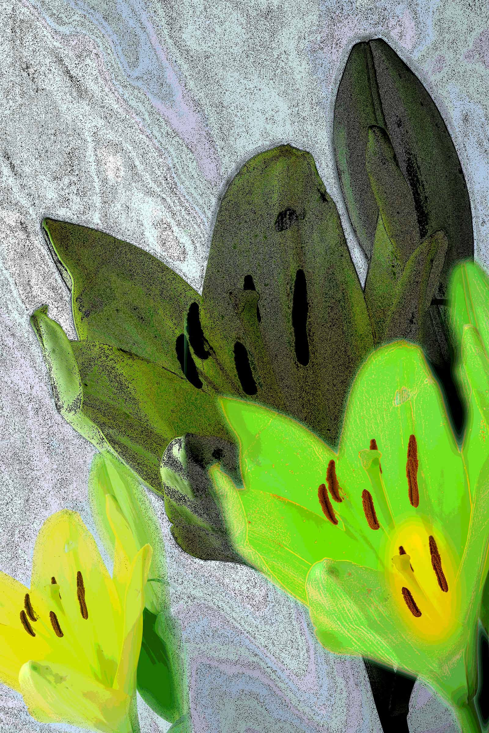
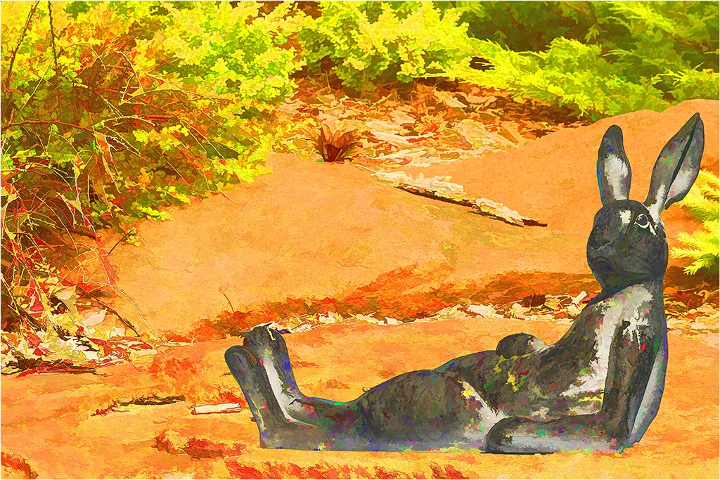
Catherine, in this one image you have captured all of your interests of moodiness, street scenes, and abstracts. You could even play with names such as bush or flower abstracts. I don't know if you live in snow country but if you do, try some bush abstracts on snow or some leafless trees against the sky. You could also use this and like images as background in composites.
Keep working on your interests! |
Feb 16th |
| 40 |
Feb 20 |
Comment |
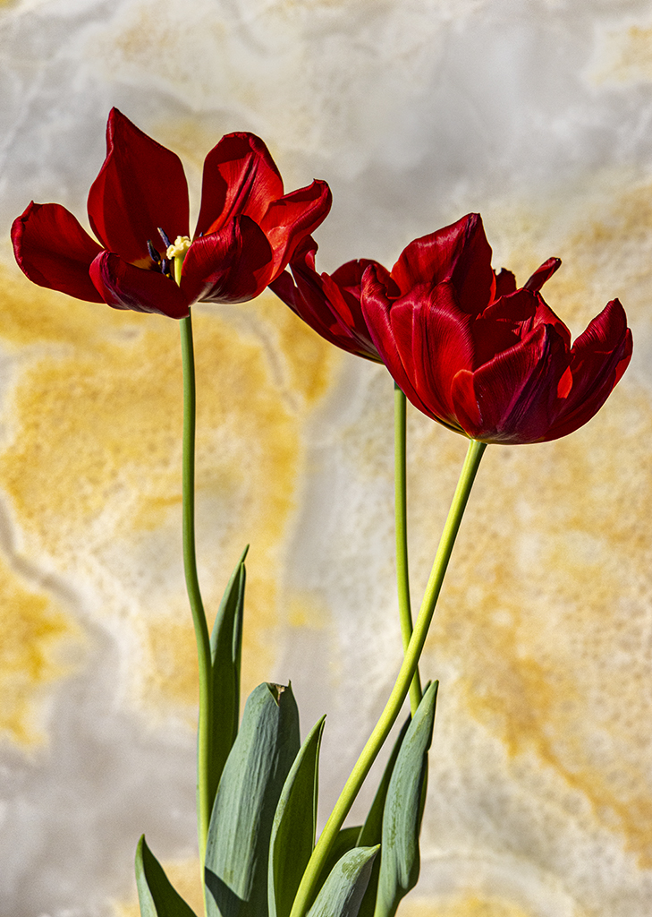
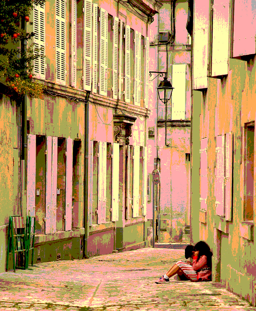
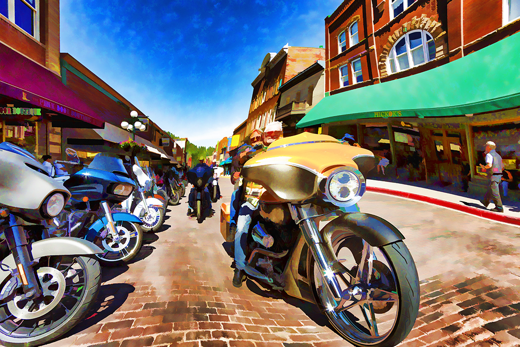
I think you did a great job Andrew with the panorama tool. The clouds look good as does the flower shop on the street. The above comments pick up some details that I wouldn't have thought of. Jamie's comments on the reds is interesting, a point of would not have thought of. |
Feb 16th |
| 40 |
Feb 20 |
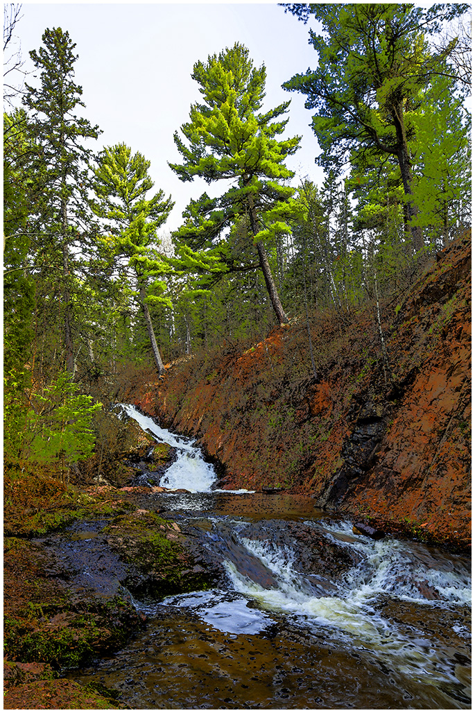
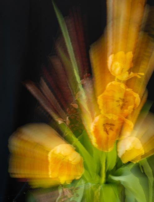
Comment |
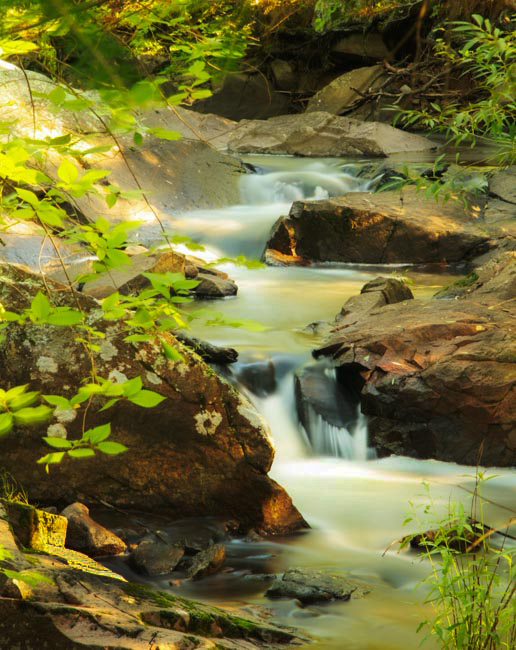
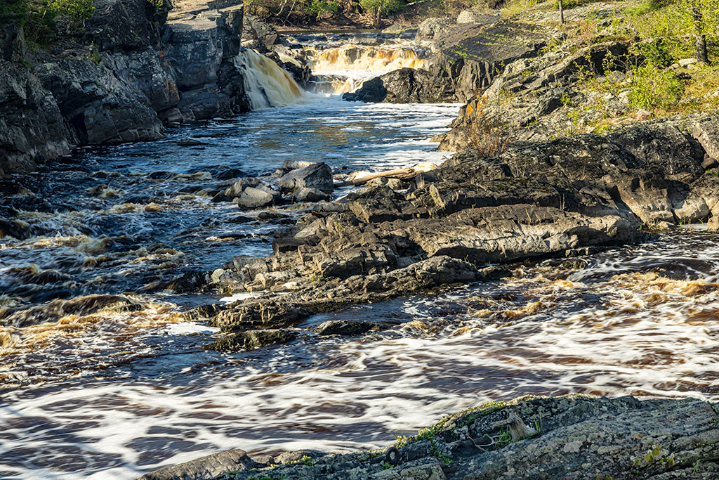
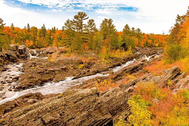
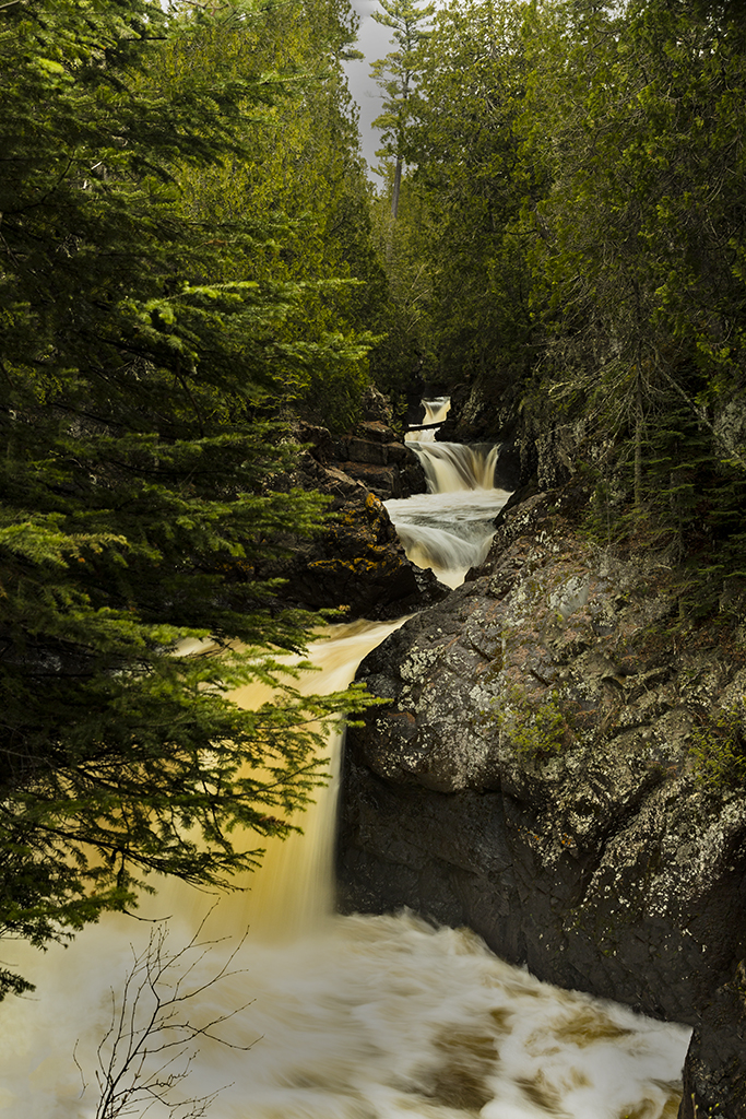
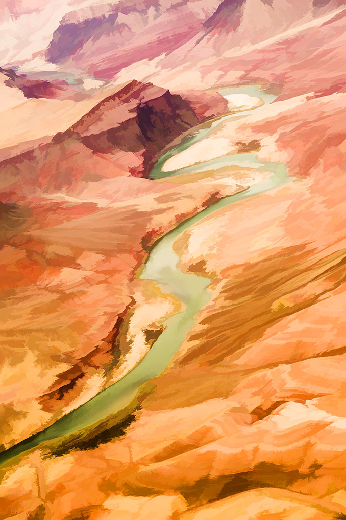
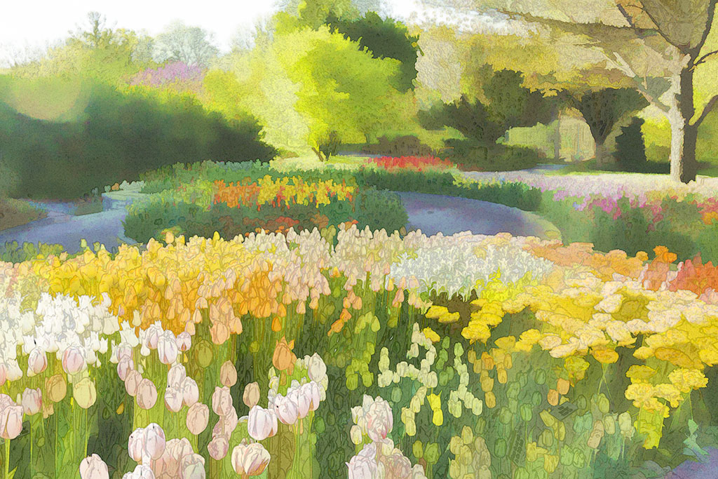
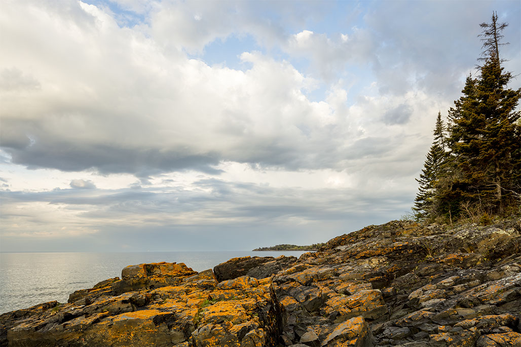
Ah Jamie, you have caught one of those days when the sun highlights the beauty of winter in the mountains of Colorado. The foreground stream and the clouds make the picture.
I would wonder if a color image of this would be just as powerful as the black and white.
The others above have good comments. Another thought, on a return, can you get closer and lower to the stream so it feels as if one is standing on the bank? It might be a snowshoe project.
|
Feb 16th |
| 40 |
Feb 20 |
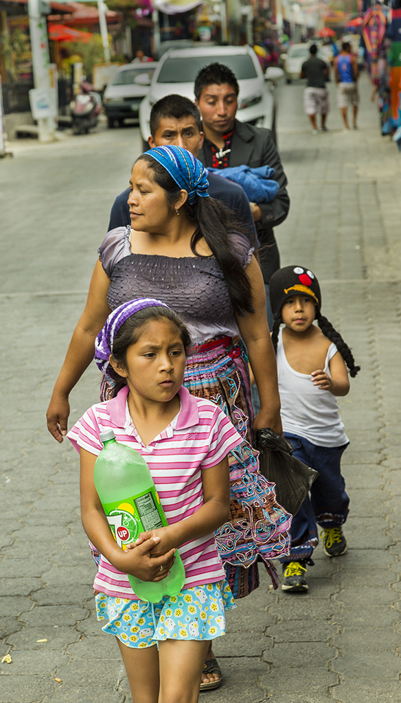
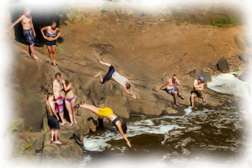
Comment |
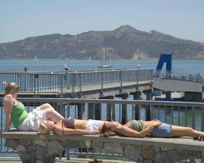
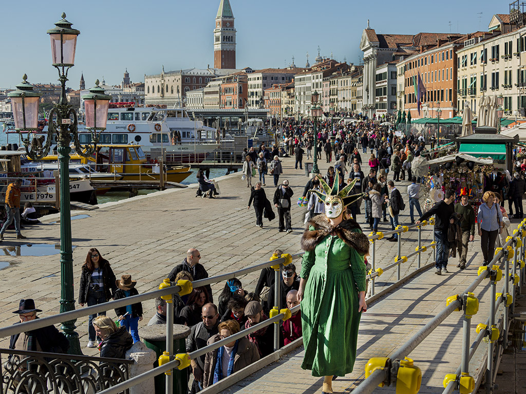
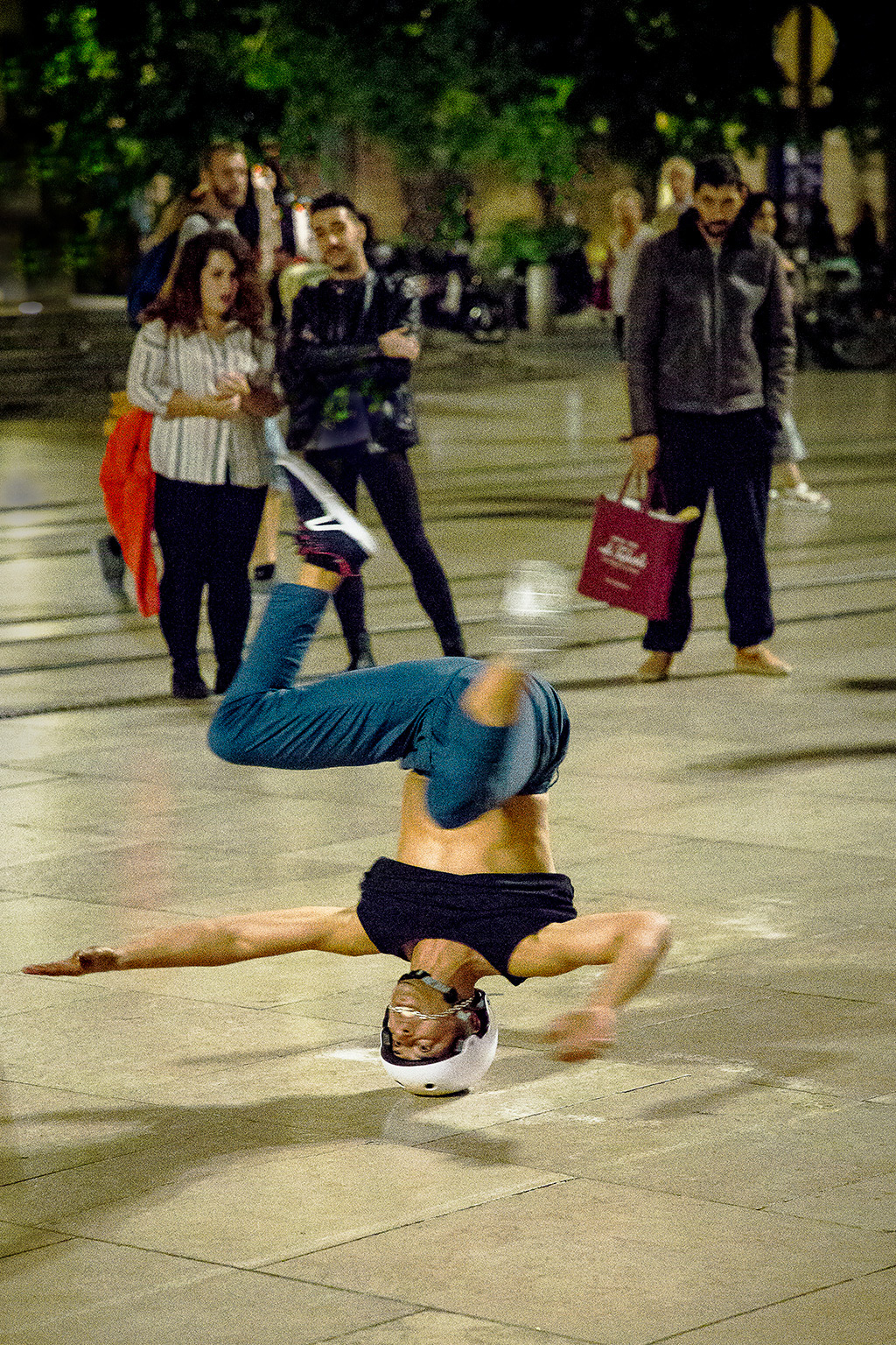
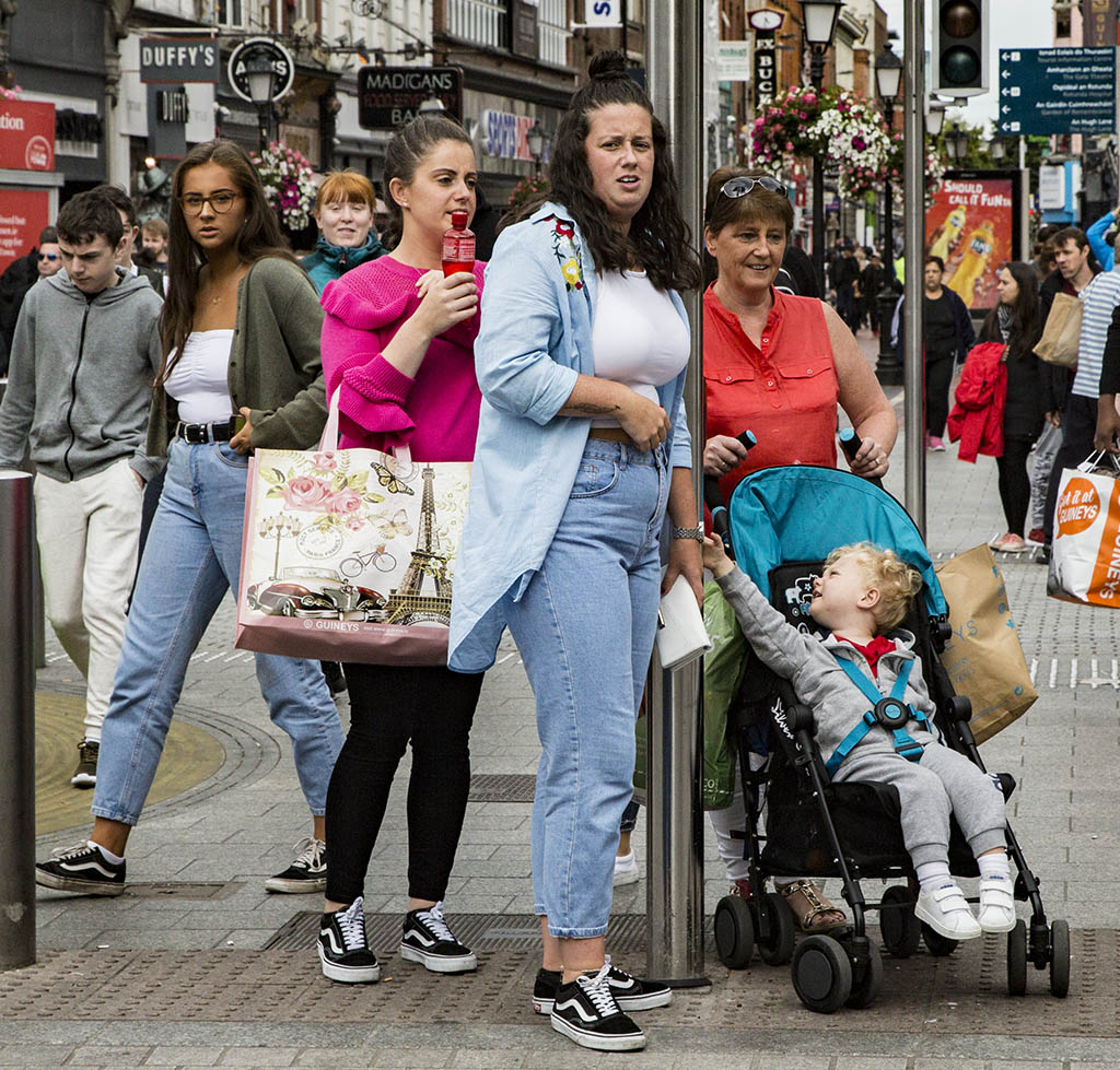
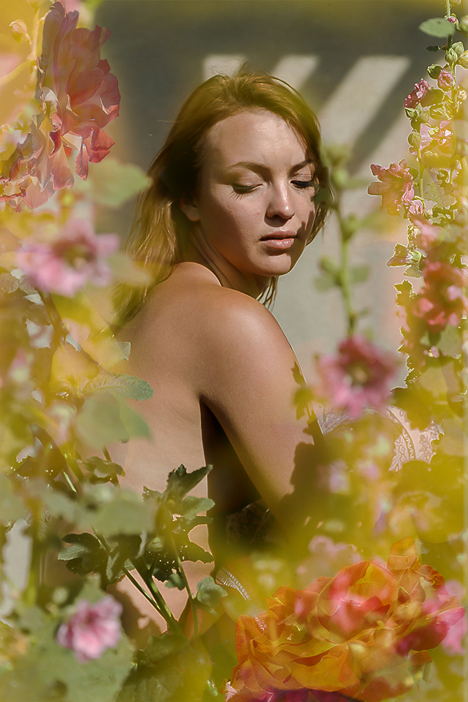
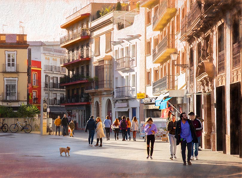
Moria, isn't exciting to walk an unfamiliar city and observe what is going on. There are families, couples, and dogs all out walking about or shopping. You have captured the sunlight of a beautiful day and the joy of the people and the dog out there enjoying it! Your masking and application of a Topaz filter have enhanced your vision.
As to personal preference, I would mask in some clouds in the sky and tone down slightly the white building. To make the dog more prominent, I would crop in on the left side as in the attached image. But that might change your concept.
Now I have read the comments of the others I think they have some useful suggestions.
|
Feb 16th |
 |
| 40 |
Feb 20 |
Comment |
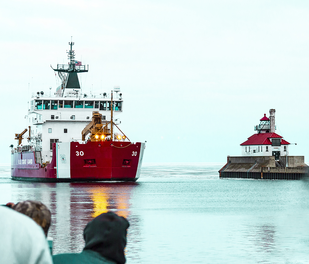
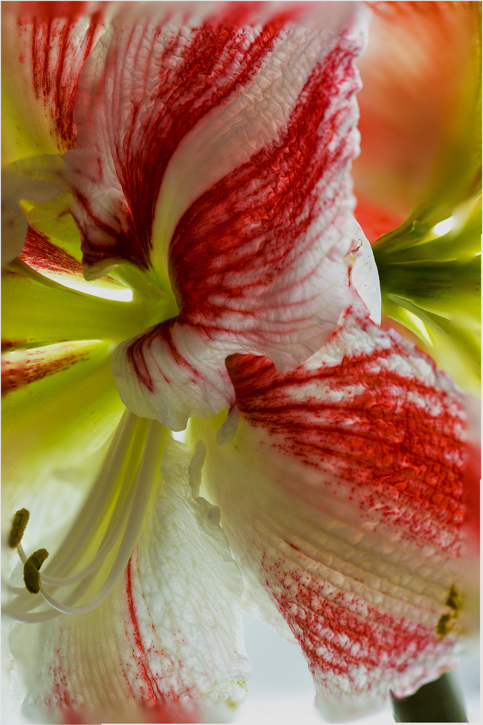
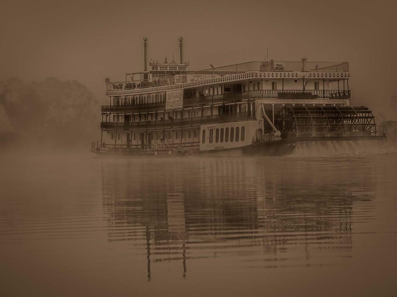
Julie, the sepia toning is perfect for this early morning image. Having said that, I also like the original color image as I am partial to color.
Your cropping is good catching the reflection and leaving space to imagine the boat moving into.
I just read the comments of others above and had an ah ha moment. I had assumed the boat was moving left to right because my eye perceived a slight drop of the river to the right corner, but now see that it is moving right to left, of course, because the paddle wheel is in the back. So I took your image into the cropping tool of PS and did an almost imperceptible rotation of the image raising the right side and lowering the left side. Do you think this helps or hinders the image?
|
Feb 16th |
 |
| 40 |
Feb 20 |
Comment |
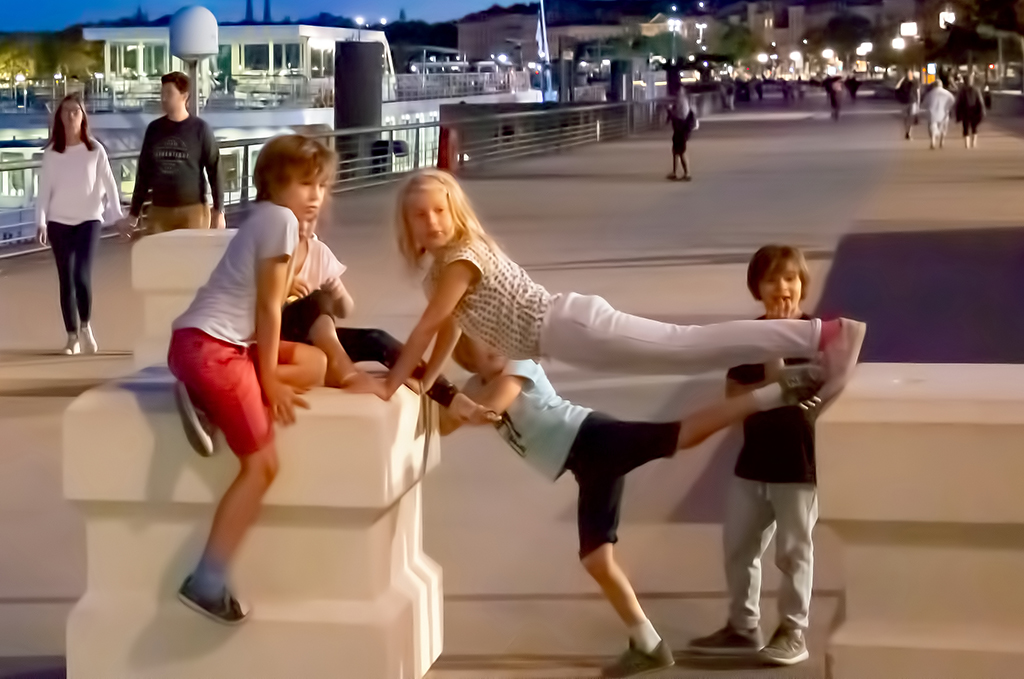
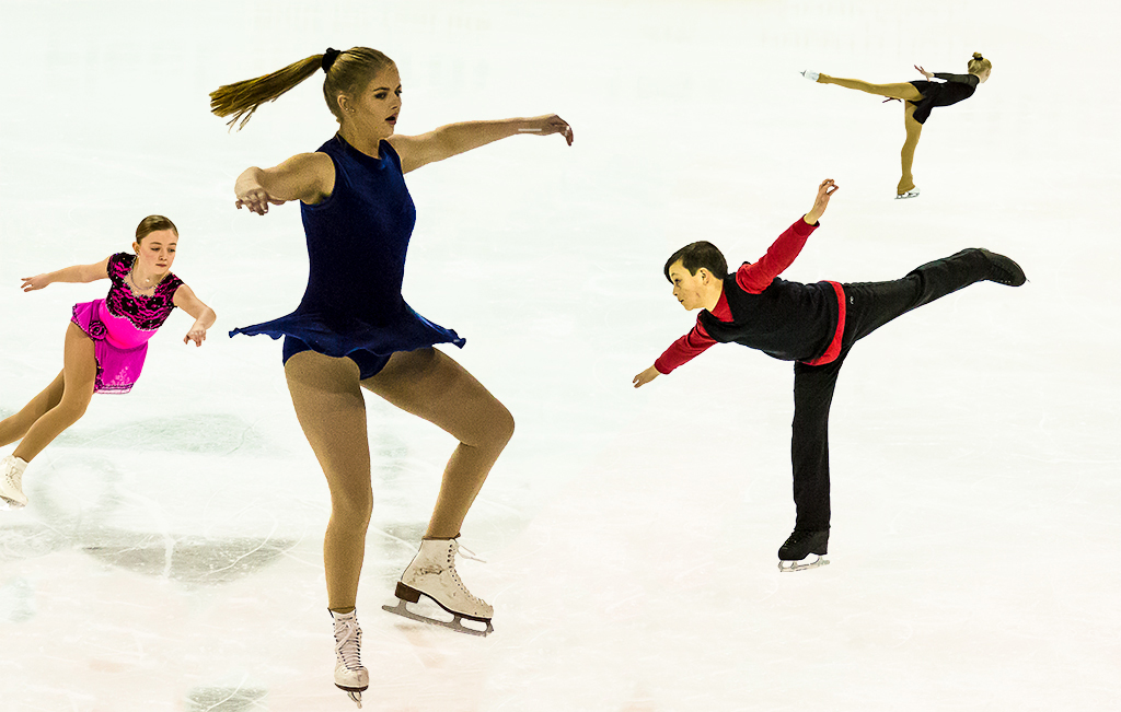
Gripping Alison, simply gripping!
I like the action pose, the lighting, the diagonal of the stretch band, and the intensity of Monica's face.
This is portrait like even though it is more than just a face. Perhaps it would be good to clone out the objects on the right so that it is only Monica.
I assume you posed this so you could have taken some shots without Monica's hair obscuring her right eye and chosen the one you best liked. Maybe you did.
A truly magnificent image! I looked back at previous rounds - you are having great fun with such a wide variety of subject matter. I can't wait to see what it will be next month. |
Feb 16th |
6 comments - 4 replies for Group 40
|
| 41 |
Feb 20 |
Reply |
Good idea! Thanks Brad. |
Feb 19th |
| 41 |
Feb 20 |
Reply |
Thanks Brad. I like my composition but Kathy's is equally good. |
Feb 18th |
| 41 |
Feb 20 |
Reply |
Kathy, your suggestions are good. Actually, I like your suggestions and my original rendition equally. Mine has a curved cohesion of the flowers and the curves of the background blue which shows up more strongly without the addition of your petals. Your rendition fills the space better. The viewers can take their pick. |
Feb 18th |
| 41 |
Feb 20 |
Comment |
Ah, what creative fun to have Mr. White's Tree Frog playing tourist in Joshua Tree on his way to pick up a hot date for the evening. Great! |
Feb 17th |
| 41 |
Feb 20 |
Comment |
Maryellen, you did an excellent job of creating a title slide for your hosts. The texture of the sun and the bougainvillea really work together. The black background is dramatic and works but I wonder if you could also find another background that would more reflect Ajijic, Mexico in lighter, more gay colors, something out of your slide show. |
Feb 17th |
| 41 |
Feb 20 |
Comment |
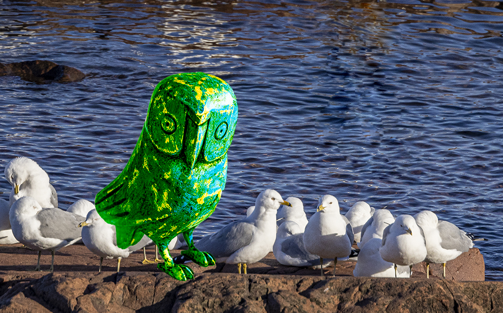
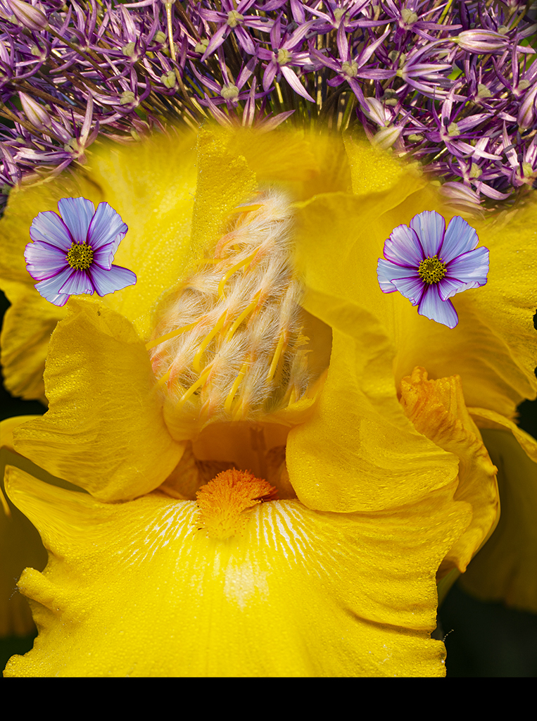
Cosmo in his read suit is quite jaunty and sets the mood of this image along with the red objects you probably colored and added. I like it! This is just light hearted and fun, perhaps an image to lighten an interior hallway or a bathroom.
The four dashes of red about Cosmo do fill in what would otherwise be blank white areas but do not add much. Perhaps you could think of some objects to use rather than just a blob.
As I go back to other rounds, you have great fun putting objects together to make an interesting picture, often whimsical. Please keep it up for our enjoyiment.
I second the comments that Brad made.
|
Feb 17th |
| 41 |
Feb 20 |
Comment |
Brad, I would agree with you that there is not a cohesive story in the various elements of this but let's look at this in another way. There is a surfer, waves and beach, there is a sunrise and filigree about it, and their is what looks like an ancient sailing ship. The viewer can look at this, be puzzled by what is being expressed, and then cognitively create their own meaning to the image.
But more important for you, it has challenged you in a dry period to try something new! Isn't that what art is about? Get out of your routine, escape past rules and see what new things you can express. That's what Picasso and other artists did. Now we have to experiment in the digital age to see what we can do.
I like the back and forth exchange you and Kathy had above and your image in group 54. |
Feb 16th |
4 comments - 3 replies for Group 41
|
10 comments - 7 replies Total
|