|
| Group |
Round |
C/R |
Comment |
Date |
Image |
| 40 |
Dec 18 |
Reply |
Karen, good suggestion.
Happy holidays! |
Dec 20th |
| 40 |
Dec 18 |
Reply |
Prakhar, good comments. I struggle with how much sky to include or exclude. Depth of field? Yes, I should have closed down the aperateur. Happy holidays and safe travels. |
Dec 20th |
| 40 |
Dec 18 |
Comment |
Karen, you have great imagination in this image! To put together all the elements, hawk, dog, pumpkin, trees, and a pane of glass takes some visualization.
The dog head might blend in better if it were slightly smaller.
As to the hawk, you must have access to a falconer. |
Dec 14th |
| 40 |
Dec 18 |
Comment |
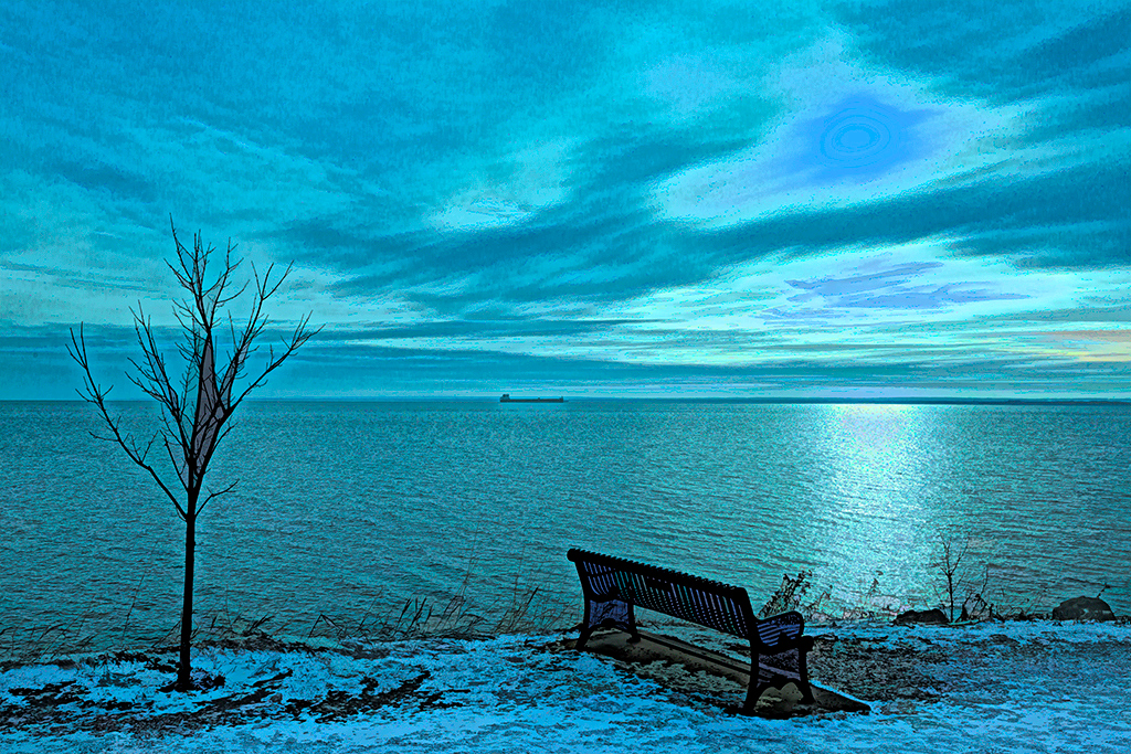
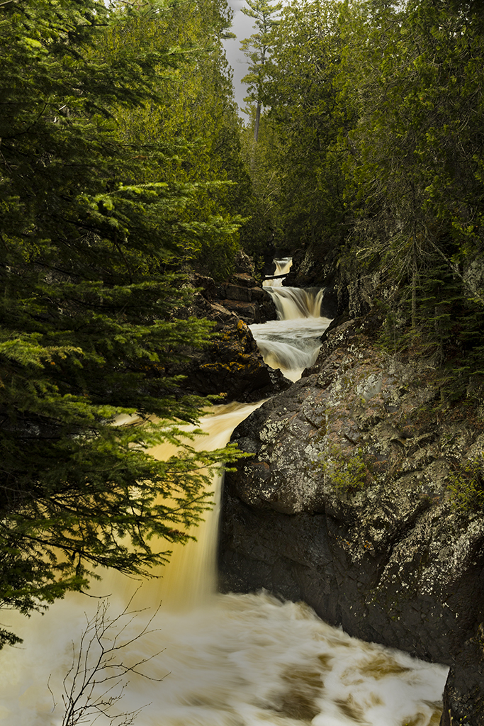
Curtis, winter is closing in as this image shows. I think this is great! The snow covered railing in the foreground - I would agree with you that it could be cropped out but either way works.
Andrew and Bob have good suggestions. |
Dec 14th |
| 40 |
Dec 18 |
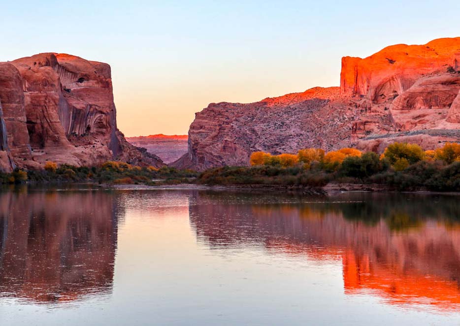
Comment |
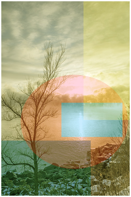
Jamie, this speaks of the solitude of the river and Moab at sunset. I really like this.
Suggestion - I tried some cropping - I don't think it improves anything but it was just a trial.
Andrew and Curtis have some good ideas.
|
Dec 14th |
 |
| 40 |
Dec 18 |
Comment |
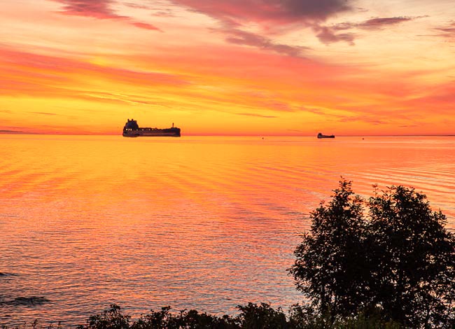
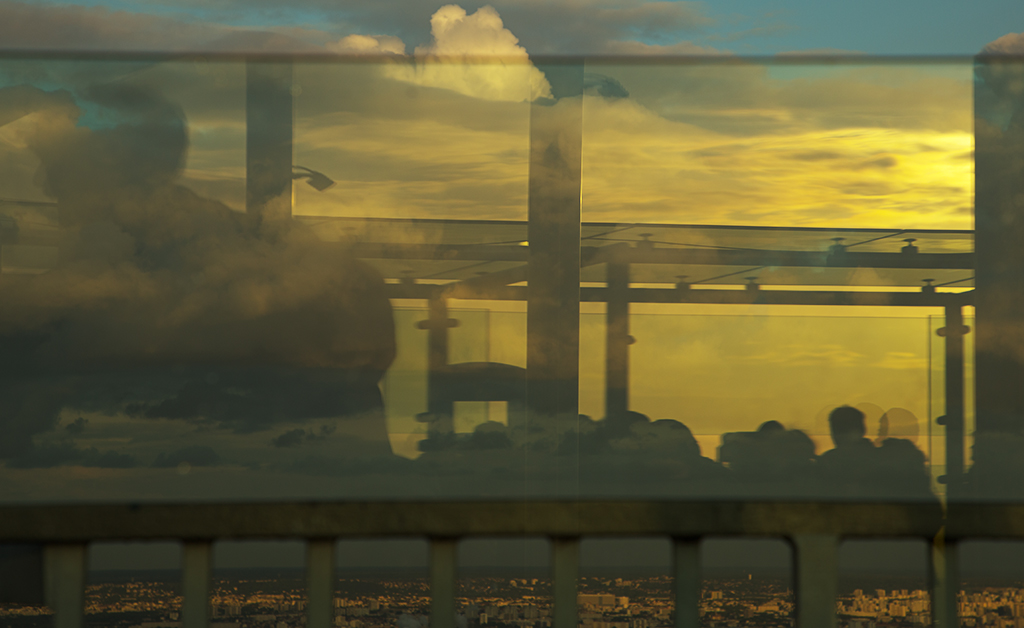
Bob, this is a tremendous sunset shot! The setting sun, the clouds, and the reflections in the water really make an eye catching image.
What would you think of a more landscape cropping and perhaps bringing out more the object in the water?
Andrew has some good suggestions.
As to your response to Andrew, since I am not trying to match say a product color, I just use my color balanced monitor (and Epson 9900 printer) to get color balances I enjoy artistically rather than a specific standard. Having said this,, I have no idea whether other monitors are producing the same color balance as my Nec 301 color balanced monitor (but I hope so).
|
Dec 12th |
| 40 |
Dec 18 |
Comment |
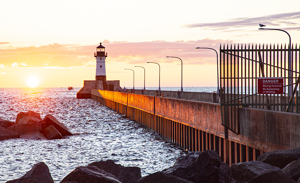
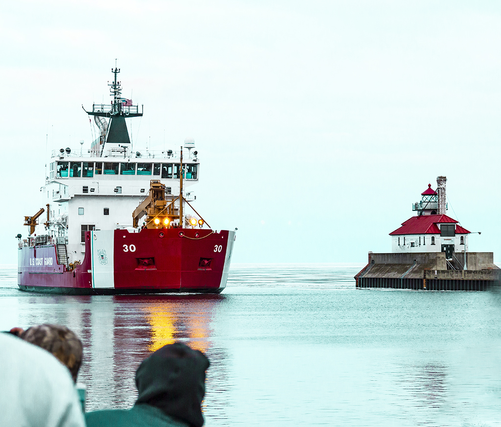
Prakhar, you caught the lighthouse right at sunset, including the flash of light from the lighthouse. The reflection in the still water is the perfect touch. Nice Job!
My personal taste - I would crop in slightly on the right side which would move the lighthouse a little more off center.
I would respectfully disagree with Andrew. I like the buildings and lights as they put more interest in the image. |
Dec 12th |
| 40 |
Dec 18 |
Comment |
Andrew, this is a great Christmas theme! The color balance and exposure is perfect including that the white highlights are not blown out. The dancer does immediately catch one's eye.
I personally would crop off the top just enough to exclude the green and yellow balls.
The comments of the others, particularly that you removed any reflections, are right on. |
Dec 12th |
6 comments - 2 replies for Group 40
|
| 41 |
Dec 18 |
Reply |
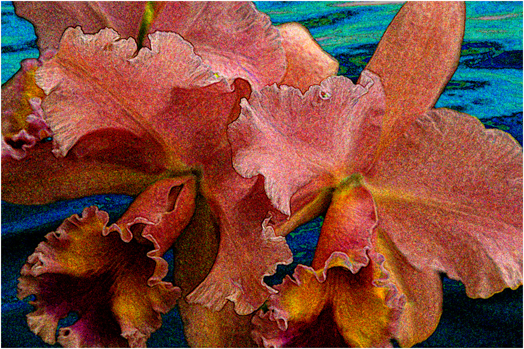
Ok Lisa, it does look like a nose but can you emphasize it more by either lightening or darkening it? This must be one of those artistic moments when each of us has a different opinion. |
Dec 20th |
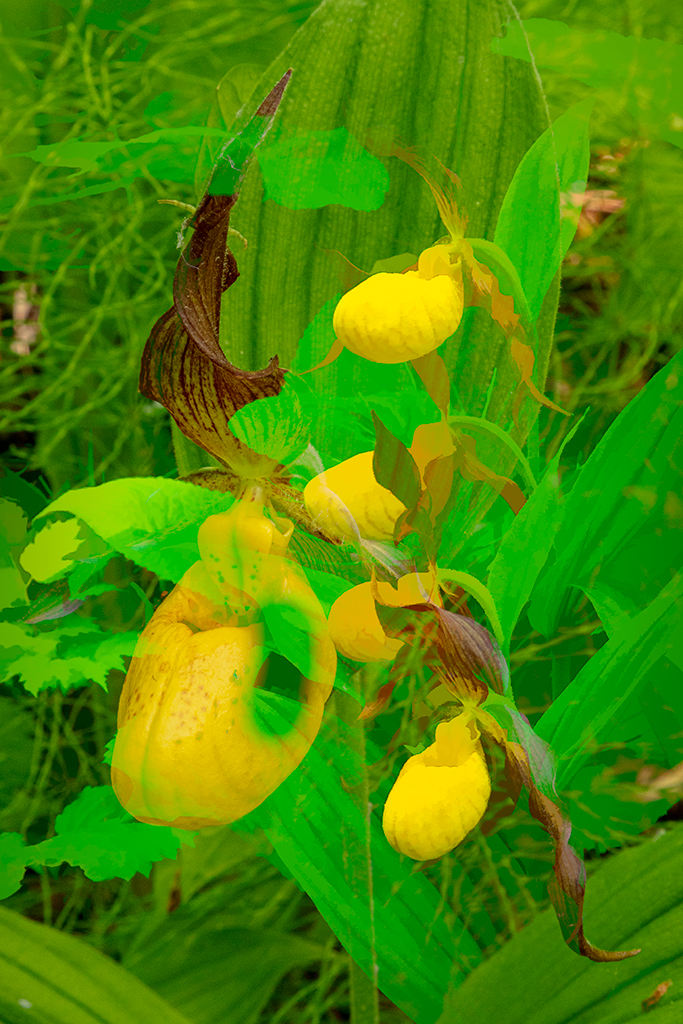
| 41 |
Dec 18 |
Reply |
Hi Lisa,
I agree with your suggestion of water color or Topaz impression van gogh. It lends the orchid a softer, more fluid approach in keeping with how orchids look. Thanks! |
Dec 20th |
| 41 |
Dec 18 |
Reply |
Brad, thanks for your supportive comments.
|
Dec 14th |
| 41 |
Dec 18 |
Comment |
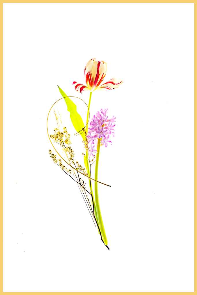
Lisa, you used your creativity to make up an imaginary face staring out at us. Great! The eyes in the fan are startling and gripping. I too would like to have more detail on how you made the eyes.
Would it increase impact if you used something for a nose coming down from the eyes?
|
Dec 14th |
| 41 |
Dec 18 |
Comment |
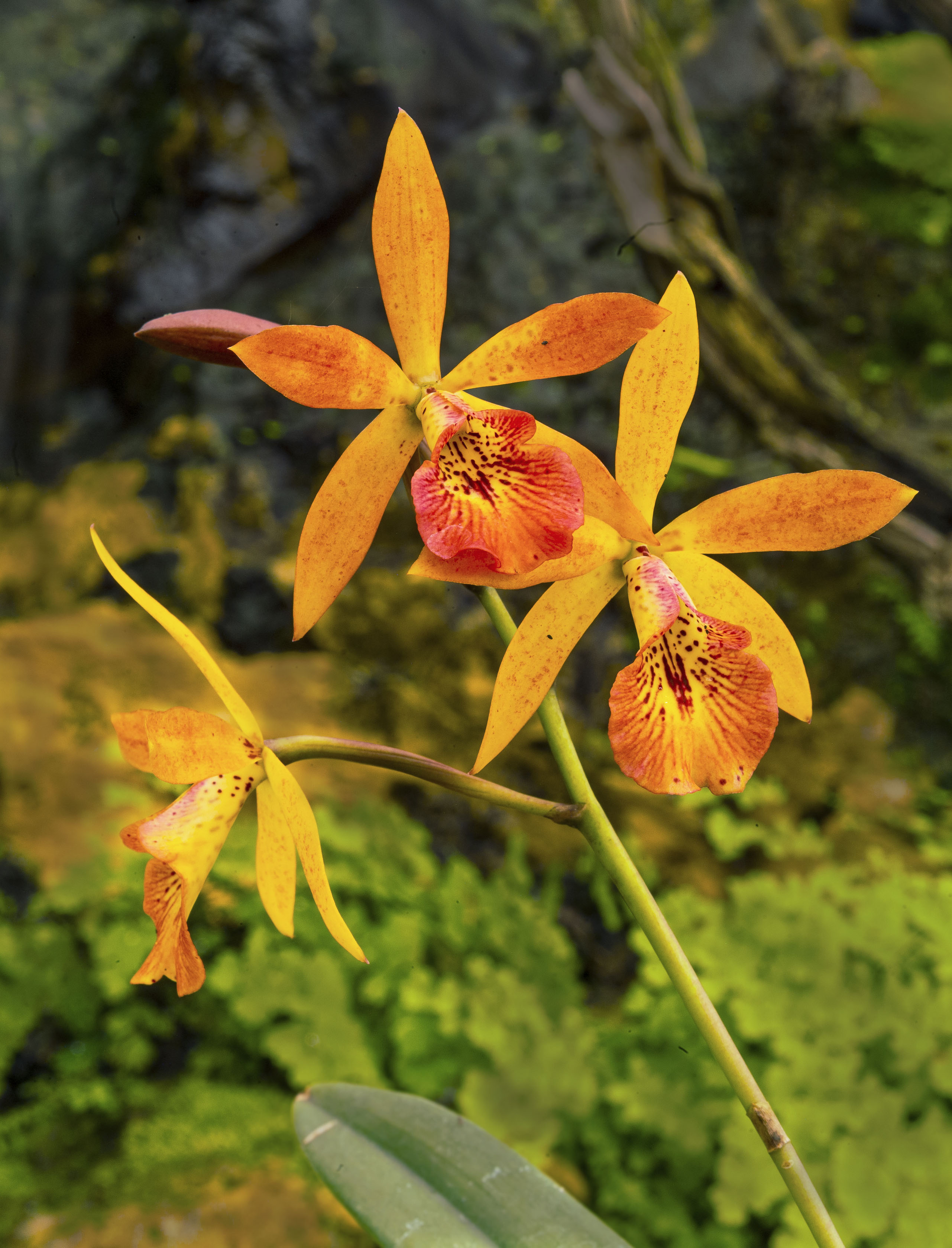
Kathy, I think this is a beautiful creation but I have a little difficulty conceiving or conjuring worlds colliding. Perhaps I am just too literal.
Perhaps if the ball and the blue ball were in actual contact and misshapen, I would understand.
Now as to the creativity, I like what you have done with the ball, the blue glass knob and the bursts of light. It is whimsical and creative. Nice work!
Brad and Sue have some interesting comments. |
Dec 14th |
| 41 |
Dec 18 |
Comment |
Brad, this reminds me of being on the beach in Monterey on a quiet evening watching the day meld into the depths of night. The time lapse of stars adds to what one would see. It is beautiful, ethereal in the midst of our busy lives. I like the diagonal flow of the beach. I don't think anything needs to be changed. Great image! |
Dec 14th |
| 41 |
Dec 18 |
Reply |
Sue, I think the textured look was from the sponge tool but I was playing with various filters when I put this together. |
Dec 14th |
| 41 |
Dec 18 |
Comment |
Sue, all the elements you put together really work in this polished image! The background sets a nice location, Coco is correctly sized (as are all the elements), and positioned. I can't think of anything to add.
Great picture! |
Dec 14th |
| 41 |
Dec 18 |
Comment |
Jan, I had to think a moment about the "two can" title and then burst out laughing. You must have put a lot of work into the layers of this image to get the can bases smaller, the branch and all the other parts working. Horses last month, toucans this month. I look forward to what you will create next month.
I really don't have any suggestions other than you might have positioned the tree limb on slightly more of a diagonal so that it went into the vegetation on the left. But that is really nitpicking. |
Dec 14th |
5 comments - 4 replies for Group 41
|
11 comments - 6 replies Total
|