|
| Group |
Round |
C/R |
Comment |
Date |
Image |
| 18 |
Jun 23 |
Comment |
I think this is most effective post processing and certainly creative, the way in which the leaves in the background have been separated I find most attractive. I can't think of anything I would do to the improve it. |
Jun 23rd |
| 18 |
Jun 23 |
Comment |
The ferris wheel is nice, but I don't think the importation of graphics from the car really adds anything. |
Jun 21st |
| 18 |
Jun 23 |
Comment |
Welcome to the group. I like the image, the colours are dramatic and it certainly reminds me of Turner. Little than I can suggest to improve it.
Great tree, sad that it has now gone (can you plant another for future generations?). |
Jun 21st |
| 18 |
Jun 23 |
Comment |
Really like this. I look at this and I think of planets or moons in space like perhaps around Mars (obviously I have never been there). And I just wonder about cropping the bottom 1/3rd off to make this more like a "space scape". Just an idea |
Jun 21st |
| 18 |
Jun 23 |
Comment |
Neat idea works very well. I wondered about cloning out some of the dots on the piles so that it isnt so obviously a copy. |
Jun 21st |
| 18 |
Jun 23 |
Comment |
Welcome to the group, Tom.
I think the unpleasant clouds are an artefact produced by the posterisation. I think this version is better though arguably the sky could be cropped. |
Jun 12th |
 |
6 comments - 0 replies for Group 18
|
| 34 |
Jun 23 |
Comment |
Nice idea which works well. A clever abstract. I am not so fond of the frame but that's a matter of taste. |
Jun 21st |
1 comment - 0 replies for Group 34
|
| 40 |
Jun 23 |
Reply |
Thanks, I think this is better |
Jun 26th |
| 40 |
Jun 23 |
Comment |
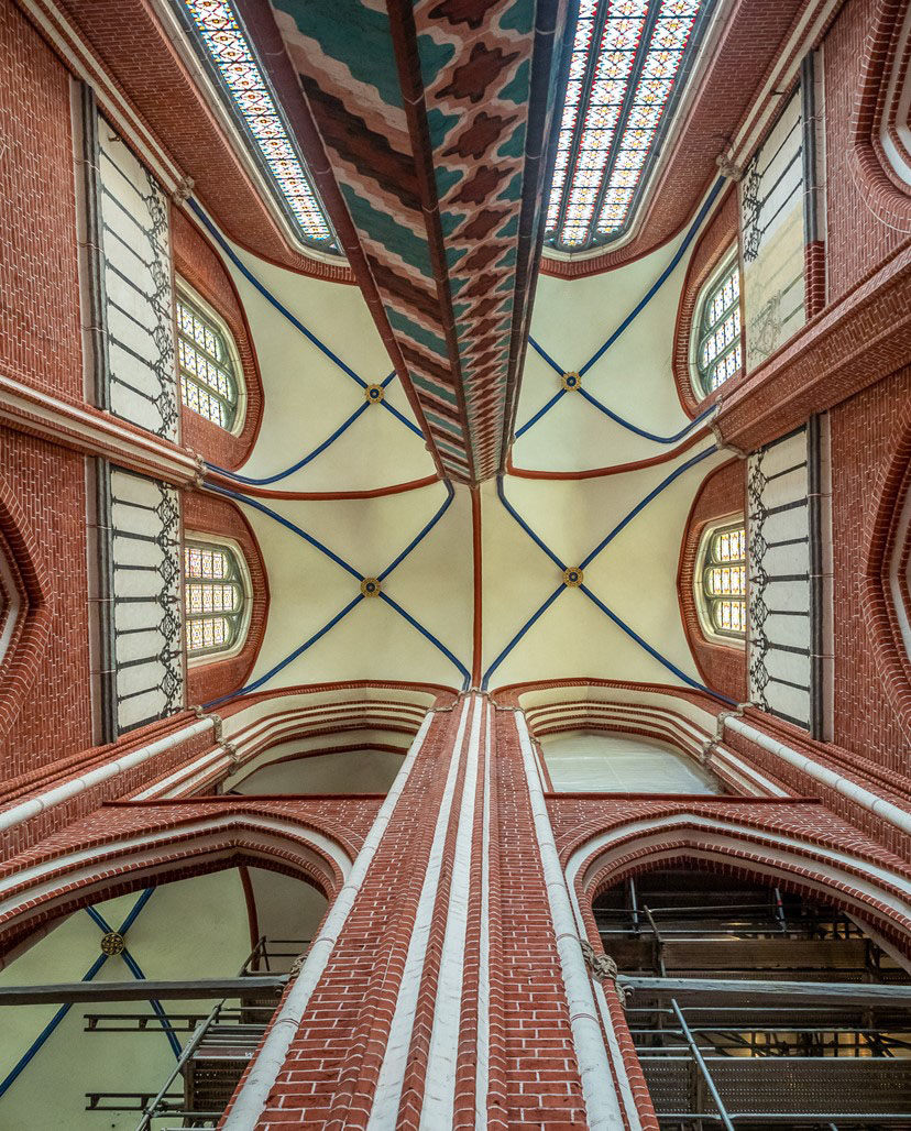
Thanks Henry, I didn't have a wide enough lens to get any foreground so got this geometrical study instead. |
Jun 26th |
| 40 |
Jun 23 |
Comment |
I think the red colours of the flower contrast nicely with the blue background - a very effective combo. Perhaps darken down the light spots in the background? |
Jun 21st |
| 40 |
Jun 23 |
Comment |
Nice colours of the iceberg. I agree the sky isn't great - perhaps this is a good time to use the new sky replacement facility in Photoshop. It needs something extra. |
Jun 21st |
| 40 |
Jun 23 |
Comment |
Good treatment. Sky is very pleasant. I think I would like to see more of the foreground - the foliage is just a tease. Else use a tele photo and zoom in on the boats. |
Jun 21st |
| 40 |
Jun 23 |
Comment |
Nicely seen I think this is an effective crop. Pleasant colours of the leaf. The web in the foreground is a bit soft, perhaps this could be sharpened up in one of the Topaz apps (if you have it). |
Jun 21st |
| 40 |
Jun 23 |
Comment |
Welcome to the group. Sorry to hear of your friend's death. This is really wintery - it looks so cold. I agree with the others about chopping off the right hand side and minimising distractions. My only criticism is that the picture has a blue cast which adds to the wintery effect, but snow is meant to be white. |
Jun 11th |
| 40 |
Jun 23 |
Comment |
Like this, perhaps better. It's not straight enough though. |
Jun 6th |
 |
7 comments - 1 reply for Group 40
|
14 comments - 1 reply Total
|