|
| Group |
Round |
C/R |
Comment |
Date |
Image |
| 18 |
Apr 23 |
Comment |
Great idea, great resulting image. 40 layers is amazing. There is a white strip bottom right hand side which you have missed. I would ignore club judges! |
Apr 28th |
| 18 |
Apr 23 |
Comment |
Great picture well seen and I particularly like the treatment which is excellent. I too have difficulty in remembering how I did treatments. I usually add instructions to the resulting title. |
Apr 28th |
| 18 |
Apr 23 |
Comment |
Welcome to the group. I really liked this, most unusual and the technique works well. I dont mind the trees in front of the car. Apart from a thin border round the edge as the others have, I have no suggestions. |
Apr 28th |
| 18 |
Apr 23 |
Comment |
Thanks for all your suggestions, I will have another look at the original too. |
Apr 28th |
| 18 |
Apr 23 |
Comment |
Lovely idea and well created in post. I agree with Gunter better to straighten both sides. |
Apr 28th |
5 comments - 0 replies for Group 18
|
| 34 |
Apr 23 |
Comment |
I've never tried this technique so something else to think about.
A very striking geometric pattern which works well, the colours all go together. Yes, the corners do give a feeling of depth. |
Apr 28th |
1 comment - 0 replies for Group 34
|
| 40 |
Apr 23 |
Comment |
Thanks. Yes, some people in my camera club thought it would be better in black and white |
Apr 18th |
| 40 |
Apr 23 |
Comment |
Not fond of the monochrome treatment TBH. It does look a bit soft to me and would benefit from Topaz denoise /sharpening. |
Apr 18th |
| 40 |
Apr 23 |
Comment |
Best not to fall in the water!
I definitely like version 2 a lot more. |
Apr 18th |
| 40 |
Apr 23 |
Comment |
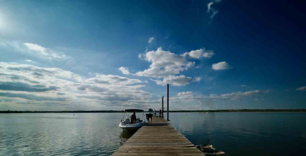
You can get interesting effects with ultrawide angle lenses but in my opinion better to have something prominent in the foreground, not just using it to fit everything in. In this image the boaters and the fisherman are very far away and it would have been better IMHO to get a bit closer, also excluding the rather prominent mooring post. A bit like this (I hope you don't mind me editing your picture). |
Apr 17th |
 |
| 40 |
Apr 23 |
Comment |
Well seen - lovely picture. I wouldn't crop anything off, it adds to the context. Perhaps just increase the vibrance a bit. |
Apr 17th |
| 40 |
Apr 23 |
Comment |
It's good to have an area like this which you can revisit. Nice calm scene. I always think it's better to be able to see "through" an image like this and, if its a river "round the bend". So perhaps better if you had moved right, closer to the water's edge. The eye is drawn to the very bright triangle in the centre of the river which isn't really very interesting. I also think the picture is underexposed about 1.5 stops - there are lots of blocked shadow areas. Sorry, but I think I prefer the original with the nice trees and lightened. |
Apr 17th |
| 40 |
Apr 23 |
Comment |
Nicely captured without being intrusive. It's well processed - perhaps needs a touch more exposure. I think it would work in monochrome too. |
Apr 16th |
| 40 |
Apr 23 |
Comment |
The toning gives the building a historical look which is nice. Overall it looks a bit light (which fits in with sepia toning) and flat for my taste but that's the effect you want. I might have moved a bit to the left and taken the building more square on. Perhaps zap the sky up too. Might have been better to wait for the couple on the left hand side to move out of the way. I don't mind the wires. |
Apr 16th |
8 comments - 0 replies for Group 40
|
14 comments - 0 replies Total
|