|
| Group |
Round |
C/R |
Comment |
Date |
Image |
| 2 |
Jul 22 |
Comment |
What a fun shot, amazing that the lady was happy to co-operate and good that you saw the opportunity and went for it. To be picky I'd be tempted to clone out the electric sockets at the bottom left which catch my eye. Good work! |
Jul 21st |
1 comment - 0 replies for Group 2
|
| 18 |
Jul 22 |
Comment |
I think the white line in the centre would benefit from being toned down a lot. |
Jul 15th |
| 18 |
Jul 22 |
Comment |
I like this effect but prefer the looser crop. |
Jul 15th |
| 18 |
Jul 22 |
Comment |
Lovely. I would just crop off the left hand side so the curve starts right in the corner. |
Jul 15th |
| 18 |
Jul 22 |
Comment |
Yes, lovely blue effect in the window light. Can't suggest anything else to improve it. |
Jul 15th |
| 18 |
Jul 22 |
Comment |
Very attractive treatment which is most effective. It would make a very nice greetings card. The border is very good. My only question is whether it might be better to straighten the vertical pillars first, but this is nit-picking. |
Jul 15th |
| 18 |
Jul 22 |
Reply |
This software doesn't seem to support layers. I have tidied up the skyline and cropped off the path. |
Jul 15th |
 |
5 comments - 1 reply for Group 18
|
| 40 |
Jul 22 |
Reply |
Got to have a "Happy Little Tree" :) |
Jul 23rd |
| 40 |
Jul 22 |
Reply |
Thanks Henry, I agree about the legibility of the text and will have a go at this. Appreciate your comments. |
Jul 18th |
| 40 |
Jul 22 |
Reply |
Yes, thank you. I was wondering about adding a bit more vibrance. |
Jul 15th |
| 40 |
Jul 22 |
Reply |
Thanks. |
Jul 15th |
| 40 |
Jul 22 |
Reply |
Thanks. I think the pavement is slightly sloping; I lined up the sign edge to be the horizontal. |
Jul 15th |
| 40 |
Jul 22 |
Comment |
I didn't know anything about white vignetting so have learned something; it's not the sort of treatment I do but perhaps I should give it a try.
To be honest I don't think this vignette adds very much to image. The original is just great, well caught. Maybe just crop a touch of the right side but that's just me. |
Jul 13th |
| 40 |
Jul 22 |
Comment |
Well spotted. I like the change in colouration. Personally I think you need something round the base to give it some context, otherwise it looks a lot like a "table top" exercise. Maybe leave the fences and signs but take out the squiggly things in the foreground. What do you think? |
Jul 13th |
| 40 |
Jul 22 |
Comment |
This is a very effective transformation which works well. I cannot suggest anything to improve it. If you turn it through 90 deg it looks a bit like a little dog jumping into a swimming pool (perhaps I have a hyperactive imagination!) |
Jul 13th |
| 40 |
Jul 22 |
Comment |
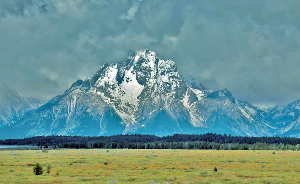
I don't think the black and white transform is an improvement. Overall, the image is a bit soft (you don't share camera settings so I am not sure if it is shake or something else). Also it's flat ie lacking in contrast. maybe better weather would have helped. You have lost the detail in the snow. There is this great strip of very dark trees crossing the picture which for me is a blocker and I also find my eye drawn to the lake on the left hand side. As others have said this needs some more Photoshopping.
For me a landscape needs to have a bit of depth (front to back) and better lighting which I hope you will get when you revisit.
I have tweaked your original - what do you think> |
Jul 13th |
 |
| 40 |
Jul 22 |
Comment |
Welcome to DD Group 40, Lin.
What an amazing animal - a thought-provoking picture and well captured. I suggest better to lighten the back of the child's head, which is in shadow. Also, I wonder if it might work better if you had stood slightly to the right hopefully capturing the child's expression, although that is not always possible and I appreciate the hippopotamus is the main subject. |
Jul 12th |
5 comments - 5 replies for Group 40
|
11 comments - 6 replies Total
|