|
| Group |
Round |
C/R |
Comment |
Date |
Image |
| 18 |
Nov 21 |
Comment |
Neat idea, well done. I think I agree with the others about having the leading biker slightly sharper. |
Nov 21st |
| 18 |
Nov 21 |
Comment |
Great picture, very creepy. Good job.
Would it be better if the reflection on the right hand side was slightly toned down? |
Nov 21st |
| 18 |
Nov 21 |
Comment |
Nice idea, I think the rabbits need to be touch smaller (and softer). Also the middle one isnt quite right, but I am not sure why. |
Nov 21st |
| 18 |
Nov 21 |
Comment |
I feel better if the top of the alcove hadn't been cropped off. Is the head slightly too far to the right? |
Nov 21st |
| 18 |
Nov 21 |
Comment |
I quite like the right hand figure but agree it would be better if he was closer to the woman dancer and perhaps not cut off. Sadly that's all I have in the image bank. |
Nov 21st |
| 18 |
Nov 21 |
Reply |
Yes I agree that some of the top could be cropped to advantage. |
Nov 21st |
| 18 |
Nov 21 |
Comment |
The treatment certainly improves on the original, I suspect it would work for a colour version as well; did you dismiss that possibility? |
Nov 21st |
6 comments - 1 reply for Group 18
|
| 40 |
Nov 21 |
Comment |
I think this image just needs a bit of a "lift" in the whites. Are you acquainted with the landscape photographs of Fay Godwin? These might give you some ideas. |
Nov 21st |
| 40 |
Nov 21 |
Comment |
Funnily enough that is exactly where they were taken. Thanks. |
Nov 17th |
| 40 |
Nov 21 |
Reply |
I suspect that most people at weddings wouldn't mind being photographed, it is, after all, a public event. |
Nov 16th |
| 40 |
Nov 21 |
Comment |
Thanks for the comments. I agree a more sideways view would have been better but unfortunately the viewing area did not permit this.
Yes, most pictures of landing planes are head on - doesn't mean they all have to be. I took some head on but the light was not right. Need a better sky.
Yes, they do make a lot of noise too! |
Nov 16th |
| 40 |
Nov 21 |
Comment |
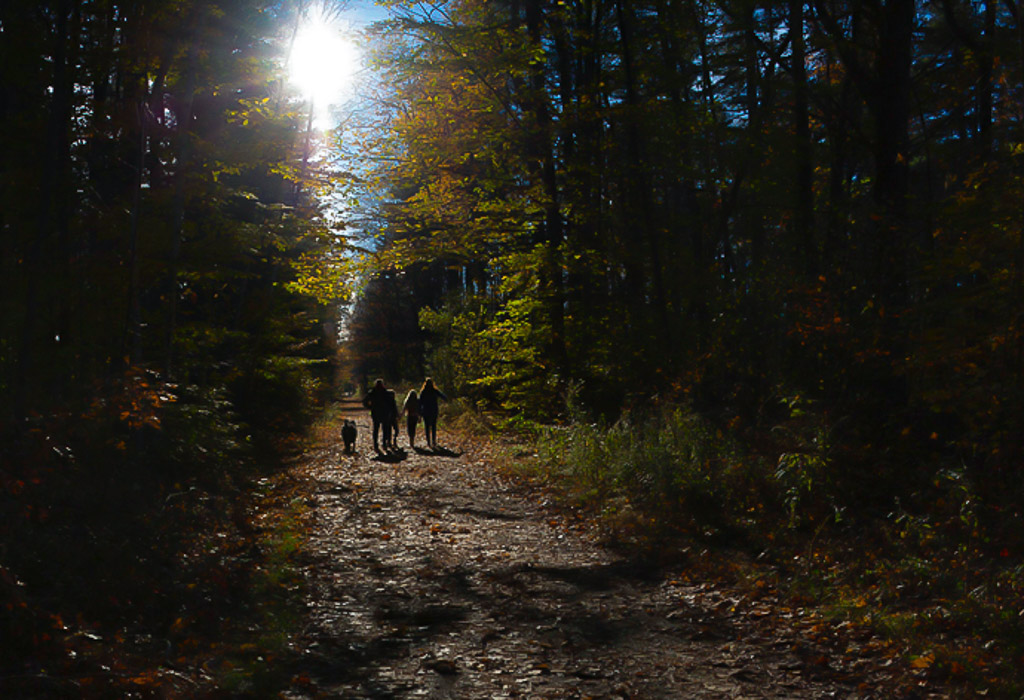
A nice autumnal scene well seen. Tricky lighting though. I wondered about a different crop removing the light tree trunks in the foreground which catch the eye (alternatively they could be darkened down, of course).
I've lightened the shadows, darkened the whites/highlights and applied some dehaze filter. What do you think? |
Nov 16th |
 |
| 40 |
Nov 21 |
Comment |
You don't show the original or share your camera settings, presumably this was shot using a tripod?
The rocks on the left hand side have really interesting shapes. Well seen scene.
The rocks on the right front look a bit soft to me - perhaps you focussed too far beyond them?
I think the shrubbery in the background detracts, if the image was in colour it mightn't matter so much. One solution, as Catherine suggests, would be to crop them out but I feel a another look at the original colour version would be worthwhile.
I still think it is is too dark, perhaps by a stop.
Sorry to be so negative. |
Nov 16th |
| 40 |
Nov 21 |
Comment |
A really clever table top, most innovative. My only criticism is the left and right dinosaurs aren't clear and it would be better having them all marching together in a file at the front of the scene. |
Nov 15th |
| 40 |
Nov 21 |
Comment |
Yes I assumed it was a wedding party. Was it? I hope they didn't scare away any wild life!
What happened next, did you take more pictures or was that it?
I think it would be improved by a different crop, less centred and to minimise the green foliage. Perhaps like this. What do you think? |
Nov 14th |
 |
| 40 |
Nov 21 |
Comment |
I have to say I am more of a LR user but either will work to parallel the scene, it's not obligatory but to me it looks better.
As there are not very many sky patches probably just as easy to deal with them individually. It's what you feel like doing. |
Nov 12th |
| 40 |
Nov 21 |
Comment |
A pleasant abstract detail shot. I had a play with the crop as you suggested and I think yours is probably the best. It's a matter of taste but I would try to get one girder absolutely parallel with an edge of the photo. The colouration is very pleasant and looks right. I think it needs some work on the little patches of sky seen in between the girders as there is what looks to me like some chromatic aberration (halo effect) at the margins. Also some sky is blue, the white tends to grab the eye. But a good effort, thanks for sharing. |
Nov 12th |
| 40 |
Nov 21 |
Comment |
Yes a bit of fun and well seen.
I think the crop is a bit tight and the image would benefit for a bit more space. What do you think?
Also I find the bokeh a bit strange in the background (I thought the same of last month's entry). Did you do something special to get this effect> |
Nov 11th |
 |
| 40 |
Nov 21 |
Comment |
Thanks, important question - does the sky look natural? |
Nov 2nd |
11 comments - 1 reply for Group 40
|
17 comments - 2 replies Total
|