|
| Group |
Round |
C/R |
Comment |
Date |
Image |
| 18 |
Jun 21 |
Comment |
I like the treatment which works well. I don't think the little figures add anything and could be removed to advantage. |
Jun 16th |
| 18 |
Jun 21 |
Comment |
I have nothing to add to the other comments. |
Jun 16th |
| 18 |
Jun 21 |
Comment |
Neat idea, I too wondered if better for the child to be a bit smaller in the frame. |
Jun 16th |
| 18 |
Jun 21 |
Comment |
Welcome to the group.
I am fairly relaxed about OTT (do it myself and sometimes get criticised) but sometimes subtle works better. I think a smaller and less centralised dancer preferable here. Also I think the intense blue in the background is a bit disturbing.
I love the sky in Original 3. |
Jun 16th |
| 18 |
Jun 21 |
Comment |
Maybe better with the star similarly blurred perhaps. Also in colour? |
Jun 16th |
| 18 |
Jun 21 |
Comment |
Thanks for the suggestions, I'll have another go (when I have got some spare time!). |
Jun 15th |
6 comments - 0 replies for Group 18
|
| 40 |
Jun 21 |
Comment |
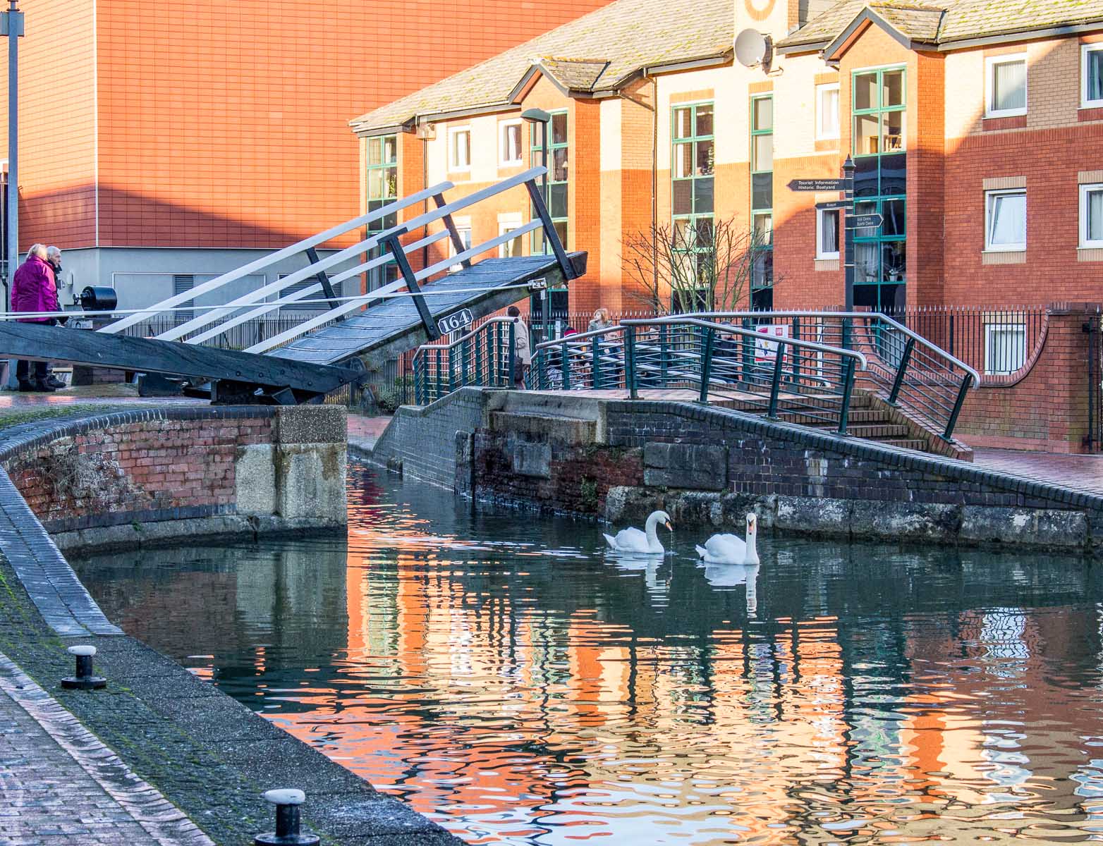
Thanks for your thoughts Stuart. I've thought about just cropping it to 1920 x 1080 and cloning all the gold bits out (there are a couple of golden leaves etcetera) and I am not sure it's better. I thought the golden reflections added something but obviously judges don't agree with me.
|
Jun 16th |
 |
| 40 |
Jun 21 |
Comment |
I have no idea what the gold area is - it must be a reflection of something, maybe a barge. |
Jun 16th |
 |
| 40 |
Jun 21 |
Comment |
The positioning is great and just right. Exposure is fine. I don't know what happened in the camera, the metadata suggests it was taken using f4.5, 1/6s which really needs use of a tripod. Good idea, worth attempting again. |
Jun 15th |
| 40 |
Jun 21 |
Comment |
Nice shot, you didn't say how long the exposure was.
I think I would either have cropped in a bit to miss the left hand side rock and concentrate on the falling water or else show a shot with a wider view showing more of the falls to give some context.
I think it is too dark and needs lightening 1/2 to 1 stop.
Also there appears to me to be a little blue cast.
The green plant in the right foreground could be cloned out.
Sorry, rather a lot of comments. |
Jun 15th |
| 40 |
Jun 21 |
Comment |
Beautifully positioned - well caught. Good to see the eyes behind the helmet too Even at 1/1600 there is slight blur on the back wheel though which detracts a little bit. This image probably would do well in monochrome as well - worth a try anyway. |
Jun 15th |
| 40 |
Jun 21 |
Comment |
This is a personal view but I would have been tempted to take a view more to the right avoiding the tree on the left hand side. It does look a bit flat to me and I feel could do with more vibrancy. I do like Anne's version. |
Jun 15th |
| 40 |
Jun 21 |
Comment |
I agree with Martin, it's two pictures and it would work better as either the lower or higher half. It looks to me as though the the camera was slightly tilted upwards and the side of the house wasn't shot "full on" which I think detracts a bit.
I'd certainly like to see another attempt in colour. Hope this helps. |
Jun 15th |
7 comments - 0 replies for Group 40
|
| 42 |
Jun 21 |
Comment |
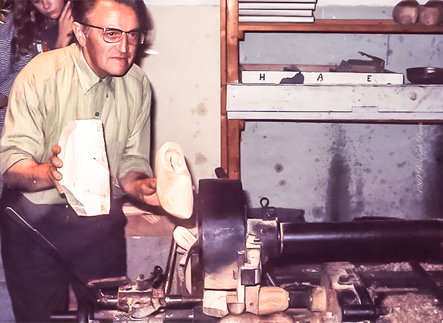
Hi Keith, I hope you don't mind me butting in. Interesting memory of rather a long ago. It's amazing how well some of these old Ektachromes appear on scanning. IIRC Ektachrome always tended to be a bit blue and it shows up here. I took the liberty of running it through Lightroom and simply adjusting the White Balance from "As Shot" to "Auto"; also slightly cropped the image. What do you think? (Andrew Hersom, Group 40) |
Jun 17th |
 |
1 comment - 0 replies for Group 42
|
14 comments - 0 replies Total
|