|
| Group |
Round |
C/R |
Comment |
Date |
Image |
| 18 |
Apr 18 |
Comment |
You are quite right _ there are some white areas which still need darkening down. |
Apr 10th |
| 18 |
Apr 18 |
Comment |
I think something (even more creepy) could be done by focussing in on the head & cross - maybe a bit of rotation. That would be something extra! |
Apr 10th |
| 18 |
Apr 18 |
Comment |
[smile] |
Apr 10th |
| 18 |
Apr 18 |
Comment |
I think for this page a border all the way round would be better. I quite like this a simple orange and black image. |
Apr 10th |
| 18 |
Apr 18 |
Comment |
Overall a very nice effect. I think better chop a bit off the the right hand side to make it almost more square but prefer your second version. |
Apr 10th |
| 18 |
Apr 18 |
Comment |
Looks like a "forest" in the background in which case the perspective of the birds jars a bit. But very striking. |
Apr 10th |
| 18 |
Apr 18 |
Comment |
Yes very creepy but to me the crosses look a bit artificial & detract. |
Apr 10th |
| 18 |
Apr 18 |
Comment |
It certainly lifts the original and gives a 3D effect which would work very well for a framed wall picture. Not so fond of the colours of the background though - maybe pale grey better but that is a matter of one's taste. |
Apr 10th |
8 comments - 0 replies for Group 18
|
| 40 |
Apr 18 |
Comment |
Good shot. I like the head on pose.
The head/face seem nicely sharp, is there a bit of softening on the chest and paws possibly due to movement? You don't say what camera setting were used. |
Apr 11th |
| 40 |
Apr 18 |
Comment |
Works well for me - lucky accident |
Apr 10th |
| 40 |
Apr 18 |
Comment |
Great shot, great pose. My only comment would be to clone out the yellow stripe at the top left hand side, as catches the eye too much compared with all the other colours. The pink stripe is OK (ish). Just a thought. |
Apr 10th |
| 40 |
Apr 18 |
Comment |
Fantastic! Well done you going out and putting in waders like this.
But I feel that the right foreground is too bright and would be better if considerably darkened or maybe instead just crop off 1/4 at the bottom, just leaving the rock in the foreground. |
Apr 10th |
| 40 |
Apr 18 |
Comment |
Its a cliche about is it good enough to put on the wall but actually its a very good judgement criteria (even if it's just your wall).
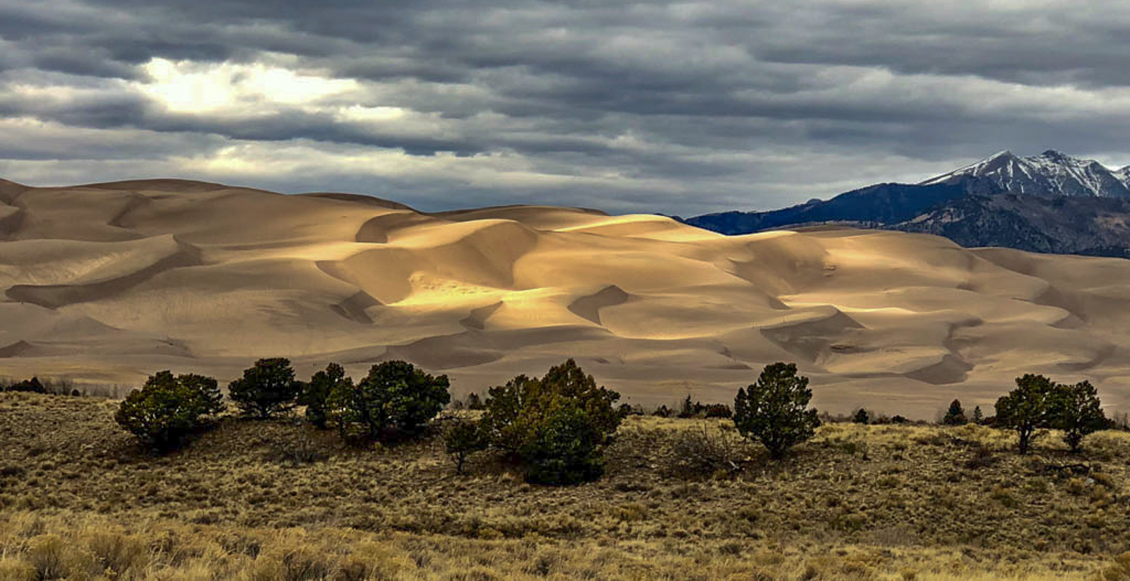
Everyone will have a different take on this and it all comes down to one's personal view. My feeling would be to crop a little off the sky so the horizon isn't half way across the frame, maybe lighten the shadows in the foreground trees and try and improve the highlight in the sky and then darken every thing slightly. But everyone is different and it all comes down to taste. Hope this helps but everyone feel free to disagree. |
Apr 10th |
 |
| 40 |
Apr 18 |
Comment |
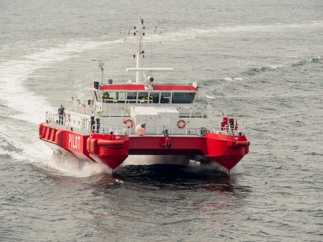
Jamie, I take your point but I was trying to put the pilot boat in context (not sure it works). This is a different version. |
Apr 10th |
 |
| 40 |
Apr 18 |
Comment |
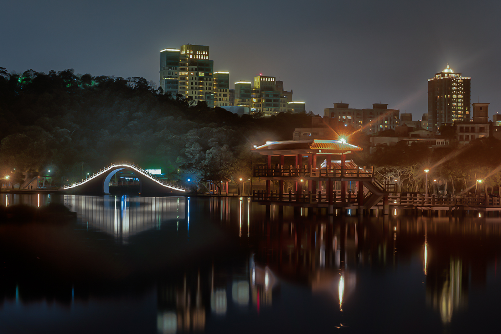
Nice looking shot the proportions are just right and the reflections add to the ambience.
The only negative for me is the colour balance which is too "brown" for me. I took the image into Lightroom and changed the white balance from "as shot" to "auto" (this is my standard workflow). Also tweaked the whites and the highlights. I think this is an improvement - what do you think? |
Apr 9th |
 |
7 comments - 0 replies for Group 40
|
15 comments - 0 replies Total
|