|
| Group |
Round |
C/R |
Comment |
Date |
Image |
| 18 |
Nov 17 |
Comment |
I agree, the background is too busy |
Nov 16th |
| 18 |
Nov 17 |
Comment |
The original is different, surely whether it is preferable or better is up for debate.
This works for me. More brutal and less pictorial than the original (but none the worse for that). Certainly this has more impact. |
Nov 13th |
| 18 |
Nov 17 |
Comment |
Reminds me of one of those basking shark pictures - the ones with the enormous mouth. Great colours, I don't think it wants cropping at all. |
Nov 13th |
| 18 |
Nov 17 |
Comment |
I think the mono version is better - just seems to work. |
Nov 13th |
| 18 |
Nov 17 |
Comment |
Agree with the other comments. I wonder if it would be improved by a slight tilt to put it more on a diagonal. |
Nov 13th |
5 comments - 0 replies for Group 18
|
| 40 |
Nov 17 |
Comment |
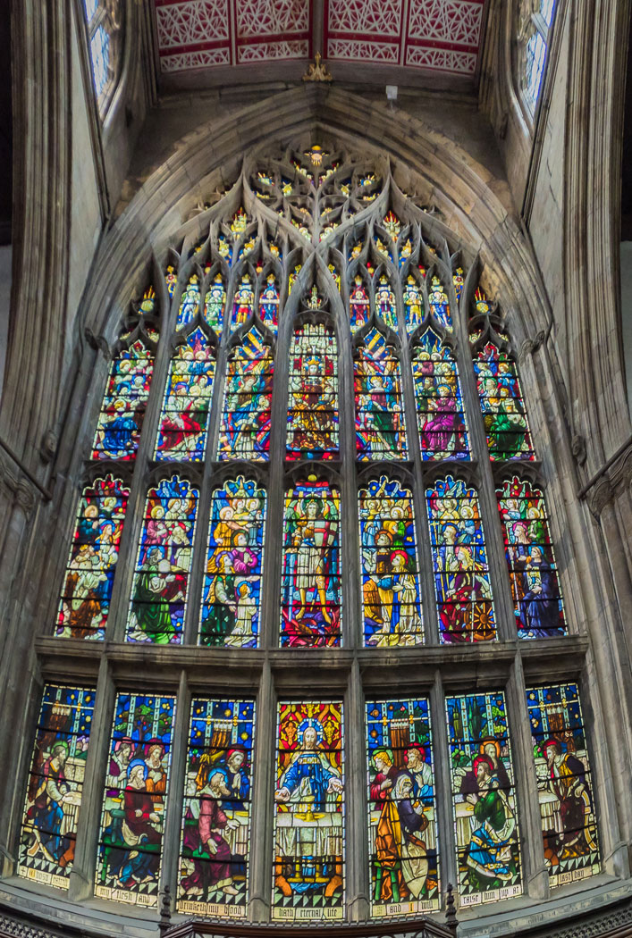
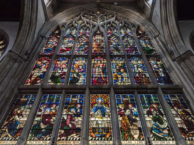
I hadn't thought of using puppet warp. This version using the vertical adjustment in LR is perhaps OK but the original shot was taken with the camera pointing so far upwards it's difficult not to look a bit strange. The bottom is still curved for example. I think better to revisit and take again. |
Nov 18th |
 |
| 40 |
Nov 17 |
Reply |
That's what I meant to say! |
Nov 15th |
| 40 |
Nov 17 |
Comment |
I take your point but my alternative shot cuts off the bottom of the window on both sides. I needed a wider rectilinear lens which at the time I wasn't carrying. I couldn't move any further back because of the position of the altar. |
Nov 14th |
 |
| 40 |
Nov 17 |
Comment |
I much prefer version 2! |
Nov 12th |
| 40 |
Nov 17 |
Comment |
Nice, but it lack a point of interest. There isn't really anything to be looking at - the theatre itself isn't very interesting. It would have been so much better with some detail in the sky too. |
Nov 12th |
| 40 |
Nov 17 |
Comment |
Nice scene, well observed. There is a nice follow-through for the eye to the vanishing point but the woodland, overall is a bit flat and miserable - needs lightening up I think. Also, the picture would benefit from a figure (eg red anorak?) walking along the path to provide some action. |
Nov 12th |
| 40 |
Nov 17 |
Comment |
This is very innovative and effective. Nice addition of the wings and I like the "water swirls" in front of the little dog. My only criticism is that there are lots of white spots on the surface of the glass which detracts. I'm not sure if it is worthwhile "healing" them all out in PS but to me they spoil the overall effect. |
Nov 12th |
| 40 |
Nov 17 |
Comment |
Yes this is a very attractive effect and well done. My only thoughts are perhaps to increase the level of blackness, overall, it's a bit pale but that is a personal thing.
Maybe OK as it is. One for the wall! |
Nov 11th |
| 40 |
Nov 17 |
Comment |
Its an interesting subject. The starburst definitely improves the picture but not enough. The foreground is too dull and flat - it looks underexposed plus needs a bit of contrast and vibrance adding. It might be improved, also, by moving the camera slightly to the left to include more of the back of the tractor - it looks a bit static as it is. Hope this helps. |
Nov 11th |
8 comments - 1 reply for Group 40
|
13 comments - 1 reply Total
|