|
| Group |
Round |
C/R |
Comment |
Date |
Image |
| 18 |
Aug 17 |
Reply |
To be honest I am not convinced by the top right hand corner, I don't feel its quite right. |
Aug 25th |
| 18 |
Aug 17 |
Comment |
Great effect, very colourful. This group is giving me so many ideas! I must confess I find the reflection part of the picture a little unsettling - not quite sure what to say about this. |
Aug 25th |
| 18 |
Aug 17 |
Comment |
I agree with the others particularly with Mike's "finger" comment. But another superb idea! |
Aug 16th |
| 18 |
Aug 17 |
Comment |
I agree with Mark, it would be better to have something more distinct on the flowers but the overall effect is superb. I particularly like the mono version too. |
Aug 16th |
| 18 |
Aug 17 |
Comment |
I am not sure if I am judging a photograph or a painting!
I like the idea (given me food for thought). I agree with the others that the phone box isn't quite the right size compared with the figure and some shadows would be better.
I think you have the visual style of Edward Hopper (the remoteness) but the painting style isn't him at all IMHO - there isn't the detail and the light and shade in the telephone box, for example. Of course Hopper did vary his painting "style" over the years.
But forgetting Hopper, I like the landscape, phone box and seated figure; positioning is fine. But just wish the box was bigger. |
Aug 16th |
| 18 |
Aug 17 |
Comment |
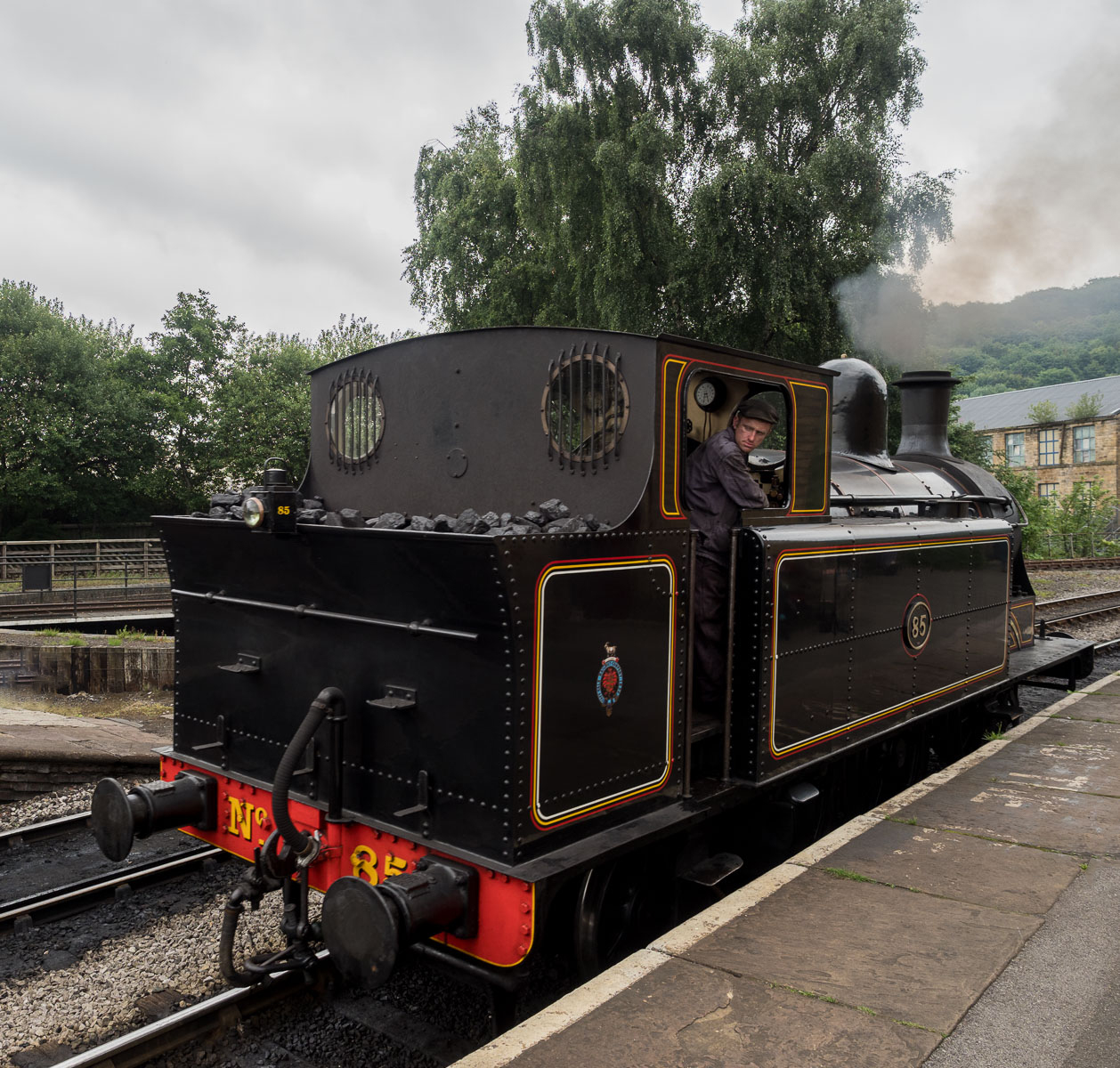
I take your point but the picture was taken for a club competition called "in its frame" (?) so I wanted to "frame" the loco. |
Aug 7th |
5 comments - 1 reply for Group 18
|
| 40 |
Aug 17 |
Comment |
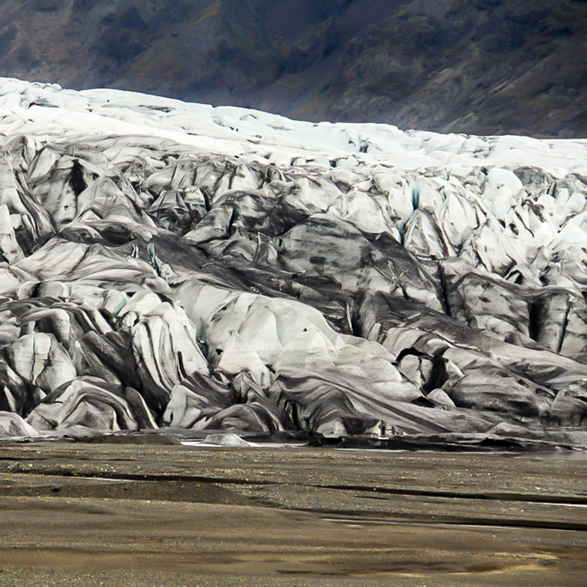
Susan is right, there isn't enough pure white or black. Also without some colour it is difficult to see what is going on.
I had a play in LR and stretched the tonal range, increased exposure by 1 stop. I've enhancing the colour bits and darkened the background. Removed some grain and made it square. An alternate view, what do you think? |
Aug 16th |
 |
| 40 |
Aug 17 |
Reply |
I wondered about that - the signal box doesn't really add anything but I tend to crop too much. I've also straightened the verticals a bit better |
Aug 16th |
 |
| 40 |
Aug 17 |
Comment |
I think the quartering of the original works well - it really looks a different abstract image now. |
Aug 16th |
| 40 |
Aug 17 |
Comment |
You've done a great job capturing this and in post-production. I would be tempted to crop in a little so that the bird is on a third. |
Aug 16th |
| 40 |
Aug 17 |
Comment |
It works OK in monochrome but I prefer the original crop as to me it gives a better context for the picture. |
Aug 16th |
| 40 |
Aug 17 |
Comment |
Super shot. I wouldn't change a thing. |
Aug 16th |
| 40 |
Aug 17 |
Comment |
Nicely captured action though I am not sure about including the static right hand side figures - maybe crop out to make more of a square picture. But interesting swirls in the water.
I don't much like the white edge either, you should be able to change it by going to the edge box on the right hand in autopainter (I think) and pick on the downward arrow to choose something different. |
Aug 16th |
| 40 |
Aug 17 |
Comment |
Very attractive image which certainly gets my attention. The bird is in a good pose. My only criticisms are that there is a noticeable curvature on the edge of the table due to the lens distortion. Also is there is perhaps a slight horizontal tilt - doesn't matter too much. I would be tempted to clone out the scooter on the left hand side and perhaps some of the cars (it might actually be better/easier to crop the left hand side slightly so the bird isn't dead centre). But that comes down to personal taste.
Perhaps this would be good as a Christmas card? |
Aug 16th |
7 comments - 1 reply for Group 40
|
12 comments - 2 replies Total
|