|
| Group |
Round |
C/R |
Comment |
Date |
Image |
| 34 |
Oct 20 |
Reply |
Thanks Georgianne, your image is an improvement. I think I didn't go far enough with the editing. Good ideas. |
Oct 31st |
| 34 |
Oct 20 |
Reply |
A well deserved win, Alan, congratulations. |
Oct 25th |
| 34 |
Oct 20 |
Comment |
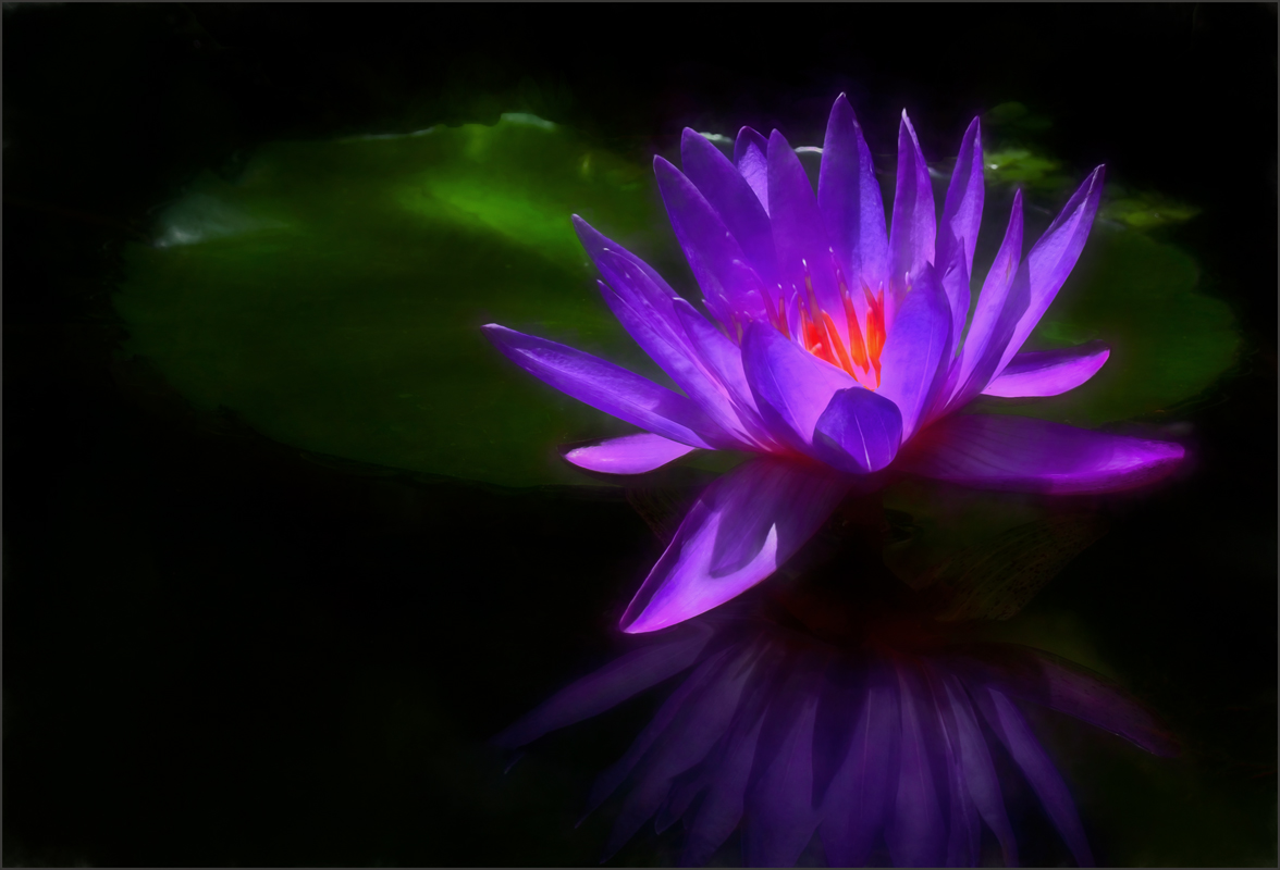
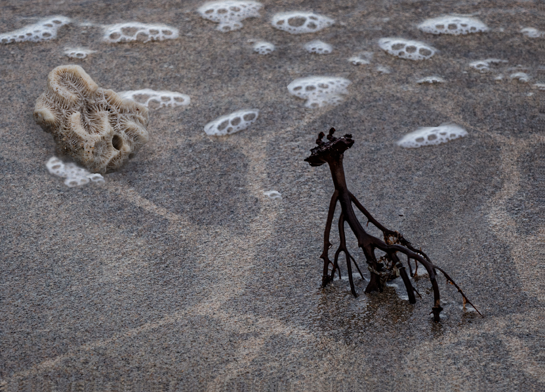
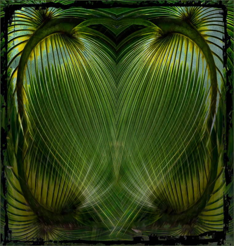
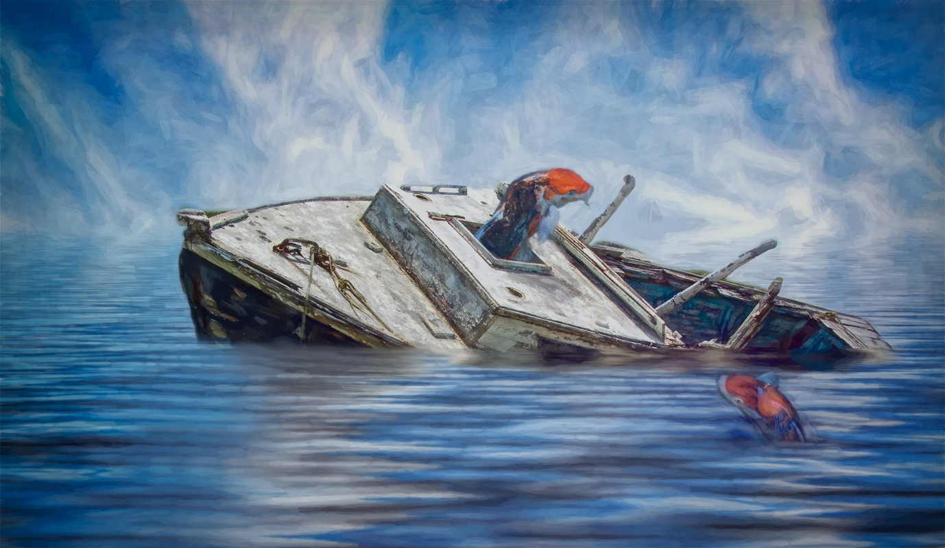
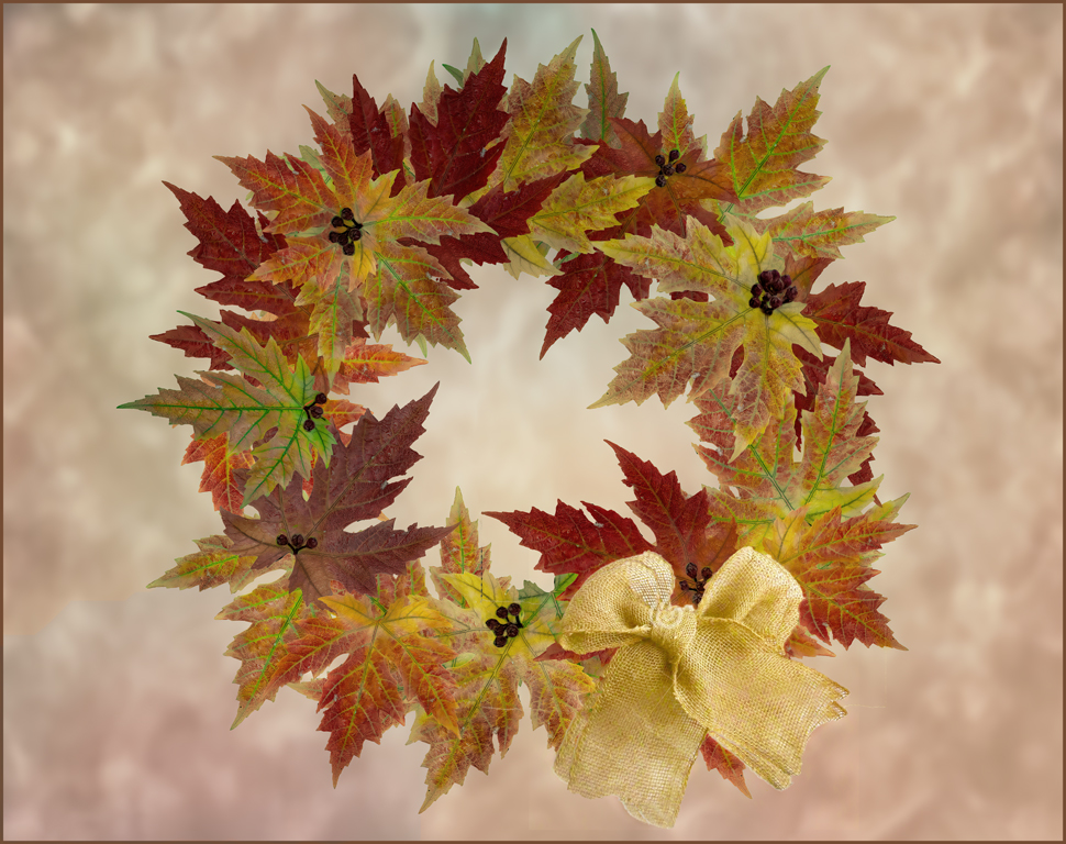
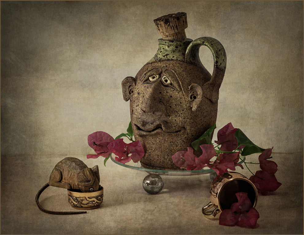
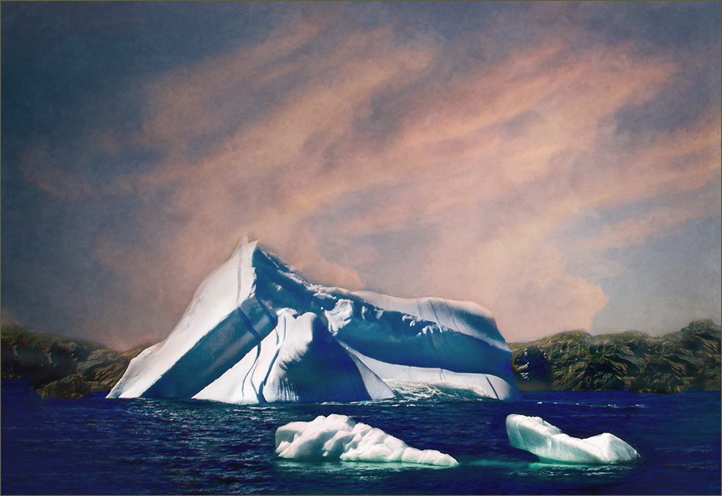
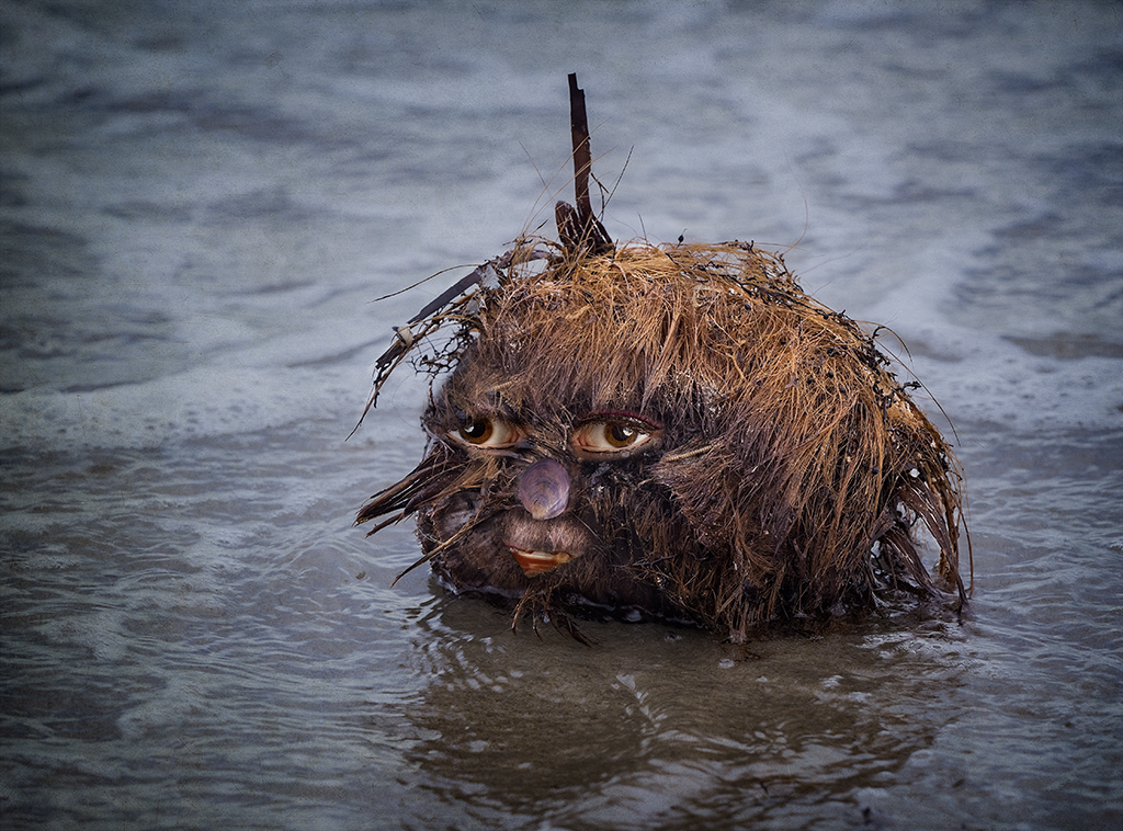
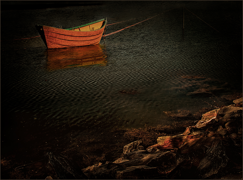
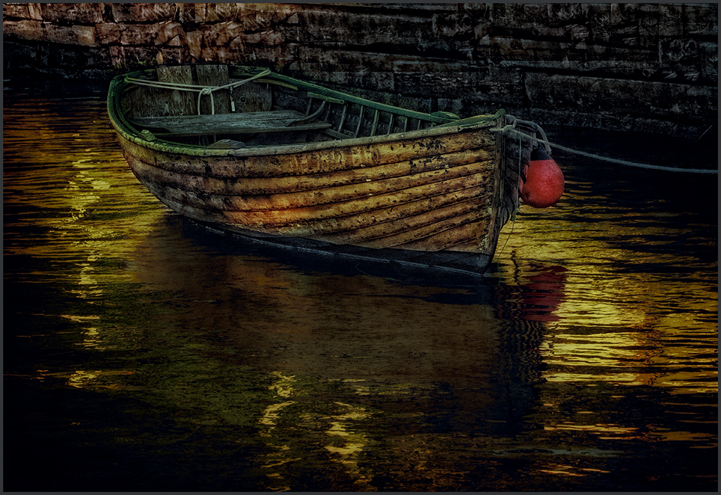
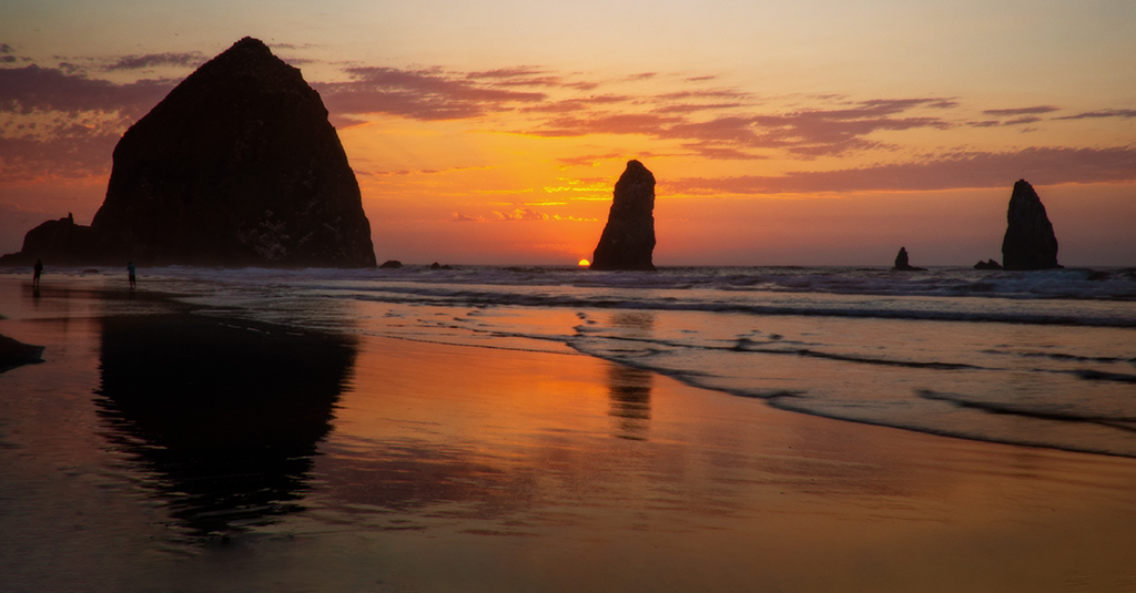
Jan, three objects in an image always work well together. The three that you selected are cohesive and blend the image into a story of the sea. A texture usually helps to bring objects added to an image together as this one does. The texture also creates gives it the antique look. Good job. |
Oct 18th |
| 34 |
Oct 20 |
Comment |
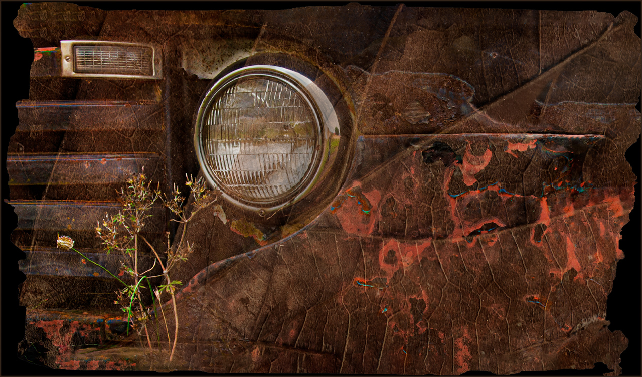
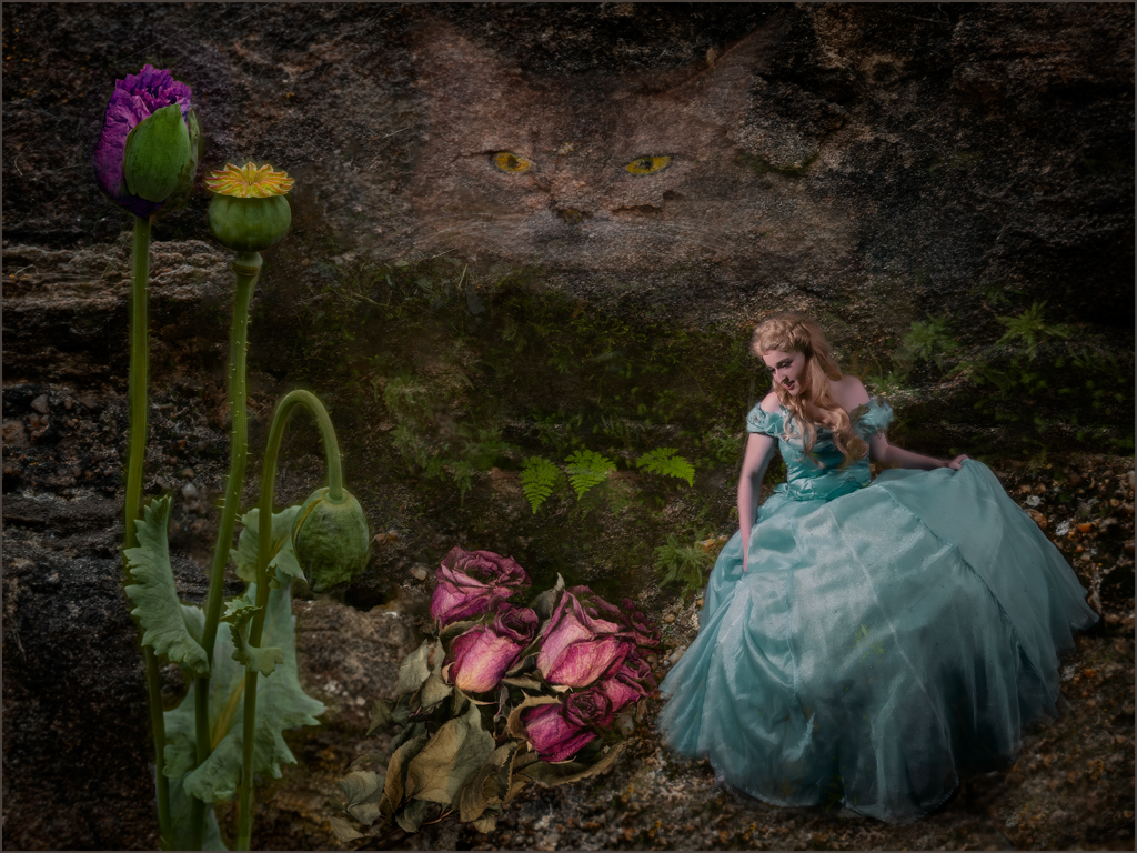
Lori, good job on transforming a modern image into an older one. The items added to the scene were good choices. I do agree that the lighting needs some tweaking. I also agree that the houses and men are not completely believable. For the image to be an older image, I feel that the saturation should be reduced. You should work on the image a bit more, and I would expect that it would turn out perfect. |
Oct 18th |
| 34 |
Oct 20 |
Comment |
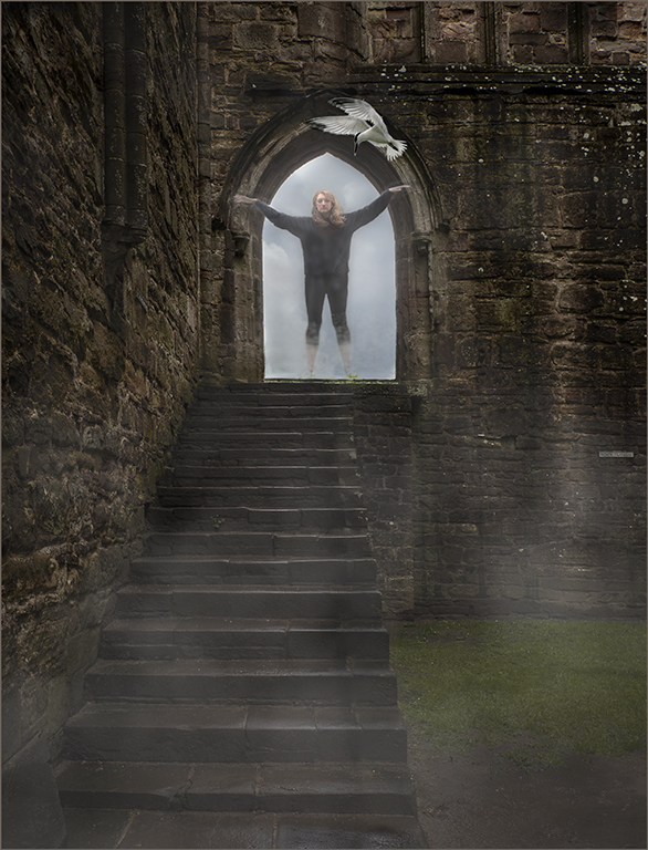
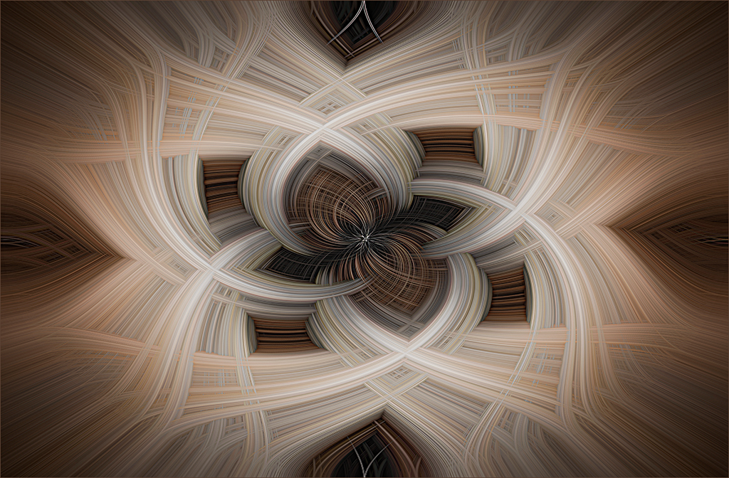
Love this, Denise. The spin blur gives the image a bit of mystery. The warm tones of the smoke create more interest than the grey. Maybe we should all walk toward the light in this tunnel and return when the chaos is over. |
Oct 18th |
| 34 |
Oct 20 |
Comment |
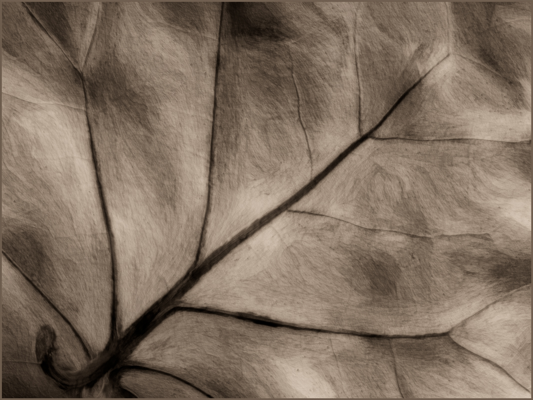
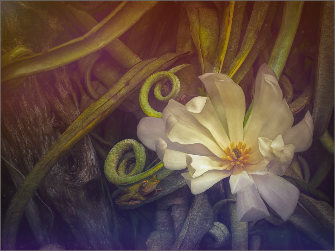
Good job, Georgianne. Your editing did a superb job of bringing out the texture in the pjs. Darkening the background did a good job of isolating the 3 items that you selected. The texture brought everything together. |
Oct 18th |
| 34 |
Oct 20 |
Comment |
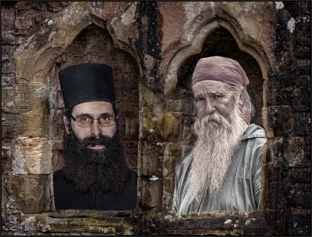
Good job adding the monks and stupa to the black background. The clouds pull it all together. good luck in the state camera club competition. |
Oct 18th |
| 34 |
Oct 20 |
Comment |
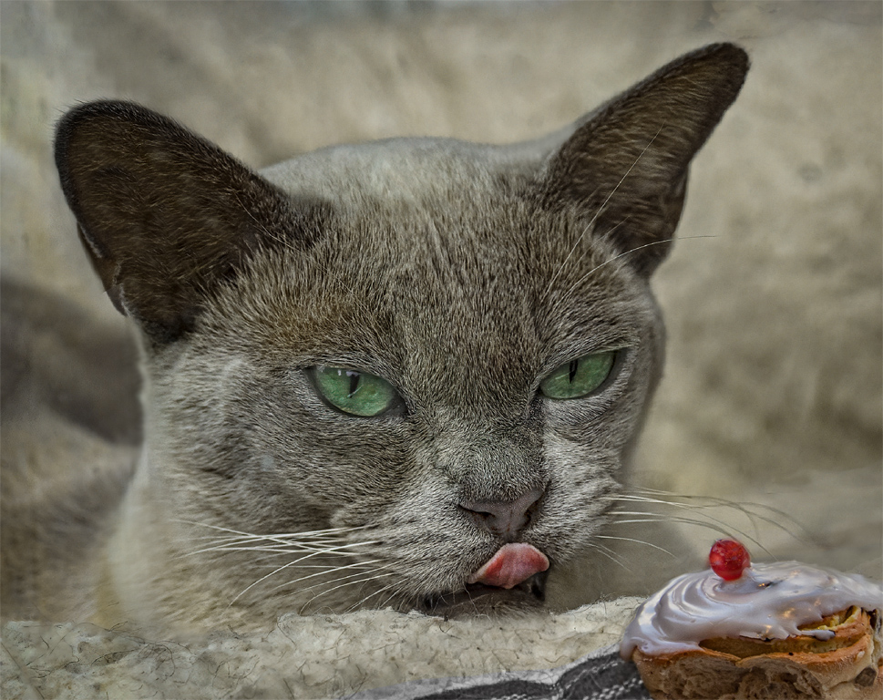
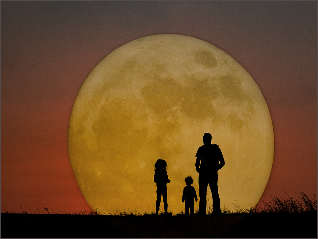
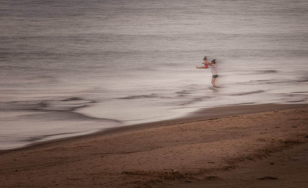
Good Halloween picture, Steve. I agree that the people need shadows under their feet to anchor them. I agree with Alan about moving the two men around. Also, I would tone down the red in original 3's jacket. He is taking all of the attention due to the brightness of his jacket. The pasted on look might be helped with a feather of the edges or a blur of the edges with the blur tool. The problem that I see is that the small depth of field of the spider, and large depth of field of the people are competing. I hope that spider doesn't show up in your house, very scary. |
Oct 18th |
6 comments - 2 replies for Group 34
|
| 69 |
Oct 20 |
Reply |
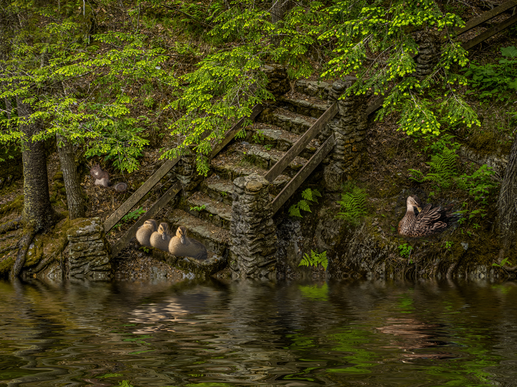
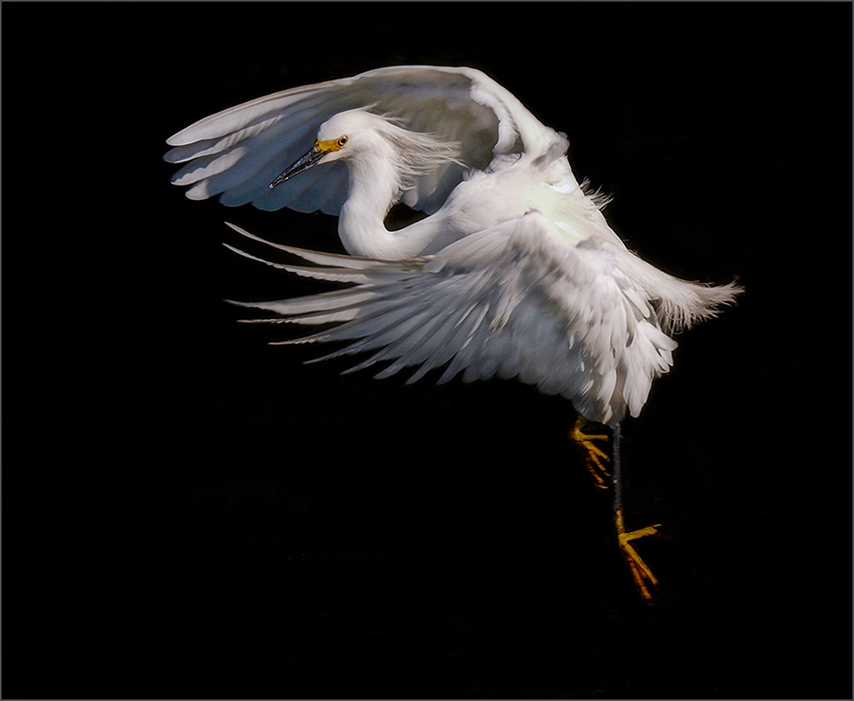
I stayed with the original background only because it is a nature group, and I felt like the image should stay as it was. I have a cloud texture that is saying it would look perfect with the hawk. |
Oct 25th |
| 69 |
Oct 20 |
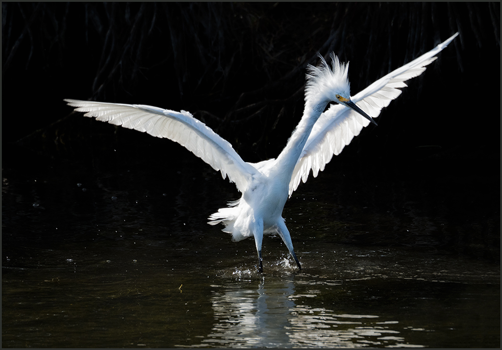
Comment |
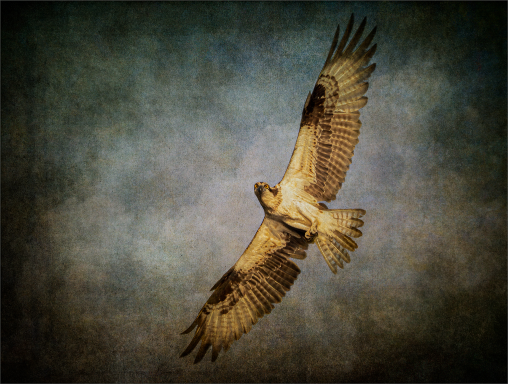
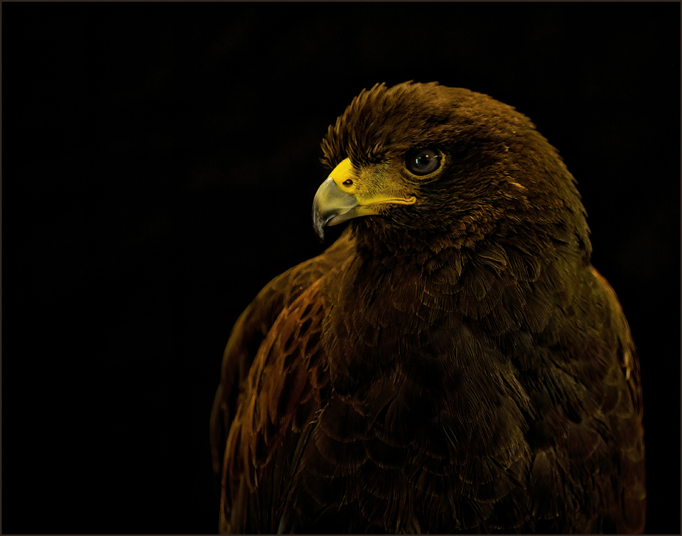
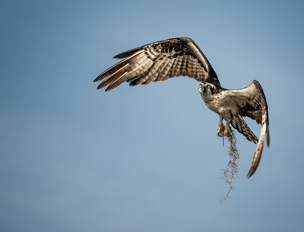
Geoffrey, so sorry about the terrible fires and loss of wildlife. The bird is beautiful and has good detail. I would try to remove some of the blue in the lower part of the eye. It is distracting. Maybe you could bring back the detail on the top of the head and neck. It appears to be over exposed. I agree that the background is too bright, however it is beautifully blurred. A crop would help. |
Oct 17th |
| 69 |
Oct 20 |
Comment |
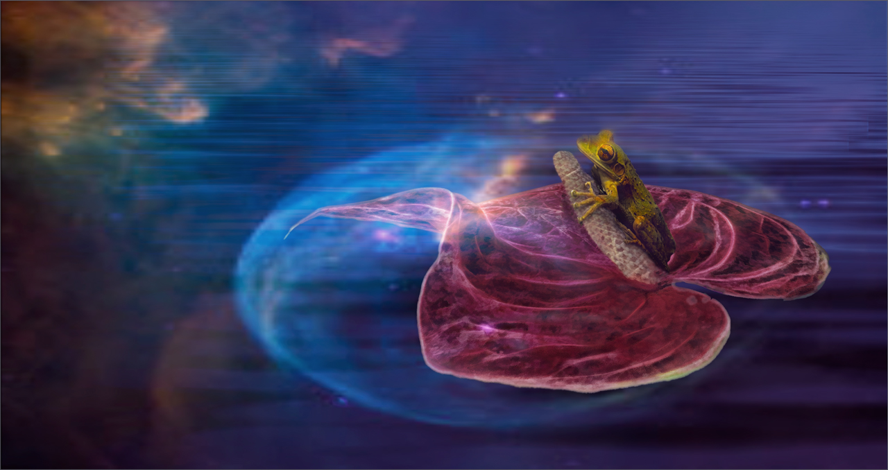
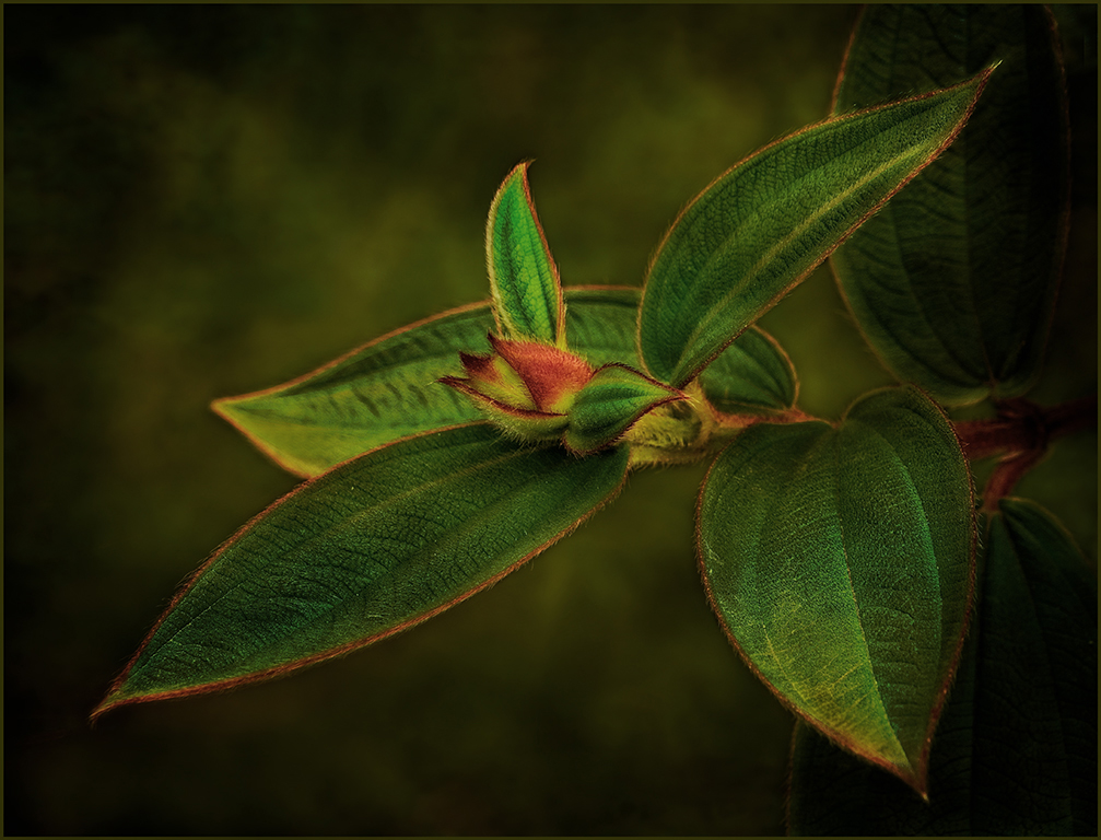
Brenda, go to the PSA website-divisions-nature. Then you will find the explanation/definition of what is allowed and not allowed in nature and wildlife. The background is nicely blurred, and you have a nice color pallet. The image with the bud is quite interesting and unusual. However, the image is lacking in sharpness/appears soft in several areas. Which is probably due to hand holding for the shot. I agree with Mervyn about the separation of background and upper petals. I feel that the image needs more contrast. If you had wanted to include the lower leaves, the entire leaves should have been included rather than partial leaves. |
Oct 17th |
| 69 |
Oct 20 |
Comment |
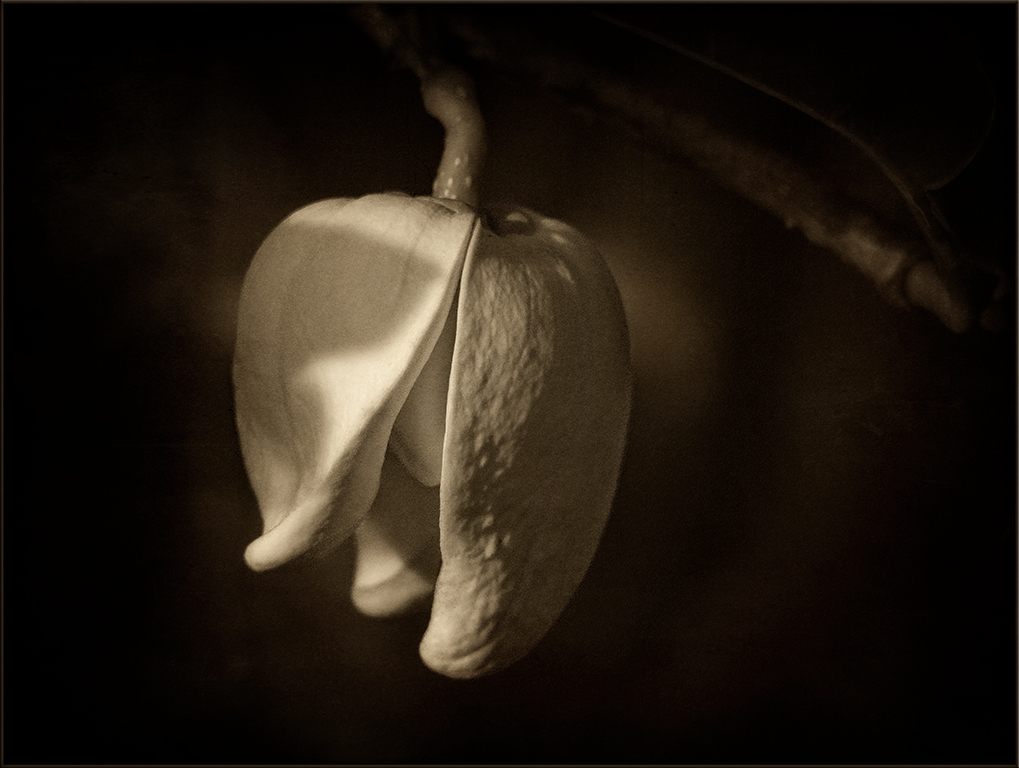
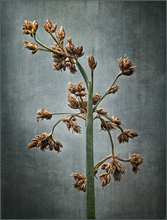
Jacob, you are learning how to use your editing tools and improving your images. Black and white was a good choice. I have no problem with two rather than three blossoms. they are well placed. I do think that the vignette should be lightened on the flowers. It works well to isolate the flowers from the background but is covering up many of the petals of the flowers. You could erase some of the darkening from the white of the flowers, and the flowers would really pop. |
Oct 17th |
| 69 |
Oct 20 |
Comment |
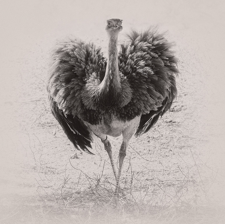
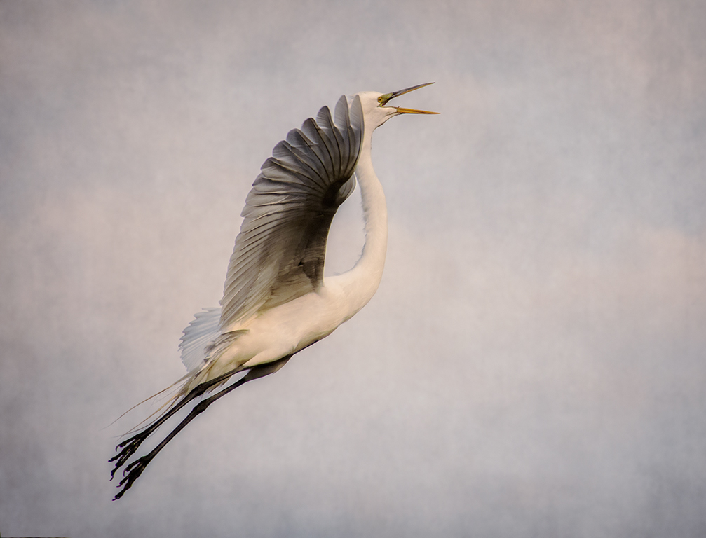
Pierre, the bird is sharp with good feather detail. I feel that more contrast is needed between the grass and bird and agree that the grass should be toned down and darkened. Usually with bird photography more interest is needed in the image. A bird on the ground needs to be doing something rather than just standing. |
Oct 17th |
| 69 |
Oct 20 |
Comment |
Dean, the colors are beautiful. The early morning sky reflecting in the salt flats along with the converging lines make the image. |
Oct 17th |
| 69 |
Oct 20 |
Comment |
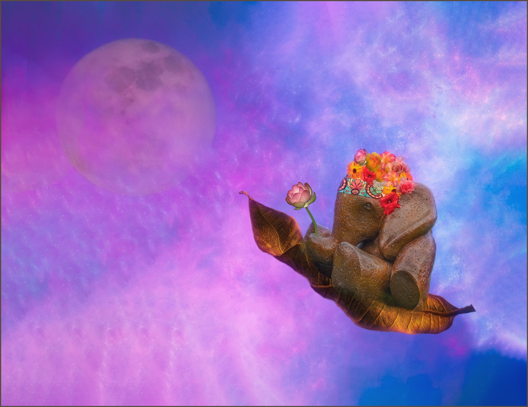
Interesting posture on this elephant, Mervyn. Maybe it was bored. The elephant is standing in a diagonal that creates interest. The lighting brings out the many textures in the elephant's skin. The green background is subdued enough, so that it does not overpower the image. Love the turns and s on the trunk. |
Oct 14th |
6 comments - 1 reply for Group 69
|
12 comments - 3 replies Total
|