|
| Group |
Round |
C/R |
Comment |
Date |
Image |
| 34 |
Jun 20 |
Reply |
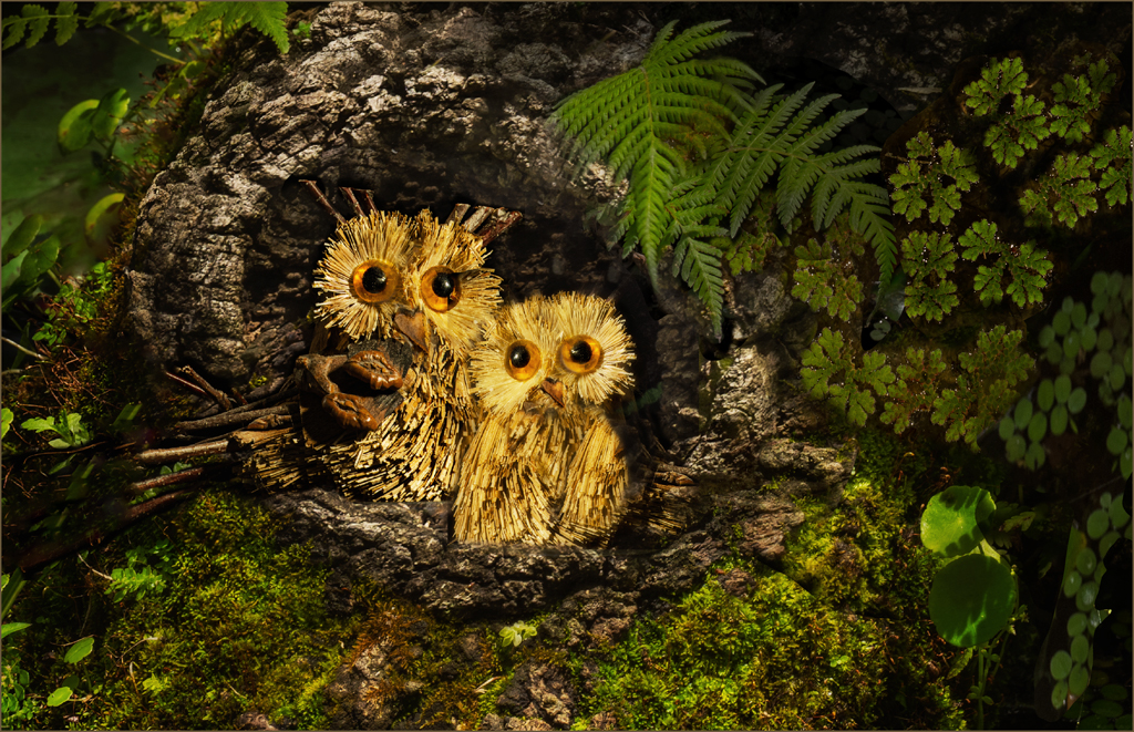
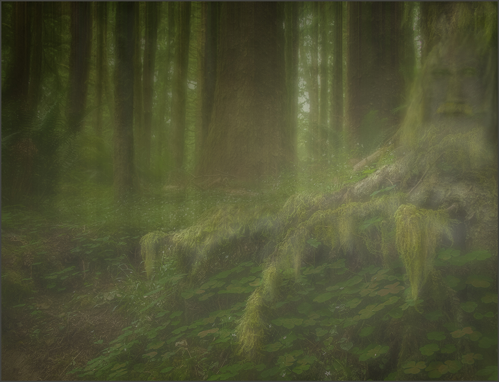
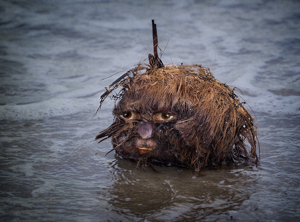
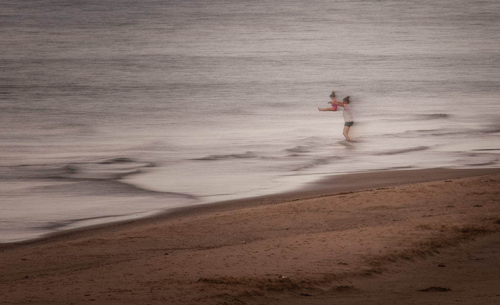
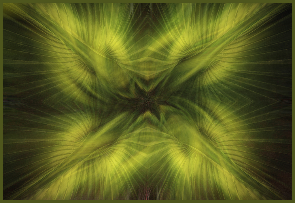
My face in the tree was always meant to be subtle, something that needed to be found after looking at the image a while. And I still think I like original 2 better. |
Jun 14th |
| 34 |
Jun 20 |
Comment |
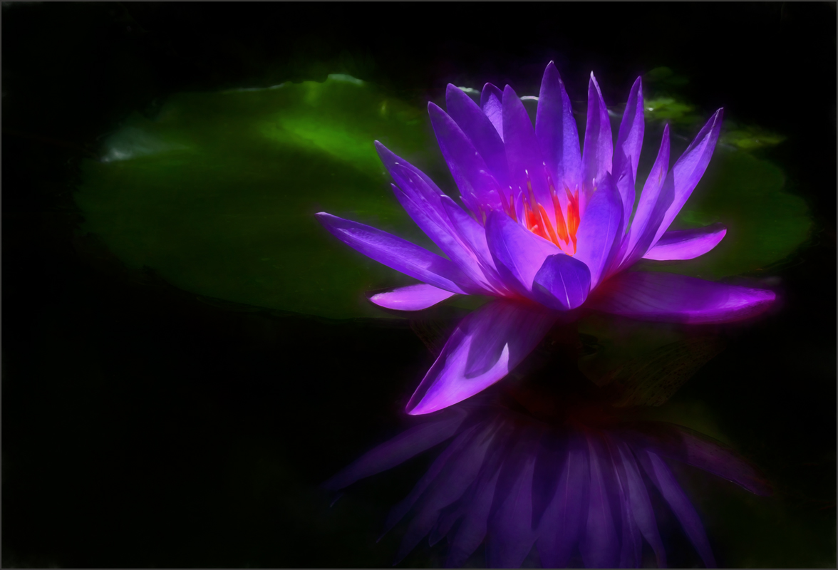
Love this Jan, the final part of the leading line (the brightest part of the image with the tree branches) the blue sky surrounding the birdhouse is perfect. I see three birds that set up a triangle with the last on one a branch at the birdhouse. It just flows so perfectly. Your background was a good choice for a starting point. |
Jun 14th |
| 34 |
Jun 20 |
Comment |
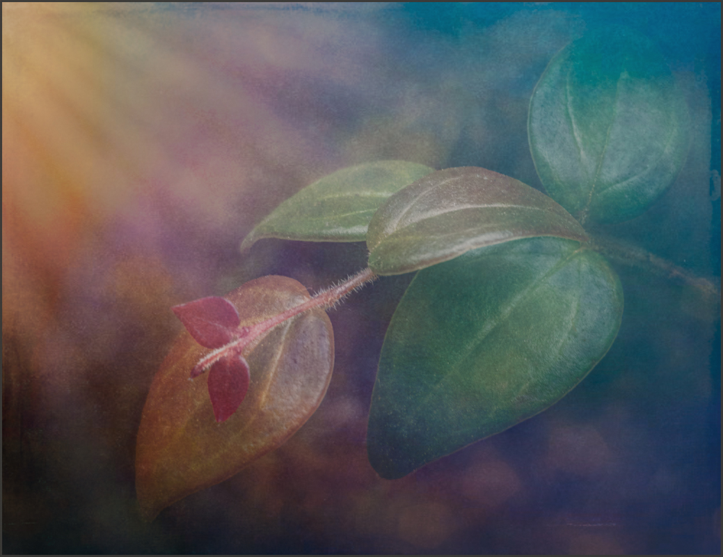
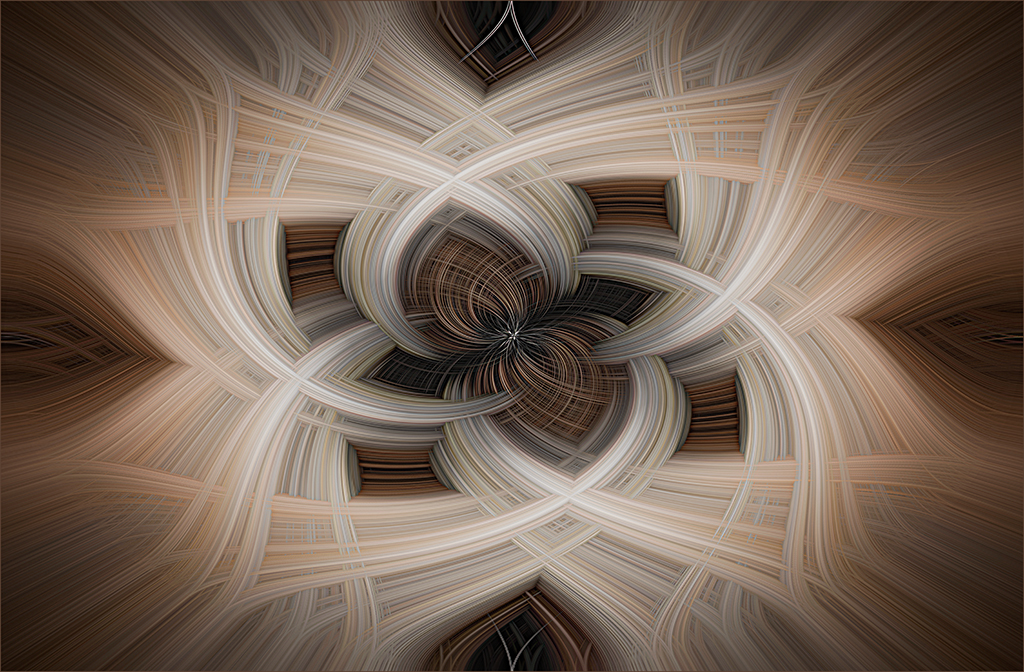
Helen, it reminds me of a daisy. Nice lines and adding the center landscape gives an image with a hopeful feeling for the future. I would also like to see sky above the tree. |
Jun 14th |
| 34 |
Jun 20 |
Comment |
Georgianne, your treatment created the vintage effect you were attempting. It is quite an improvement over the original. |
Jun 14th |
| 34 |
Jun 20 |
Comment |
Alan, you always pick the best color palette for your images. This is no exception, the monochrome toning is perfect. Removing the color makes us look at the lines of the image. Thanks for the description in the info tab, I'm sure we will all profit from it. You have told your story well. |
Jun 14th |
| 34 |
Jun 20 |
Comment |
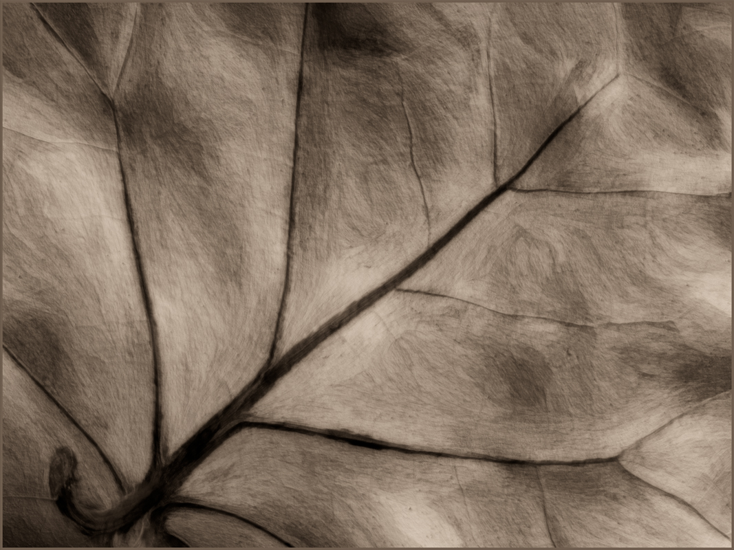
Good job, Steve, the pencil sketch effect lends an interesting texture to the image. The flowers in the foreground set up the image and the winding path leads to the flowers. I agree that it might be helpful to have the 3 flower groupings less symmetrical. The two large garlic leaves at the front seem to hold the image together like a pair of outreaching hands. |
Jun 14th |
| 34 |
Jun 20 |
Reply |
Thanks, Alan. The original tree has somewhat of a face which gave me the idea to create a more obvious face. |
Jun 9th |
| 34 |
Jun 20 |
Reply |
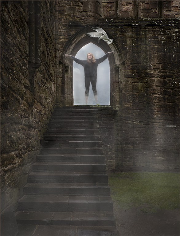
Steve, I started out with the idea that I was going to create the fog and blur the trees, then bring back some of the tree detail by layering the fog and blur layer and reducing the opacity. After that was done I could see the making of the face in the original tree. I had the stone statue that provided the facial features and decided to try to create a real face. It took a lot of work to make it look realistic. After the features were in place I added more hair, a beard, eyebrows and a moustache. The tree was lightened to make it more visible. So it sort of evolved. I never meant for it to be contrasty and stand out but rather fade into the foggy atmosphere. Thanks |
Jun 9th |
5 comments - 3 replies for Group 34
|
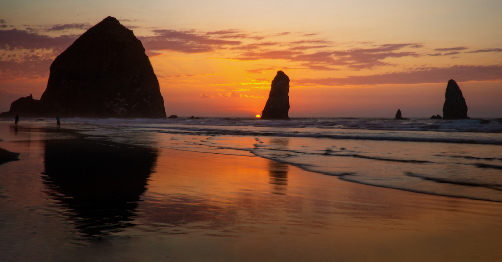
| 69 |
Jun 20 |
Comment |
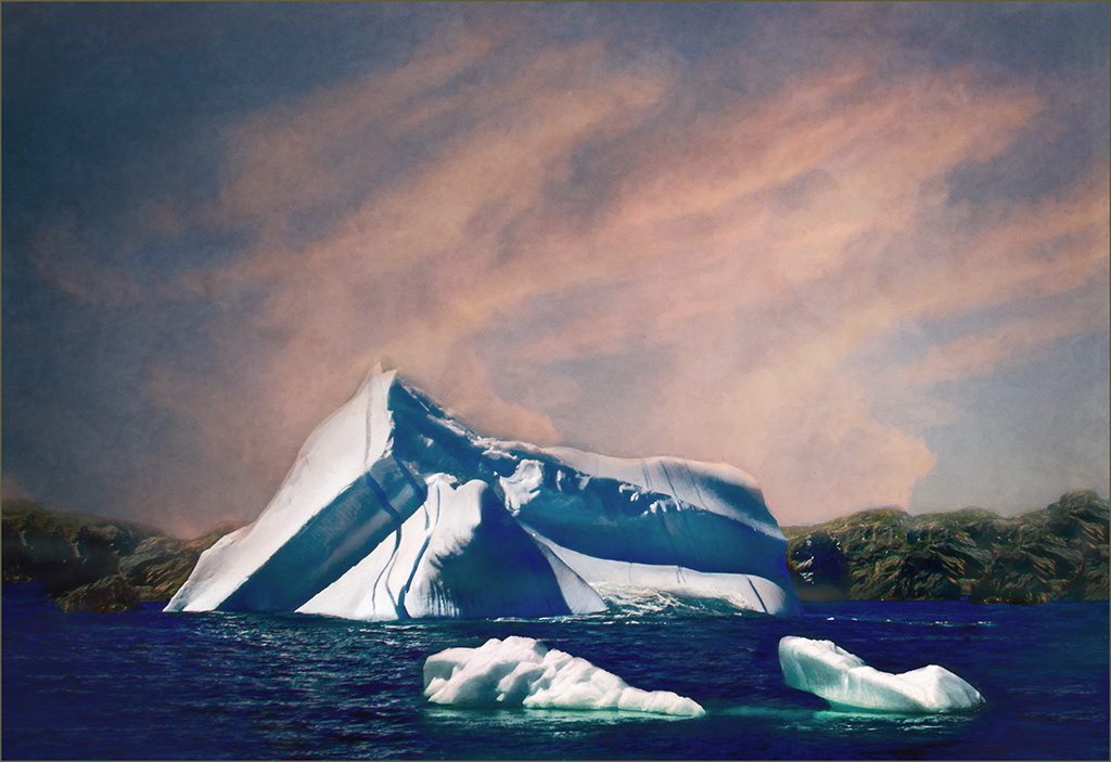
Pierre, I flipped the image to give the rocks a higher-left side-to lower-right side orientation. That said, the flip eliminated the leading line created by the wave motion. So I am not sure which is better. However, I have no problem flipping a landscape as long as it looks natural. |
Jun 30th |
| 69 |
Jun 20 |
Comment |
This is beautiful, Geoffrey. Looks like the long exposure is a good choice to capture several strikes. The storm clouds, three strikes, lighting around the strikes and purple toning make the image. Good choice on dialing down the exposure. |
Jun 14th |
| 69 |
Jun 20 |
Comment |
Good capture, Dean. The lightning is well framed by the tree, storm clouds and water. I agree that the horizontal crop is a better choice since the flash is such a long one, and it definitely needs the stroke.
|
Jun 14th |
| 69 |
Jun 20 |
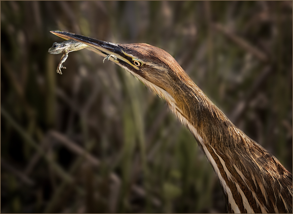
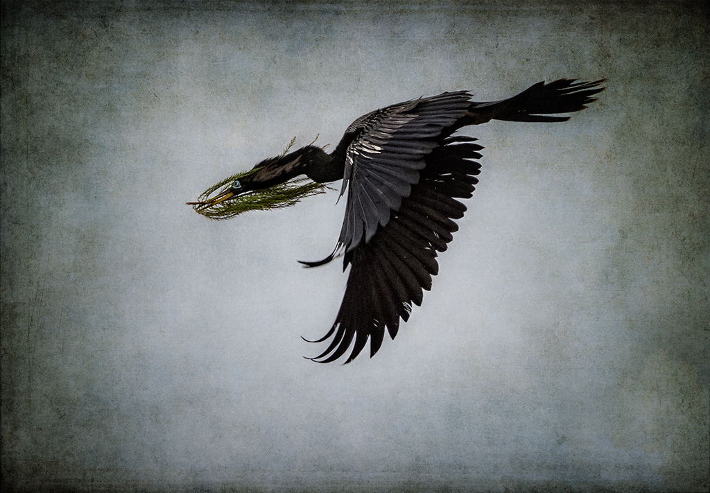
Comment |
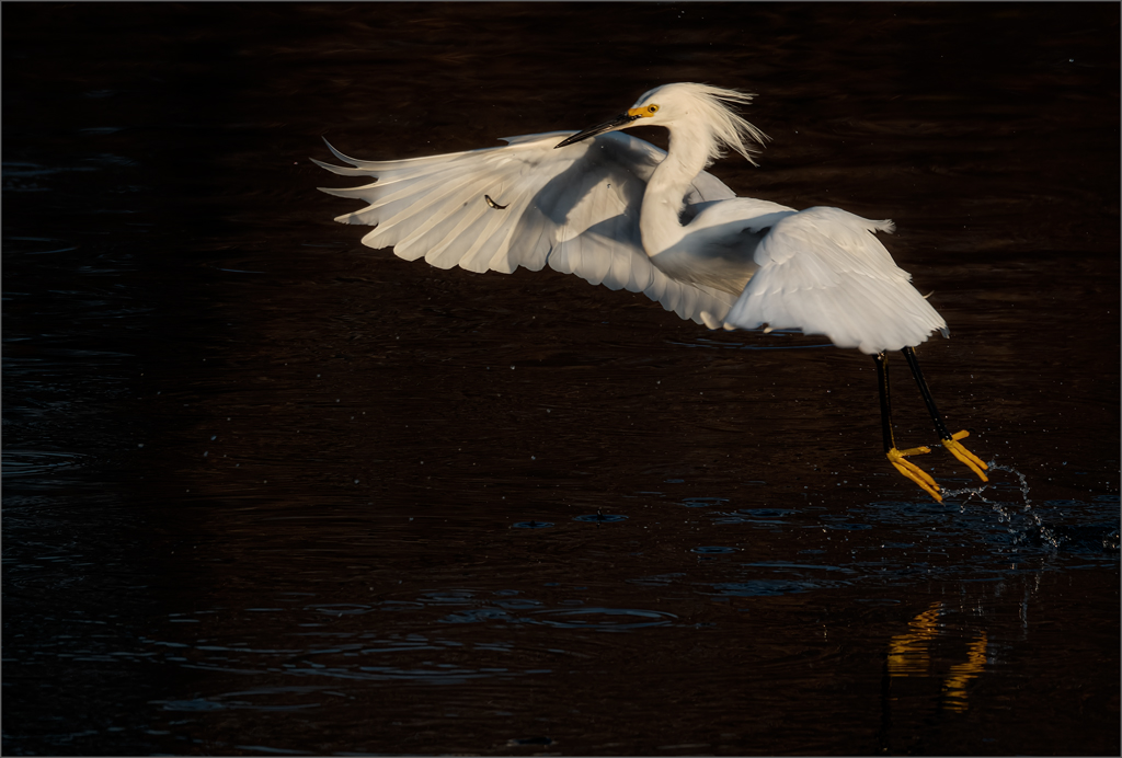
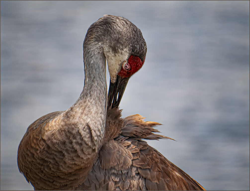
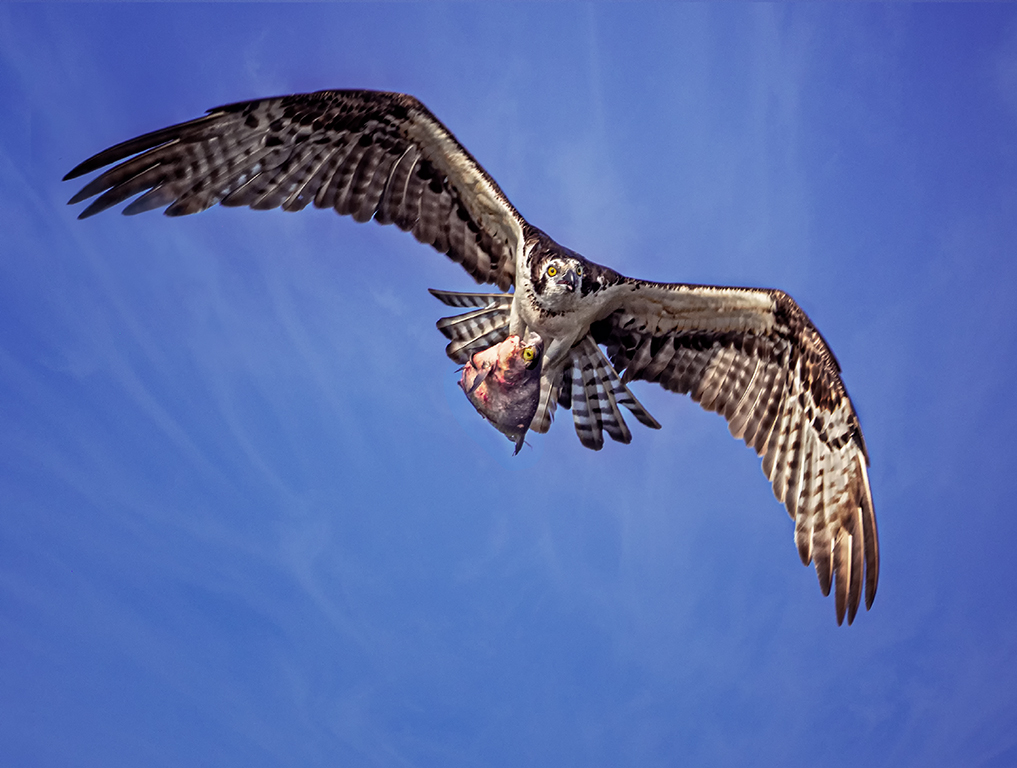
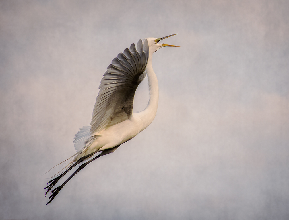
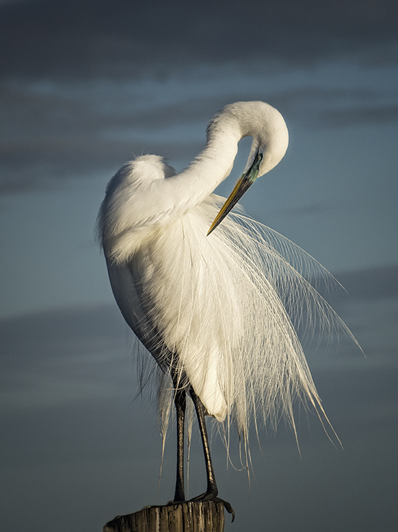
Mervyn, such a wonderful action shot of the Kingfisher. The red beak, blue on the bird and detail in the locust are outstanding. I agree with Brenda that is somewhat dark. The curves layer image is a great improvement. |
Jun 14th |
| 69 |
Jun 20 |
Comment |
Jacob,
Good job removing the green from the background. Using Photoshop in post processing will definitely improve your images. If your version has the camera raw filter, a lot can be accomplished with the use of the sliders. Usually it is better to move in closer to your subject. Then it is not necessary to crop away so many pixels which degrades the image. |
Jun 14th |
 |
| 69 |
Jun 20 |
Comment |
Brenda, you were able to recover an outstanding sky, and the sun/God rays add to the image's beauty. Black and white was a good choice. The halo is distracting to me because I know it shouldn't be there. Usually a halo is created by over processing, probably adding too much clarity. A judge that I admire once said that when taking a silhouette there should be definition in the elements of the image. You have some blocked (large areas of blackness) areas in the top of the palm tree. |
Jun 14th |
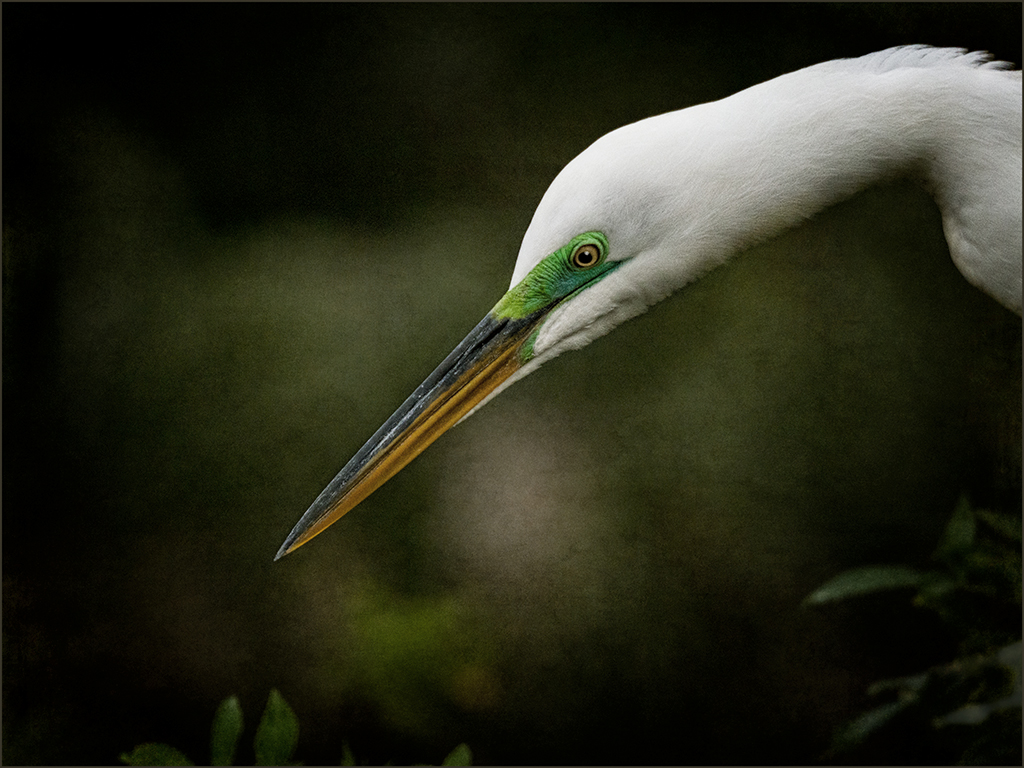
| 69 |
Jun 20 |
Comment |
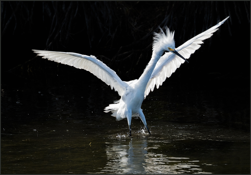
Pierre,
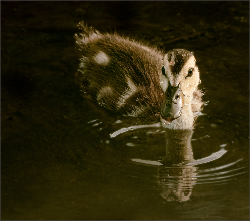
I agree with what already been said. I think you were unable to achieve a smooth, blurred background because the bird is too close to the background. A lot of the detail has been lost in the bird even though it appears sharp. Usually when this happens you are too far away. |
Jun 14th |
| 69 |
Jun 20 |
Reply |
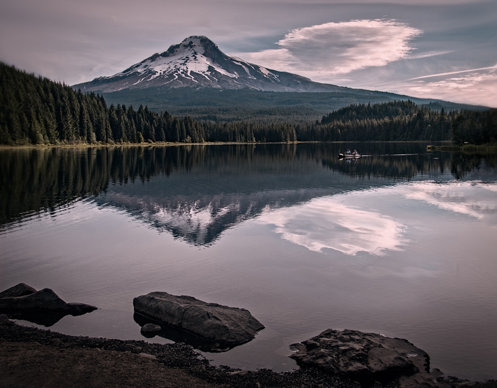
The sky was one from my collection not shot at the same time. |
Jun 7th |
| 69 |
Jun 20 |
Reply |
Mervyn, I went back and revisited this image, before seeing your comments, and decided that the flip was not the best presentation. You are absolutely right that the wave lead in is eliminated. I did not use Luminar for the sky. It is my sky that I added not using a filter. |
Jun 7th |
7 comments - 2 replies for Group 69
|
12 comments - 5 replies Total
|