|
| Group |
Round |
C/R |
Comment |
Date |
Image |
| 34 |
Aug 18 |
Reply |
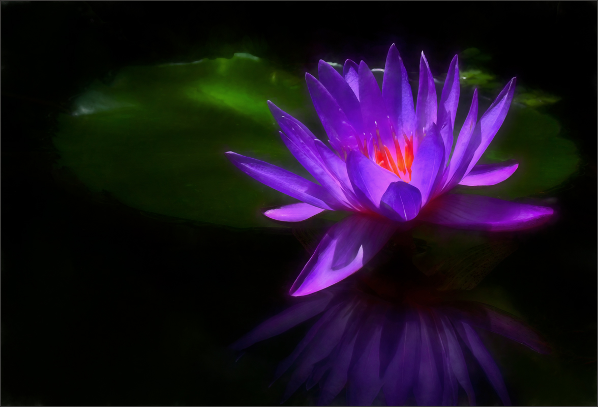
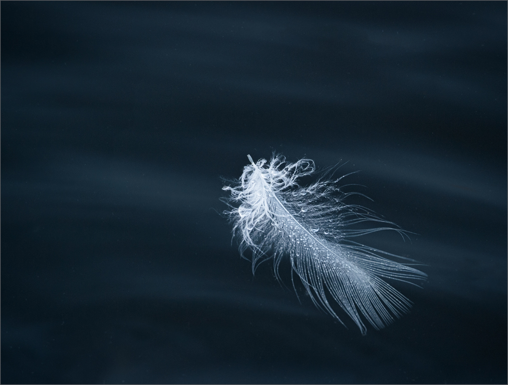
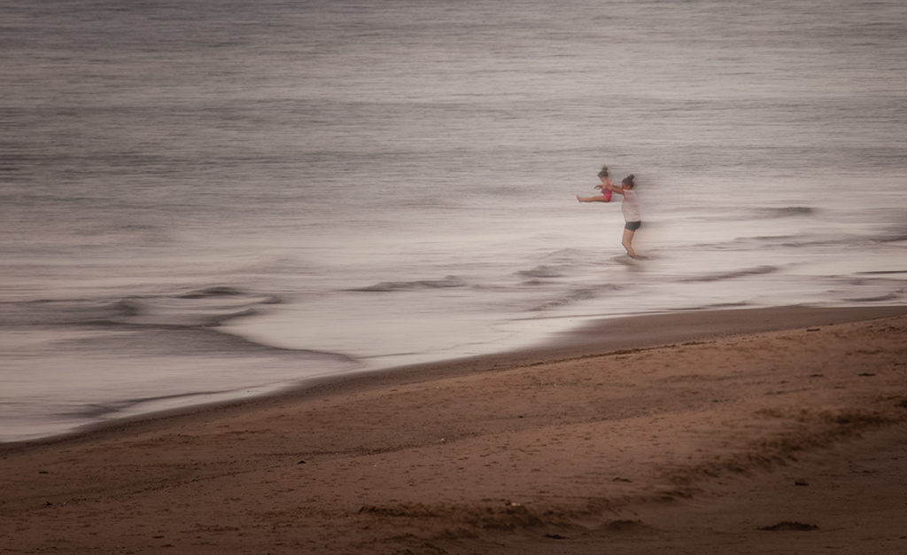
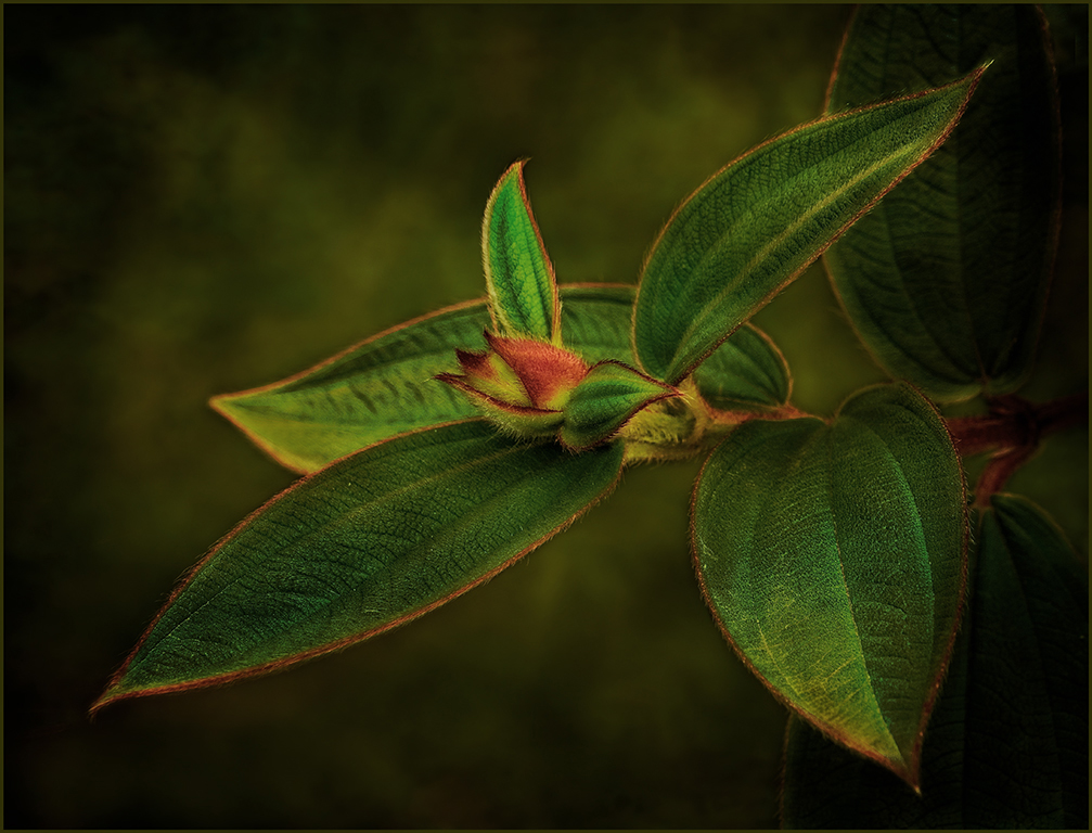
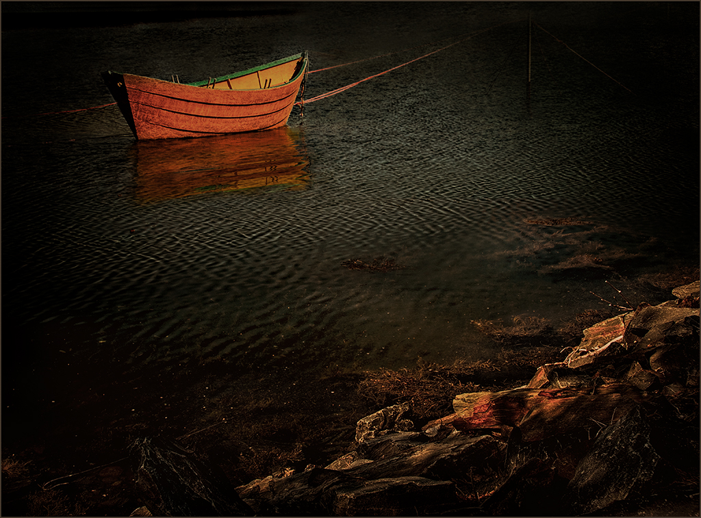
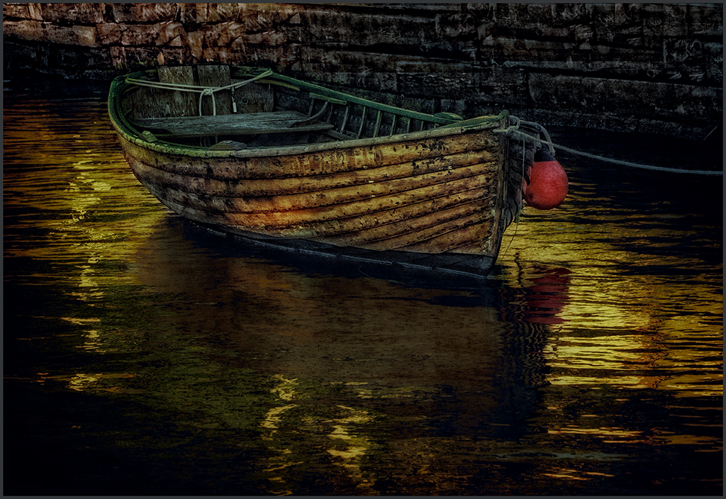
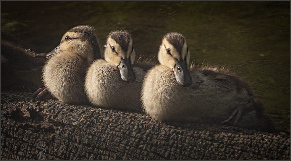
In my original image the bottom is lighter. For some reason when i convert from a 16 bit TIFF file to an 8 bit JPEG the entire image becomes darker. I am going to try lightening even more than I have been to see if that improves the brightness. Thanks, Barbara. |
Aug 14th |
| 34 |
Aug 18 |
Comment |
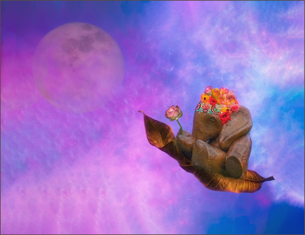
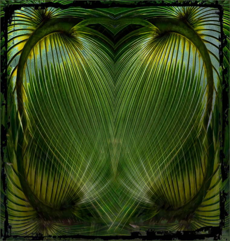
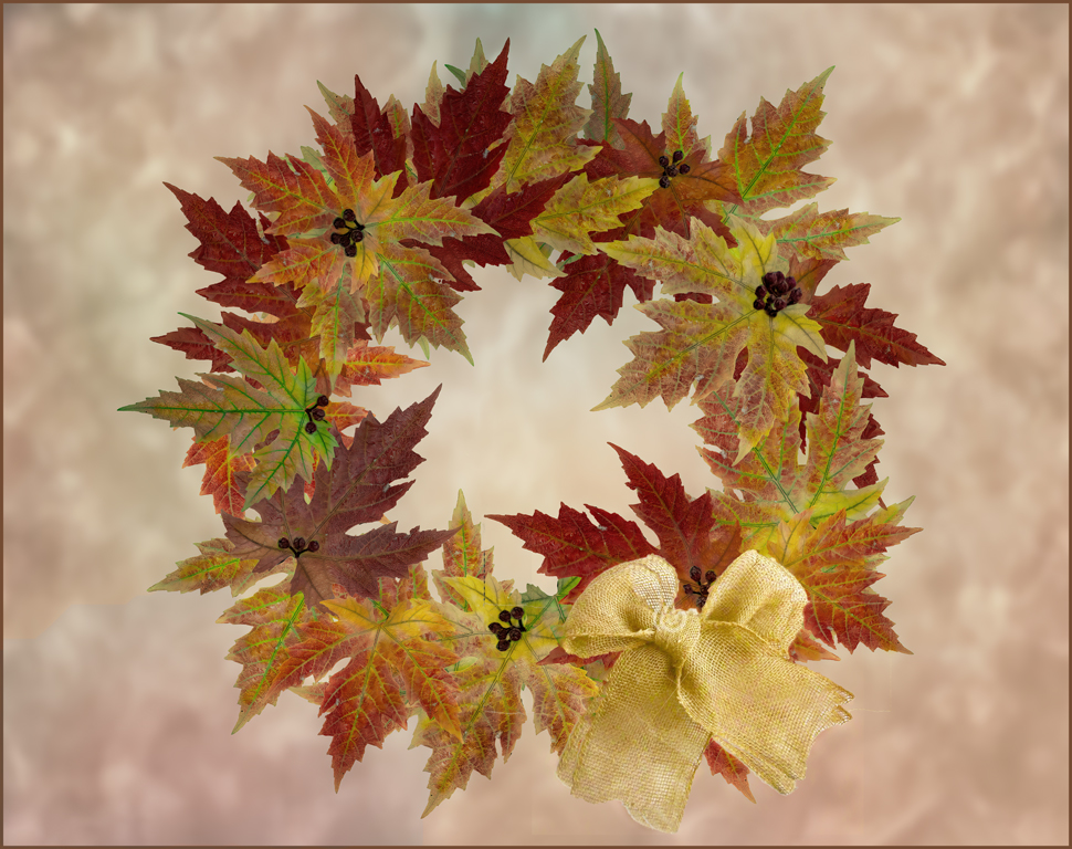
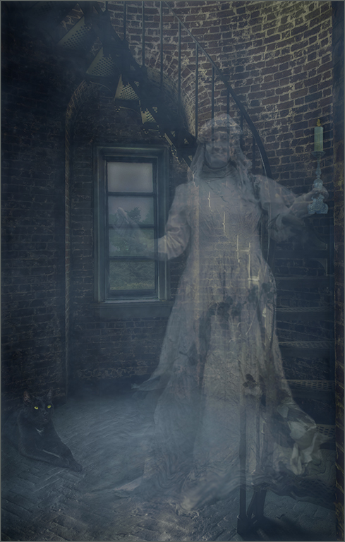
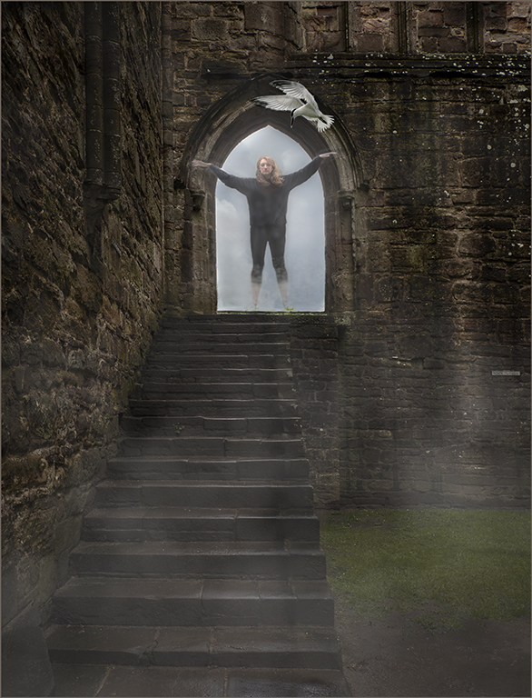
Cute idea and lots of fun. I know you enjoyed putting it together. |
Aug 14th |
| 34 |
Aug 18 |
Comment |
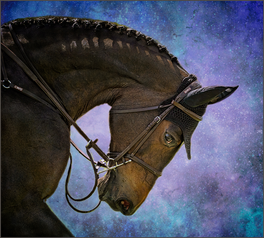
Christine, you did a beautiful job of moving the horse to a new background. I love your crop making it about the eye area of the horse rather than the whole head. Jan's treatment of the eye really bring a spark to the eye to make it the center of attention. A wonderful image. |
Aug 14th |
| 34 |
Aug 18 |
Comment |
Georgianne, you have really put a lot of work into this image. Your treatment of the eyes makes the image. I agree with Jan that the highlights in the hair are lacking in detail with the high key treatment. Masking the hair and brushing the highlights back in might improve the image. You did a wonderful job of molding the tattoos to her face. I might have moved the tattoo around a little so that it did not cover areas that would not normally have a tattoo-like the eyebrow and eyelid area. Great work. |
Aug 14th |
| 34 |
Aug 18 |
Comment |
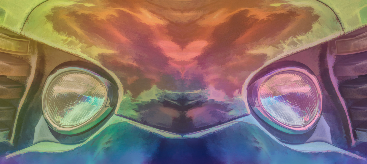
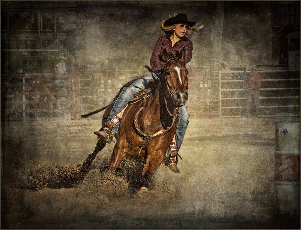
Excellent job this month, Phil. You certainly have conveyed the speed of his hands with this image. The negative preset was the perfect choice to bring out the movement. In my opinion your title is perfect. |
Aug 14th |
| 34 |
Aug 18 |
Comment |
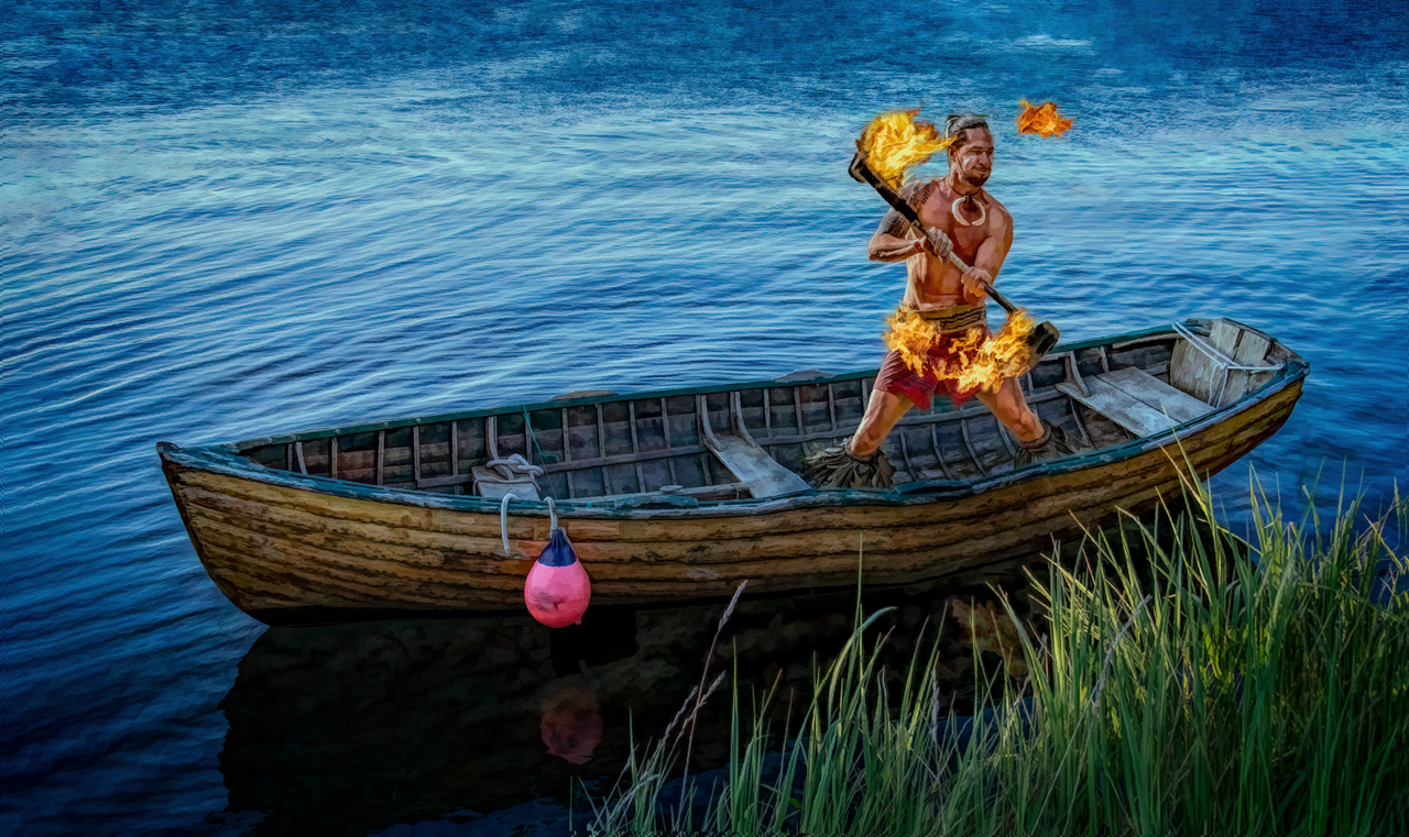
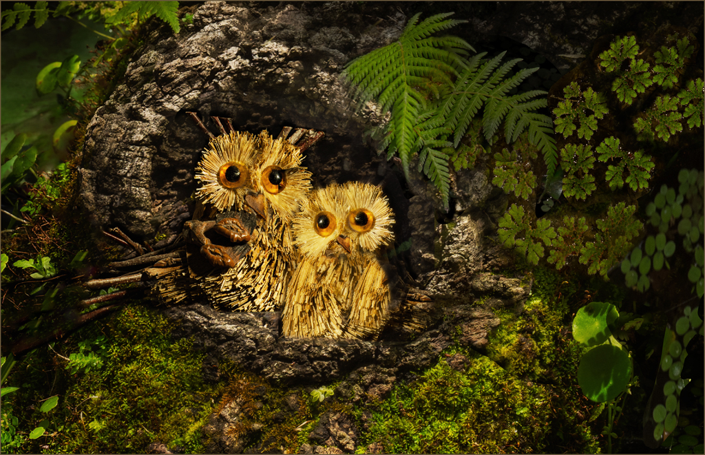
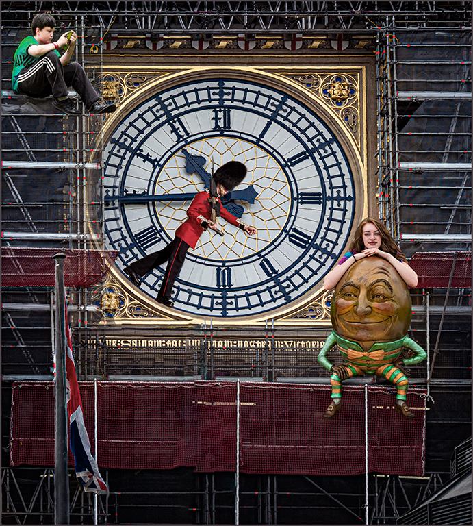
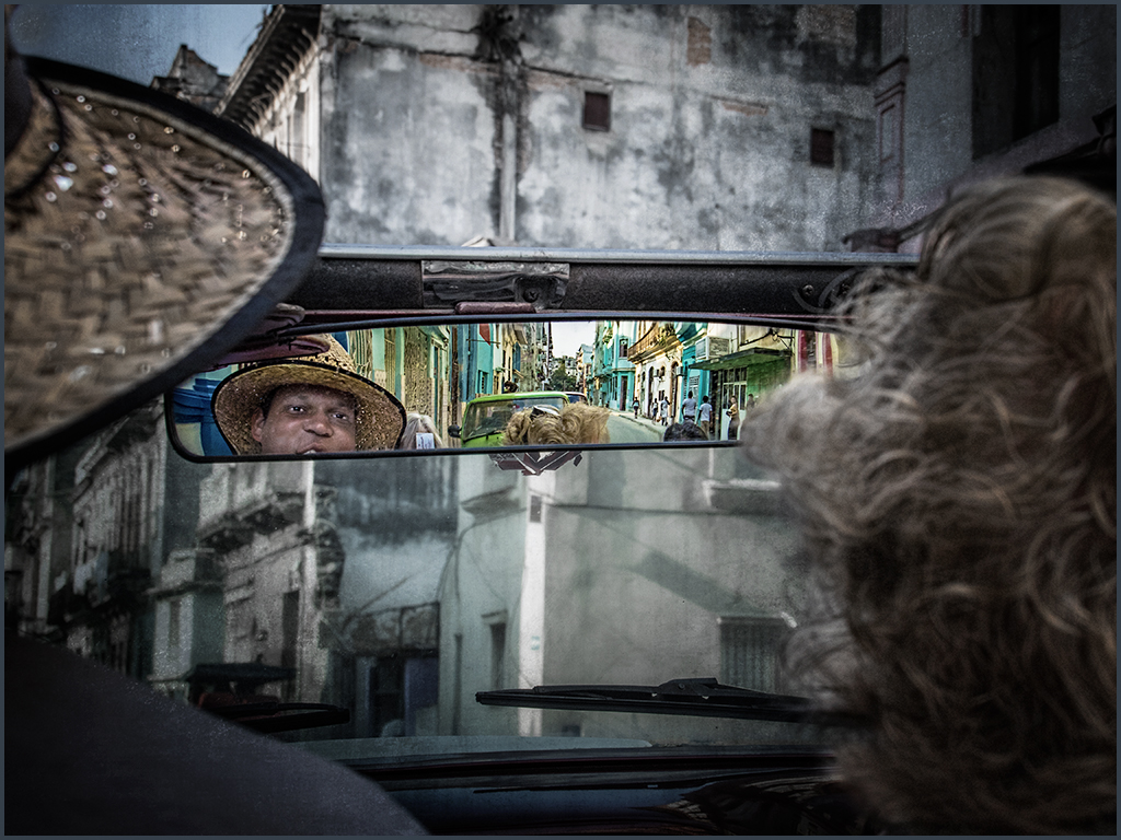
Steve, this time you really created a composition that flows perfectly and is completed with simple lines where nothing is competing with the rest of the image. You put a nice triangle together that works well. The reflections are perfect as well as the background. Your characters seem to have the perfect pose/stance to fit together as if they were really always that way. Wonderful, job. |
Aug 14th |
5 comments - 1 reply for Group 34
|
| 69 |
Aug 18 |
Reply |
|
Aug 22nd |
| 69 |
Aug 18 |
Reply |
|
Aug 22nd |
| 69 |
Aug 18 |
Reply |
|
Aug 22nd |
| 69 |
Aug 18 |
Reply |
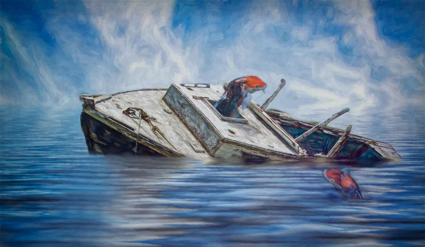
Brenda, personally, I like your 8/5 image better, especially for competition. Less is more. In my opinion, the grass is not needed. The reflection is the foreground that is needed in this case. The white flowers give a nice framing to the image and the extra background is not needed. The tiger's eyes are right there staring at you in your 8/5 image-making immediate contact with the viewer. The tiger has plenty of room in front and doesn't need extra room on either side. Beautiful. |
Aug 19th |
| 69 |
Aug 18 |
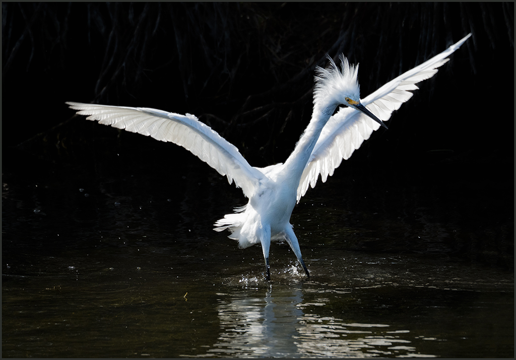
Comment |
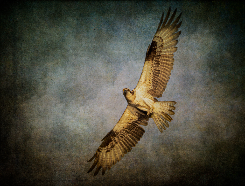
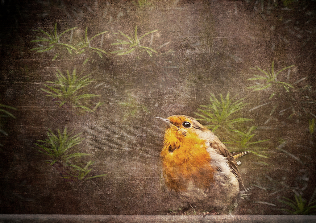
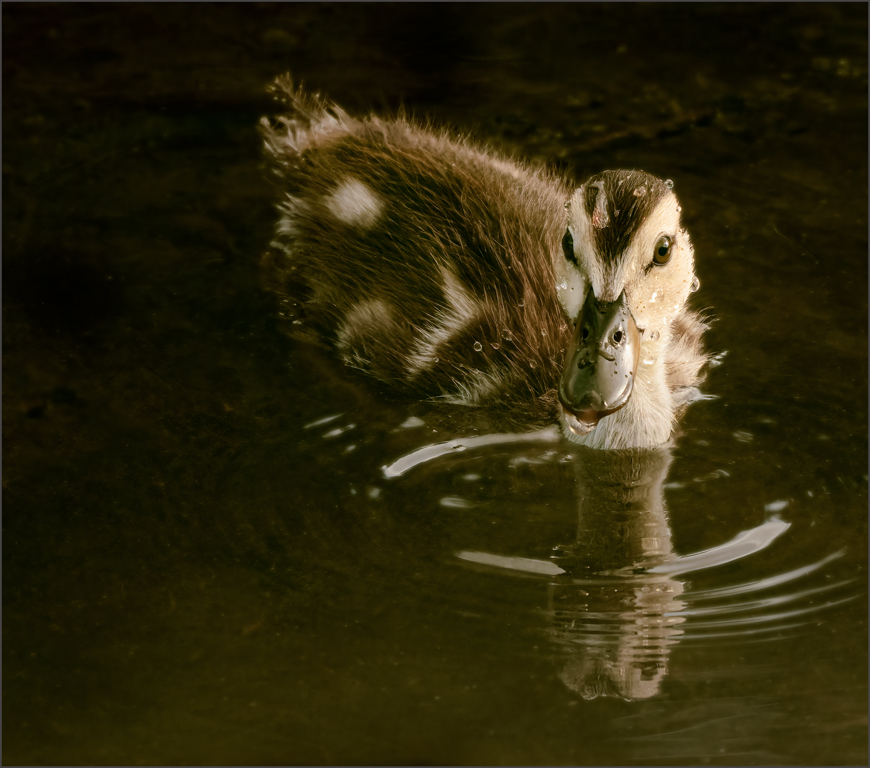
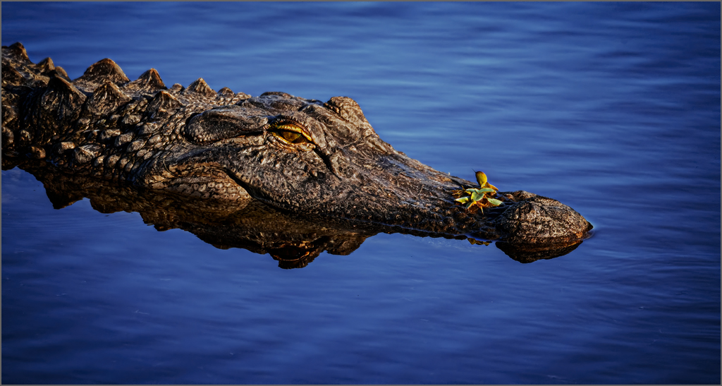
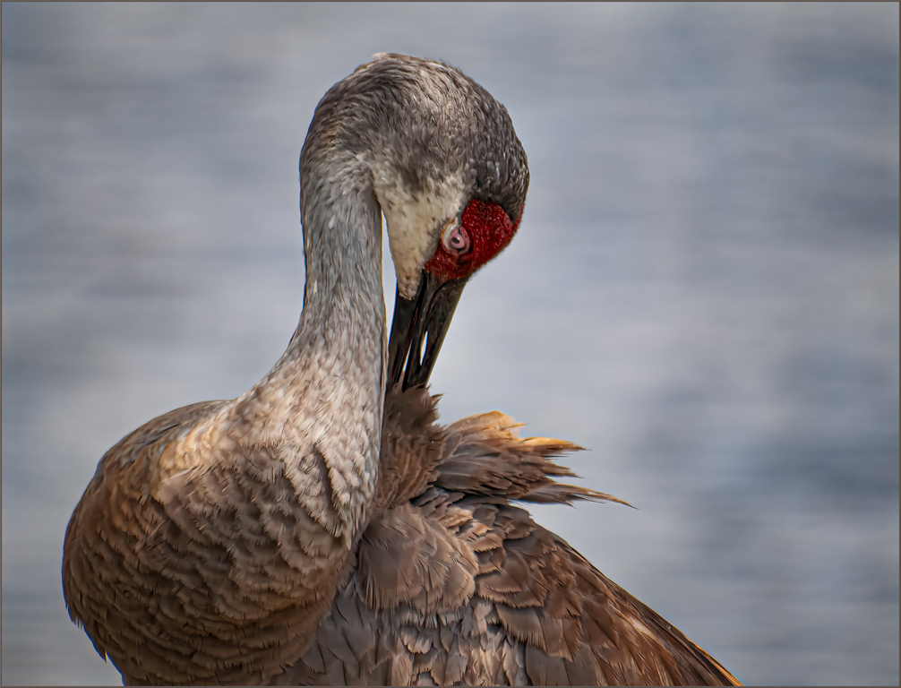
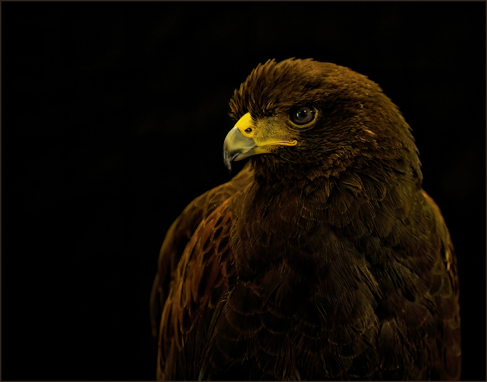
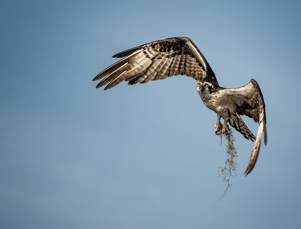
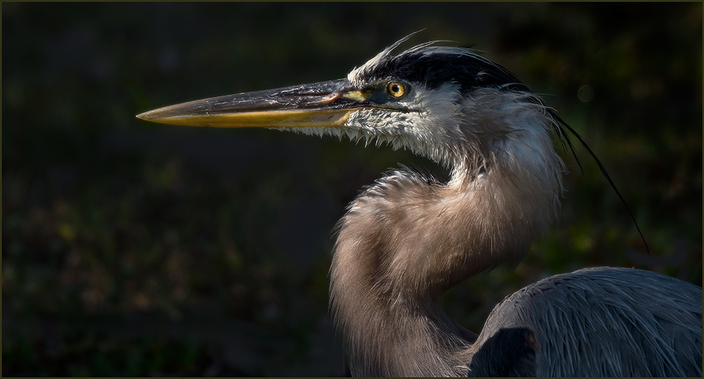
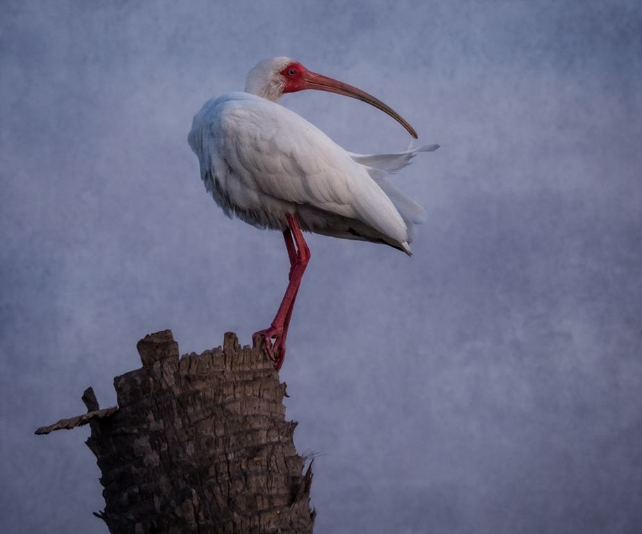
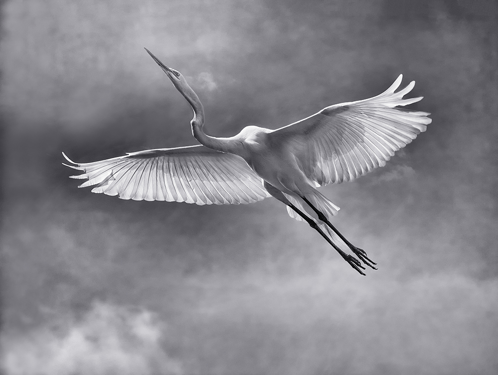
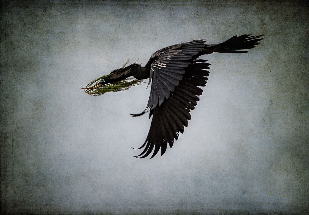
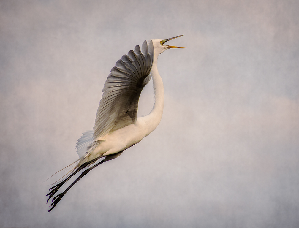
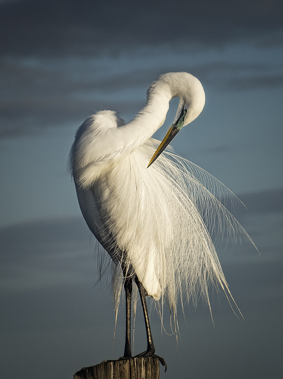
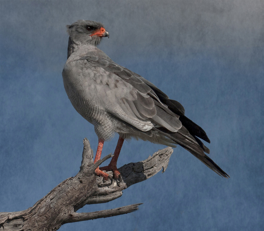
Rob, you captured beautiful colors and a nice pose on this bird. The eye and beak seem to draw the eye into the bird. The whites could probably be recovered in the raw processor or camera raw filter. Good job. |
Aug 14th |
| 69 |
Aug 18 |
Comment |
Brenda, your cropped version is definitely a beautiful piece of work. The eyes are looking right at the viewer and draw you into the image. Beautiful reflection and the white flowers frame the tiger perfectly. I love the way that the tail is curved so perfectly. A subtle, slight vignette would certainly add to the image. |
Aug 14th |
| 69 |
Aug 18 |
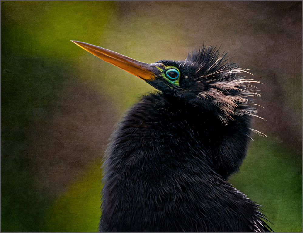
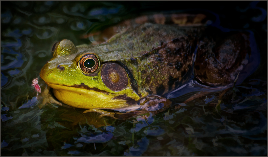
Comment |
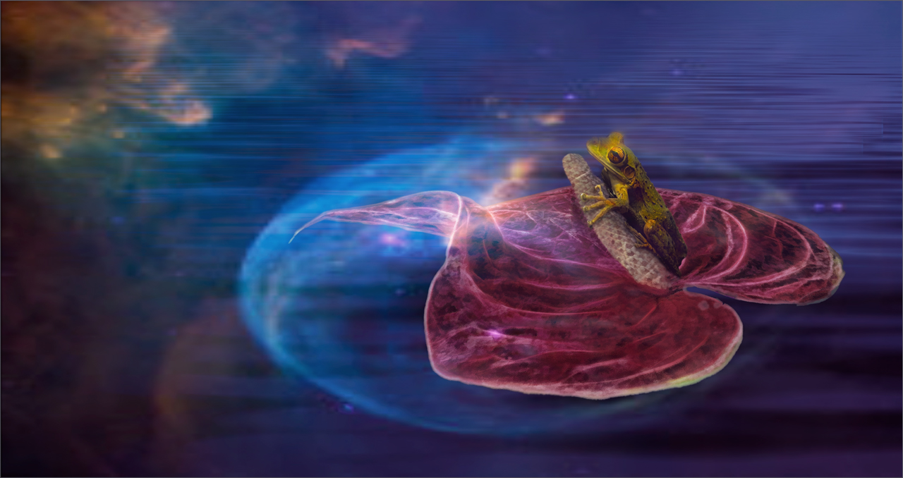
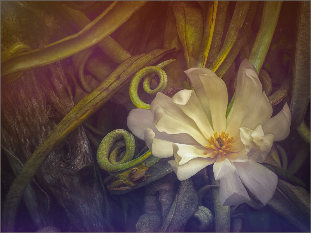
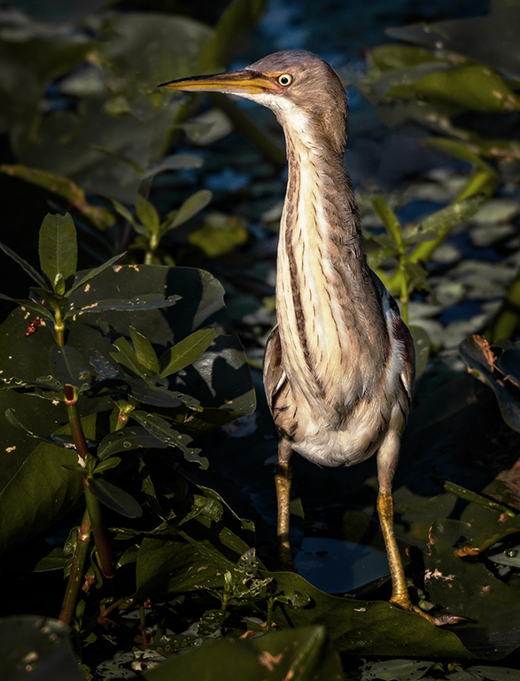
Donna, I love the frog's eye and texture as well as the softly blurred green background. Mervyn's crop seems to really enhance your image by removing a few distractions. The frog is just the right sharpness and becomes the star of your image. Beautiful work. |
Aug 14th |
| 69 |
Aug 18 |
Comment |
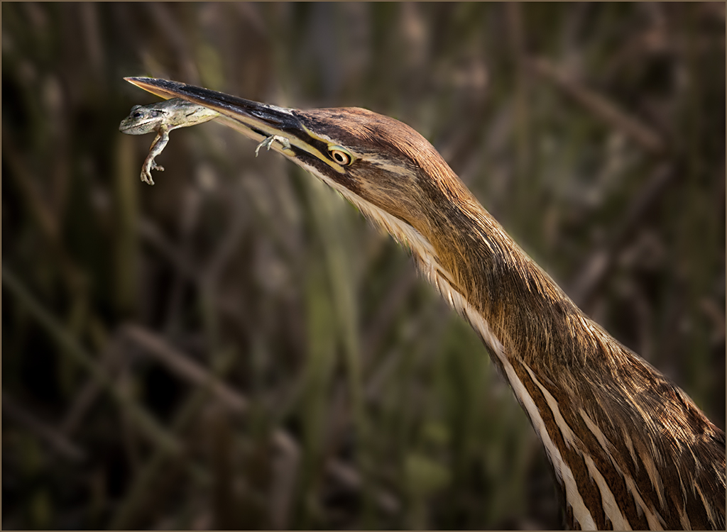
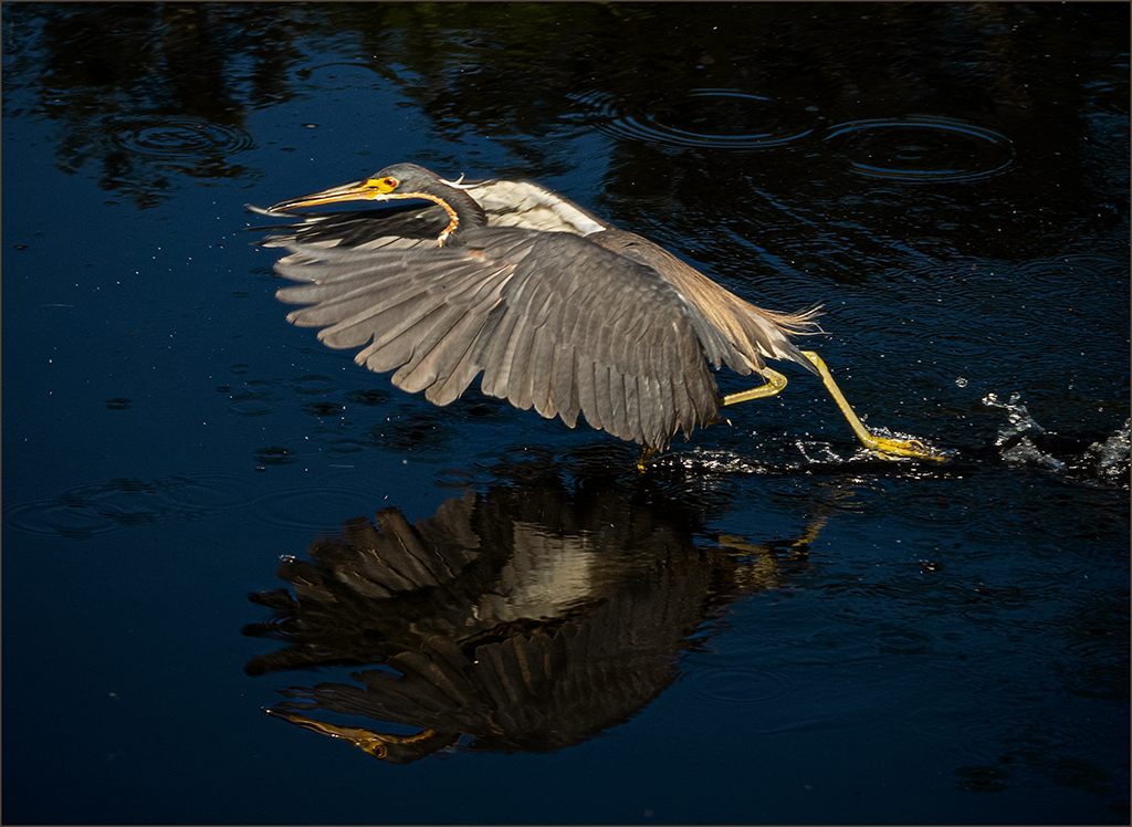
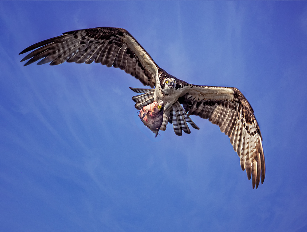
Good composition, Pierre. I agree with the others that the background is somewhat too bright. 1/800 was probably not a fast enough shutter to freeze the action with the bird. I darkened the background and reprocessed in the camera raw filter as well as brightening the eye. |
Aug 14th |
 |
| 69 |
Aug 18 |
Comment |
I think everything has already been said. There is really nothing interesting about the rear end of a bird.Keep trying, bird photography takes lots of patience and practice. |
Aug 14th |
| 69 |
Aug 18 |
Comment |
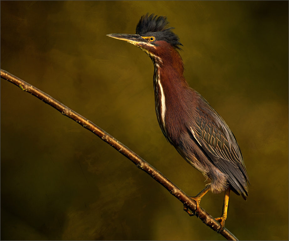
Good job removing the branch, Mervyn. I agree with the others that the head is soft. In my opinion, the crop after removing the branch is somewhat too tight. I feel that it needs more room on the left. The bland banded sky does not add to the image. I have sharpened the bird, changed the crop and added a texture to the sky. see what you think. |
Aug 14th |
 |
| 69 |
Aug 18 |
Reply |
Pierre, please see new image below from 8-6-2018, thanks. |
Aug 6th |
| 69 |
Aug 18 |
Reply |
Dean, please see image below from 8-6-2018, thanks. |
Aug 6th |
| 69 |
Aug 18 |
Reply |
Brenda, please see image from 8-6-2018. do you like this one better than 1st or 2nd? |
Aug 6th |
| 69 |
Aug 18 |
Reply |
Thanks, Mervyn please see image below 8-6-2018. this is the clossest I can get to my original PS file. |
Aug 6th |
| 69 |
Aug 18 |
Reply |
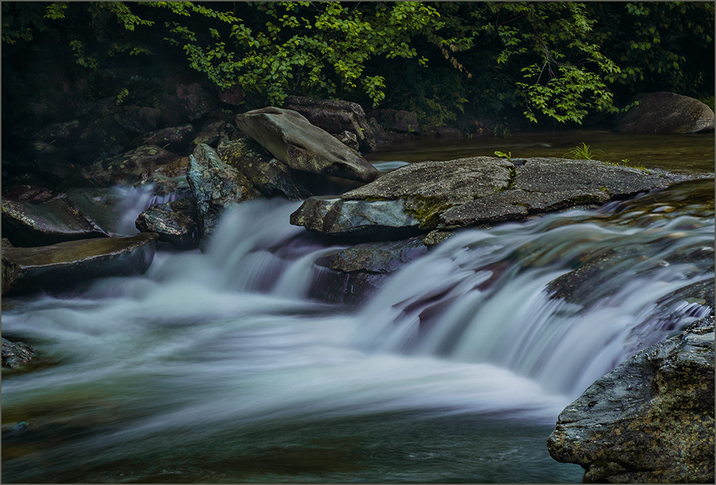
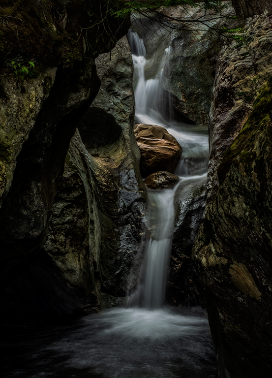
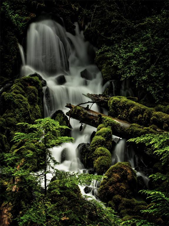
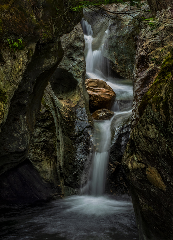
Please see new file below. Isaac, thank you. My vision for this image is not exactly what your editing brought to it. I wanted the falls and red rocks to be the main players and everything else less important. That is why I had the rocks on either side of the falls at a lower value than the falls and two rocks. |
Aug 6th |
| 69 |
Aug 18 |
Comment |
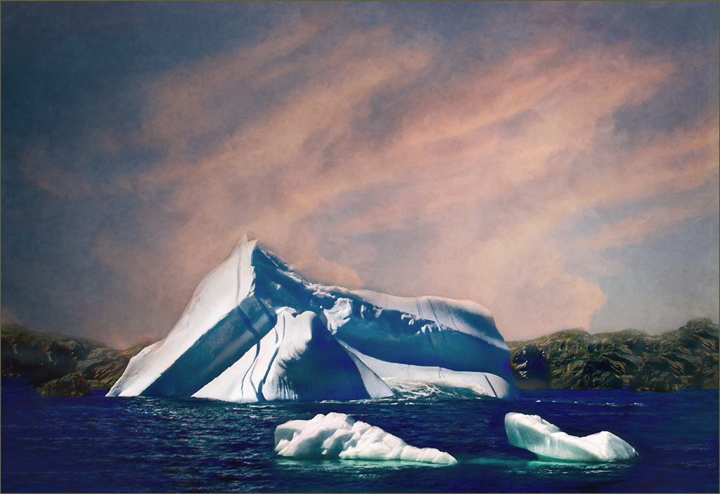
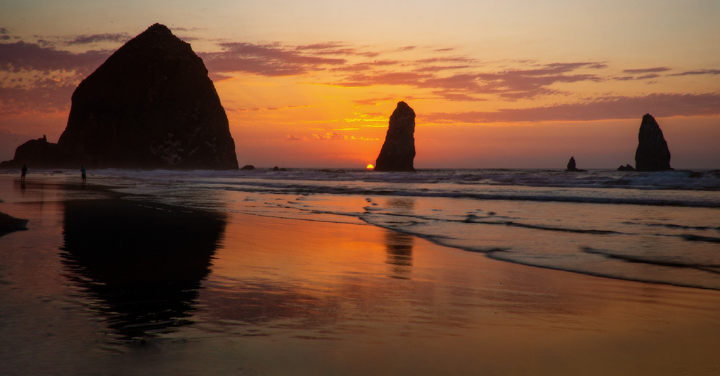
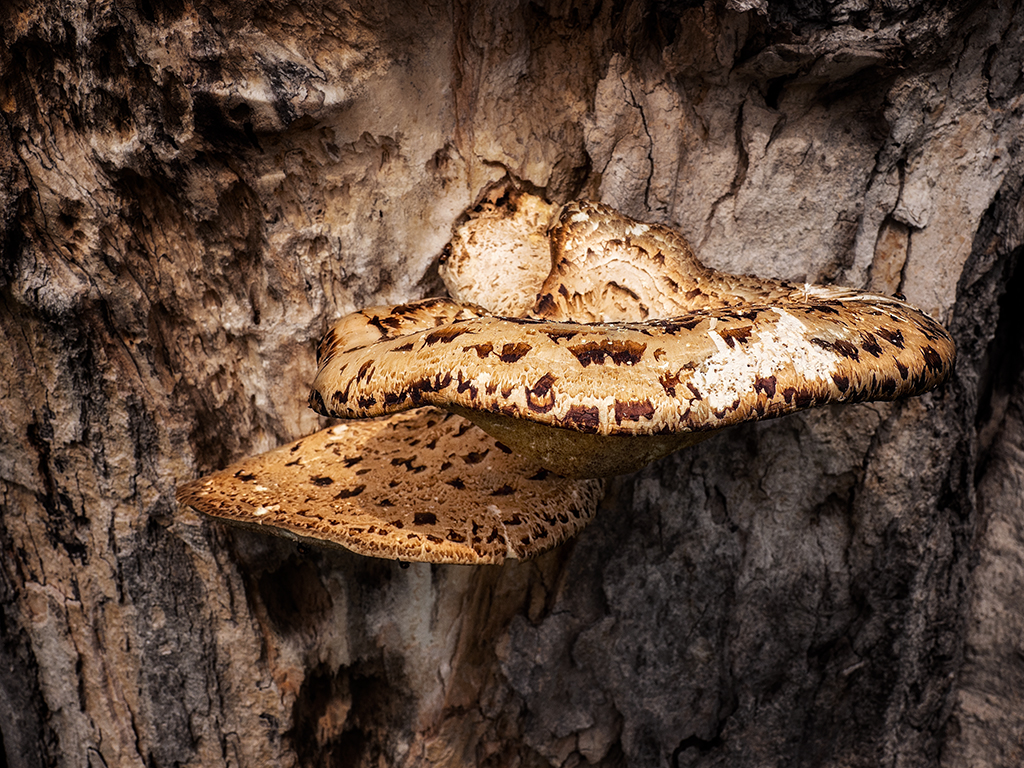
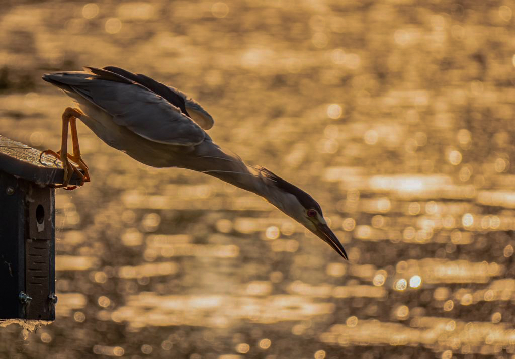
I have opened the darkest shadows on the left. The falls and red rocks remain as the focal point, but there is some detail in the black rock chute. None of these images matches my original TIFF file from PS in Adobe color space. That file has detail in every area. When the file is reduced to 8 bit and srgb color space as a JPEG everything changes. This file is the closest that I can reach. |
Aug 6th |
 |
| 69 |
Aug 18 |
Reply |
Brenda, the sponge tool is nested at the bottom with the burn and dodge tools. With it you are able to saturate or desaturate. Just be sure to use at a low opacity.
On my monitor the image seems bright enough but is dark on my tablet. I did lighten it from the original as my images seem to be darker for digital dialog presentation. Here is a lighter version. what do you think? |
Aug 5th |
 |
7 comments - 10 replies for Group 69
|
12 comments - 11 replies Total
|