|
| Group |
Round |
C/R |
Comment |
Date |
Image |
| 34 |
Jun 18 |
Comment |
Jan, everything seems to work well together in this image. Good composition, and nice placement of the layers. The navy swirl texture seems to add just what is needed. |
Jun 10th |
| 34 |
Jun 18 |
Comment |
Helen, you created a completely new image with the use of polar coordinates. Both your image and Georgianne's are pleasing-yours bold and the other more muted. You kept trying and were able to arrive at your goal, good work. |
Jun 10th |
| 34 |
Jun 18 |
Comment |
Excellent composition, Christine. I do agree that the textures seem to overpower the key and using a mask to remove some of the texture might help. Also, maybe burning the key a bit in soft light mode might help to emphasize it. |
Jun 10th |
| 34 |
Jun 18 |
Comment |
You have conveyed your idea well, Georgianne. The flamingo was placed in the polluted water and looks as if it was always there. Flipping the bird helped to correct the lighting.The Topaz filter helps to blend the image together. |
Jun 10th |
| 34 |
Jun 18 |
Comment |
Phil, the blue is much more pleasing than the grey. Yes, you did do an excellent job of straightening the doors. That is always an accomplishment in itself. Your editing brought out the textures and lighting in the rooms, good job. There does seem to be some ghosting around the object at the back in the last room. You might try using less clarity in LR and reprocessing for clarity in PS with the camera raw filter. This would allow you to remove the excess ghosting with a mask. Overall, well processed and edited. |
Jun 10th |
| 34 |
Jun 18 |
Reply |
Jan, a judge once said to to flip an image if there is a part that is distracting and have that part on the lower left hand side. There was no part of this image I wanted to hide, so it was flipped. |
Jun 9th |
| 34 |
Jun 18 |
Reply |
Georgianne, I use content aware in the regular PS dialog after completing the raw edits. I love the two images you created with different color palettes and also think the three images would create a nice tripych. |
Jun 9th |
| 34 |
Jun 18 |
Comment |
Beautiful work, Steve. You made your lady into quite a beauty. the eyes bring you right into the image. The texture you added is the final piece that brought the whole image together, well done. |
Jun 9th |
6 comments - 2 replies for Group 34
|
| 69 |
Jun 18 |
Reply |
Yes, this is perfect. Even the eye has more detail. Beautiful work. |
Jun 13th |
| 69 |
Jun 18 |
Comment |
Rob, the log gives a nice leading line to the bird. I might have left the part of the log that was cropped from the bottom. That would move the bird up in the frame. The image would probably benefit by cropping the two trees on the left. And burning of the bright areas would definitely help the image. A vignette would also help to bring attention to the bird. |
Jun 12th |
| 69 |
Jun 18 |
Comment |
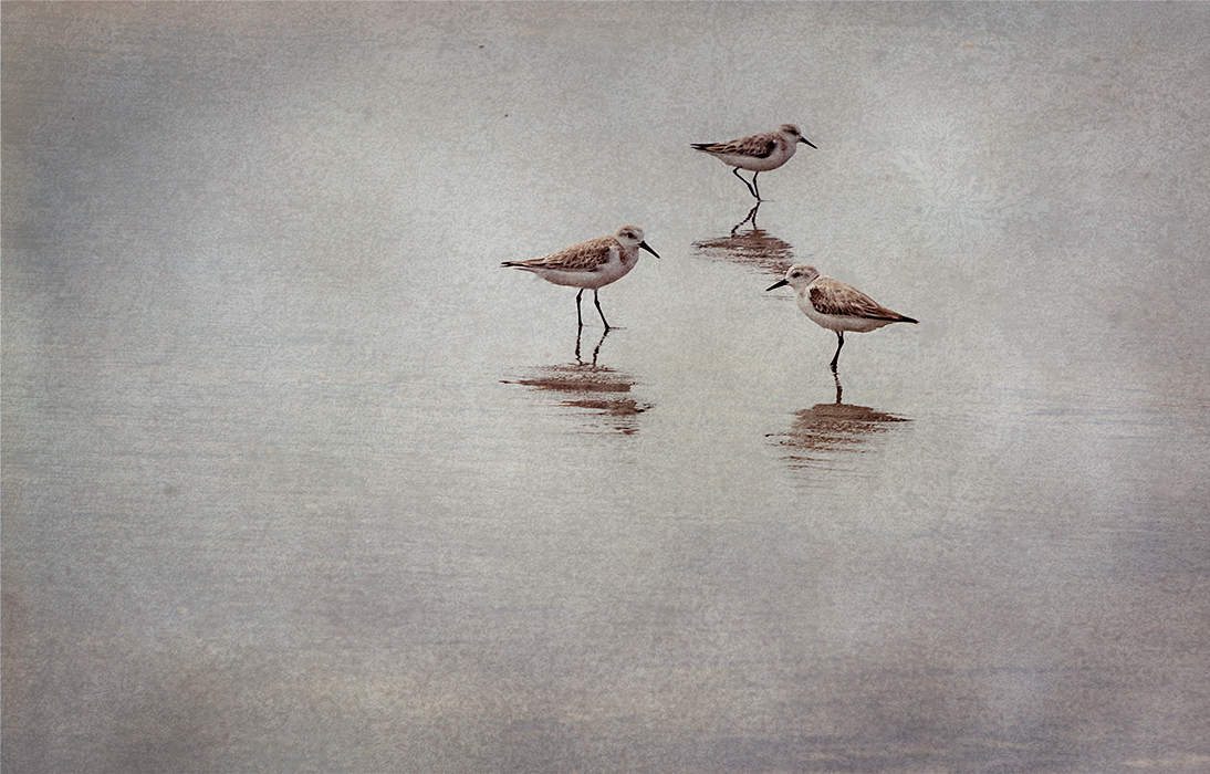
Brenda, I love your image. The reflections of the birds add so much interest to the image. This spring I took a workshop with Lisa Langness. She is presenting at PSA in Salt Lake and creates images to use in home and office decor. This is the kind of image that someone would love to hang on their wall, large format. There is nothing wrong with empty space in the right setting. A vignette might bring improvement as well as a bit of sharpening, just to the birds. I also added a slight warming filter. I would remove the 2 dark specks at the top. Beautiful work. |
Jun 12th |
 |
| 69 |
Jun 18 |
Comment |
Donna, beautiful detail in the feathers and the bird stands out nicely against the background. It is perfectly framed between the grass blades. I find the out of focus area in the front a bit too much. Perhaps if there was less of it, and the starting point was lower in the frame further away from the feet, it would be less bothersome. |
Jun 12th |
| 69 |
Jun 18 |
Comment |
Pierre, the swans stand out nicely against the blue water. Your second version with some sharpening is an improvement over your first version. Burning the rocks in the background might be an improvement. |
Jun 12th |
| 69 |
Jun 18 |
Comment |
Dean, you have presented a beautiful black and white image. The sky is stunning, and the reflections of the sky and trees complete the image. I too feel that the trees on the left could be cropped as they are not really adding anything. the horizon line does not bother me. |
Jun 12th |
| 69 |
Jun 18 |
Comment |
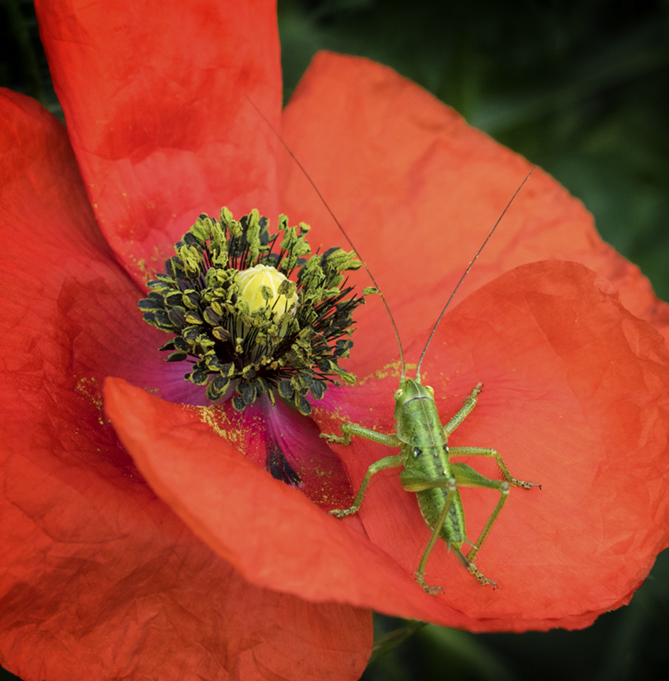
Mervyn, wonderful color palette and the grasshopper's color is the same as the flower center which brings the whole image together. I'm wondering if a tighter crop and vignette might be helpful. I've also added a bit more sharpening to the grasshopper, especially the eyes. |
Jun 12th |
 |
6 comments - 1 reply for Group 69
|
12 comments - 3 replies Total
|