|
| Group |
Round |
C/R |
Comment |
Date |
Image |
| 34 |
Nov 17 |
Reply |
Thanks |
Nov 12th |
| 34 |
Nov 17 |
Comment |
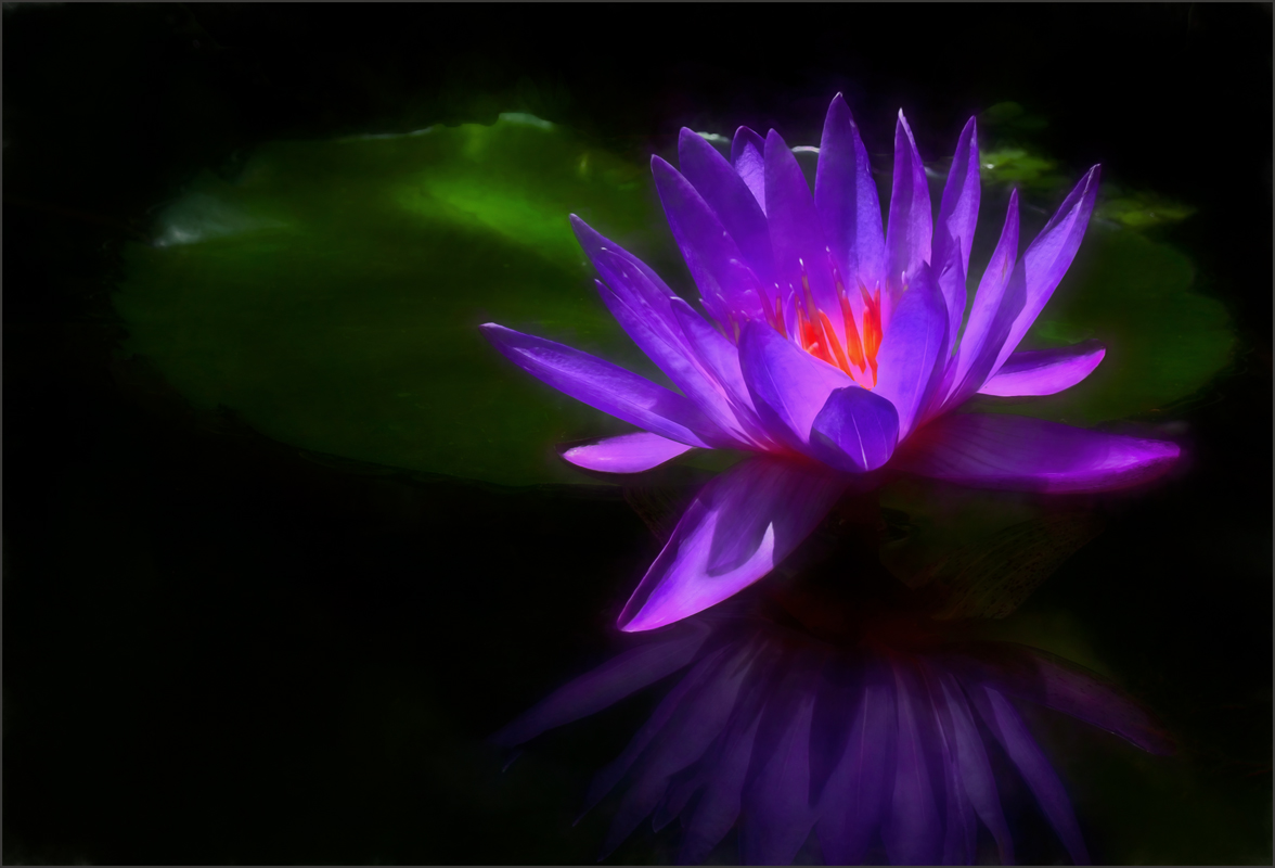
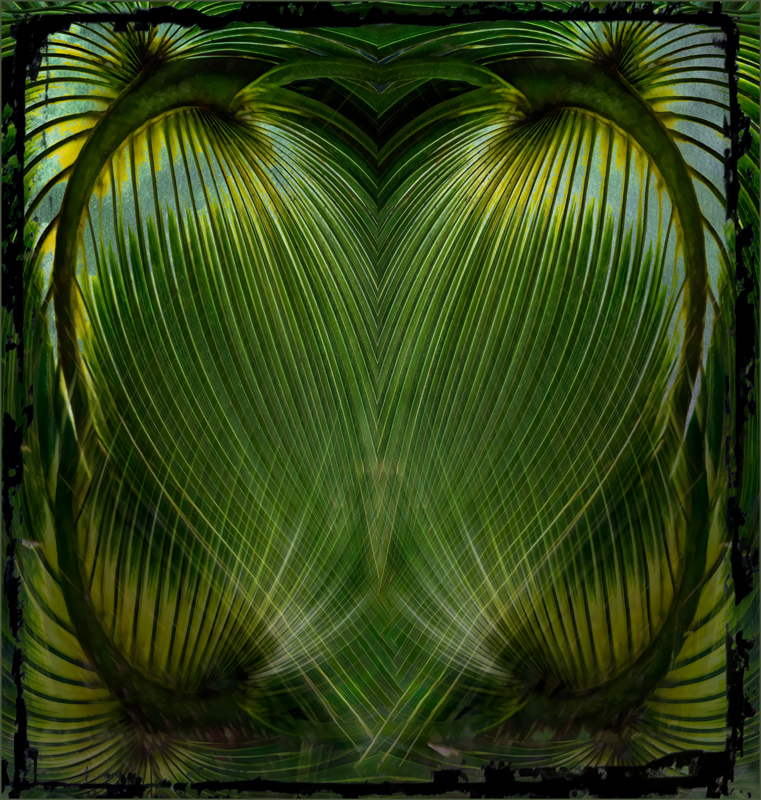
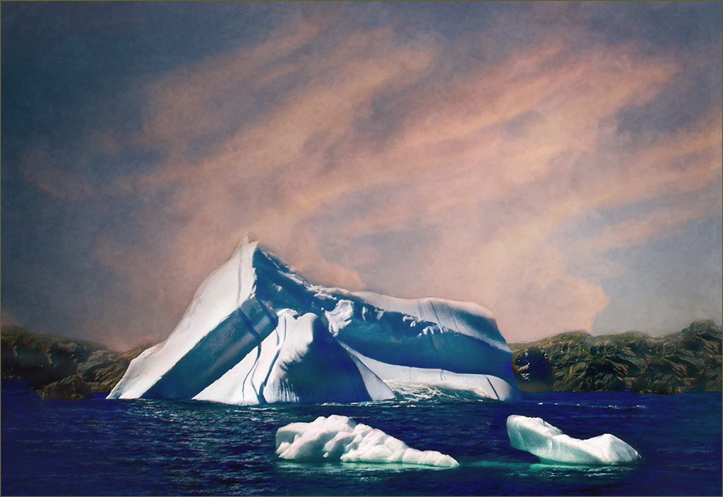
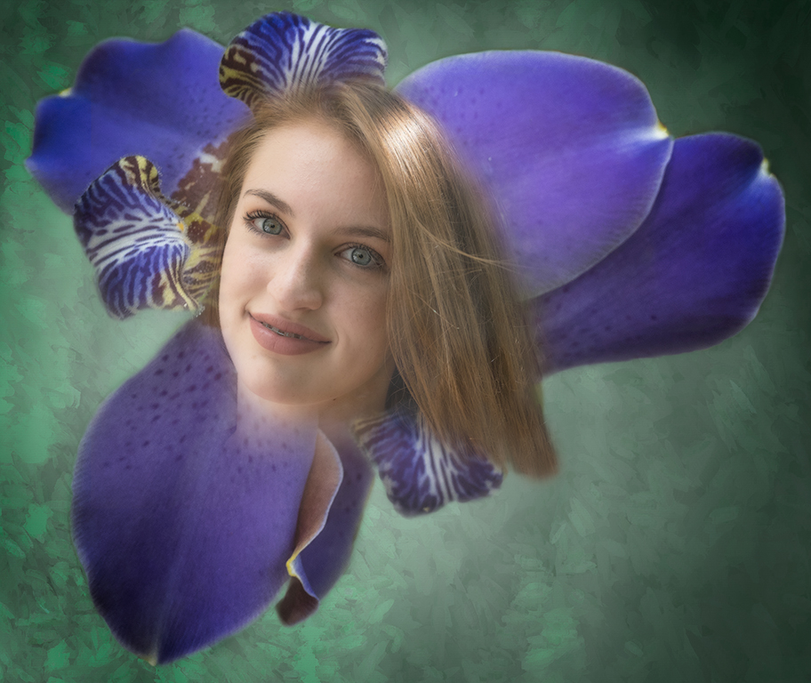
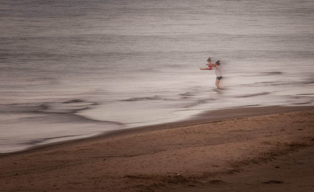
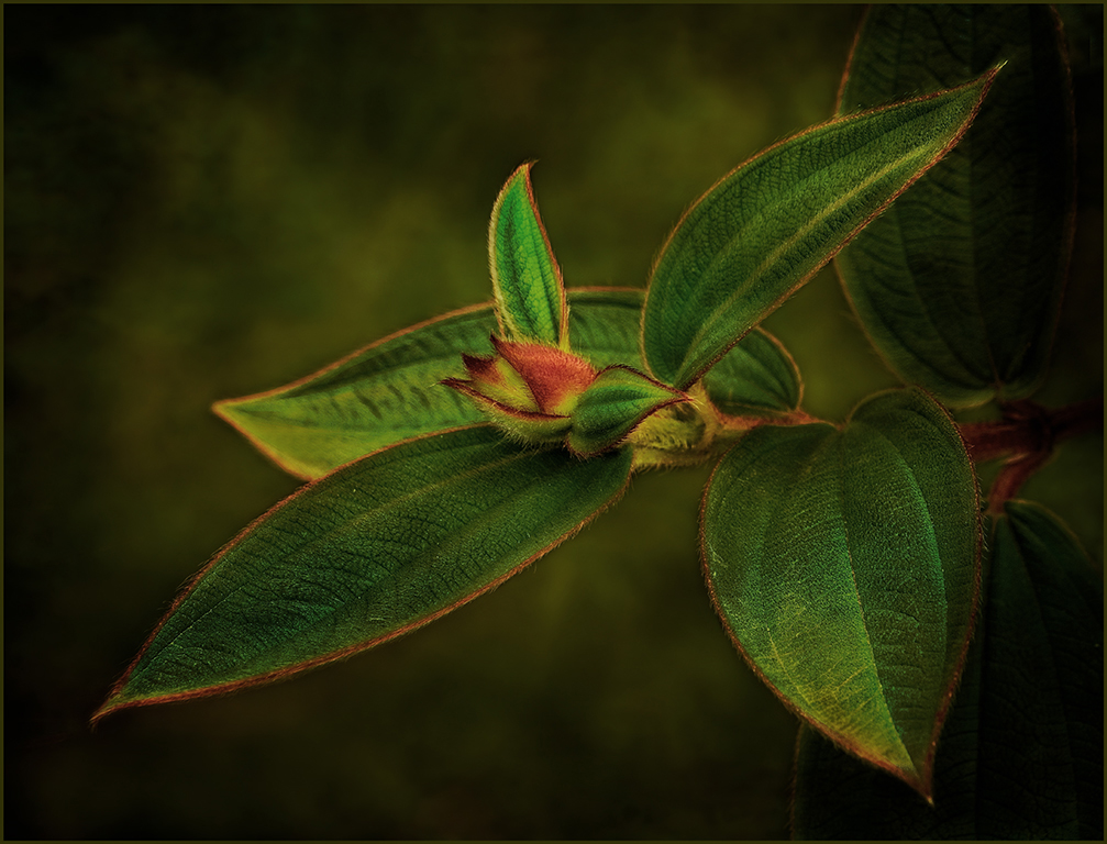
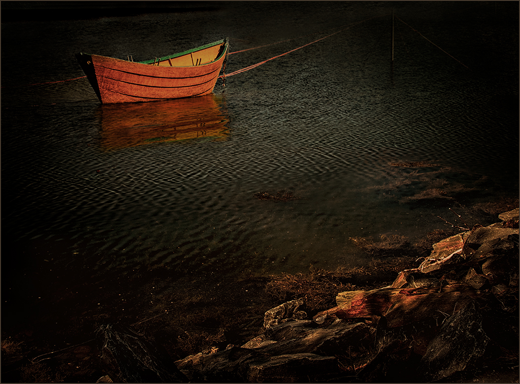
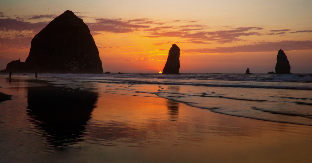
Jan, your image gives a nice dreamy feel like a foggy morning. In my opinion, I would add some blurring to the additions, as Steve suggested-especially the fence.As the others said, forget the judge. Each one judges according to their likes and dislikes. Love the sunset. |
Nov 12th |
| 34 |
Nov 17 |
Comment |
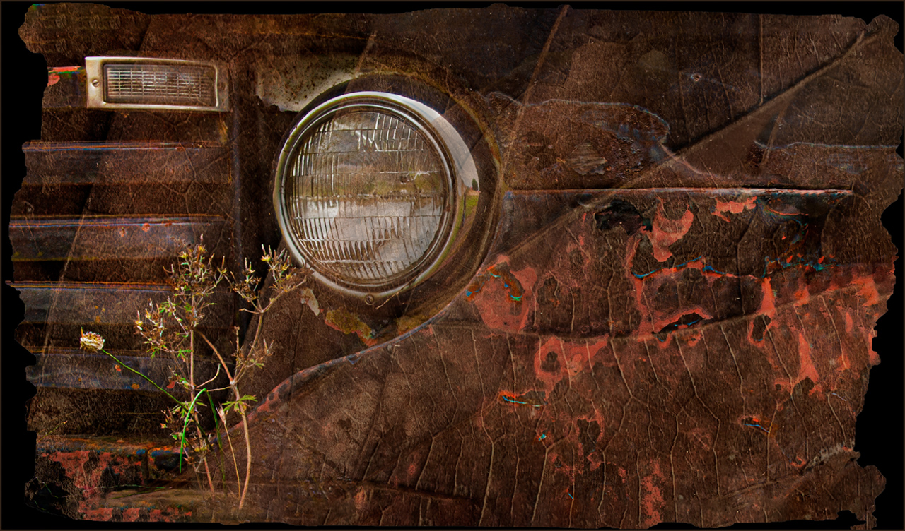
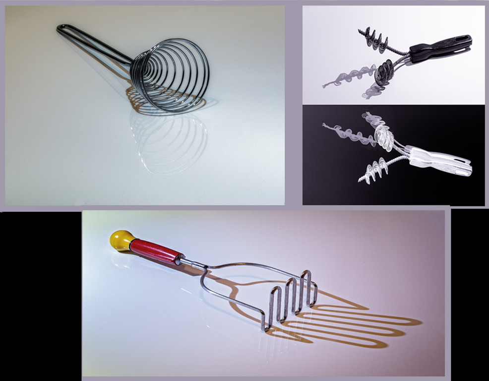
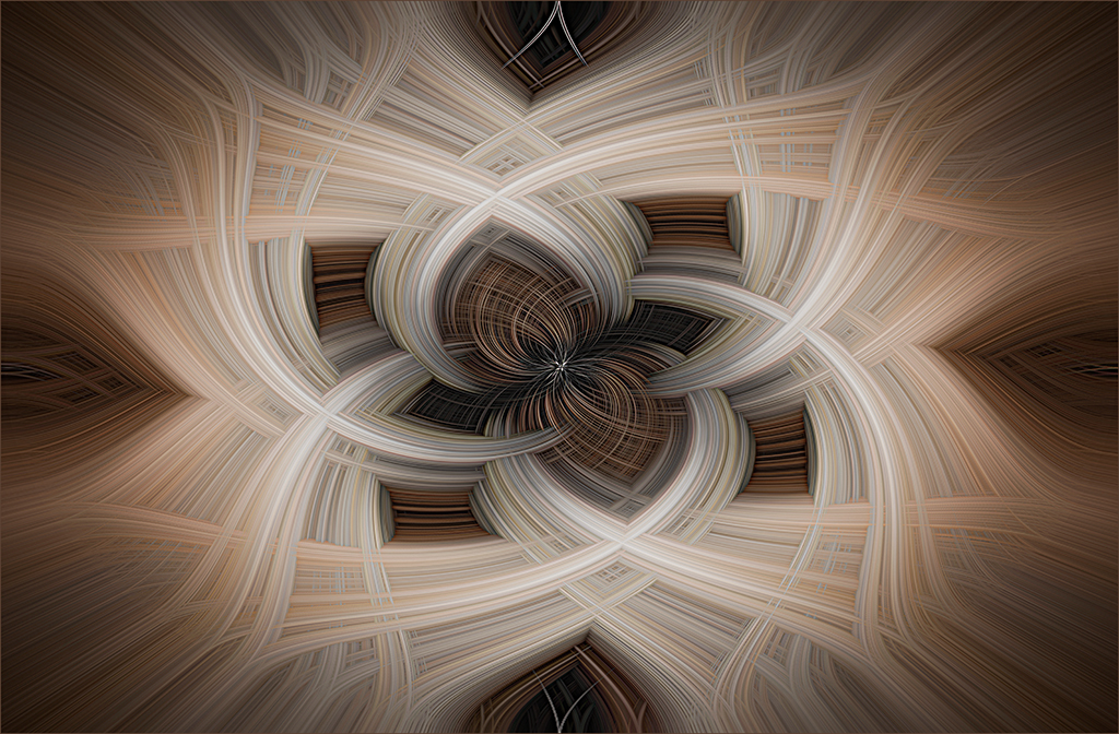
Interesting image, Helen. The squiggles of each truck seem to lend interest. I played around and came up with this image. Used filter distort-polar coordinates-polar to rectangular, then cropped to larger size and used transform scale.it gives some movement to the image. |
Nov 12th |
 |
| 34 |
Nov 17 |
Comment |
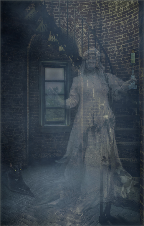
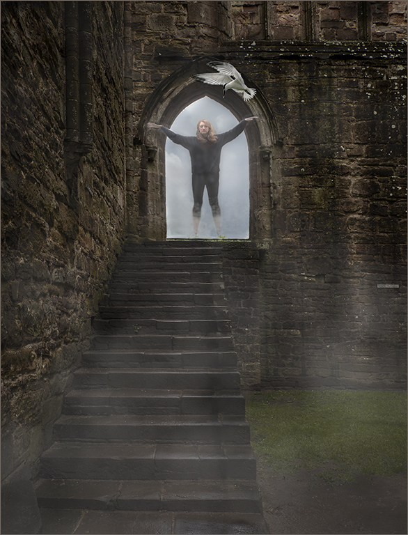
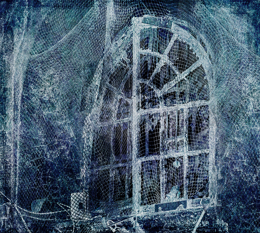
Excellent job, Georgianne. Everything in this image seems to work together. I would like to see the saturation on the bright green grass lowered and the hue changed to a more neutral tone.the outline on the door frames the ghost perfectly. I feel that the blur and luminosity on the ghost match the rest of the scene. |
Nov 12th |
| 34 |
Nov 17 |
Comment |
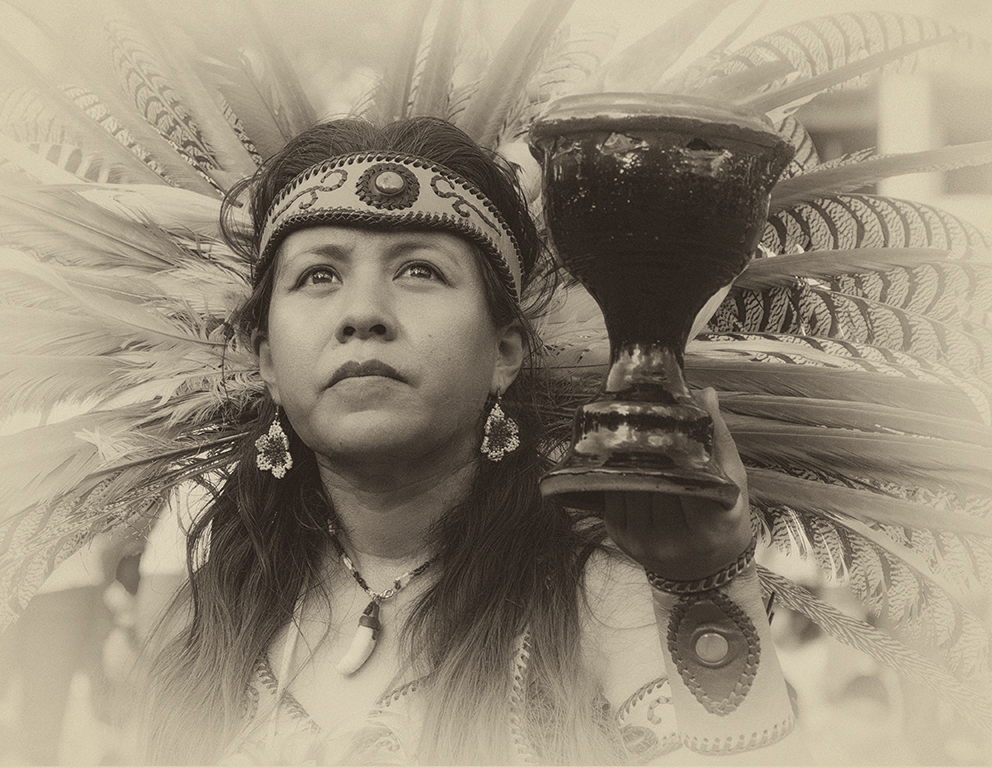
Phil, what a lot of work you did to capture the eclipse and arrive at this month's image. Your image is precise and gives a new look to the phases of the eclipse. I like that the center retained a bit of color and the sunspots are visible.Good job. |
Nov 12th |
| 34 |
Nov 17 |
Reply |
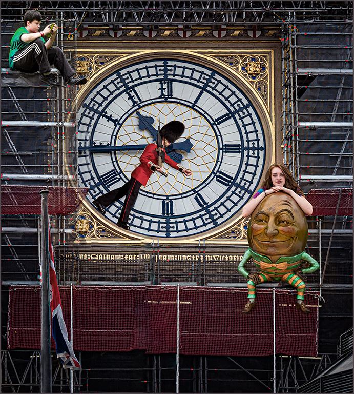
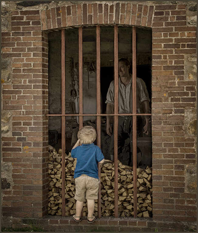
Thanks, Georgianne, my idea was to leave the blue shirt rather than to blend to the more neutral colors of the rest of the image to show that this was a boy dressed in our dress of today looking back in time to the blacksmith behind the bars representing an earlier time. |
Nov 12th |
| 34 |
Nov 17 |
Reply |
Thanks, Jan, I had left the angle at the bottom because it is obvious that the image was taken from an angle with the inside edge of the left side visible. The left edge is straight and right edge almost straight and the bars are straight. I felt that the bottom angle should remain. What do you think? |
Nov 12th |
| 34 |
Nov 17 |
Comment |
Steve, You did wonders with the girl's face from original 1-2, especially the eyes, skin and lips. Then the transition to original 3 and the final brings out the best of each image except for the snakes. I agree with Jan that the snakes should be more definable. Using a mask on original 3 before moving to the final edits should solve the snake problem. I do feel that there are areas in the top third-hair, background and snake and skin- that are a bit bright.A little burning or the camera raw filter-reducing the highlights- should reduce the brightness. The blurring and blending of the hair around the left side are great improvements. The hair doesn't look so stringy. Really good job! |
Nov 12th |
5 comments - 3 replies for Group 34
|
| 69 |
Nov 17 |
Comment |
Beautiful capture of the oystercatcher, Rob. The eye is very goo, in my opinion. It is bright, sharp and is definitely the focal point of the bird. Your vignette is perfect. I do agree with Mervyn and Brenda that it needs a crop to move the bird out of the center. |
Nov 12th |
| 69 |
Nov 17 |
Comment |
Beautiful image, Brenda. The oranges, purples, reds and blues bring such nice contrasts into the image.It is always hard to prevent extreme highlights and shadows in lighting conditions like you have captured. The camera raw filter can be a help in such cases to bring back some of highlights and unblock the shadows. Located across top in PS CC in filter drop down box. I used it to open some of your dark shadows and lower a few highlights a bit. Some of the shadows, however, remain completely blocked. |
Nov 12th |
 |
| 69 |
Nov 17 |
Comment |
Welcome to our group, Donna. You have captured a lovely early morning fog image.The lighting is beautiful. I agree with Mervyn and Brenda that the shadows on the legs of the elk are blocked and lacking in detail. Exposing to the right usually prevents such problems.It is usually impossible for the viewer of the image to read a story into an image if it is not evident in the image. |
Nov 12th |
| 69 |
Nov 17 |
Reply |
The first thing I do is to actually flip the image to see if I like it flipped. I always try to have an anchor on the right side if the image lends itself to that. The lower left is a dead spot that hides details. I never want to have an image with important information starting there. Your eye reads an image from left to right, so I want an anchor on the right as a place for the eye to land and start to move around the image. This image probably would have worked with either format. I just liked it better this way. |
Nov 12th |
| 69 |
Nov 17 |
Comment |
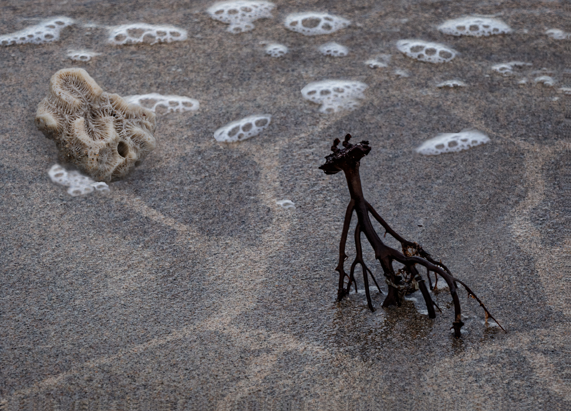
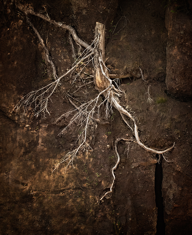
Beautiful landscape. The tree roots make the image. The background sun glow and autumn leaves on the trees add to the image. Since you do not have the whole tree in the image, I might crop some off the top, so it doesn't look like you just cut the top off. |
Nov 12th |
| 69 |
Nov 17 |
Comment |
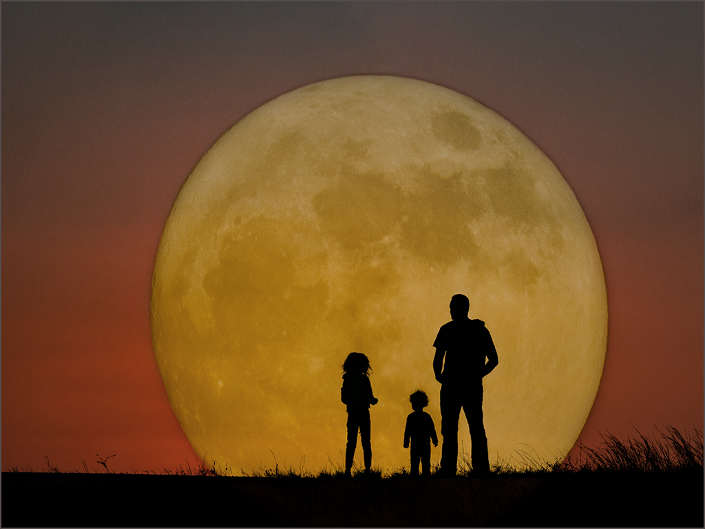
Beautiful image, Dean. You have captured such detail in the moon. At least you didn't waste a sleepless night. |
Nov 12th |
| 69 |
Nov 17 |
Comment |
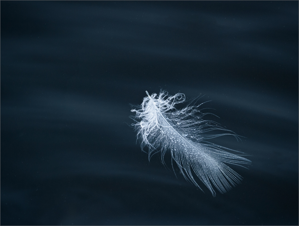
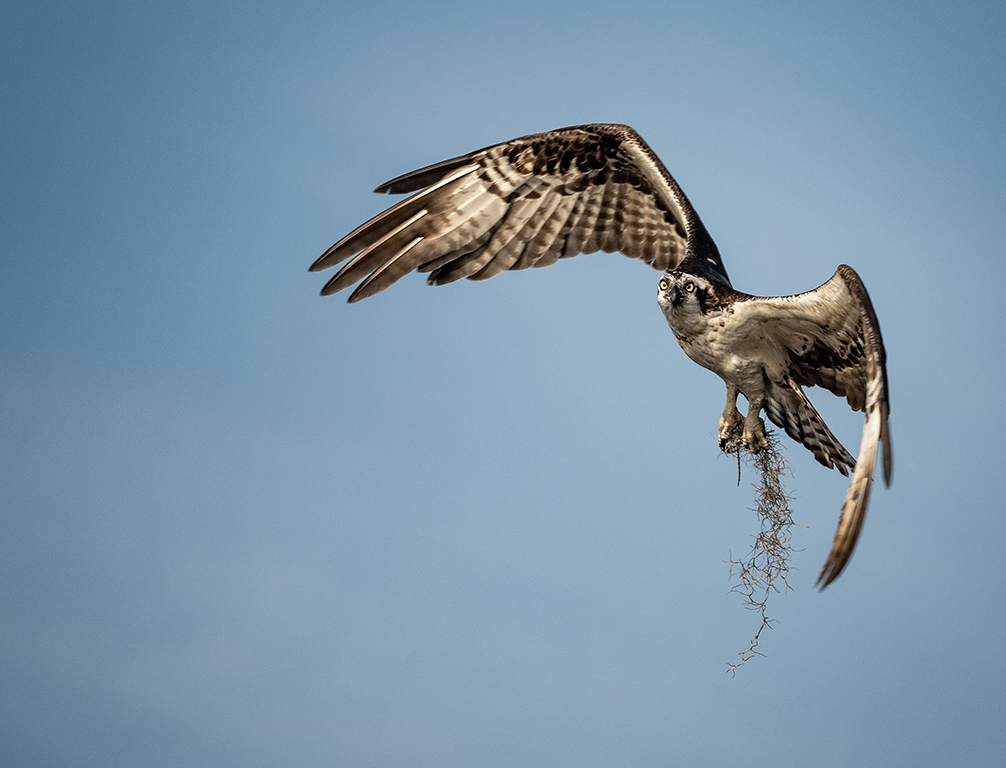
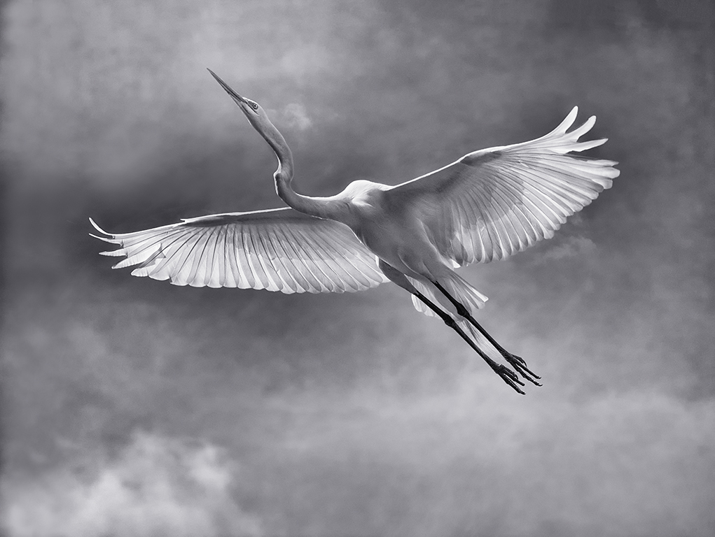
Mervyn, perfect timing, nice detail especially in the feathers.
excellent storytelling image. |
Nov 12th |
6 comments - 1 reply for Group 69
|
11 comments - 4 replies Total
|