|
| Group |
Round |
C/R |
Comment |
Date |
Image |
| 34 |
Jun 17 |
Reply |
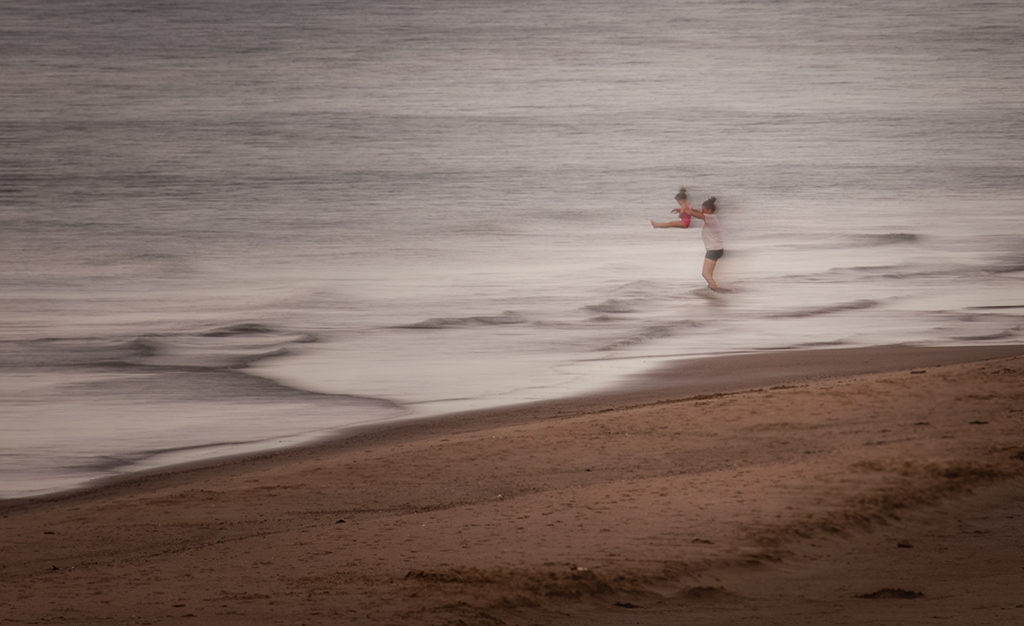
Phil, I can usually end up with a print that is close to what is seen on the monitor. However, it takes work with brightening and sometimes changing the color. But sometimes it just ends up somewhat different. A print is never exactly what I started with. |
Jun 29th |
| 34 |
Jun 17 |
Comment |
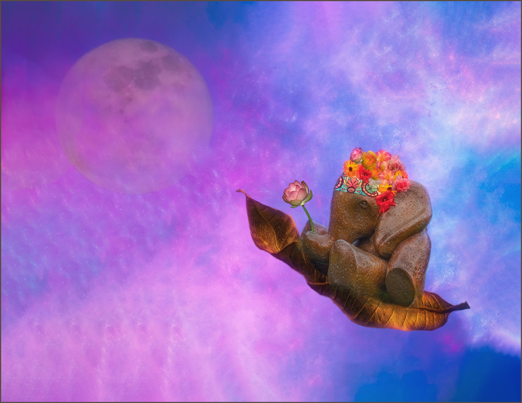
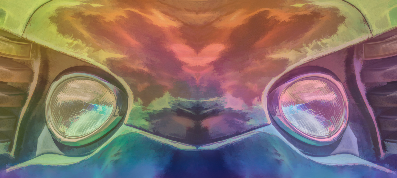
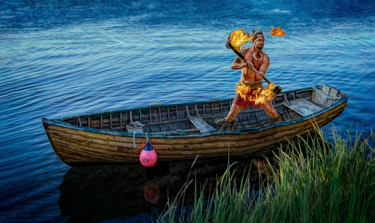
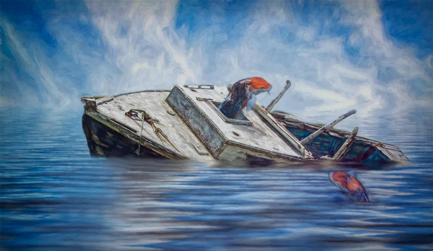
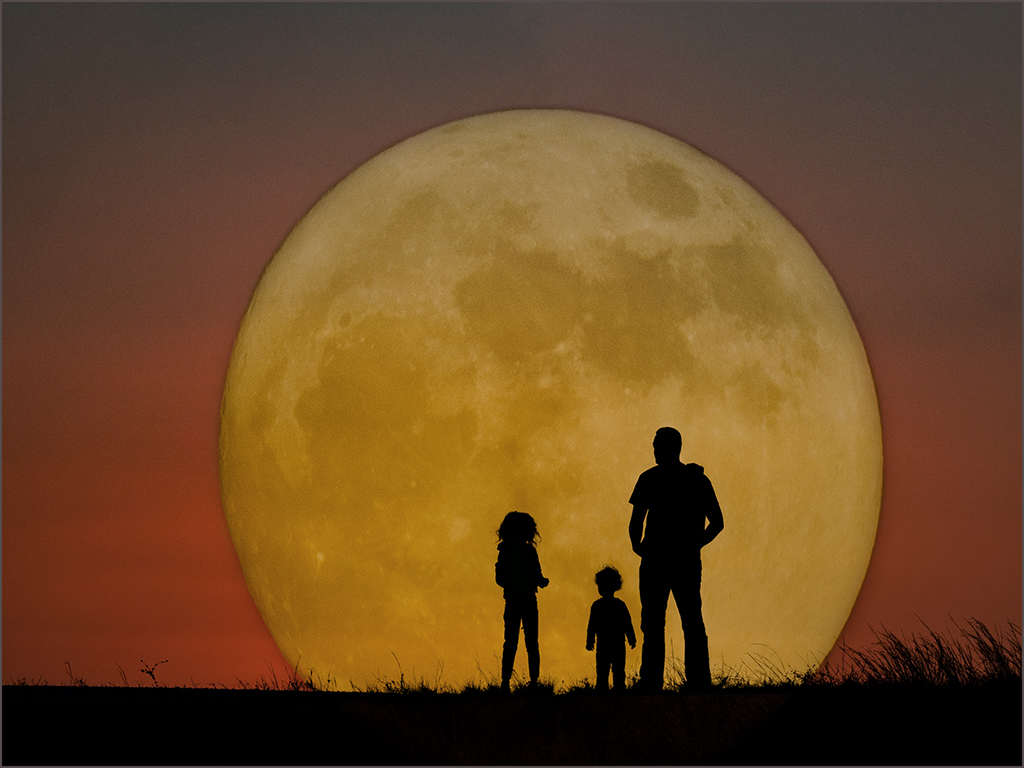
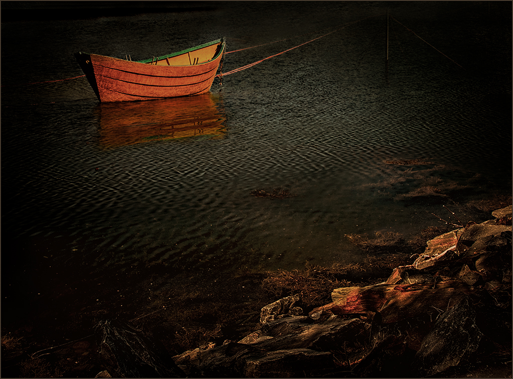
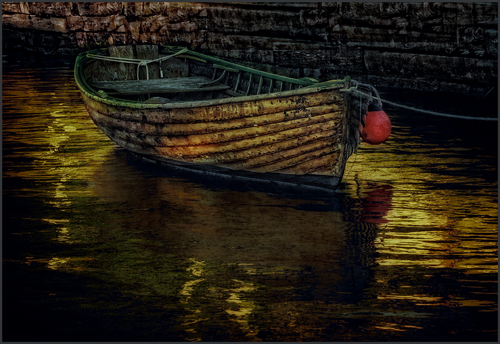
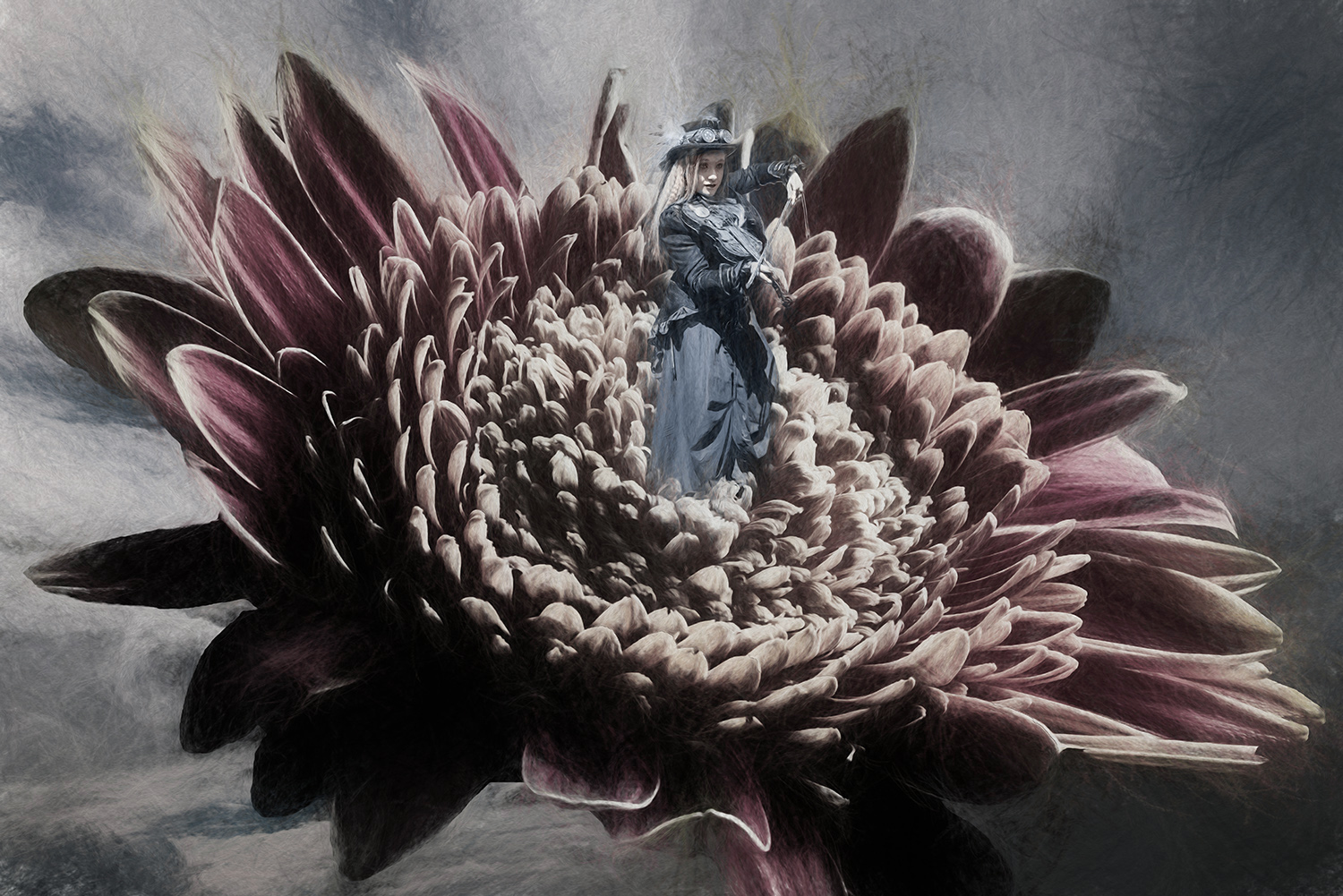
Jan, it is quite obvious that a lot of work went into this composite. It is simply lovely. The background sky with the moon pulls the image together. I do agree with Georgianne that a bit more dreaminess would be an improvement--something like a glow or slight blur. Your boat is ingenious. It's just wonderful. |
Jun 7th |
| 34 |
Jun 17 |
Comment |
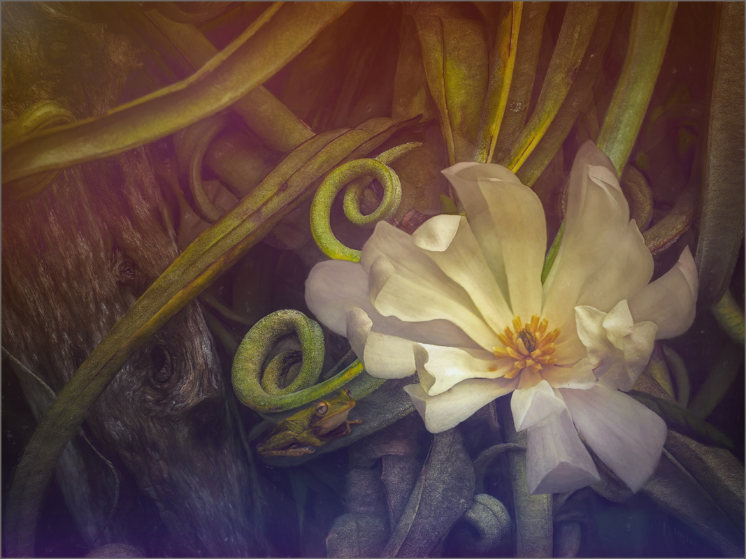
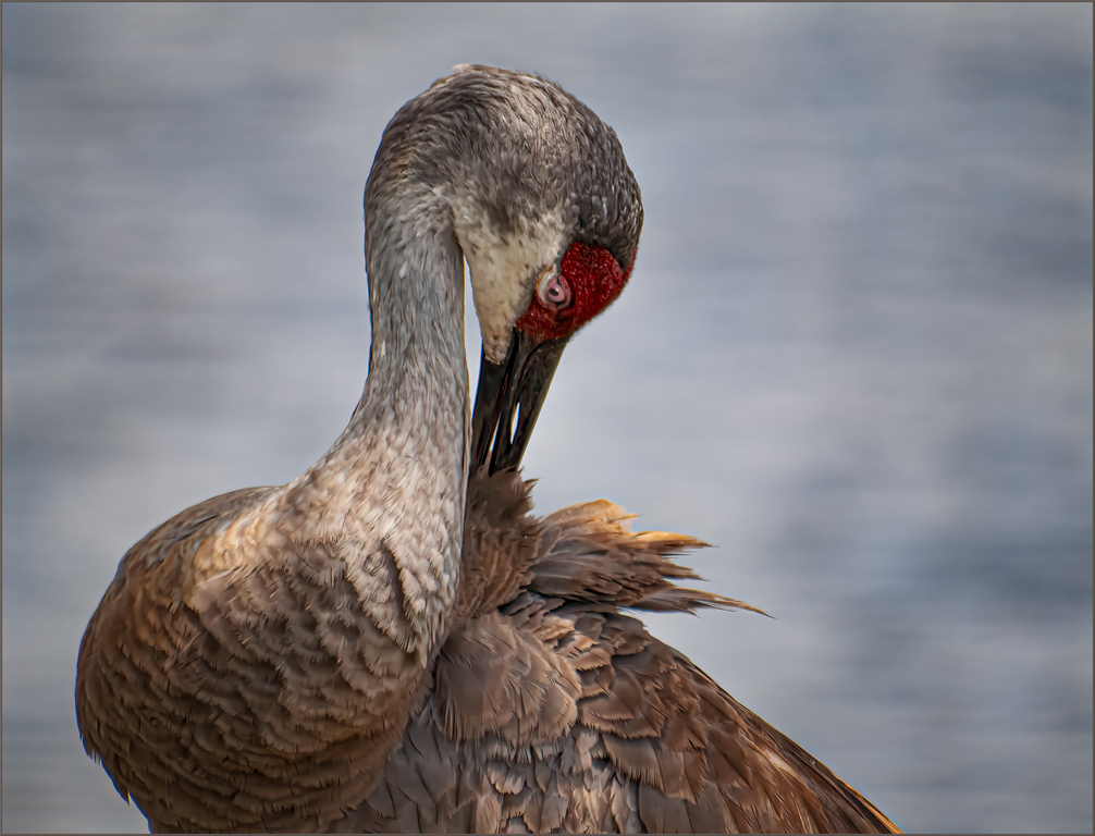
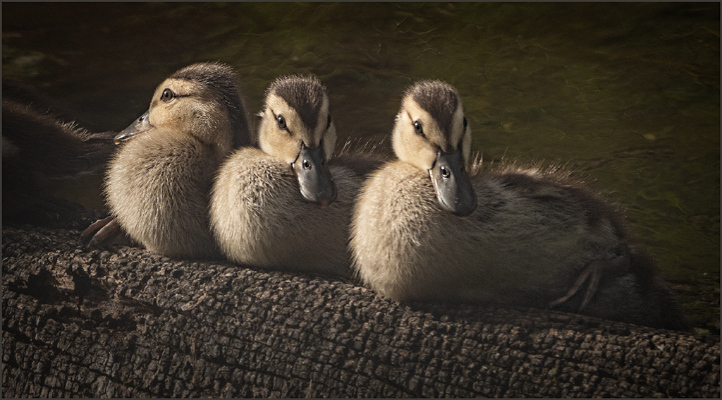
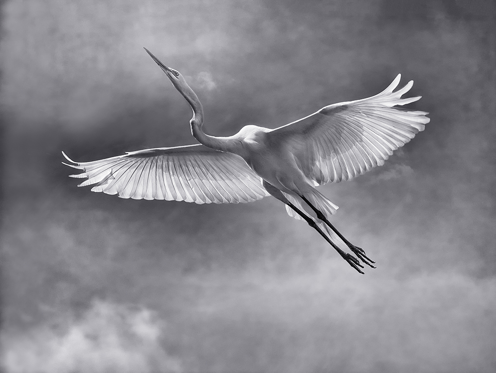
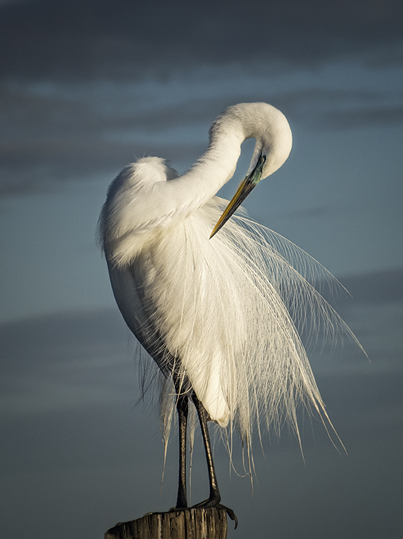
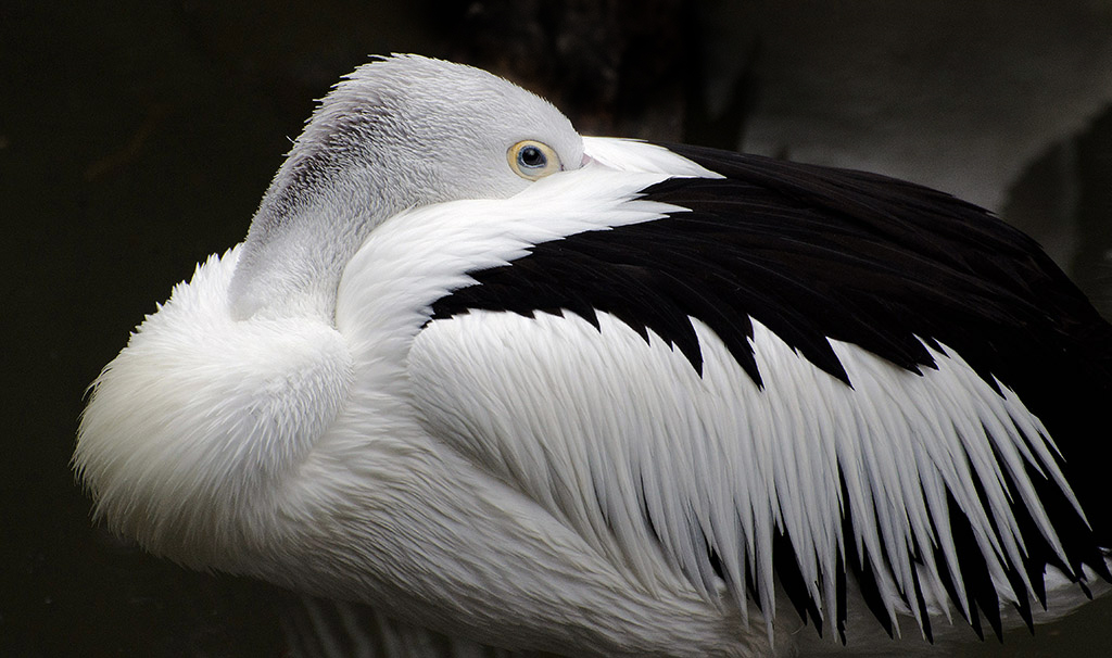
Love your bird, Christine. You did a fine job with the background. I agree with Steve and Georgianne. But softening the edge and bringing back the eye will give a beautiful image. |
Jun 7th |
| 34 |
Jun 17 |
Comment |
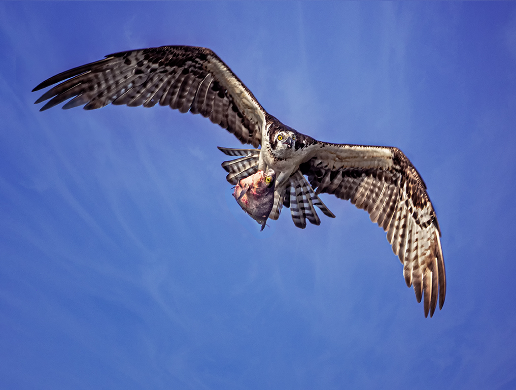
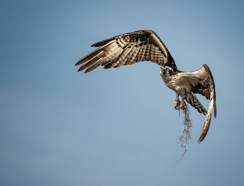
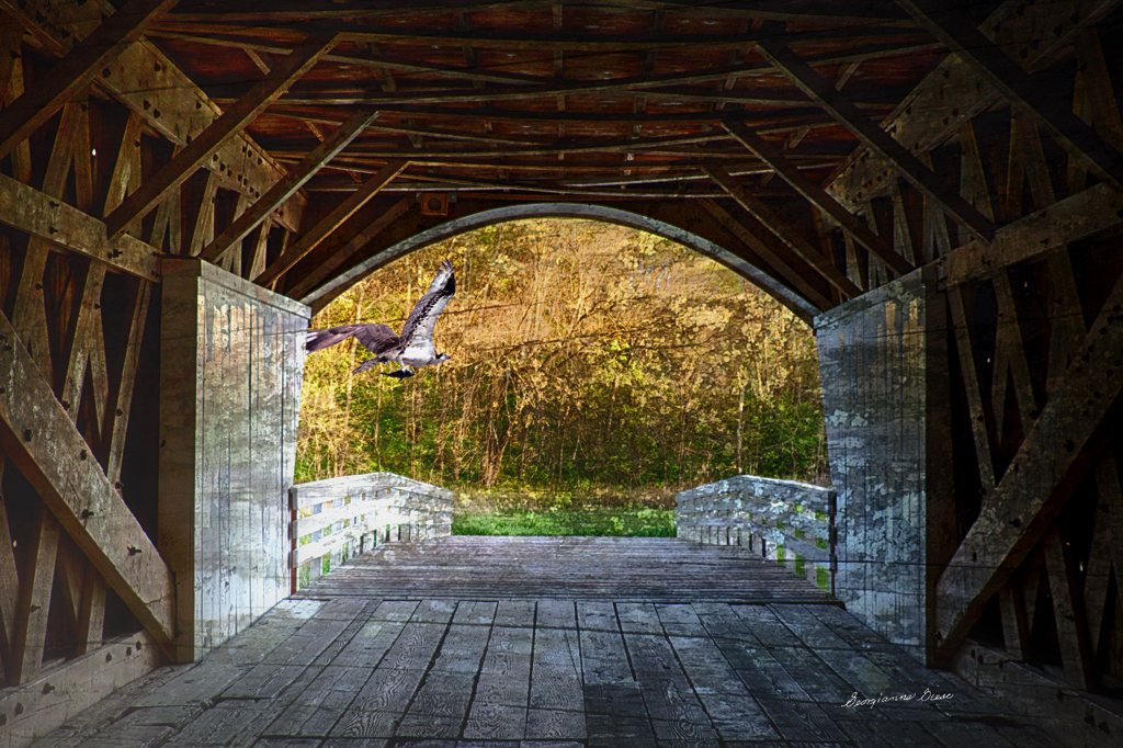
Well done, Georgianne, covered bridges are always a challenge. In my opinion, the overall image is slightly too bright, especially the bright areas on the left. The inside of the bridge should probably retain some mystery. I agree with Steve that the osprey should move away from the bridge. Thanks for the history. |
Jun 7th |
 |
| 34 |
Jun 17 |
Comment |
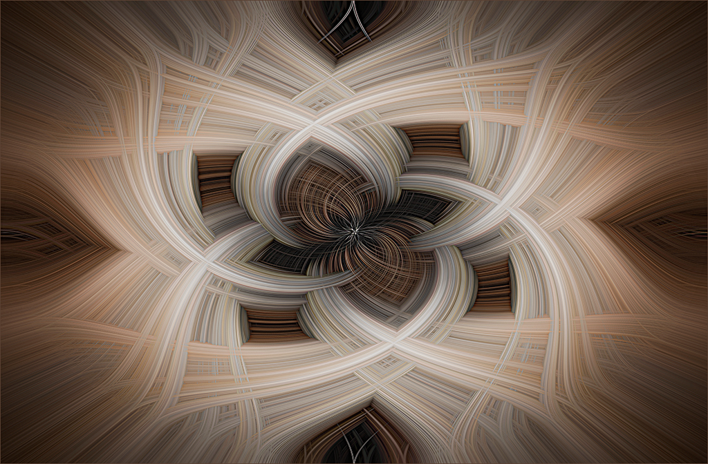
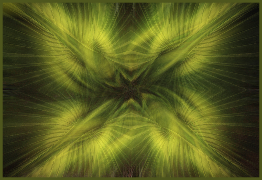
Phil, the image transformations are beautiful. the color addition certainly is an improvement. I do agree that it seems to need more. |
Jun 7th |
| 34 |
Jun 17 |
Reply |
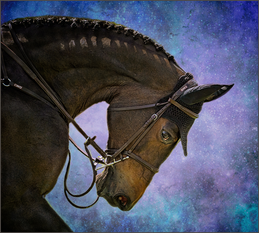
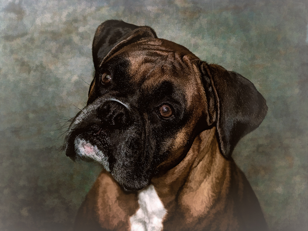
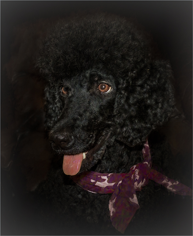
Thanks, Jan, the image of Annie was taken with an Olympus OM-D M-1, Mark II. Annie is the first poodle we have ever had. She is full of personality, so smart and definitely identifies herself as human,. She gives hugs and kisses freely and takes the chair every chance that she gets. |
Jun 7th |
| 34 |
Jun 17 |
Reply |
Thanks, Georgianne, Annie is our little princess. |
Jun 7th |
| 34 |
Jun 17 |
Reply |
Thanks, Steve. I always wonder if I should brighten my image a bit after finishing it. I always looks fine on my computer, but somehow comes out a little dark on the site. |
Jun 7th |
| 34 |
Jun 17 |
Comment |
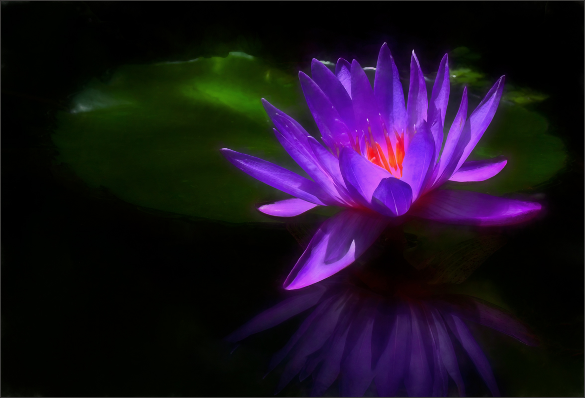
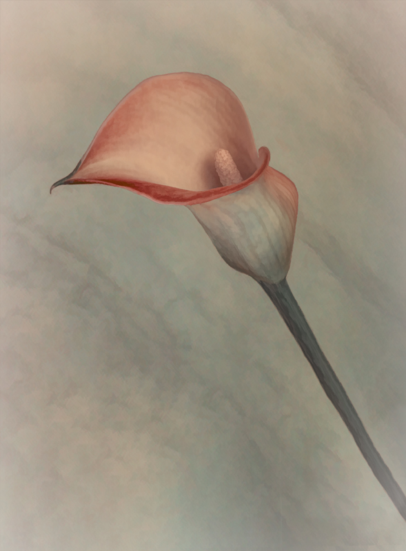
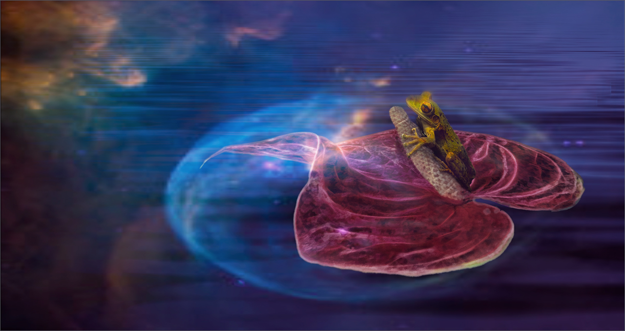
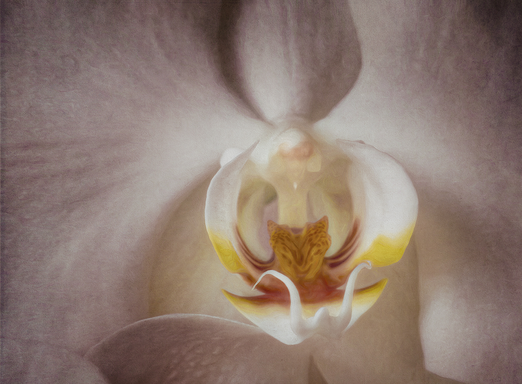
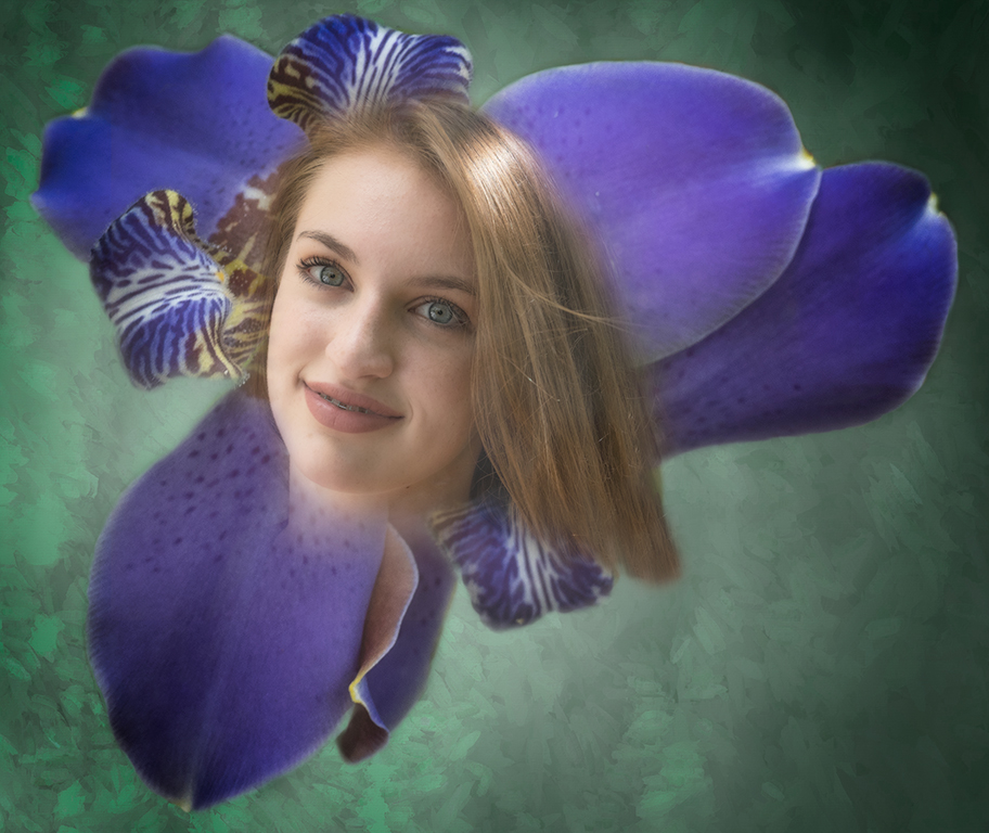
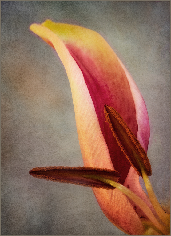
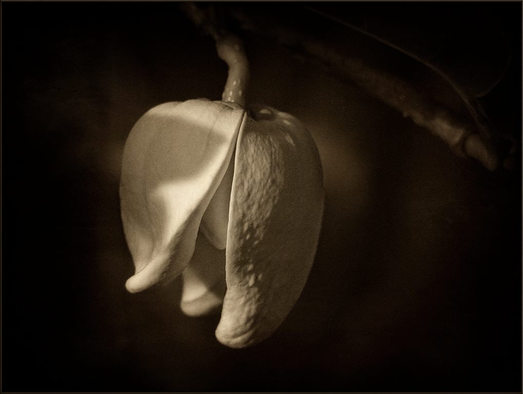
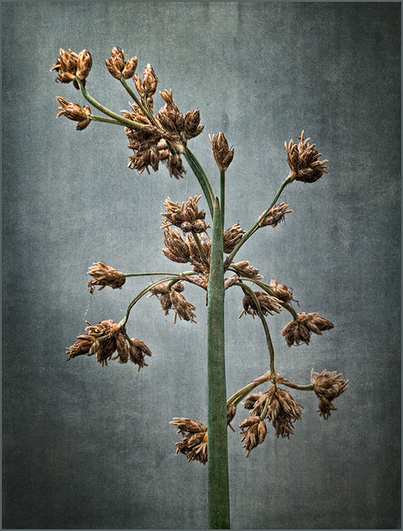
Steve, the flower is beautiful,and the bluish texture in the background really adds to the overall image. Jan's idea to elevate the fiddler above the flower works well to balance the image better. I agree with Georgianne that the overall color palette has too much sameness. I used selective color to increase the pinkness of the flower to give more contrast between the fiddler and the flower. Overall you have produced an interesting image. |
Jun 7th |
 |
5 comments - 4 replies for Group 34
|
| 69 |
Jun 17 |
Comment |
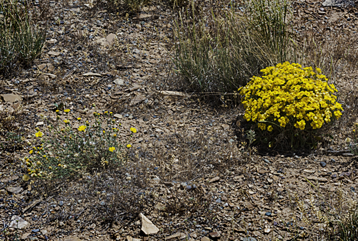
Chuck, as a nature photographer, I find that less is almost always better than trying to include too much. The desert landscape here is mostly lacking in interest. Concentrating on the one bunch of flowers or the one and smaller group might have been a better choice. the image needs more contrast to make it pop. The camera raw filter was used to reach my edit. |
Jun 14th |
 |
| 69 |
Jun 17 |
Comment |
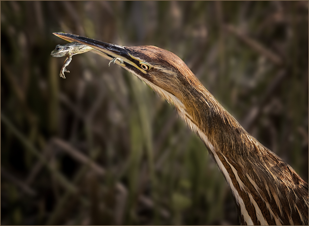
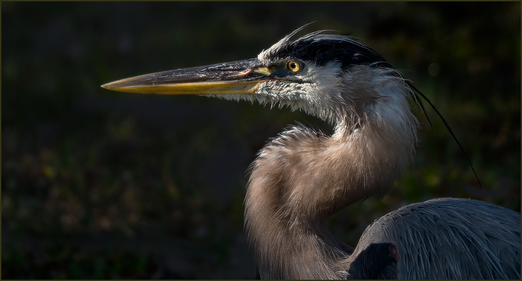
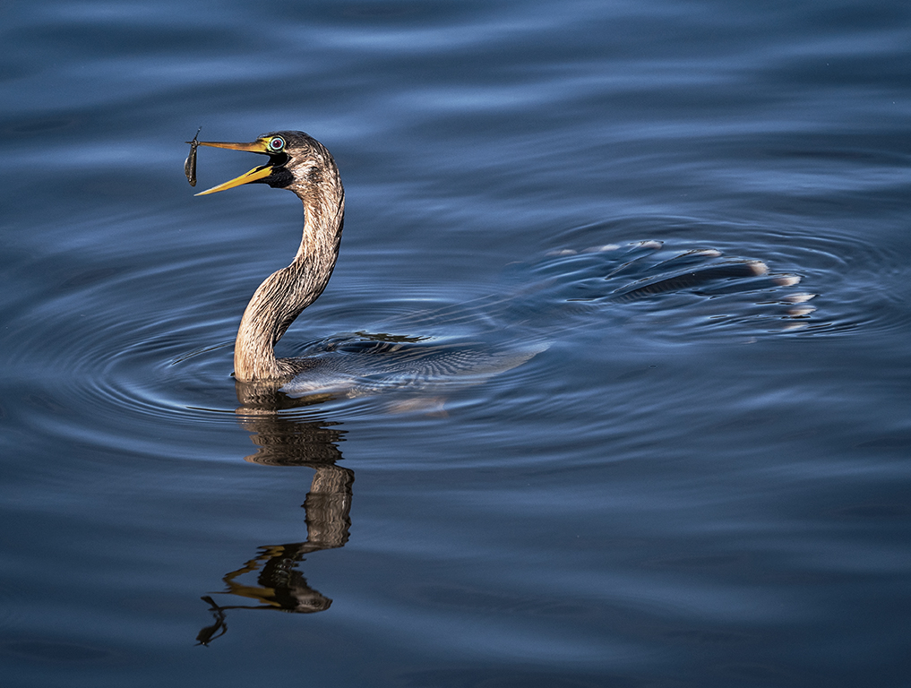
Beautiful bird and composition, Rob. The distracting area behind the bird can be significantly reduced with burning and using the sponge tool to remove the brown of the tree.The eye can be enhanced using selective color to bring up the yellow and use the paint brush to place a brighter dot over the highlight. Also the beak is almost completely missed because it blends with the feathers. Use selective color to bring the yellow up a bit.In my opinion a black and white loses a lot of the impact and the black feathers just disappear. |
Jun 14th |
 |
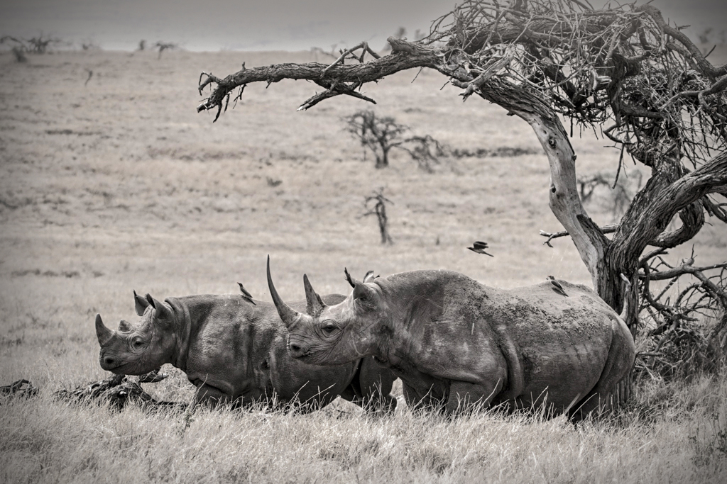
| 69 |
Jun 17 |
Comment |
The black and white conversion works well for the rinos but has made the background too bright. the tree is a nice frame and the birds add interest. I have tried the camera raw filter, a gradient and vignette to try and tone the image down. |
Jun 13th |
 |
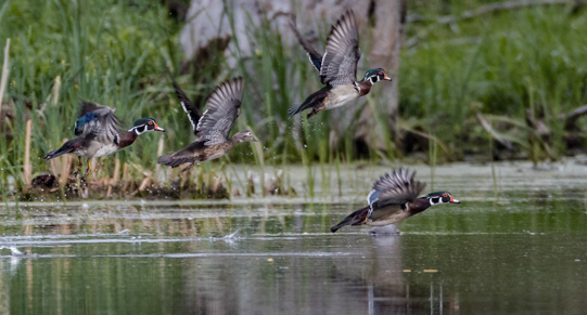
| 69 |
Jun 17 |
Comment |
Nice capture, the ducks appear sharp, and it is nice that each duck is in a different mode of flight. However, as already said the background is very distracting. Maybe if you cropped the image and concentrated on the ducks in front it would present a better image. I cropped it, used the camera raw filter, curves and selective color to better emphasize the ducks. |
Jun 13th |
 |
| 69 |
Jun 17 |
Comment |
Dean, I have seenso many images of Antelope canyon that usually I am turned off as they all look the same. However, yours is special. The coloring is so much more pleasing than the usual orange.The lighting on yours perfectly illuminates the inside of the canyon as it comes in from above. Usually the lighting is too bright for my taste.This image is just beautiful with the chocolaty toning. I do think that opening up the shadows improves the image even more. Beautiful work! |
Jun 13th |
| 69 |
Jun 17 |
Comment |
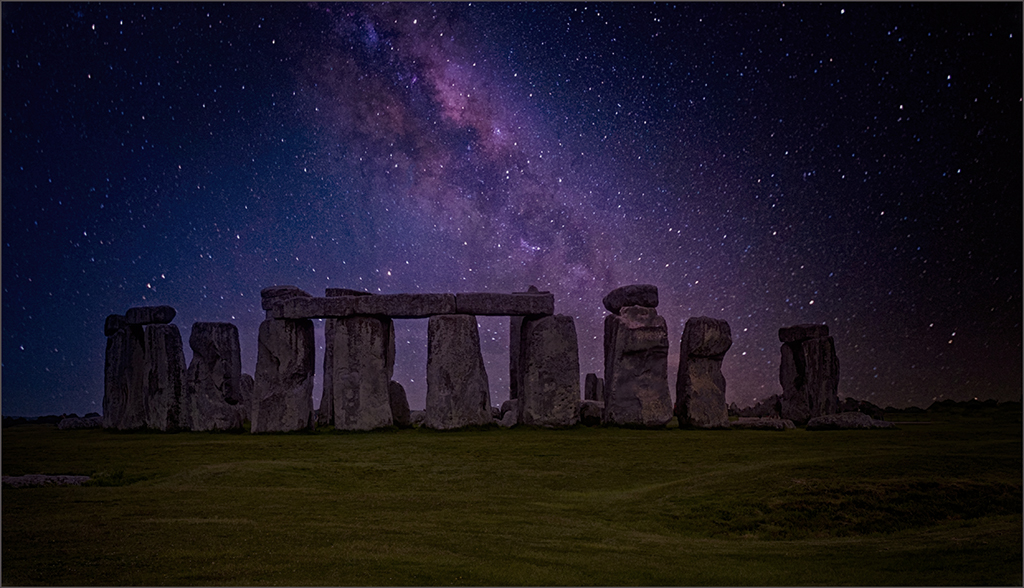
Mervyn,
I am definitely no expert in this field. But I have read that you should use a fast lens and the widest aperture possible. the shooting star is a plus, and you captured the milky way nicely before moon rise. However, I feel that the foreground is lacking in interest. |
Jun 13th |
6 comments - 0 replies for Group 69
|
11 comments - 4 replies Total
|