|
| Group |
Round |
C/R |
Comment |
Date |
Image |
| 34 |
Feb 17 |
Reply |
Yes, Phil, I think you are right. The barrel was what I resized and moved. I was trying to recreate my steps at the last minute. |
Feb 20th |
| 34 |
Feb 17 |
Comment |
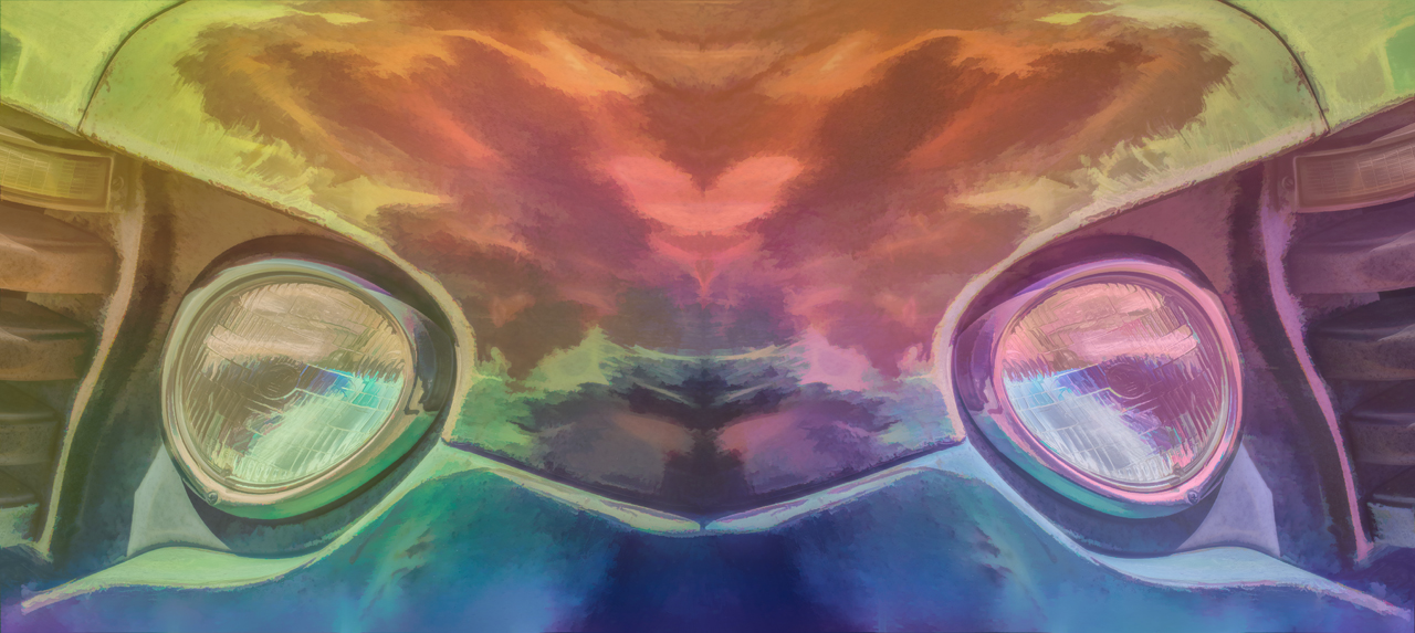
Steve, I feel that you have done a fine job with this image. The crop and flip work well. The flame and smoke brushes did wonders to transform it into something spectacular. I do feel that the opacity of the last layer might be better at a further reduced opacity. There might be too much color in your final image. I do agree with Jan that a face lift is in order. Some of the shadows and wrinkles need reducing. |
Feb 12th |
| 34 |
Feb 17 |
Comment |
|
Feb 12th |
 |
| 34 |
Feb 17 |
Comment |
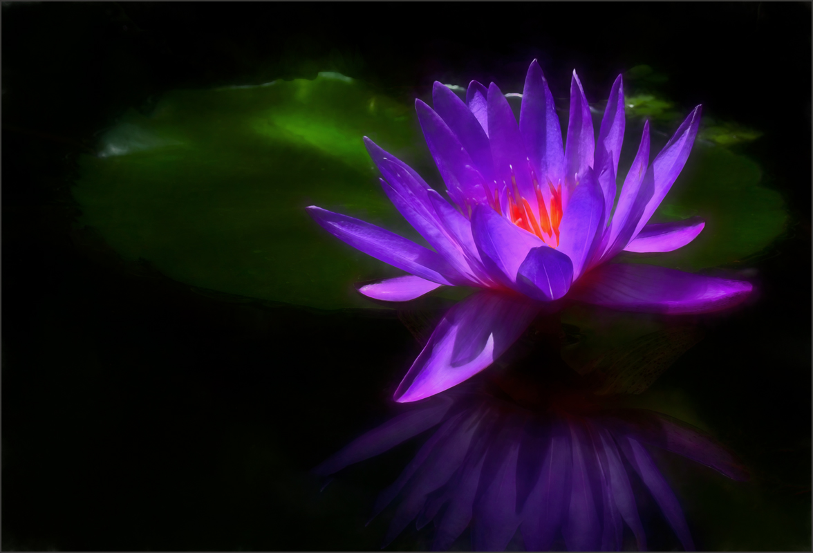
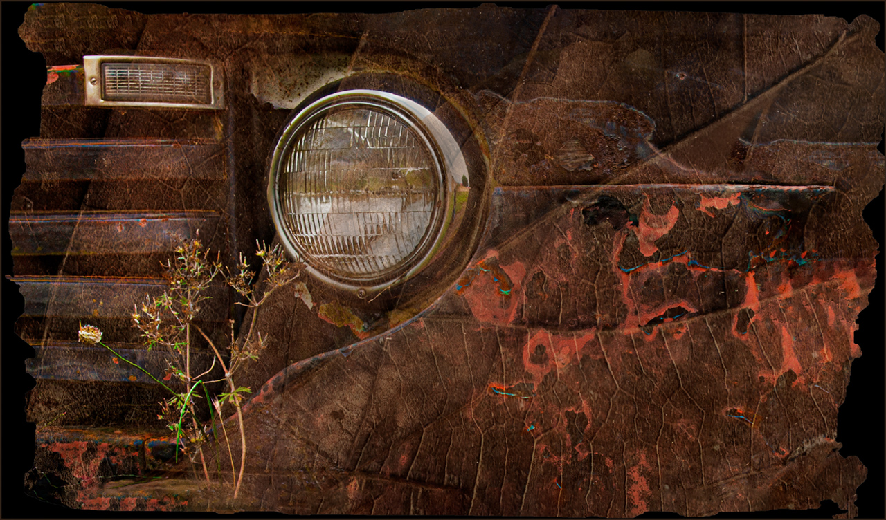
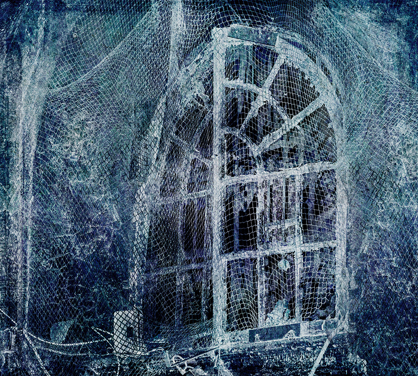
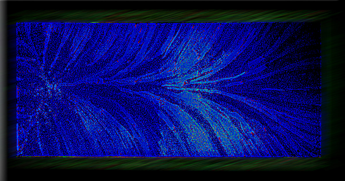
Nice way of creating an image from your frosted skylight.The blue monochrome on the inside of the frame works well.I took ypur image into Topaz glow, moved the sliders slightly. when I got to color in the Dark the red dots appeared. Then I put motion blur on the frame. It is not your image, but a different look with a focal area. I can't make a decision about the Black Hole, the file is too small.I used edit-transform-scale to increase the file size. |
Feb 12th |
| 34 |
Feb 17 |
Comment |
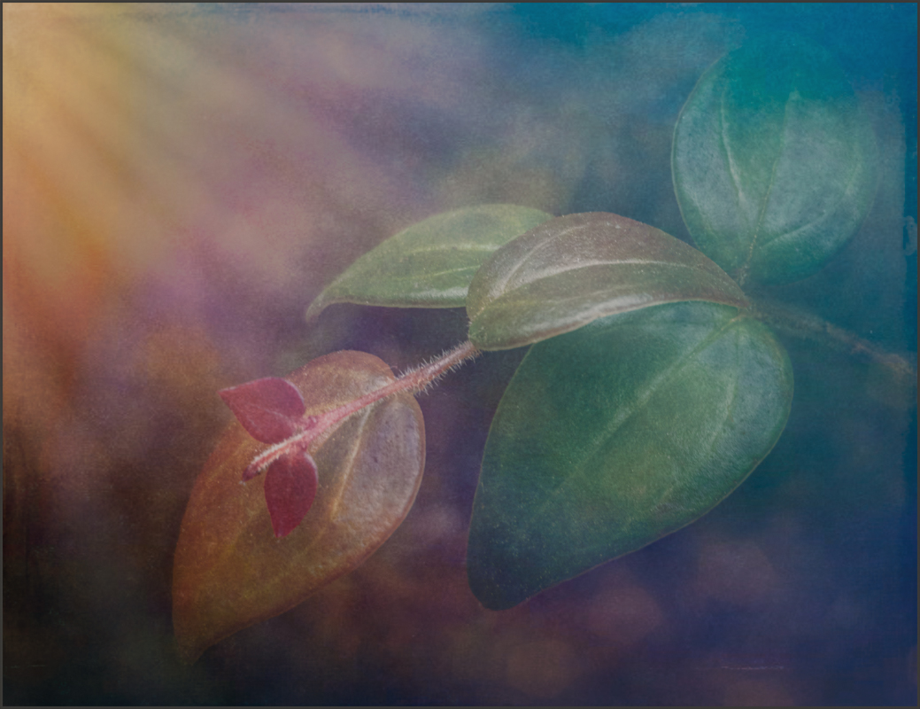
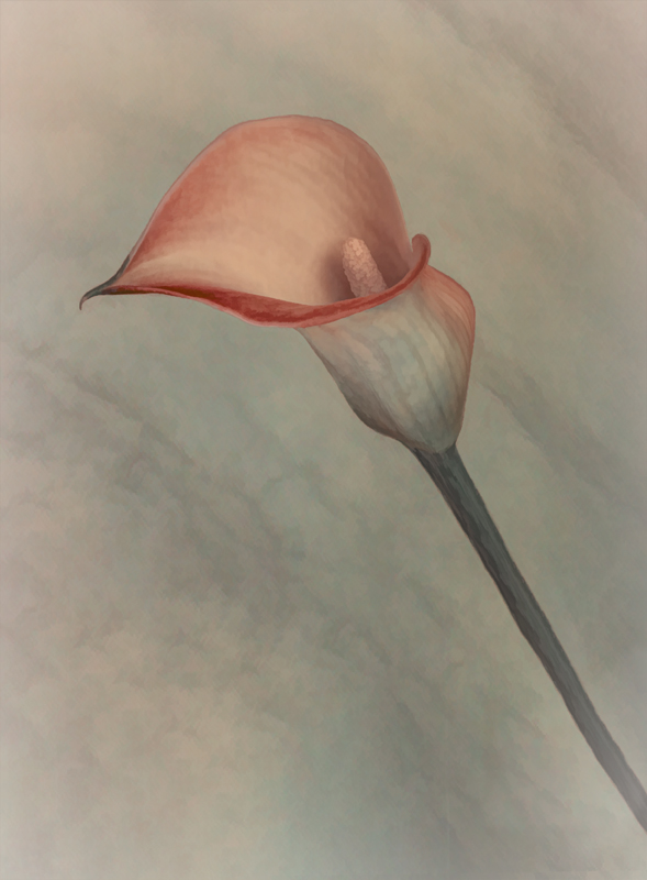
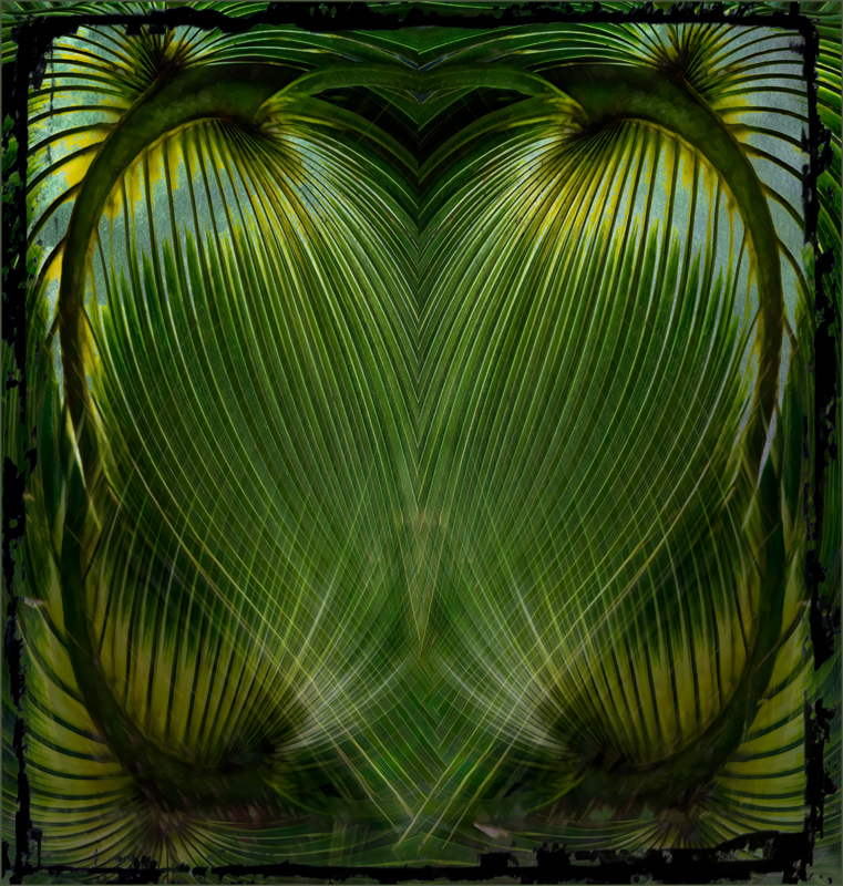
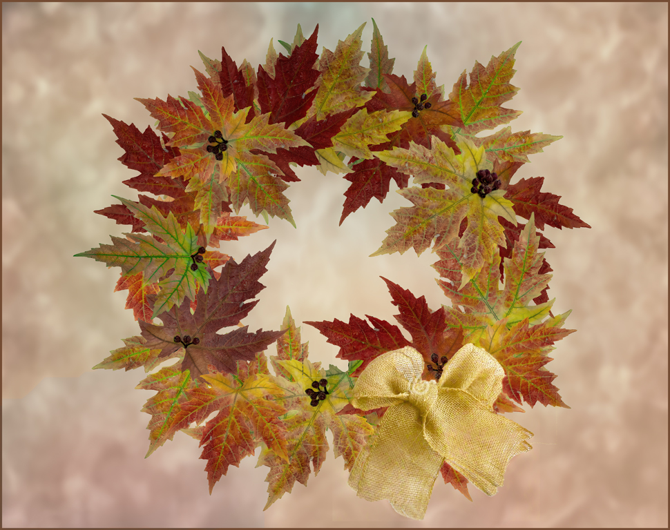
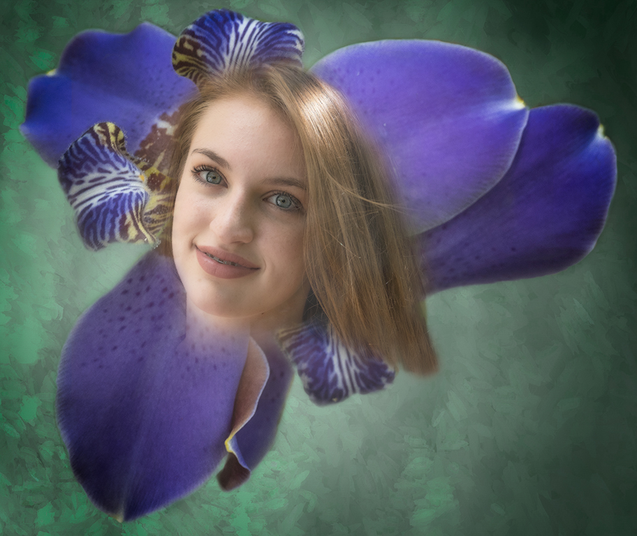
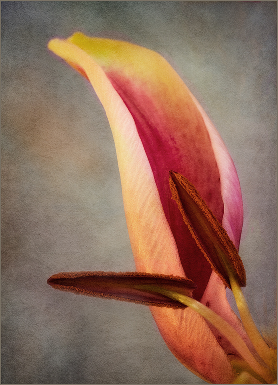
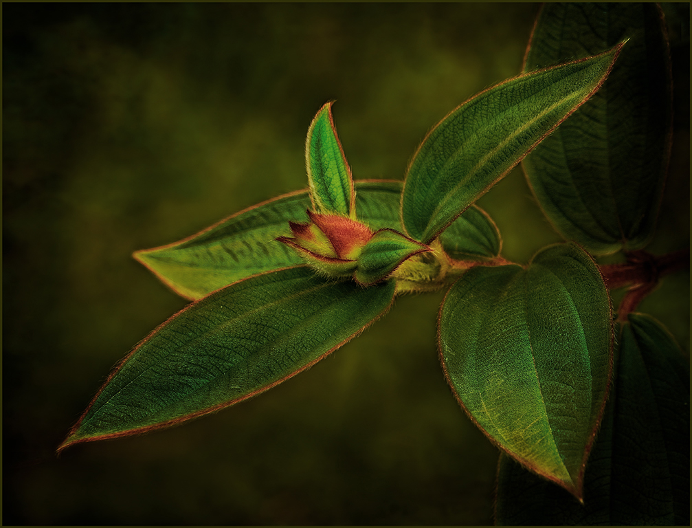
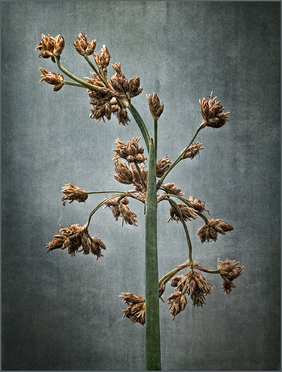
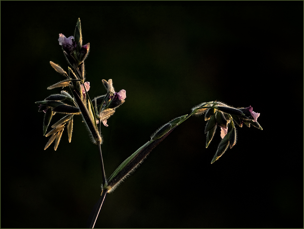
Jan, wonderful job. I love the more muted colors you used and the texture in the upper left corner.Good job with the crop. My only suggestion would be to soften/slightly blur the front leaf. |
Feb 12th |
| 34 |
Feb 17 |
Comment |
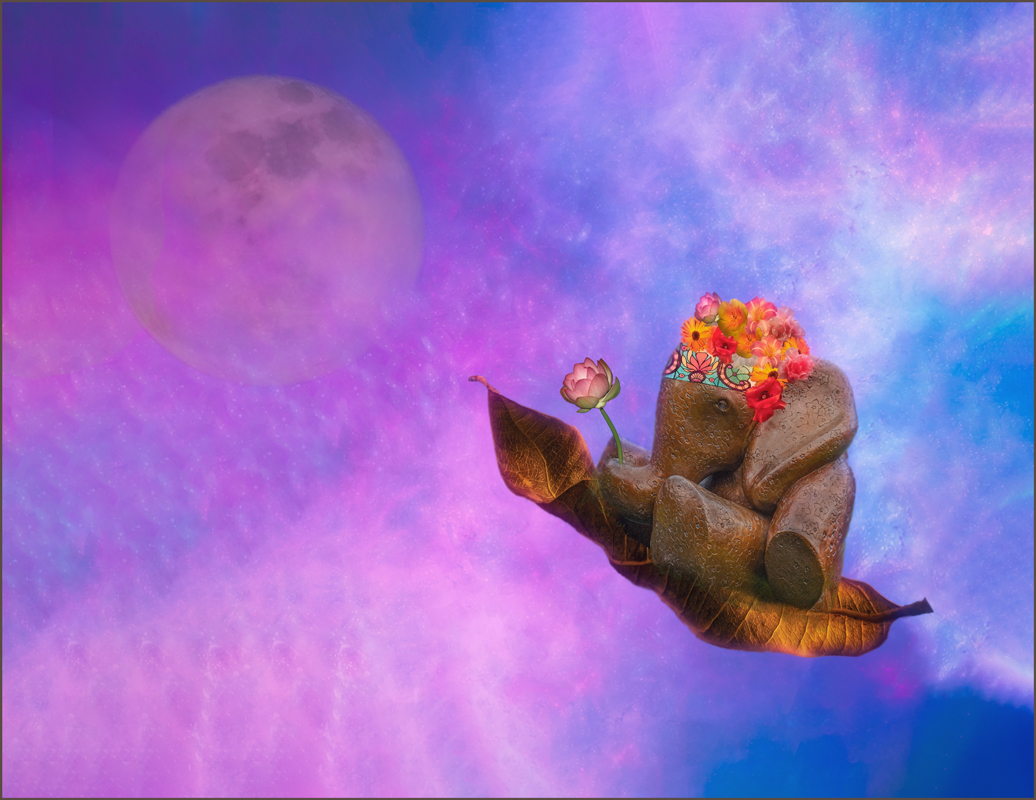
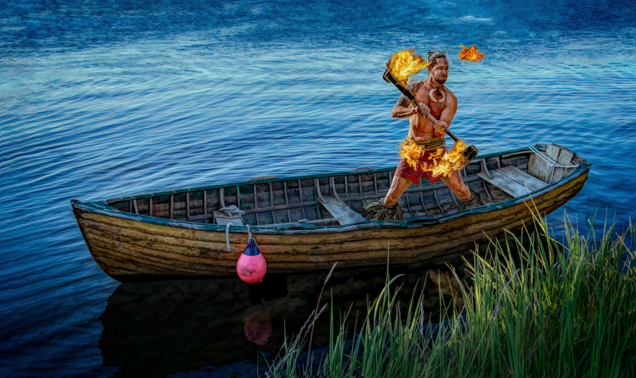
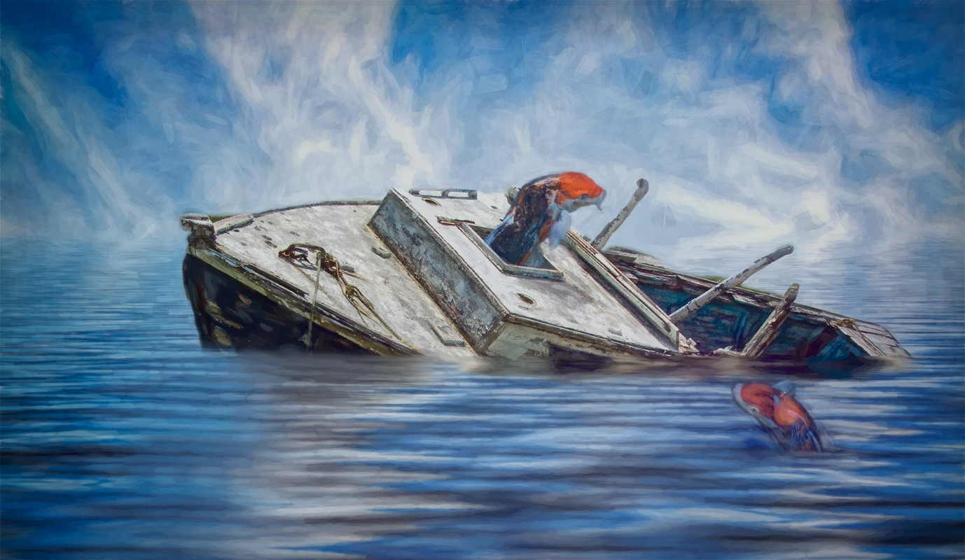
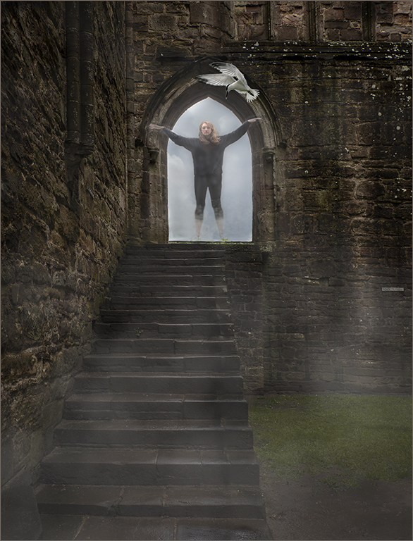
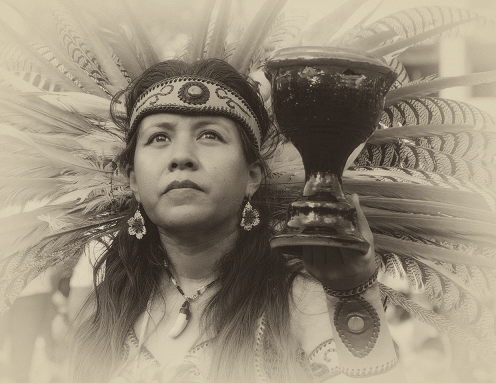
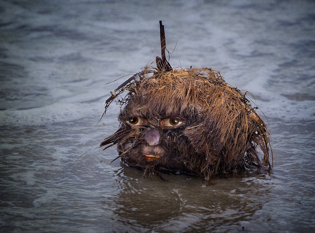
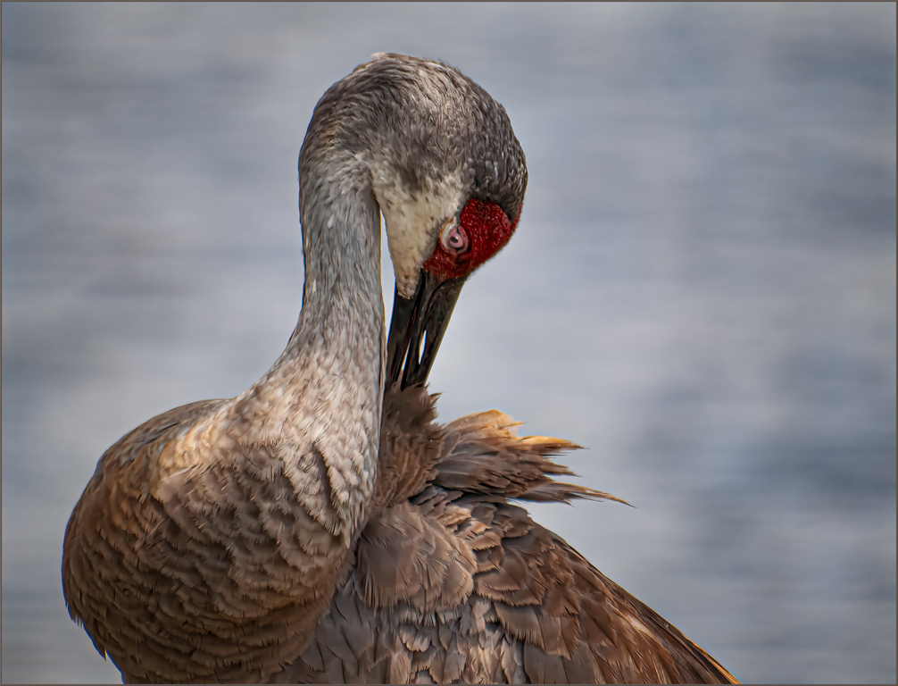
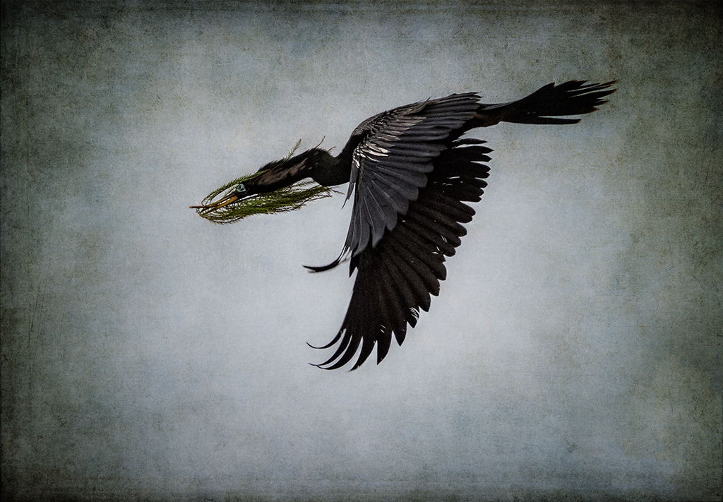
Helen, you did a superb job of selecting your bird god and placing him in the image. There is just enough detail and shadowing. You might want to remove the water ripples from the god. The placement of the hand gives a good line.I do feel that the grass is over sharpened. You could soften it with the clarity filter in the negative direction.Good job. |
Feb 12th |
| 34 |
Feb 17 |
Comment |
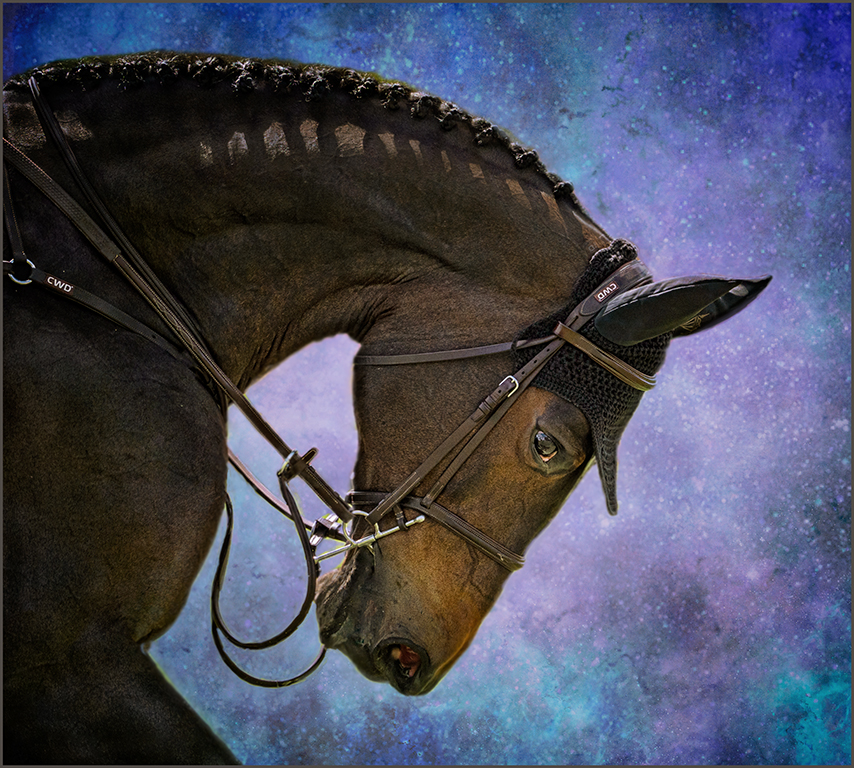
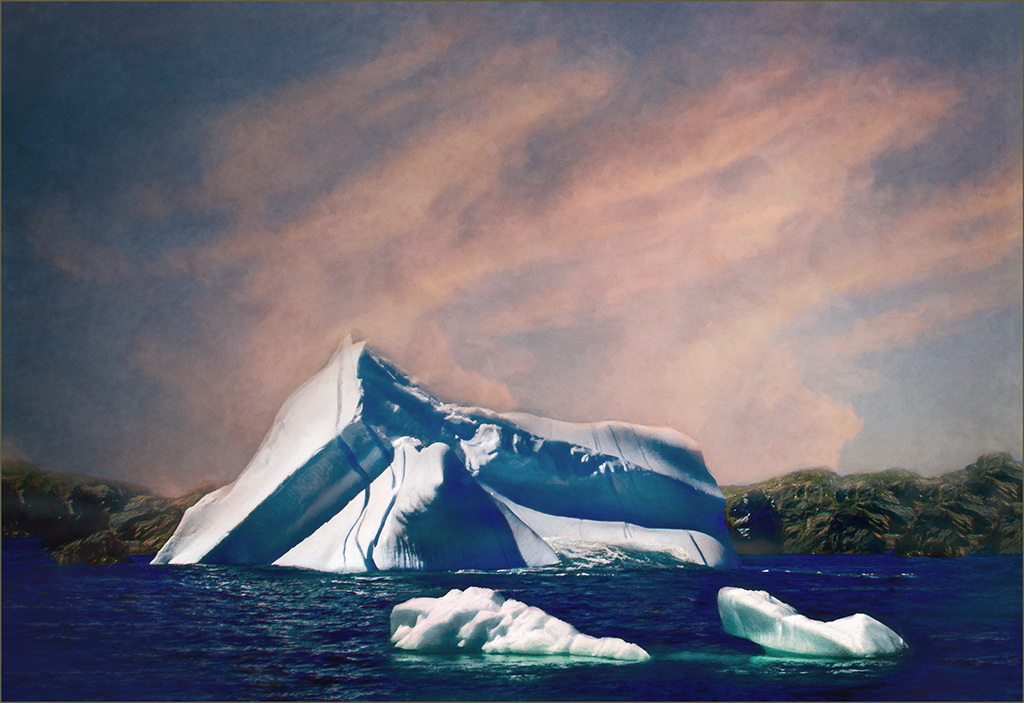
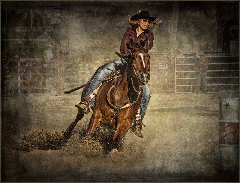
I feel that you have chosen the best of your images. The almost monotone color pallet works well. The texture lightens the dark area in the sky. The lighting on the horse is lovely. I do feel that it would be helpful to remove some of the texture from the horse's face.There is a bright area over the eye that should probably be toned down. There are also some sharpening lines on the front leg of the horse and across the back and a bright area around the eye on the left. Toning these down would make the image crisper.Personally, I like a little more room in front of an animal. It gives them room to move through the frame. |
Feb 12th |
| 34 |
Feb 17 |
Comment |
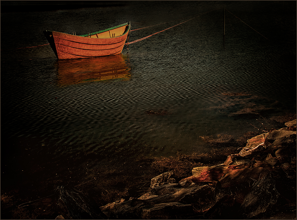
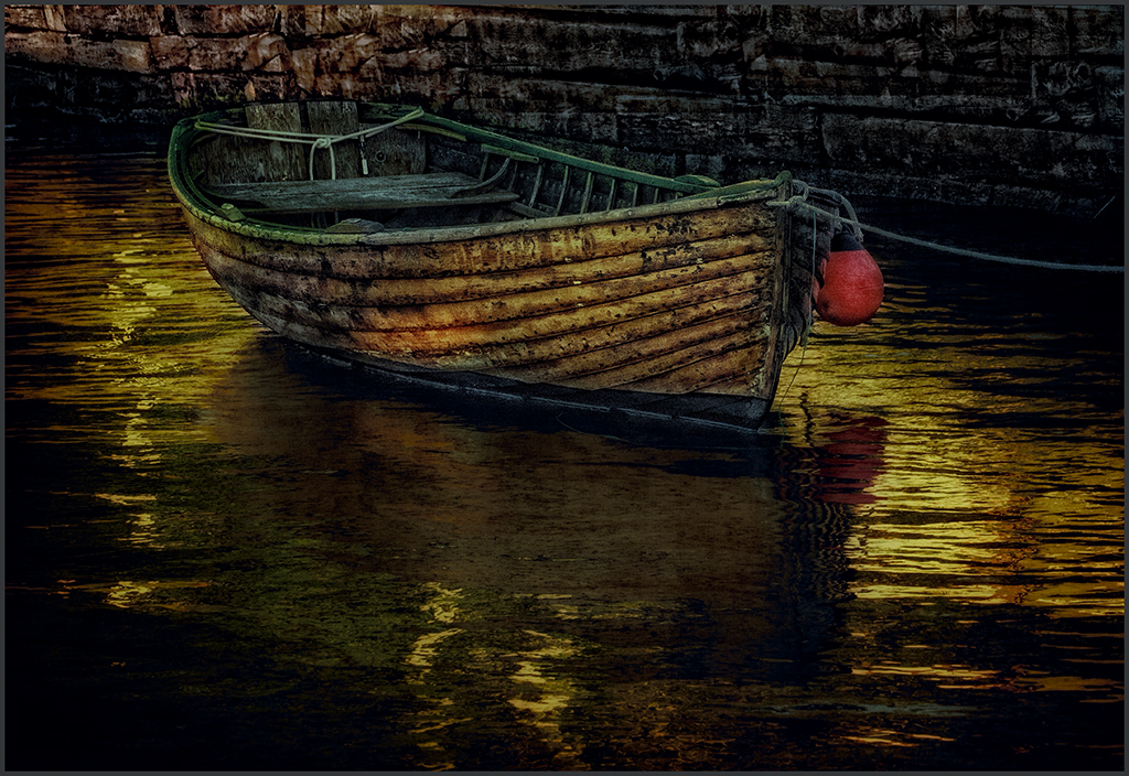
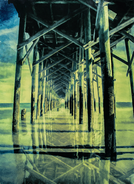
Excellent image, Georgianne. You did a wonderful job with the reflections.You selected a very nice old looking pier with lots of character for your image.I really like the look that you have created. It does seem to be a bit bright. Maybe Nik darken/lighten brightened it too much, and yellow always becomes blown out very easily. I created something similar to Steve's with the ACR filter. It seems to bring down the highlights somewhat. |
Feb 12th |
 |
| 34 |
Feb 17 |
Comment |
Thanks, Marie. I always love and am impressed with what you do with an image. |
Feb 5th |
8 comments - 1 reply for Group 34
|
| 69 |
Feb 17 |
Reply |
It is in PS creative cloud. don't know if it is any versions before that.Go to Filters in PS and click for drop down pallet-choose camera raw filter. You will get the same options you receive when opening a raw file. |
Feb 12th |
| 69 |
Feb 17 |
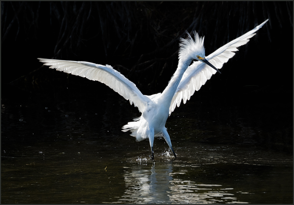
Reply |
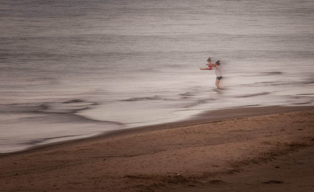
I feel that this is a far better image with the surf in the background, nice detail on the horse and nice shadows in the sand. One foot up on the horse is definitely a plus. |
Feb 12th |
| 69 |
Feb 17 |
Comment |
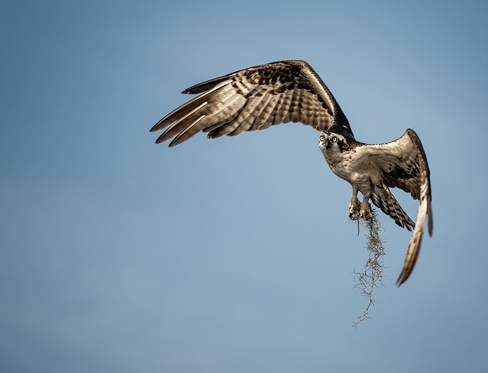
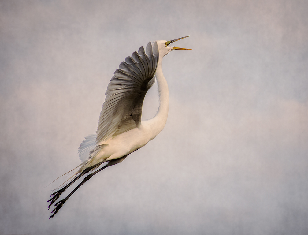
Rob, nice stop action on the birds.It is nice that each bird is in a different form of flight.The grass adds nice texture to the image.However, there doesn't seem be be a clear focal point, just some birds flying. It is usually better to focus on one or two birds. There seems to be a part of your description missing. |
Feb 12th |
| 69 |
Feb 17 |
Comment |
Brenda, nice image taken in harsh light. I love the layers and colors. In my opinion, the image is somewhat too bright , and th colors are washed out. The ACR filter works really well after the fact to improve an image. I used it to bring out more detail. See what you think. |
Feb 12th |
 |
| 69 |
Feb 17 |
Comment |
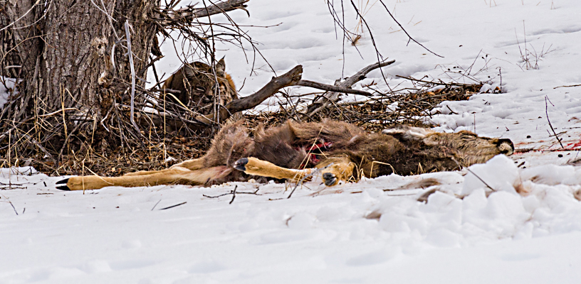
Chuck, I feel that your image would have better and more impact if cropped. As it is, there is too much around the lynx and deer. Your subject is the lynx and deer not all that snow and tree. The blood around the deer and evidence of scuffle in the snow is missed with so much background. I used ACR filter to bring out some of the detail in the image, a crop, and curves layer to bring some wow to the image. |
Feb 12th |
 |
| 69 |
Feb 17 |
Reply |
The birds were still building the nest last week. |
Feb 12th |
| 69 |
Feb 17 |
Reply |
Thanks, when I first looked at this image, I thought it was not usable. But I found that there was enough detail in the file to do what I needed to bring out the bird. |
Feb 12th |
| 69 |
Feb 17 |
Comment |
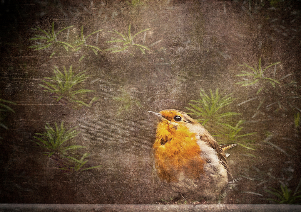
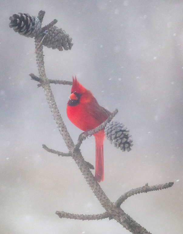
Beautiful snow image and the red bird is the icing on the cake. In my opinion, the curve of the branch is a beautiful leading line-straight to the bird. The branch that the bird is perched on and pine cones above and below provide a nice frame for the bird. I used the dehaze filter in the ACR filter to bring the bird into a bit more detail. |
Feb 12th |
 |
| 69 |
Feb 17 |
Comment |
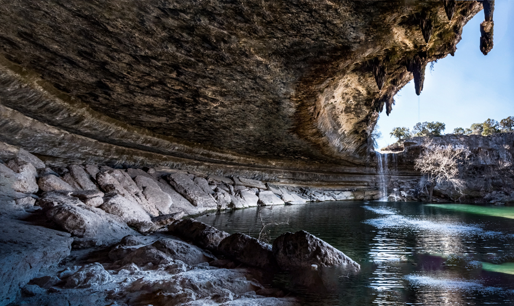
Welcome to our group, Dean. we are so happy to have you as a participating member. Your image is beautiful I can see that at different times of the day the lighting could change and be more beautiful. It has nice leading lines with the curve around the pool. The detail in the overhang also adds interest. I used the ACR filter to increase the contrast and a curves layer and burn/dodge layer to help open up the details. |
Feb 12th |
 |
| 69 |
Feb 17 |
Comment |
Nice capture Mervyn. However, I feel that it is a bit stagnant. The horses are not doing anything-just standing there. In my opinion, some kind of action is needed. |
Feb 12th |
6 comments - 4 replies for Group 69
|
14 comments - 5 replies Total
|