|
| Group |
Round |
C/R |
Comment |
Date |
Image |
| 34 |
May 18 |
Reply |
Hi Steve,
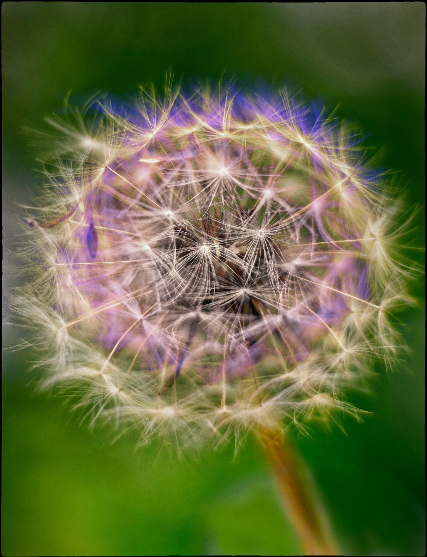
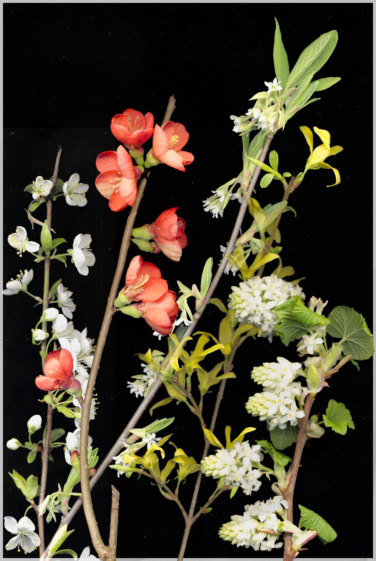
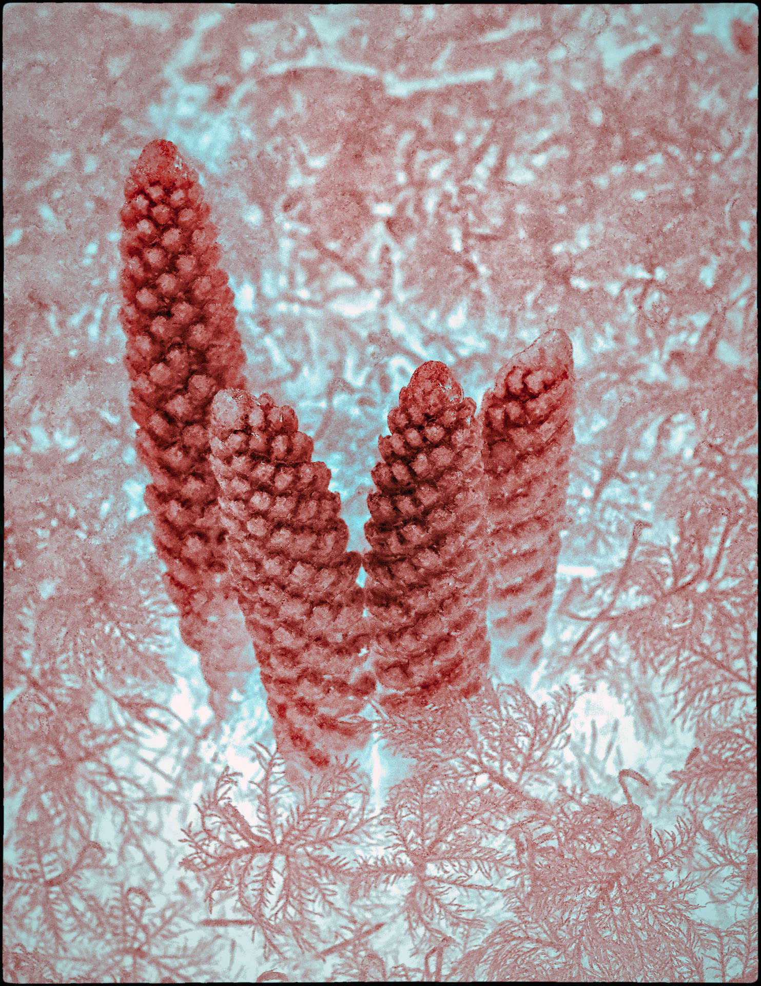
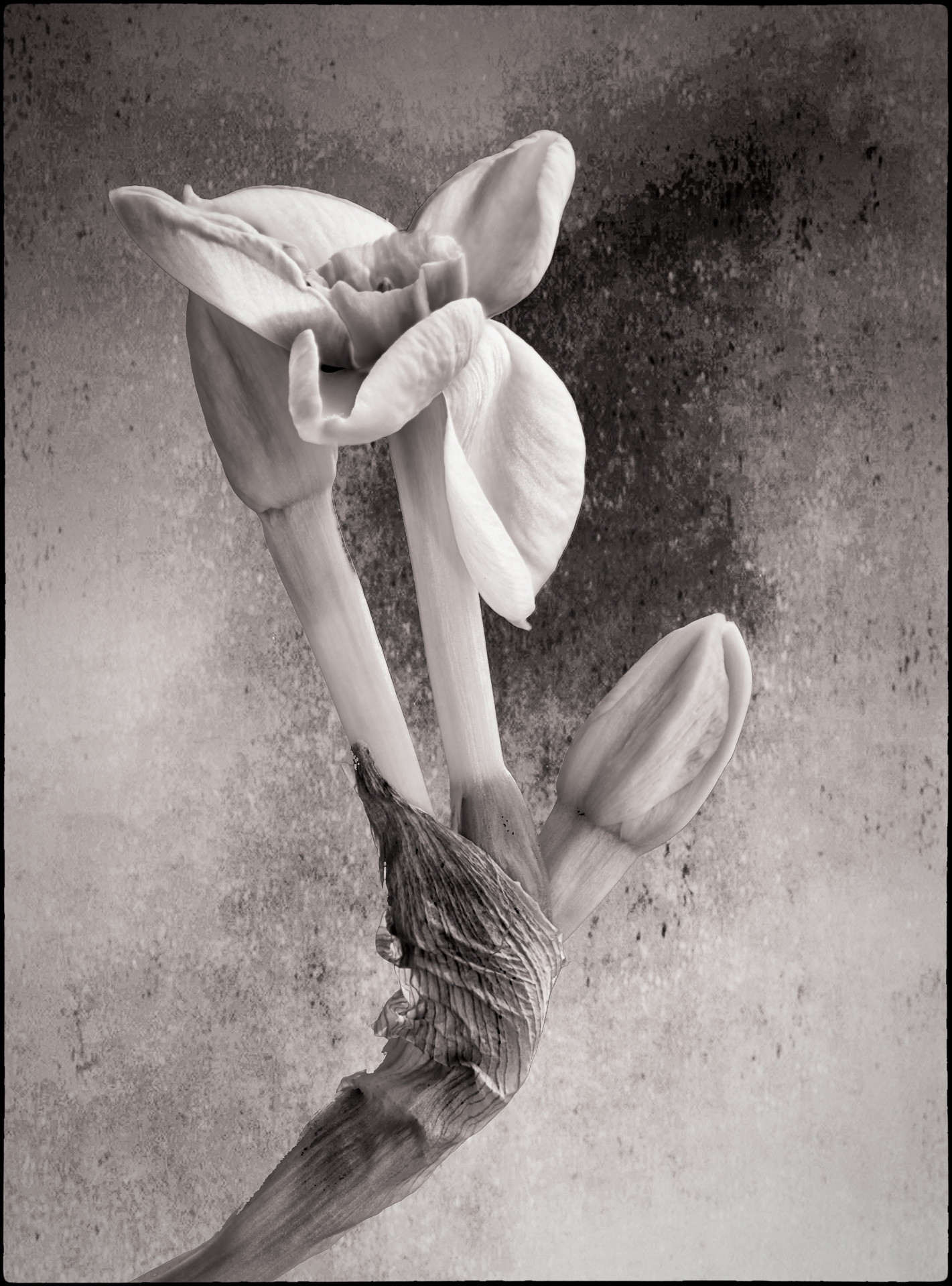
i was inspired by seeing and hearing about the scanner art of Deb Stoner; she is based near Portland Oregon. See www.DebStoner.com. Yes, I just lay the item on the scanner, suspend a black card above it and turn off the room lights. Nonetheless, the background comes out gray with dust spots and you have to clean that up in Photoshop. The "Select/Subject" feature of PS-CC does a good job of separating the object from the background. I used the free Nik Color Effects Pro 4 plugin to make the stroke part part way through the process and then added more scanner images on top. Deb does her work all at once; I scanned each twig separately and then added them as layers in PS, arranging as needed until I liked the composition. |
May 15th |
| 34 |
May 18 |
Comment |
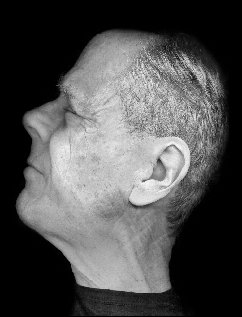
He might give me nightmares! I do think the composition would be stronger if you kept the dark background that starts above his right shoulder and extends on a strong diagonal towards the upper left (but of course eliminating the gold detail above his left arm). Also, his hairline does look like he has a wig on; perhaps blur that a bit? |
May 11th |
| 34 |
May 18 |
Comment |
I too would like something more to focus on though I am not sue it would be a Goth face..... Actually, I like best your Twirl (original 3) version because of the strong bands of green and yellow. |
May 11th |
| 34 |
May 18 |
Comment |
The main man's shadow is almost consistent with the strong "spotlight" coming up from bottom center. So that doesn't bother me. It is more the shadow of the tree on the ground unless you want to suppose a strong overhead spotlight. Perhaps too it is that the lighting of the tree (yellow) seems so uniform; I would expect more gradation. |
May 11th |
| 34 |
May 18 |
Comment |
Well done. The only change I might suggest is to dodge the central shadows a bit. |
May 10th |
| 34 |
May 18 |
Comment |
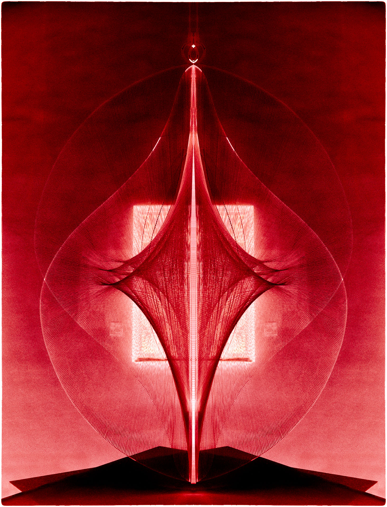
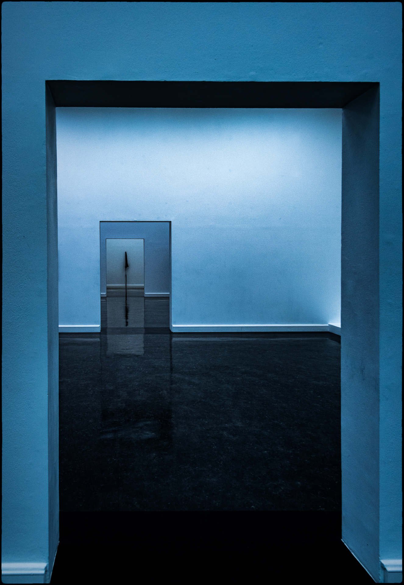
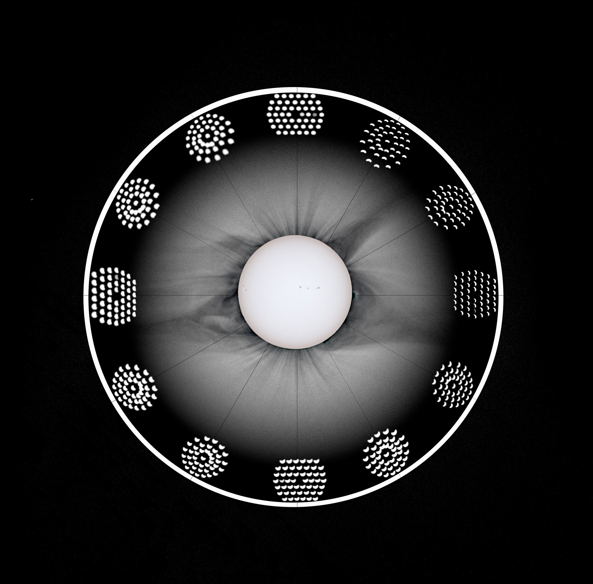
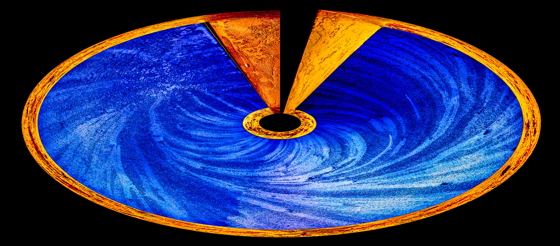
Your original is interesting in itself and your final result a neat abstract. But beyond being an exercise in geometry, I keep wishing for more contrast or color or a focal point. I started with your final, added a curves adjustment for more contrast, added two copies of the original in Hue and Overlay blend modes, then more Curves adjustment, then a copy of the final in Luminosity mode, and then stamping up, applied Nik's Color Effects Pro 4 (tonal contrast, detail enhancer, sky and vignette). |
May 10th |
 |
5 comments - 1 reply for Group 34
|
5 comments - 1 reply Total
|