|
| Group |
Round |
C/R |
Comment |
Date |
Image |
| 34 |
May 24 |
Reply |
Hi Gunter
Sorry for any confusion. I agree that the treatment should be used to please the maker, but I feel we see many images which seem to promote the software, rather than improving the image.
I think the end result should always be the bottom line. |
May 23rd |
| 34 |
May 24 |
Comment |
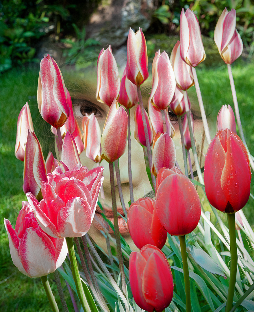
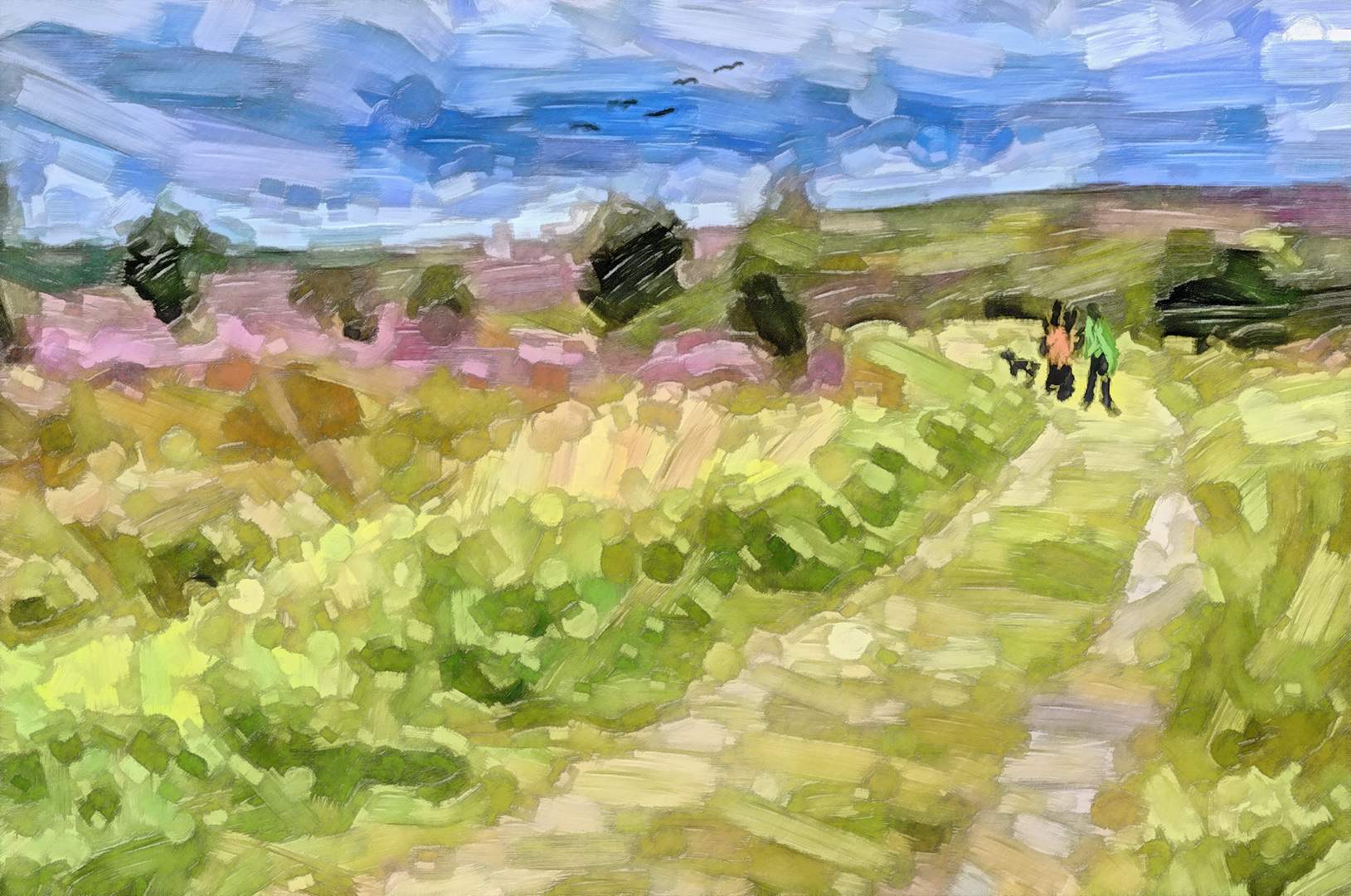
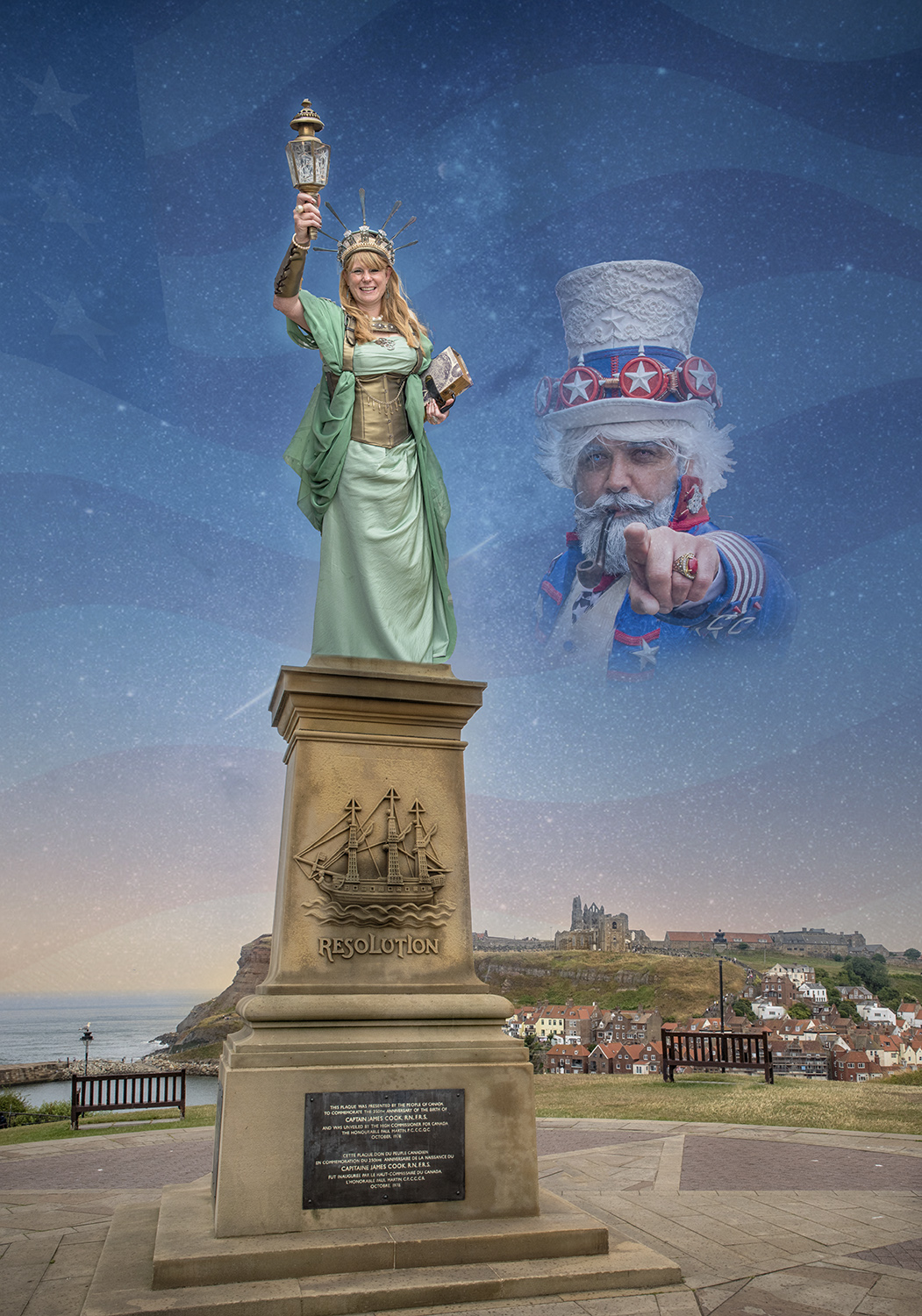
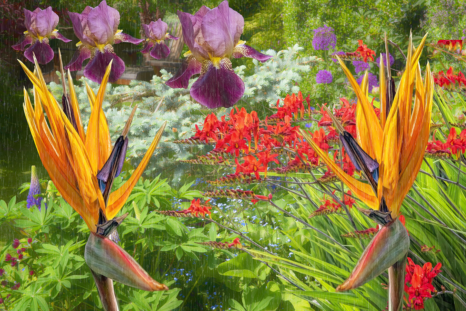
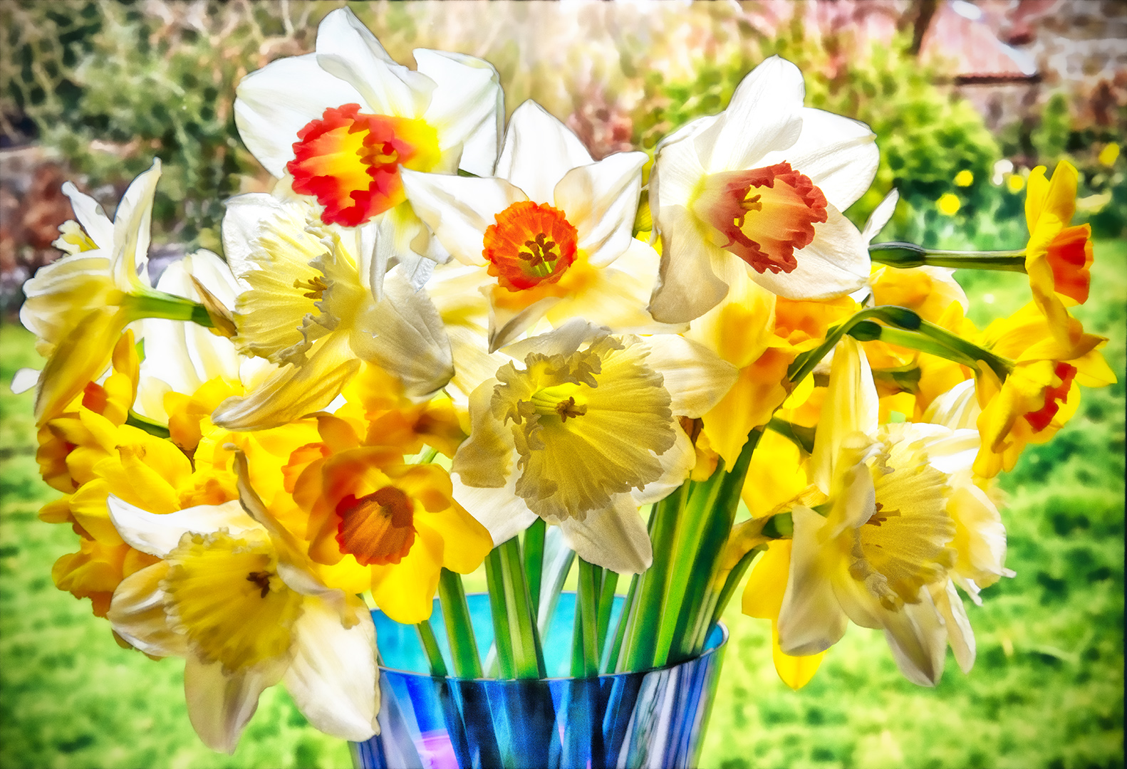
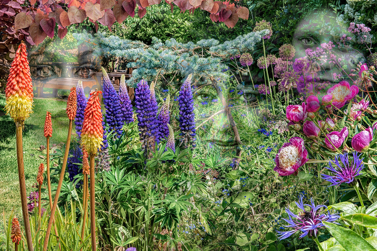
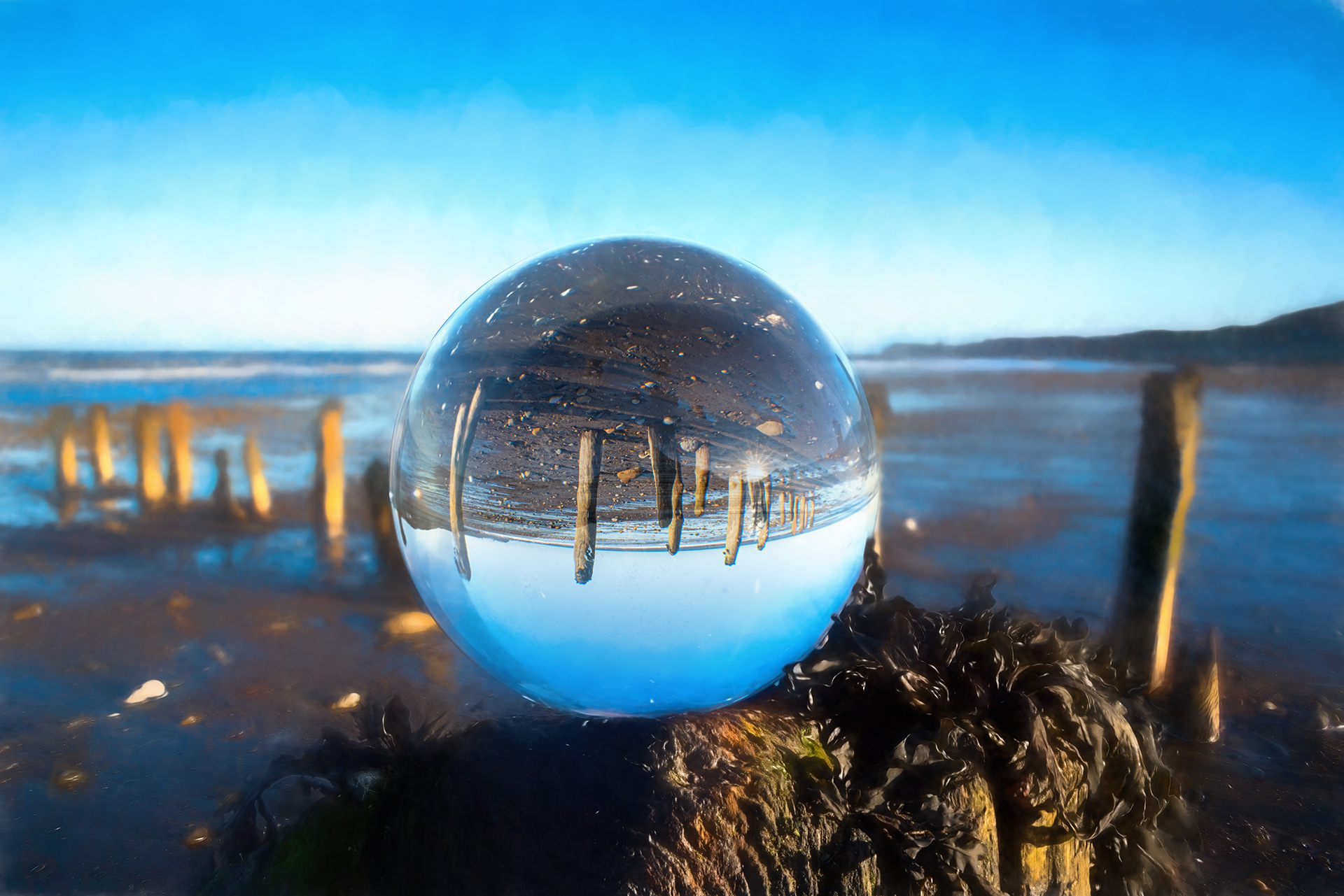
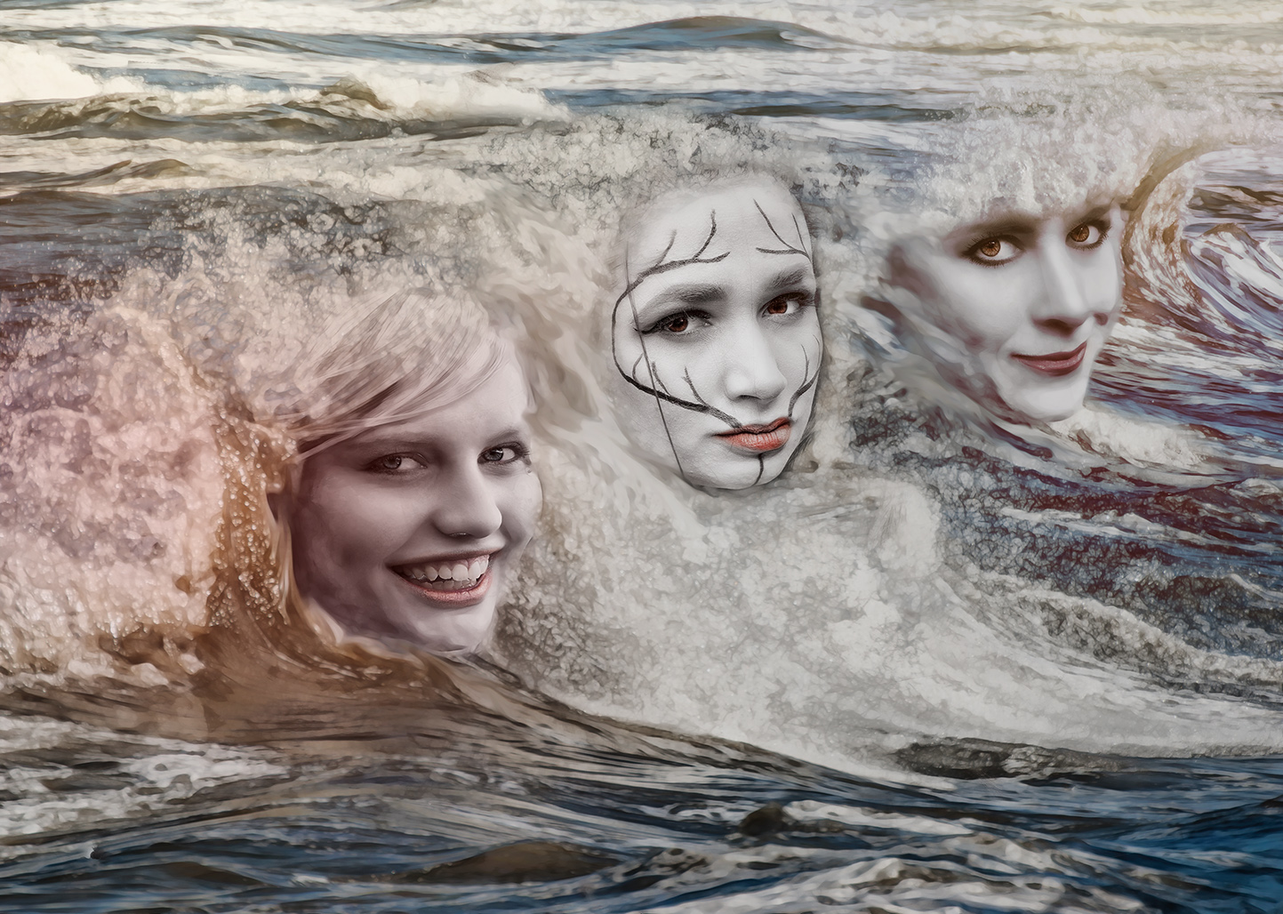
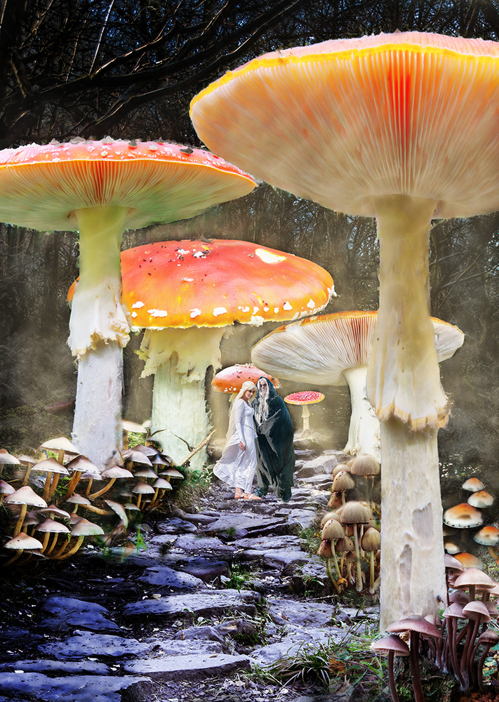
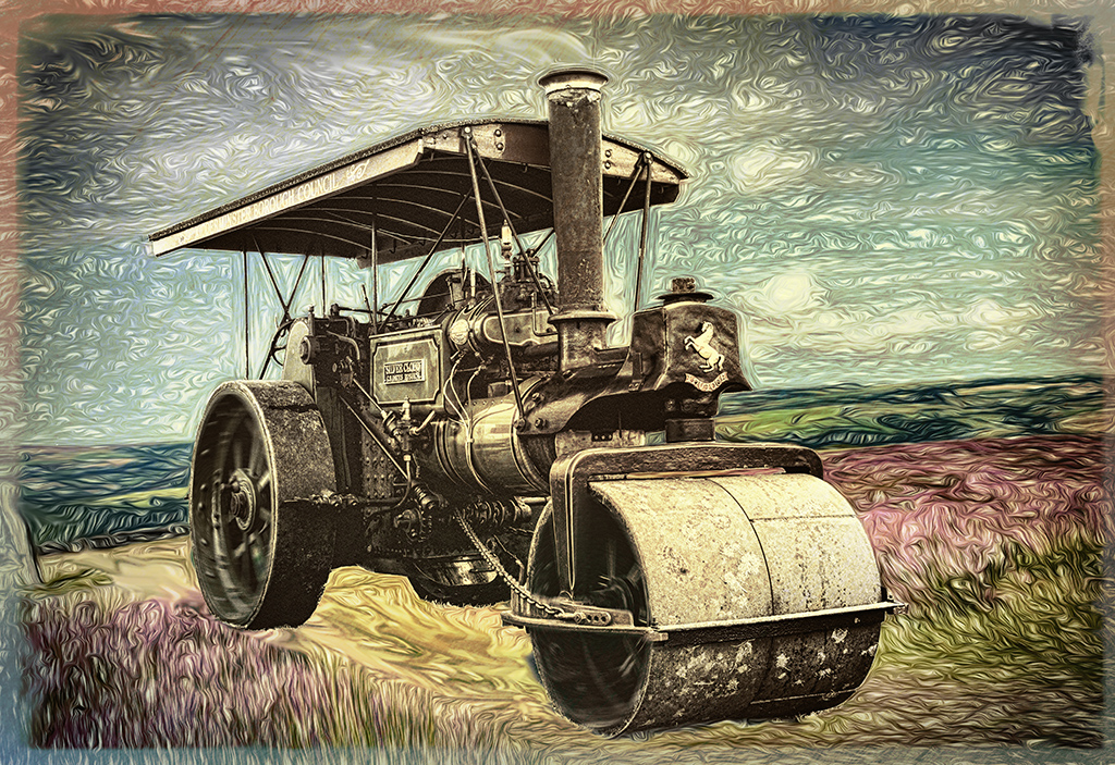
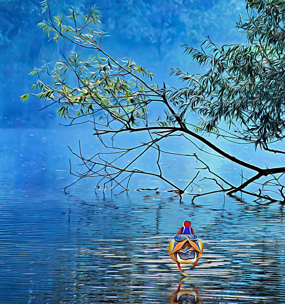
Another fun image. Well done.
I particularly like Original 2 - it was just asking for an image like this!
I like the composition and the walking on water is what makes it.
To make it look more realistic I've added a reflection for the duck, (Flaming Pear Flood 2), so it's more tied into the background. |
May 16th |
 |
| 34 |
May 24 |
Comment |
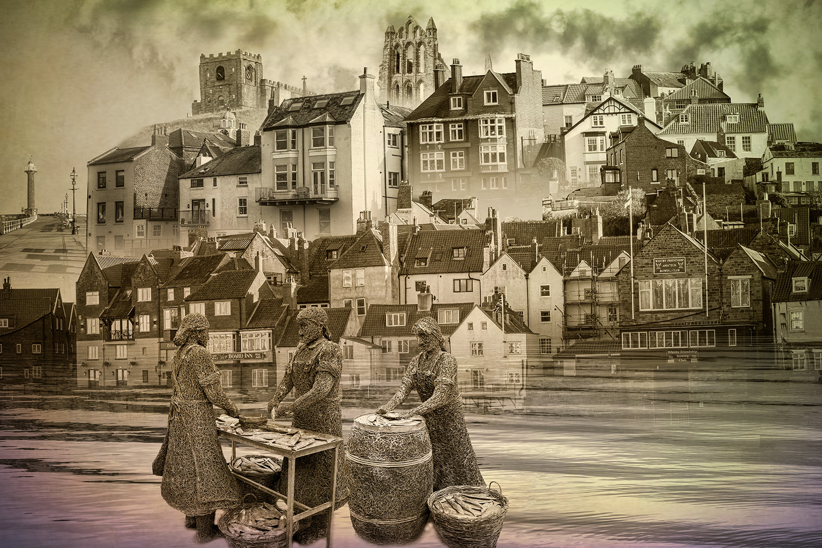
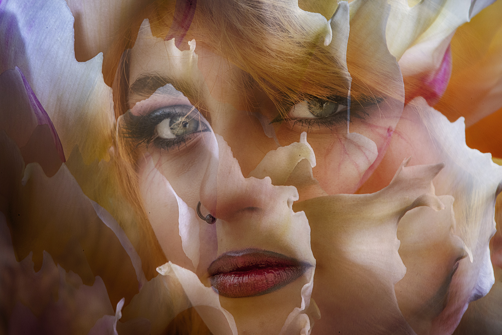
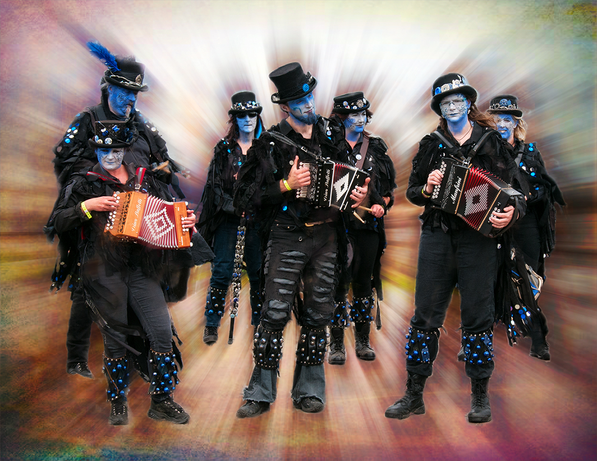
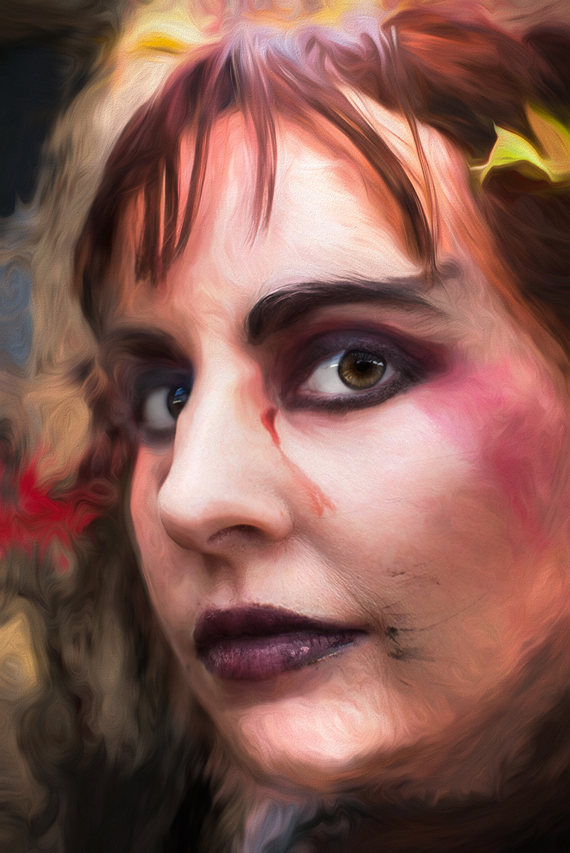
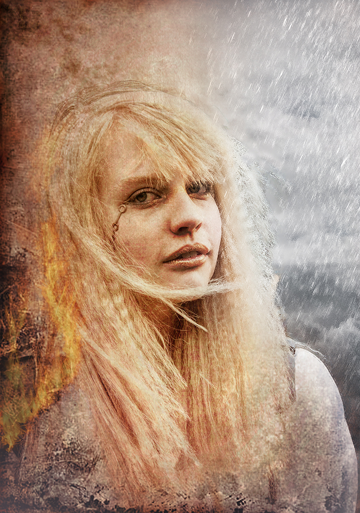
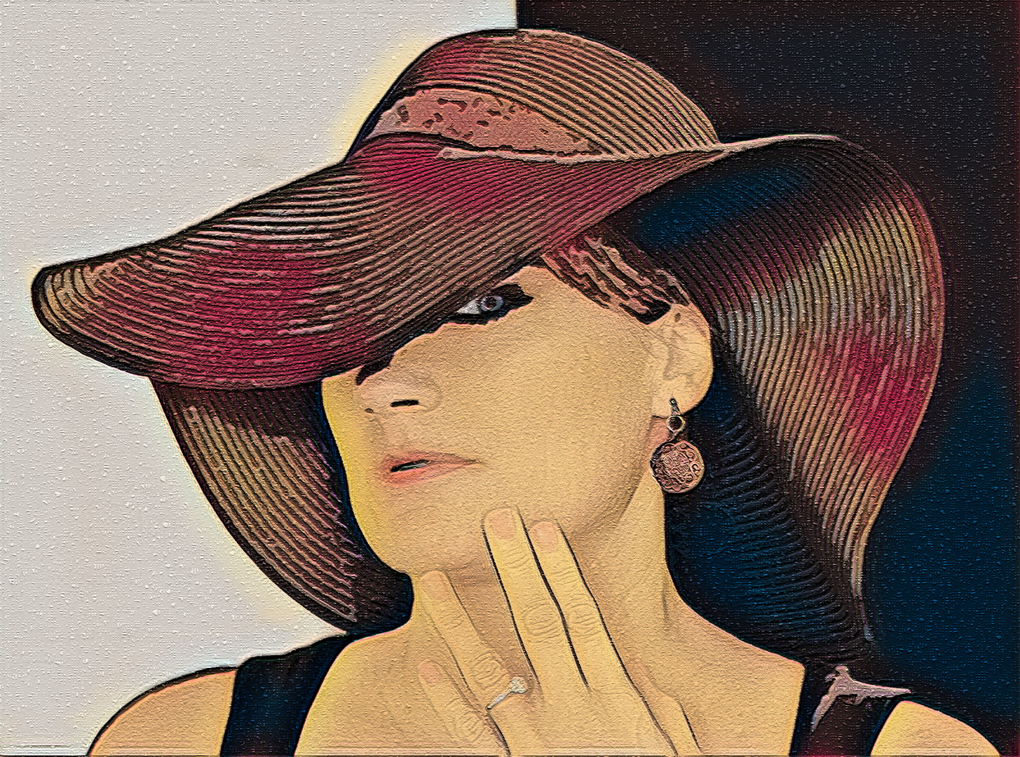
I like this. Your use of the PS filters is impressive and a you've put in a lot of work to produce an excellenbt image.
I couldn't resist playing with it. I put original 3 over original 1. I used Portrait Pro on original 1 to change the lighting, and removed some of the heavy lines around her hand in original 3, and reduced the opacity to bring back some of original 1. Stamped up and used Topaz Studio 2 Egyptian Sand filter. Finally I used Mosaic Tiles in PS.
Thanks for the ingredients. I enjoyed playing |
May 16th |
 |
| 34 |
May 24 |
Comment |
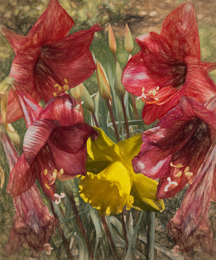
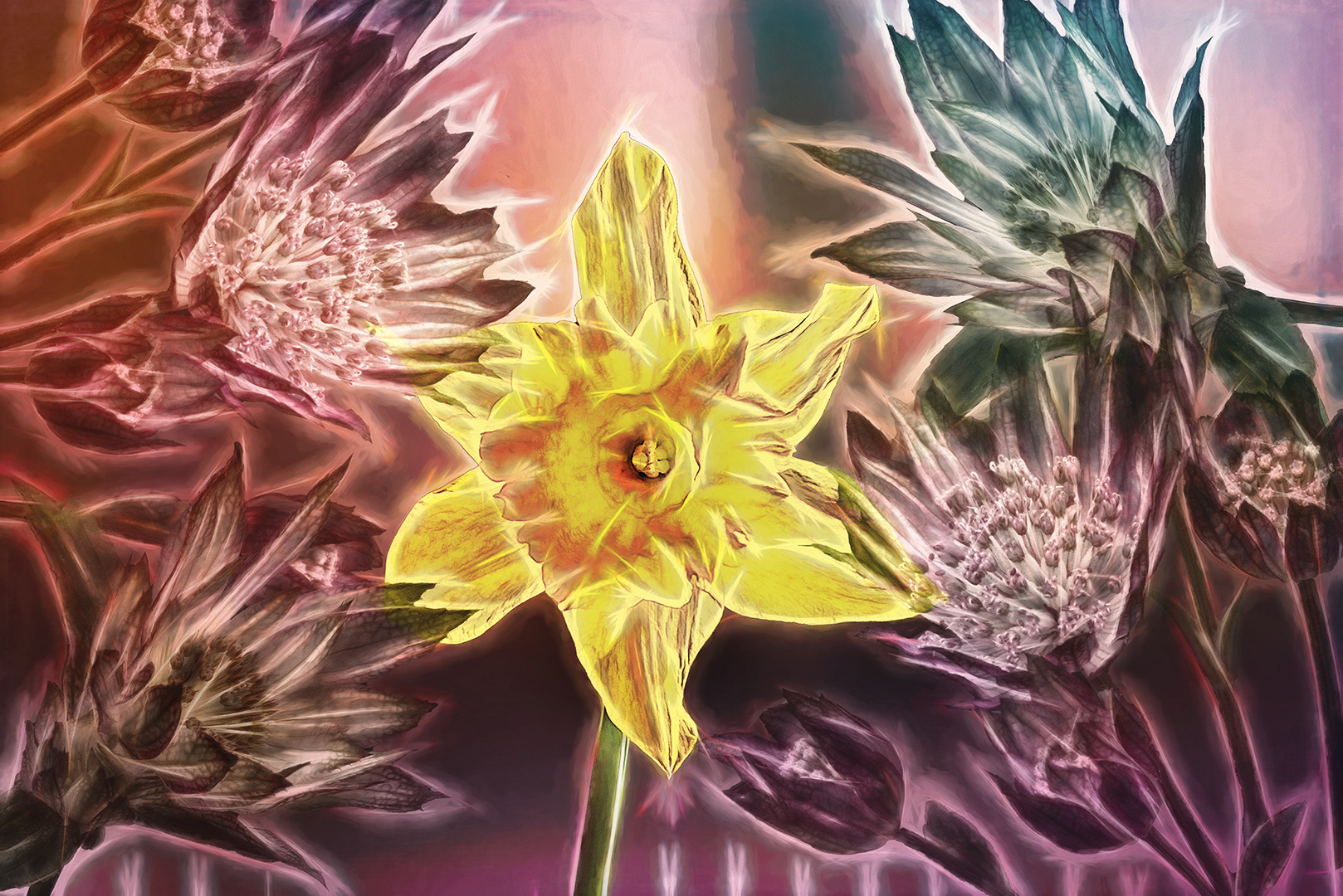
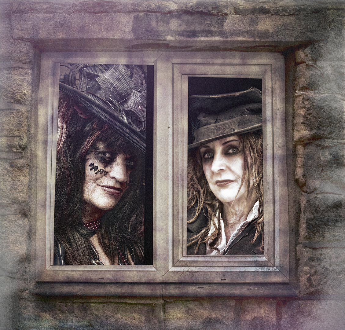
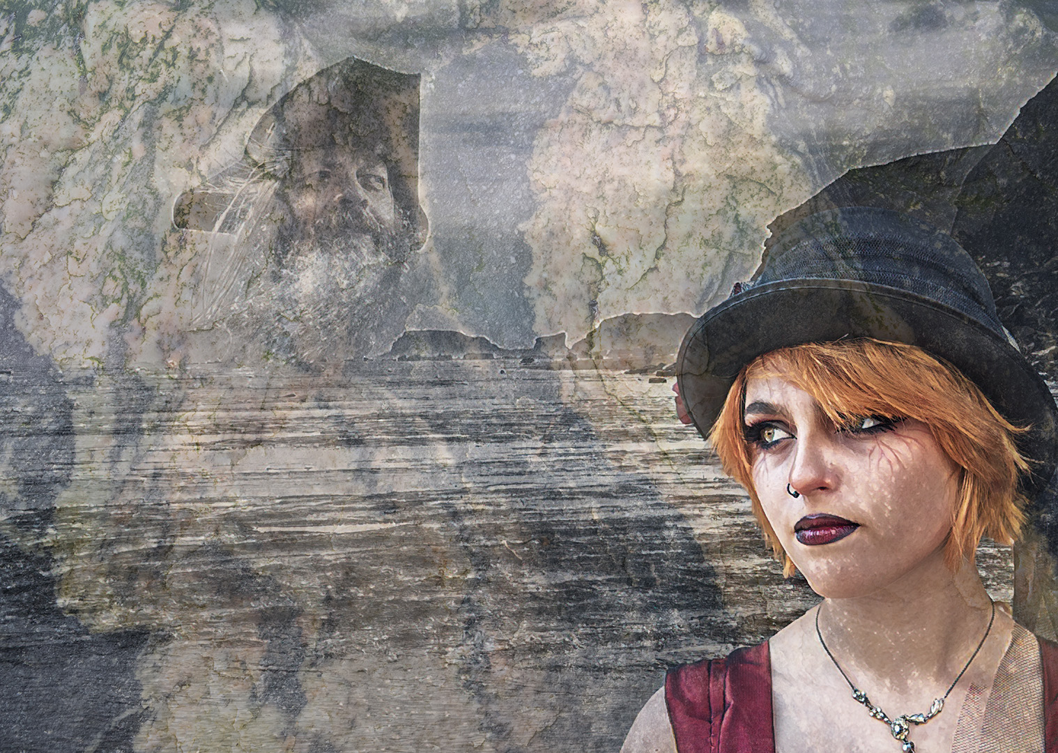
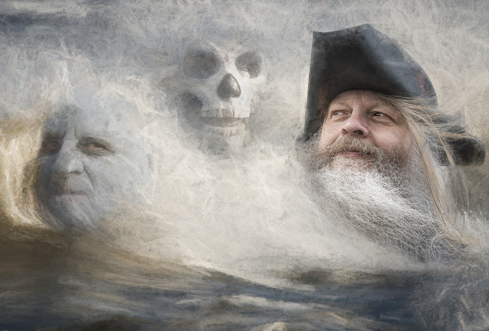
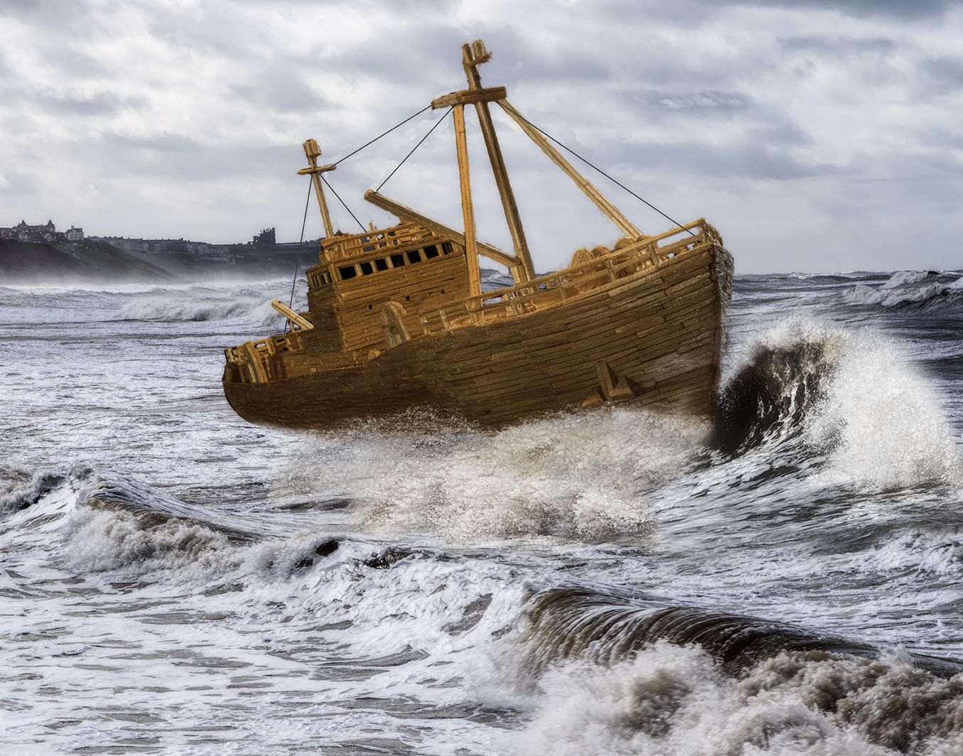
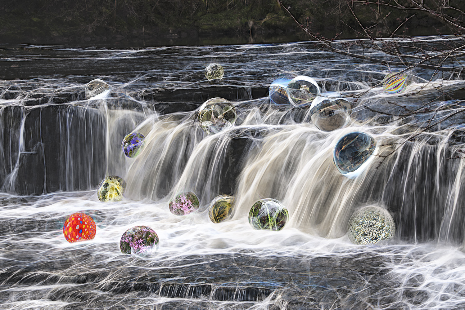
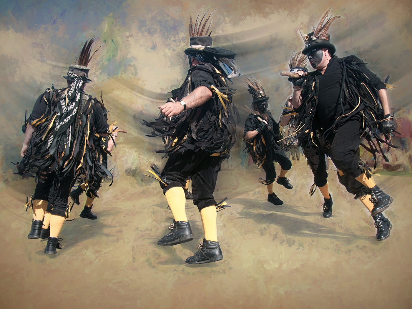
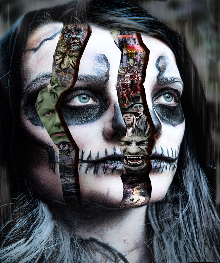
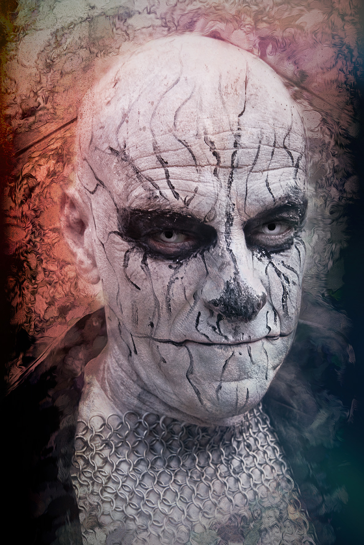
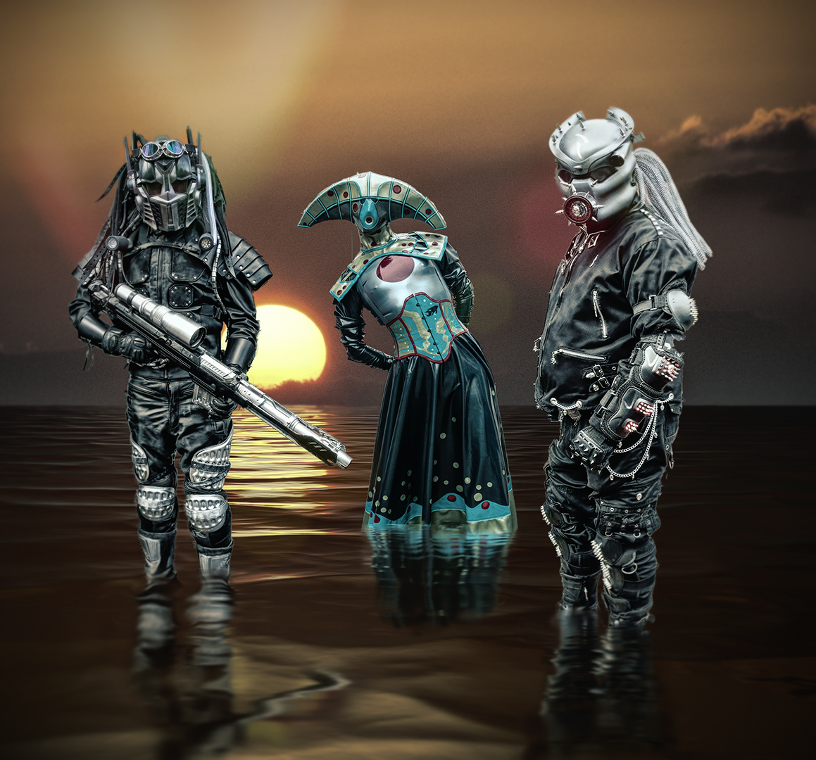
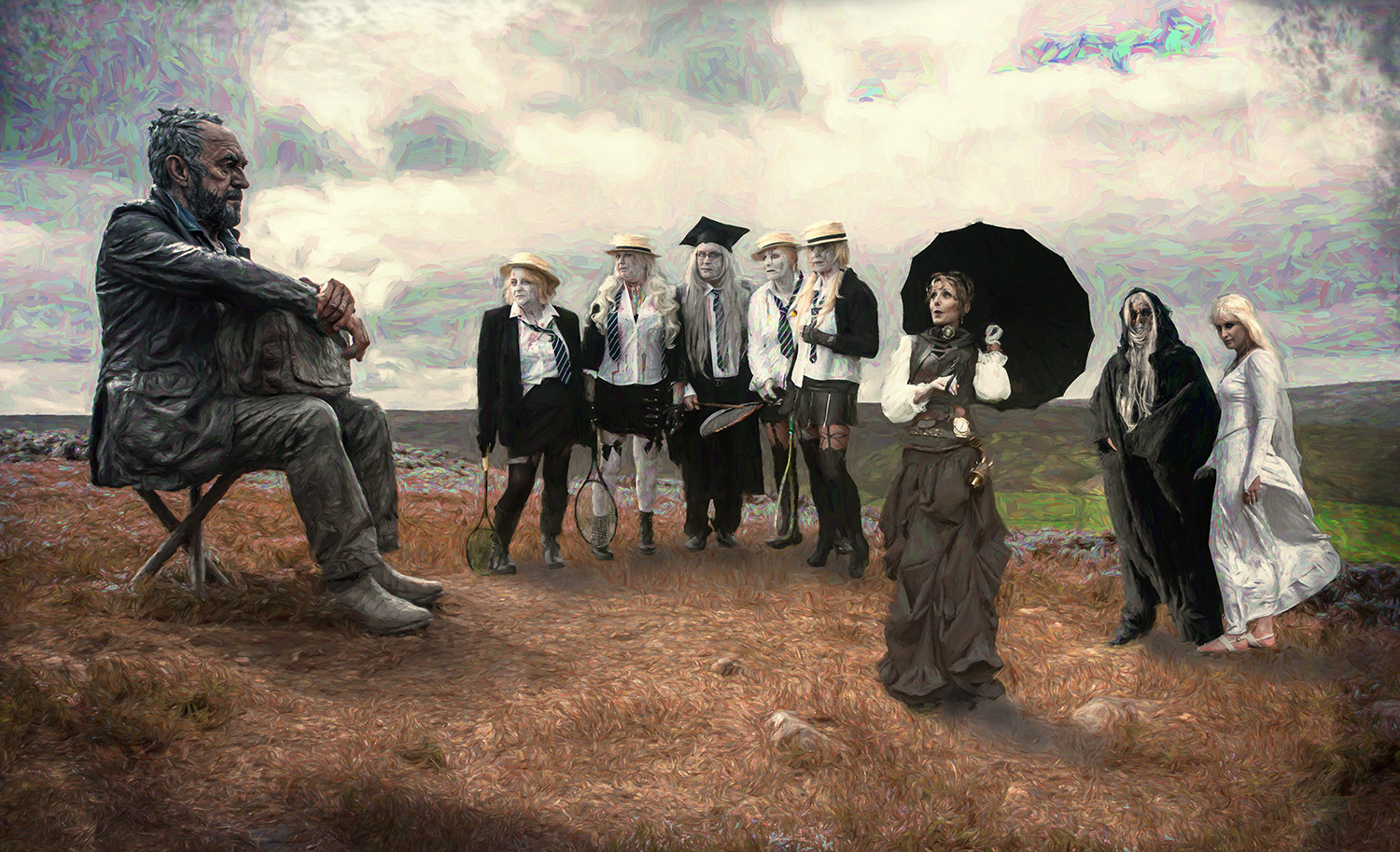
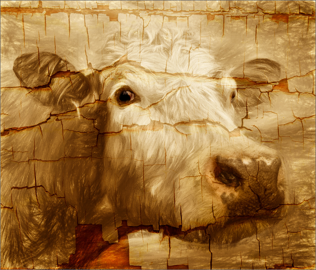
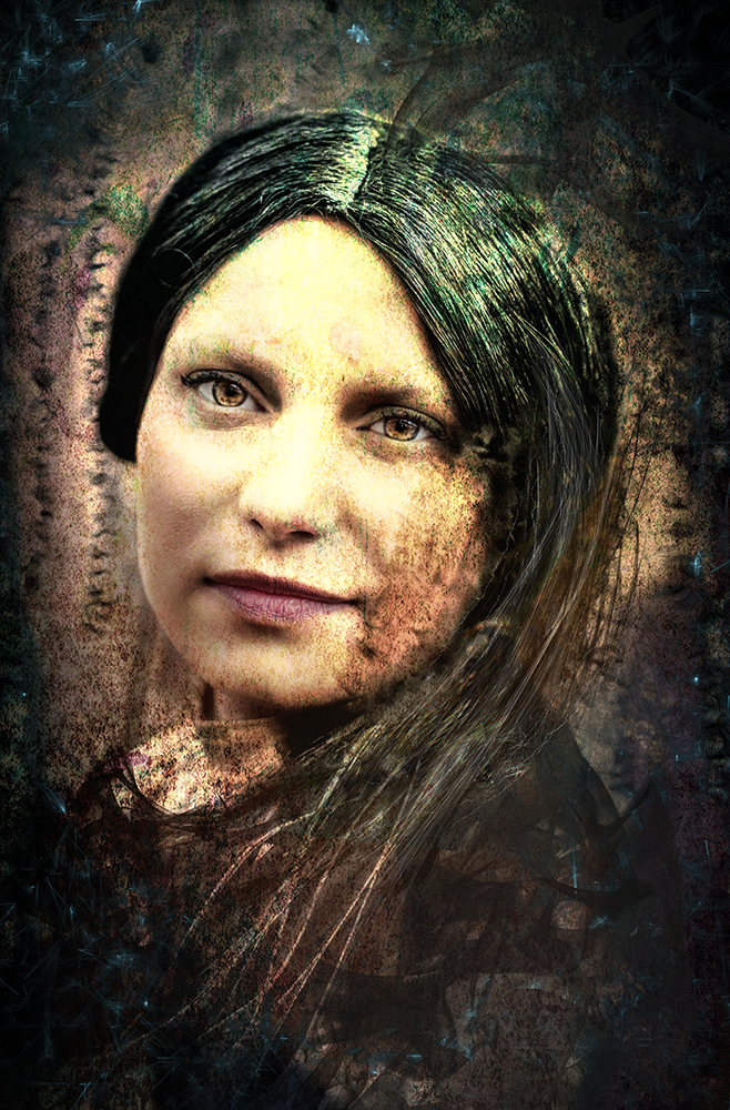
Amazing what can be generated from a single shape! The final image is intriguing.
While realising that you've worked the image well and put some work in, I feel that the image is more about what the software can do, rather than the creativity of the author. What you've produced bears no resemblance of the original, so maybe it's more abot the process than the image - the original is irrelevant.
Congratulations on the final image. I agree with Jan that a border would help define it in the page's black background, or modify the parts that 'touch' the border, so the elements blend into the background. |
May 16th |
| 34 |
May 24 |
Comment |
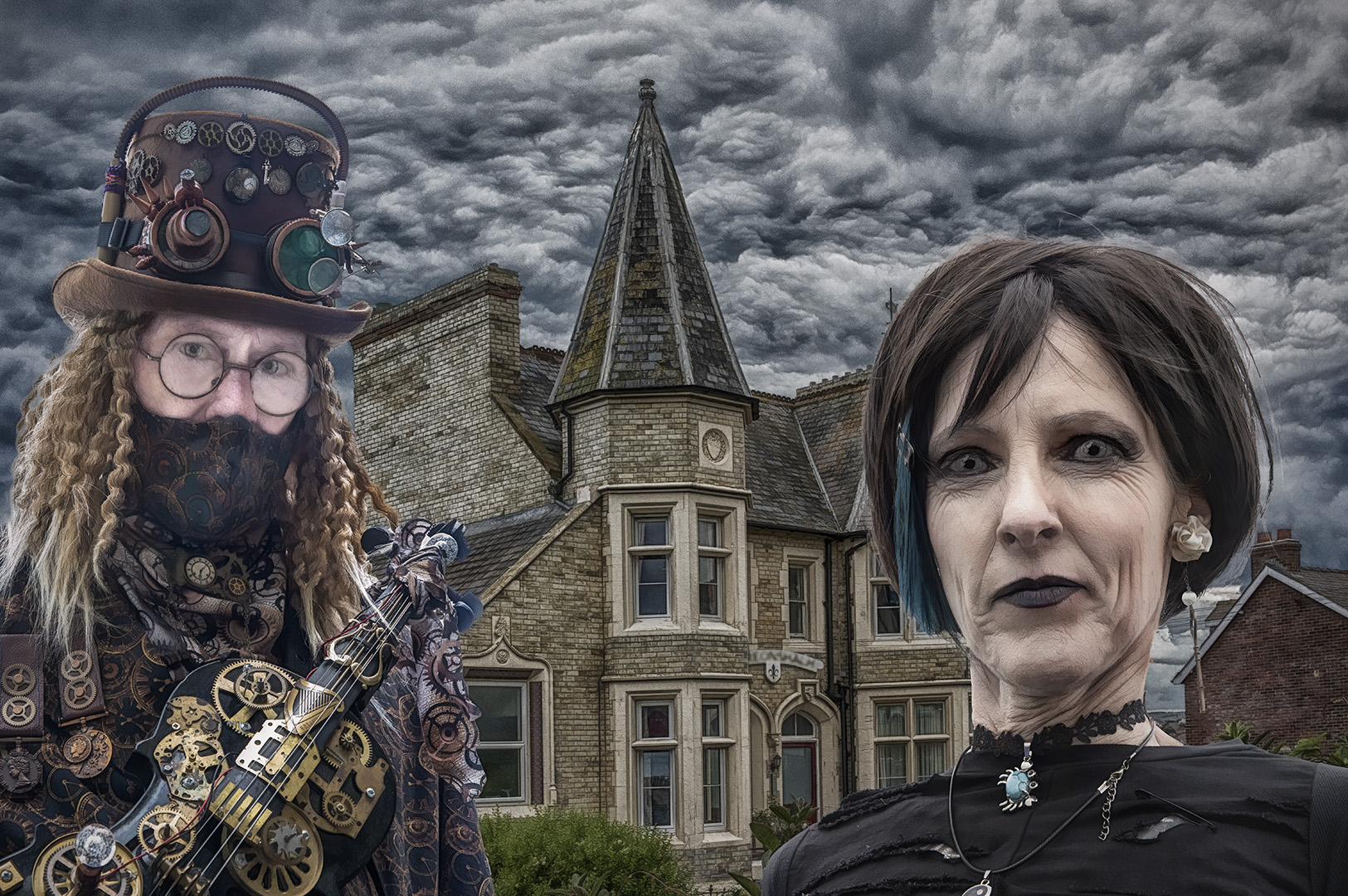
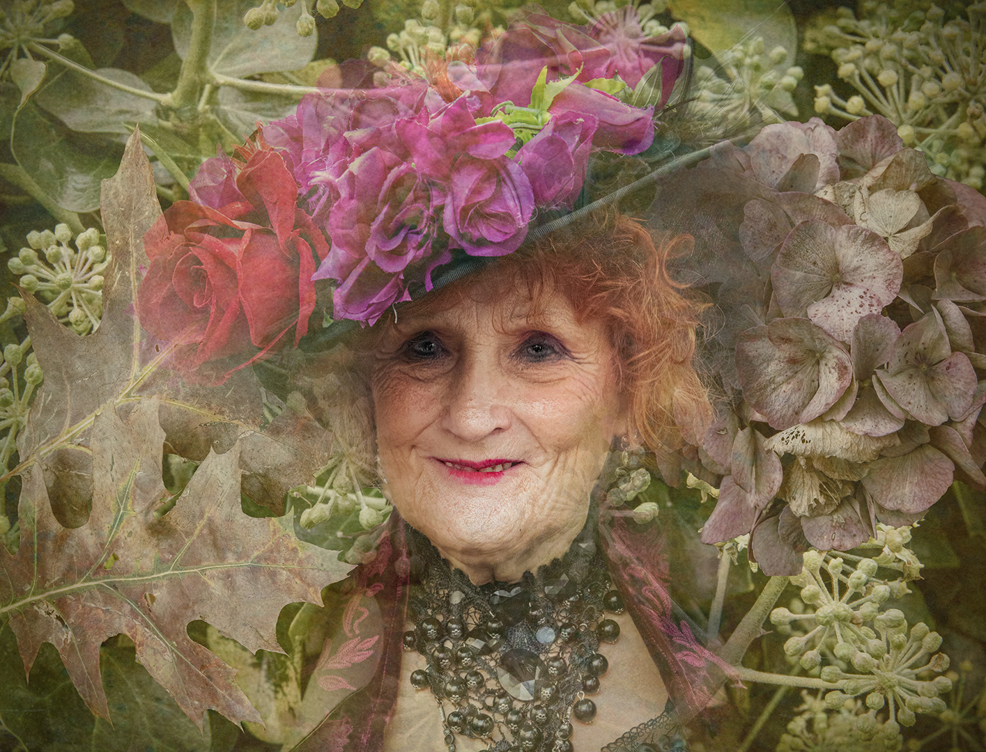
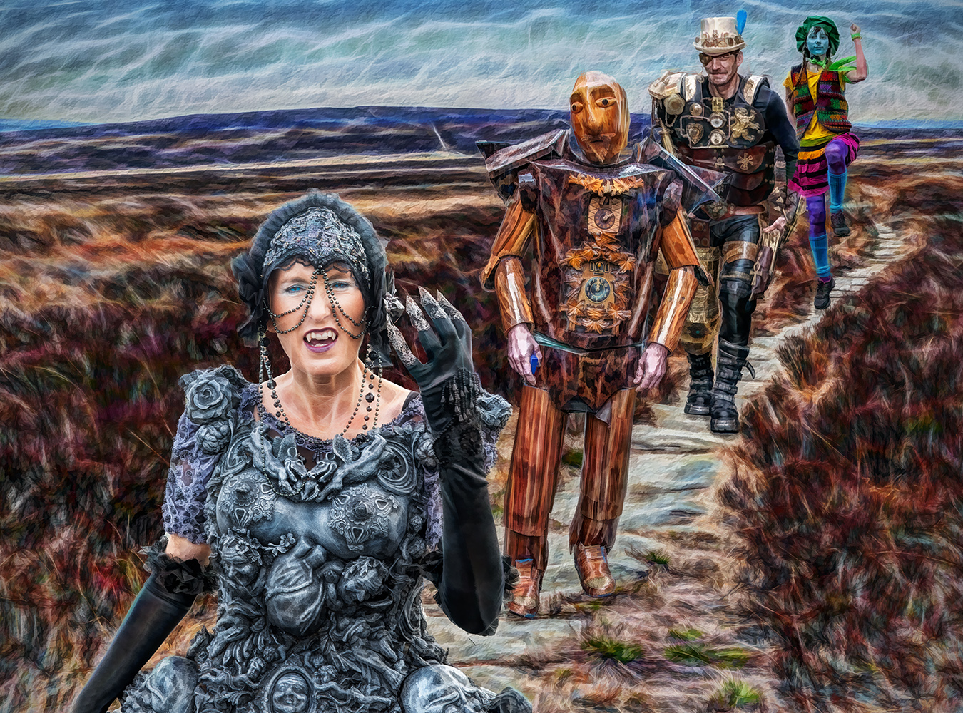
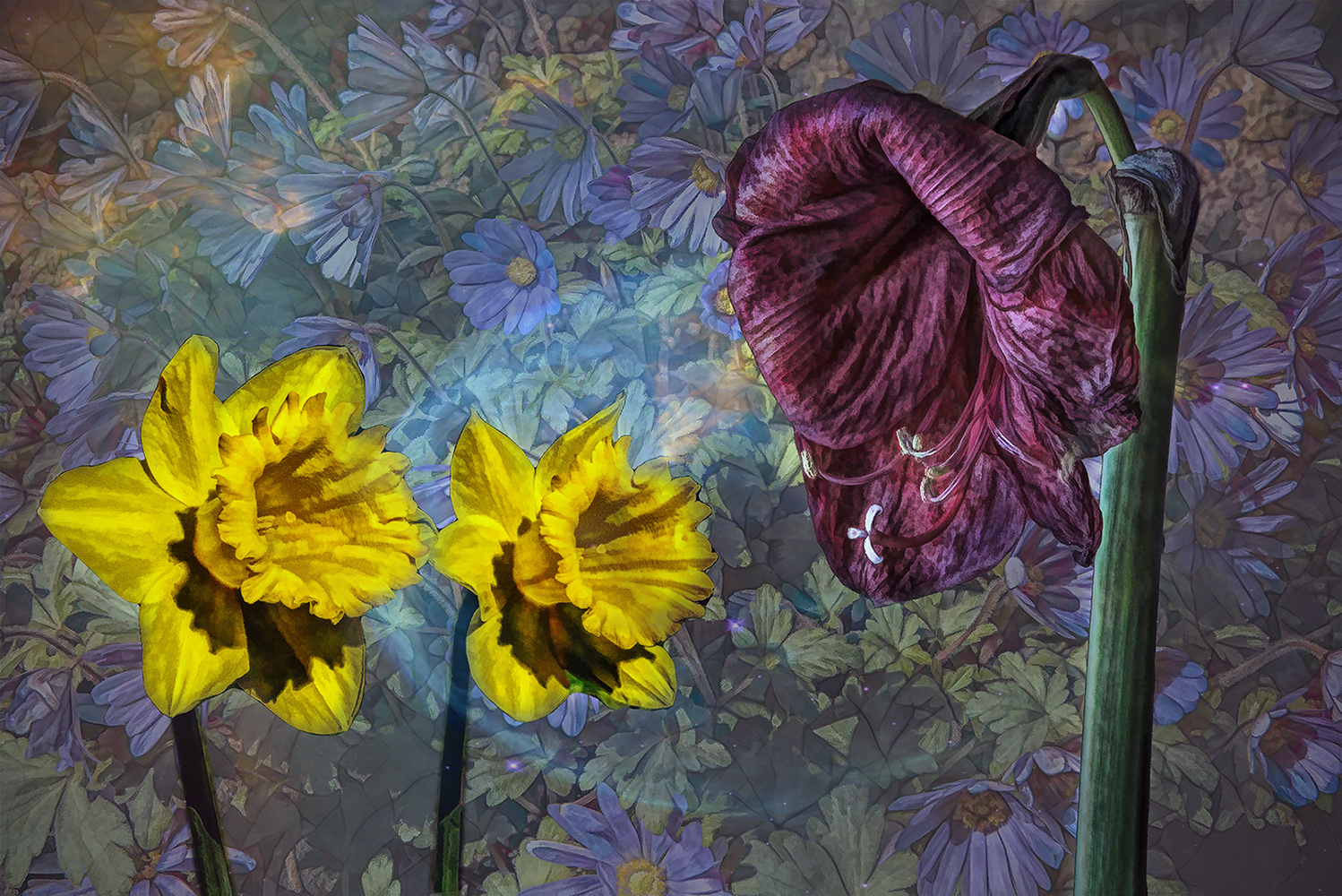
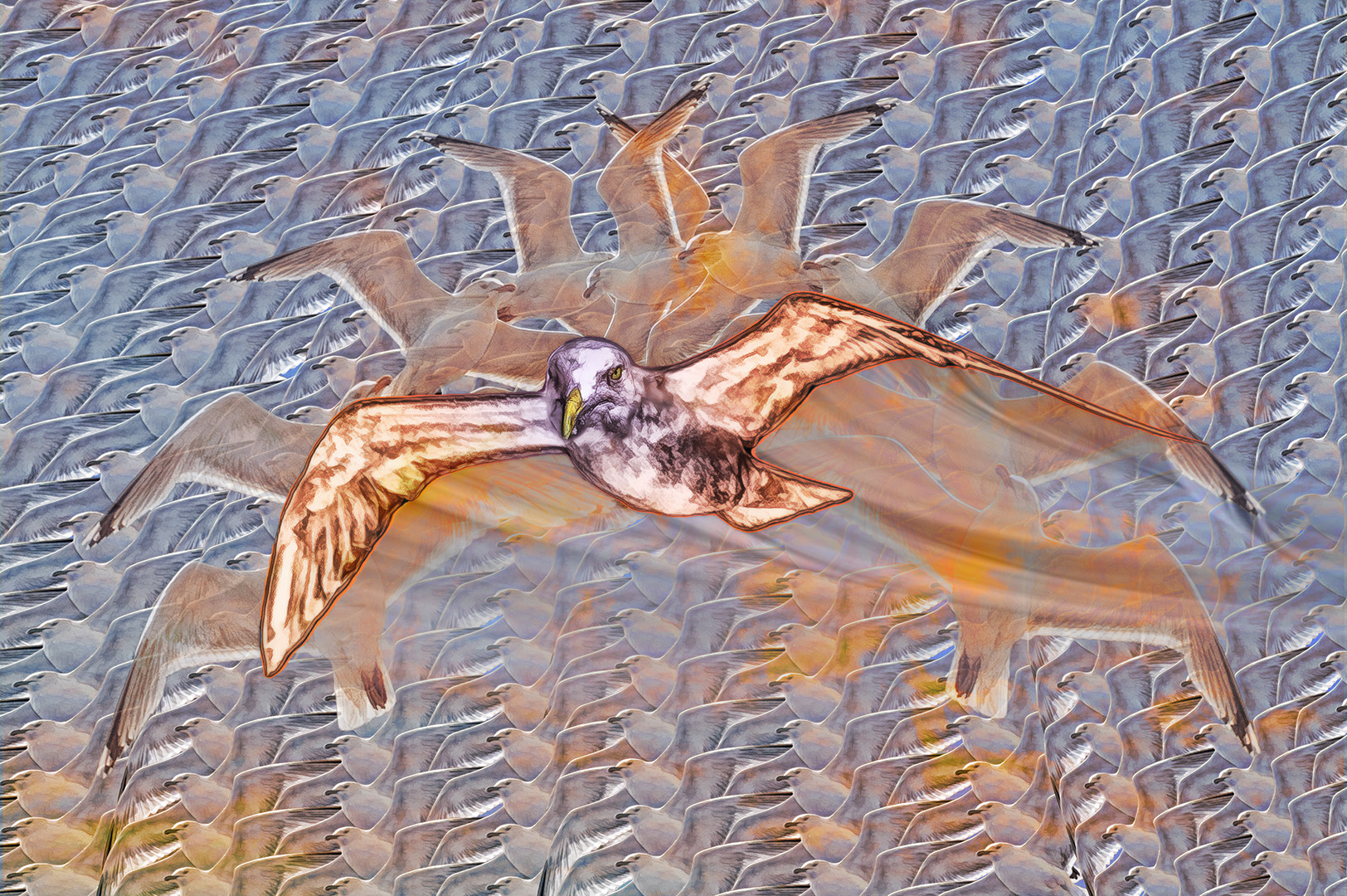
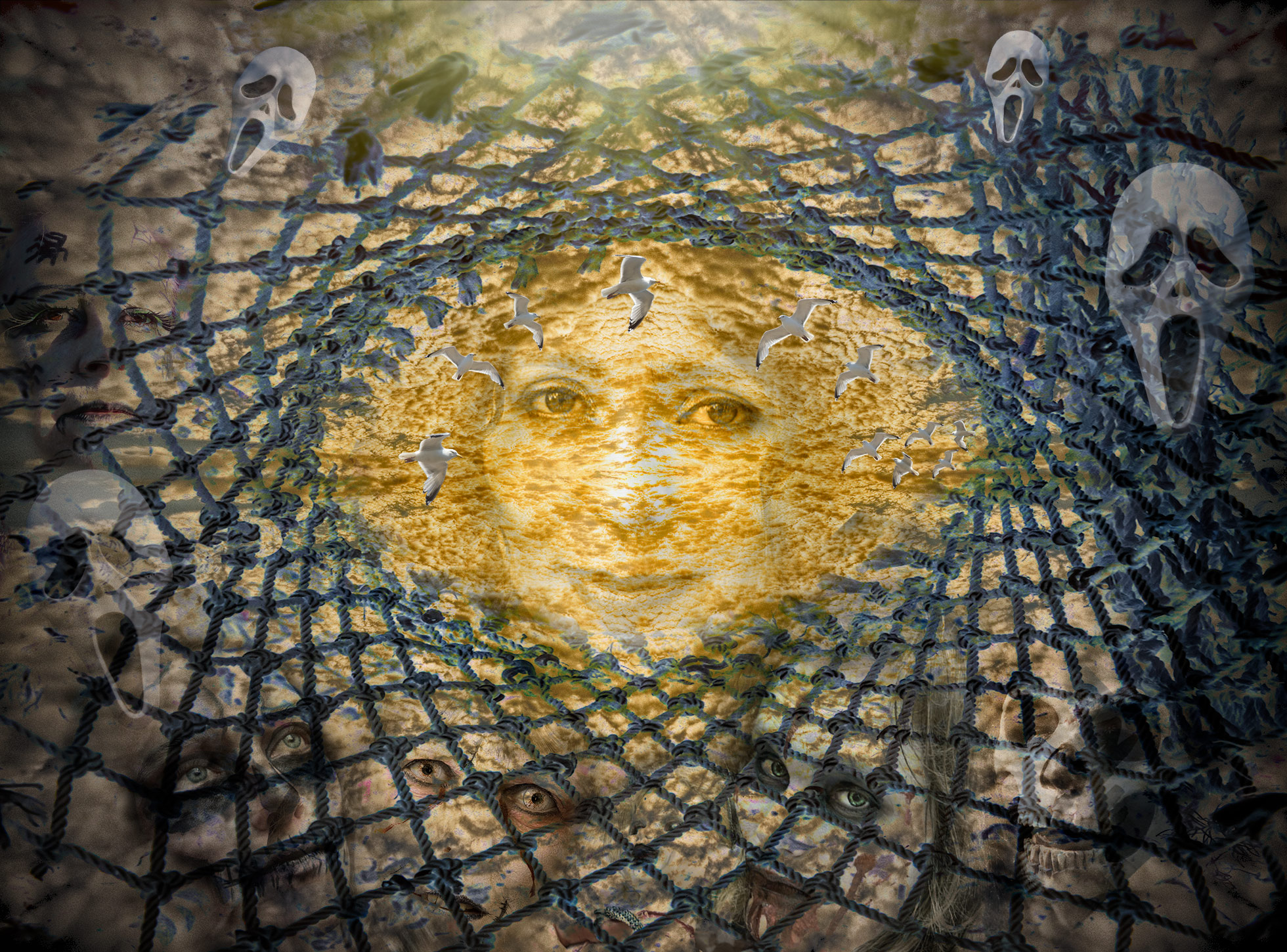
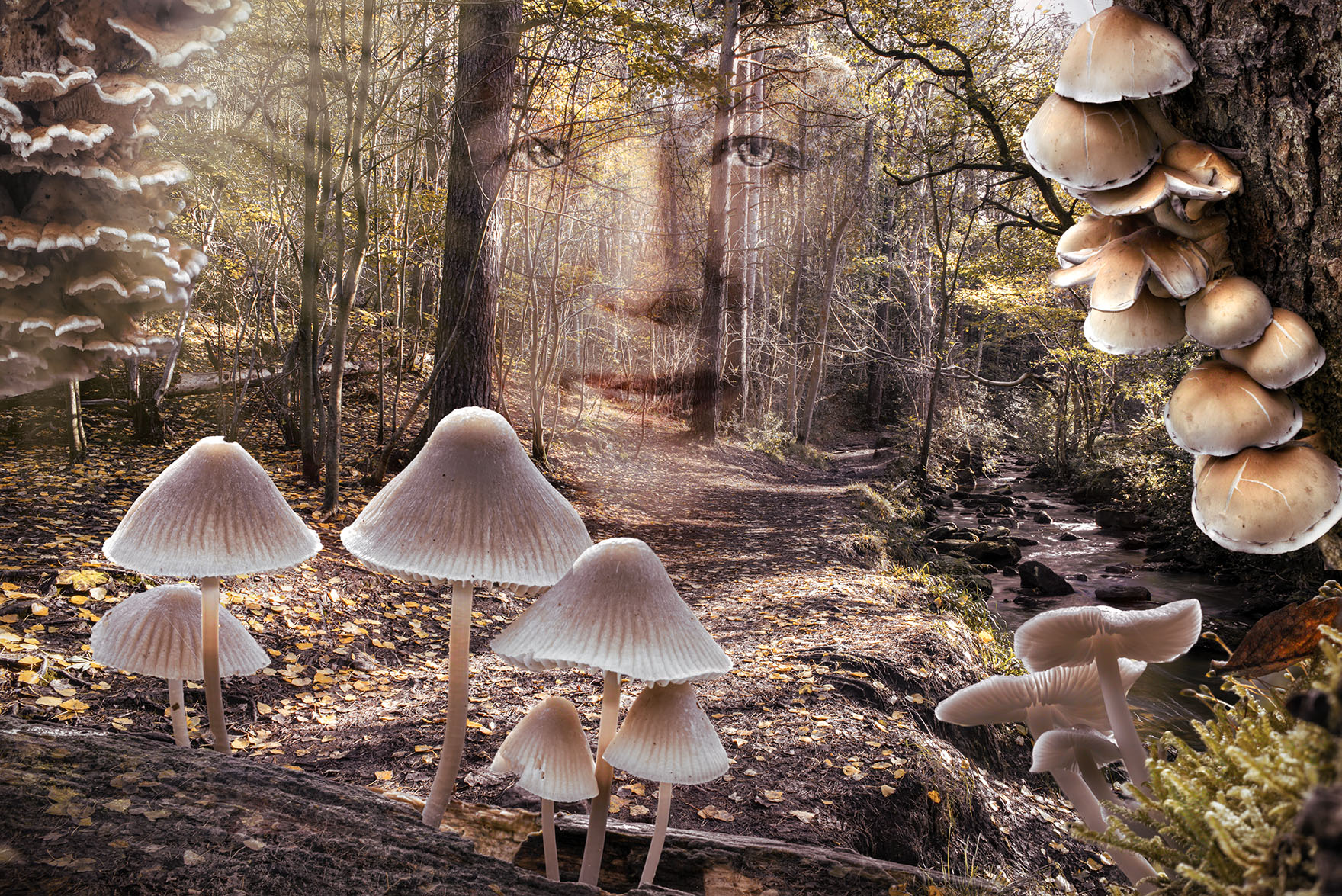
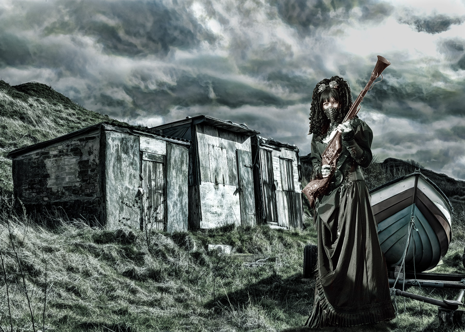
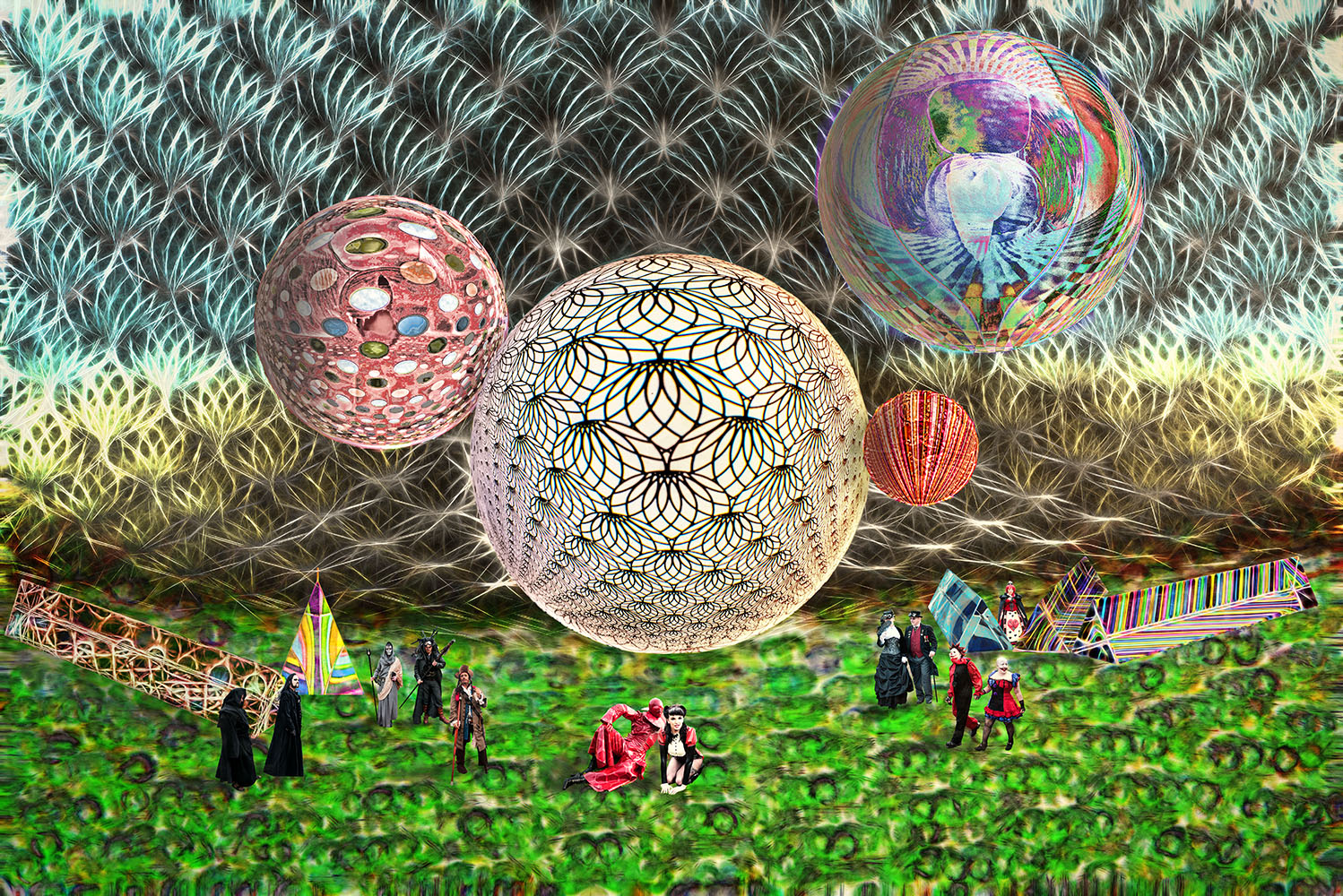
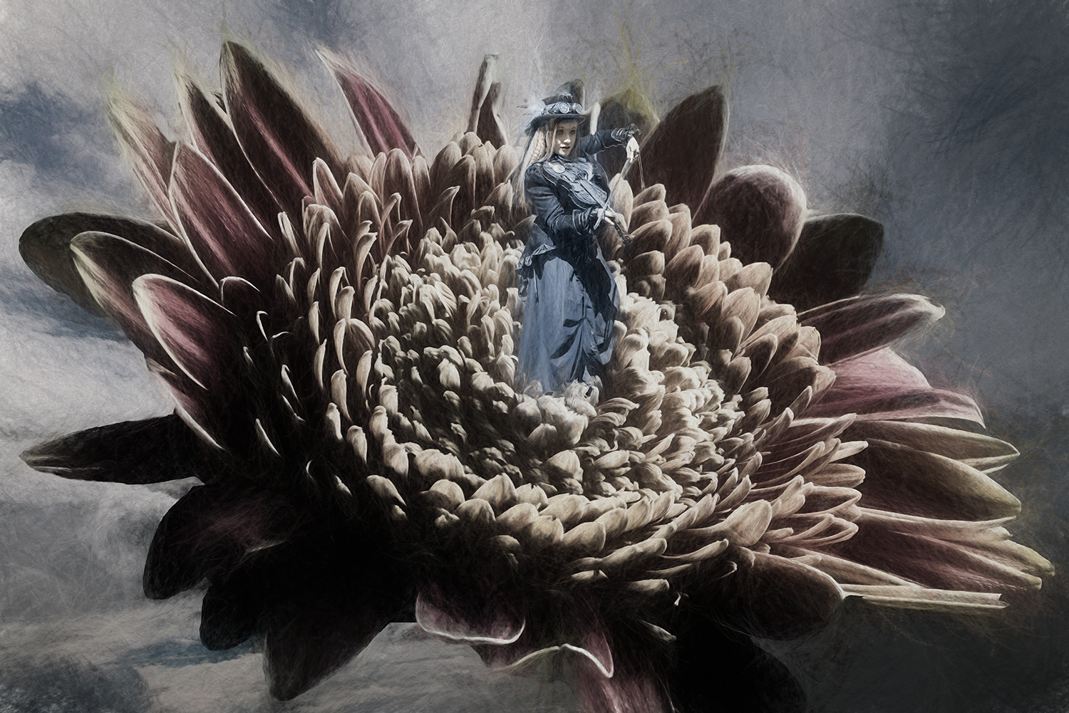
This is quite a transformation from the original.
The changes using 'generative fill AI' have produced an attractive image which bears little similarity to the original, and I'm not sure that's a good thing. As far as I'm aware, images which use AI are frowned upon in exhibitions. I prefer to stay away from AI, but that's just my preference.
I appreciate that you've worked the image well and produced an excellent image, but I have my reservations. |
May 15th |
| 34 |
May 24 |
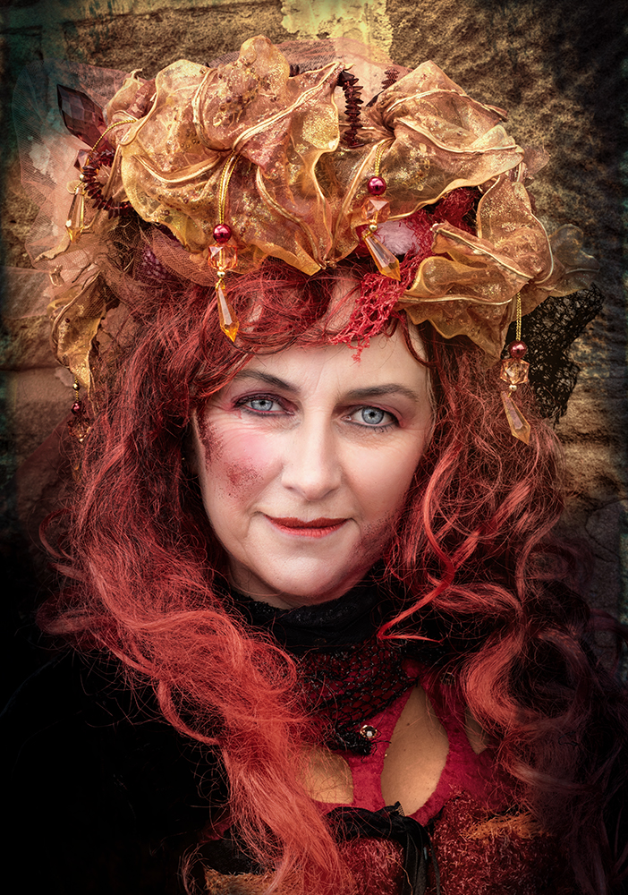
Comment |
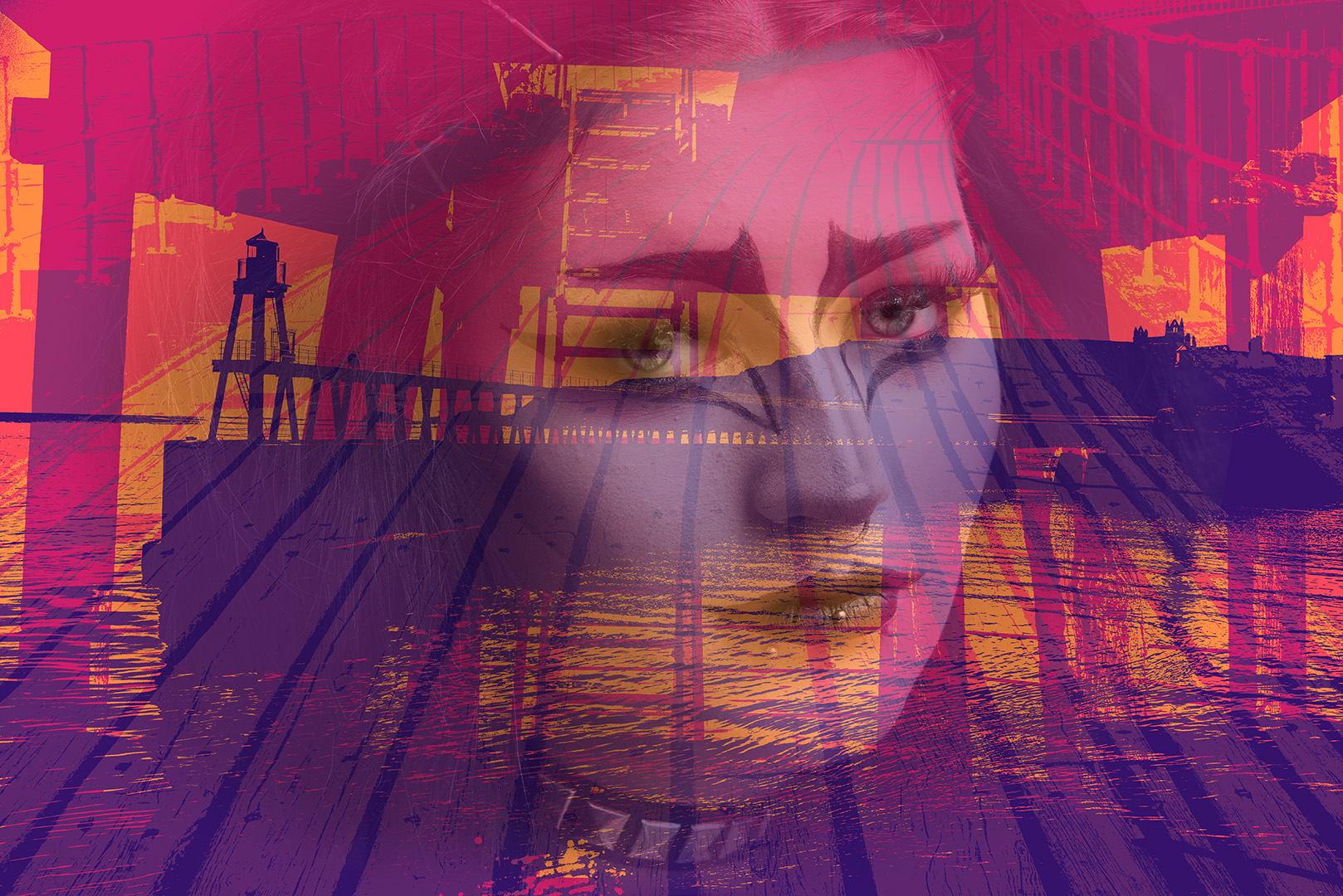
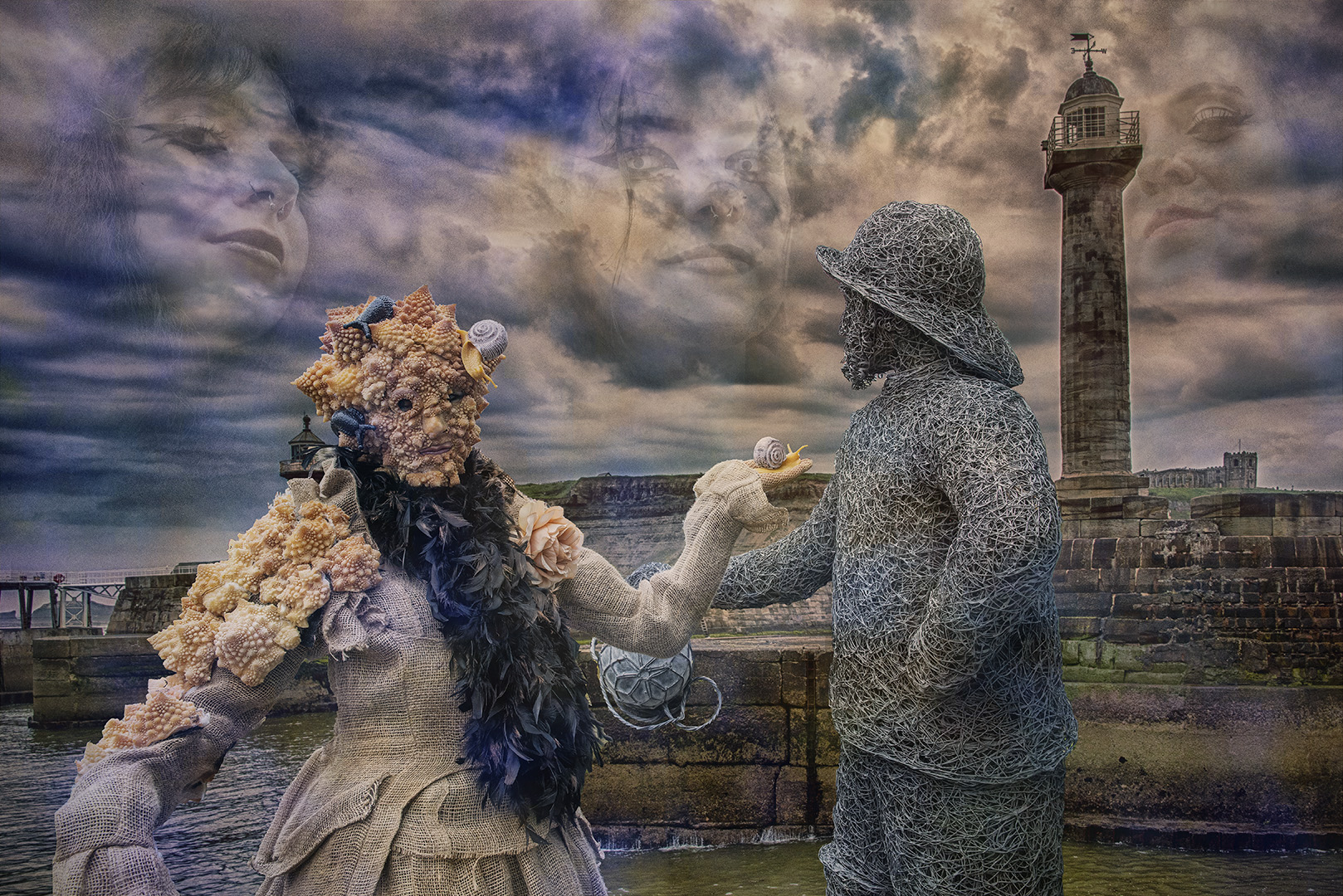
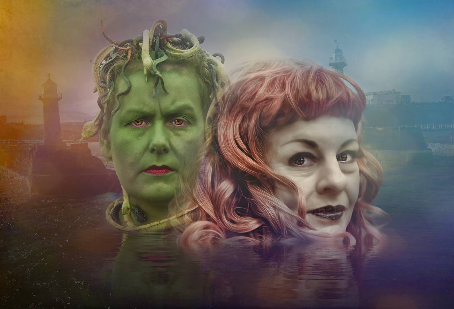
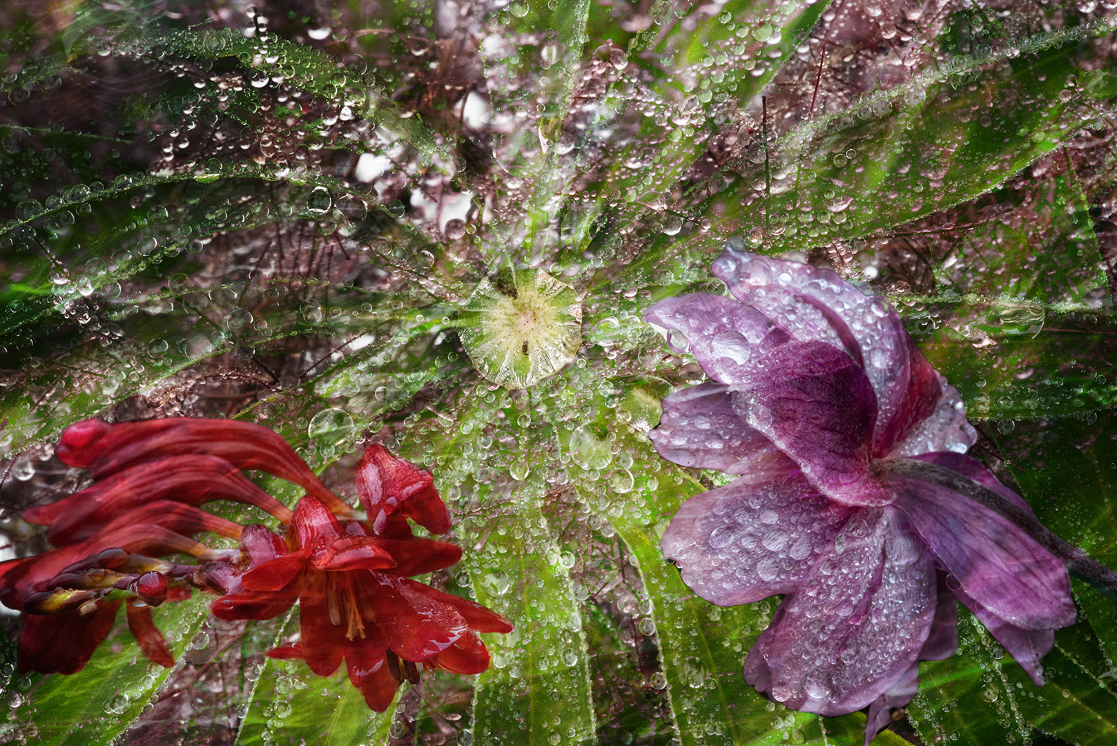
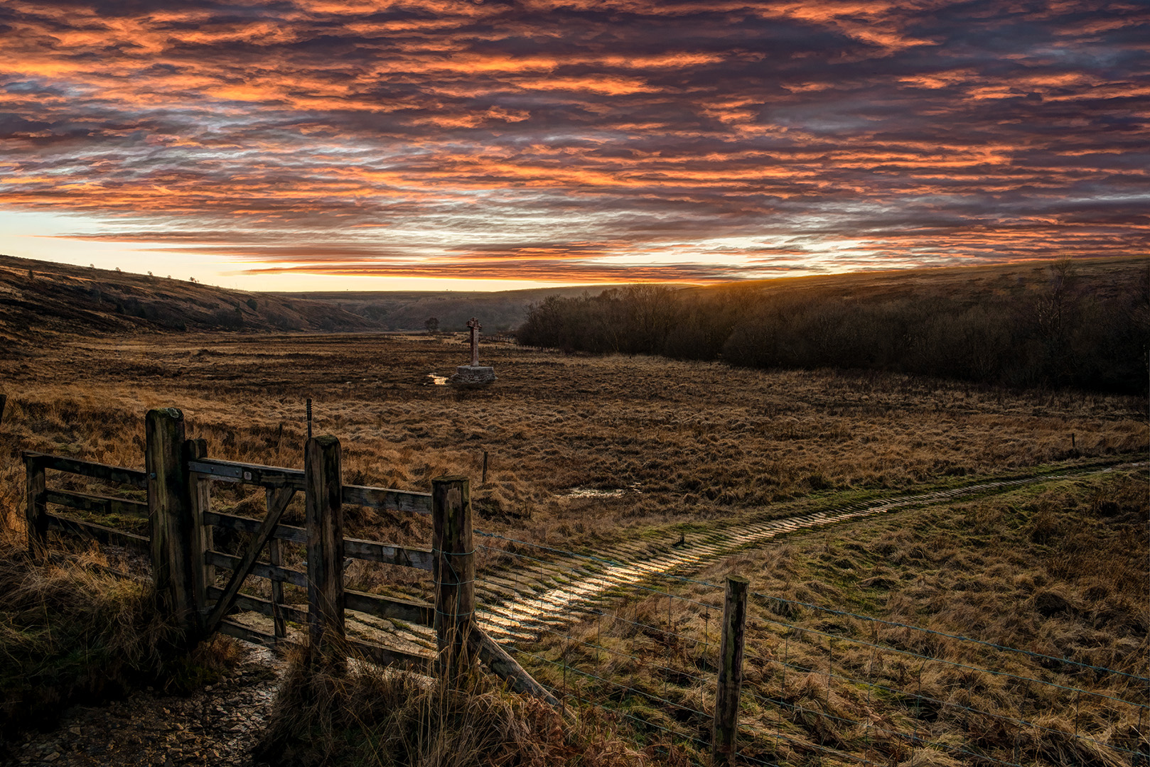
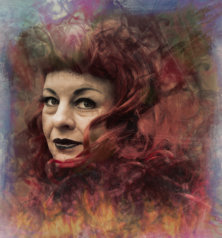
An interesting perspective and treatment of the original.
I appreciate what you've done, but I'm afraid it's just not my cup of tea. For me it needs a point of focus.
I echo Jan's comments and I prefer her version.
I applaud your experimentation, but I feel that the main objective is the use of the software, rather than the end product. Sorry. |
May 15th |
| 34 |
May 24 |
Comment |
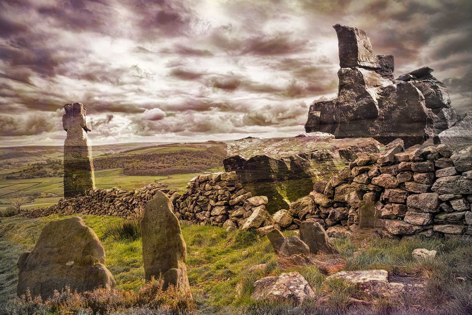
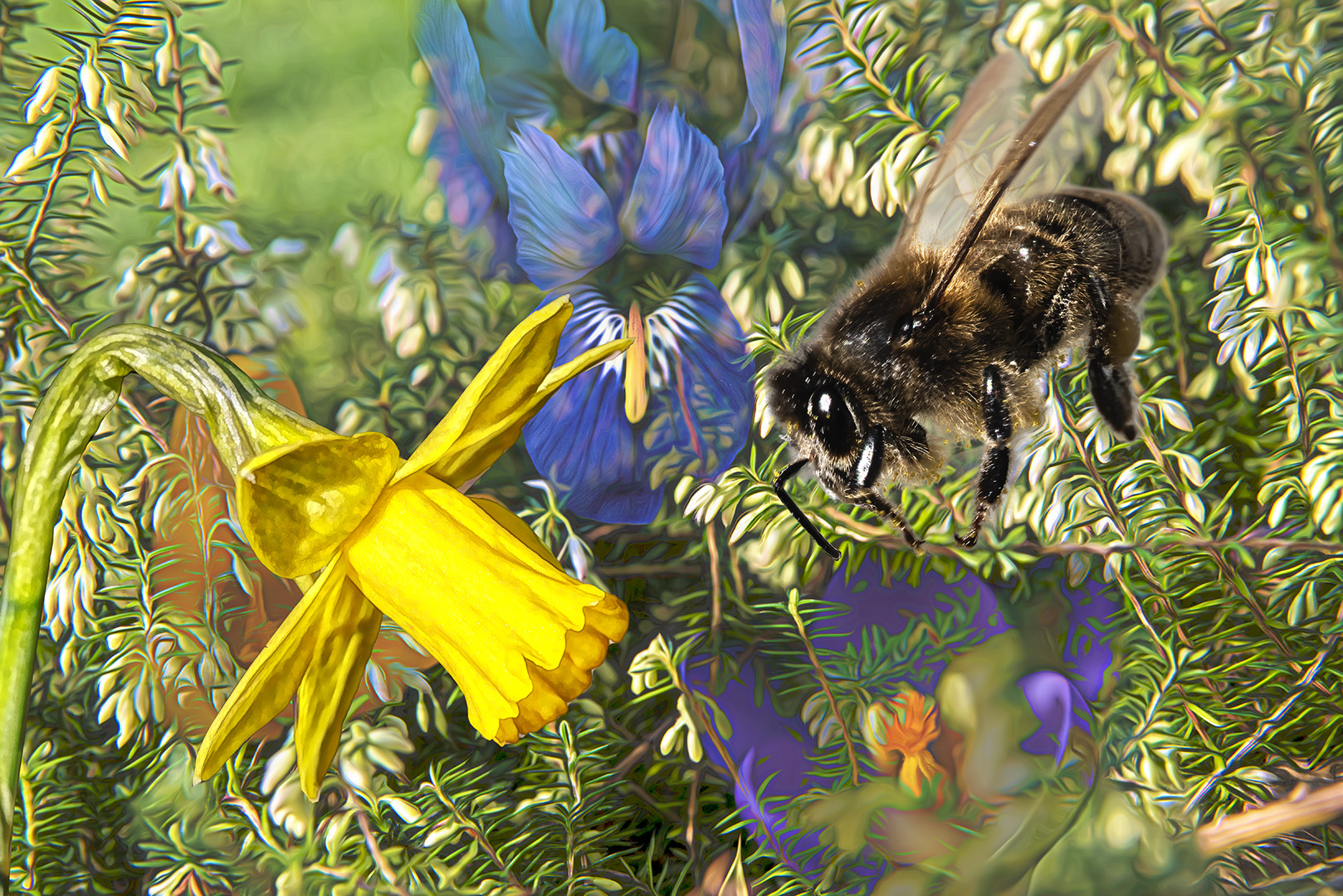
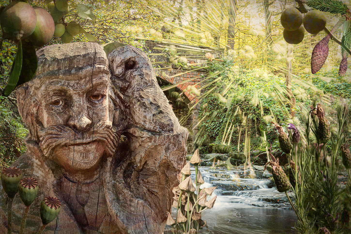
An excellent result. Your treatment is very good and I like the use of the breaking through filter.
Using a stroke was a good move too, so it sits well in the page.
Well done. |
May 14th |
| 34 |
May 24 |
Reply |
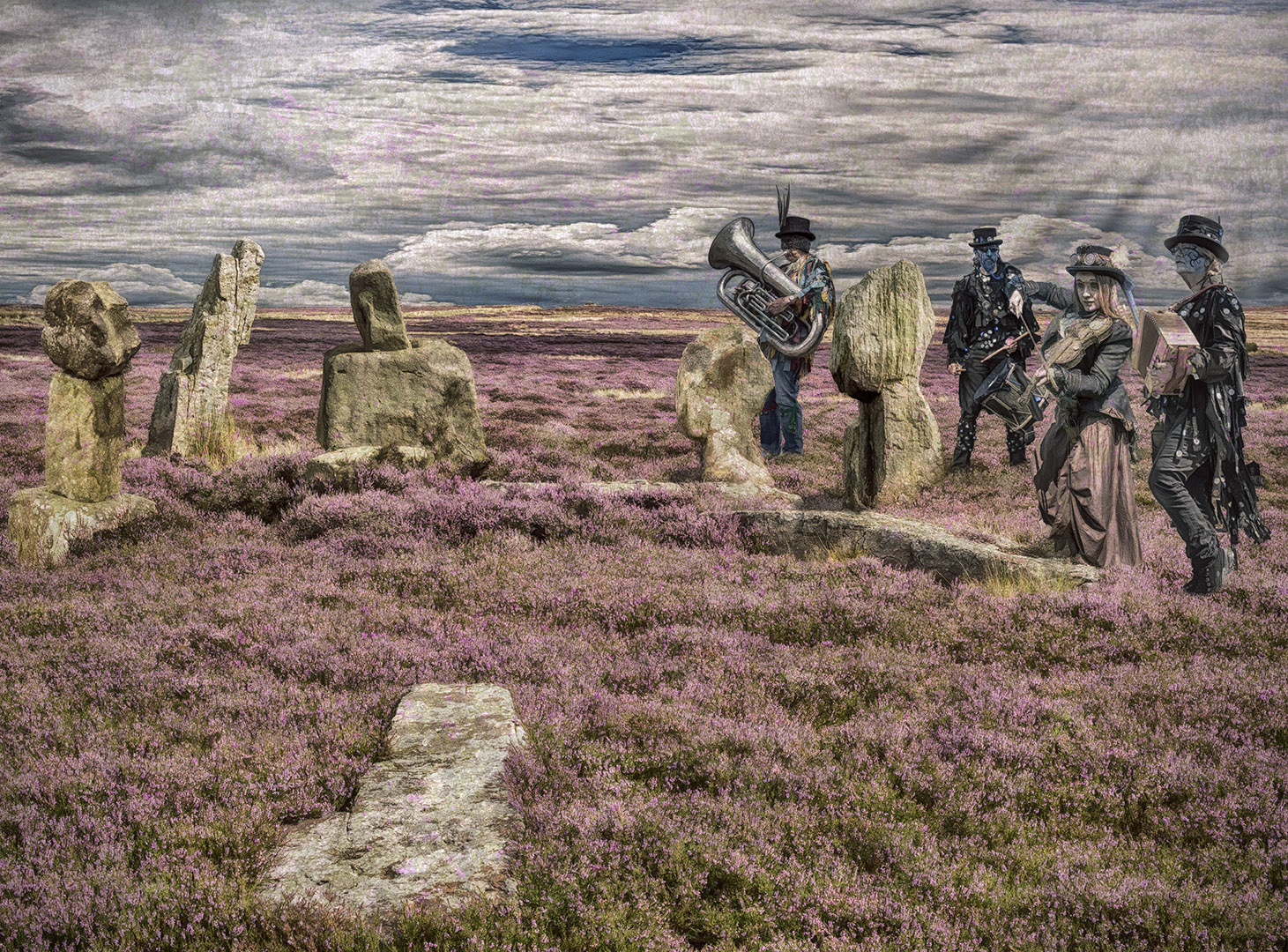
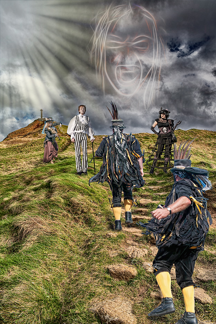
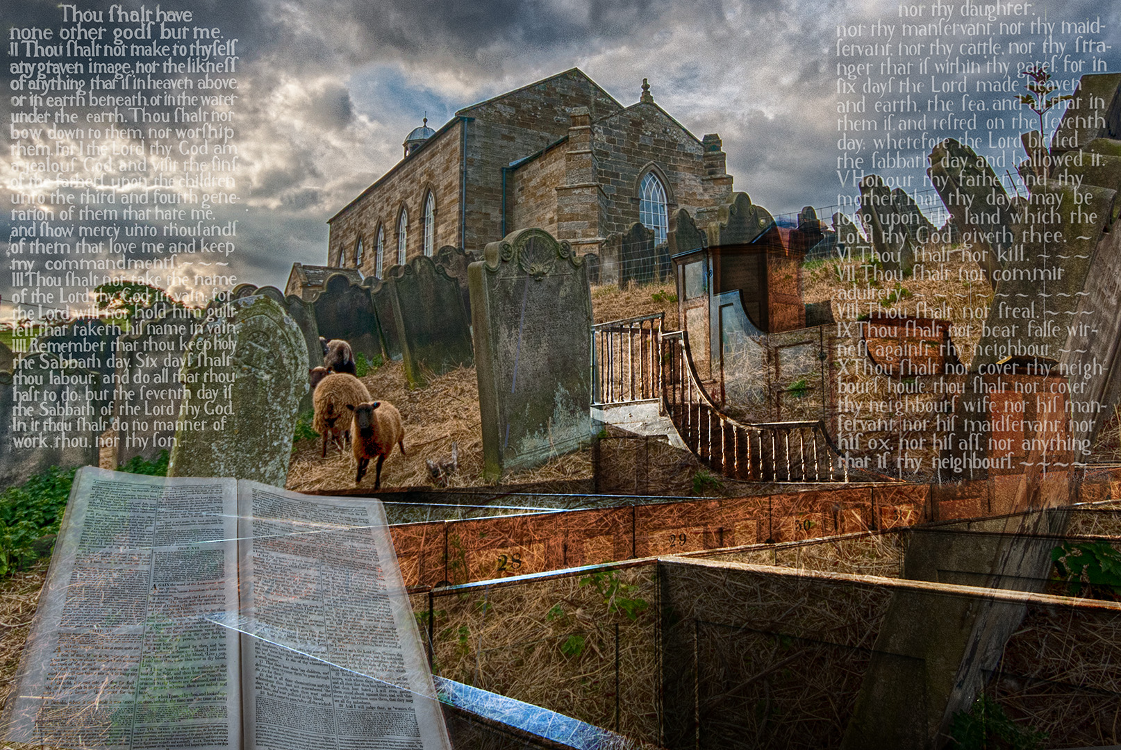
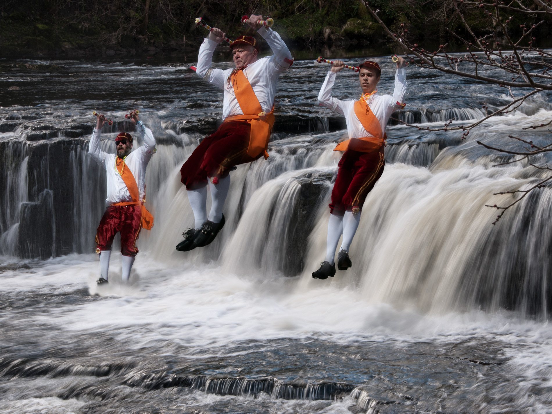
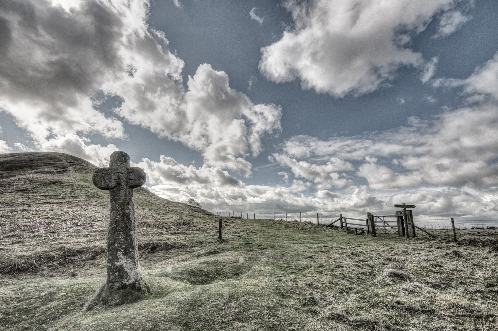
Hi Jan
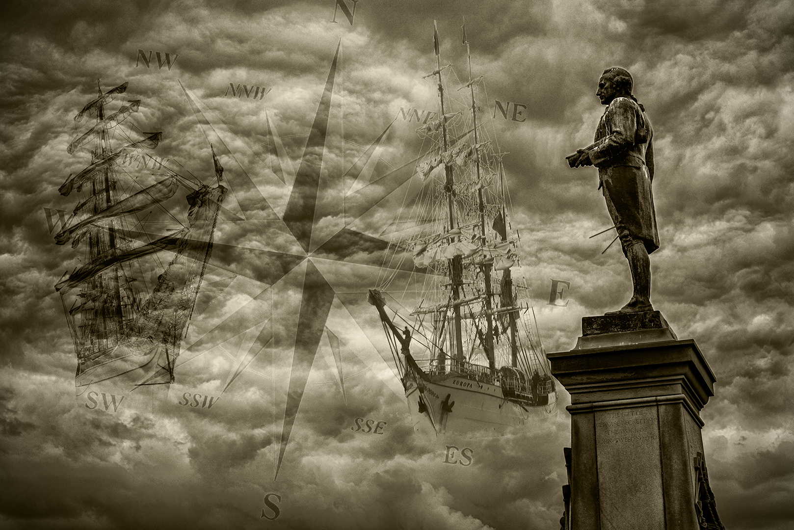
Thanks for your kind words. This image isn't in the book, but versions of the originals are - the publishers wanted to make their own compilations and selections. Most of the images used effects, but the actual stones and crosses weree presented realistically within them - like the one attached here.
The project took about 4 years and several pairs of shoes! |
May 14th |
 |
6 comments - 2 replies for Group 34
|
6 comments - 2 replies Total
|